Ooooh, some trends and surprises emerge!

We’ve been having a gas with DC’s swanky new corner boxes, which mark the end of the publisher’s Rebirth branding.
I dig ’em, I gotta say.
Now, last week, we took a look at the first week’s offerings. You can check them out here and here.
But for the titles coming out 12/13, we’re starting to see some trends and surprises.
Let’s begin by taking a look at some of this week’s notable covers:
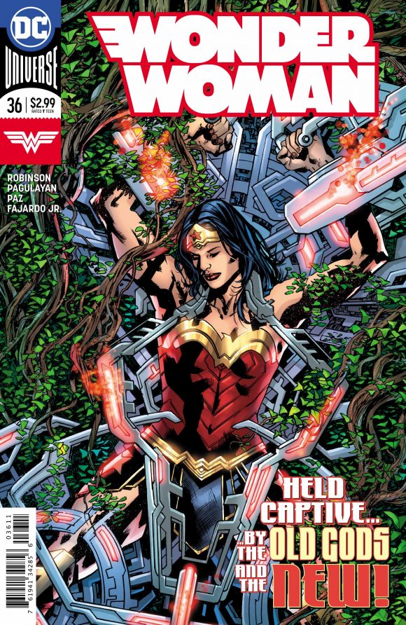
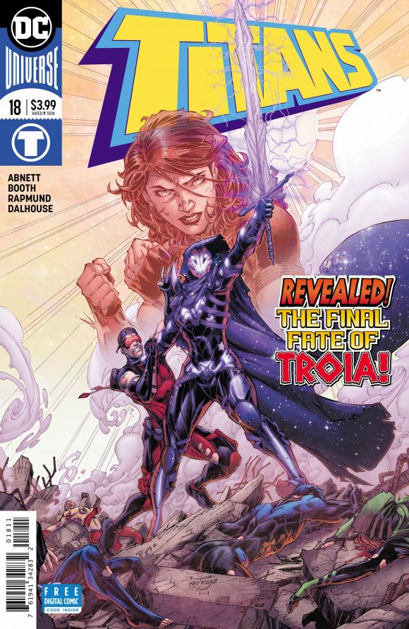
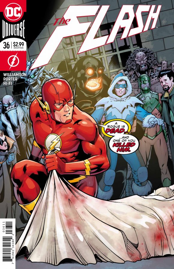
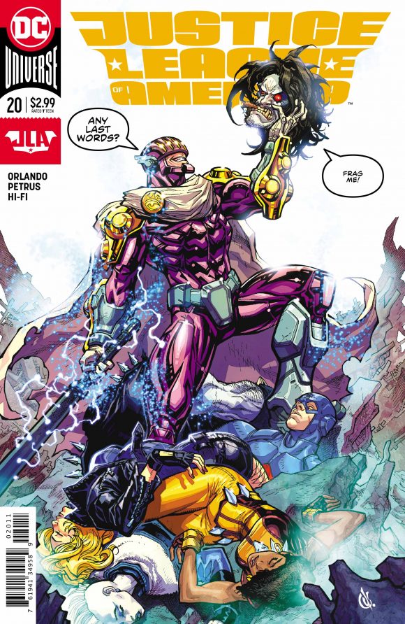
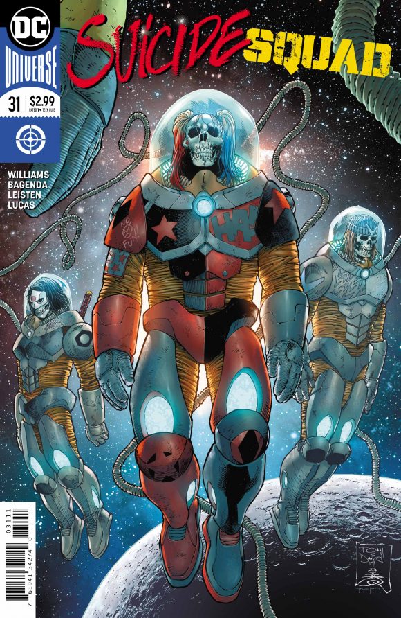
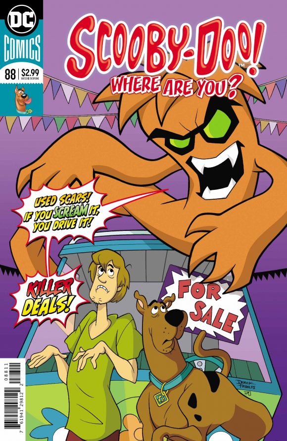
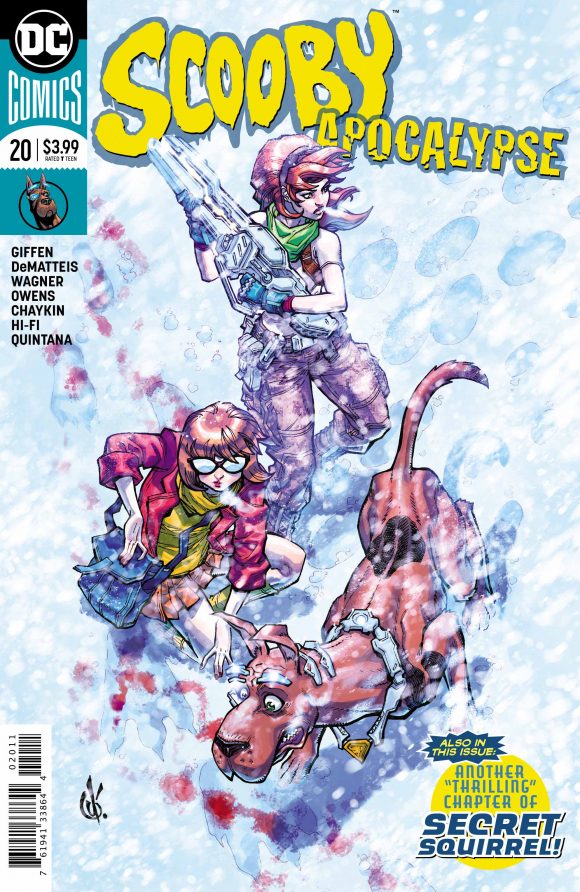
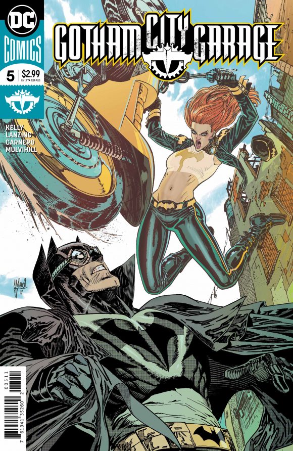

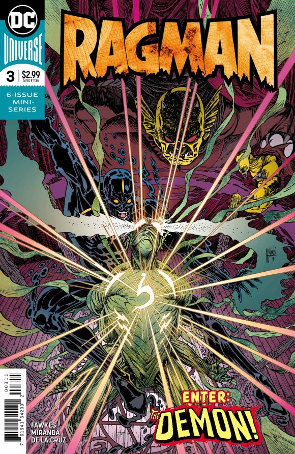
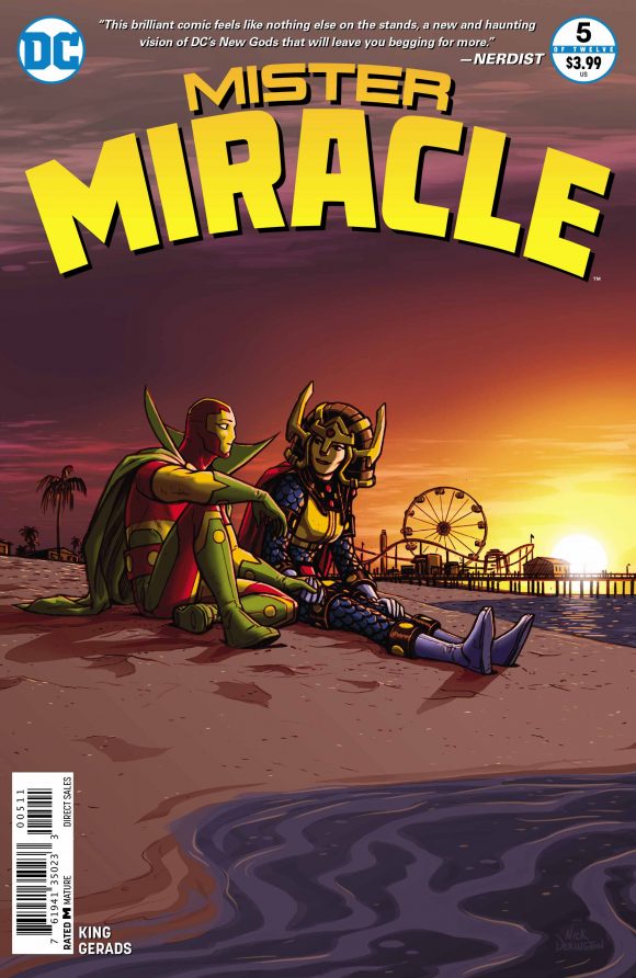
And some thoughts:
— Wonder Woman’s corner box formally debuts this week, though a prototype was shown off at New York Comic Con.
— Last week’s issue of Justice League used a logo inspired by the movie. Justice League of America has a logo of its own. That surprises me. DC is using these boxes in part to signal to readers that they’re part of the same family: The Batman books all have the same logo, for example, even if the colors shift based on the needs of the cover.
— Flipping the script, I’m halfway surprised that this week’s Suicide Squad logo is the same as last week’s Deathstroke logo. I suppose a gun-sight target means Antihero Book.
— In last week’s initial go-around, the Hanna-Barbera books didn’t have corner boxes. Now they do! And look — two Scoobys! But now no mention of Hanna-Barbera.
— Gotham City Garage’s logo is nifty.
— Two examples where the corner boxes really help the covers: The Flash and Detective. Detective has a very crowded title logo but moving it all the way to the top gives the art a chance to breathe. Plus the use of red and black all the way around really makes the whole thing pop. The Flash cover is right out of the Bronze Age and the image is made all the more bombastic because of its size.
— Take a look at Ragman and Mister Miracle. Both are limited series. So far, it seems to be holding up that DC’s non-canonical series are just getting the bullet in the upper left while canonical minis are getting the full box. (See last week’s Deadman and Batman: White Knight.)
— They’re using teal a lot. Maybe too much.
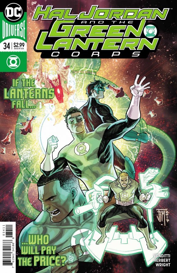
Here are this week’s other covers, sorted by family:
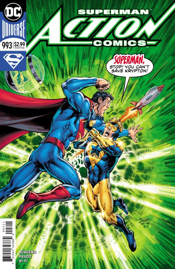
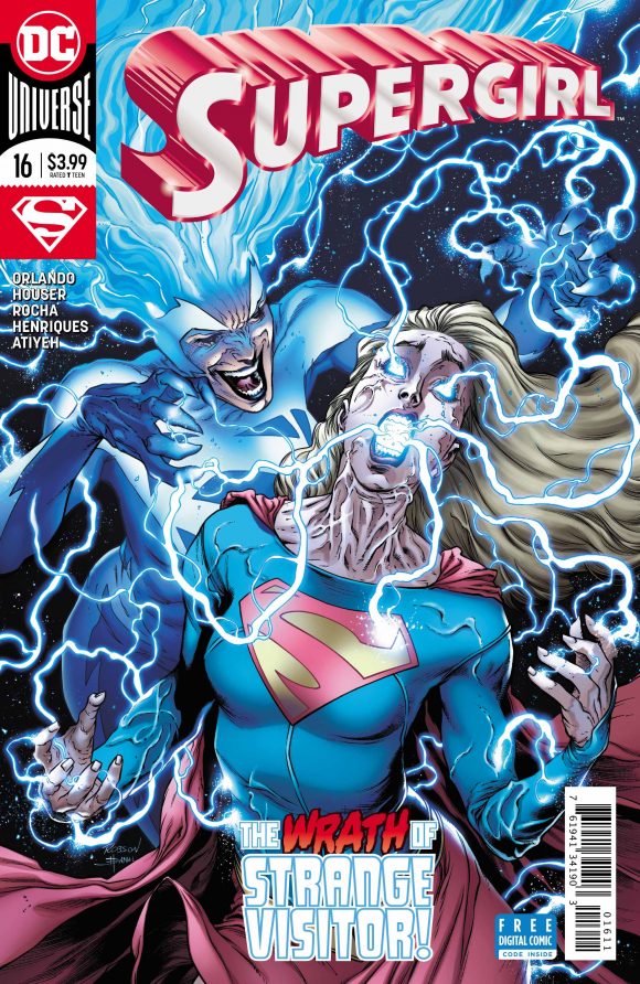
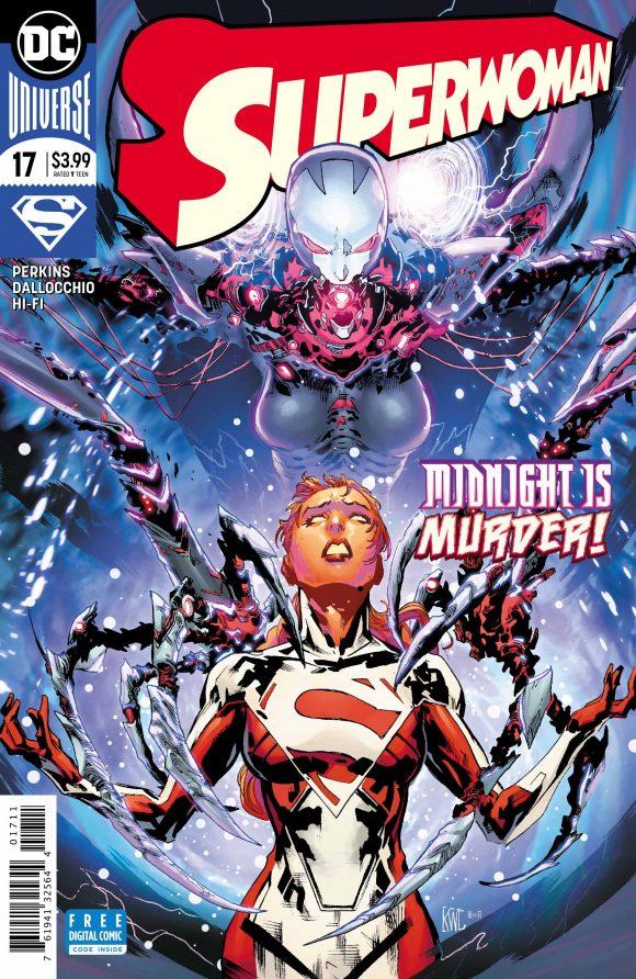
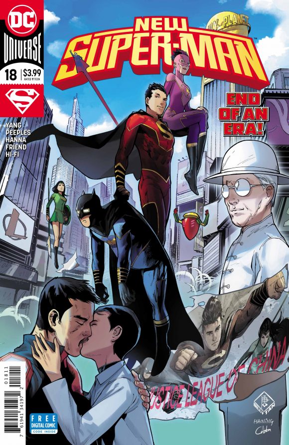
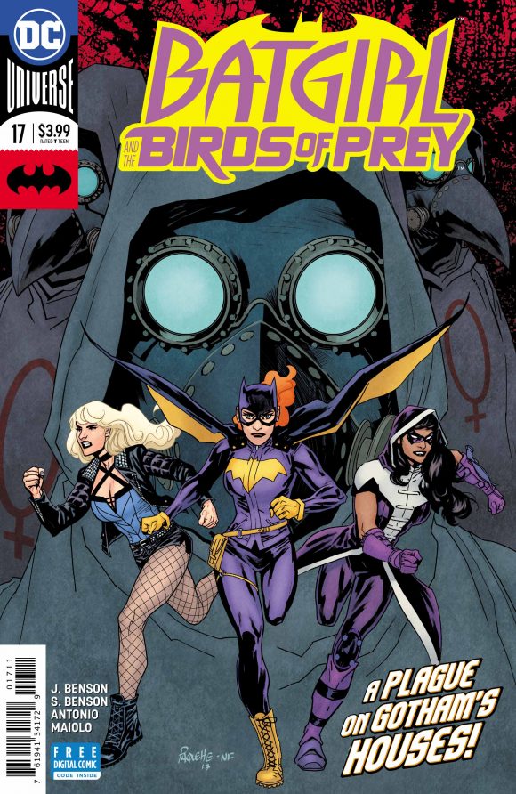
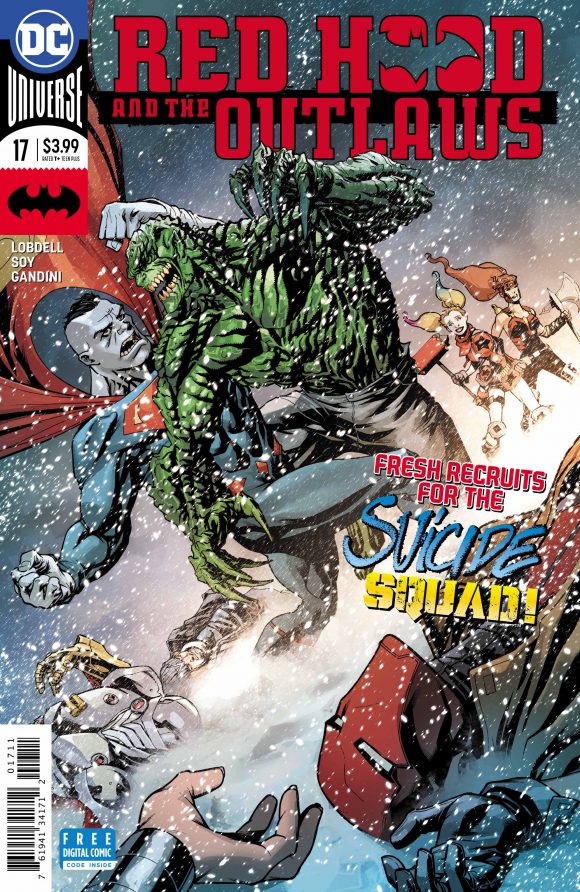
—
NEXT: Week 3!

December 9, 2017
I like the corner box, nice to see different colors in Batman and Superman titles. If only they could bring back 1960-70’s pop-art checkered top…