So glad the bullet is back…

Can’t wait for Mark Waid and Chris Samnee’s Batman and Robin: Year One? Me neither!
So, it’s great to be able to give another update on the 12-issue series that launches in October.
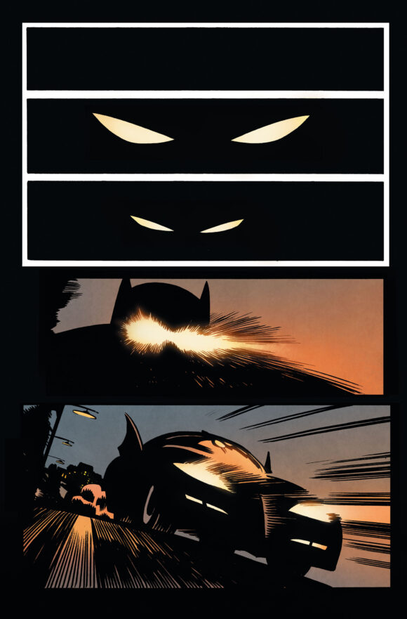
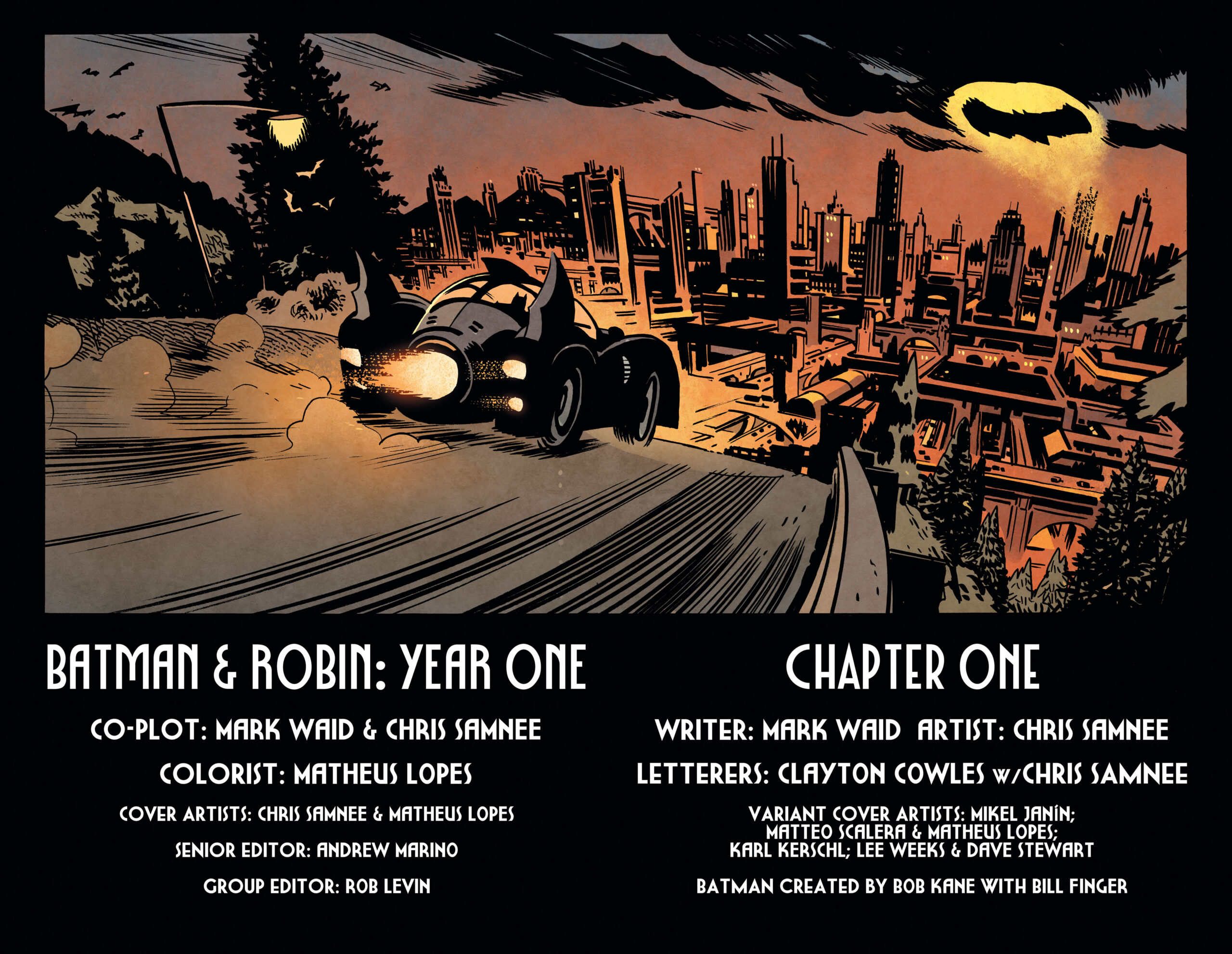
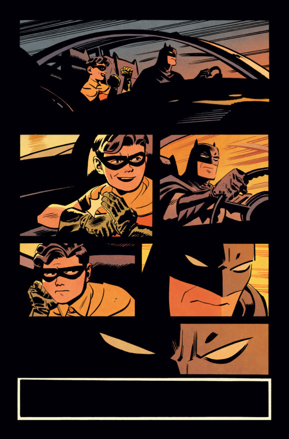
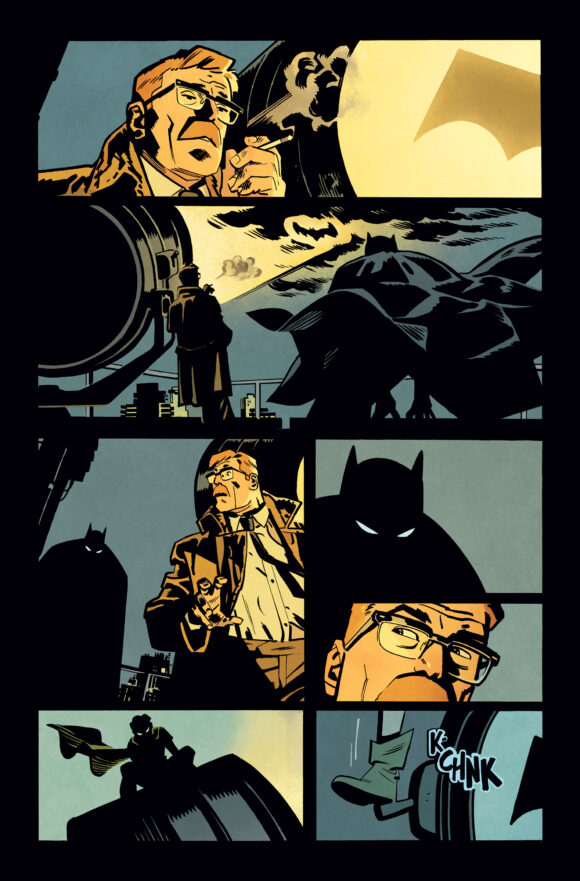
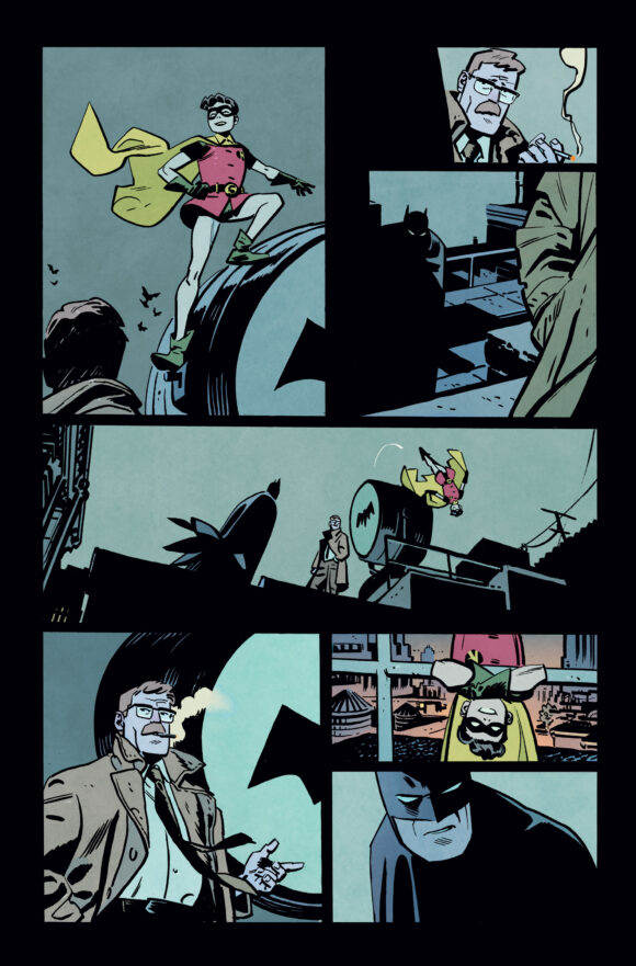
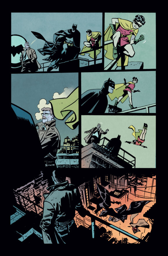
Dig this FIRST LOOK at the first seven (unlettered) pages in color — and the series’ groovy trade dress:
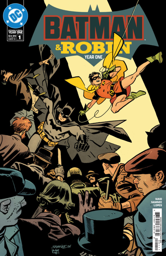
Main cover by Chris Samnee
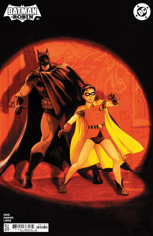
Mikel Janin variant
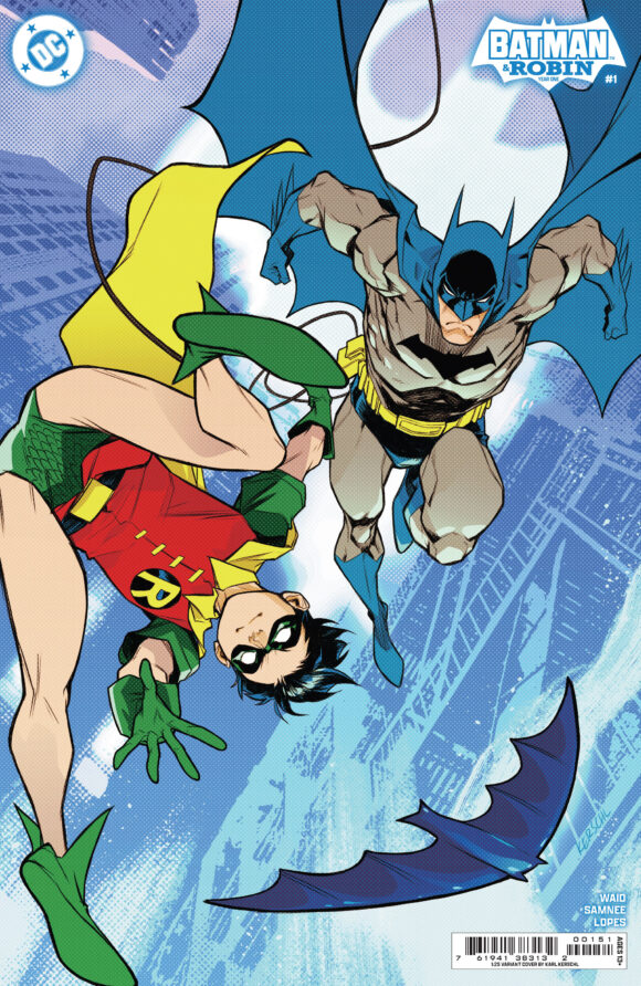
Karl Kerschl variant
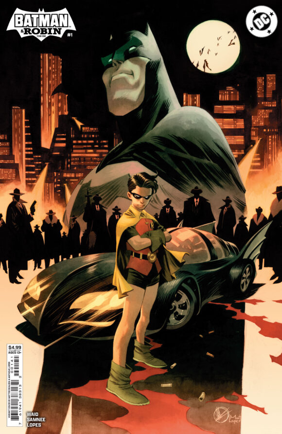
Matteo Scalera variant
—
A few thoughts:
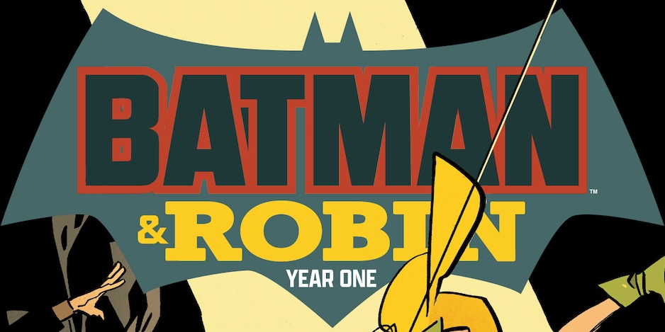
— I dig the logo. It has hints of the old — the Bronze Age Batman font condensed a la Batman: Year One, and the tweaked classic Robin wordmark — with a sleek, modern sheen. Perfect way to capture the concept of the series: the early days of the Dynamic Duo chronicled in a contemporary fashion. (And it’s great to see the DC Bullet.)
— Matheus Lopes’ colors are outstanding. You knew the color would be flat and we wouldn’t have it any other way.
— Lee Weeks’ variant still hasn’t been revealed.
— Issue #1 is due in comics shops Oct. 16.
—
MORE
— Samnee’s BATMAN AND ROBIN: YEAR ONE #1 Cover is a Grand Homage to BATMAN ’66. Click here.
— 13 THINGS We Want to See in BATMAN AND ROBIN: YEAR ONE — RANKED. Click here.

September 17, 2024
Yayyyyy!!!! The Bullet is Back, Bayyy-Beeee!!!
September 17, 2024
These look good. I’ve a feelin’ I’ll be trying these out and not necessarily waiting on the TBK edition either.
September 17, 2024
Some of that art (like the splash page) looks fantastic! I wasn’t sure whether I’d like it, as I’d read most of the Waid/Samnee issues of Daredevil and wasn’t too fussed; in fact, some of those were a bit weird. But I’ll definitely give this a try.
September 25, 2024
Art looks very good.
Although I don’t like Gordon smoking a cigarette.
I remember Gordon smoking a pipe for decades.