A cover that reaches into the mists of the past …

NEAL ADAMS MONTH is here!
In case you missed it — and you can read about all the details by clicking here — every day in February, we will be running EXCLUSIVE commentary by comics legend Neal Adams about each of his variant covers for DC Comics this month. (Plus all sorts of other goodies and surprises. Again, click here for the details.)
Adams re-penciled 27 of his most famous covers but the characters have been switched around or replaced wholesale. They’ve also been inked and colored by some of comics’ biggest names, like Frank Miller, Jim Lee and Dave Gibbons.
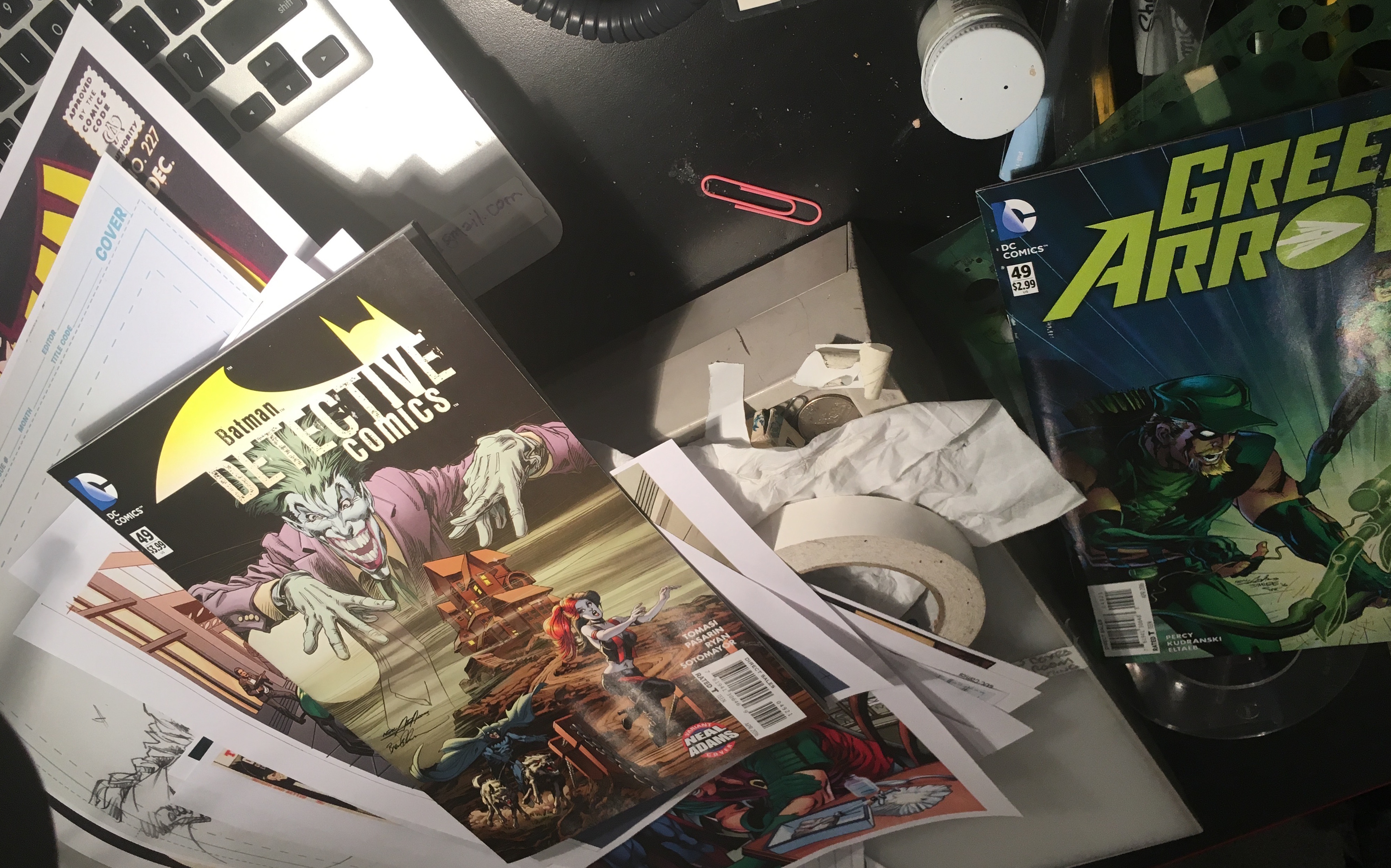
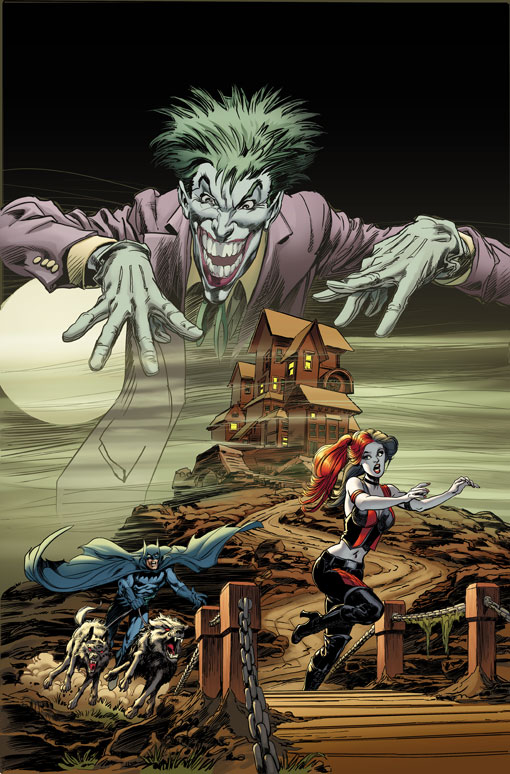
To kick things off, we’re jumping into one of Adams’ — and Batman’s — most famous covers: Batman #227, which has been re-done for Detective Comics #49, out 2/3.
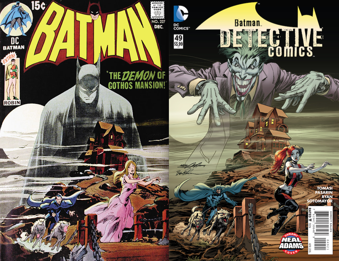
The inker is Brent Anderson and the colorist is Laura Martin.
Oh, and fun fact: This is the first time Adams has drawn Harley Quinn for publication …
—
Dan Greenfield: Going (way) back to the past, here’s Detective #49 and Batman #227.
Neal Adams: I’ll tell you something interesting about this. When I did these covers originally, you have to understand that I was being paid $50 a cover. It’s very hard to support a family for 50 bucks a cover. So putting a given amount of work into a cover was really, from my point of view, the need to do a good cover beyond making the $50.
I could go to an advertising agency and do a storyboard frame and make $50 and I could do 20 of them in an evening. So what was the reward for doing one of these covers? The reward was, it’s something juicy! So my editor came to me and said, “Well, we want to do an homage to THIS cover.”
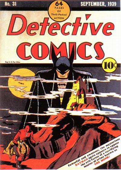
Dan: Detective #31.
Neal: Right. Now, it wasn’t just that. That wasn’t just the only reason. At this time, if you check the…(affects stern voice) “If you check the records…!” I had been doing a bunch of covers for House of Mystery and House of Secrets that were takeoffs of the pocket books that were being sold in those days, of the pretty woman who runs away from the mansion where something was going on in the upper room because the brother of the man who lived in the mansion was retarded or some crazy thing and she’s running through a gated fence or she’s running away from something.
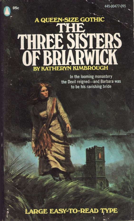
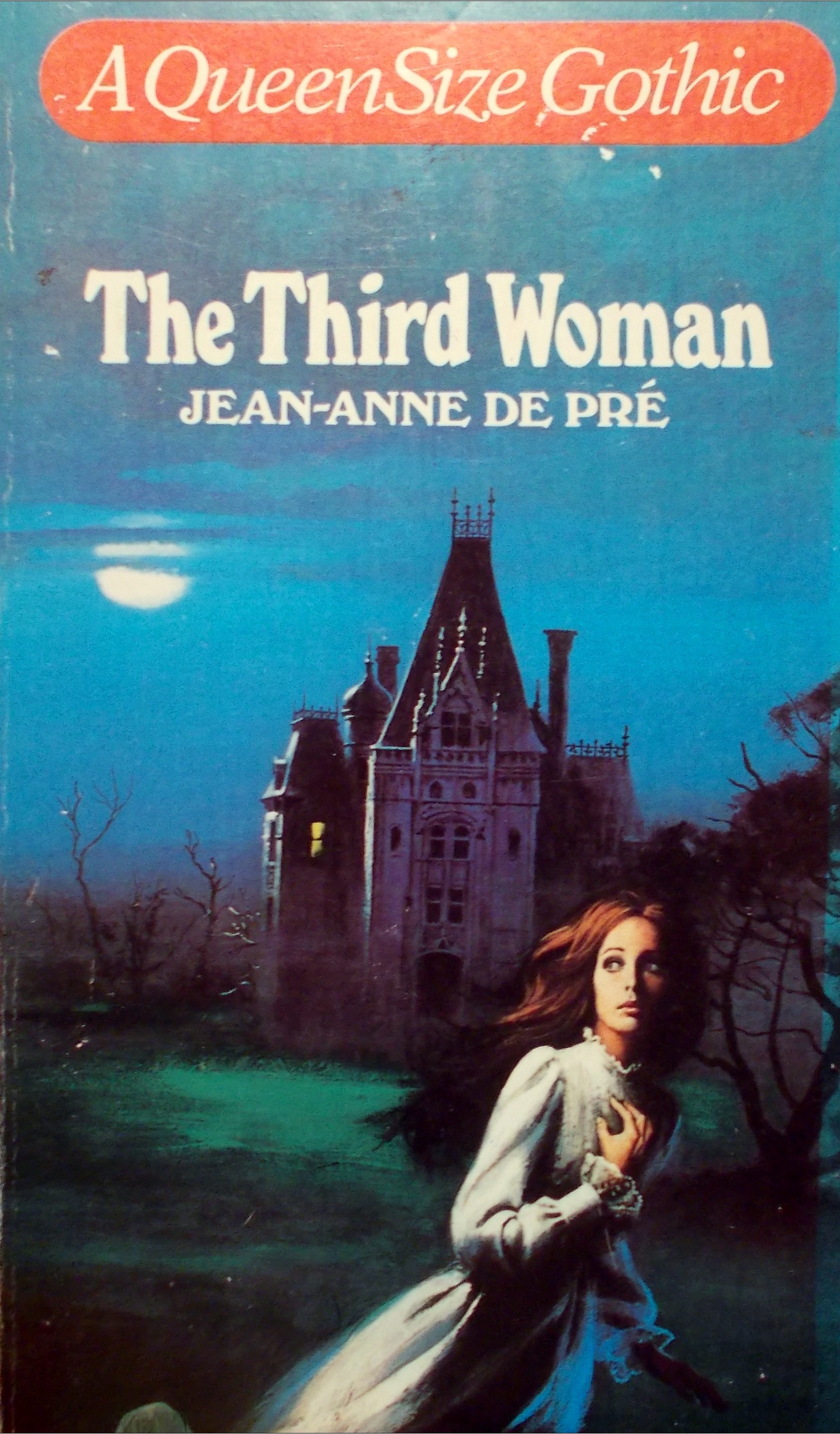
It was all these gothic romances that were really kind of…Julie Schwartz was, like, “How do I take advantage of this gothic romance?” So he put that together with this old Batman cover and said, “Let’s do that. We’ll have a Batman looming above this castle, the beautiful woman running away from this guy and he’ll be chasing her.”
I said, “Well, can we put in wolves and stuff?” (Dan laughs) So I basically did more or less an homage to this cover but it’s an homage to gothic romance covers of the day! If you walked into any bookstore in those days, you would see a half a dozen of those covers with the pretty girl in the foreground and the castle or the house in the background. So that basically is what this is an homage to, so…
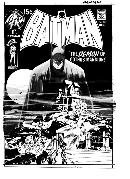
What’s interesting about this — I get this all the time — people bring this up to me to sign because it stands out from all the other Batman covers in that it’s done as a style change or a theme change to a gothic romance, having nothing to do with Batman. Batman isn’t even in it. He’s just kind of this looming ghost above the thing, which shocks me because I’m going:
“Oh, it’s just a Batman cover.”
“No. No, it’s something different, Neal. You don’t understand. You have no idea how this affected me when it came out. It was totally…”
And I go, “Really? OK…” (Dan laughs)
I get that all the time.
Here’s the second thing. This I find to be most interesting:
(The inker is) Brent Anderson. OK.
This is the pencil:
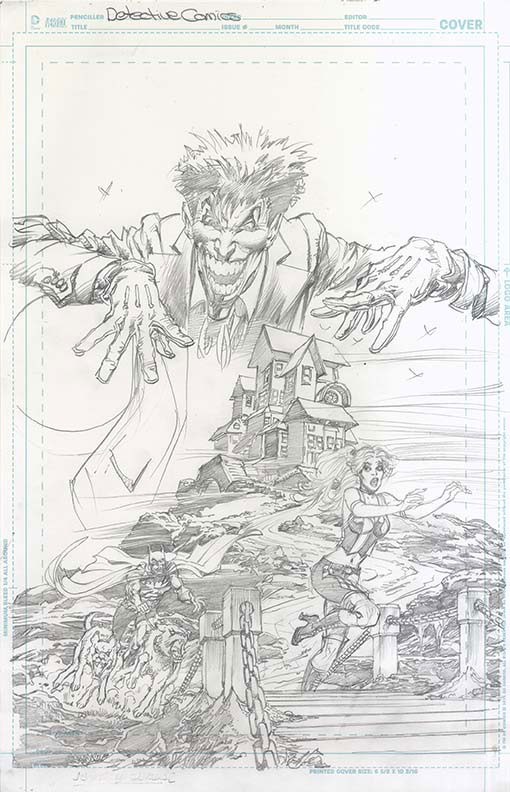
Now, what I felt when I did the original cover is — because I worked so fast, remember the $50? — I tilted her head in such a way that had I had a moment to fix it, I would have erased it and I’d have tilted her head (forward) a little. Why is her head tilted to the left like that? So I thought, well, when I do this, I’ll tilt her head properly.
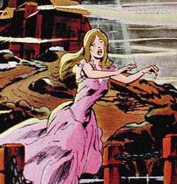
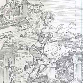
Brent went ahead and re-tilted her head to match the original! (Both laugh.)
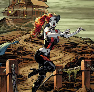
You really can’t have more sincerity than that! I mean, really, you can just see it’s exactly the same tilt as in the old cover! He must have gone over it and decided to bring the tilt back!
Isn’t that wonderful and a little crazy at the same time?
—
NEXT: Adams, Jim Lee and flipping the script on Green Lantern/Green Arrow. (Click here.)
For the full NEAL ADAMS MONTH INDEX, click here.
—
You can also find more on Neal Adams at his website, here.

February 1, 2016
This is going to be a fun month!
June 13, 2017
The inker changed the art? Are you kidding me?
October 26, 2020
Well, in this case, it wasn’t any Joe Schmoe inker.. it was Brent Anderson, a master at his craft, and a veteran artist. I have a feeling Neal sees him as a colleague and collaborator, not just “an inker”. For what it’s worth, I think Anderson improved it.