The cartoonist and writer drops in to tell us how he nailed this FIGHT CLUB 2 #1 variant.
Chip Zdarsky (Sex Criminals, Howard the Duck, Applebee’s) is a clever guy and a terrific artist — and here he shows just how much he is of each, with a step-by-step breakdown of his Books-a-Million variant cover for Dark Horse’s Fight Club 2 #1, out 5/27. It seems like everyone’s talking about Fight Club 2 this week, so I’m just gonna get out of the way and let Chip take over … — Dan
—
By CHIP ZDARSKY
1. My initial idea! A little Jack peeking out from the inside of a pill, resting in a bloodied hand. I thought it summed up Issue #1 nicely, but they didn’t go for it so I’ll probably just re-use the idea for Jughead or something.
—
2. I was hesitant to send this one in ’cause it kind of makes fun of sequels. But I gotta be me (an idiot).
—
3. The accepted rough! It’s good to reference the fact that he’s now a dad, so this one probably made the most sense to pick.
—
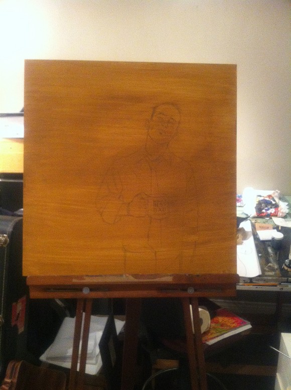
4. I’m not the brightest, so I thought, “Hey! You haven’t oil painted in a while! You should do this as an oil painting!” Here you see what I decided to work on. It’s a dense piece of board from Home Depot that I covered in gesso, and then painted with a raw sienna acrylic. When I first started as an illustrator I learned that a nice warm layer of colour before painting will stop bits of white canvas poking through. A quick painting can feel more finished with this layer underneath.
—
5. Photo reference! Sometimes I think I should shave my beard off to help with photo reference, but other times I remember that I don’t have a chin, so, beard wins.
—
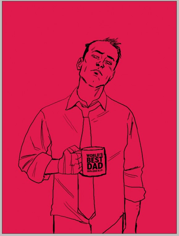
6. My sketch! Done digitally, but then I blow it up and print it out across several sheets of paper…
—
7. … then I tape the sheets together and rub graphite on the back. Once it’s covered, I tape those sheets to the board and use a pen to trace out my sketch. The tracing embeds the graphite onto the board, leaving me with a light impression of the sketch to work over. It’s … simpler than I make it sound.
—
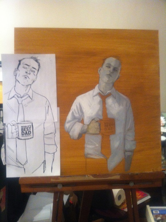
8. See? There’re the sheets taped together! Next to, of course, the beginnings of the painting. I’m just laying down all the light bits to start with.
—
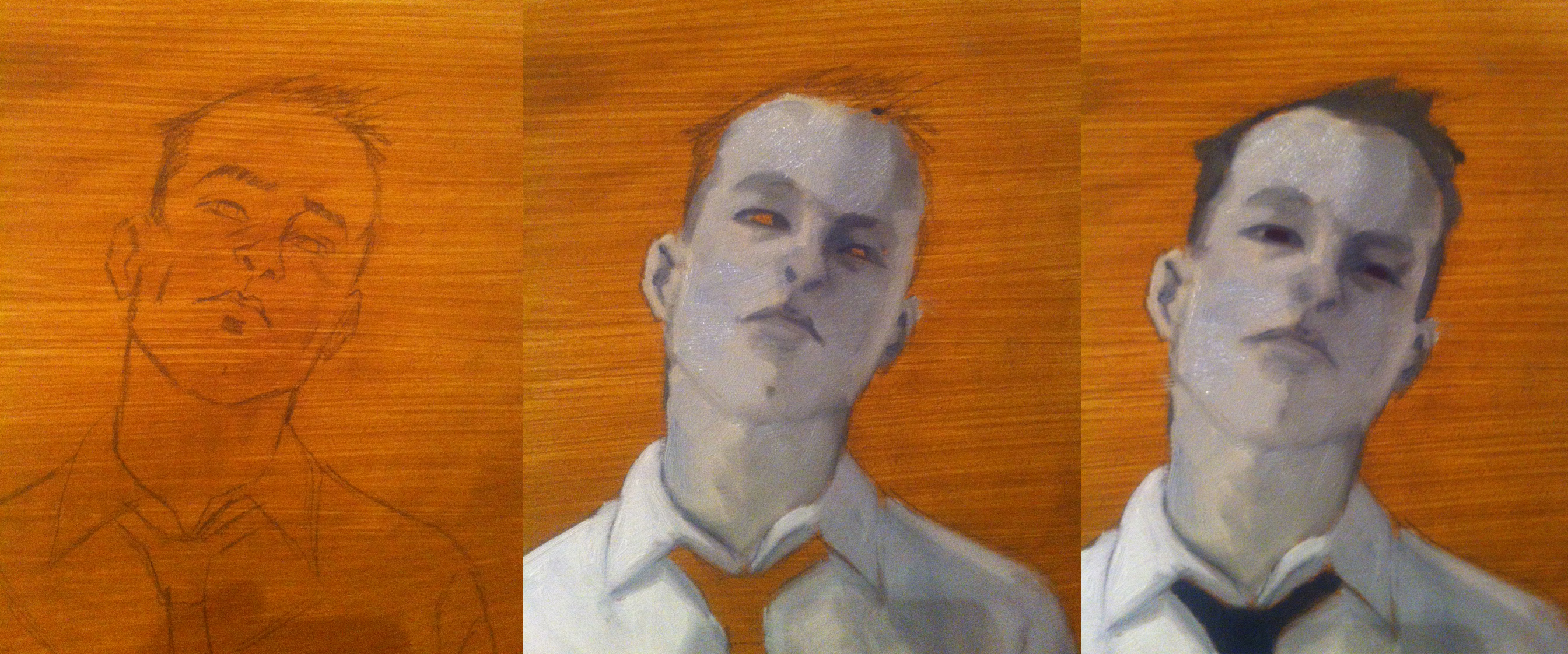
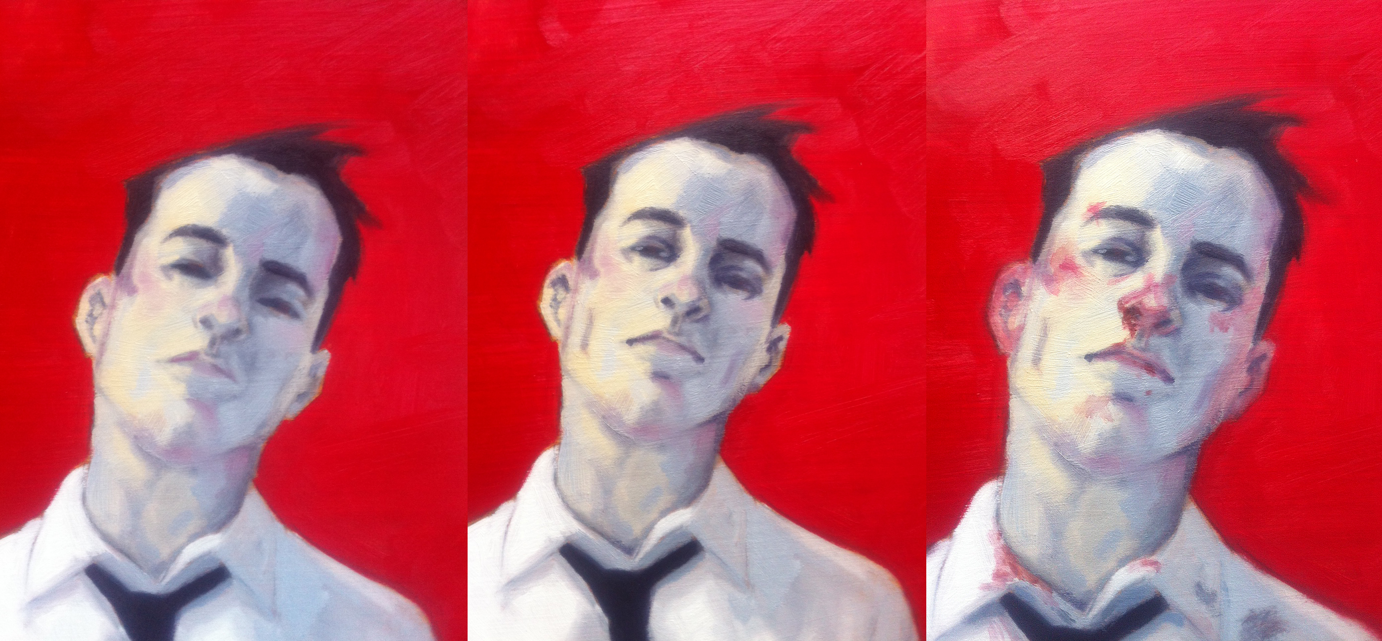
9. Paiiiiiinting. My idea was to keep him pretty monochromatic, but lightly accentuated with primary colours.
—
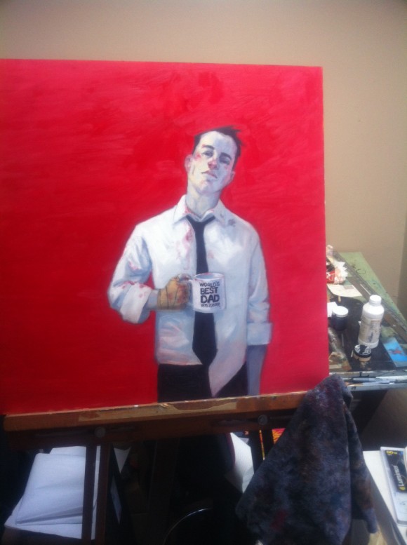
10. At some point I surround the figure with the red colour. After that it’s pulling out details.
—
11. What I ended up with. Nothing ever turns out the way I want it to, but this is pretty OK. The one thing I’m really bad at happens at this stage: photographing the piece. I took my girlfriend’s big fancy camera, hauled the painting outside in the snow to give it more light, and tried to take a decent shot of it. All were garbage and I started to panic a bit.
—
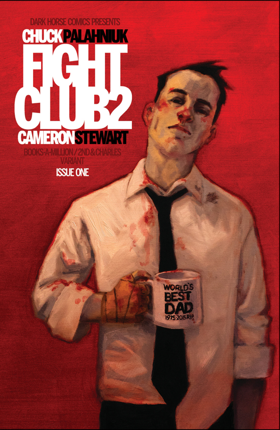
12. So, frustrated, I grabbed my basic point-and-shoot camera and took a shot of it in the studio. The picture was completely inaccurate, adding a yellow tinge to everything. But art is about happy accidents and I loved the yellow tinge. It made the piece feel like an old paperback cover. So, that was the final shot! The folks at Dark Horse were cool with me doing the type for the cover, so I made something nice and graphic to contrast the painted feel, and had the letters touch and overlap to create some tension.
And now I will never oil paint again.
—–
Fight Club 2 by Chuck Palahniuk and Cameron Stewart is out 5/27, from Dark Horse.

![01[1]](https://13thdimension.com/wp-content/uploads/2015/05/011.jpg)
![02[1]](https://13thdimension.com/wp-content/uploads/2015/05/021.jpg)
![03[1]](https://13thdimension.com/wp-content/uploads/2015/05/031.jpg)
![04[1]](https://13thdimension.com/wp-content/uploads/2015/05/041.jpg)

May 26, 2015
This is a great article! 🙂 The creation of a cover is such a fun and interesting process.