
A BIRTHDAY SALUTE TO THE KING: Comparing what might have been — with what was, by Chris Ryall…
This year, for the late Jack Kirby’s birthday — he was born 106 years ago on Aug. 28, 1917 — we have a trio of tributes by an all-star line-up of Kirbyites: Peter Stone, Fred Van Lente and Chris Ryall, each with their own take on the King’s legacy. The links are at the bottom of the column, so by all means check ’em out. Long live the King! — Dan
—
By CHRIS RYALL
Jack Kirby’s contributions to comics have been celebrated in just about every way a person’s creative output can possibly be celebrated. Which still isn’t enough, when considering everything Kirby created in comics. But the point is, it gets to be a challenge to celebrate the King’s birthday in a unique way. Kirby’s works have been enjoyed, re-published, taught, studied, admired, copied, and otherwise printed, posted, and shared in innumerable ways.
13th Dimension has long feted Jack in many smart ways before – once Alex Ross has talked up his top 13 Kirby Fantastic Four covers, it sets a high bar.
So rather than try to pick 13 Kirby splash pages or cover images or two-page spreads or 13 best images with photo backgrounds… I thought I’d take a different tack to celebrate Jack. Namely, by sharing the TOP 13 JACK KIRBY COVERS THAT DIDN’T GET PUBLISHED. (Which is to say, they didn’t get published on the comic for which they were originally drawn; eventually, most of them did see print in one form or fashion. Most likely in the Jack Kirby Collector. Still, there’s one here that I don’t recall seeing before, and it’s only appearing as a quick mobile phone pic I snapped a couple months back. You’ll see.)
Accompanying the 13 unpublished covers are the published images, too. And at the end, a bonus piece, not a cover at all, that celebrates both Jack and another artist who celebrates their birthday in August.
—
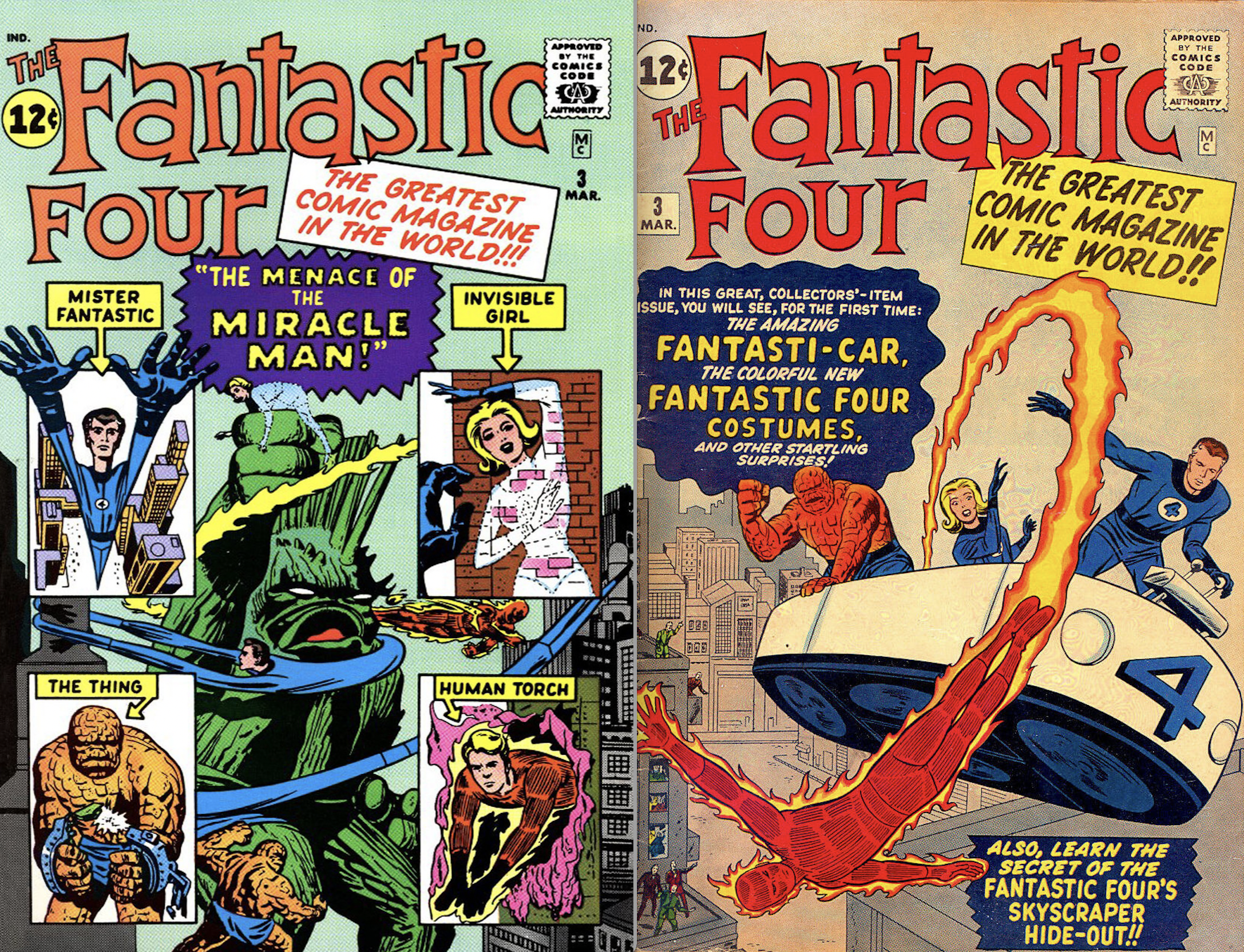
Fantastic Four #3. I’m presenting all of these without any commentary as to what I read or what has been said about why these images didn’t pass muster at the time. I wasn’t there when the decision was made, and it’s not really important for our purposes today. Really, what these pieces show is that even Jack’s cast-offs or images deemed not ready for print-time were still amazing in their own right. So we begin with a series of unpublished Fantastic Four covers, this one dating back to the series’ first year of publication. The unpublished piece (which was colored at some later point, colorist unknown) was more in line with Kirby’s 1950s monster comics. The published version is much more superhero-y, opting for more of a close look at the team’s new costumes and flying bathtub instead of the Miracle Man’s monster from the unpubbed version.
—
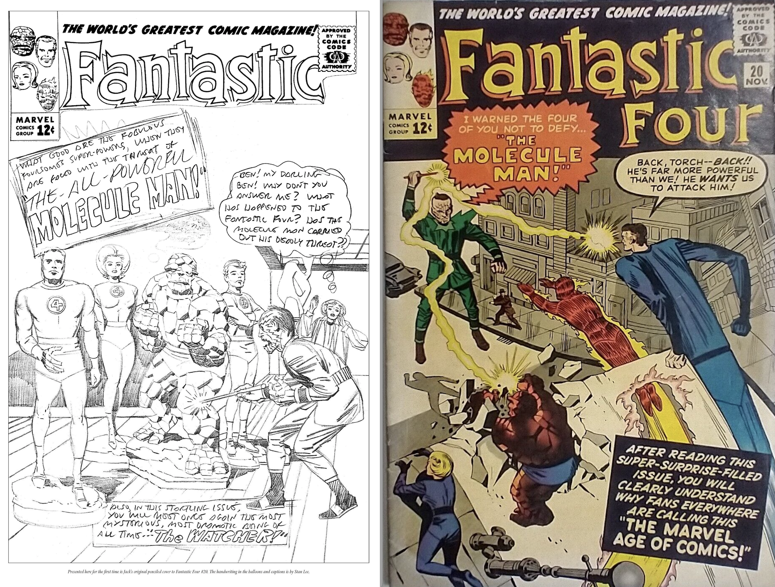
Fantastic Four #20. Maybe the initial image of the FF as statues was deemed too static for print. But it’s amusing to me that the Molecule Man on this cover is much more dynamic and menacing than on the published cover, where he looks like a statue himself.
—
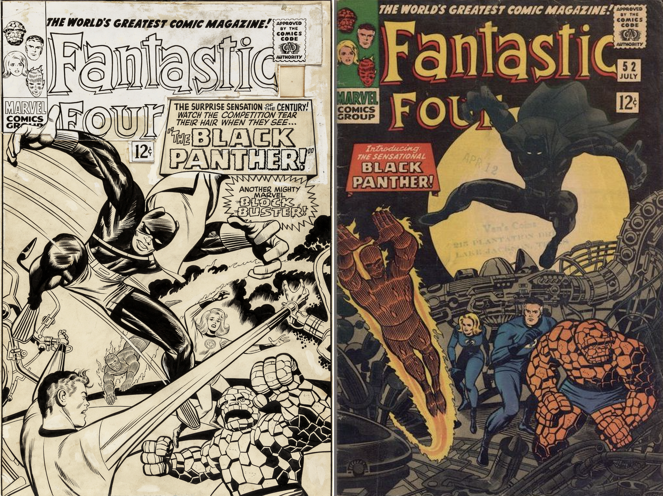
Fantastic Four #52. With the revised Black Panther costume—no longer looking like the original “Coal Tiger” design—came an all-new cover approach, too. One that shows all the characters from a more head-on view, always a good move for a cover, and one that adds mystery and intrigue to the Panther leaping into the scene, too.
—
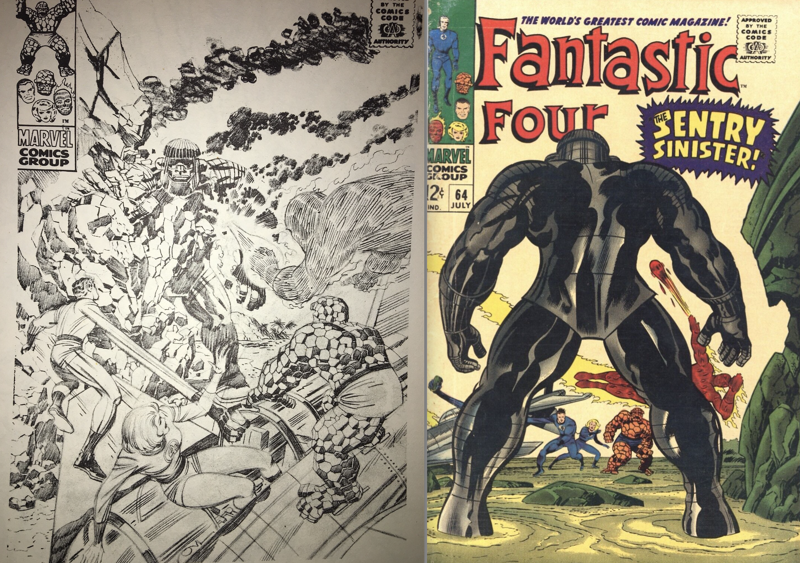
Fantastic Four #64. The unpublished cover is so much more dynamic than the final cover image, showing a close-up of… the Sentry’s backside and tiny versions of the FF in the background? An odd choice to replace the original pencilled cover with this more static finished piece.
—
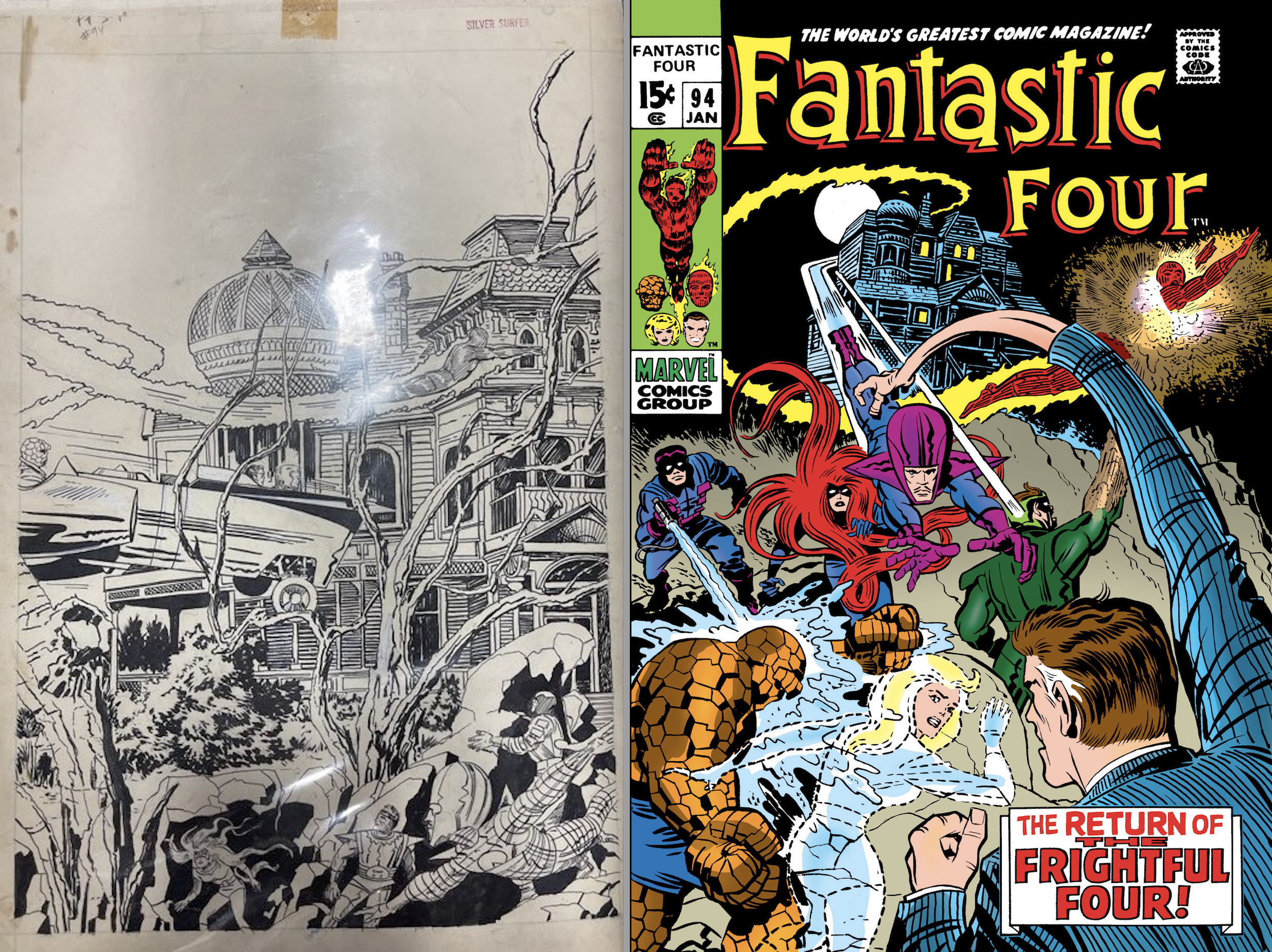
Fantastic Four #94. Jim Shooter had this piece in a portfolio at a recent convention. He said that as a neophyte creator, he had plans to break into Marvel as an inker. So he stopped in at their offices and told them so; he was handed this unpublished Kirby image to take home and ink and bring it back to show them his stuff. I know, I know… he probably regrets it as much as we all do. It’s an incredibly odd image as a cover, with every character minimized, almost hidden, in the bottom third. But man, that’s a great shot of the house on Whisper Hill. If only we could all see it as it was originally penciled.
—
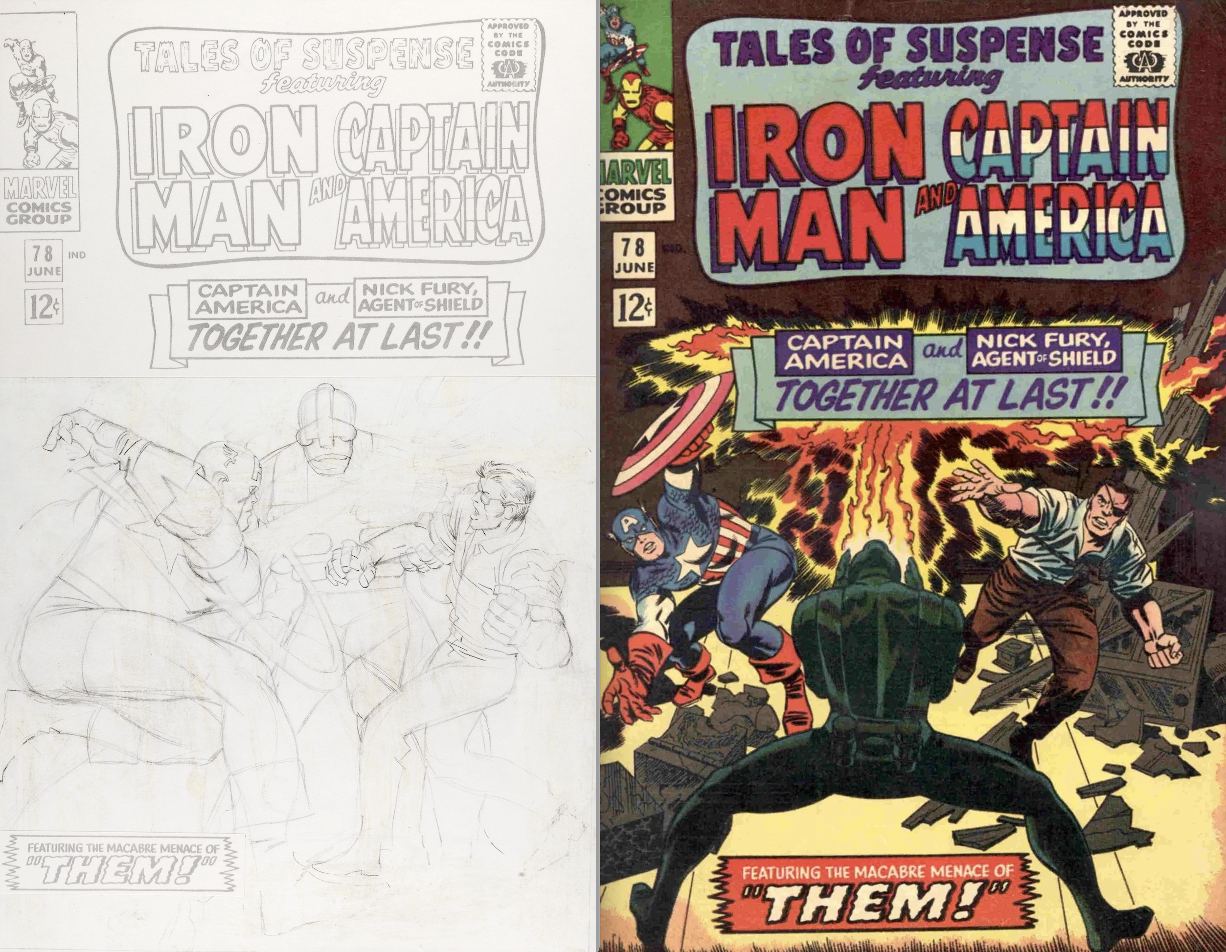
Tales of Suspense #78. Another action shot, with all three characters looking big and bold, that was scrapped for a nondescript villain’s backside shot. Another odd choice not necessarily made better by this second attempt.
—
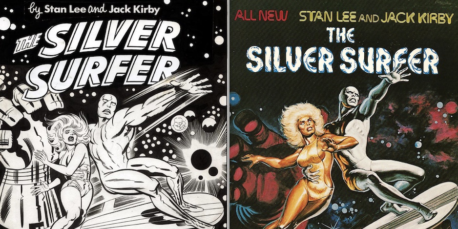
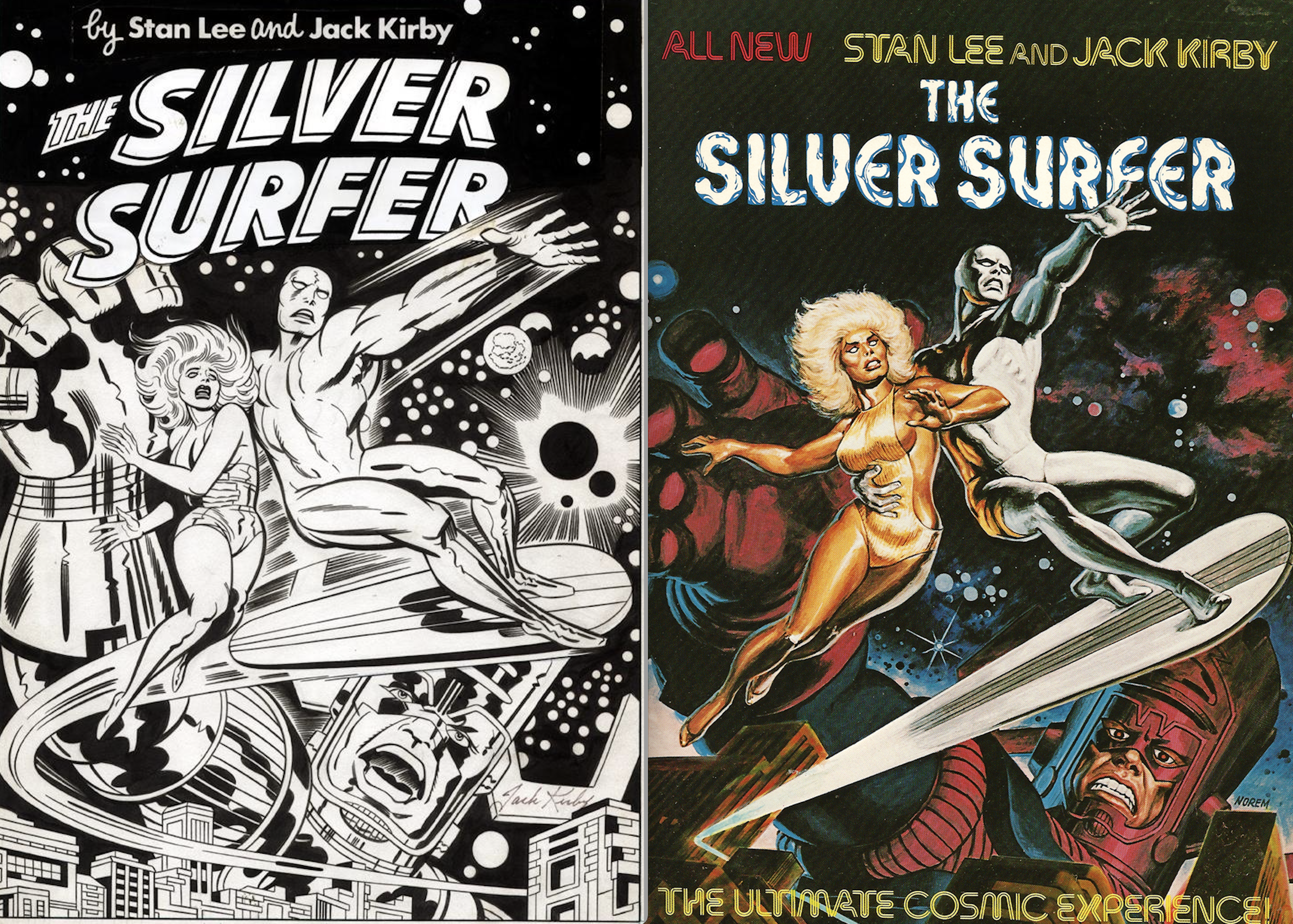
Silver Surfer Graphic Novel. Now, I understand that the 1978 Fireside graphic novel that saw Lee, Kirby and Sinnott partner up one last time for a story that was intended to sell the world on a Silver Surfer movie… and further, that the painted Earl Norem cover was deemed to have more “mass-market appeal”… but it always frustrated me that this important graphic novel didn’t have a Kirby cover. And even more so when I saw Jack’s cover that served as the basis for Norem’s painted piece. One of those wrongs you wish you had a way to rectify (a long list, granted).
—
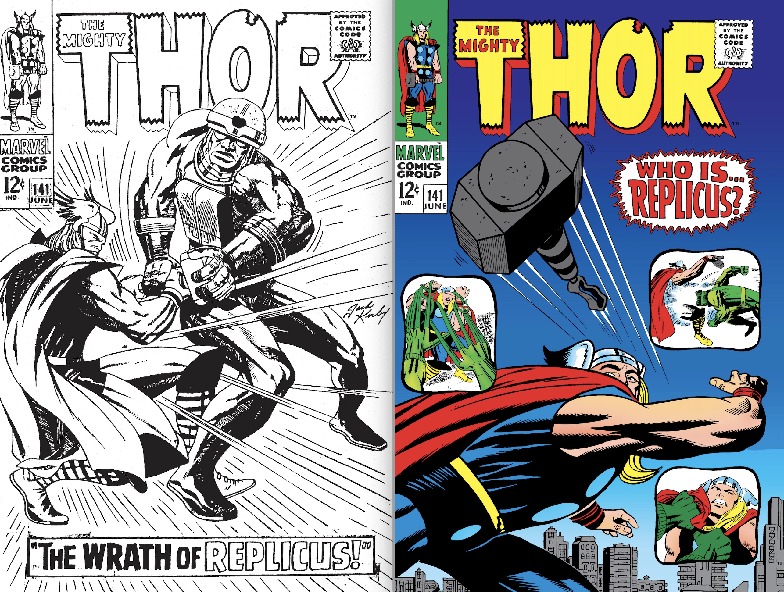
Thor #141. Neither cover is peak Kirby if y’ask me, not that a villain like Replicus deserved anything better. The published cover with its odd inset panels and an odder version of Thor is at least more visually interesting but the unpubbed cover still would’ve made for a better one.
—
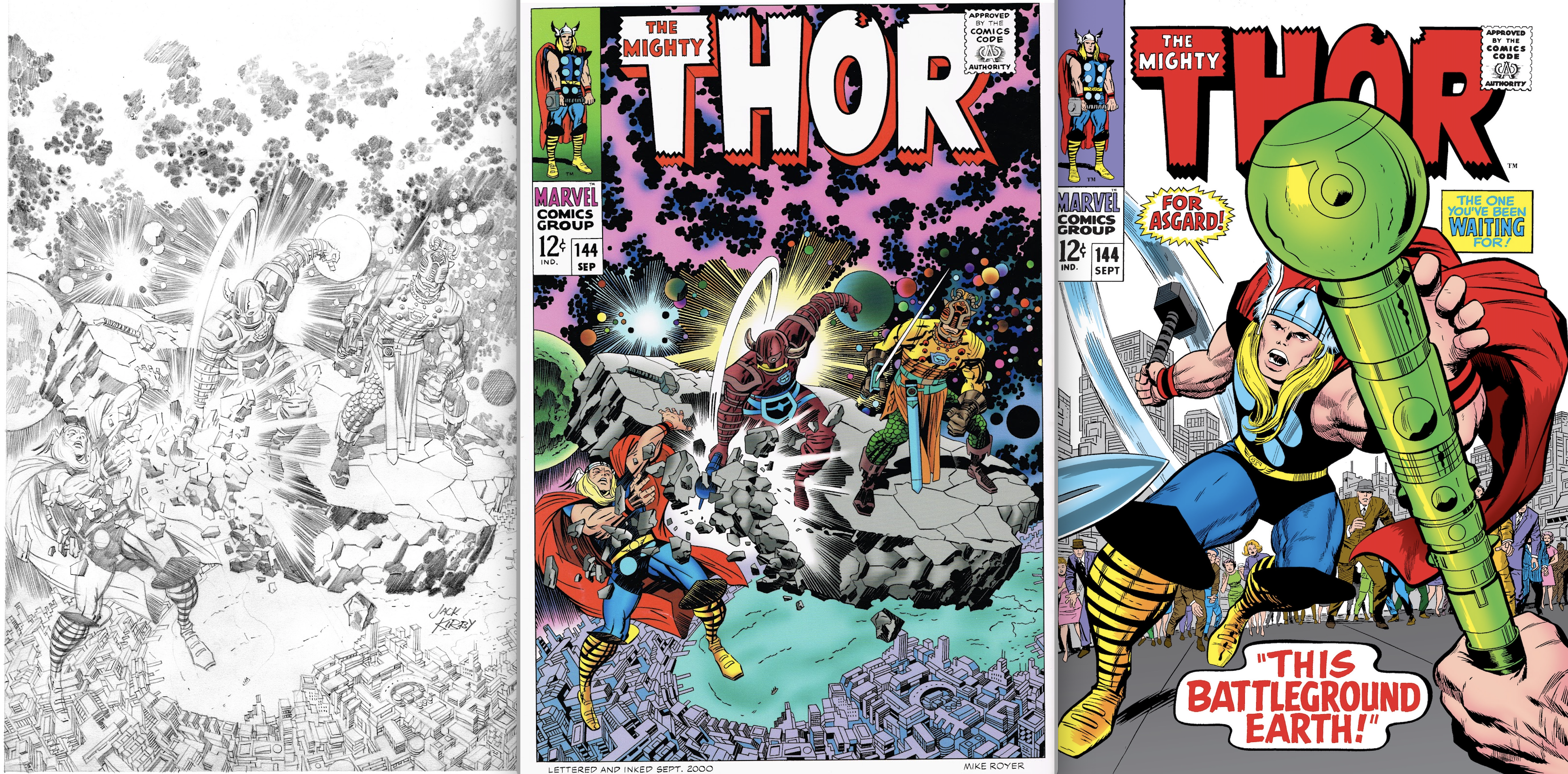
Thor #144. Why this great Kirby cover – inked and colored after the fact by Mike Royer – was replaced by one that focused on a high-tech walking stick and a very grounded Thor is a mystery to me. The unpublished action-packed piece is flat-out great.
—
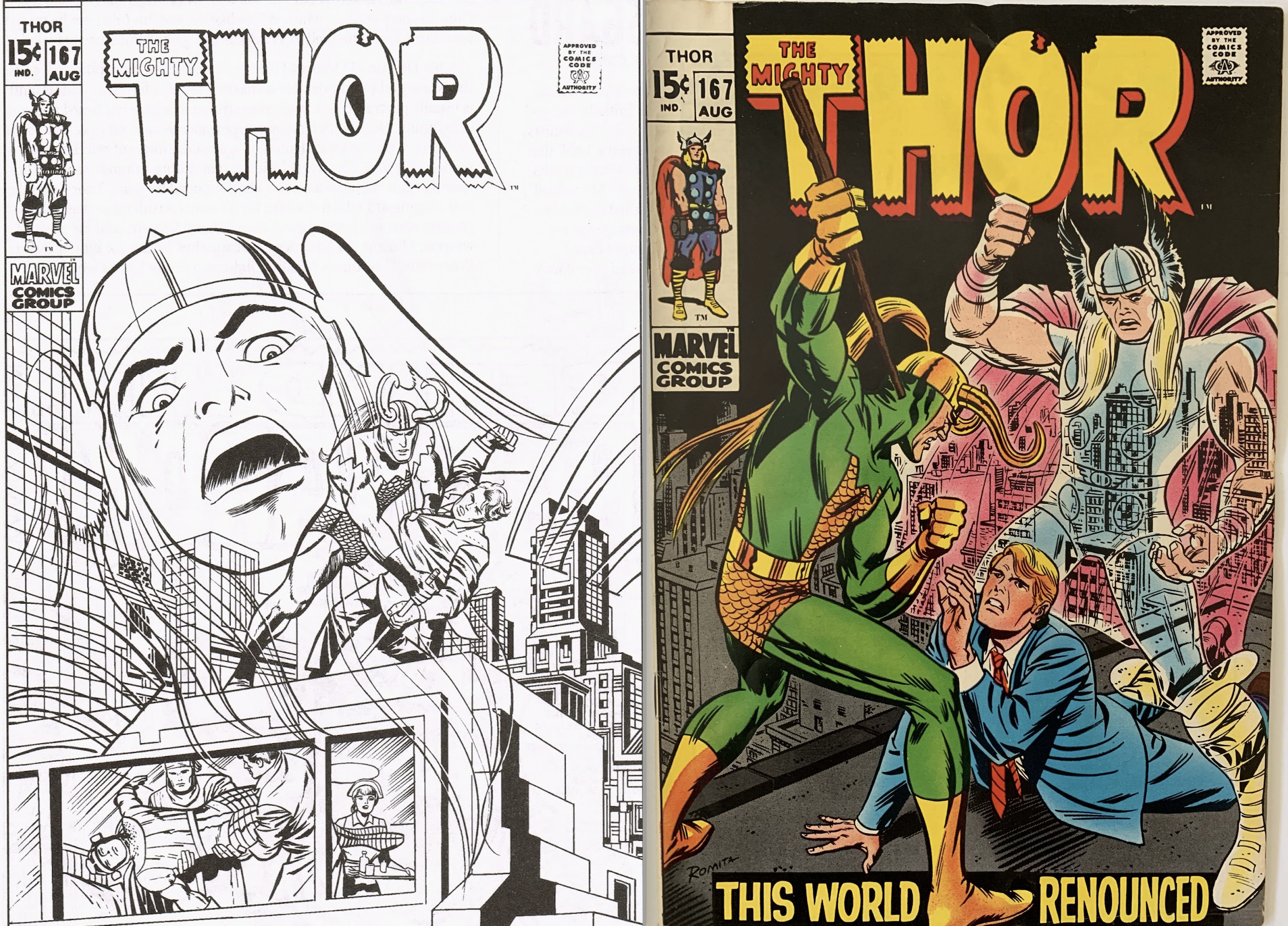
Thor #167. Jack was determined to get his spectral version of Thor onto the cover of Thor #167 one way or the other. The original is certainly odd (note Balder the Brave being carried like a stack of cordwood) but it could’ve been something really unique when colored. I do prefer the published version here, however.
—
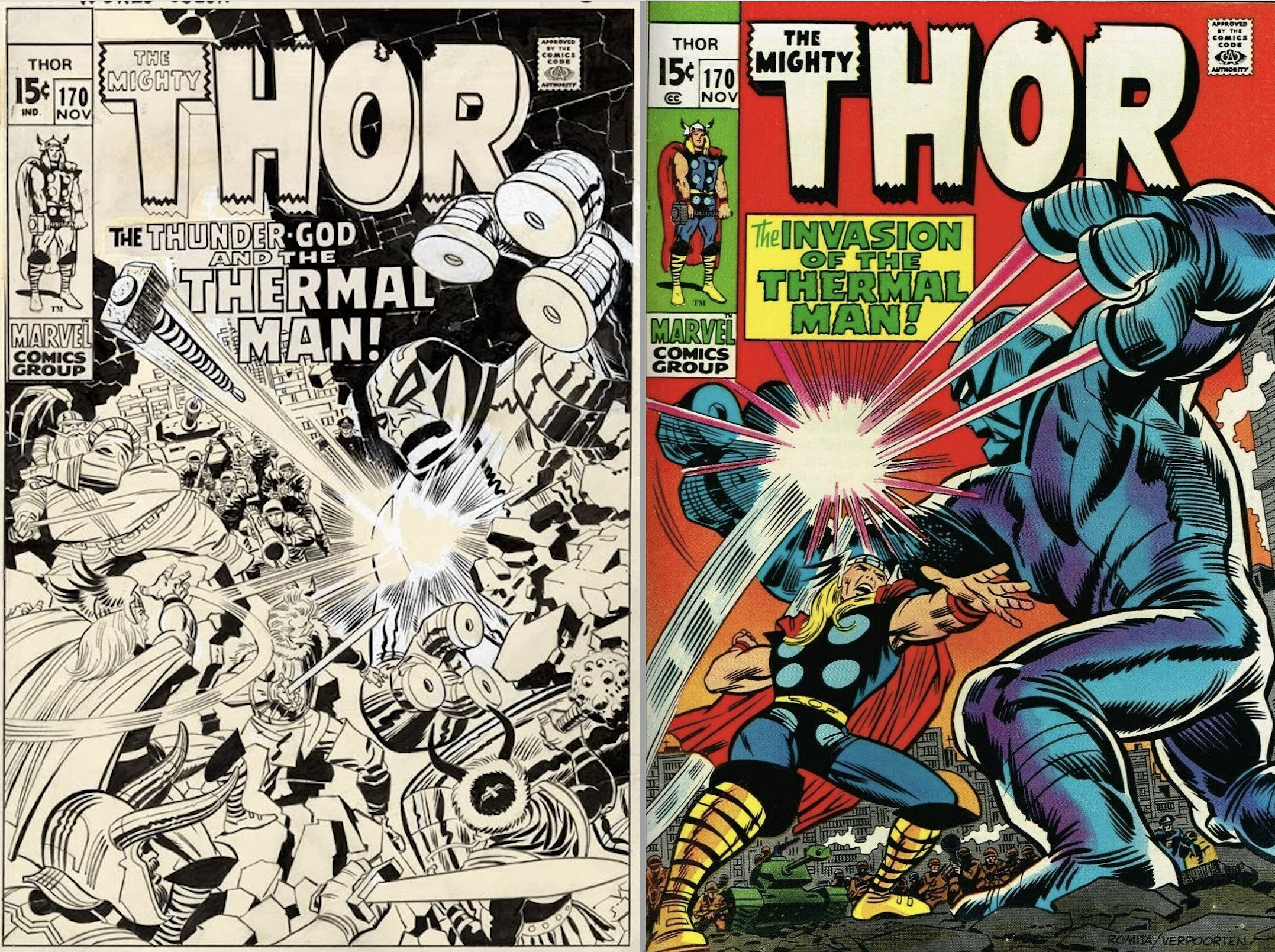
Thor #170. Scrapping this action-packed Kirby cover for a pedestrian Romita Sr./Verpoorten cover image is another odd choice. The art director’s prerogative, I know, but I really love Jack’s image here. Look at the seemingly effortless way in which he fit so many characters on the cover.
—
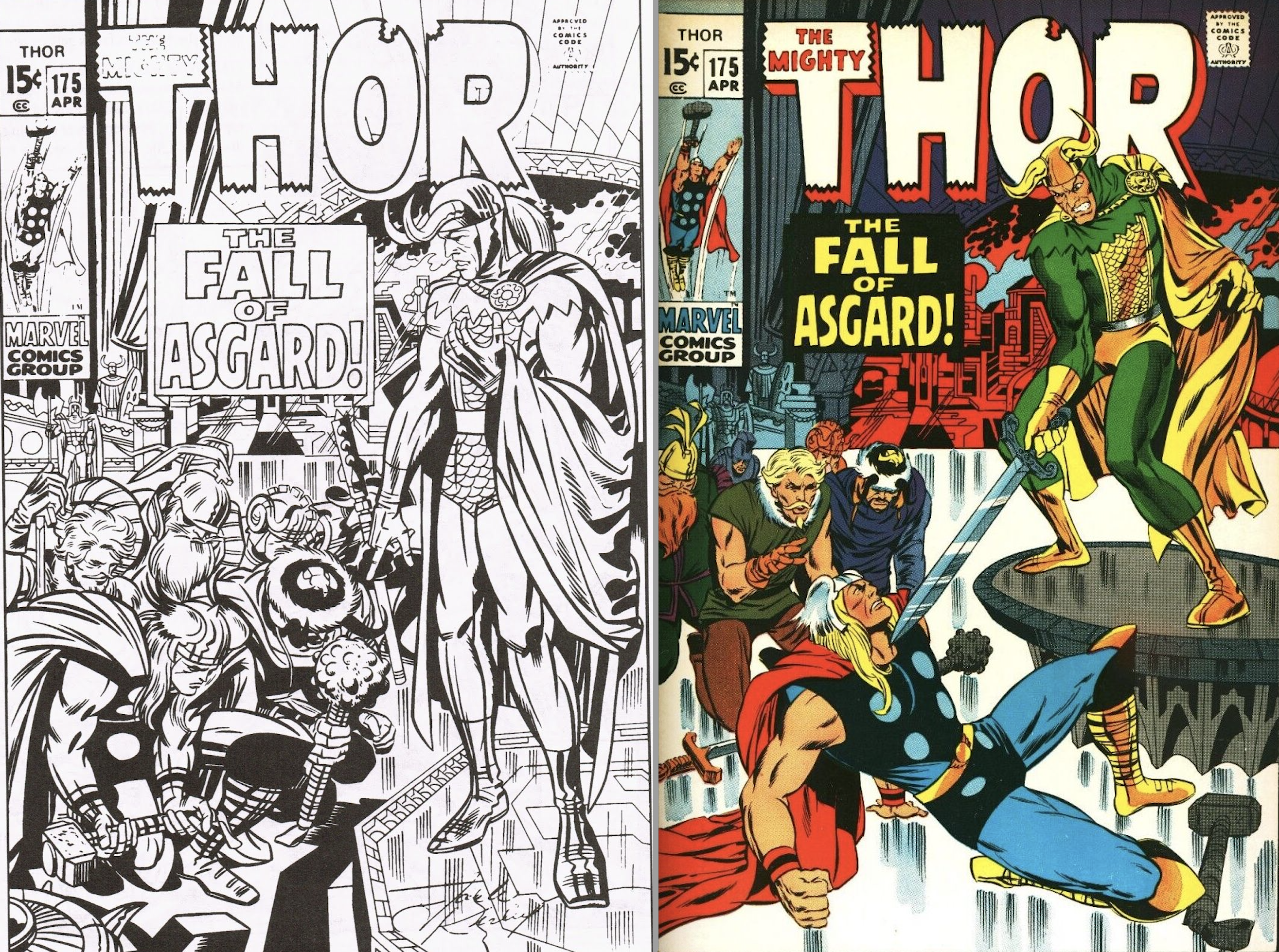
Thor #175. The published image is definitely more menacing than Thor and the others in a supplicating position to Loki. The final cover got a fair amount of corrections from Marie Severin and Tom Palmer, too.
—
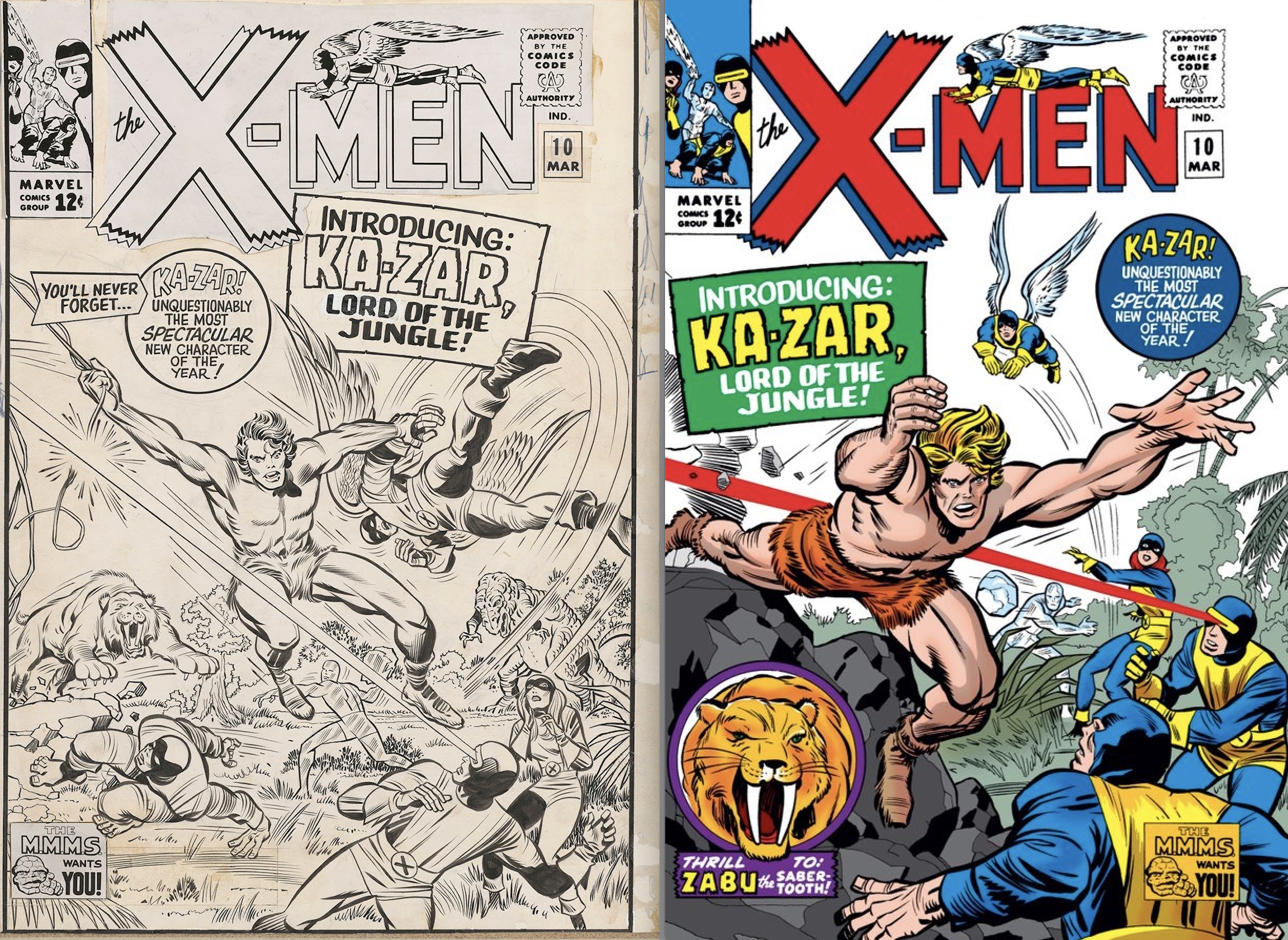
The X-Men #10. Finally, I could make an argument for either version of this cover – it’s nice to at least see that Cyclops has better aim on the unpublished version, and bonus points for the inclusion of the dinosaur in the background. It does appear that Ka-Zar’s vine was erased from his hand on the published cover but if not for that, it could well be that the published image is one of those “10 seconds later” images, since in the original, Iceman is just winding up and in the final, he’s hurled his iceball at Ka-Zar’s back. The final piece is maybe more dynamic but man, I love the original with all of its elements crowded together in a pleasing way.
—
Finally, the bonus image I mentioned above. It’s an image I also added to my piece celebrating the birthday of another artist last week: a pin-up from Superman #400, it’s one of the rare pairings of penciller Jack Kirby and inker Terry Austin. And it seems like a perfect way to celebrate both of these titans together.

—
MORE
— THE NEAL ADAMS CHRONICLES: Mapping Out NEAL ADAMS’ Enduring Respect and Admiration for JACK KIRBY. Click here.
— COMIC BOOK DEATH MATCH: Jack Kirby’s FANTASTIC FOUR vs. Jack Kirby’s THOR. Click here.
—
Chris Ryall is the co-owner/publisher of Image Comics imprint Syzygy Publishing. His latest series is Tales of Syzpense, out now.