A lovely piece made vintage…

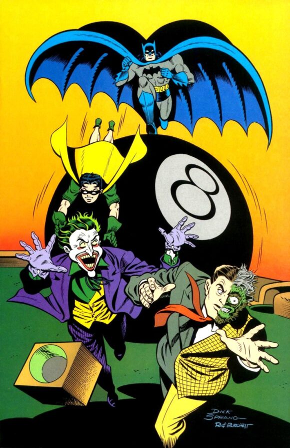
Boppin’ around the webs you find cool things. Like this Dick Sprang piece that was published as a pinup in 1997’s The Batman Chronicles Gallery #1:

Color by Rick Taylor
Nice, huh?
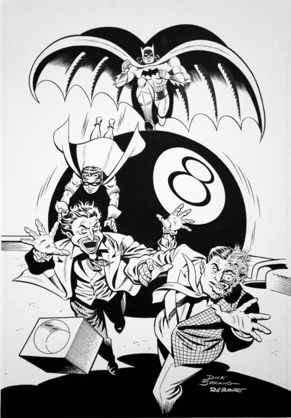
Check out the original art:

Also nice, huh?
But wouldn’t it have been great if this had been used as a Batman cover back in the Golden Age?
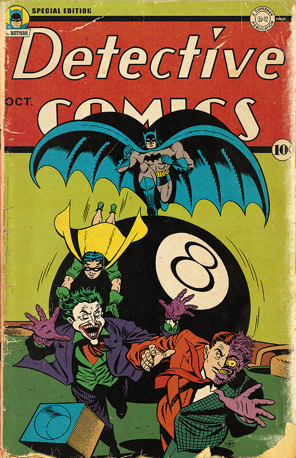
Lee “The Batfan” Johnson, known around online Bat-circles, thought so. He took Sprang’s black-and-white piece — inked by Rick Burchett — “aged ” it, recolored it in vintage style, added Detective Comics trade dress, and came up with this beaut:

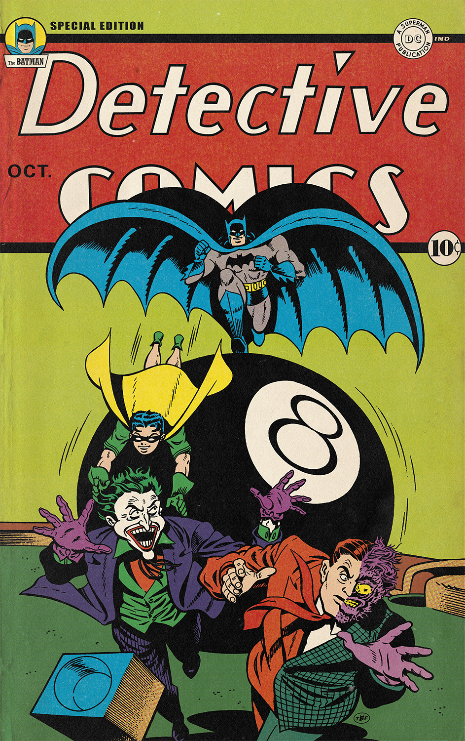
And here’s one in “mint condition” if you like:

Dang, I would read the hell out of that.
—
Check out more of Lee’s artwork at his Facebook page. You’ll dig it.
—
MORE
— Behold These Sweet 1966 BATMAN Trading Card Posters That Should Have Been. Click here.
— The Great 1967 JUSTICE LEAGUE VS. AVENGERS Face-Off That Should Have Been. Click here.

February 23, 2024
This is classic, great! Please share more….I don’t use FB. I’d love to see a 13 Top Picks.
February 23, 2024
This is very cool. Looks like Lee Johnson did a bit of color adjustment as well — for good and ill. In the original image I was baffled about the cube in front of Joker, but the retouched version makes it clear it’s cue chalk. But then, what’s going on with Joker’s vest, shirt and collar in the updated image?
February 23, 2024
Actually I recolored it from scratch using digital vintage style 4 color process systems then did all the aging, logo recreation etc..
February 23, 2024
Wow! I just eight that up!!!