Y’know what’s cool? Checking out something — and finding something pretty awesome you didn’t expect.
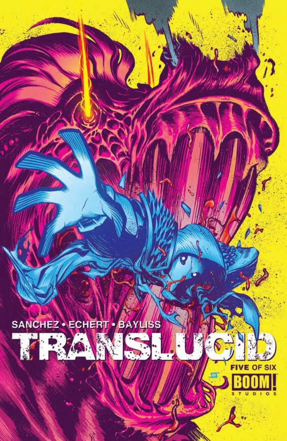
That’s what happened with Adam Metcalfe, the color artist on Boom! Studio‘s Translucid, by writers Claudio Sanchez and Chondra Echert and artistDaniel Bayliss.
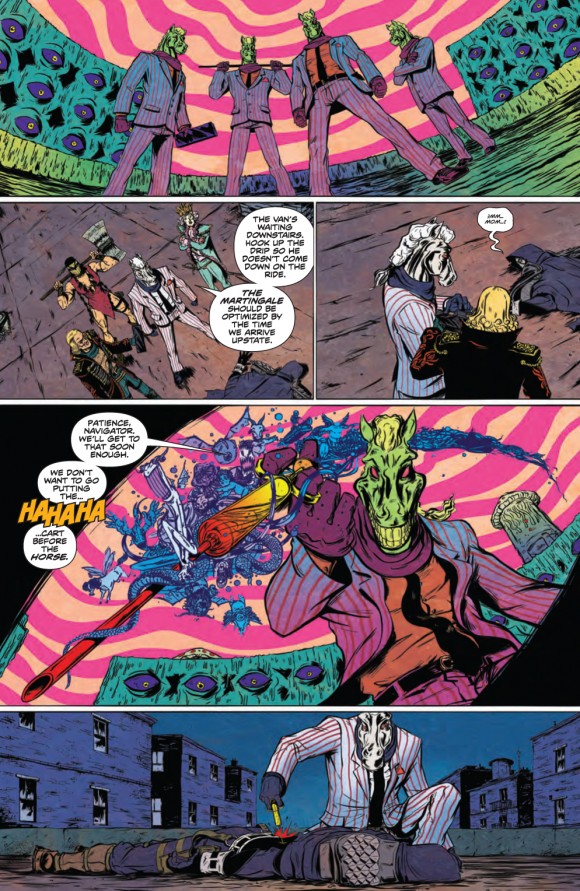
When I got the preview pages to run here at the site the other day, my eyes blew out of their sockets. That COLOR! Or, as Toronto resident Metcalfe spells it, that COLOUR!
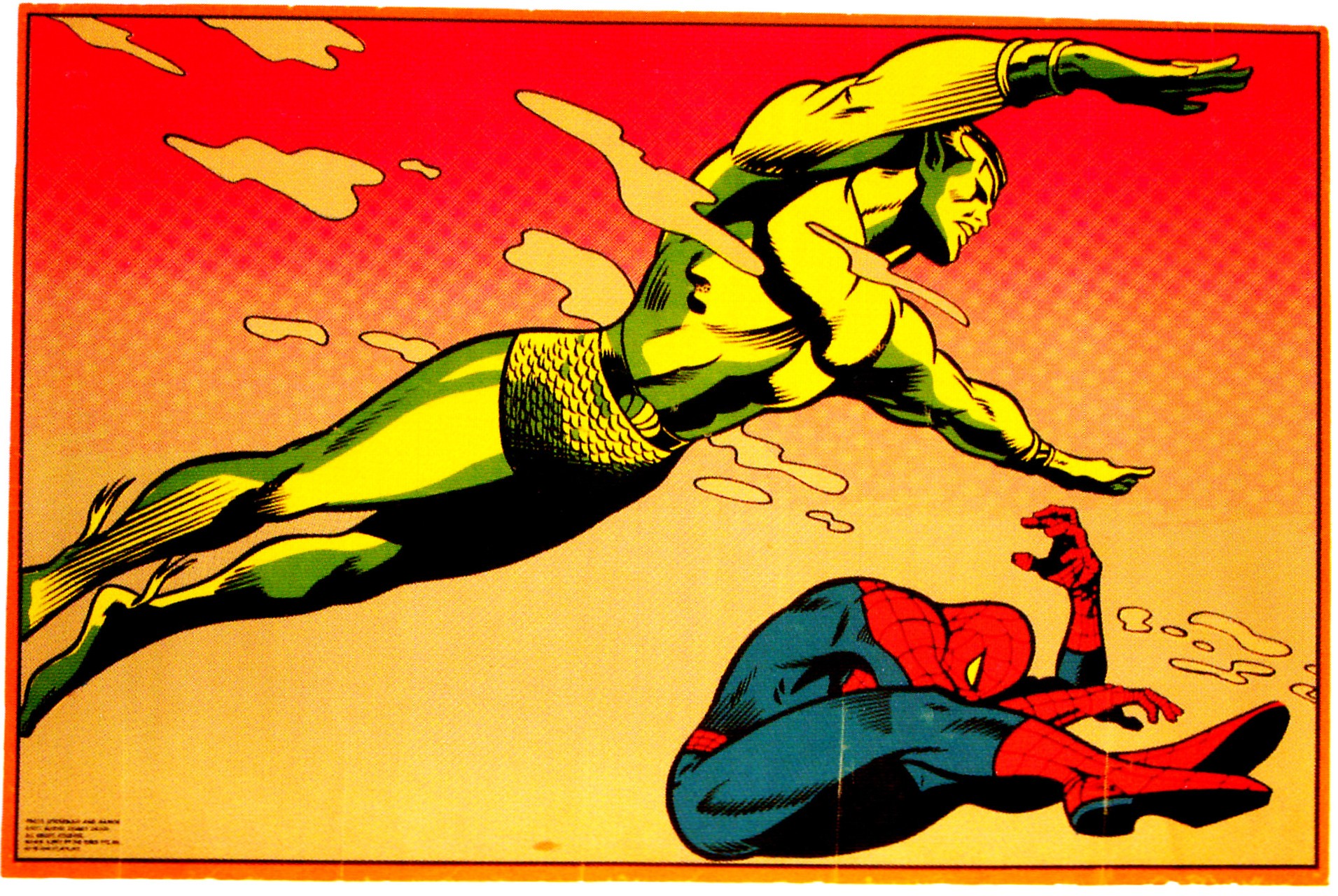
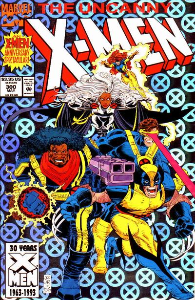
Reminded me of this bad boy I had on my wall when I was a younger dude:
Like brightly colo(u)red lightning, I knew Metcalfe, 32, was someone I wanted to connect with.
And ZAP! Here we are with a MIGHTY Q&A in advance of Translucid #5, which comes out Wednesday, 8/20. (EXCLUSIVE preview, right here.)
Dan Greenfield: What’s your Secret Origin?
Adam Metcalfe: Born in the Rocky Mountains during a summer snowstorm that led to my invincibility against freezing temperatures. Seriously, I wear shorts and T-shirts in Canadian winter.
How did you get to be a colorist? Is it something that you looked for or something that found you?
Coming out of school I didn’t really have an idea of what I wanted to do so I guess I kind of fell into it. I’ve always loved painting and messing around with colour palettes, with any traditional media really, so I began colouring over some friend’s linework and it just kind of snowballed from there while I learned to be somewhat competent with Photoshop.
The colors in Translucid are so bold they look like they jumped off a ’60s psychedelic poster. They’re incredibly striking. Explain your work process with the other creators and how it all fits together.
Thanks. Chondra and Claudio’s scripts really let me experiment from issue to issue as they drop notes on where to let loose with the psychedelics. Daniel’s art has so many great details in the linework so I didn’t want to over-render anything, just bring out the texture and insanity at times. I was initially given a couple test pages to see how I could differentiate the Cornelius and Navigator timelines and although I had a clear vision for Cornelius’, my first pass at the Navigator’s was too straight forward and needed spicing up. Big thanks to (Editor) Ian (Brill) and (Assistant Editor) Jasmine (Amiri) for the extra editing push and letting me be bold.
The comics world raves about Dave Stewart, Jordie Bellaire, Laura Allred and a few others. But what color artist do you consider to be underrated?
So hard to pick one! I consider way too many to be underrated: Nolan Woodard, Jean Francois-Beaulieu, John Rauch, Rico Renzi, Kelsey Shannon, Nelson Daniel, Paul Little, Ian Herring, I could go on and on. There’s some amazing palettes coming out from colourists every month, so it’s great to see the growing appreciation and recognition for their work.
What other projects do you have in the works right now?
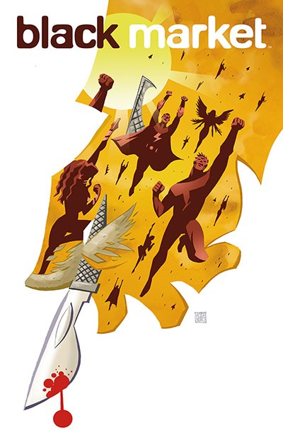
I’m wrapping up another Boom! miniseries this month called Black Market, story by Frank Barbiere and art by Victor Santos, and working on a large Canadian history graphic novel that will be out next year. Also have a miniseries from Action Lab called Southern Dog, story by Jeremy Holt and art by Alex Diotto, that had its first issue come out last week. I’m available for work in the fall if anyone’s looking, too.
How big into comics were you growing up? What were some of your favorites?
I basically grew up reading them whenever I could. My Dad had a small collection from when he was growing up, with the classics like Richie Rich and Archie to start on. My favourites as a kid were Asterix and Obelix, Uncanny X-Men and Spawn.
Who were your biggest influences as an artist?
Tough to narrow down a list…let’s go with Frank Frazetta, Drew Struzan, Jae Lee, and Adam Hughes.
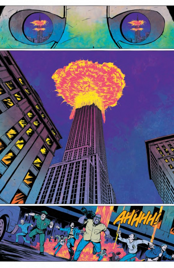
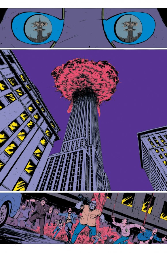
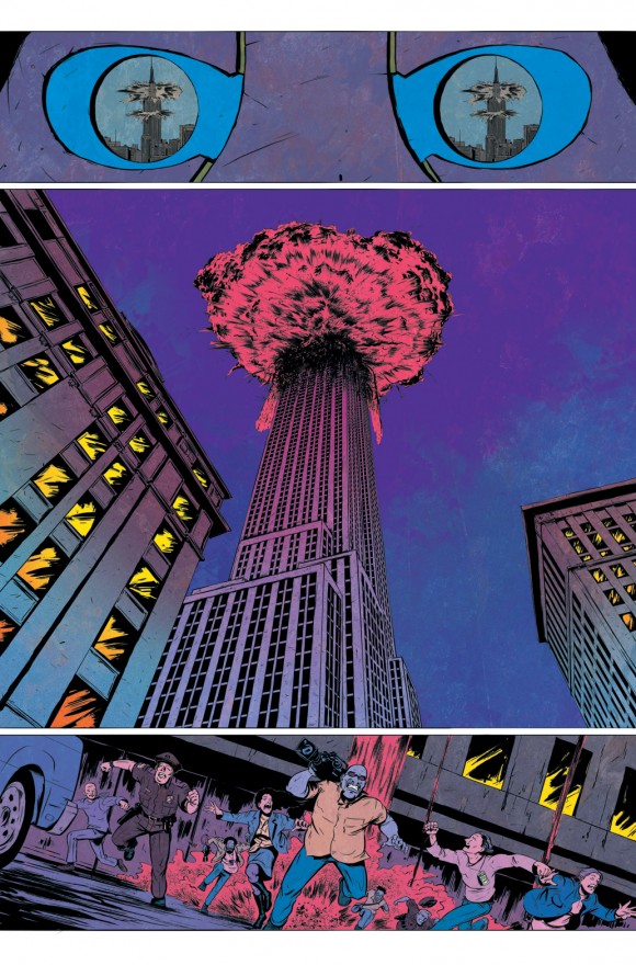
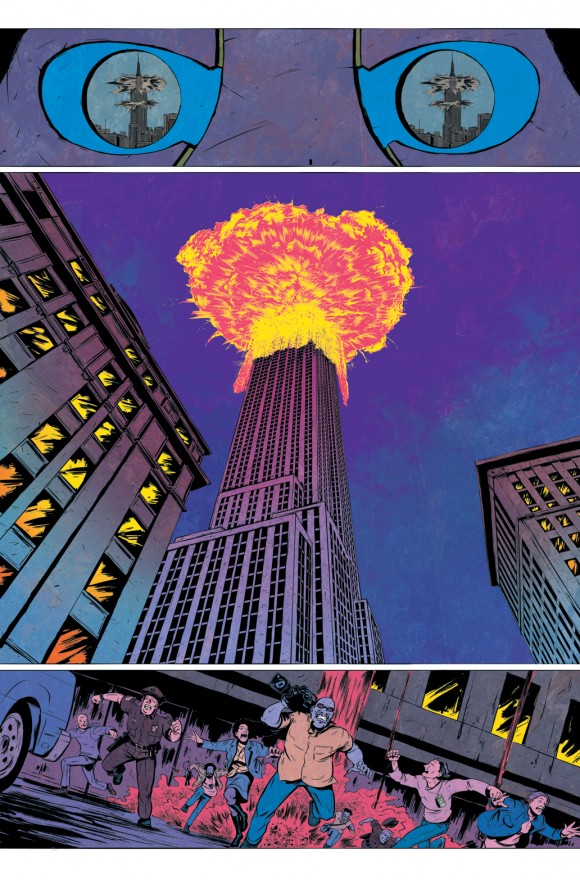
That’s some list. One last thing about Translucid: The skyscraper shot. Magnificent. Tell me how you did it.
Appreciate the comment, thanks again. Just trying to let Daniel’s linework shine, quite literally on this page. I used a simple colour hold on the explosion and then it was just a matter of getting the light and dark contrast right and toning down the saturation on the page. Added in some colour and texture work to the sky and buildings, to have them almost bleeding out from the explosion, and using bits of reflected light in the windows to lead the eye to the next panel. Hopefully it plays out like that to the reader 🙂
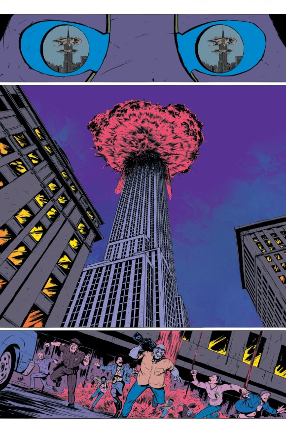
Darkened the surrounding buildings for focus on the skyscraper, brushed in some sky texture and added in some orange fade to the windows for depth.

