
THE NEAL ADAMS CHRONICLES: …while daring to make some — gasp! — improvements!
—
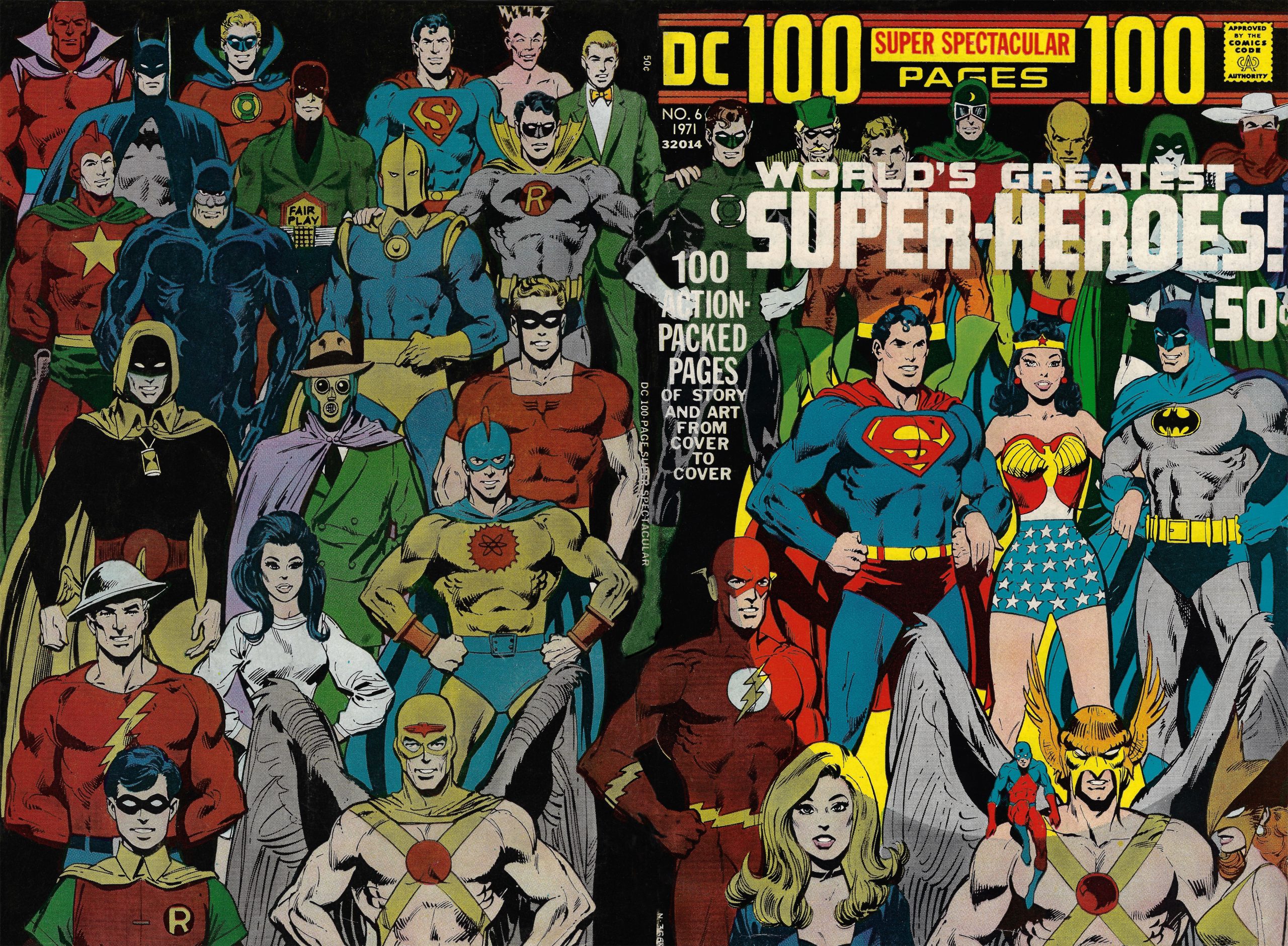
We got a two-fer for ya! Our pal Walt Grogan is so enamored of Neal Adams and Dick Giordano’s cover to 1971’s DC 100-Page Super Spectacular #6 that he’s written — and illustrated — two groovy stories about it! The other one can be found here. Dig it! — Dan
—
By WALT GROGAN
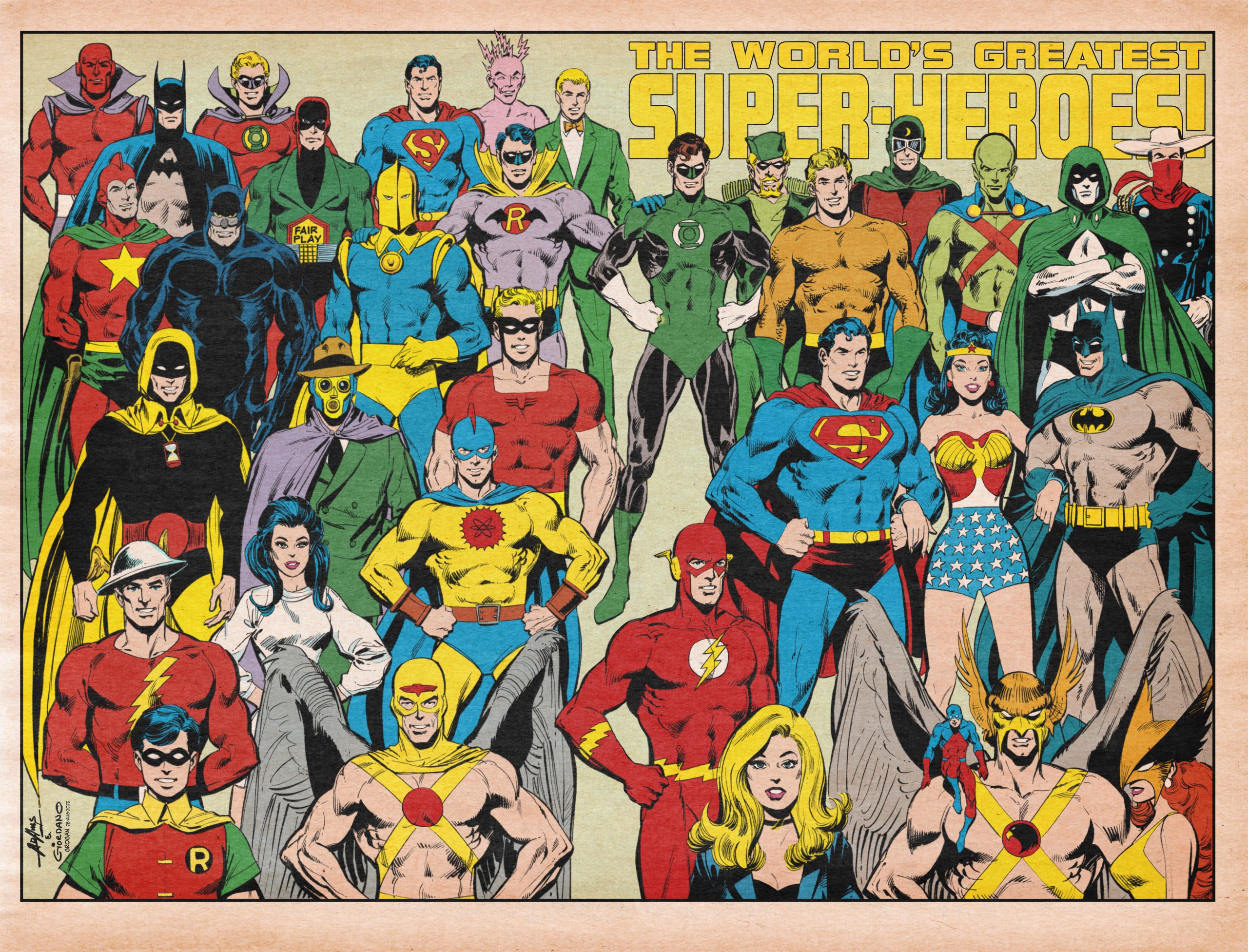
My all-time favorite comic-book cover isn’t very dynamic, is a bit of a mystery, yet it features a spectacular wraparound super-hero gallery by one of the greatest art teams ever: Neal Adams and Dick Giordano. I’m talking about the World’s Greatest Super-Heroes cover to DC 100-Page Super Spectacular #6 from July 1971:
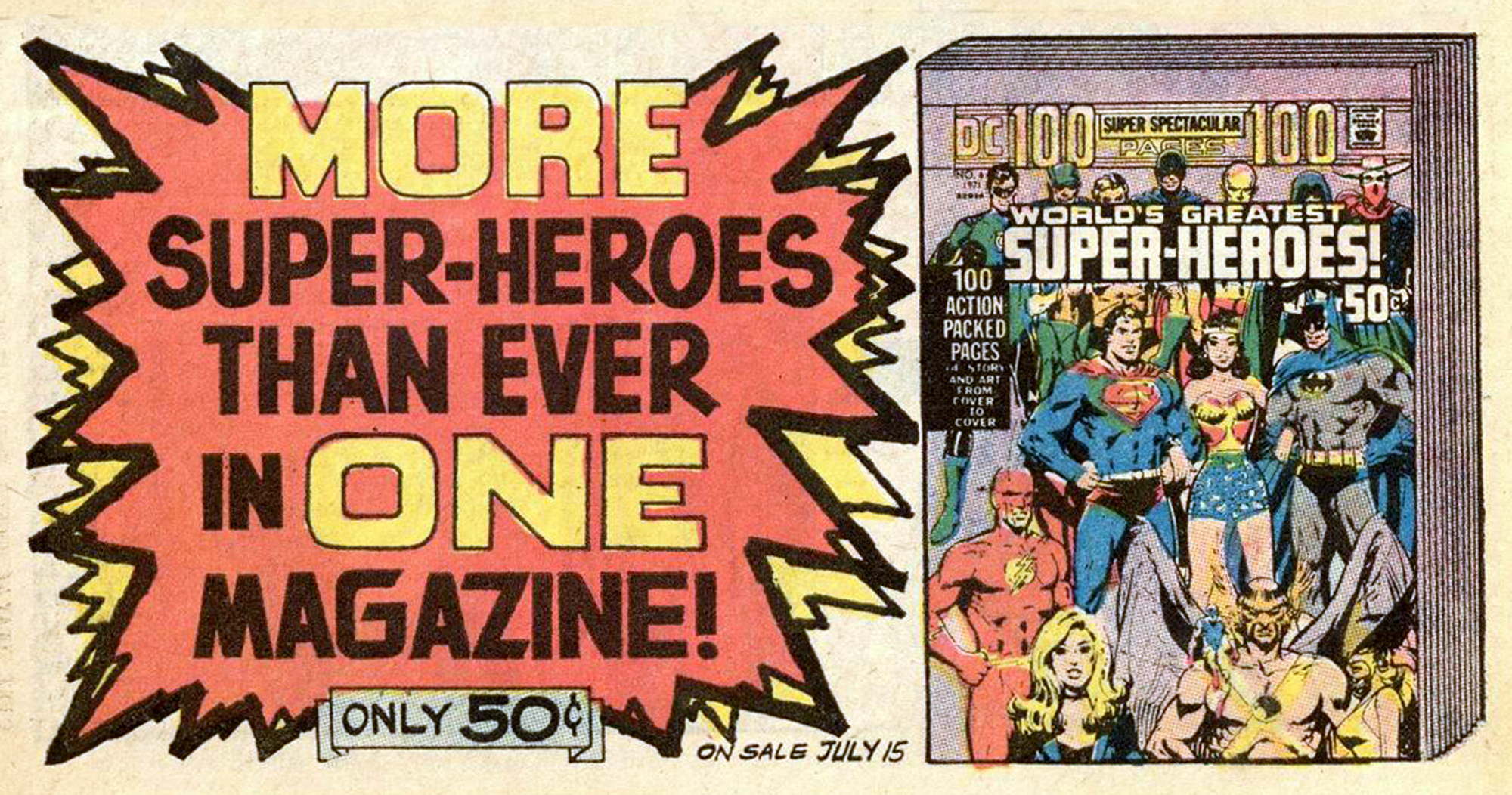
DC was just getting started reprinting stories from its vast library in an affordable 100-page format and that summer, I became re-acquainted with the Justice Society and was introduced to its adjuncts like the Vigilante and Johnny Quick. House ads like this one grabbed readers’ attention:
I used to spend part of my grammar school summer vacation at my great-aunt and uncle’s retirement home in Salem, Wisconsin, and would ride my green Schwinn bicycle 2 miles to the drug store in neighboring Silver Lake. The town’s pharmacy had a free standing, wire comics rack and in that summer of 1971, I bought my first copy of that fabulous cover.
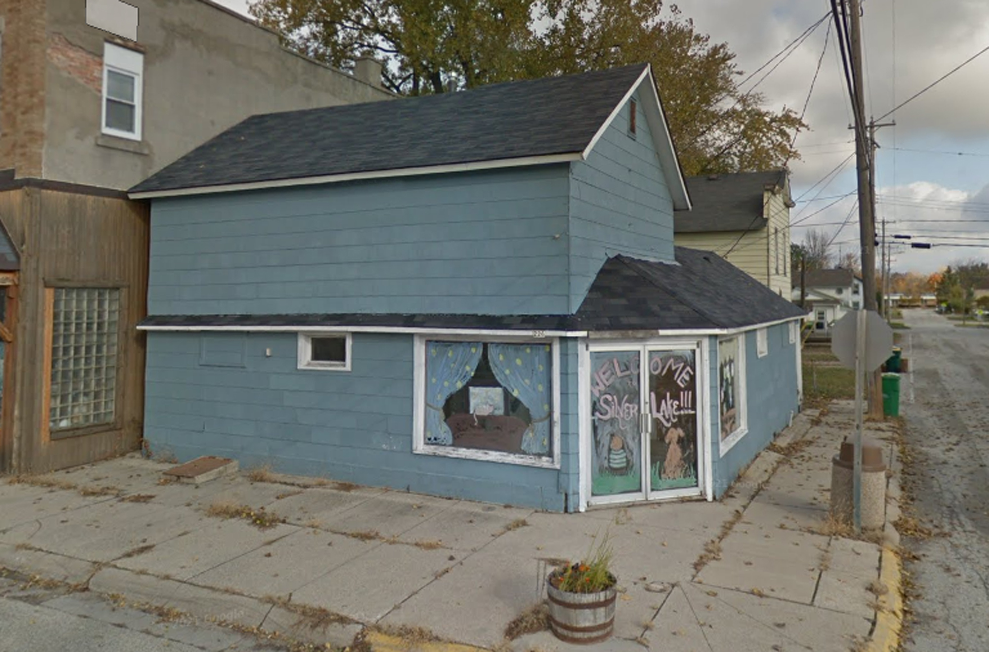
Former pharmacy and soda fountain in Silver Lake
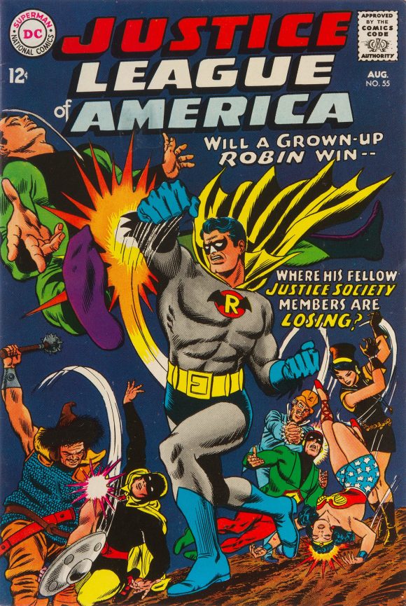
The cover — over here are 13 WONDERFUL THINGS about it — boasts 34 of DC’s greatest super-heroes from both Earth-One and Earth-Two. I was stunned that first time I saw it and delighted to find that the cover wrapped around. I knew many of the characters from previous DC 80-Page Giants, and I was gleeful to see my fave, the Earth-Two Robin in his Batman-esque duds, adorning the back.
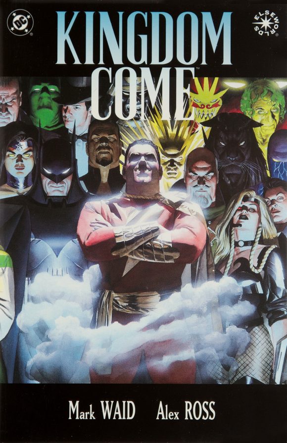
If a cover ever demanded to be a poster, it was that wrap-around but sadly that never came to be. I keep hoping that Alex Ross does a painted version of this gem, especially since his first three covers to Kingdom Come appear to be homages to the style.
Speaking of homages, Neal’s cover is just that. It harks back to All-Star Comics #16 (Apr-May 1943), published 28 years earlier and featuring a cover by Frank Harry. Harry’s original spotlights Sandman, the Spectre, Starman, the Atom, Dr. Mid-Nite, Wonder Woman, Hawkman, and Doctor Fate along with a plethora of Americans from all walks of life who contributed to the war effort. The title: “The Justice Society Fights for a United America!”

Adams’ version changes the emphasis to a group portrait of the heroes from both Earths. Rather than a bird’s-eye view, the perspective is a straight-ahead shot.
I adored it — but that’s not to say it’s perfect. I was irritated by the inverse of the spotlight that cast the majority of the heroes in shadow. There was also something a bit weird about it: The cover featured a logo that just didn’t feel like a traditional one and, maddeningly, it covered up most of the heroes in the top row.
Back in 2004, DC reprinted DC 100-Page Super Spectacular #6 as a replica edition. This was one in a series of reprints that weren’t quite Facsimile Editions in that they didn’t have many, if any, of the vintage ads. This one also featured a cover recreation by Giordano instead of the original art.
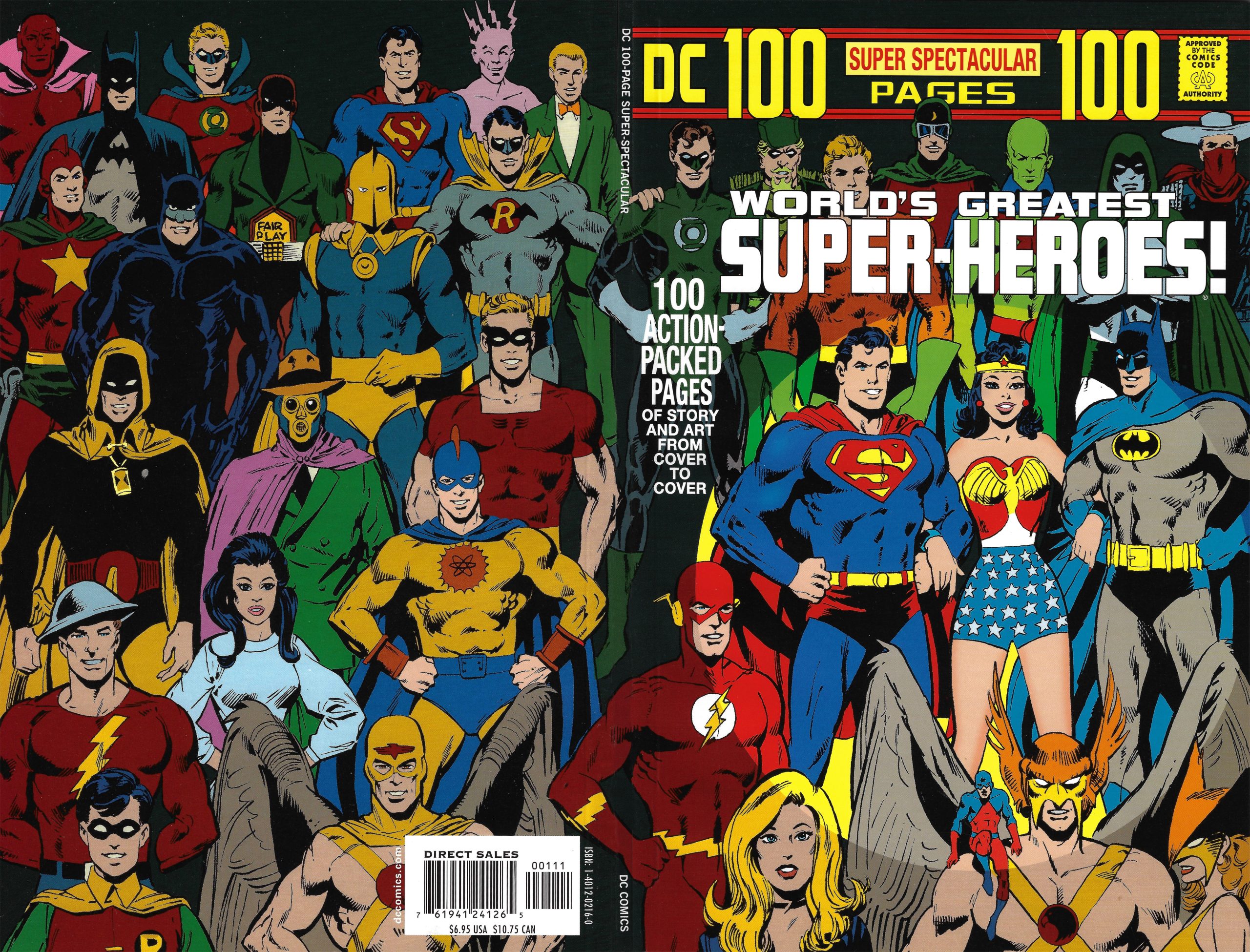
Comparing it to the original, Giordano made some noticeable changes, including giving Superman and some of the other heroes a pair of eyeballs rather than a squinting face (while maintaining Black Canary’s cock-eyed left eye from the original). The colors are a bit more garish and in some cases don’t match the original; also, the Earth-Two Robin’s gloves aren’t color corrected.
Although I loved the recreation, it also just seemed a little off. What I really wanted was to see the original cover art — and give it my own colors.
I found a black-and-white illustration in the digest-size convention program for the Super DC Con ’76 but it was small and lacked the sharp lines needed to blow it up:

So I did a bit more internet sleuthing but it didn’t pan out. Every few years I’d take another crack at trying to find it, but I pretty much gave up hope and considered it a lost cause.
Well, one day out of the blue, Scott Dunbier, formerly of IDW and now publisher of his own imprint, Act 4, announced on Facebook that IDW would be printing a Neal Adams Classics Artist’s Edition. I posted a message asking Scott if the cover of DC 100-Page Super Spectacular #6 would be included and he responded yes, and that it would be a fold-out.
Now, as much as I like the idea of these collections and the ability to see the original art at its original size, they are normally out of my price range. But I really wanted to have that cover, so I purchased the edition for that one piece of art alone! But it was well worth it as it contains a boatload of Adams artwork, and it’s all stunning to see.
There are several covers. I went with the classic Green Lantern/Green Arrow one…
Once I got it, I started scouring through it, making sure the cover was there — instead of just going to the table of contents! Well, it’s there indeed AND without the spotlight overlay! You can see that the spotlight circle was inked in.
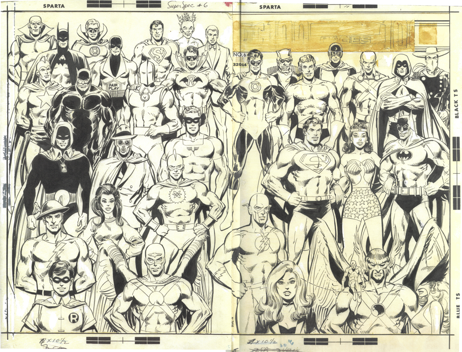
Well, this just had to be recolored! Scanning it posed to be a problem because even though I have an 11″ x 17″ scanner, imagine trying to hold a 10-pound book and scanning an 22″ x 17″ foldout without damaging it. It was something!
But I managed to do it, and the first thing I did was clean up the art and start laying some colors down. I knew I had to include the original trade dress as well as that darn spotlight!

I’m sure some of you eagle-eyed buffs have noticed that I made a few notable changes, including fixing Black Canary’s wonky left eye, balancing out Hourman’s hourglass, and centering the Golden Age Atom’s symbol. I did a few color corrections and made some different color choices because that’s just part of the fun!
But after seeing the original art, it seemed strange that DC went with a black background that hid some of Neal and Dick’s line work. So, I changed the background color to let it show through:

I also couldn’t let that trade dress stand — this really needed to look like a poster — so I removed the dressing and the spotlight and just left the World’s Greatest Super-Heroes! logo:
![]()
Even though the original ended up a cover and the art shows where the paste-up masthead was going to be, it always felt like it was intended to be used as an interior poster, much like Murphy Anderson’s classic Justice Society and Seven Soldiers of Victory versions.
So I recolored the whole thing again and gave it that vintage touch:
I hoped you enjoyed this!
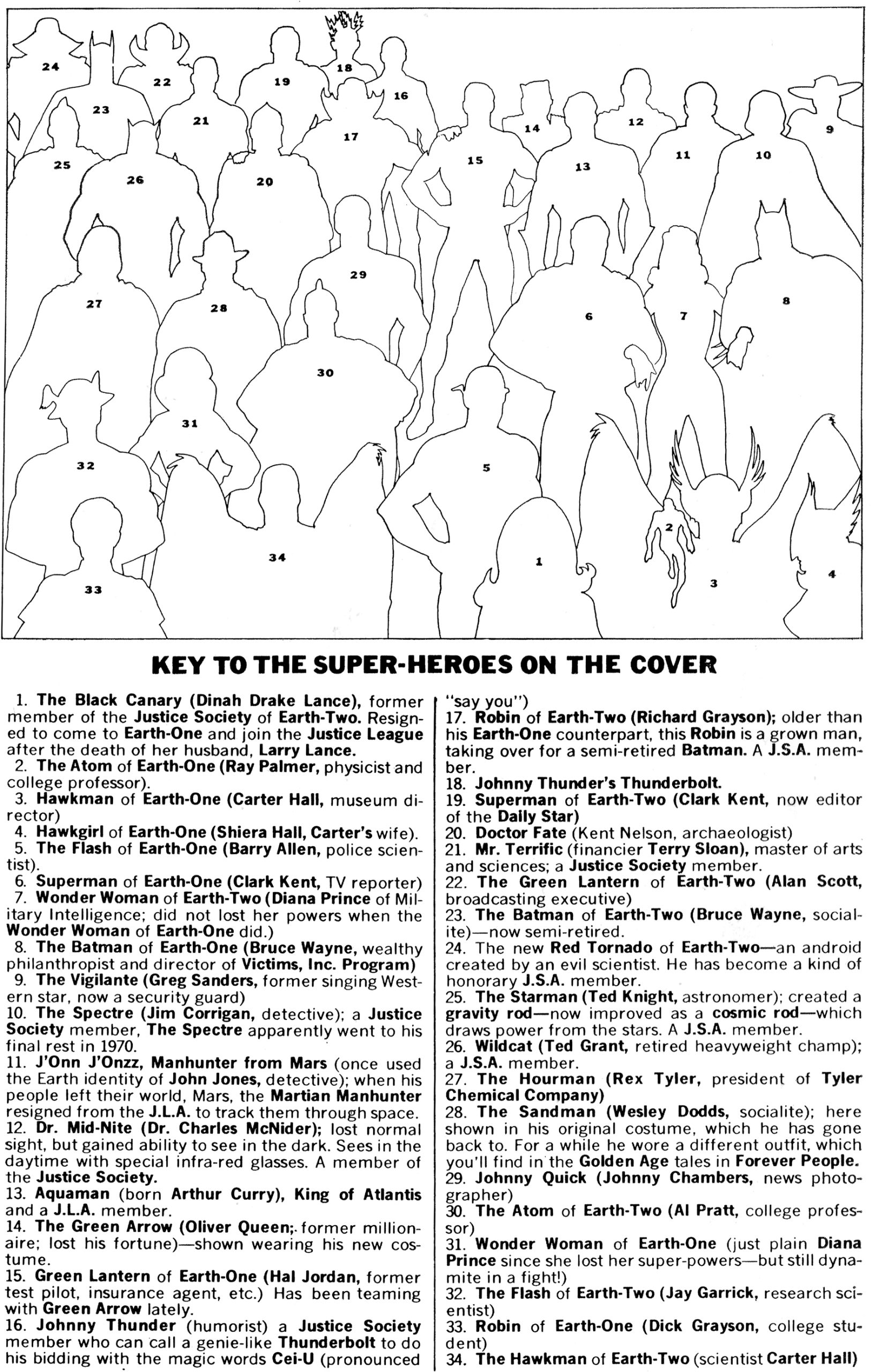
Oh, and here’s one last thing, especially for you readers who may not know who all the characters are — the original key to the cover:
—
MORE
— 13 WONDERFUL THINGS About 1971’s Classic DC 100-PAGE SUPER SPECTACULAR #6 Cover. Click here.
— The TOP 13 DC COMICS Logos of 1977. Click here.
—
A 10-year-old Walt Grogan fell in love with the Big Red Cheese thanks to essays written by Dick Lupoff and Don Thompson in the paperback edition of All in Color for a Dime, released in 1970 and bought for him by his father off a paperback spinner rack in a liquor store on the South Side of Chicago. Walt runs The Marvel Family Web Facebook page devoted to all incarnations of the Fawcett/DC Captain Marvel and blogs about Captain Marvel at shazamshistorama.com.
October 5, 2025
Fantastic job Walt! Thank you!!
October 5, 2025
All-Star Comics cover also spotlighted Johnny Thunder, who wore a sailor suit as he was in the navy at the time (of course, hijinks ensued!) instead of his familiar green suit and bowtie.
October 5, 2025
Mike! Thanks so much for pointing that out! I completely overlooked Johnny Thunder on the cover of All-Star Comics! Shame on me!
October 5, 2025
I think I heard once that Neal wasn’t too keen with the cover, saying there was nothing terribly creative about it on his part, just a shot of a bunch of people standing around. I guess he was sort of bemused that it had become so iconic.
October 5, 2025
Thanks so much for this, Walt. You did a masterful job in retouching and recolouring the original page. This is a worthy hommage to a seminal piece by Neal Adams. I recently acquired the issue and had it on display in my house. I love your suggestion of an Alex Ross painted version of the cover and would wholeheartedly support. I had never thought of the Kingdom Come original covers as being inspired by the 100-page spectacular, but now that you say, I can totally see it. Two questions: 1. has Alex Ross ever acknowledged the link between the KC covers and the Spectacular? 2. With regard to Earth 2 Robin, has anyone anywhere explained either in a comic story or in some sort of editorial comment why Earth 1 Robin did not keep the original Neal Adams design after JLoA 92? I’ve tried to track that down, but have been unsuccessful so far. Thanks again
October 5, 2025
Walt, great job! Can you post a high resolution PDF of your re-do? Funny…all these years and I never noticed J’On’s large head. The space now in front of Hal is noticeable maybe we could plug another “7 Soldiers of Victory” there.
October 5, 2025
If anyone is looking for JSA merch, check this place out. Unfortunately, I didn’t find this cover there but there are others. https://beardedshirts.com/collections/jsa
October 5, 2025
Hi, Buck! If you open the image in a new tab, it is much larger!
October 5, 2025
And just like that, my wish is granted. Cool!
October 5, 2025
Great bit of history and fine sleuthing.
When I was given my first-ever tour of DC Comics, there was one small office, without much in the way of decoration. But seated at a drawingboard was Neal, pencilling this very cover. While he may have been dismissive of it, I was pretty impressed at the powerful drawing. I’ve always been fond of the cover ever since.
October 5, 2025
Wow! That’s awesome, Robert! I can only imagine how cool that was!
October 5, 2025
I never knew you went back that far, Robert!
Great piece, Walt. Not being an artist is probably why I just can’t see this ‘wonky’ eye on Dinah that bugs you, or the hourglass difference.
October 5, 2025
Excellent job, Walt! When I saw the reprint in 2004 I was going to buy it even though I had a copy of the original but I immediately realized it was redrawn so I put it back. What I don’t understand is why didn’t DC contact Neal for a scan of the original cover back in 2004?
October 5, 2025
Thought you might find this of interest: the cover to my DC Comics toy and merchandise checklist book: https://www.amazon.com/Ultimate-Comics-Figures-Collectibles-Checklist/dp/0989334473
You can blow up the image to see it closer: same but using action figures
October 5, 2025
Funny, I just commented on another blog on this website that I wished the other non-spotlighted characters could be colored the same way & not darker. And viola! You did just that. Have to point out one error on all of your versions though–Green Arrow’s hand on his pal GL is still blue!
October 5, 2025
Hi, Guy! Thanks for the kind words. That’s the Earth-Two Robin-s hand on Green Lantern’s shoulder not Green Arrow’s, that’s why it’s colored blue.
October 6, 2025
Won-der-ful!!!!
October 6, 2025
And Wonder Woman’s wonky eye corrected as well!
October 7, 2025
Nice work! I love the mock-up retro pin-up you’ve created.
October 8, 2025
I have no recollection of that comic! Weird. Seems like I would have at least noticed it on the spinner or rack! In college I didn’t pay as much attention to comic books or buy very many. But, I was not out of high school yet.
Wish Neal had inked it himself! I know at a certain point I had to stop buying so many monthly titles and sold off some ‘lots’ of comics through THE COMICS BUYER’S GUIDE. They were just piling up.
October 9, 2025
I also love the scanning clean-up, coloring, etc. you did so we can see it in all its glory! THANK YOU!