
In his latest Alternative Fridays column, historian Jon B. Cooke takes you on an illustrated journey through the beautiful artwork of Nick Cardy, who died earlier this week. Included is an insightful interview Cooke conducted with Cardy about some of his best-known material.

All characters TM & © DC Comics.
The following interview was conducted for John D. Coates’ fine book “The Art of Nick Cardy” [Coates Publishing, 1999], of which I am grateful to have been book designer. In the midst of doing layout, I noted not much discussion within John’s extensive interview with the late, great artist—who passed away on Nov. 3—about Nick’s early 1970s work for The Brave and the Bold and Teen Titans, some of my favorite Cardy comic book material. Me, I thought the artist was reaching sublime heights, using new rendering techniques and pushing the boundaries of design, and I lamented it had received little notice by comics fans. I was particularly taken with a pair of issues he drew for The Brave and the Bold, two comic books that were treasured (and re-read over and over) by my brother Andy and me when we were growing up. So I asked John if he’d allow me to have a chat with Nick, and we could use the transcribed discussion as a chapter, and the author enthusiastically approved. I vividly recall calling up Nick in his Florida home one Saturday afternoon and the following, reprinted here with the gracious permission of Mr. Coates, is the result. — Jon B. Cooke, editor, Comic Book Creator magazine

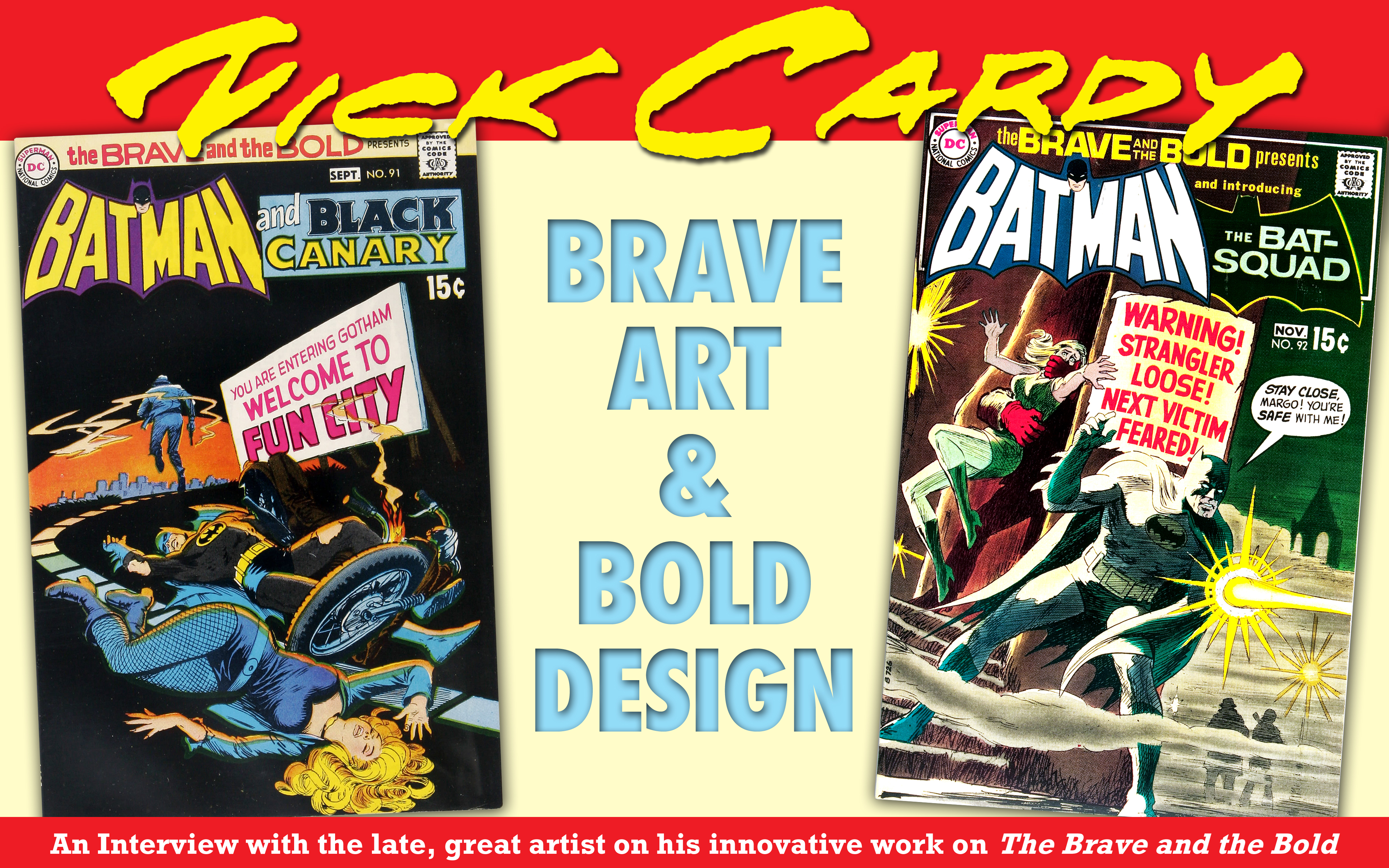
From left to right, “The Art of Nick Cardy”; Nicholas Viscardi, a.k.a. Nick Cardy, in a portrait from the 1970s, when the artist was doing less comics work and more for advertising and motion pictures; and the cover of this writer’s Comic Book Artist #5, from the Summer of 1999, published just prior to “The Art of Nick Cardy” and featuring a brilliant cover painting by the artist. All characters TM & © DC Comics.
Jon B. Cooke: One of the aspects of your career that warrants further examination is your work for the title, The Brave and the Bold—specifically #91 (Aug.–Sept. 1970) and 92 (Oct.–Nov. ’70). Earlier, you mentioned at certain times in your career you challenged yourself with new storytelling techniques. I think the B&B work was the culmination of that challenge. First, I’d like to review your overall creative process. How do you approach a blank page?
Nick Cardy: I always worked in pencil. I’d start with a lot of little thumbnail sketches. When I got a script, I would take a blank 81/2” x 11″ sheet and break the story down into little page layouts. (I didn’t have an Art-O-Graph like Neal Adams did at DC; if I did, I could have blown up my pencils and traced them on the final board—that would have been a lot quicker.)
Jon: So you just adapted the thumbnail designs and redrew them larger on the final board?
Nick: Yes. At least I had a rough idea of what the design would be. Sometimes I would draw the figures, put a tone over the whole thing, and then create highlights by erasing. (Though sometimes the colorist would fill those highlights in and destroy the effect! On the cover for Teen Titans #13, I wished they had made the background lighter because a lot of activity was obliterated in the published piece; they put a dark gray over the background. If only they used a moody but light color, but I liked that job and it was a turning point for me. I previously did do a lot of experimental work on Daniel Boone with scenes that took place in the woods.)
Jon: What was at the heart of your artistic transitions? Did you feel you were turning stale at particular times?
Nick: I was looking for a certain perfection in style. Out of a hundred drawings, I may like maybe four or five. I was seeking out things pleasing to me; I would accept pictures that were nice and were effective in telling a story well. I was trying to draw the women prettier. With some comics work (like TT) I didn’t get the opportunity to use many shadows and blacks, but with The Brave and the Bold, I had the chance to work on dramatic detective stories and I was able to use a lot of bold blacks.
With that Scrooge story (TT #13), I used a lot of pen and ink crosshatching. And I used that technique right on through to the Bat-Squad story [B&B #92]. With pen and ink, I can achieve a scratchy, foggy effect that is appropriate. (You just had to always hope that the colorist would recognize your efforts and color it right!) It was a continual process of learning.
![From left, page and panels from Teen Titans #13[Jan.–Feb. 1968], drawn by Nick Cardy and written by Bob Haney, where the artist went to town with his elaborate crosshatching. On right is the cover to the same issue and the artist was disappointed with the DC production department’s coloring, which obliterated the background artwork. All TM & © DC Comics.](https://13thdimension.com/wp-content/uploads/2013/11/CardyTT13_image.jpg)
(CLICK FOR THE FULL, BIG EFFECT) From left, page and panels from Teen Titans #13[Jan.–Feb. 1968], drawn by Nick Cardy and written by Bob Haney, where the artist went to town with his elaborate crosshatching. At right is the cover to the same issue and the artist was disappointed with the DC production department’s coloring, which obliterated the background artwork. All TM & © DC Comics.
Nick: As long as it was right for the script, I would love to play up the dramatic aspects of a story. I enjoyed emphasizing the mystery. Tenement buildings always fascinated me (probably because I grew up in one!), so I was very familiar with urban atmospherics — back alleys, laundry lines, crooked telephone poles, wet streets with streams running down the middle, street lamps glowing — and those are very dramatic! I liked to draw the old tenement buildings more than the new modern buildings because I hated drawing straight lines! [Laughter] You could draw tenements crooked because they were a little crooked!
![Just prior to his Brave and the Bold masterworks, Nick Cardy produced a tour de force with “Blindspot” in Teen Titans #28 [July–Aug. 1970], which featured downright psychedelic imagery! TM & © DC Comics.](https://13thdimension.com/wp-content/uploads/2013/11/Cardy_Blindspot_image.jpg)
(CLICK TO BEHOLD THE EPICNESS) Just prior to his Brave and the Bold masterworks, Nick Cardy produced a tour de force with “Blindspot” in Teen Titans #28 [July–Aug. 1970], which featured downright psychedelic imagery! TM & © DC Comics.
Nick: With that story, I tried to express the city at night in a different way. You just see the patterns that the lights make through the darkness. We had three black kids hitching a ride on the back of a bus and I made the entire background pitch black, and I did the highlights with white paint. I made it look like a woodcut; it was different. I didn’t want to do the entire story that way, but the beginning of the story called for that approach. Again, I was experimenting.
I never did get to finish “Jericho.” Most of the copies I’ve seen of the pages show that I didn’t get a chance to fill in the blacks or add detail. Often, when I was composing the figures, I would block them in first with very heavy lines just to cast shadows. Later on, I would make the outlines. So it was, more or less, painting in black.
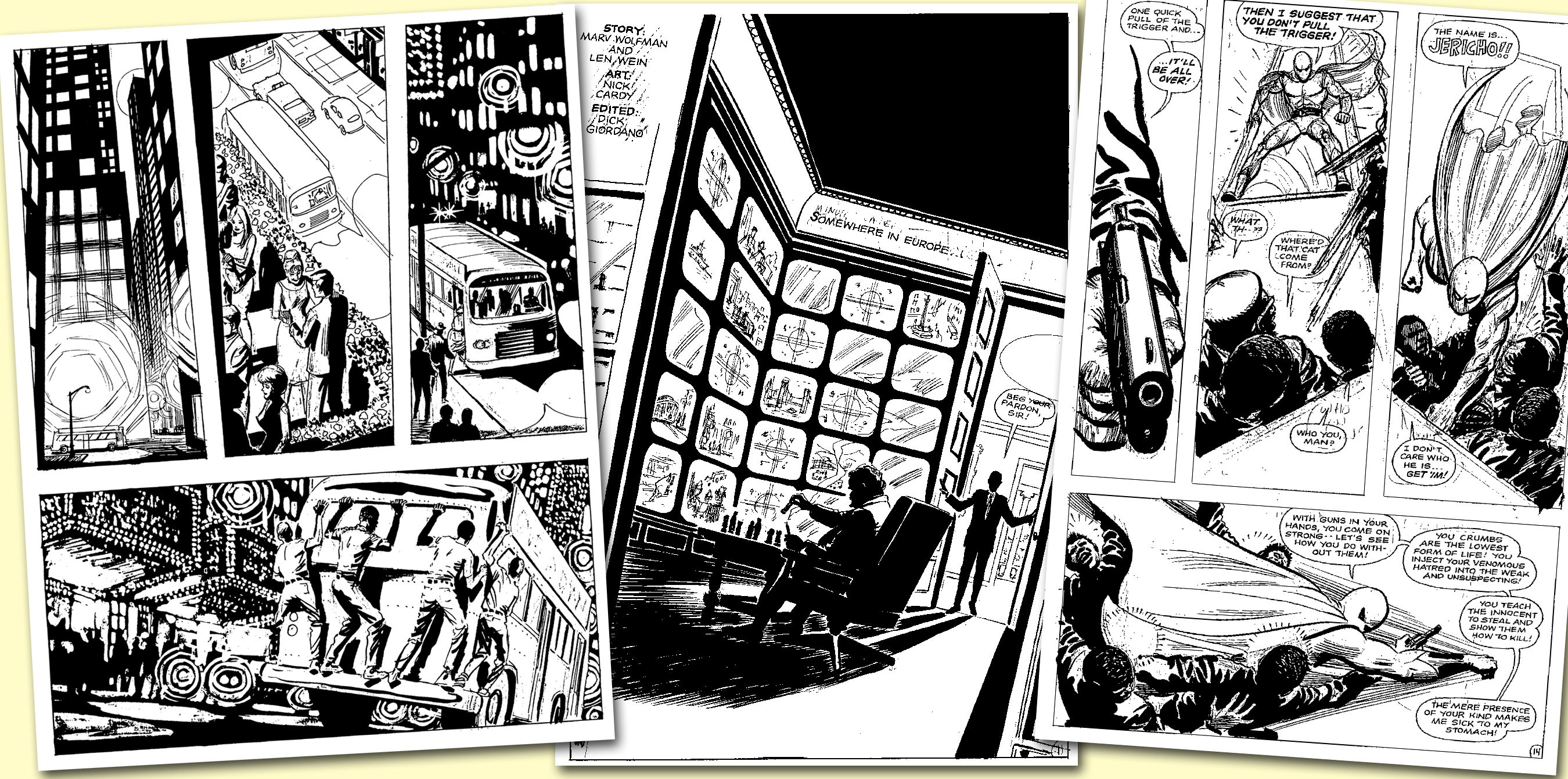
(DO YOURSELF A FAVOR AND CLICK FOR THE BIG) Pages from the unfinished — hence unpublished — “Jericho” story originally intended for Teen Titans but was yanked by higher-ups at DC Comics for its “controversial” content that included the introduction of a new African-American superhero. For the full story behind this Marv Wolfman-scripted and Nick Cardy-drawn production, seek out the PDF edition of Comic Book Artist Vol. 1 #1 at www.twomorrows.com. End plug! Characters TM & © DC Comics.
Jon: So the “Jericho” pages show an intermediate stage of the production process. Before you finished inking, the letterer would get the pages, and then you would fill in the detail?
Nick: I would write the copy in the balloons freehand and then I would pencil up to those areas of text, leaving a lot of space for the letterer. Some writers would use a lot more verbiage than others, but you need a balance between words and pictures to tell a good story.
Jon: So you had a jump in your creative approach with TT #13, then moved on to even more experimentation with Bat Lash, and, I would suggest, your storytelling ability really hit a peak with your B&B work—the final comic book series you regularly worked on.
Nick: I think I matured with my blacks. And I used them in the B&Bs because the stories called for heavy blacks — they were mysteries. Teen Titans were light and humorous, with kids flying through the air; you didn’t want them portrayed too heavy with moody lines.
Jon: Were you given B&B as a regular ongoing assignment, or was it a temporary stint?
Nick: I think I just did one and they said, “Here’s another!” I just did what they gave me.
Jon: With #91, you start off with…
Nick: That splash page wasn’t my work. My art starts on Page 2. I think I came into the story late and replaced another artist. I don’t know what the reason was.
Jon: It looks like Jim Aparo’s work.
Nick: I don’t know who it was.
(CLICK TO ENLARGE) Nick says the first page of The Brave and the Bold #91 is not penciled by the artist though they are obviously his inks adorning the atmospheric opening. TM & © DC Comics.
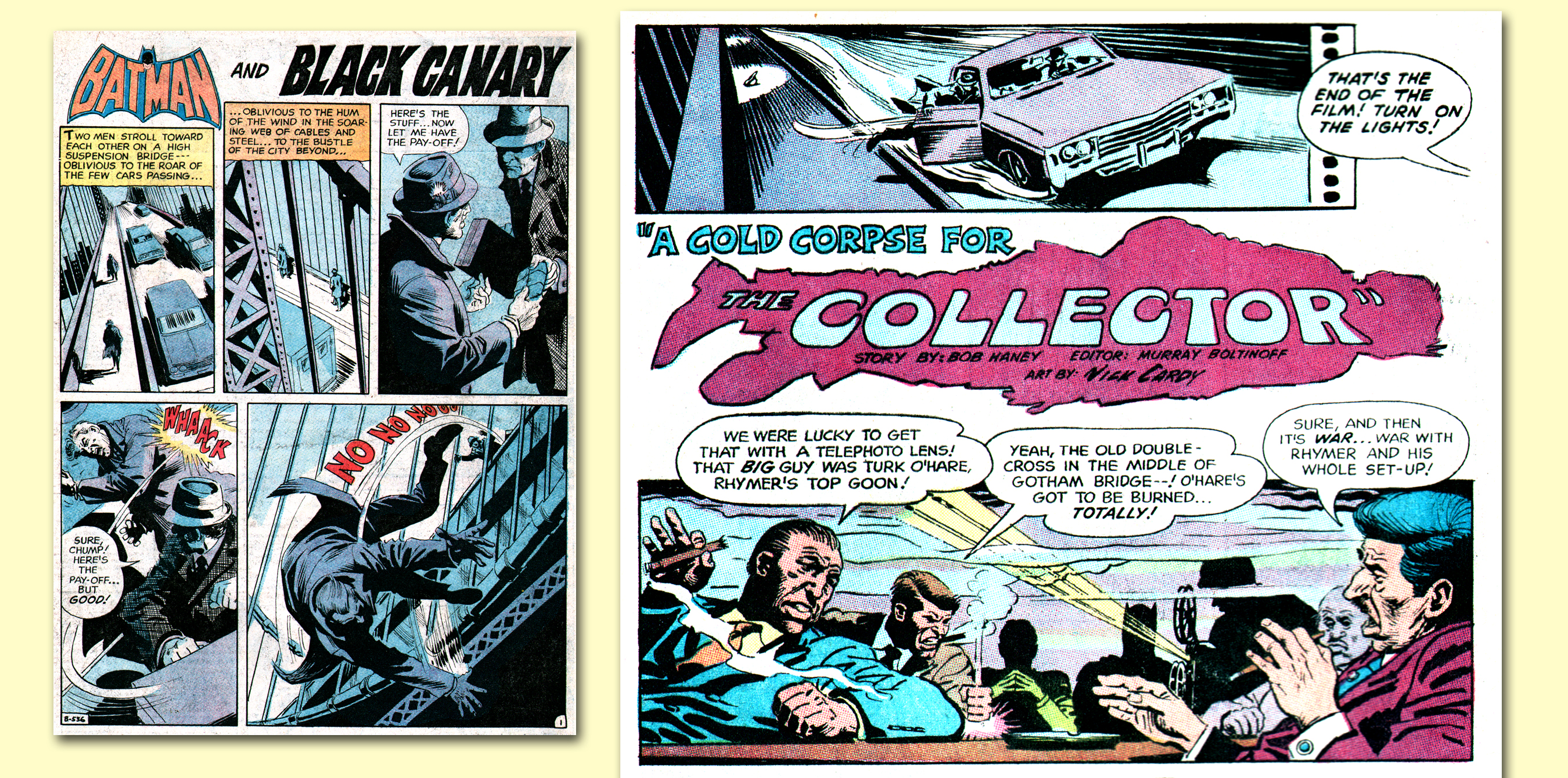
Jon: With Page 2, you achieved a Saul Bass-like effect with the silhouetted corpse.
Nick: I liked that. In fact, on Page 17, I achieved a beautiful relief with the vignette of the couple walking into the room. I think I was effective with the girl’s faces and her figures. The top panels on Page 18 also worked well. (What I should have done with those panels, I should have picked up the railing in the background in the first panel and extended it over into the next, to compose an entire scene though in two different locations.) I left the outlines on Batman to accommodate for the police light.
Jon: So you obviously designed with color in mind.
Nick: Oh, yeah! For instance, on the last panel of Page 12, I drew jagged lines for the firelight to reflect on his figure and I specifically did it for color (though often they ignored my drawing and colored it all in).
Jon: With the gangster sequence on Page 2, I recall that you truly have a gift for caricaturing. Did you sketch in public?
Nick: Every now and then, I would see characters in a movie or in real life, and I would remember that face. I would seek out facial types who would fit certain roles in stories. I kept a mental file on the characters who would fit the bill. I based Commissioner Gordon in this story on the actor Lee J. Cobb. But I didn’t copy his face; I did it from memory.
(AGAIN, CLICK TO MAKE BIG) Cardy in the sublime. Black Canary and her soon-to-be late husband go off for a romantic encounter in the exquisite final panel of this Brave and the Bold #91 spread. To the right, Batman and Commissioner Gordon are present for a superb lighting effect by the master on the page following the idyllic spread. TM & © DC Comics.
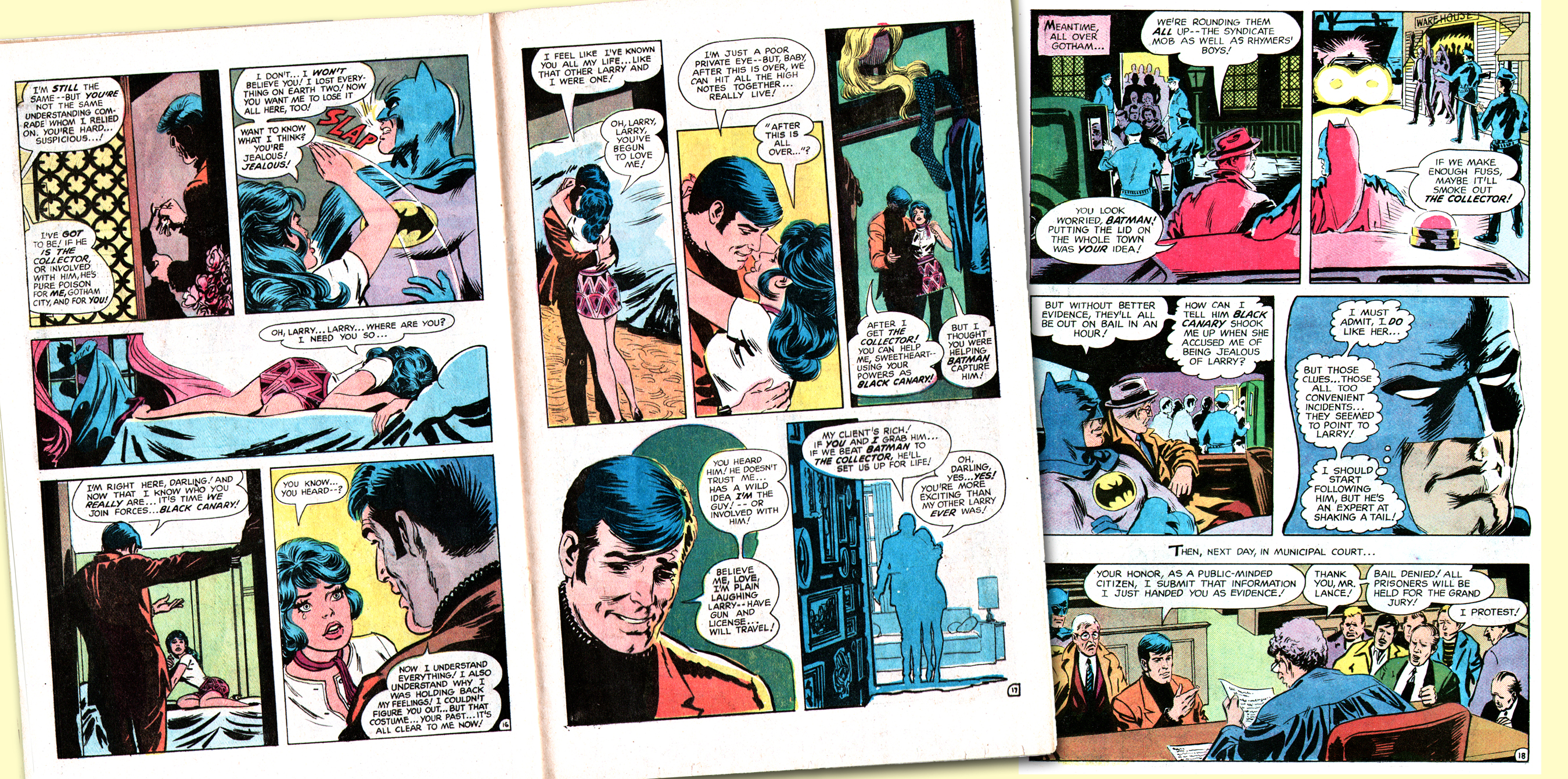
Jon: On Page 5, you have an interesting effect: After the first three horizontal panels, you add a slight amount of additional space before the bottom panel row to connote the passage of time. I don’t recall seeing that before in comics.
Nick: I figured the top panels ended Chapter One and I wanted to indicate Chapter Two, even though it occurs mid-page.
Jon: Then on Page 6, you introduce an extraordinarily sensual and sexy Dinah Lance.
Nick: I liked to portray very pleasant sexy girls without being crude. You can look at a girl simply standing and she can be sexy as hell! Years ago, men would go crazy just looking at women’s ankles; now… [Laughter]. Like with violence — you can portray violence without being bloody and explicit.
Jon: And the same is true with your inference of sex between the characters on Pages 16-17: There’s really no question that they sleep together after the sequence but you’re quite subtle.
Nick: If it were a film, the last scene would be her hand closing the bedroom door behind her. So you got it right! They were just fading into the sunset. [Chuckles] But it was subtle….
Jon: But we readers were hip enough to know!
Nick: That’s the thing: Don’t ever underestimate the imagination of the readers!
Jon: I think that’s the essence of Nick Cardy—you didn’t talk down to us through your art, so to speak; you brought sensuality into mainstream comics with your portrayals of Wonder Girl, Black Canary, and Bat Lash’s girlfriends. Is sensuality an important component of your art?
Nick: I felt, if I’m going to draw women, I’m going to draw pretty — but nice — women. A nice figure of a girl, just standing, resting on one leg, can be very sexy.
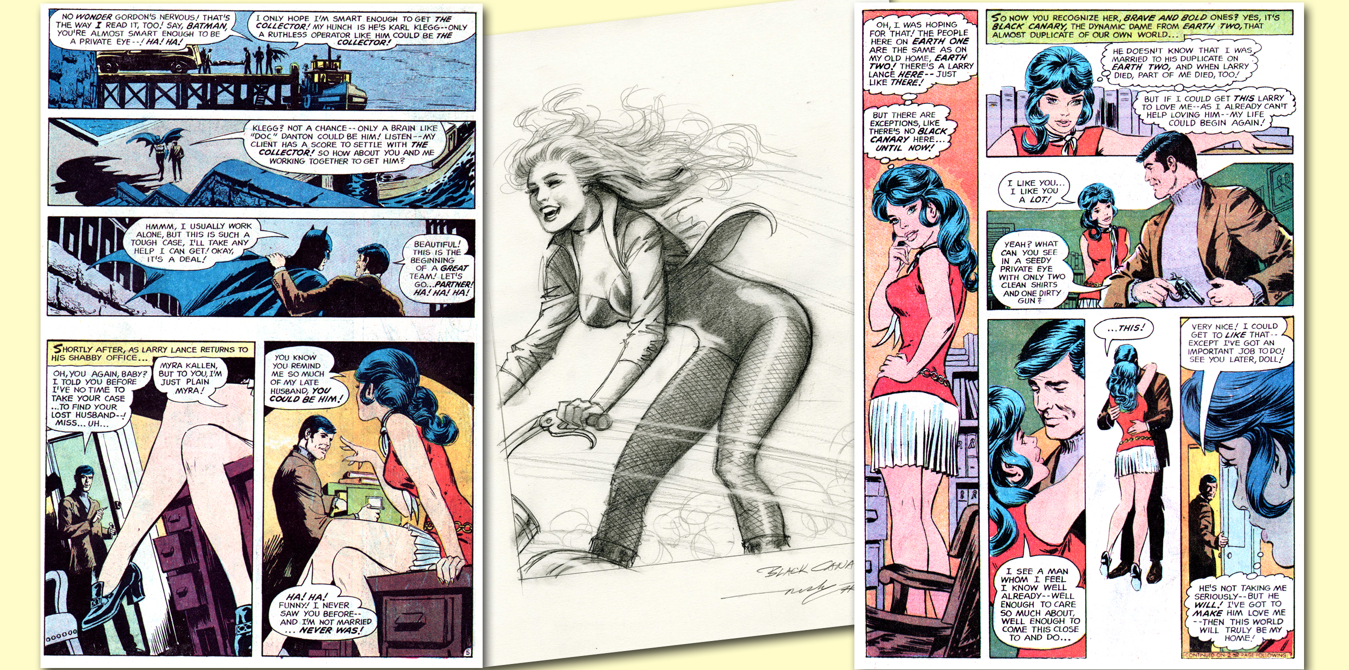
(CLICK TO MAKE LARGER) Dig them pleats! Two consecutive pages from B&B #91, the left innovatively depicting the passage of time — or a chapter break, as Nick says — with added space between panels. The right is one hot Dinah Lance, a.k.a. that “dynamic dame from Earth-Two,” the Black Canary. In center is a 2005 commission piece by Nick that was auctioned off by Heritage. TM & © DC Comics.
Jon: Was the cover of #91 your composition?
Nick: Yes. I designed it with the curve in the road complementing Canary’s figure — the entire picture is composed as a circle, more or less. The dashed line leading into the gunmen; the sun; the motorcycle wheel — it’s all concentrated into that one spot. (The only thing that’s oddball about this cover is I wished they used a circular sign!) I always liked to play with covers, and I put a little more work into the design — the design was the main thing; the figures were incidental though they had to fit.
Jon: In the letter column of your first B&B (#91), editor Murray Boltinoff announced the next issue would feature Neal Adams and Denny O’Neil’s “Red Water, Crimson Death.” That story didn’t actually appear until #93. Do you recall if your Bat-Squad story in #92 was a rush job?
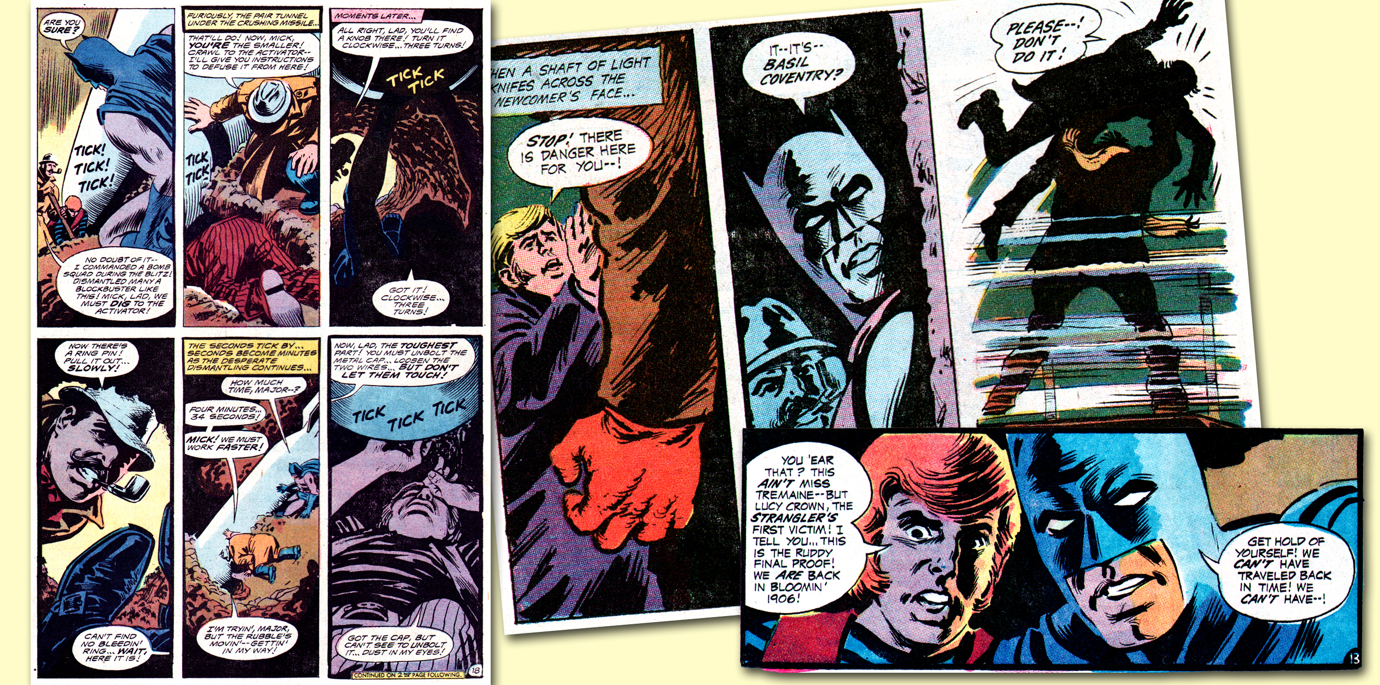
Nick: No. They gave me a regular deadline with that story; there was no rush. The style was a lot looser but, there again, I was experimenting. With #91, most of my work was just brush with maybe one or two little pen lines to reinforce where perhaps it wasn’t tight enough; but with #92, most of my work was just pen. I added some blacks with a brush but I used pen for the fog scenes. I tried to give that story a “Jack the Ripper” flavor. (Chuckles)

(CLICK AWAY) Evocative panels from B&B #91, plus the story’s final page (with somewhat off-key comedic final panel), and the opposing page letter column, which featured a nice profile on the artist by editor Murray Boltinoff. Yours truly was consistently impressed with the title during much of its Batman team-up run, not only because of the excellent artists working on the title but very often due to Bob Haney’s expert and engrossing writing. TM & © DC Comics.
Jon: Did you regularly use a pen?
Nick: On and off. In the beginning, I couldn’t find the right pen but I ended up using a Gillotte #170 pen, which I’ve used for years. A lot of artists use felt-tip pens these days — Neal Adams and Gil Kane, for instance — but I use a Hunt’s #99 pen with which I can get nice, sensitive lines. And I’d get the depth with a brush.
Jon: Pages 2 and 3, the double-page spread has some interesting effects. The panels on Page 2 are curving to emulate the drifting fog of the next full-page splash.
Nick: As was established on Page 1, they’re making a movie so I set up each panel as a separate scene, so it looked like a real movie sequence. I loved old, wrecked buildings! They’re so free and easy to draw! They have so much character.
Jon: On the bottom of Page 5 of #92, you have an interesting composition in drawing the girl in delicate lines, the boy with medium lighting, and the man in total black silhouette …
Nick: And then, Batman’s face. It was all leading to him because they were calling him on the phone, hence the transition.
Jon: B&B #92 had a different kind of cover….
Nick: I enjoyed that. I had a tendency to make Batman’s ears too small. I just wanted to emphasize the fog on this cover. The thing that distracts from it is the poster, “Warning! Strangler Loose!” It takes away from the picture but it was the format. Batman is standing at an angle, and the girl parallels his angle; then you have the diagonal angle of the columns. But when you get to the figures in the background, your eye goes from them clear up to the flashlight. … This piece is all designed with a series of triangles that compel the viewer’s attention the way I intended. All design is about leading the eye.
Jon: Did you have anything to do with the coloring on the Bat-Squad (#92) cover?
Nick: I believe I told the production department that I wanted all these muted colors to denote the foggy scene — I wanted greenish grays and that type of thing. On that, they didn’t do too bad a job. On some jobs, they really did some awful work, but the B&B covers didn’t come out bad. I believe Jerry Serpe did the colors on #92, who could be quite flamboyant with his cover work, with almost an abstract feeling.
Jon: There’s a color continuity throughout the entire Bat-Squad story; it’s truly color designed from the cover and all the way through. And, importantly, the villain’s gloves are red which contrast so strongly with the muted colors.
Nick: I liked that because even though the villain was standing in the shadows, just a glance at his gloves reveals who he is — especially on Page 3 where he’s carrying his victim off into the fog. The colorist did a really nice job on that story.
Jon: And you end the story in stark daylight.
Nick: Well, the nightmare was over! [Chuckles] The crimes were solved, the birds tweeped, and the sun shined! [laughs]
Jon: On Page 21, panel 4 of #92, the blond character is heavily outlined and, interestingly, so are the word balloons. Were you experimenting with different effects with balloons and borders?
Nick: I don’t think I asked for thick lines on the balloons. They probably felt because it was a vignette it needed more emphasis. On Bat Lash, I worked with a lot of heavy lines and I felt heavy outlines with fine lines on the face features gave it the effect of flesh. It gave it a textural, delicate feeling.
Jon: On the top tier of panels on Page 16, there’s a progressive variance on the thickness of the border lines on each panel.
Nick: As you can see on the upper left of panel 3, I gave that line segment a lighter gauge compared to the rest of the panel to give it more “air.” That added more depth. So I tried to give the panels a sense of space though I had very little room. A thin line next to a heavier line gives it distance and it throws the lighter area back. I feel that with every panel I draw, I had to make a dramatic statement.

(CLICK TO BIG) Opening spread, panel selection and detail of original art page from The Brave and the Bold #92, all featuring dramatic and outstanding illustration by Nicholas Viscardi. TM & © DC Comics.
Jon: On pg. 14, the last panel is a vignette. Did you use this device for more dramatic tension?
Nick: The first four panels on that page are so cluttered, and I used the fifth as a transition. But I wanted to depict the stark terror of the villain lifting the victim off the ground and I didn’t want anything to take away the impact. The vignette made those figures more dramatic. Ideally, I would have preferred more space between the figures — the villain holding the victim up higher — so you would have seen the full body of the killer. The colorist carried the green in that panel a little too far — he should have faded the color from the bottom up. But I like that vignette. If you use vignettes correctly, they make for good “breathers” and emphasizers. For instance, I did a TT cover with Aqualad taking a sock at Robin; had they used a color in the background instead of white, it would have slowed down the action tremendously — without color, it had impact.
On Page 18, they’re digging underneath the bomb, and I simply used a silhouette on panel 3 to emphasize the claustrophobia of the situation. You don’t need detail in the figure; I just put detail in the texture of the tunnel.
Sometimes I would adapt Bob Haney’s scripts and do it my way, and he would later shift the dialogue. Sometimes I would add or subtract a panel if I needed to. I took some liberties—sometimes I took a lot! [Chuckles]
![Nick discusses the cover of Teen Titans #28 28 [July–Aug. 1970] where Aqualad takes a sock at Robin, and we’ve thrown in a classic Cardy TT cover, #14 [Mar.–Apr. 1968] for good measure. TM & © DC Comics.](https://13thdimension.com/wp-content/uploads/2013/11/Cardy_TeenTitansCovers_image.jpg)
(CLICK TO EMBIGGEN) Nick discusses the cover of Teen Titans #28 28 [July–Aug. 1970] where Aqualad takes a sock at Robin, and we’ve thrown in a classic Cardy TT cover, #14 [Mar.–Apr. 1968] for good measure. TM & © DC Comics.
Nick: Well, as I’ve stated before, I like classical music. If you listen to Beethoven and hear a movement that is very loud, there’s usually a very soft piece before that. There’s a contrast and it makes it so much more powerful. So when you draw a beautiful girl with a heavy-outlined man behind her, you can feel her delicateness. It makes the drawing more feminine.
Jon: Were you influenced at all by the arrival of Neal Adams?
Nick: If anything, his presence pushed me to do better work. His work was very dynamic and different, and I figured if he could get away with his heavy use of blacks, so I went ahead and did the same! I always wanted to emphasize the blacks but Neal led the way — and nobody said not to do it!
Jon: Do you recall when the industry stopped using twice-up boards and went to the one-and-a-half board format? A number of artists said the new smaller size led them to consider the overall design of the entire page more often. Is that when you started doing thumbnails?
Nick: I always did thumbnails. As a matter of fact, when I went to school, the teacher would instruct us to make little charcoal drawings with simple lines to develop the design. First the piece was composed with a preliminary black-and-white sketch, next we added a tone and then designed the grays with a kneaded erasure. Only then could you have a strong composition.
There’s an old saying that a painting needs to direct the viewer as if he were a visitor — take him in the front door, show him around the room, and gradually leading the viewer out the back door. A painting has to compel the viewer to see things the way the painter intends it to be viewed; there has to be an entrance and an exit for the eye. But with comics, you also have to deal with captions and balloons, for instance.
(CLICK TO BALLOON) A master of suspense in four-color panels, Nick Cardy shows his chops in this mélange of artwork from B&B #92. Note the reversed page numbering on the bottom right panel, the signature of expert letterer (and no slouch in the cartooning department himself) John Costanza. TM & © DC Comics.
Jon: So you were always aware of the overall design of the comics page?
Nick: I started to go a bit wild with TT #13. I composed a lot of diagonal panels denoting action, for instance.They were interesting but ultimately too distracting. You can design a two-page spread using diagonal panels but you have to give it a rest for the remainder of the story.
A solid line going straight up and down gives a sense of regality and height. A horizontal line, in contrast, suggests repose. A diagonal line represents action.
I did a Western painting that I designed in the shape of an arrowhead, composed of an Indian and a soldier battling atop their horses as they fall off a cliff, saber versus tomahawk. It’s action, going right off the canvas, and I painted rows of clouds lined up in the opposite direction.
All of my work possesses these elements. Unfortunately, deadlines come into play and I only had so much time to devote to design.
Jon: In B&B #91, Page 14 really works as a designed page, leading the eye on the page with Batman’s movements expertly.
Nick: You’ll notice in the fourth panel, I needed Batman to get a running start so I could do the last panel with Batman flying! (Chuckles) I saw it as the perfect chance to spread Batman’s cowl and use his cape like bat wings — had I had more room, I would have made it even bigger!
Jon: Were you excited to work with Batman?
Nick: Yeah! I really liked the character and I think B&B has some of my best work.
My work has always been challenging; I’m not only a frustrated illustrator, I’m also always looking for perfection! [Laughter] My career has always been phases: I got into comics, went into advertising, and finally did movie posters. The comics were my training ground.
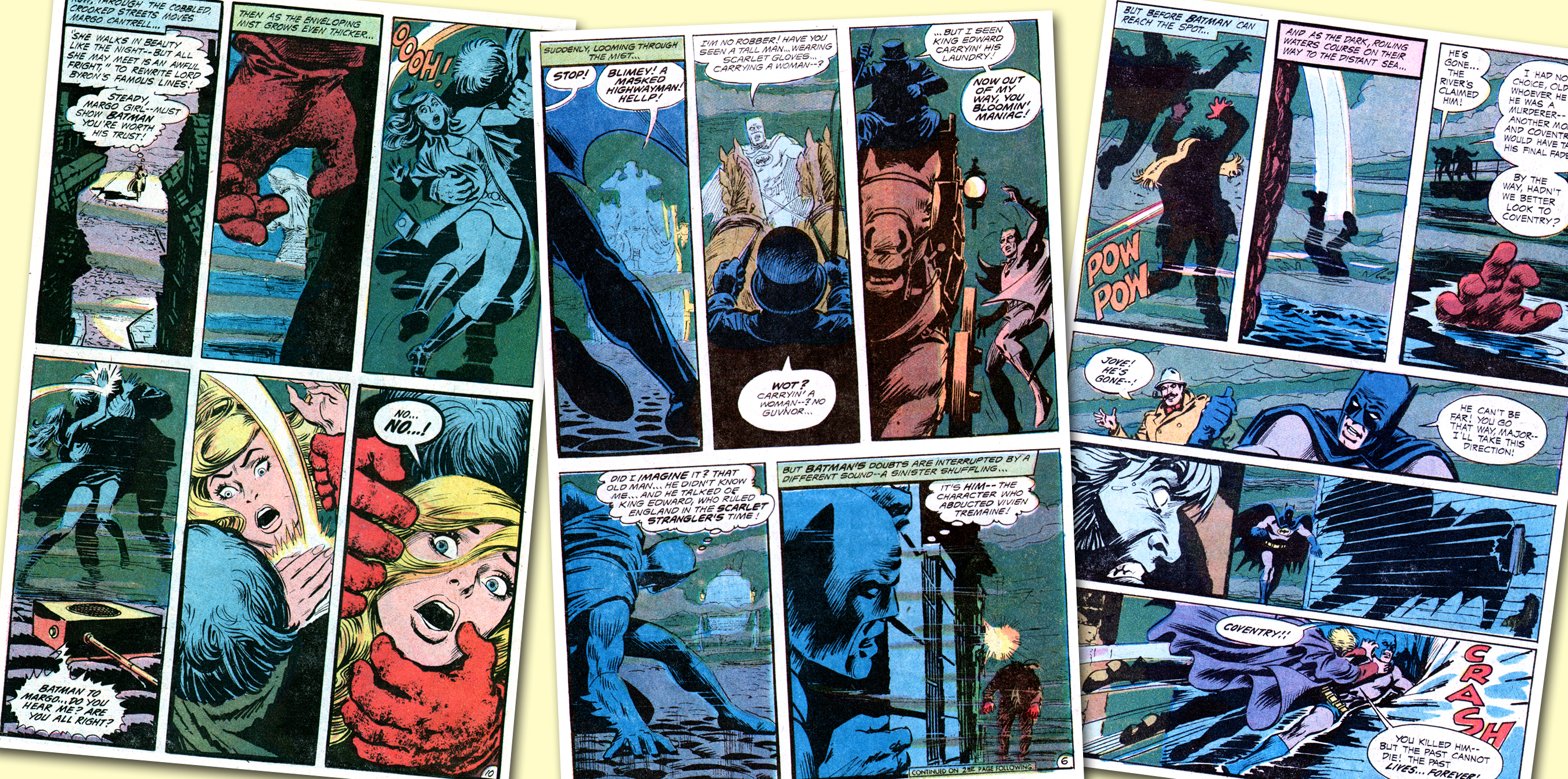
(CLICK TO BLOW UP) A triptych of pages from Nick Cardy’s lovely work depicting foggy Olde London Towne in B&B #92. TM & © DC Comics.
—
From Jon: I became pals with the late Nicholas Viscardi when I asked for his permission in 1998 to use a painting he had rendered featuring a bunch of DC Comics characters for a cover of my Comic Book Artist magazine. Our working together on “The Art of Nick Cardy” solidified the friendship and we would periodically be in touch, if only through Christmas cards for a few of those years, and when we chatted by phone, he always — always — asked how my wife was and how old my boys had gotten. He was endearingly sweet and sometimes goofy, always self-effacing and extremely loveable, a kindness that perpetually shined through his work. I loved him very much and am tremendously grateful to not only to have pored over so much beautiful artwork since childhood but to have been his pal and shared time and affection with such a precious human being. God bless you, old man. You enriched our lives all the more … — JBC.
November 9, 2013
Fantastic piece on a real talent!