
THE NEAL ADAMS CHRONICLES: Can’t get enough of this one…
—
We got a two-fer for ya! Our pal Walt Grogan is so enamored of Neal Adams and Dick Giordano’s cover to 1971’s DC 100-Page Super Spectacular #6 that he’s written — and illustrated — two groovy stories about it! The other one can be found here. Dig it! — Dan
—
By WALT GROGAN
My all-time favorite comic-book cover is DC 100-Page Super Spectacular #6, which came out in the summer of 1971.
The cover is just fun from top to bottom, and I remember excitedly reveling in the realistic interpretations of 34 heroes from Earths One and Two by the legendary team of Neal Adams and Dick Giordano. It’s gorgeous.
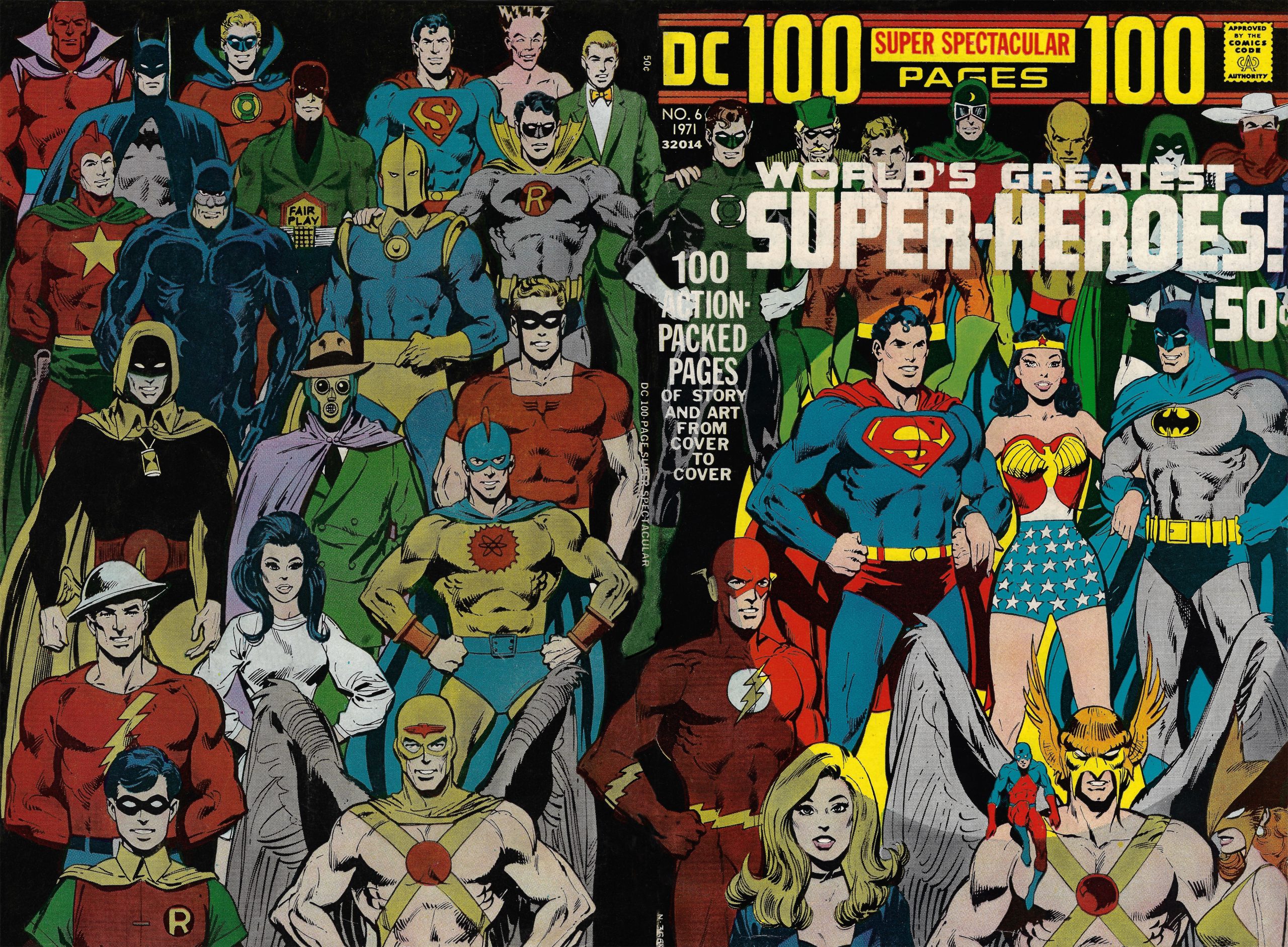
But narrowing it down, here are 13 of my favorite characters and groupings — RANKED:
—
13. Hard-Traveling Heroes. When Denny O’Neil and Neal Adams teamed-up Green Lantern and Green Arrow in Green Lantern #76 (April 1970), fans stood up and took notice. Leaning into the politics and popular culture of the late ’60s and early ’70s, O’Neil and Adams showed that comics could cater to a more adult audience. So it’s only fitting that Adams has them standing next to one another in the group shot. And if you let your eye drift downward, you can see GL’s other best pal, the Flash, right underneath him.
![]()
—
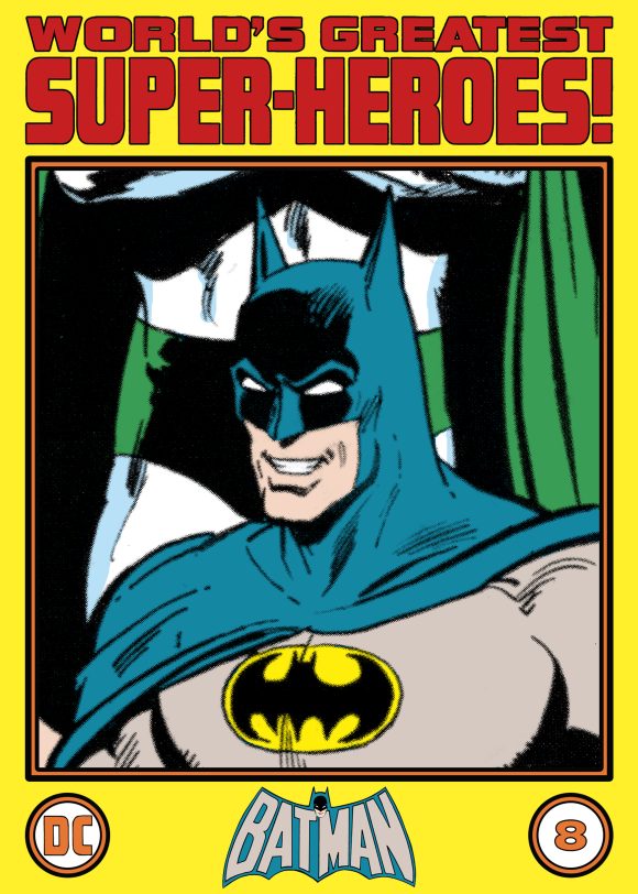
12. Mostly Smiling Heroes… Even Batman! Probably my biggest joy about this cover is that 98 percent of the heroes are smiling… including the Caped Crusader. The only hold-outs are the Spectre (naturally), Mr. Terrific (for some reason), and the Earth-Two Batman. Heck, even the robotic Red Tornado was able to crack a grin!
—
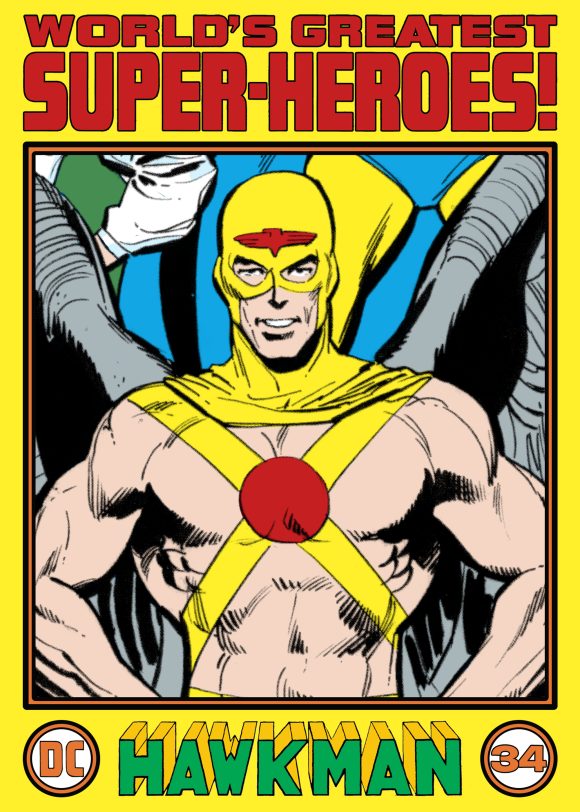
11. Hawkman’s Wings. The Hawkmen (and Hawkgirl) only work visually when the artist really knows how to draw bird wings and two of the masters at that were Neal Adams and Marshall Rogers. Look at the heft of those wings on the Earth-One and Two Hawkmen! They look like they could carry those two heroes! And it also shows the strength of both to be able to hoist them on their backs!
—
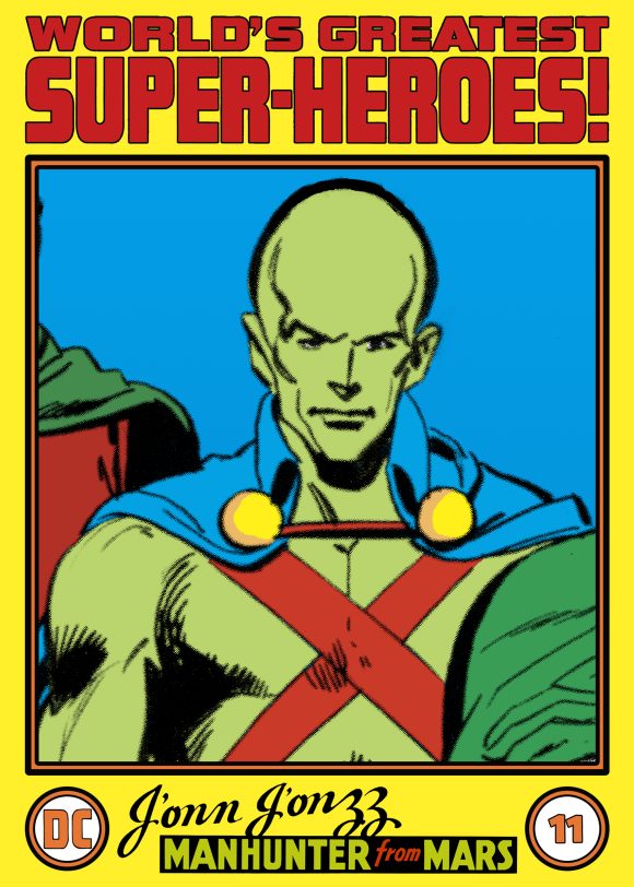
10. The Martian Manhunter’s Cranium. I loved that Neal gave J’onn J’onzz an over-size cranium to accentuate the alien-ness of the character. At the time, the Martian Manhunter’s appearances were mostly off the table, so it was a treat to see him on the cover!
—
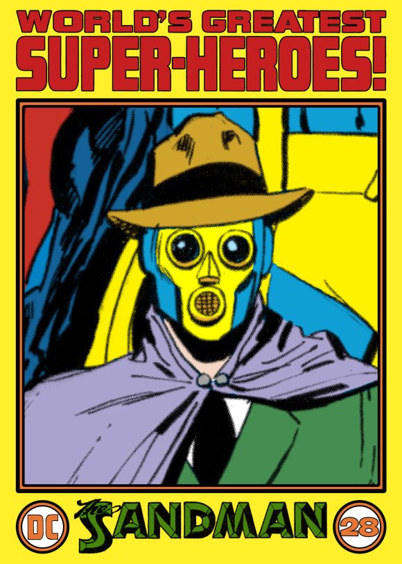
9. The Sandman. There’s something to be said about a hero who wears a business suit — he can easily use a dry cleaner. But it’s the addition of that expressionless, colorful gas mask that makes the Sandman so creepy. Imagine seeing him step out of the shadows! Yikes!
—
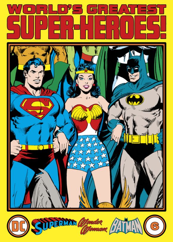
8. The Trinity. Neal wisely combined the Earth-One Superman and Batman with the Earth-Two Wonder Woman in the center-stage spot on the cover. By the time the issue was published, Earth-One Wonder Woman had lost her powers, becoming an Emma Peel-type character. She was relegated to the back, preserving the classic line-up on the front. It’s a great way to grab a reader’s attention.
—
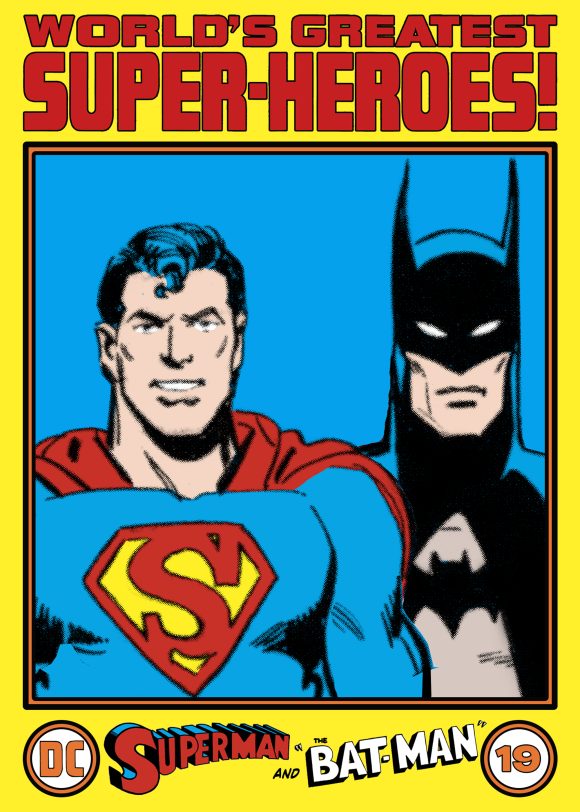
7. The Earth-Two Superman and Batman. I always loved when artists made the Earth-Two Superman visually different from his Earth-One counterpart. The key, of course, is the “S” symbol and Neal does a great job here. He also doesn’t make the E-Two Superman as bulky as the E-One version. But it got me to thinking — what a team these two, in these versions, would have made, back in the day, with Superman tossing hoodlums off rooftops like ragdolls and Batman peppering crooks with lead. Pretty terrifying to say the least!
—
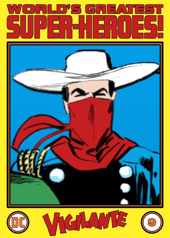
6. The Vigilante. I’ve never been a big fan of cowboy characters, but the Vigilante was different. He was a masked man who lived in the modern day and rode a motorcycle instead of a horse. Those things combined made him a favorite and I was delighted to see him included on the cover.
—
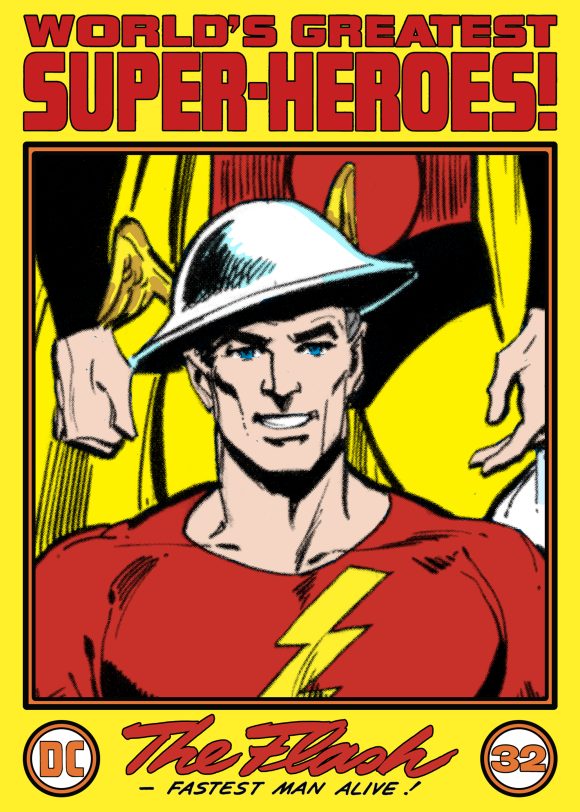
5. The Flash of Earth-Two. The Barry Allen Flash has one of the greatest costumes in comics. I mean, how could he not as it was inspired by the uniform of my fave, the original Captain Marvel. That said, I’ve always preferred Jay Garrick’s costume. His Mercury helmet is great! When I was a kid, I would have loved one of those. And that he’s just wearing a pair of pants along with a sweatshirt with a lightning bolt sewed on, well, you can’t get any simpler or better than that!
—
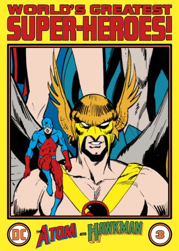
4. The Atom and Hawkman. Another great pairing! It really adds something when artists show the friendships between heroes. (Don’t forget: The Tiny Titan and the Winged Wonder shared a mag together!) Plus, anytime the Atom takes a load off on the shoulder of another hero, it shows that they are friends and not just colleagues. But you better hope he doesn’t accidentally change his weight to 180 lbs.
—
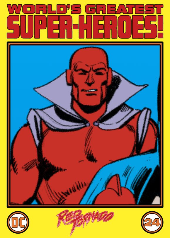
3. Red Tornado. I have nothing against Len Wein’s redesign of Red Tornado’s uniform but I think it lost quite a bit of the android/robotic feel of the original design. But I get it — this costume, as cool and simple as it is, is a bit of a relic of Earth-Two and is not as suited for his move to Earth-One. Still, I love that vaguely Iron Man-esque head and mechanical visage.
—
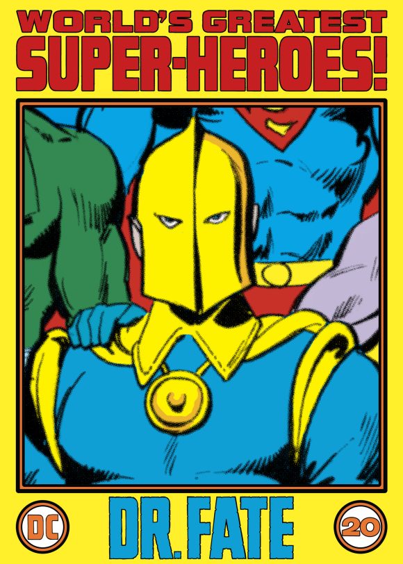
2. Doctor Fate. Mystical heroes aren’t usually for me, but there’s something about Dr. Fate. Part of his appeal is that his transformation from Kent Nelson is confined to his mind. And that helmet! It’s simply great; I can’t think of another hero who wears anything like it. Here he’s sporting a classic super-hero pose, in that fabulous blue-and-yellow costume. The stance seems so out of character yet is very charming.
—
1. The Earth-Two Robin in his Bat-Duds! How could I not close out the list with my other fave, the Earth-Two Robin?!? Man, I love that costume and I was so giddy to see it included. After all this time, I’m finally able to articulate why it’s always been higher on my list than the Neal Adams redesign.
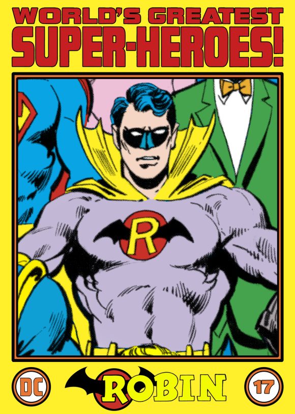
Adams’ updated Robin costume that adorned the grown-up Boy Wonder in All-Star Comics #58 is great, but it could have been easily transferred over to and worn by the Earth-One Robin — which it was when it made its debut in Justice League of America #92. And that’s the difference! Robin’s Batman-style duds are part and parcel of Earth-Two and the 1960s when the Batman TV show craze was still in high fashion.
Make no mistake: Robin’s Batman-style duds are campy. But they’re wonderful and hark back to a simpler time, a Pow-Zap-Bam period not suited to the then-evolving Earth-One or any modern-age DC Universe. Its design is nostalgic in all the best ways and that’s not something that can be said about the Adams costume, which transcends a point in time. If it’s not looked at in that context, I can see how it’s easy to laugh at, but it stands as a testament to an era when young readers could embrace both the fantastic and farcical and not take their comics — or themselves — too seriously!
—
MORE
— An INSIDE LOOK at a Masterpiece: 1971’s DC 100-PAGE SUPER SPECTACULAR #6 Cover. Click here.
— The TOP 13 DC COMICS Logos of 1977. Click here.
—
A 10-year-old Walt Grogan fell in love with the Big Red Cheese thanks to essays written by Dick Lupoff and Don Thompson in the paperback edition of All in Color for a Dime, released in 1970 and bought for him by his father off a paperback spinner rack in a liquor store on the South Side of Chicago. Walt runs The Marvel Family Web Facebook page devoted to all incarnations of the Fawcett/DC Captain Marvel and blogs about Captain Marvel at shazamshistorama.com.
October 5, 2025
Always loved the goofiness of Earth-Two Robin’s original costume
October 5, 2025
You and me both, Mike!
October 5, 2025
You aren’t wrong about that E2 Robin costume – it’s the bee’s knees. I have an article about it in RETROFAN #42.
October 5, 2025
Hey, Jim. Got my order in for Retro Fan already. And I’m right there with you on the “bee-zy-ness” of that costume.
I was very disappointed that “All Star – 58” went backwards on Earth-2’s evolution. They’ve seemed to turn his age back some as depicted in his physical appearance/size. Of course, Perez made him an old man in his “Crisis” run.
I hope that McFarlane comes out with a figure in this style some day.
October 5, 2025
Jim! I’m looking forward to your article!
October 5, 2025
Though Black Canary should be standing by Green Arrow, it is a great cover. I wonder if anyone has the original art for it.
October 5, 2025
Re: Mostly Smiling Heroes… Even Batman! The more I look at the illustration the more I think Neal intentionally went with the idea that everyone was posing for a group shot and, just like in a real life group pic, some people were caught not smiling, half smiling or even even an awkward pose. Nice touch from the master.
October 5, 2025
I know a reprint of this book was done some years ago, but this wonderful Adams cover was not used for some reason. (The redrawn cover was adequate, but it simply wasn’t up to Adams’ standards.) How do we get a more accurate facsimile edition, with a special outer cover for the !@#$#@! UPC?
October 5, 2025
I saw the reprint & some places were different, especially Wonder Woman’s eyes on the front cover. Dick Giordano made them bigger but it looked weird. I noticed other retouches. But I thought otherwise it was from the original Adams/Giordano cover. No? I mean, who could’ve redone it without us noticing?
October 5, 2025
One of my favorite covers of all time too. But wouldn’t it have been even greater if they hadn’t used the spotlight approach where only three heroes were shown brightly while everyone else was colored as if in the dark?
October 6, 2025
It’s one of my favorites, right next to the “World’s Greatest Flying Heroes” Superman issue.
October 11, 2025
Why isn’t Mr. Terrific smiling? Probably because he knew he would soon have a less than terrific date with a certain Spirit King…