
A Silver-lined list for the expert or the newcomer…
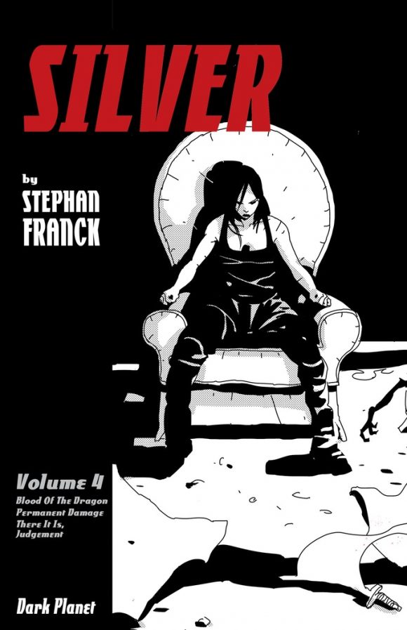
Dark Planet’s Stephan Franck is prepping the final volume of his cult-fave vampire-hunter-cum-caper graphic novel series Silver via Kickstarter. The project, which has gotten props from the likes of Jim Lee, Bill Sienkiewicz and Tim Sale, was funded quickly, which just shows you how well-liked it is. But there are still plenty of buying options available geared toward whatever extras you’re looking to pick off.
You really oughta click here to check it out.
As Franck’s blurb says, “A group of con men and the descendant of Van Helsing team up to steal a treasure… from a castle full of vampires. What could go wrong?!”
Franck’s work conveys serious attention to comics’ visual language, which a lot of readers — long-timers and newbies alike — take for granted. So he’s put together a terrific list of 13 VISUAL STORYTELLING TIPS FOR COMICS — featuring the art of Jim Aparo, Dave Gibbons, Jack Kirby and other greats.
Check it out. — Dan
—
By STEPHAN FRANCK
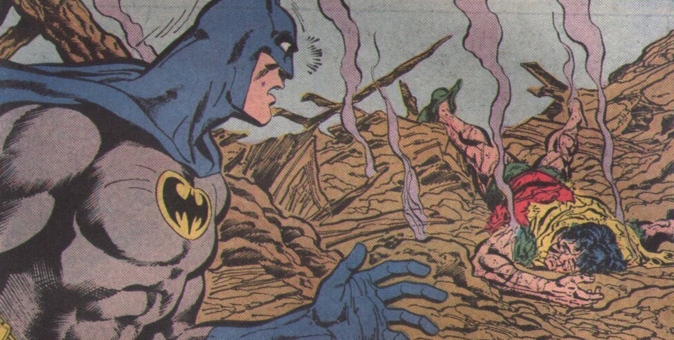
1. Whose Moment is This? In telling a story visually, the goal is to move past what I call “asset management” (aka: which characters are present, where are they, what are they doing), and get to creating a moment. Capture a vibe. An emotion. A point of view. So underlying all that, I always ask myself, “Whose moment is this?”. Whose experience am I connecting to in this particular image. Of course that doesn’t mean that every shot is a character’s straight POV. In most cases, you represent the external point of view of an observer. But even so, you want to pick the right distance, the right angle, so that you participate correctly in the emotional moment.
In the first image below, we are WITH Batman, discovering the dying Robin ALONG with him.
In this second drawing, we are right there at the scene, and we, ourselves are shaken, as you can see by the Dutch angle, and close enough to feel the tension, but keeping our distance safe enough from Batman. Yet, we are in his way just enough to create a sense that we’re 2 seconds away to get yelled at to get the fuck away from him, or getting punched in the face.
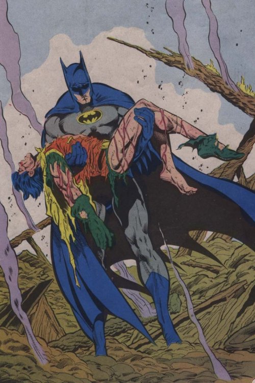
Also did I mention that Jim Aparo is one of my favorite artists?
—
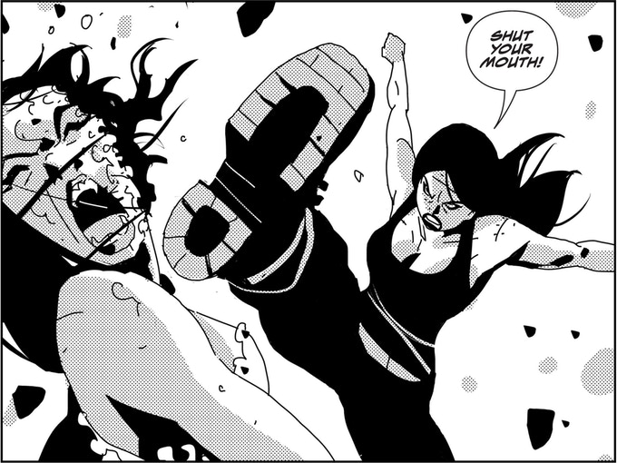
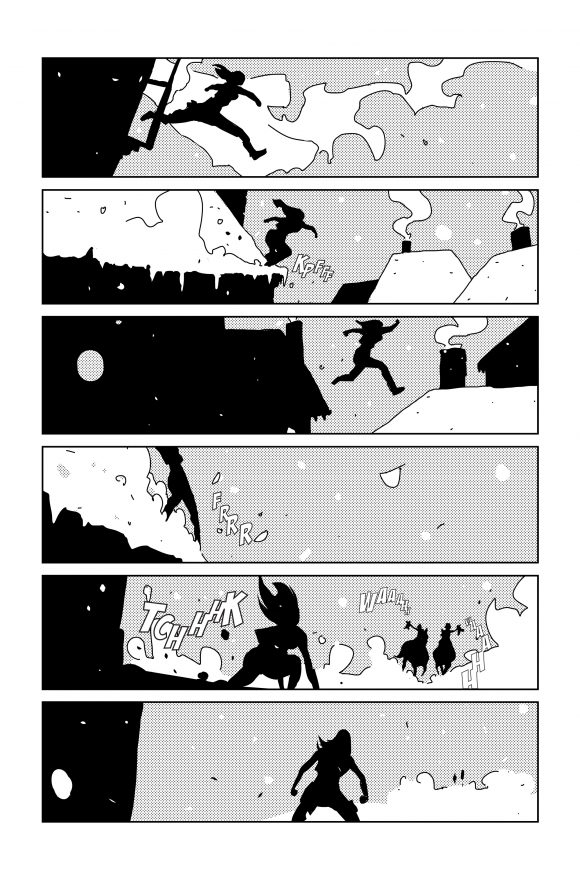
2. Compress. Masters such as Jack Kirby had the ability to put together giant cosmic epics that would feel complete and satisfying in 18 pages. That was achieved with a “compressed” style of storytelling in which big iconic images and bridge-over text combine to progress the story by leaps and bounds while delivering impact. Later, comics developed a “decompressed” style of storytelling that plays the action more moment to moment. Modern comics use a combination of both. I find that compressed storytelling is particularly great when you want to introduce a character by showing them in action, but the bit of action in question is not a big part of the plot. It’s more about getting the vibe for the character. In the example below we introduce Sledge with this first fight. We don’t care about how the fight actually goes, or about who is that vampire. We just want to get a sense of what Sledge is about, so that is done in just three panels.
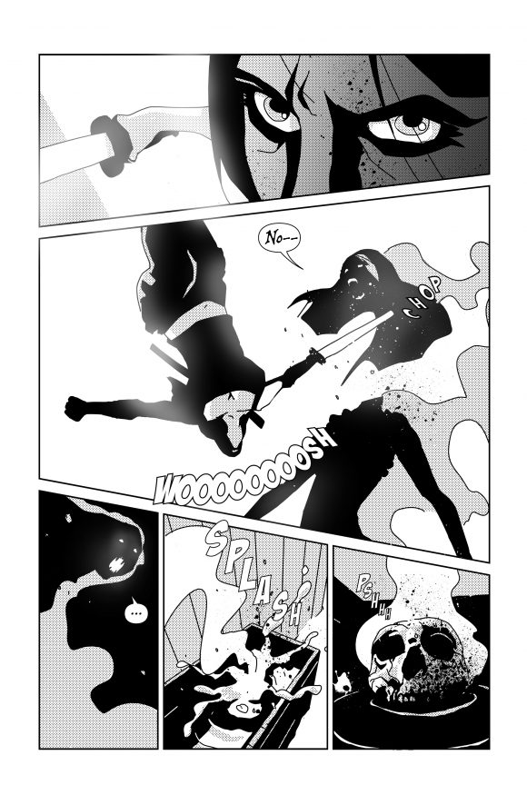
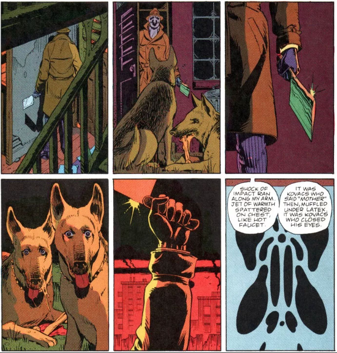
This gives you the moment’s impact and texture without getting involved with any kind of play-by-play. It is also great when you want to deliver certain tropes, hitting them will full force, but moving on quickly before the reader feels like I’m belaboring familiar ideas. A great example of compressed storytelling that delivers the idea spectacularly, but without getting involved with story beats that are beyond the dramatic scope of the story, is this image from Watchmen. It pretty much tells you all you need to know about Dr. Manhattan’s military involvement in the Vietnam War. It may have been going on for years, but it’s presented in one image.

—
3. Decompress: Meanwhile, you want to decompress the storytelling when leaning into original ideas, key plot points or important action or suspense moments that need to be tracked and dramatized. It’s also needed for important character moments, and especially emotional conversations during which a character turns. A great example is also from Watchmen: As Rorschach proceeds to kill the dogs, the scene is decompressed so that we experience the scene with all the amount of dread, second-guessing and deliberateness required.
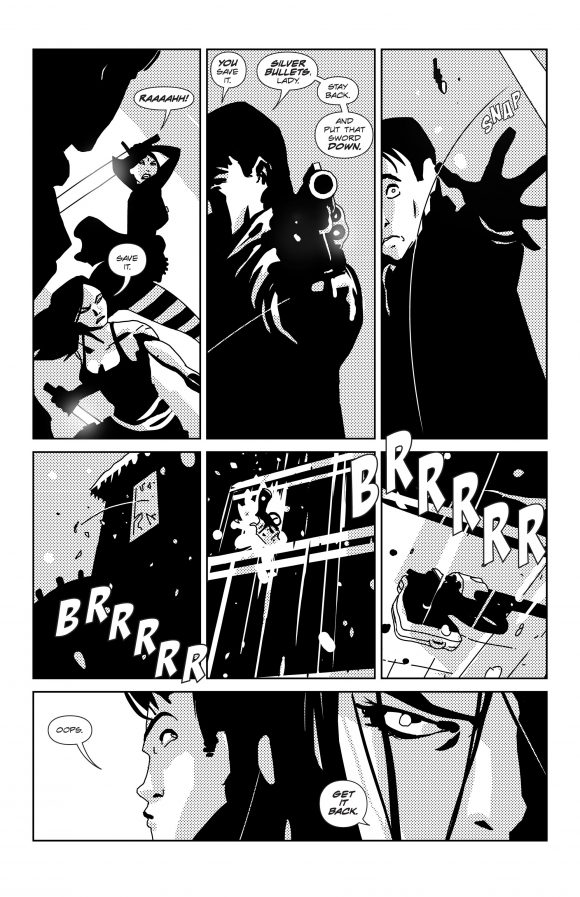
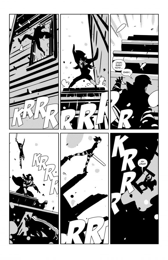
Below are two consecutive pages from Silver Vol. 3, as an example of decompressed action, where you track the play-by-play and keep score on what’s happening:
—
4. Show, Don’t Tell. Like film, comics is obviously a visual medium, and you want to express most of the ideas visually, first and foremost through the characters’ actions. I take it as a win when I letter a finished page and find that I can lose pieces of dialogue because the visuals already carry the story points. The example here is from Silver, and by the way, it also happens to be a decompressed action moment:
—
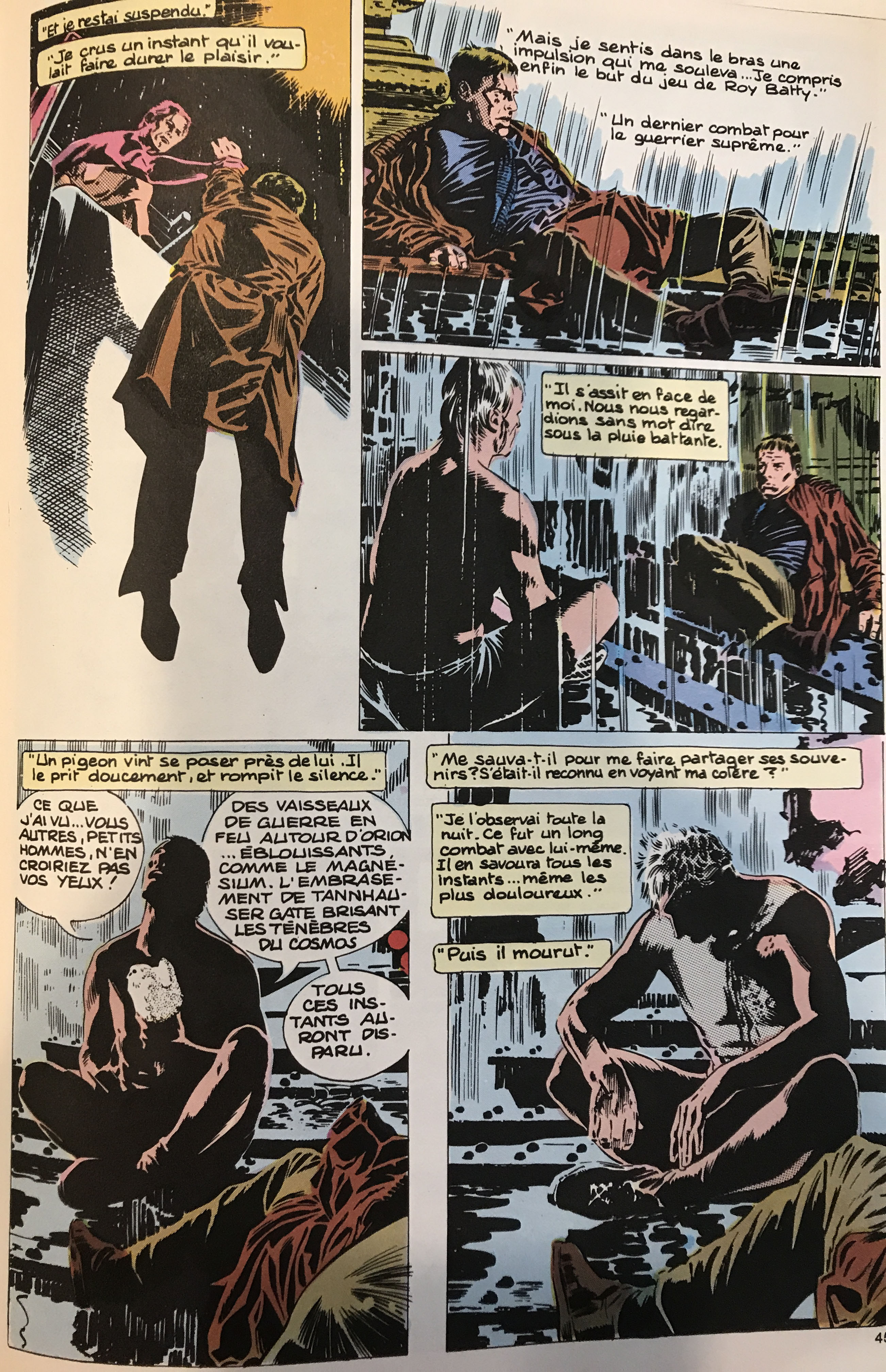
5. Tell, Don’t Show. Understand what your moment is about. Is it about the information being conveyed, or is it about the characters? If it is the latter, you want to resist the temptation to cut a visual representation of the piece of info in question, and stay with the characters discussing it, and giving them the appropriate acting moment. A classic example would be the final scene between Decker and Batty in Blade Runner. The scene is not about giving us a back story on what happened at the Tannhauser Gate. If that was the case, you would want to cut to a flashback showing those starships on fire. The scene is about Decker looking into Batty’s eyes, and realizing that Batty’s existence is as valuable as anyone else’s. So you want to stay on the characters. Meanwhile, in a heist story like Silver, you may have a complex set of threads to weave together, and you want the story to remain linear and digestible, so choosing what you show from what you tell is paramount. Of course, the storytelling choice was made in Blade Runner the movie, but here’s the beautiful Al Williamson comic adaptation (in French, no less):
—
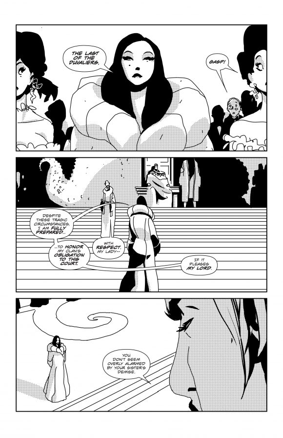
6. Create Signature Design Elements. Let’s face it, drawing characters that remain consistent through expression changes, different angles, and whatever kind of drawing day you’re having, is hard. That’s why you want to design characters that have certain unmistakable signature shapes and elements. Take Sledge and Lillian, for instance. Sure, Sledge has a more feral presence, while Lillian has a more aristocratic vibe, but that’s in resting pose. When they swing their swords, jumping around, they could easily blend together. That’s why Sledge always has that tank top, and Lillian always has that specific coat. That’s why Sledge’s hair is fairly wild, and Lillian’s has that specific shape. That’s why Liilian has a mole. That’s why Finnegan, for instance, has that signature hair shape, with the spiky hair in the front and higher shape in the back. That is very common in traditional animation, where hundreds of artists draw the same characters. Watch The Little Mermaid and pay attention to the drawings and you’ll see that Ariel looks completely different from scene to scene. But once you have the signature hair shape and the shell bikini, it’s the Little Mermaid.
In the example below, Lillian’s signature elements make her immediately recognizable from any angle or distance:
—
7. Avoid Meta Shapes. This is about keeping sequential art sequential. Each panel is supposed to be its own little slice of space time, and (unless that is the intended effect) you generally want to avoid having visual elements from one panel seeming to merge into other visual elements from another panel. For instance, avoid lines that form tangents across panels. That is even more true with black shapes that inadvertently seem to continue from one panel to the next as if an ink bottle had been spilled over the page, forming what I call meta shapes. These become visual worm holes that link the panels visually, destroy the illusion of sequentiality. It’s hard to prove a negative, so just trust me on this one.
—
8. Avoid Visual Repetition. Unless you want to decompress time for dramatic reason, and have the same panel several times with only minor changes, because you’re hyper-dramatizing a contained action, you want to avoid visual repetition on the page. By repetition, I mean, for instance, a face that is seen from a certain angle in one panel and appears in the same angle, just 50 percent bigger two panels later. Here too, you can’t prove a negative, so you’ll have to take my word for it.
—
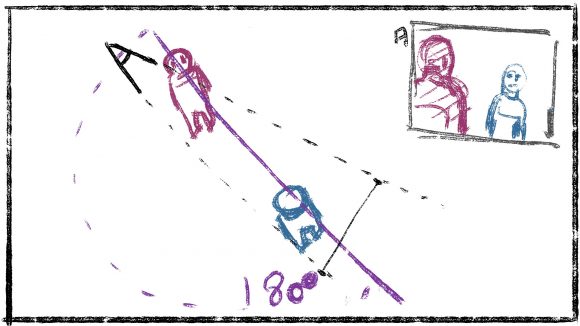
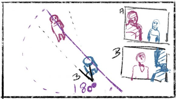
9. Keep the Scenic Space Consistent. Fair warning: This might be a controversial point. Coming from film, I am used to keeping the virtual space within a scene consistent. That means, for example, never crossing the 180 line while blocking out a sequence. This results in the characters staying consistently on one side of the image, even when you shoot around them, which keeps the audience oriented as far as who is who, and who is where. Along the same lines, avoid reversing the left-to-right or right-to-left presentation of the action in the middle of a moment that you want the audience to track and keep score on. So while I know that many comic artists — including super great ones — think in terms of the overall graphic quality of the printed page, and have thoughts like “always have the character who talks first on the left side of the panel for an easier balloon placement,” I am of the opposite school of thought, which is to keep the scenic space of the sequence consistent in its presentation so the reader can focus on the dramatic and emotional impact as opposed to expanding mental capacities reassembling the scene.
The sketches bellow illustrate the 180 rule, and how it is implemented when placing your camera around the scene:
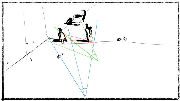
Also, unless there is a dramatic or POV reason to do otherwise, it’s good to start blocking out the scene with basic camera conventions: Move closer to axis (more frontal view) on the characters the closer you get. I feel that comics are often guilty of weird side or 3/4 close-ups that disconnect the reader from the character:
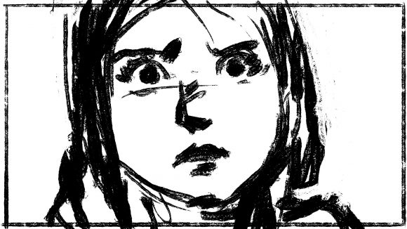
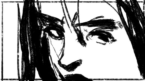
As you can see on the example below, the two angles create different emotions, and different relationships between the reader and the character. In the frontal shot, we are WITH her, wondering what WE are going to do next. In the side shot, the reader is disconnected from her, and we’re bracing for HER next move, wondering what it is going to be:
—
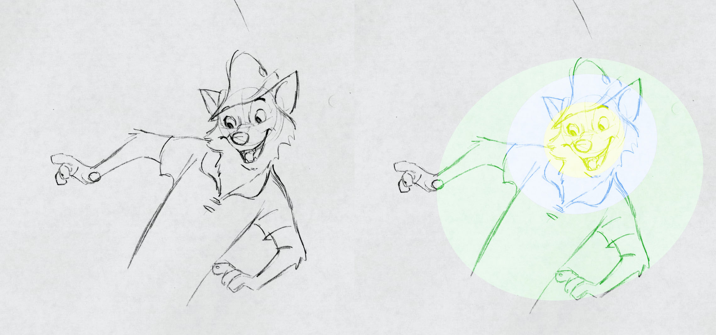
10. Create Visual Bullseyes. One of the key aspects of visual storytelling is the ability to control where the reader’s eye goes at any given time. That is done by controlling the amount of visual activity (aka, contrasting how busy different parts of the drawing are) by composing the image in concentric circles around the dramatic focal point. The all-time master of this was legendary Disney animator Milt Kahl, who, if you don’t follow animation, was to Disney what Kirby was to Marvel:
—
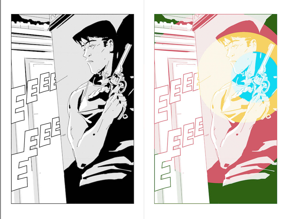
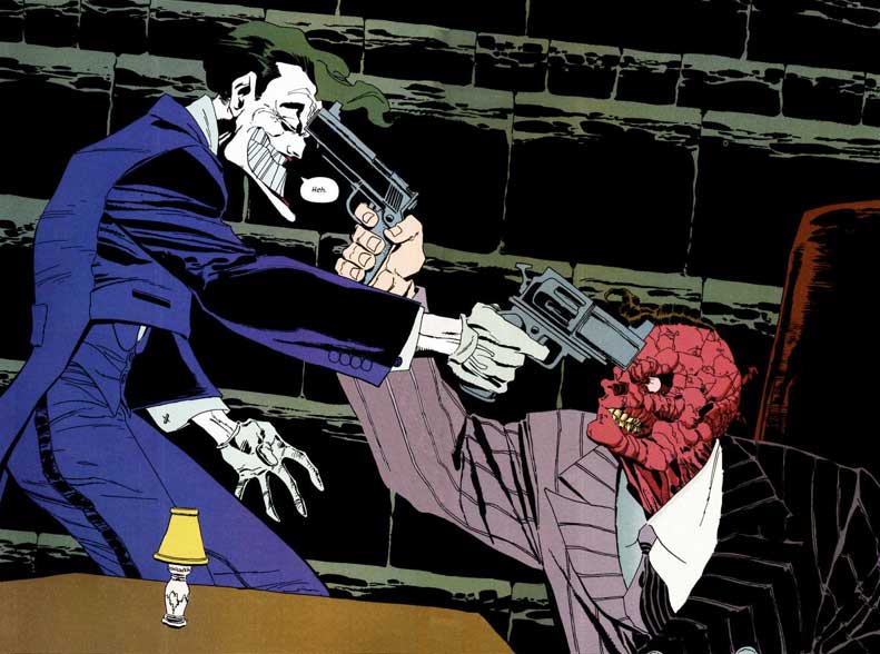
11. One Killer Element Per Panel, One Killer Panel Per Page. Just like in music, you don’t want everything to be cranked up to 11. Instead, you want dynamics in your visual approach. Frank Frazetta used to say that there should only be one killer detail that “makes” the painting. To me, the same goes with a comic panel. Get ONE detail in there that gives killer creds to the drawing — one detail that would make the image just a little too vague and generic if it were missing. Then let everything else blend in and stay out of the way of the moment, the comedy or the drama. Similarly, the page itself needs to have peaks and valleys. So usually, one killer panel does it. Not that the other ones need to be weak. They just need to dial the intensity back, so one thing on the page really pops. Again, nothing will sound like a high note if you scream the entire time.
In my example below, the one key element is, of course, the hand gripping the gun (and the bullseyes effect is also in play):
—
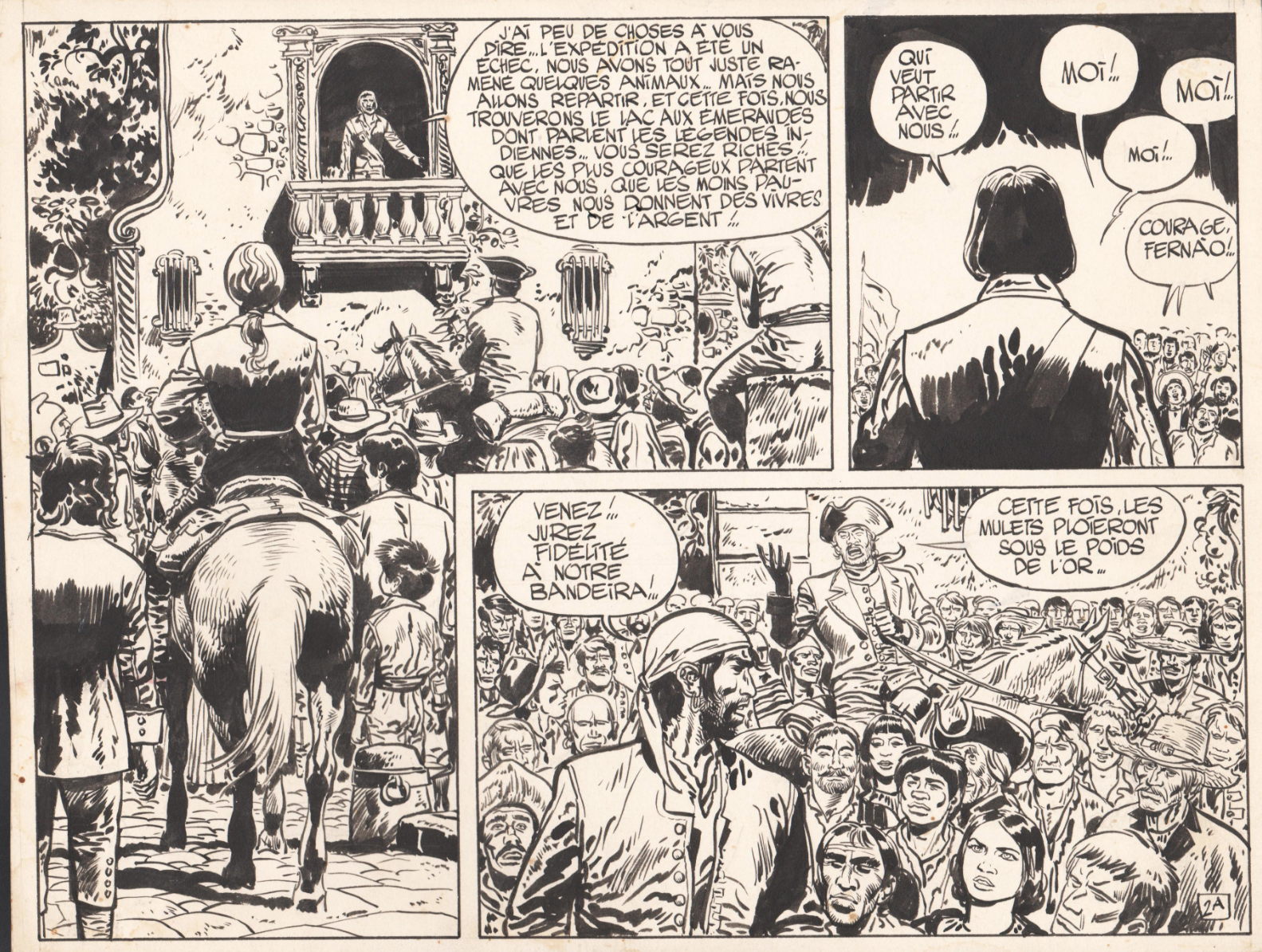
12. Work in Half-Pages or in Double-Pages. In European BD, where artists often cram tons of background elements and details into each panel — and where the format is usually based on a four-strip grid, as opposed to a three-strip grid in US comics — it is not rare for people to work half a page at a time. This allows them to work at a large original size that allows for all that detailed work. Jean Giraud, aka Moebius, for instance, was the master of the half-page. Meanwhile, in the US comic format that I use (although people say my European roots sometimes show), the visual approach is more about a fluid flow of storytelling. Once established, details are not repeated for texture from panel to panel unless they are involved in the actual story point. In that context, I like to work two pages at a time, so I can control the flow across the double-page, which will be the experience of the reader. It also makes me work twice as fast, somehow!
—
13. Lastly, Be a Cartoonist. Regardless of the fact that the audience perceives movies like The Avengers as live-action movies, those movies are actually well over 50 percent animation. Similarly, no matter how the readers perceive comic-book drawings as realistic, they are always coming from a very pushed point of view. Whether it’s Kirby’s unique version of anatomy, or Bill Sienkiewicz’s mix of fine art naturalism with classic caricature and abstract painting, they offer a sensory experience to the reader that goes way beyond a literal representation of what’s happening. Their cartooning takes you to a place of sensation and emotion that captures the reader’s imagination, and create unique images that, once seen, cannot be unseen. Here are some wonderful examples by Jack Kirby, Bill Sienkiewicz and Tim Sale:
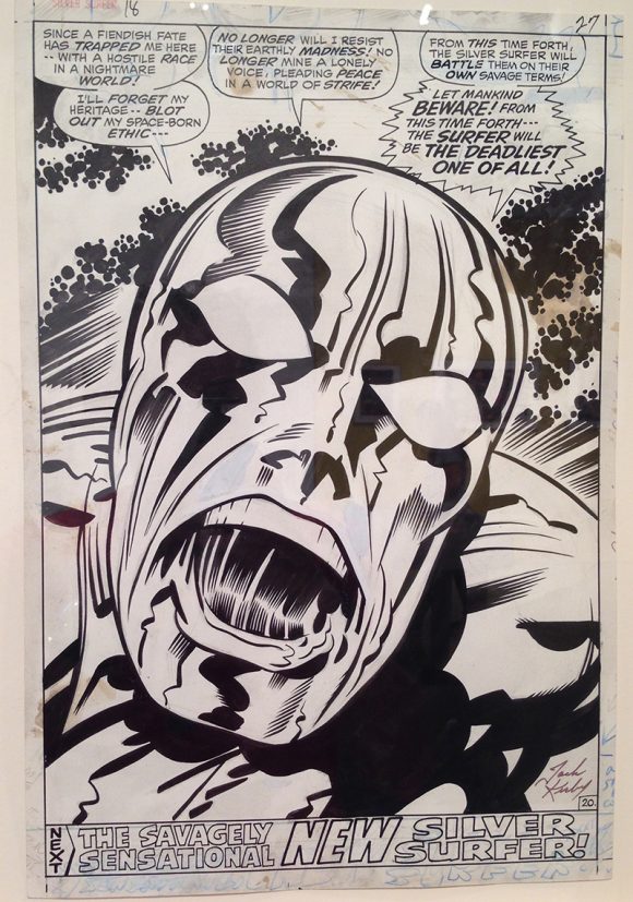
Coming from animation, “cartoon” used to be a loaded word in my mind. We animators always felt like it diminished what we did —”Excuse me, we are serious people. We do feature animation around here.” Fifteen years ago, we even changed the name of our union from “Screen Cartoonist Union” to “The Animation Guild.” Or TAG. Because, you know… SAG. But since then, I’ve come to appreciate the “cartooning” of it. The bigger-than-life of it. The exaggeration, without which the stuff feels literal, boring and tacky to me.
So, here’s to being a cartoonist. Once a scarlet letter, I now wear that word like a badge of honor.
—
Dark Planet’s Silver Vol. 4 is on Kickstarter now. Click here for more info.
August 26, 2018
great information thanks