
Carver creator Chris Hunt discovers a mixture of sharp-eyed science and instinctive alchemy…
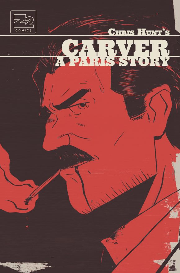
Trade cover
Chris Hunt’s Carver was a breakout book for upstart Z2 Comics and the trade is out this week. It’s like Hemingway crossed with Corto Maltese, a two-fisted European adventure.
Hunt is a protege of Paul Pope and it’s clear he’s learned his lessons well. So well, he’s here to give you a 13-step viewpoint on creating a great comics cover that will, proverbially speaking, outmuscle the competition on the racks.
Oh, and Chris will be signing at the Z2 Comics booth at 11 a.m. on Saturday 10/8 at New York Comic Con. Aaand, check out your FIRST LOOK at Matt Taylor’s NYCC EXCLUSIVE variant cover, below. — Dan
By CHRIS HUNT
Like most aspects of my skill set, I’m self-taught. That isn’t to say that I’ve just been winging it for the better part of the last decade though. On the contrary, I’ve sought to absorb, study and consult with as many sources on the subject of comic-book creation as I could get my hands on, in order to develop my skills as a comic-book artist and writer. I take this as a point of pride personally, but the challenge with it is that I only seek out the knowledge that I know I’m lacking in, i.e. when I’m presented with a problem I cannot solve at the ready.
Designing a comic-book page that works with words and imagery is a niche skill set that doesn’t really apply anywhere else in graphic art. Because my focus has been constructing, writing and drawing comic books on the whole, I haven’t spent as much time on another key area, which is the study of comic-book covers and their multiple facets.
Trade cover by Matt Taylor — an NYCC exclusive variant
Since Carver was a totally new book, from an unknown writer/artist (Hi, Chris Hunt. Nice to meet you.), I felt that it was extremely important for the covers to stand out on a shelf, regardless of what titles the books were shelved next to. I remember hearing somewhere years ago that when you’re thinking about your book, you want to picture it on a shelf in a comic-book store, but from the other side of the room about 20 feet away. If it takes you more than just a couple seconds to locate it, then you can be assured that the cover is in no way going to arrest the attention of a casual consumer who has no knowledge of you or your story.
I’m good at taking things apart in order to understand how they work. It’s probably safe to say that’s the one actual talent I have that’s allowed me to toil remotely for years in self-directed study. With that in mind, since I wasn’t immediately good at covers, I decided I’d evaluate the good ones as objectively as I could and attempt to exploit the blind spots in the retail environment itself.
There are a number of great shops in New York City close to where I was living in Manhattan at the time, and they all have their own vibe and clientele. So I decided that I’d go out and do “the Pepsi Challenge,” so to speak, and evaluate not just the books and their covers, but how they were shelved.
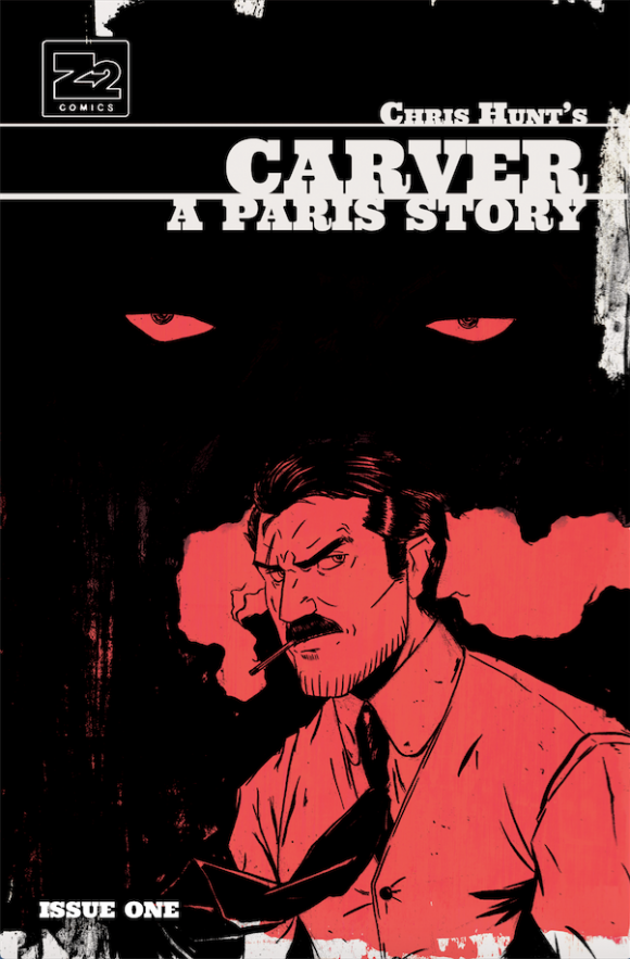
Issue #1
So what did I learn? The 13 steps to creating a great cover:
1. Shelf Awareness. Pretty much across the board, I realized that most of the stores went straight up alphabetical with new comics, a simple observation that I just never registered at all for some reason. So I started sizing up the competition by looking at the other “C” books I’d most likely get shelved next to. Oddly enough I got lucky, because there aren’t that many big comic books that start with the third letter of the alphabet, so the only book I could count on 100 percent being somewhere in the vicinity of my book was Captain America from Marvel.
2. Scour the Competition. Going a little further, I noticed that Captain America and many of the color palettes on the bigger books across the shelves really relied heavily on blue. For the standard cover of Carver Issue #1, I drew a scowling close-up of Francis, cigarette dangling from his lips, and smoke curling about his head. Paul did a wider shot of Francis, seemingly caught in arrested motion as he taunts enemies that exist outside the frame of the shot. Both covers used red and black, a color combo I wasn’t seeing a lot of at the time, and our two covers were designed to complement each other — his being mostly red, with bits of black, whereas mine was almost all black, with Francis essentially being cut from the background as a red shape. Why red, you ask? Simply because it would contrast heavily with all those blue books I was seeing.
Issue #1 Paul Pope variant
3. Bring Harmony. Most of the covers I’ve seen have multiple subjects with either the tried-and-true extreme perspective pushes, or abstract, clever visual riddles or illusions that rely heavily on a knowledge and ability to articulate design as a visual language. The latter, though I admire it immensely, just isn’t in my wheelhouse. In my mind, the covers I’ve loved are the ones that are able to showcase several different points of interest, while giving the impression that every element on the cover was placed there deliberately and in order to serve the cover as a whole. I’m always trying to avoid making a cover that lacks harmony between the logo of a book and the cover image itself — meaning that if my eye is consistently drawn from a company’s logo to a book title header to the cover image itself, I am not registering one cohesive design, I am registering three competing elements.
4. Collaboration is Key. I broke my analysis down to a handful of hypotheses. I then brought my analysis to Tyler Boss, who was the amazing artist that handled the heavy lifting on laying out the book, as well as doing the finishing touches on the covers and interior pages. I’ve always held to the opinion that if you’re not really good at something, hire the best person you can that’s better than you at that thing. On Carver, that person was Tyler, and I am incredibly grateful that he was on this book, because he is the one responsible for pulling all the pieces together and making any amateur attempt on my part look professional.
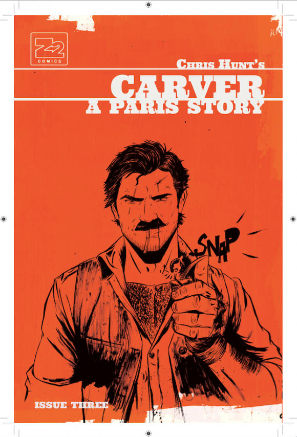
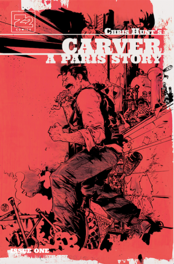
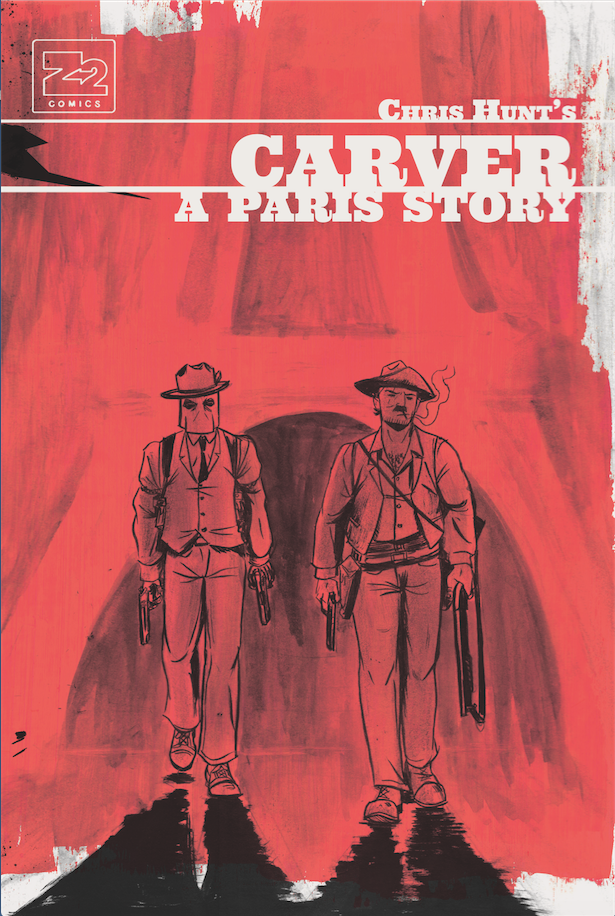
Issue #3
5. It’s Iconic. Since the purpose of a cover is getting a stranger to pick up your book and look at it, what made the most sense to me on the most basic level, was to make the covers as simple and iconic as possible. Using one subject and one color is. This was my best shot to make sure my book is riveting from 20 feet away. I discussed this logic with Tyler and Paul, who provided two variant covers for Issue #1 and the book’s preface. He too felt that a simple, iconic approach was best, so his two covers are a reflection of the same logic.
6. When Something Works, Run With It. I started talking to Tyler early on, so we could get on the same page, and make sure we were going to be working on parallel tracks. I knew creating a series of covers was going to be a sprint, so I wanted Tyler and me to have the visual language locked in so that with each cover for the Carver series, instead of reinventing the wheel every time, our discussions could simply be focused on what color would we use in the monochrome cover, and where to crop the image. Simple, fast, consistent.
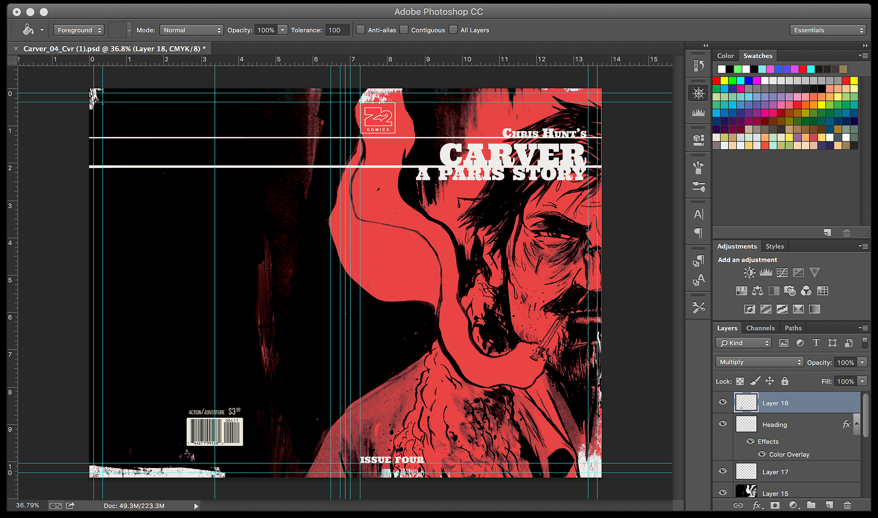
7. Don’t Reinvent the Wheel. The Carver publisher, Z2 Comics, Tyler and myself all agreed that we wanted the book to be evocative of old adventure books, which came to be reflected both in the title header design and font, as well as in the weathered appearance the book came to have. Tyler then spent a good deal of time developing a Photoshop template that had several layers of textures, washes and weathering that allowed us to essentially drop in the cover art with minor tweaks each time.
8. Stealing as Flattery. With each subsequent issue, we decided to cycle through high contrast, bright colors keeping in line with the logic that it would stand out, but I have to come clean here and admit where the idea for what colors we used came from. I’m a huge fan of the old Penguin Books from the ’30s and ’40s. For those of you who don’t know what I’m talking about, back in 1935 when Penguin came to exist as an offbeat (for its time) company producing cheap paperback editions of books, they used a color-coded system for categorizing genres. The only way a Penguin book differed from another was the title and the description, and what color it was. Everything else, font, layout and design was consistent across all books. It is no coincidence that the five issues of Carver were red, blue, orange, purple and yellow.
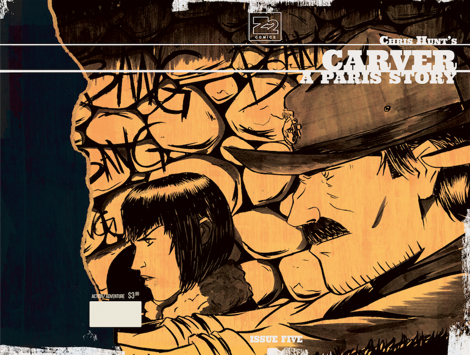
Issue #5
9. Why Characters On The Covers? Each issue of Carver: A Paris Story, with the exception of the fifth, focused primarily on one subject at a time, usually Francis, the protagonist. As I mentioned previously, I became fixated on the notion that the covers would remain simple, single subject pieces. My logic was that without describing the details of the story, they could evoke the important player in each particular issue. Not only that, I wanted the covers to also indicate to some degree the state in which you would find that player. So for example, Issue #1 is the scowling, archetypal mask of Carver, the tough-guy image we are introduced to at the start of the story, but by the time we hit Issue #4, it’s a close-up crop of him bruised and bleeding, pointing out the emotional and physical abuse he’s endured up to that point in the story.
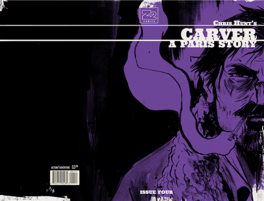
Issue #4
10. Covers as a Set. Another reason for the simple subjects and the bold, monotone design of the books, is that I imagined the issues, variants included, as a set once printed and released. Obviously there are shared elements between covers in any comic-book series, but I liked the idea that due to the uniformity of the template Tyler developed, that it wouldn’t matter who had drawn the cover art, there would be an obvious relationship between them all. I envision it as a design landscape where each cover was one element of a larger design container.
11. Easter Eggs. There was one unique cover that I’m particularly proud of with elements that no one has picked up on (to my knowledge yet) but it’s a bit of a spoiler, so consider yourself warned. Issue #2 was the only cover not to feature the protagonist, Francis Carver. Instead it was a medium shot of the antagonist of the story, Stacker Lee, standing against a wall. This is actually a play on old criminal mugshots from the 1920s I’d come across, with the individual’s information written directly on the photo in grease pen. At the end of the story, through means I won’t go into detail about, the reader and Francis finally learn who Stacker actually is. You’ll have to read the book to find out, but directly on the cover of Issue #2, above Stacker staring out at the audience, it clearly reads “M. Web-”, the first initial in Stacker’s real name and the first three letters of his last name, right above his alias, “Stacker Lee.”
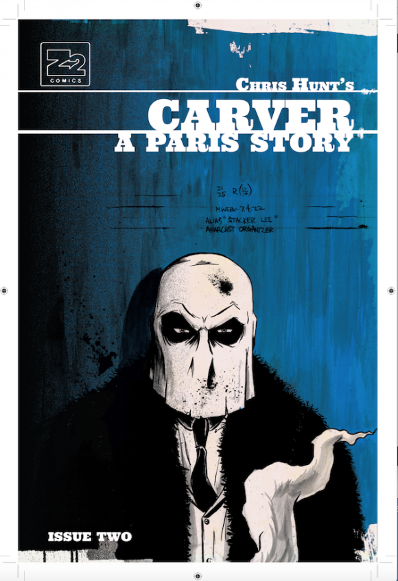
Issue #2
12. Covers As Magic Tricks. Part of the challenge you’ll encounter when you’re releasing a brand-new story as an unknown author, is not only the aforementioned fight for attention on the shelf at the comic store, but also staying power. Once upon a time in another life, I was a sleight-of-hand magician. I was really only ever passable, but I practiced enough that I was a fairly decent mechanic with a deck of cards. If you ask any magician, they’ll all tell you that the greatest asset they have is the audience — the people they perform for. One simple trick will be described, the story retold over months, if not years, always growing in size and the skill of the magician. Why is that? I believe a great deal of it comes down to having a strong association with an event, place and person, so strong that the ability to recall in specific details overshadows the memory that exists in the broad strokes. I recognize that this may sound crackpot but this is why I wanted the strong, simple imagery in repetition with the covers. I wanted to beat people over the head with it, so that years from now if someone said, “Carver” the first thing someone would think about were those covers.
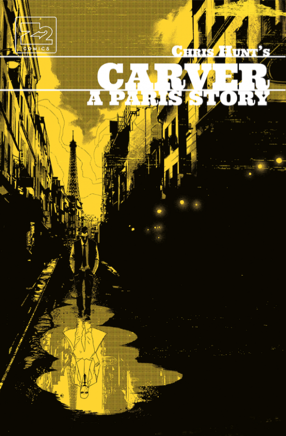
Unused cover to Issue #5
13. The Trade. So we come to the end, the last stop on the train. After eight unique covers, all built and designed around the above logic, how could we begin to encapsulate all of that in one image? Often times, the trade paperback will be the entry point for new readers, even more so than the individual issues tend to be, so it was agreed to stick with same design plan. The trade in many ways is a more distilled version of my original image for Issue #1, also keeping the heavy use of black and red, with one key difference: the crop. I felt it best to double down on the strength of Carver’s silhouette and my ability to emote through my drawings.
Trade cover
From the beginning, part of what I liked about the single-subject covers was the ability to present them in a way that they almost appeared to stare out from the rack at a viewer. With the trade I wanted to take it a step further. I drew Carver with his beaten, bloody face and dirty collar, with a scowl designed to taunt the reader. I wanted someone walking past the book to almost feel as though they had inadvertently made eye contact with someone, someone they probably wouldn’t want to cross in a dark alley. I wanted to emotionally arrest them.
Ultimately, it seems as though we did our job. Since the issues started coming out, I’ve received a number of comments about the books’ designs, and how they jumped up out of the chaos of the shelves, to catch people’s eyes. I won’t be winning any design awards anytime soon (though Tyler certainly should) but that’s fine with me. I’m not a designer, I’m a tinkerer at best, someone who has gotten good at faking it before I make it, time and time again. Now that everyone knows my secret, I’ll probably have to hire Tyler full time myself here on out. That’s the only way to outdo ourselves on the next rodeo.
—
Chris Hunt is an American cartoonist born in Columbus, Ohio, and raised in Boise, Idaho. Never formally educated, Hunt developed his talents mostly through self-directed study, and the generous guidance of his friend and mentor, Paul Pope, whose comics Chris was inspired by at a young age. He worked on the Ghostface Killah comic 12 Reasons to Die for Black Mask, and has also done artwork for IDW, Vertigo and ZIP Comics and film and music industry work for AMC, Biz3 Mgmt, Tribeca Film and the Universal Music Group. In 2010, Hunt was invited to study as a resident artist at the Atlantic Center for the Arts, under Pope. Hunt‘s Carver: A Paris Story expands the story of Francis Carver, the gentleman of fortune who premiered in Hunt’s self-published Volume One.