
TOYHEM: A lotta pretty — and a lotta, well…

—
Welcome to TOYHEM! For the holiday season, we’re bringing you a series of features and columns celebrating the toys of our youth, which often made for the best memories this time of year. You’ll be hearing from comics creators, regular 13th Dimension contributors and more. Click here to check out the complete index of stories — and have a Merry Christmas, a Happy Chanukah and Happy Holidays! — Dan
—
Here’s the thing about TOYHEM: We cover a ton of ground — Captain Action, G.I. Joe., Star Wars and whatnot — but there’s a heavy accent on Mego. Why? Because Mego’s World’s Greatest Super-Heroes line is the best toy series in the history of mankind, that’s why.
So it’s endlessly fascinating to look at the action figures that dominated so many of our childhoods from many different angles. That’s why I’ve enlisted 13th Dimension regular Anthony Durso — a graphic design magician who runs the customizing company The Toyroom — to take a look at Mego’s famed boxes from an aesthetic standpoint.
The other day we ran Anthony’s 13 GROOVY CUSTOM MEGO BOXES THAT WILL MAKE YOUR DAY (click here).

Examples of Anthony’s customs
Now, here are 13 MEGO BOXES: THE GREAT AND LESS-THAN-GREAT. (And yes, these are all pix of Anthony’s repros. Details below on how to get your hands on them — or any others you might need.)
—
By ANTHONY DURSO
I LOVE Mego boxes! How can I not? What started as a hobby many years ago (reproducing Mego boxes) has since become a profession for me. Not to mention the nostalgia factor.
But as much as I love Mego boxes, I also dislike them. Some of them anyway. Looking at them now, 45-plus years later, with a designer’s eye, some fall short for me. But whether I love or loathe, as a collective group they’re probably the best-looking line of packaging that still hits all the feels for most kids who grew up in the ’70s.
So here are 13 MEGO BOXES: THE GREAT AND LESS-THAN-GREAT in no particular order:
—
Jet Jungle. An obscure add-on to Mego’s World’s Greatest Super-Heroes line, Jet Jungle was first brought to the attention of collectors back in 2005. But the figure was actually produced for the South African market circa 1974. Jet Jungle was a character created to promote Jungle Oats (as the Fittest Man in the World) and he starred in his own radio show on the Springbok network in South Africa.
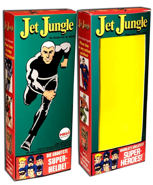
Although the figure is made of leftover material (Action Jackson’s Signal Spy outfit and a modified Bruce Wayne head), it’s a very accurate depiction of Jet Jungle, as illustrated on the box. The box itself uses much of the same basic design as the WGSH boxes: The side squares showcase the DC side of the early WGSH line (Superman, Batman, Robin and Aquaman), while the masthead also includes Captain America and Tarzan. They even found room to promote Jungle Oats on the box!
The red, green and yellow color scheme give the box more POP than the usual singular solid color. All in all it’s a cool mix (including dual language text) that allows Jet Jungle to stand on his own and yet still be a part of the bigger World’s Greatest Super-Heroes picture.
—
Aquaman. Style guide? What’s a style guide? When Mego got the licenses to produce action figures in 8-inch format of super-heroes from Marvel, DC and Edgar Rice Burroughs, they were pretty much left on their own as far as artwork goes. Which is much different from today where corporate conglomerates are VERY particular about how their characters are represented on toy packaging. But back in 1973 it was anything goes.
Case in point: Aquaman. Even in the early Wild West days of merchandising in the ’70s, Aquaman was usually represented by the famous Murphy Anderson “circle” image of the Sea King, um, swimming. Because, as everyone this side of Atlantis knows, that’s what Aquaman does. SWIM.
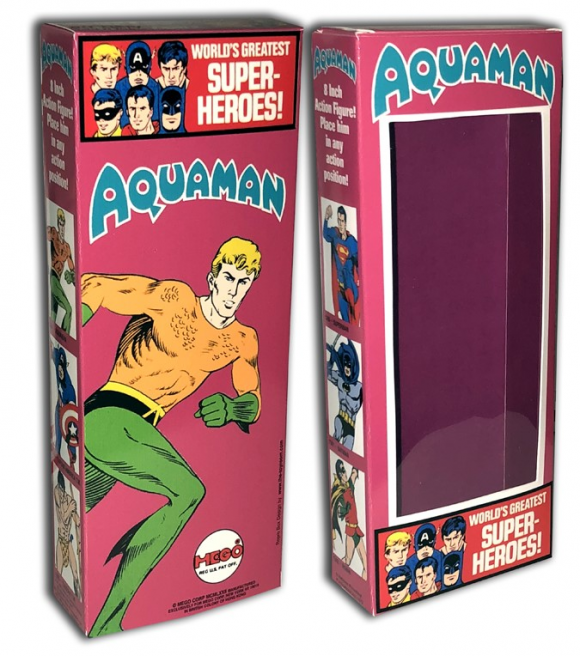
So why is Aquaman RUNNING on the back of his Mego box? Maybe it’s because Mego couldn’t figure out a way to get that particular aforementioned image of swimming Aquaman on the back of the box properly without 1) cropping it or 2) wrapping it around to the sides. So instead they had one of their artists trace over an image of THE FLASH (running, naturally) and change it into Aquaman. Running. Because… Mego.
And while the purple of the box itself is a nice color, combined with the orange and green of Aquaman it just doesn’t work. Orange, green and purple are traditionally super-VILLAIN colors and this is AQUAMAN after all, not Sub-Mariner.
—
Tarzan. Tarzan was part of the second Wave of WGSH characters that were released in 1974 (alongside Captain America and Spider-Man) and was a big “get” for Mego. Unfortunately, they weren’t able to hold onto the rights to the Lord of the Jungle for too long and he faded from the lineup by 1976. He was usually marketed with the DC characters – the company published his comics at the time. (In addition, Tarzan and the two original Marvel characters were briefly promoted alongside the DC characters early on, something that would be unheard of today.)
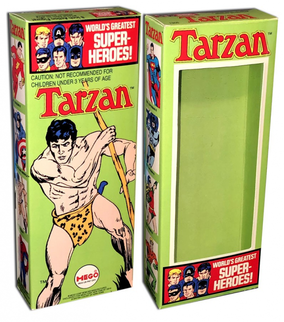
The bright green of his packaging really helps the jungle vibe, while the artwork looks like another redraw/trace as Mego was known to do. This is one of the boxes I recall seeing stacked 10-12 high in a Kay-Bee toy store, probably circa 1975, and it’s always stood out to me.
—
Green Arrow. Mego really kicked it up a notch (two actually) with their 1975 releases. Leaving the “oven mitt” gloves in the past, Mego produced a series of figures that year that really pushed the envelope. Iron Man, Green Goblin, the Lizard, the Falcon, the Hulk represented Marvel while Green Arrow was the sole (and final 8-inch) DC hero. The figure itself has all of the bells and whistles of the Emerald Archer (minus the boxing glove arrow) and is phenomenal.
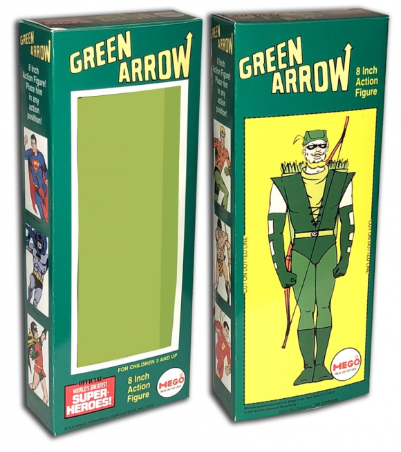
The box, while standard “DC hero” fare, has a nice color scheme and strangely uses rather static Alex Toth art from Super Friends style sheets. Which has always made me wonder what figures would have looked like had Mego continued producing DC characters into the Challenge of the Super Friends era.
—
Invisible Girl. By 1976, Mego was definitely firing on all cylinders, producing the Marvel characters of the Fantastic Four, Thor and Conan (who at the time was a somewhat honorary Marvel hero). From heat-sealed emblems, to hammers and axes, to unique approaches to the looks of the Thing and the Human Torch, Mego really went all out with the figures (too bad, though, that gray skin tones often malign the heads in this batch).
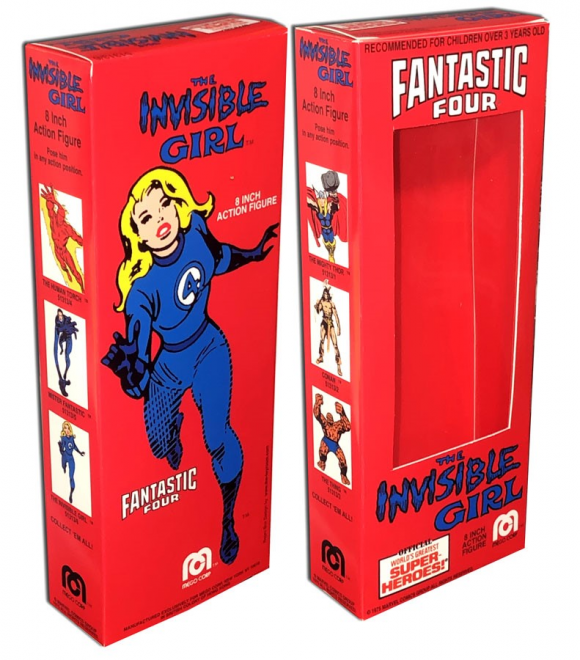
With the boxes for the Fantastic Four, Mego altered the look slightly, choosing to promote a Fantastic Four logo above the window, while moving the hero’s logo below the window. Out of the four boxes, the Invisible Girl has always been my favorite, utilizing slightly redrawn John Romita art with a bright red background.
—
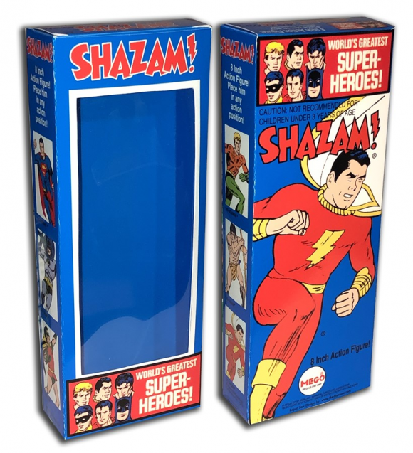
Shazam! – Holy Moley! It’s the ORIGINAL Captain Marvel, who, by then, was almost always called Shazam in merchandising. The Shazam figure isn’t one of Mego’s best, as it’s off model in almost every aspect, right down to the headsculpt he shares with the rare Peter Parker figure. The box, though, is as on-model as it can be, using what appears to be slightly redrawn C.C. Beck art with a dark blue background. Like Tarzan, this is another box burned in my memory from seeing it in stacks at Kay-Bee Toys.
—
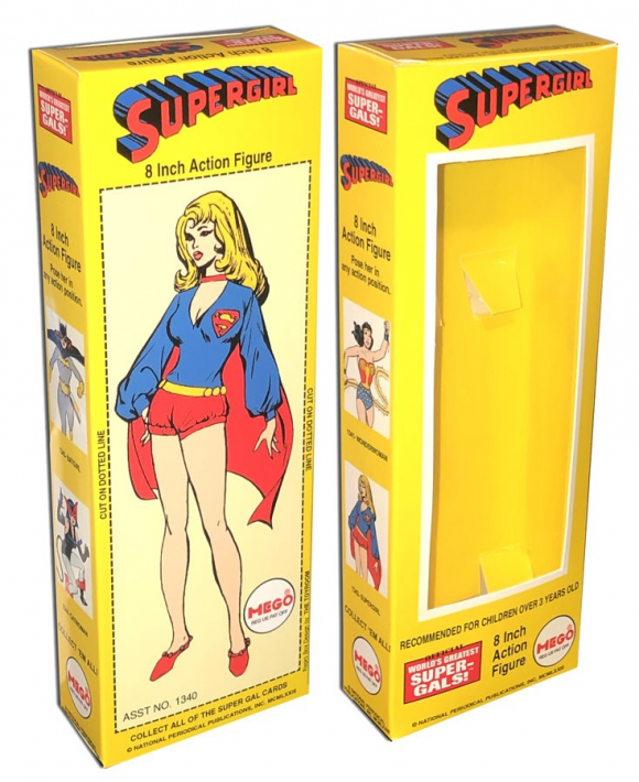
Supergirl. Supergirl was part of the DC exclusive Super-Gals sub-line (also featuring Wonder Woman, Catwoman and Batgirl) that Mego introduced in 1974. The initial release of the figures featured silk-screened uniforms but Mego eventually caught up and produced textured, layered costumes. Supergirl’s outfit is representative of her Bronze Age look, complete with hot pants and ballet slippers (and the occasional peace-symbol belt). The artwork on the box is the classic look that was used for the Girl of Steel during this time period on other merchandise and the masthead of her run in Adventure Comics. The yellow background of the box is like that of her cousin Superman’s.
—
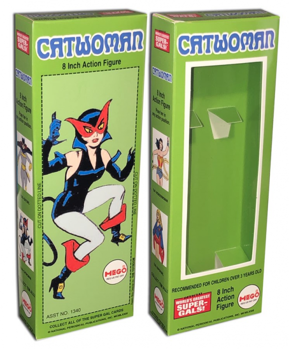
Catwoman. Another member of the Super-Gals, Catwoman also originally had a silk-screen suit before transitioning into a layered costume, complete with cat tail. Much like Supergirl, Catwoman’s costume is very indicative of the era during which the figure was produced. However, it had a much smaller window of use, as Catwoman only wore her “pirate suit” for a handful of appearances. As a kid, I hated this costume and couldn’t understand why it didn’t look like Julie Newmar. In fact, by the time the figure was released, Catwoman last wore the suit in 1974, to be replaced again by the classic green-and-purple dress. The altered artwork for the box comes from Batman #210 (the first appearance of the costume and originally drawn by Irv Novick and Joe Giella. Frank Robbins, who wrote the story, designed it).
—
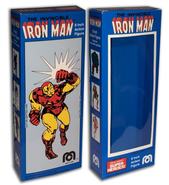
Iron Man. Part of Mego’s 1975 Marvel line-up, Iron Man is another great figure, having unique gloves, boots and belt. The one minor flaw is the inclusion of the Golden Avenger’s short-lived nose on his mask. Which the artwork chosen for the back of the box (altered from Iron Man #60), does NOT have. Much like Shazam, Mego took a red and yellow character and gave him a deep blue box and it totally works. Primary colors, aw yeah!
—
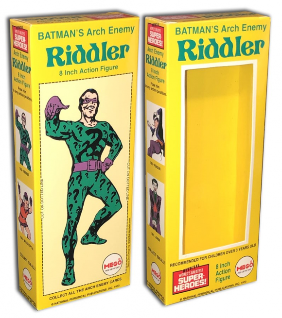
Riddler. Along with the Super-Gals, Mego released another DC exclusive sub-line, the Super-Foes, in 1974. Consisting of Batman foes (the Joker, the Penguin and the Riddler) alongside Superman’s Arch-Enemy, Lex Luth…er…um, Mr. Mxyzptlk, the Super-Foes were the only DC villains produced. The Riddler has always been my favorite of the lot and I still remember opening his yellow box for Christmas. The box art is a redrawn attempt at the famed 1960s pin-up by Carmine Infantino and Murphy Anderson (which was itself redrawn by Irv Novick for the cover to Detective Comics #377).
—
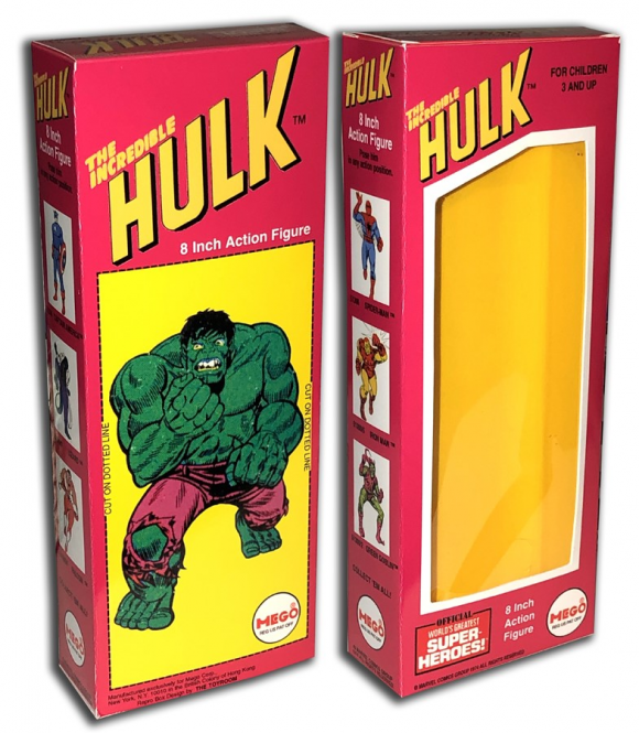
The Incredible Hulk. Almost every kid on our block seemed to own a Hulk figure back in the day. I didn’t. Although I appreciate it now, back then, um, no. Why was he so small compared to the other WGSH figures? Yeah, his face looked Romita-ish but what’s up with the hobo pants? And I’m not crazy about the box either. The magenta-and-yellow color scheme is not bad. But they went with that angled (and off-centered) Hulk logo and cut the window of the box at an angle to accommodate it, obscuring the top of the (short) figure’s head. The (slightly altered) art on the back was originally drawn by Herb Trimpe for Aurora’s Comic Scene Hulk kit. So I’m not a fan of that either. It’s just not HULK enough for me. Anyway…
—
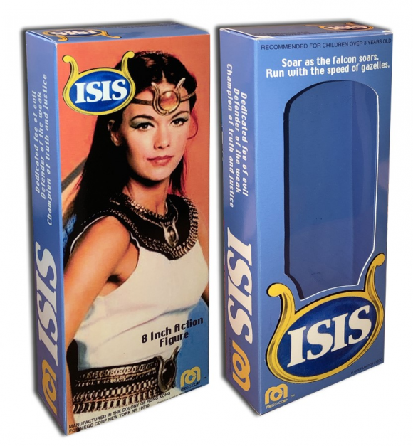
Isis. Originally released as a Montgomery Ward catalogue exclusive in 1976, Isis (portrayed on Filmation’s live-action TV show by Joanna Cameron) eventually joined Mego’s WGSH line with the rest of the Super-Gals. But Isis wasn’t a Super-Gal. In fact, she’s not even in a WGSH box. Unlike her TV counterpart Shazam, Isis was given her own unique box. Everything about it is different from what Mego was known to do with WGSH boxes. The big logo at the bottom of the window. The text running up the sides of the box. Even the window is uniquely cut. The back features a photo of Joanna Cameron as Oh Mighty Isis from what was probably a long promo shoot.
—
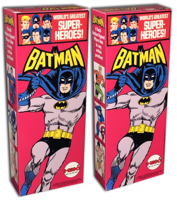
Batman. This is my favorite of all the Mego WGSH boxes, simply for the fact that it was my first one. And a solid box version, to be exact. But beyond that personal nostalgia it’s probably the greatest Mego WGSH box anyway. That pink(!) background. The (sigh) redrawn classic swinging Batman pose (based on Carmine Infantino art). In fact, I spent as much time redrawing that image itself as I did playing with the action figure that initial weekend. It’s all perfect. And it’s also all so wrong by today’s standard of “Batman” and toy packaging. Today, everything is pretty much standardized, no matter what toy company holds a Batman license. Everything is packaged with black and gray tones with a bat symbol as the only real logo. And most times, Batman himself isn’t displayed on the package. It’s Cookie Cutter Design 101. And that’s what makes the Mego Batman box very special. It’s definitely a product of its time.
—
If you’re interested in any of these — or if there’s a box you like that’s not here — contact either thetoyroom@yahoo.com or you can message Anthony through Facebook, Twitter or Instagram.
—
MORE
— The Complete TOYHEM! Index of Features and Columns. Click here.
— Dig These 13 Groovy Custom MEGO Boxes That Will Make Your Day. Click here.
December 6, 2020
Gotta agree 100%. The BATMAN box is classic. Also my first figure added to my collection.
December 6, 2020
Really nice entry. I, for one, would like to see a comparison of the boxes to the later carded graphics, if you’re ever so inclined…
December 6, 2020
I remember so well, Christmas morning, unwrapping Batman and Robin. I didn’t even care that their masks weren’t removable, I thought the loose mask on my friend’s Batman looked goofy. I too drew and re-drew the box art, as previously the only art I had to reference was the occasional borrowed comic, or a pair of slippers I had for years. Such memories!!
December 6, 2020
A pretty nice selection of Mego boxes.