
A tribute to the artist, who has died at the age of 99…
By JOE JUSKO
The incredible Robert McGinnis died March 10, at the age of 99. That he was working to the very end, with practically no decline in the quality of his work, was as much a marvel as his storied career. He contributed to many different commercial venues, including the many movie posters ingrained in the minds of film aficionados, but we’re going to focus on his book cover art today.
Leafing through my hundreds of McGinnis tear sheets I realized it’s impossible to pick 13 “best” pieces from a career of over a thousand covers, so I chose examples that I found special interest in and, aside from one obvious deviation, stuck to the crime genre for which he is best known.
His popularity among readers and publishers alike is evident in not only the proliferation of his work, but by the freedom he was often given to paint what he wanted as he wanted. The Carter Brown series in particular showcased what has become known universally as “The McGinnis Girl.” The covers had no direct correlation to the stories, but man, did they sell a lot of books.
His work became so popular that, like Frank Frazetta at the height of his popularity, art directors and publishers were instructing other artists to emulate his style and approach. It took me years to realize some of those other covers were not McGinnis.
Every artist I know is reeling today from the loss of a talent that most of us would carve on a Mount Rushmore of artistic genius.
—
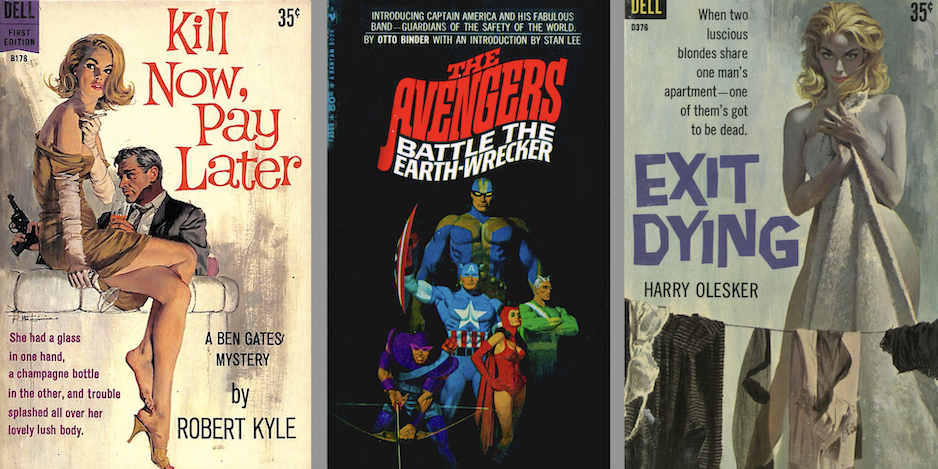
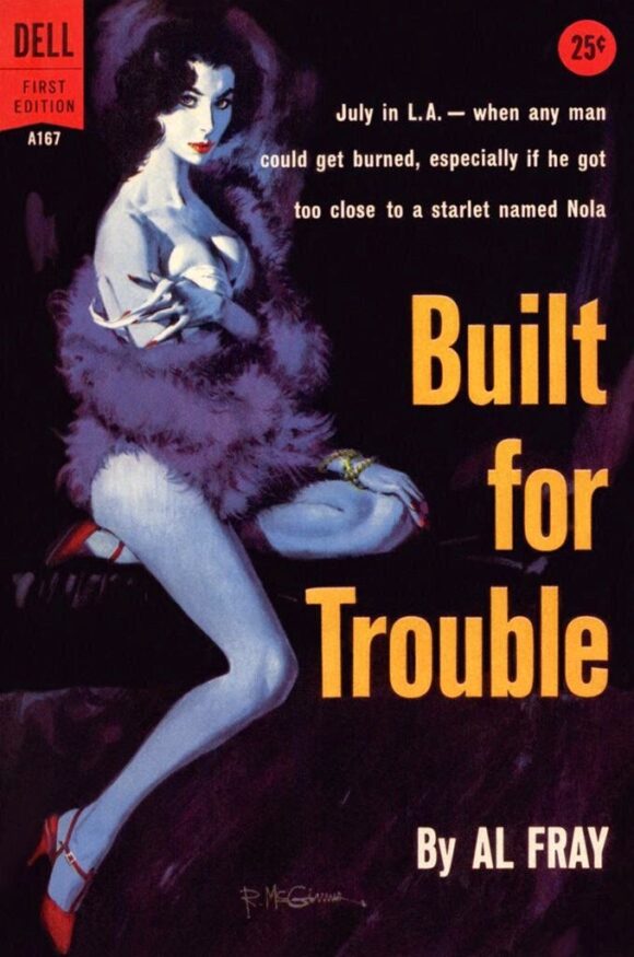
1. Built for Trouble, by Al Fray (1958). What else could be in the top spot besides McGinnis’s very first cover, the one that started what is probably the most prolific paperback career of any artist?
—
2. Kill Now, Pay Later, by Robert Kyle (1960). My favorite cover and the original I’d most love to own. It’s always tickled that film-noir chord in me just right. I’ve been passing on all the McGinnis paintings that have come to auction in the hopes that this one will eventually turn up.

—
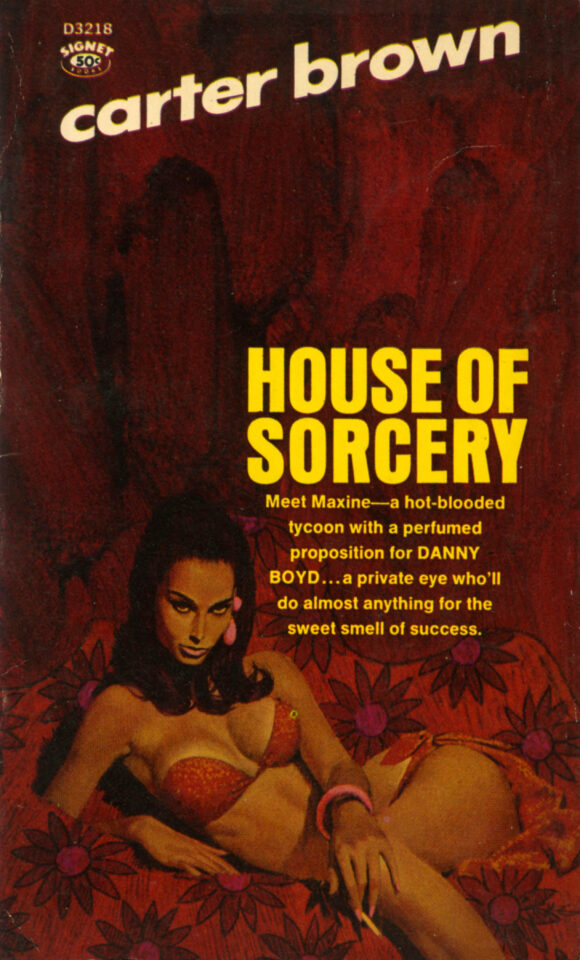
3. House of Sorcery, by Carter Brown (1967). A piece whose palette perfectly matches the title and the girl is as mysteriously and dangerously seductive a femme fatale as McGinnis has ever painted. Number 2 on my “Want to Own” list.
—
4. Death Comes Early, by William R. Cox (1961). A wonderfully subdued painting evoking the film noir feel at it’s finest. I’m not certain, but I can’t help but think it might have been an inspiration for Adam Hughes’ Catwoman #50 cover (right), which probably explains why I love Adam’s cover so much.

—
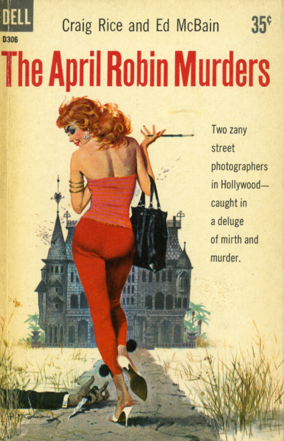
5. The April Robin Murders, by Craig Rice and Ed McBain (1959). Dark humor and whimsy coupled with a cartoonish old mansion straight out of a classic Disney feature. The red hair and clothing that ties everything to the title make this an absolute favorite.
—
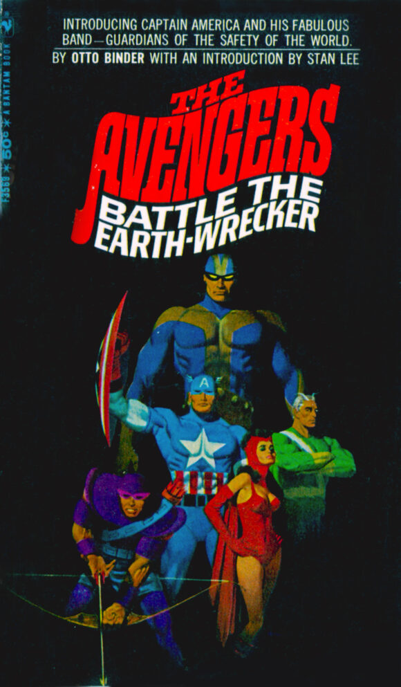
6. The Avengers Battle the Earth-Wrecker, by Otto Binder (1967). Probably the most head-scratching of all McGinnis paperback covers, but I love it because of that. It’s also a great precursor to his wonderful movie poster for The Incredibles a few decades later.
—
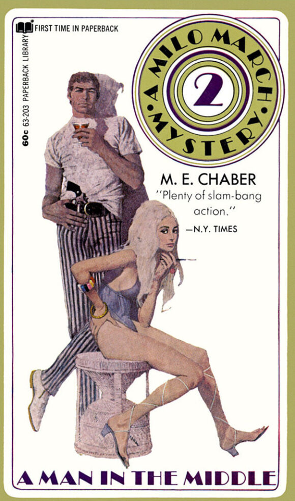
7. A Man in the Middle, by M.E. Chaber (1970). Obviously capitalizing on James Coburn’s popularity post the Derek Flint films, McGinnis based the male figure on him for this series.
—
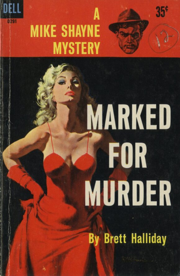
8. Marked for Murder, by Brett Halliday (1959). A simple and stark image, its impact heightened by the fact that red never looks redder than it does next to black. Bob knew his stuff, as did the art director who put the cover together. You would not have been able to pass this by on the racks.
—
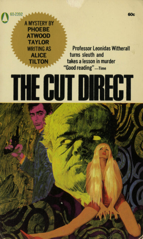
9. The Cut Direct, by Alice Tilton (1966). Apparently hating the books, McGinnis had total creative freedom to paint whatever he wanted for the six Alice Tilton novels. He produced what are probably his most incredibly unique hallucinogenic images.
—
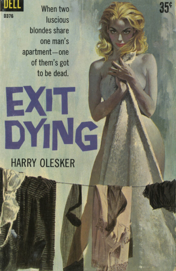
10. Exit Dying, by Harry Olesker (1960). A palette of deathly pallor that mirrors the title. I’m sure he had no idea what the book was about, but still conceived a perfect painting.
—
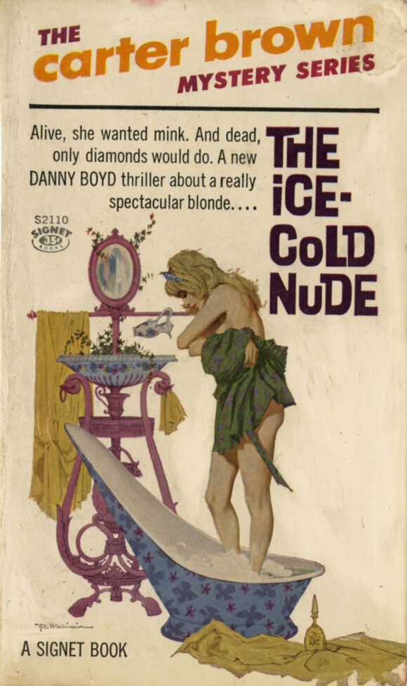
11. The Ice-Cold Nude, by Carter Brown (1962). A great little vignette painted almost completely in flat color, but still giving the impression of three-dimensional volume. Brilliantly executed.
—
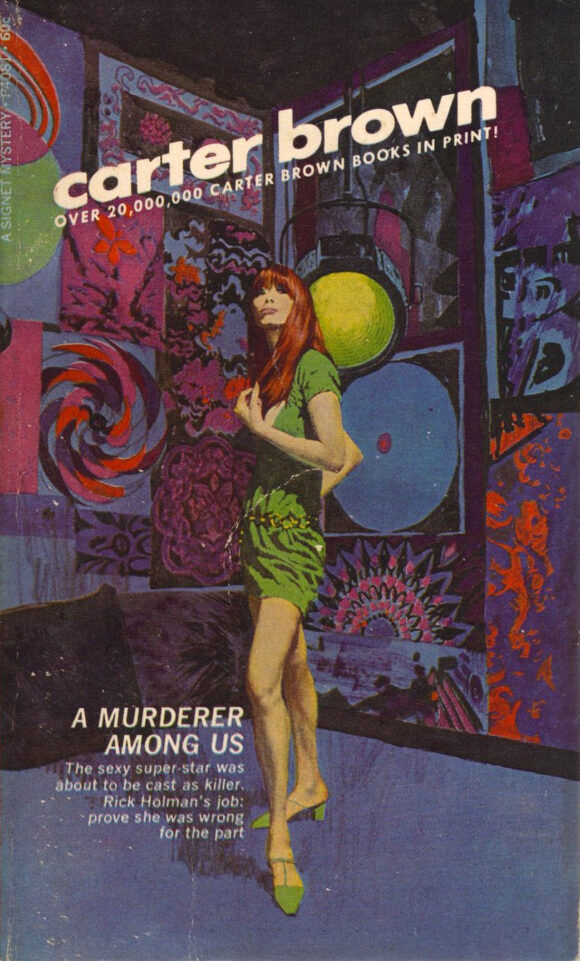
12. A Murderer Among Us, by Carter Brown (1969). McGinnis painted 100 Carter Brown covers and every one was totally unique. A great incorporation of the 1960s mod aesthetic, something he utilized on more than a few covers. Subdued and muted, yet extremely colorful at the same time. Not as easy as it may look.
—
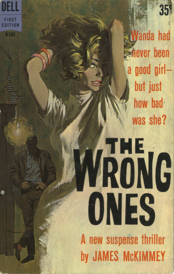
13. The Wrong Ones, by James McKimmey (1961). Just a brilliant example of creative designing to leave open space for title and copy without losing the form.
—
MORE
— 13 GLORIOUS COVERS: A GEORGE WILSON Salute, by JOE JUSKO. Click here.
— JOHN BUSCEMA: A Birthday Appreciation, by JOE JUSKO. Click here.
—
JOE JUSKO has been a professional illustrator for almost 50 years, painting comic and book covers, album art and advertising campaigns. He’s an avid collector and student of vintage illustration art and the artists who produced it. He is currently painting all-new cover art for every book written by Edgar Rice Burroughs, the very first such undertaking by a single artist.
April 6, 2025
Robert painted all the great James Bond & Matt Helm movie posters too…I have Thunderball framed on the wall.
April 6, 2025
Losing McGinnis and Brad Holland virtually simultaneously–two enormous losses in the world of illustration. It was like when we lost Marshall Arisman, Neal Adams and James Bama.
April 7, 2025
Sign me up for a ticket of admission to the “House of Sorcery”!
April 14, 2025
These are all fantastic!