
A BIRTHDAY SALUTE by Scott Dunbier, editor of the Neal Adams’ DC Classics Artist’s Edition…
—
The late, great Neal Adams was born 84 years ago, on June 15, 1941, and we have a two-fer birthday salute for you this year: a column about Adams’ Ben Casey strip by his son-in-law Peter Stone, and this piece by Scott Dunbier that highlights the upcoming Neal Adams’ DC Classics Artist’s Edition. The book, with multiple covers, is due July 8, but you can already get special editions from Adams’ family, here. I have mine and it’s extraordinary. Dig it. — Dan

—
By SCOTT DUNBIER
Dan at 13th Dimension asked me to select 13 covers in honor of Neal Adams’ birthday, using images from next month’s Neal Adams’ DC Classics Artist’s Edition from IDW Publishing. This was my very last Artist’s Edition for IDW and I think I went out with a bang. It is 288 pages plus five foldouts, the largest AE book I have ever done. On a personal note, I miss having Neal in the world. He was cantankerous as hell and loved to argue. He also championed the underdog, and he was as talented as they come. Happy birthday, Neal.
We’re showing the covers I selected alongside the published images. So, without further ado, here we go:
—
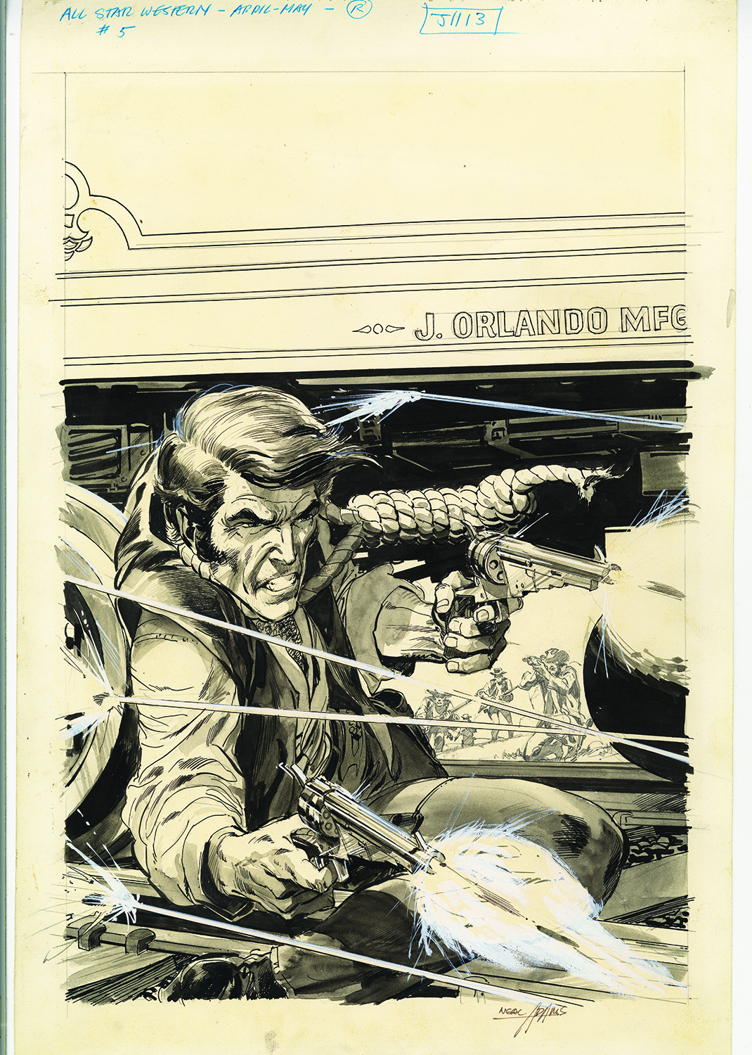
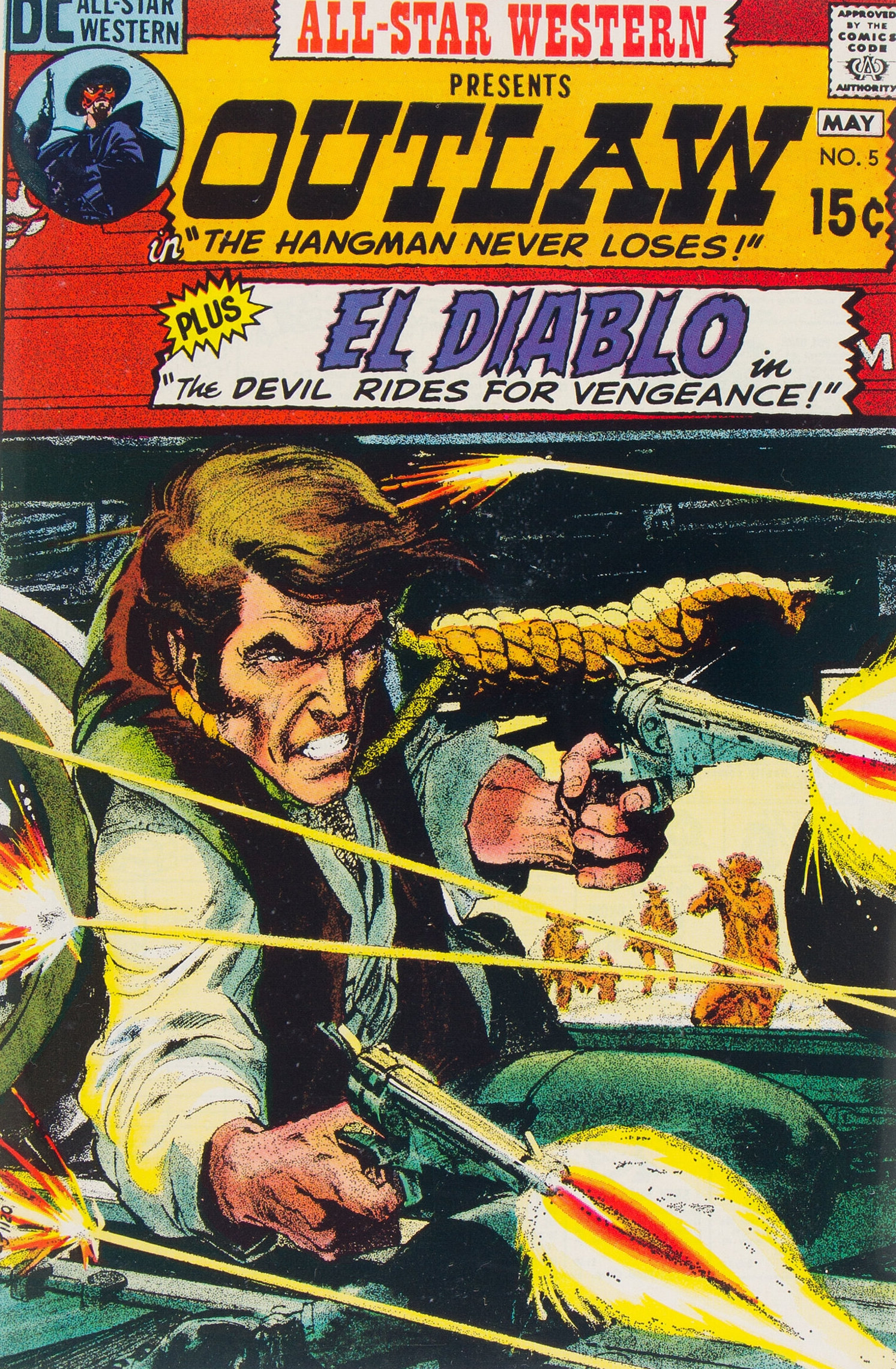
All-Star Western #5. (April-May 1971). An incredible piece of work. I love the wash Neal applied, and the use of white paint to emphasize the gunshots and the ricochets. Outstanding. But take a look at the four figures converging on the outlaw. Neal drew them in pencil to add depth to the cover. Genius.
—
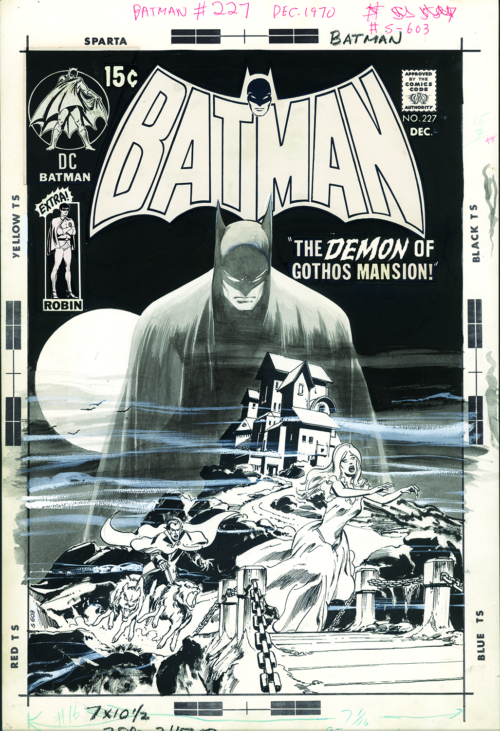
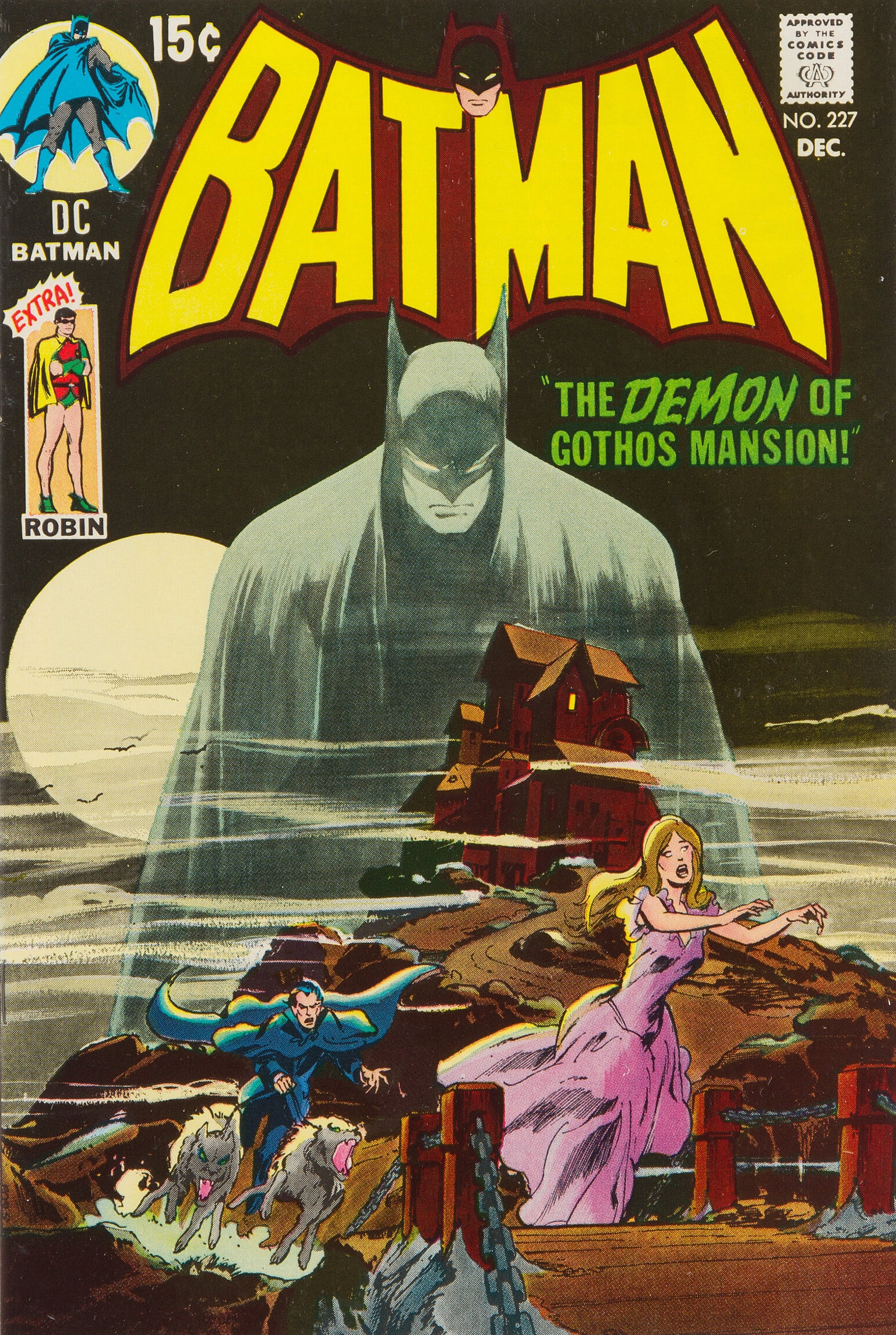
Batman #227 (Dec. 1970). Another wash image. It’s based on the Bob Kane cover of Detective Comics #31 (the third Batman cover) from 1939. In this case, Neal uses the wash to give depth to the foreground. It’s eerie and heroic. A superb cover, one of Neal’s finest.
—
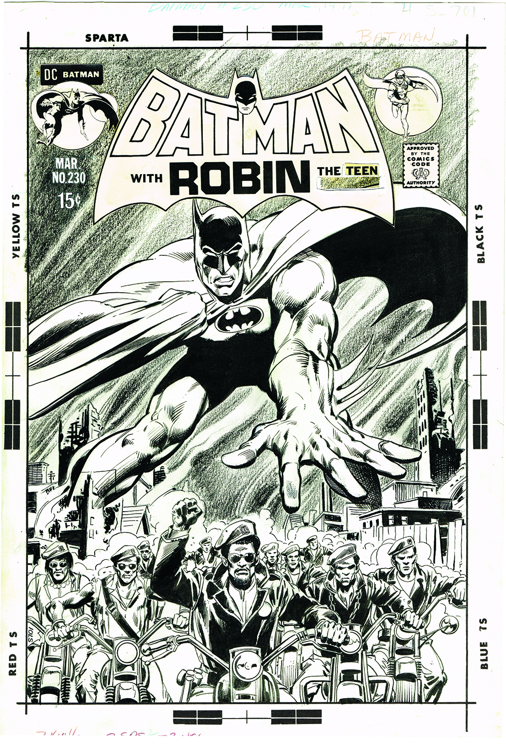
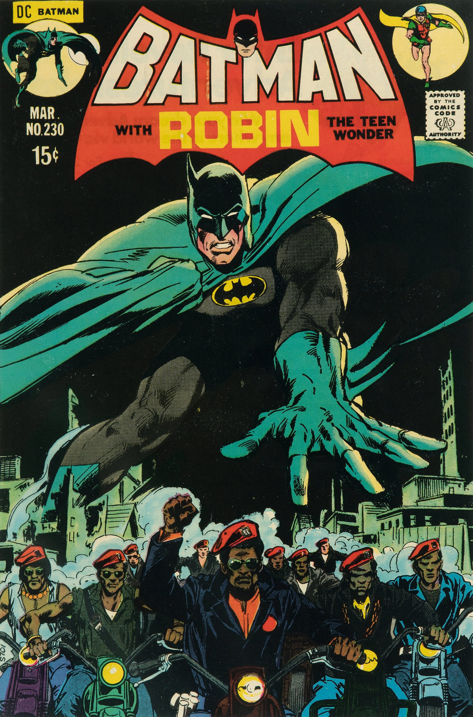
Batman #230 (March 1971). I confess I didn’t love this cover until I saw the original. But if you compare the art to the published piece, you’ll see that the smoke rising from the city is in grease pencil while the comic background is all blacked out. Maybe it was considered too incendiary for the times? Also, the coloring didn’t do it any favors; it’s very dark and difficult to make out the motorcyclists. This is a hidden gem that I never fully appreciated before.
—
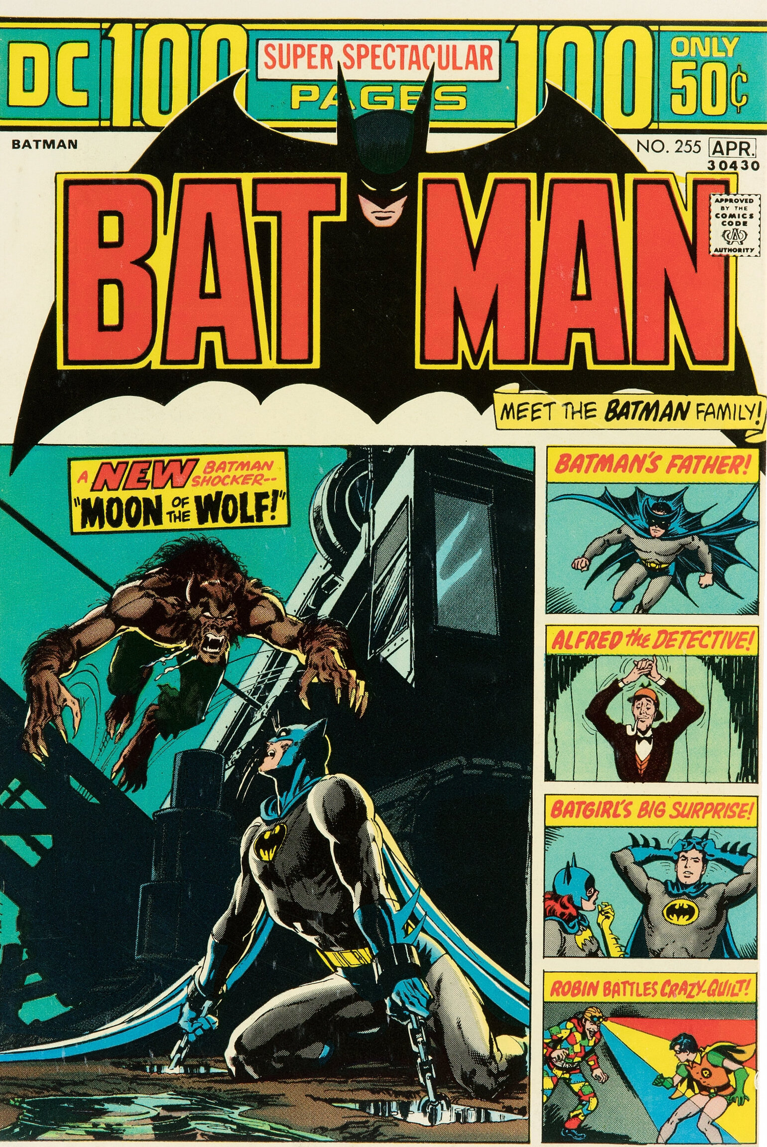
Batman #255 (March-April 1974). Here’s another cover you need to compare to the published version. As a kid, I loved the DC 100-page giants — they introduced me to so many classic Golden Age stories. But they had a very strict cover layout. In this case, the image here was shrunk to fit the cumbersome dictates that were editorially imposed. The original art was drawn full size and is outstanding. And as a side note, this was Neal’s final Batman story for many years–and it’s truly one of his very best. (It was written by Len Wein.)
—
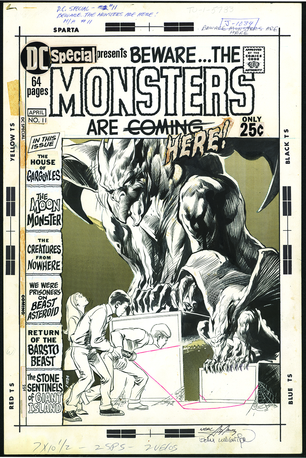
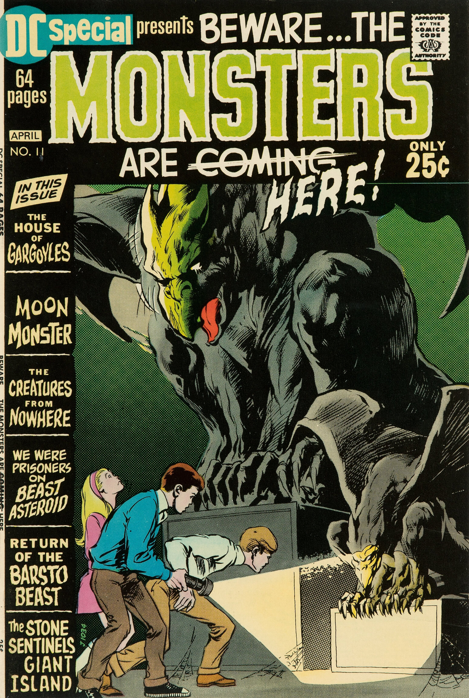
DC Special #11 (March-April 1971). Neal was so great at drawing kids, he did so many in the DC mystery books. This particular cover was inked by the great Bernie Wrightson, who always did a terrific job embellishing Neal. As an aside, there are two complete stories in the Neal Adams Artist’s Edition that were inked by Bernie.
—
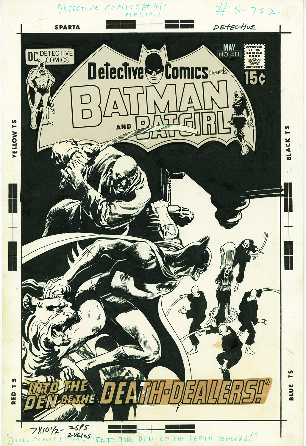
Detective Comics #411 (May 1971). Just a beautiful batman cover by Neal. And I love how the DC production department meticulously cut a path for the sword in the logo. Fun fact: That’s the first appearance of Talia there.

—
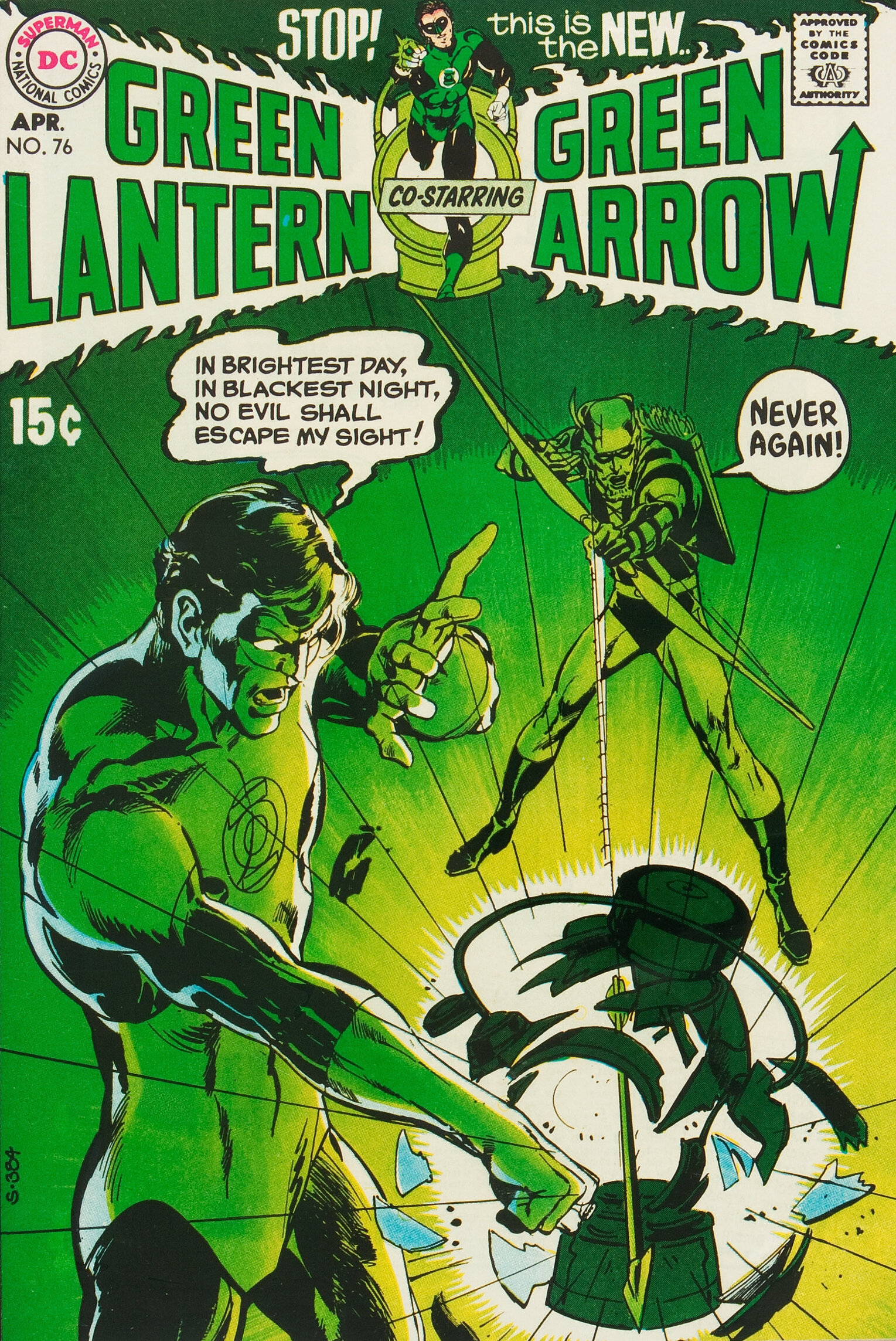
Green Lantern #76 (April 1970). One of Neal’s most important covers, and beautifully designed. The first team-up of Green Lantern and Green Arrow. This was comics at their apex for me as a kid.
![]()
—
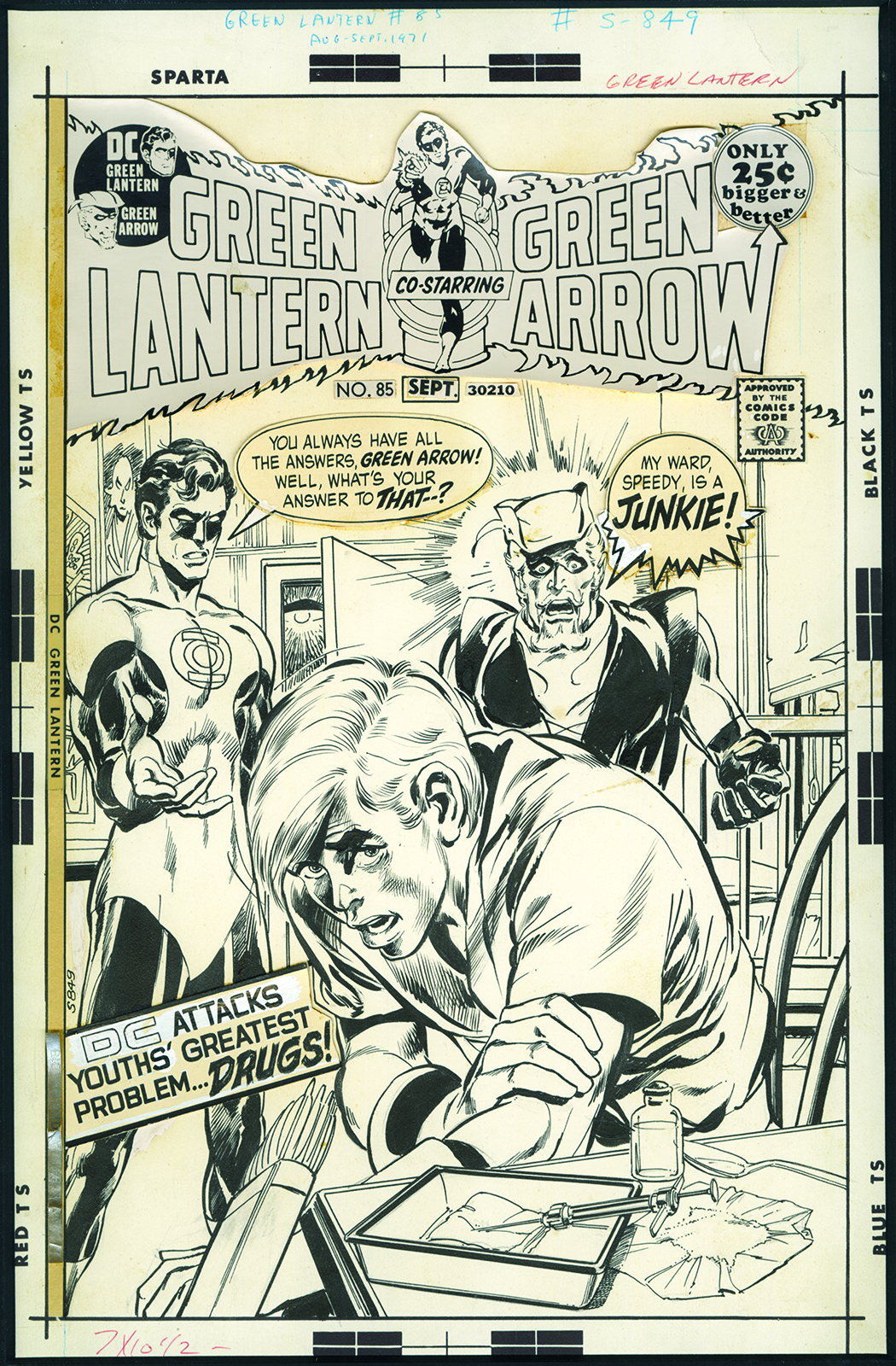
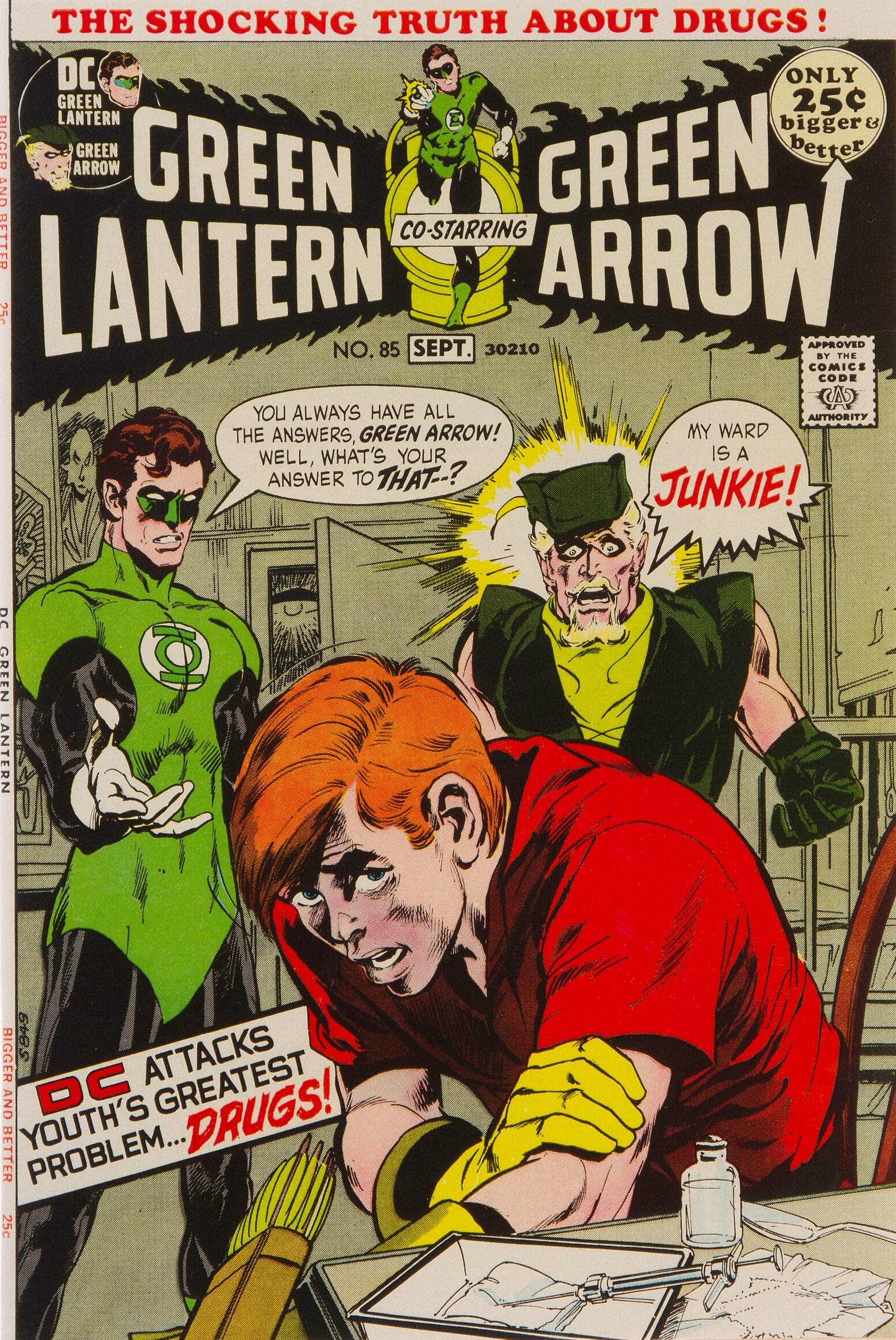
Green Lantern #85 (Aug.-Sept. 1971). It may not seem like so big a deal now, but this was truly shocking when it came out. Compare Green Arrow’s word balloon in the original to the published cover. Maybe they thought “Speedy” was redundant for a drug addict?
—
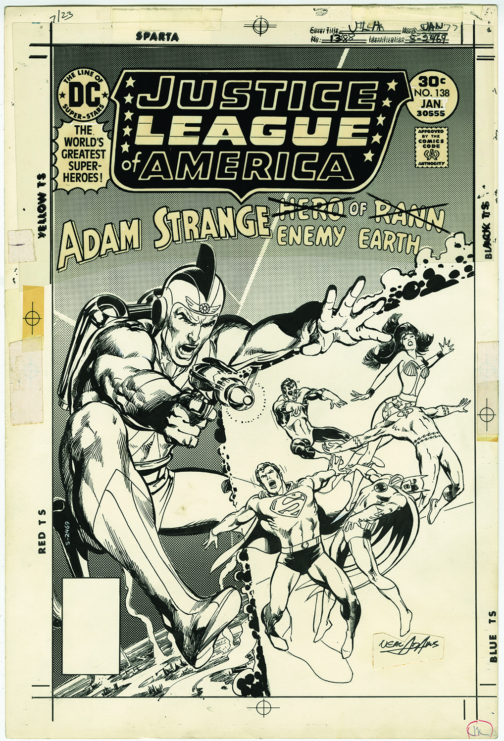
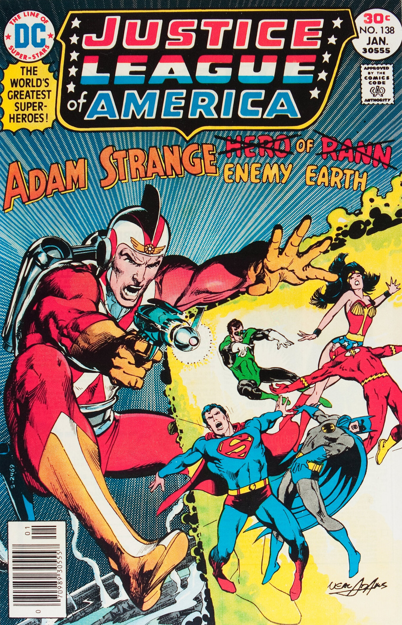
Justice League of America #138 (Jan. 1977). In the mid-1970s Neal took a break from doing covers for DC. So, when he began to do more, it was a happy occasion. Neal’s style was evolving, there were subtle differences. Of all those “later” covers, this one is probably my favorite. The figure of Adam Strange is fantastic, and I love the inking on him, and the planet below.
—
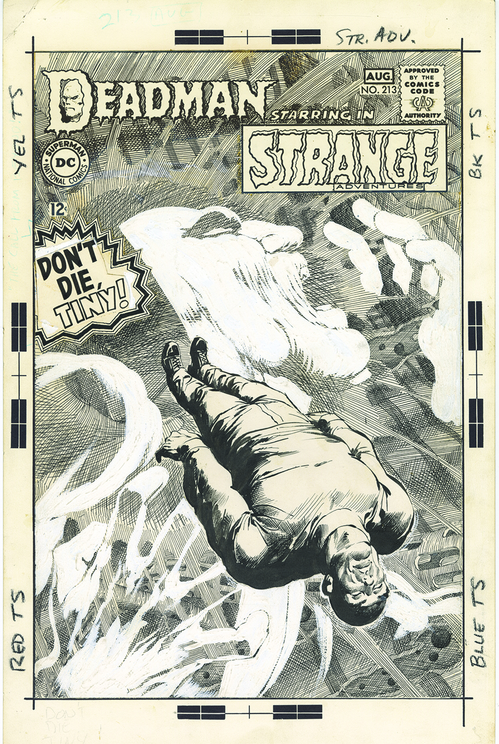
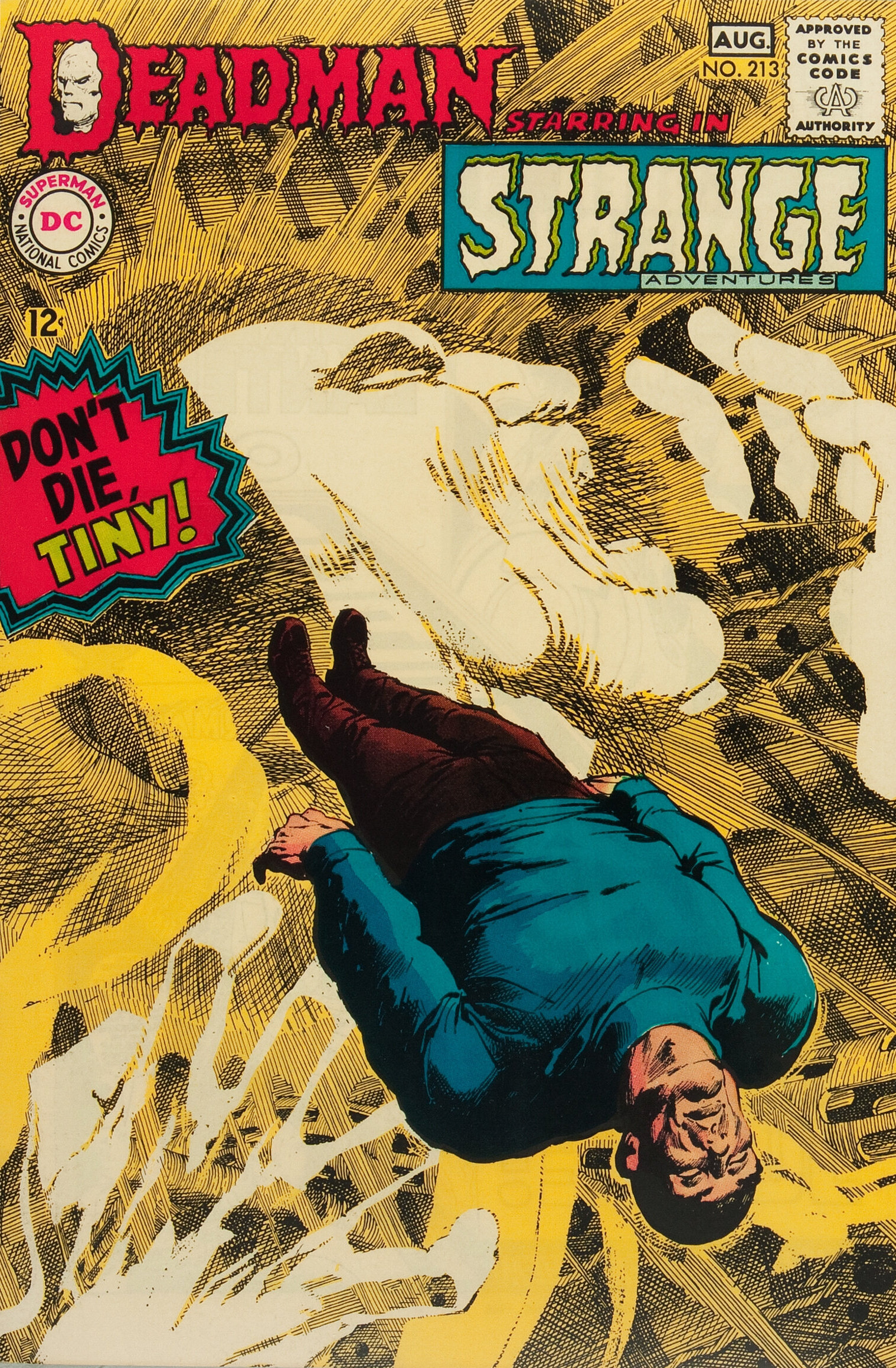
Strange Adventures #213 (July-Aug. 1968). Deadman at his best. Tiny floating in limbo between life and death. The figure is inked in Neal’s regular style, but he went nuts on the crosshatching in the background, almost going for a Franklin Booth effort in some places. But what really makes this cover is the white paint used to include Deadman. His profile and hands, over that intense crosshatching, makes this cover sing. And the three varieties of style give that ever important feeling of depth. Beautiful work!
—
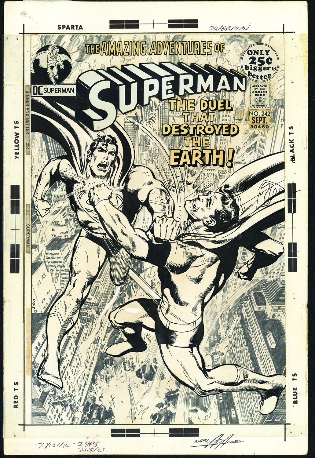
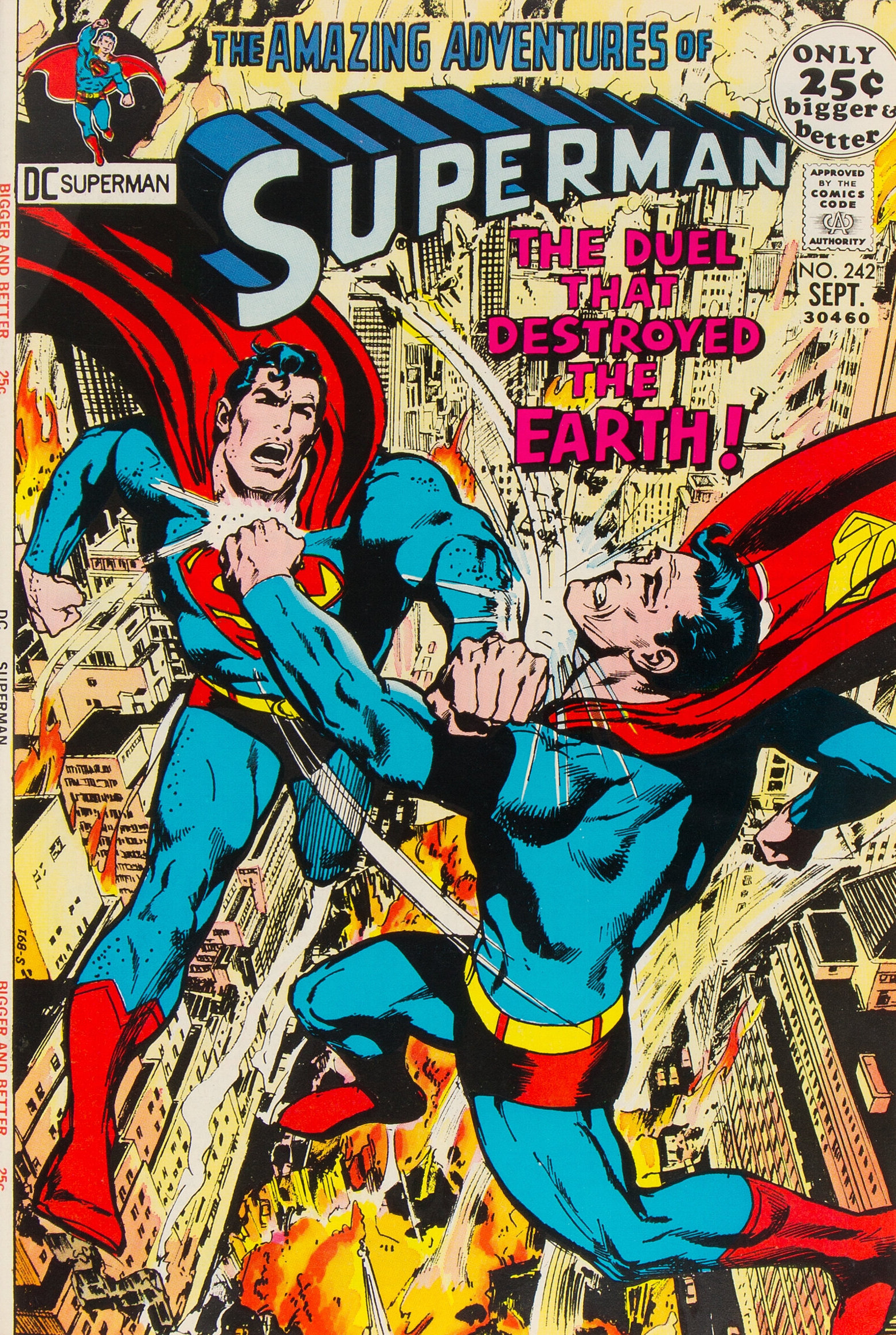
Superman #242 (Sept. 1971). Arguably Neal’s greatest Superman cover. The two figures battling over the smoldering city of Metropolis are stunning… but, look at that background – it is entirely in pencil! Unfortunately the printed cover doesn’t capture the subtlety in the art; instead the colors clash with the work. Another gorgeous image, though.
—
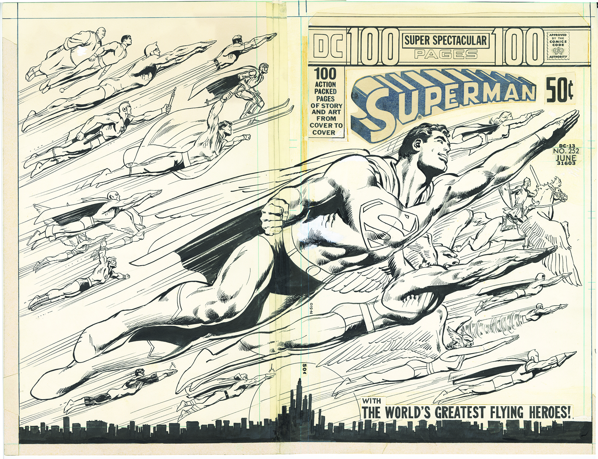
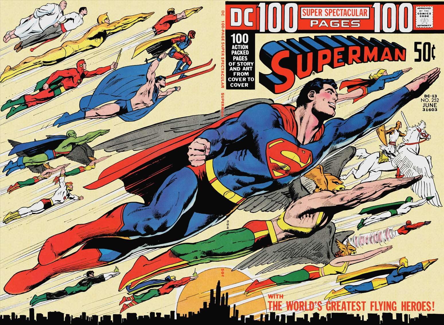
Superman #252 (June 1972). The “flying heroes” cover. This one is so easy to visualize, one of Neal’s most iconic images. I wonder how many sheets, pillow cases, shirts, used that superman figure?
—
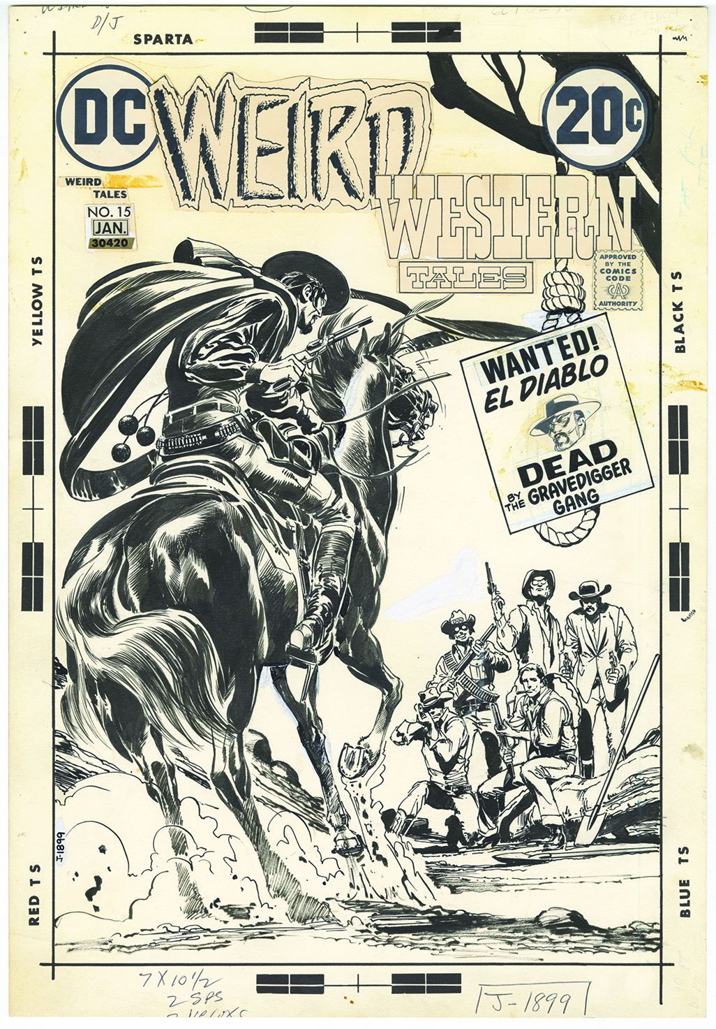
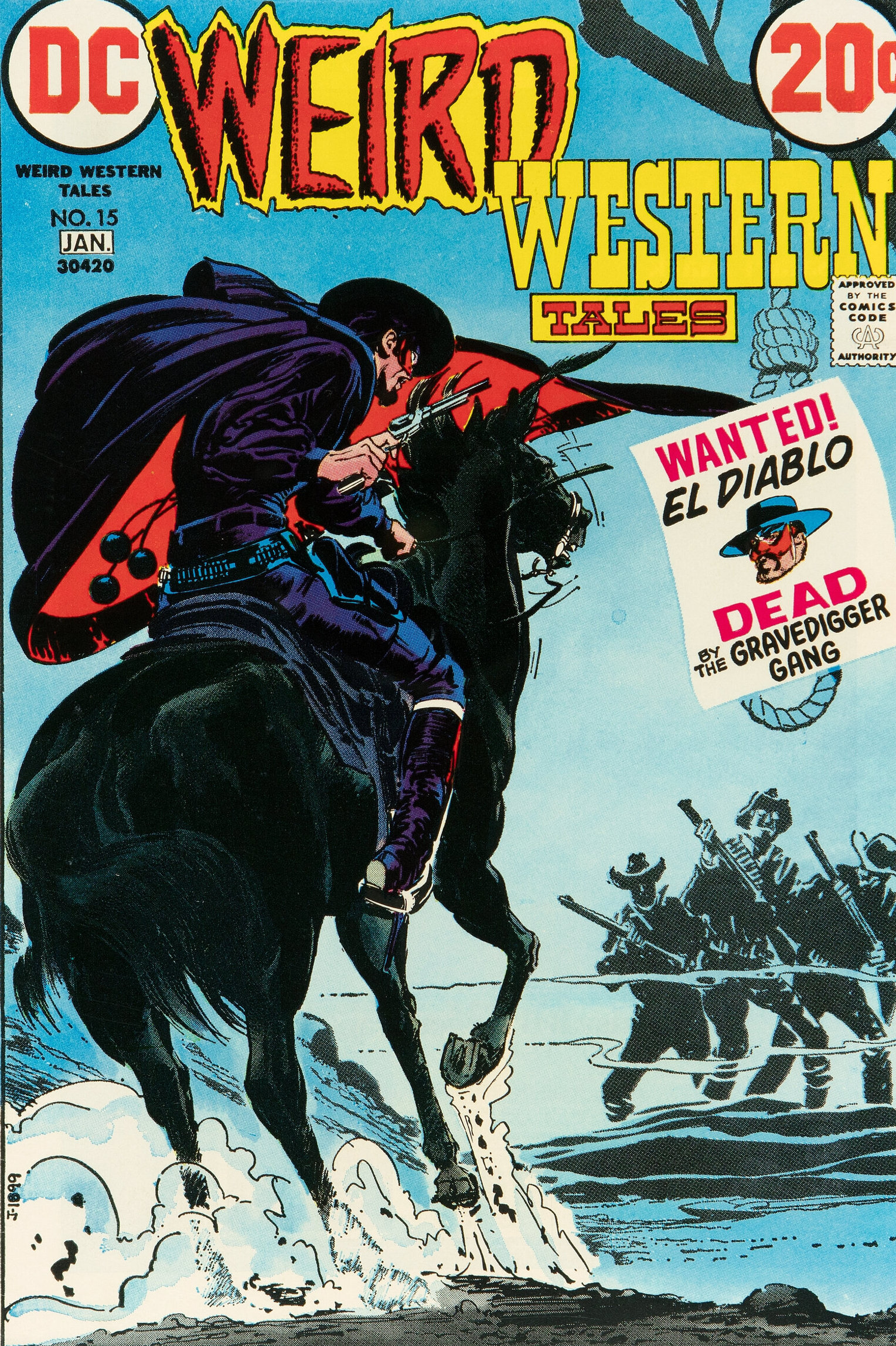
Weird Western Tales #15 (Dec. 1972-Jan. 1973). Just look at that horse! Neal really could draw anything. Speaking of the horse, the inking is terrific, peak Neal. Until you see the original, you never are able to take in just how good it is. Also, for some reason the five figures have been removed from the published cover. There are three images in their place that were reportedly added by editor Joe Orlando. Maybe to make the cover feel more ominous? Regardless, a great cover (and I love the logos!).
—
MORE
— 13 Glorious Original Art BEN CASEY SUNDAY Strips by NEAL ADAMS. Click here.
— NEAL ADAMS: The Most Intimidating Nice Guy You’d Ever Meet, by FRANCO. Click here.
—
Scott Dunbier, who pioneered DC’s Absolute Editions and the Artist’s Edition concept for IDW, now operates his own company, Act 4 Publishing.
June 15, 2025
I had the “Flying Heroes” cover on my bedroom wall when I was a kid. I would have bought (read: begged my Mom and Dad to get me) a poster of it if there was one! I love all these!
June 15, 2025
We all know what Neal’s greatest Superman cover is, hands down, even if Neal himself didn’t love it: Kryptonite Nevermore!
June 15, 2025
ALL-STAR WESTERN #5 is one of my favorite Neal Adams covers. The image itself is incredible, but the addition of the hangman‘s news being broken at so much more depth to the storyline behind the image.
June 15, 2025
Apologies for typos. Using speech to text and should’ve edited. “Hangman’s noose”
June 15, 2025
Can I cast a vote for the Adam Strange cover on Strange Adventures (right after Deadman was abruptly cancelled.). That image of Adam Strange soaring towards the reader strikes me as soon very powerful and attention grabbing.
June 15, 2025
With one or two exceptions I believe those are not the original art but the proofs sent to DC from the Sparta printers. A minor point but still not photos of the originals but one step further removed.
June 15, 2025
Allan, sorry to correct you, but these images all come from the soon to be released Neal Adams DC Classics Artist’s Edition. All of the images (aside from the accompanying published covers) were indeed scanned from the original art (they are not proofs). I scanned most of these myself. Thanks.
June 15, 2025
You are the most accurate source for information on the scans we can have! Thank You!
Allan R.
June 15, 2025
cant wait to buy it!
June 15, 2025
man im sure these originals are worth a ton! ive got the last book in excellent shape, the art inside is fantastic.
June 15, 2025
Many of those Bronze Age covers were s should’ve been full sized.Justice was not done.
June 16, 2025
All are excellent choices for facsimile editions and BATMAN #255 would be great to be done with a full cover and trade dress from the era. Give it the treatment that was missed so long ago.
June 16, 2025
I notice the comic’s logo, month and price, Comics Code Authority seal and similar elements are with the original art. Was Adams and other artists given elements like these to draw around? I always assumed they were placed over the finished art with the possible exception of the logo, of which the artist may have created a “rough” version as a place holder.
June 16, 2025
I would sure love to have the “old” process explained to us. I believe there was real art in that very mechanical process.
June 16, 2025
Definitely a great cover. Another in that vein would be Superman #317. https://4.bp.blogspot.com/-jctt54EvDHw/UFNZoeUbdeI/AAAAAAAATDs/feRwofiHd7w/s1600/Superman-317.jpg
June 16, 2025
Argh…. Hate Word Press. This was meant to be a response to SJG.
June 16, 2025
Who are the two guys in white on the top left corner of the flying heroes spread?
June 16, 2025
Daniel, https://en.m.wikipedia.org/wiki/Kid_Eternity
June 17, 2025
Kid Eternity and Mr. Keeper.
June 16, 2025
As an artist, I believe pencils are the finest medium for illustration. The detail and tones you can achieve with a pencil are unlike anything else.
The problem is – as you see here – they’re nearly impossible to replicate! Especially in a comic that wants to add colors.
June 16, 2025
Whichever editor decided to add “static” to Western no. 5 really missed the mark.
June 22, 2025
God, will there ever be another artist that put in the effort to each cover that Neal did, while also being potentially the best comics artist in history? Just amazing work! We owe Scott Dunbier a major vote of THANKS!