
Golden nuggets from a short-lived publisher…
By WALT GROGAN
I love logos! And when 13th Dimension’s head honcho, Dan Greenfield, suggested that I pick my 13 favorite Atlas/Seaboard comic book logos, I was ecstatic!
Back in 1974, when I was 14, my great-aunt made a quick trip to the drugstore in downtown Lake Geneva, Wisconsin, and she took me along. Going inside, I was struck by that distinctive pharmacy smell and if I go into a true drug store today and catch that same whiff, it just takes me back. If any place looked like it carried comics, I would make a beeline toward the magazine rack and this pharmacy fit that description.
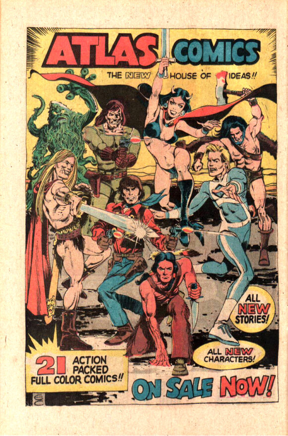
I scanned the titles and this time I spotted something new! What’s this? Atlas Comics?!? Who are these characters? All of a sudden, right before my eyes, was a brand new universe to compete with the Big Two! This was something unheard of in 1974! I eagerly grabbed all of the available titles, and asked my aunt for a bit more money to buy them all! I couldn’t wait to get back to her house to start reading!
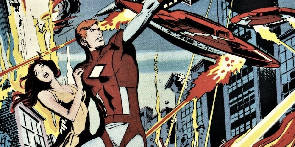
The Phoenix #1 (January 1975). Cover by Dick Giordano, from a layout by Sal Amendola.
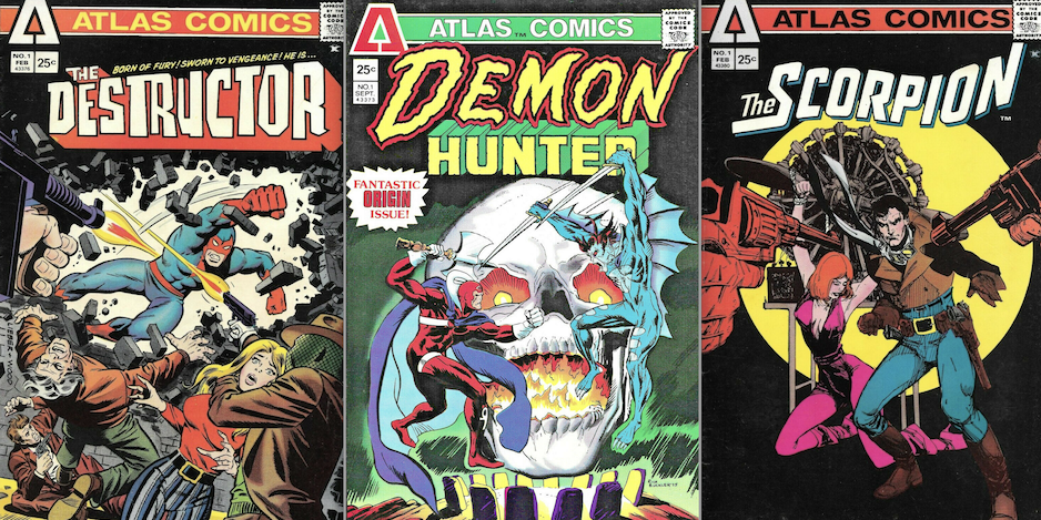
Atlas Comics produced an eclectic mix of characters: barbarians, monsters, superheroes, vampires, a pulp adventurer, a plant creature, a teen character, police officers, a cowboy, and a couple of war sergeants — something to appeal to everyone!
Sadly, though, Atlas Comics was like a bit of magician’s flash paper — on the stands one minute and — POOF! — gone the next! Twenty-three comic book titles and three comics magazines (plus a story mag with illustrations) for a total of 68 issues in just little over a year! And those issues featured some of the biggest artists in comics and some who were just starting out: Steve Ditko, Wally Wood, Alex Toth, Mike Sekowsky, Howard Chaykin, Walt Simonson, Pablo Marcos, Sal Amendola, Larry Hama, Klaus Janson, Pat Boyette, Ric Estrada, Frank Thorne, Pat Broderick, and Jim Craig — to name a few!
I’ve been collecting comics for over 55 years and I’ve been cataloging them. As I sort them, I create comic box labels. I’ve been doing this for several years now and finally hit on a design that generally employs the logos of the titles in the box. And now, I’ve finally gotten to the Atlas titles.
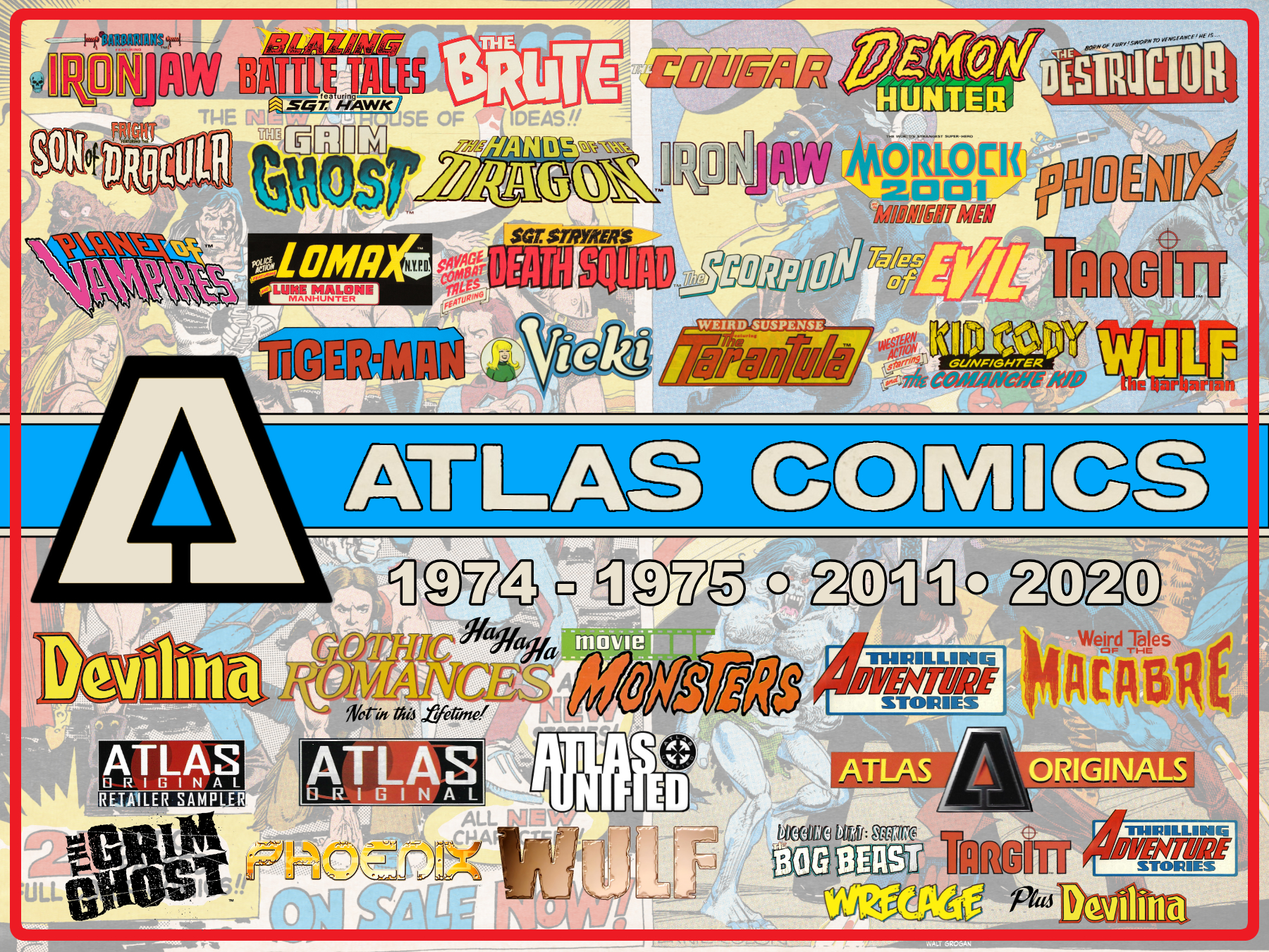
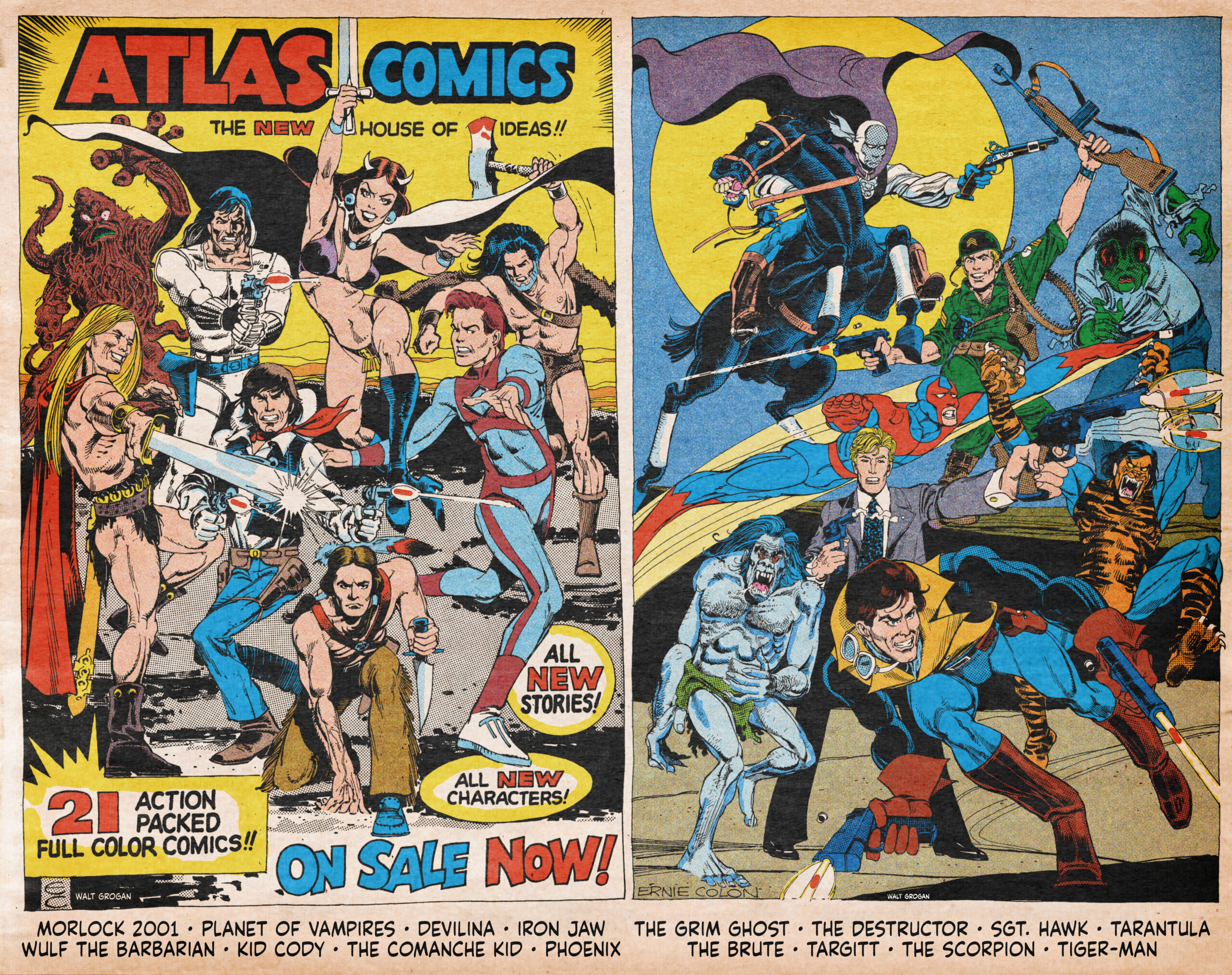
Generally, if a box contains one title, I’ll find a representative image and use it for the background. In this case because there were so many titles, I decided to use the house ad that ran in many of the initial first issues since it featured many of the heroes in the Atlas Universe.
Unfortunately, to fit the dimensions of the label, many of the characters would have been cropped — but then I noticed that the magazine ran a black and white version of the ad alongside a secondary house ad sans copy that featured more heroes in the Atlas Universe.
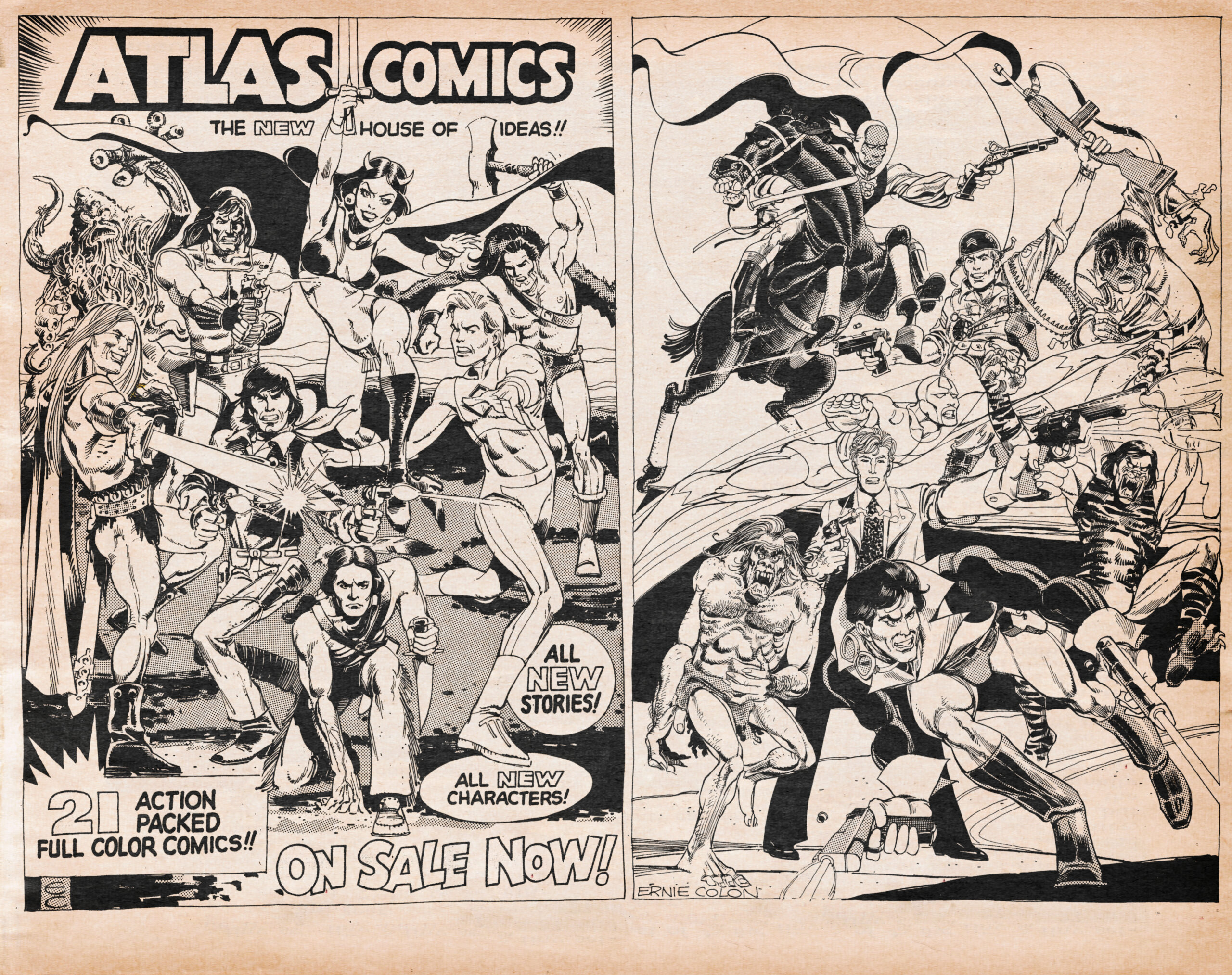
Well, I also like coloring, so I ended up recoloring the left hand side, generally following the color scheme in the ad, with some minor changes, and coloring, for the first time as far as I know, the right-hand side ad. Note, by the way, that the Tarantula was dressed quite differently from how he was published. One of the strange things about both ads is that none of the characters or the books they appeared in were identified, so I dropped in their names at the bottom of the pages.
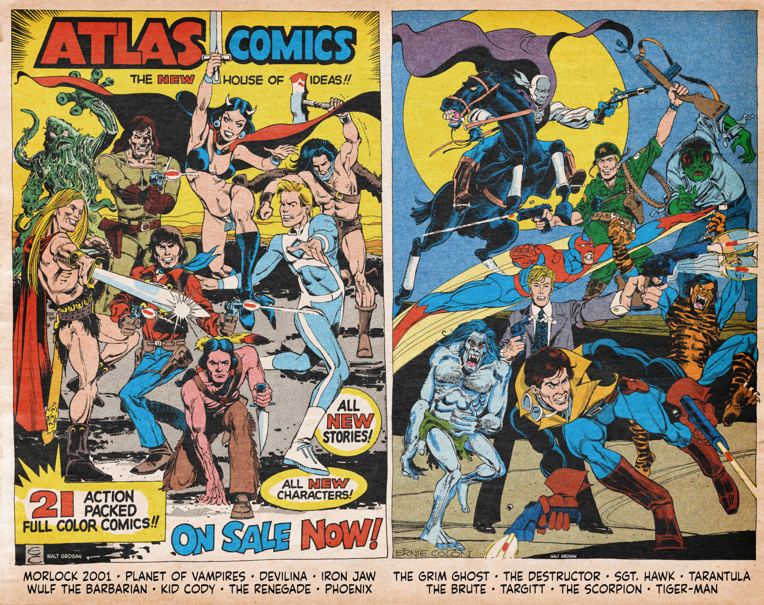
But I noticed that the left-hand side really didn’t reflect the colors of many of the characters as they were published in their respective titles. The coloring of the ad had to have been done well before the color schemes were finalized. Morlock, Phoenix, Kid Cody, the Renegade (who turned out to be the Comanche Kid), and Devilina all ended up being colored differently in their respective titles. So, I ended up recoloring the left-hand side to more closely match what was published. And used this piece as the background of my box label with the opacity turned way down.
I then made the Atlas logo and its Marvel-style banner the centerpiece of the label. I think the Atlas logo is awesome in its simplicity and it’s been said that the arrow in the middle of the “A” was a not so subtle “Up Yours” to Marvel Comics for pushing Martin Goodman’s son, Chip, out of the company after Martin Goodman sold it. But as I was looking at the logo, especially with it sitting on top of the banner, it looks like a belt buckle! And it made me wonder why there was no Captain Atlas or Atlas-Man or just plain Atlas in the Atlas Universe. Maybe it was because DC was coming out with an Atlas comic before it got slotted into the lead of 1st Issue Special. Whatever the reason, it just seemed like a missed opportunity!
![]()
And then I did the pain-staking work of scanning covers and cutting out logos in my photo app. I decided that the original 23 titles would sit above the Atlas banner and the five magazine logos sit below. But I didn’t want to leave out the short-lived 2011 Atlas Original resurrection or the more-recent prose books published under the Atlas Originals banner.
So, through all of this, I got a chance to really examine each logo, and thanks to letterer supreme, Todd Klein, I learned that all of these logos were designed by the amazing, versatile Gaspar Saladino.
By the way, if you like the art of lettering, you should be reading Todd Klein’s blog — it’s fantastic. Also, follow him on Facebook! He’s been posting logos and providing history on them for years!
As you look at the Atlas logos, remember that more often than not, these comics were displayed on a spinner rack, so, like all comics at that time, they had to grab a prospective reader’s interest since they might have been all that could be seen! So here they are — my Top 13 ATLAS/SEABOARD LOGOS — RANKED:
—
13. Tales of Evil (3 issues). I love the juxtaposition of the smaller, straightforward “Tales of” mixed with the much larger and jagged “Evil”. The second and third issues demoted the name of the title to a generic horror look while providing a logo of the featured character “The Bog Beast” and “Man-Monster” respectively. But I really like the original logo — it pops!
![]()
—
12. Western Action starring Kid Cody: Gunfighter and the Comanche Kid (1 issue). The “Western Action” part of the logo is generic but “Kid Cody” evokes an Old West feel with its pieces of wood hammered together — like a patching of a roof or fence.
![]()
—
11. Devilina (2 issues). The sharp edges on this logo evoke a sense of danger and the diamond tittles on the lower case “i”s look like eyes to me — as if the lead character is giving me a spooky stare through them. The magazine was originally going to be called “Tales of the Sorceress” but I think it was a wise choice to go with Devilina.
![]()
—
10. Phoenix (4 issues). The original logo is a bit simple but I like the simplicity and slight wave, as well as the bird wing added to the stroke of the “X”. By the fourth issue, the Phoenix logo was redesigned, although it kept the wing on the X and was deemphasized in favor of larger text declaring him a Protector as the character debuted a new costume.
![]()
—
9. Demon Hunter (1 issue). Here’s another good juxtaposition by Gaspar as the waviness of “Demon” contrasts with the slightly jagged “Hunter” — suggesting that the hunter may have issues himself. I had to reconstruct part of the “E” and a fair amount of the “R” in “Hunter as it is obscured by Baalberith’s hand and sword. I tried to make the “R” as close to Gaspar’s distinctive “R” as possible.
![]()
—
8. Tiger-Man (3 issues plus a story in Thrilling Adventure Stories.) A nice, generic comic-booky logo with 3-D perspective. Does it suggest a tiger in any way? Nope! Does it suggest “Spider-Man” in any way? Yep! Most of the characters in Spidey’s name are in that title!
![]()
—
7. Barbarians Featuring Iron Jaw (1 issue). Hey, why not go for two logos in one as this spin-off title also features Iron Jaw’s banner — a character who was already holding down his own mag! Weight is given to the generic “Barbarians” by adding the swords around it and a skull off to the left-hand side but it’s not the main attraction as “Iron Jaw” gets that space. I’m digging the metallic look and the rivets in “Iron” here, although the coloring is definitely going for an “Iron Man” feel while the roundness of “Jaw” suggests the soft flesh of a human. Both styles go well together.
![]()
—
6. Fright Featuring the Son of Dracula (1 issue). “Son of Dracula” gets the space here and the letter forms scream horror! Add to that Gaspar’s waviness and we’ve got a winner — a logo that jumps off the spinner rack! While unnecessary, it’s great that “Fright” is also rendered in a horror style!
![]()
—
5. Morlock 2001 (3 issues). Here’s another good one that just screams science fiction. With a date 27 years in the future from 1974, we’re well past 2001! The logo changed slightly in the second issue and by the third, Morlock was diminished by the addition of the Midnight Men. For this one, I combined the logos from all three issues.
![]()
—
4. The Destructor (4 issues). This one is dynamite! Every letter looks like it was chiseled out of a block especially with the added 3-D perspective. It just screams action and with the tagline, “Born of Fury! Sworn to Vengeance!”, you better believe it delivers.
![]()
—
3. The Hands of the Dragon (1 issue). What a logo! I love the vaguely Asian feel of “Dragon” and the 3-D perspective on “Hands.” Without looking at the articles or the preposition, you know what this book is about!
![]()
—
2. The Grim Ghost (3 issues). Both “The” and “Grim” lack character, which is fine because “Ghost” does all the heavy lifting in this logo. The waviness and perspective on “Ghost” is quite effective, suggesting spirits flying out of the ground into the sky. By the third issue, the logo was redesigned and it lost much of the charm of the original. The initial one, as much as I like it, takes up a fair amount of room on the cover, so I can see why they went with a more vertical look.
![]()
—
1. Planet of Vampires (3 issues). This one has got it all and is my favorite of the bunch! “Planet of” has a distinctive sci-fi feel with its 3-D perspective and “Vampires” is horror all the way with its wavy letters. Face it, True Believer, you’re getting a science fiction horror story! Sadly, the logo was changed to a less charismatic one on the third issue and as before, the charm was lost.
![]()
—
As I mentioned, these logos had to grab a reader’s attention. It’s so strange that on Atlas’ more (somewhat) successful titles, they chose to redo many of the logos, sacrificing Gaspar’s eye-catching designs for ones that were shockingly mundane — somehow hoping to pique a reader’s interest in a last-ditch effort to stay afloat.
—
MORE
— PAUL KUPPERBERG: My 13 Favorite ATLAS/SEABOARD COMICS COVERS. Click here.
— SID GREENE: 13 Groovy Panels by the Unsung Inker of the 1960s BATMAN, by WALT GROGAN. Click here.
—
A 10-year-old Walt Grogan fell in love with the original Captain Marvel thanks to essays written by Dick Lupoff and Don Thompson in the paperback edition of All in Color for a Dime, released in 1970 and bought for him by his father off a paperback spinner rack in a liquor store on the South Side of Chicago. Walt runs The Marvel Family Web Facebook page devoted to all incarnations of the Fawcett/DC Captain Marvel and blogs about Captain Marvel at shazamshistorama.com.
July 2, 2022
Have these titles ever been collected in trade paperbacks? This really seems to be a part of comics history that should be re-examined and preserved.
July 3, 2022
Interesting and well-written article. I never heard about any of these titles before today despite being old enough to recall picking up comics during this time period (in The Red Bank, NJ area).
July 3, 2022
At one point I was sure I had every Atlas issue they published, but never heard of the Gothic Romances, just saw some asking prices for it now! Out of my price range! Also never heard of Wrecage, but read the back story on that one just now