
Plus three more…
—
(UPDATED 10/10/19: Today is Ira Schnapp’s birthday. Or it would be if he were still alive. He was born in 1892 and died in 1969. In case you missed it in 2015, below you’ll find my ranking of 16 of Ira Schnapp’s greatest DC Comics logos. Why 16 as opposed to our usual 13? See the first sentence below. And make sure you check out Arlen Schumer’s five-part series on Schnapp, which you can find here. — Dan)
—
In his 13th Dimension series OH, SCHNAPP!, Arlen Schumer identified 16 DC Comics logos by Ira Schnapp as exemplars of his talent and impact. I’m picking up the gauntlet and ranking them — 1 to 16.
A caveat: In one of his entries (which you can read here), Arlen points out that Schnapp also created the Action Comics and Superman logos. I’m not putting them here because A) I’m sticking with what Arlen called his Sweet 16, and B) those logos are so great they almost defy comparison.
Here are Arlen’s Sweet 16 …
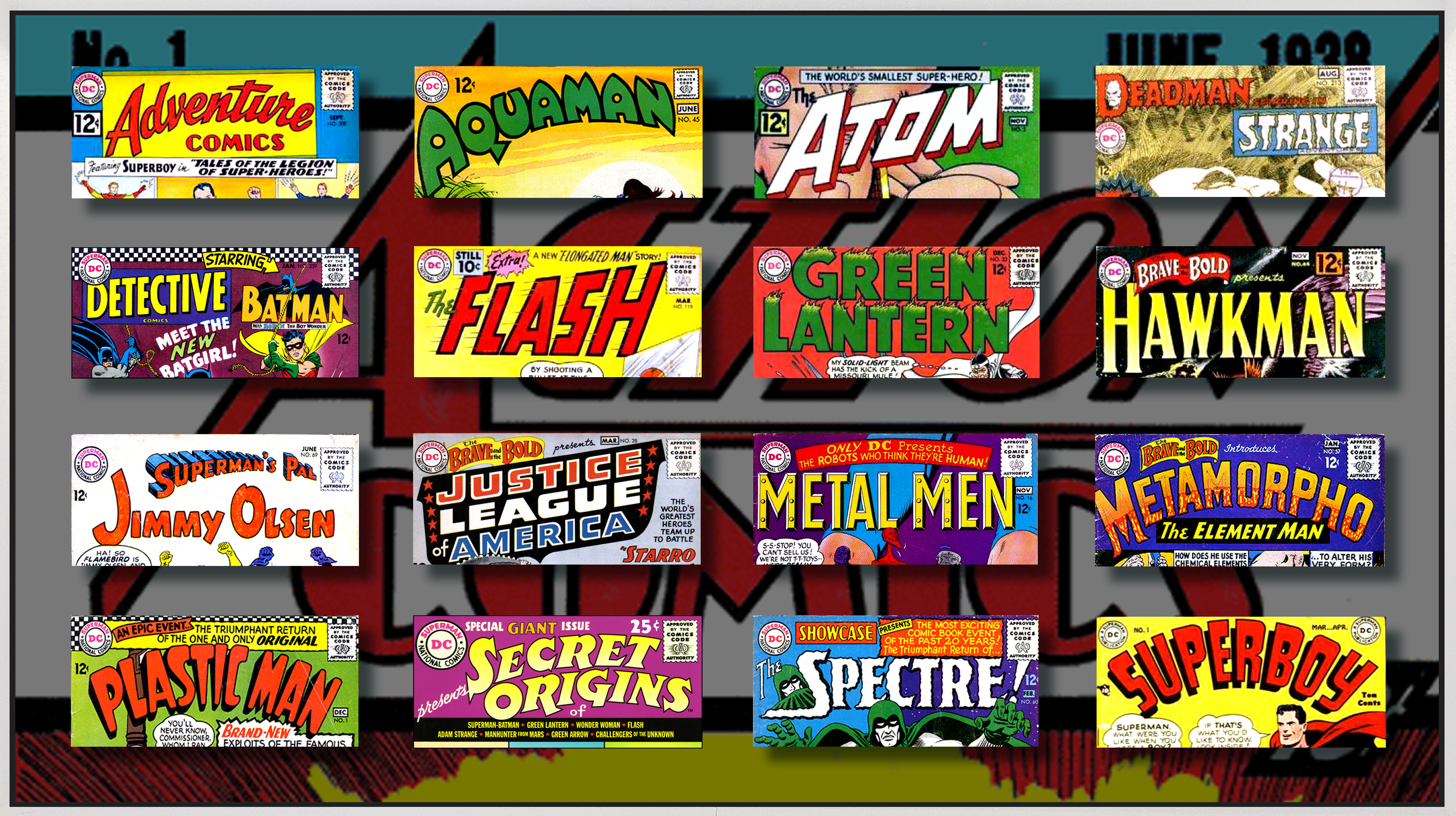
… and here’s how I rank ’em (plus I’m including the full covers):
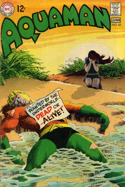
1. Aquaman. This is brilliant. The skewed angle and the combination of rounded lines and pointed ends convey an aquatic quality. There’s something about this look that’s indelibly ’60s and yet timeless. Future Aquaman logo designers have tried to emulate or surpass Schnapp’s original and nobody’s hit it yet.
—
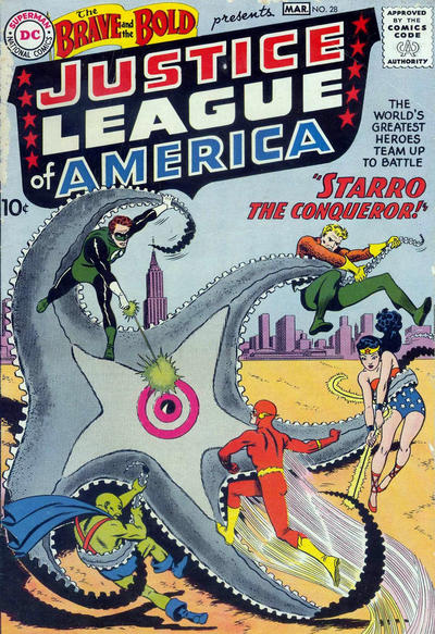
2. Justice League of America. The gold standard of Justice League logos and whenever DC diverges from it, I find myself asking why. It’s the perfect logo for this team and should never be messed with. I can live with the JLI logo, but other than that, no other JLA emblem is in the same galaxy.
—
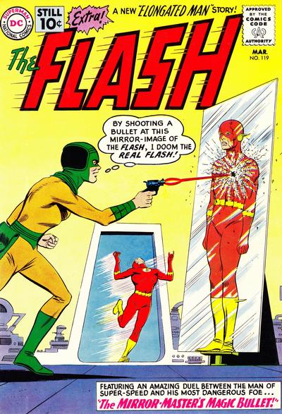
3. The Flash. This logo takes the motion implied in the Golden Age Flash emblem and brings it into the Jet Age, with the letters getting progressively larger, giving the appearance not only of speed but perspective and power. This is about as classic a logo as you will find in the DC archives.
—
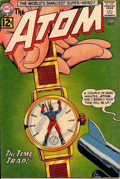
4. The Atom. Another of my favorites. It’s interesting that the Tiny Titan gets such large letters that take up so much cover space. But the design gives the sense of growth and perspective so important to the Atom conceptually. The Atom has never had a better logo.
—
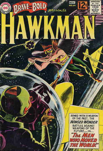
5. Hawkman. An elegant design with panache. Schnapp could have gone with a more obvious logo, incorporating wings or a beak or something. Instead, the logo seems to play off the more classical elements of the Winged Warrior: archaeology, museums, arcane weaponry. Beautifully understated and refined.
—
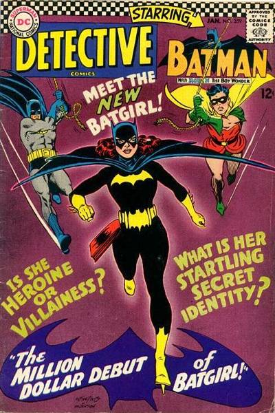
6. Detective Comics. Now, of course, my Batman bias comes into play here. I LOVE that Batman logo on the right — it might be my all-time favorite — and were it on its own, it would easily top this list. But it’s only partially the work of Schnapp. As Arlen explained to me: “Schnapp redesigned the Detective logo in ‘64, and for Batman in ’65, he just refined the “Batman” letters that were already there, making them all one word, “Batman” vs. “Bat Man” from before. The new Bat-art behind his refined letters was by Infantino/Anderson. That’s why I decided to use a double-version, to kill two birds with one stone.”
So. How to rank this? I always thought the “New Look” Detective logo was bland on its own. DC combined it with the Batman logo in 1966, presumably because the Batmania unleashed by the TV show was in full rage. But together it’s all kind of busy.
So I put it here.
—
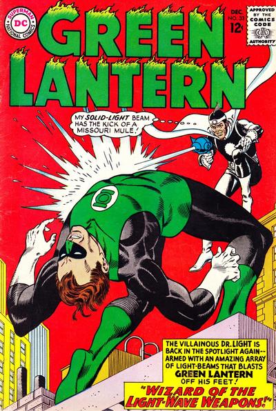
7. Green Lantern. I have a soft spot for this design, though I actually prefer the later design introduced just before the O’Neil/Adams classic run that was quickly adapted to Green Lantern/Green Arrow. This is among Schnapp’s more on-the-nose designs but I still like it, if only for nostalgia’s sake.
—
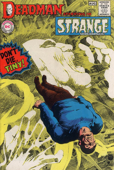
8. Strange Adventures/Deadman. These two are cut from the same spooky cloth, but I give the edge to Deadman. I dig Boston’s ghostly puss peeking out from the D.
—
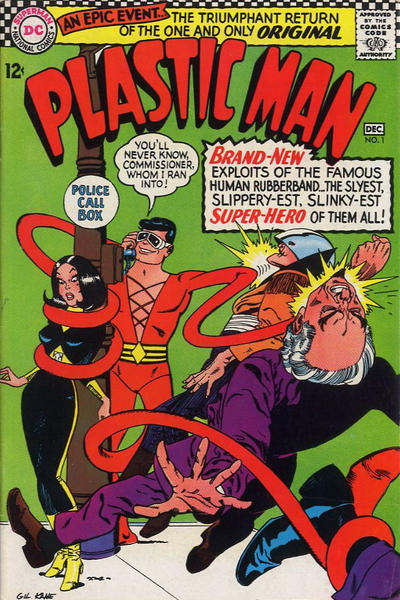
9. Plastic Man. A Schnapp classic. It’s similar to Superboy but is more in line with Plas’ character and humorous sensibility. It’s a fun, light-hearted design. It really works because the letters look like they could be stretched like Silly Putty. Which, come to think of it, is probably what Plastic Man smells like.
—
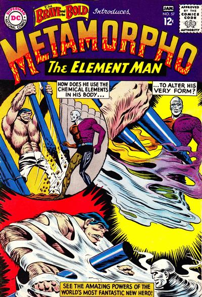
10. Metamorpho. A clever way of utilizing the Element Man’s powers in the logo — the melting, the molten lava, the shifting colors. Great shorthand for a character who was just arriving on the Silver Age scene.
—
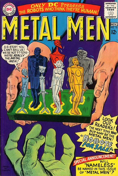
11. Metal Men. The polar opposite of Plastic Man’s design, this logo looks like it was forged from Lead or Iron themselves. It’s a powerful look, though come the think of it, the Metal Men themselves are more humorous than this banner lets on. No matter. It’s another classic.
—
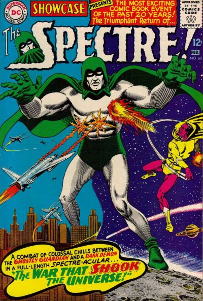
12. The Spectre. Deadman and Strange Adventures borrow from the same spooky vibe. I think the Deadman logo is more successful and iconic, but this is still a solid Schnapp design.
—
13. Adventure Comics. Some designs are so basic yet say so much about their subject matter that their mere style becomes a genre shorthand. In the same way that Dodgers script has been used to say “baseball,” Schnapp’s logo here says “comics.” That said, I find this one a little bland.
—
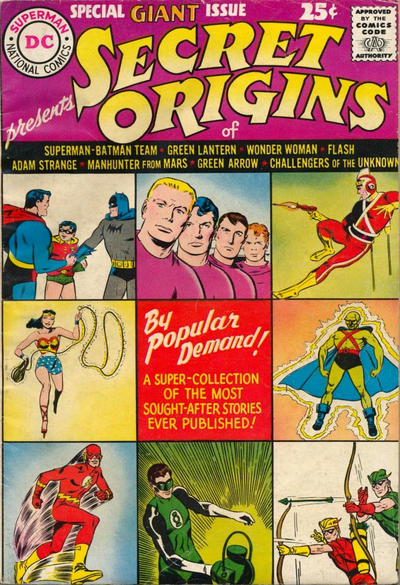
14. Secret Origins. I have a sentimental spot for this one because an issue of the ’70s ongoing featuring this logo was one of my very first comics as a kid. But it’s otherwise fairly basic and lacks the pizzazz of many of the others on this list.
—
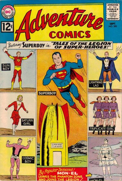
15. Superboy. Not a huge fan of this one and I think it might be because it doesn’t say “Superman” to me. There’s not enough grandeur. Maybe that’s the point. This is about someone who’s not Superman yet. It’s a homey comic. I dunno. Not one of my favorites.

—
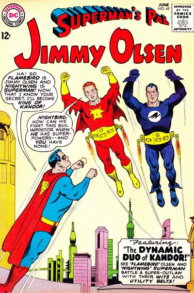
16. Jimmy Olsen. I never much cared for the Jimmy Olsen logo, but then I never much cared for Jimmy Olsen. The lettering in the main part of the title is fine — it looks like handwriting scratched into a cub reporter/photographer’s notebook. But “Superman’s Pal” is awkwardly placed, giving a too-loose look overall.
—
(Note: The original version of this story included logos for Enemy Ace and Sgt. Rock. But whether they were the work of Schnapp or Gaspar Saladino is unclear. To be certain, they were replaced by Detective Comics and Secret Origins.)
—
MORE
— Oh, SCHNAPP! The Greatest Hits of DC’s IRA SCHNAPP. Click here.
— 13 REASONS to Love DC in the SILVER AGE. Click here.
April 24, 2015
Dan, i LOVE what you wrote here! I really appreciate you taking Schnapp seriously! 🙂 Your comments on each logo were succinct & chock full of insight–even the ones I didn’t agree with! 🙂 So next question–of the ones at the bottom of your list, like the Jimmy Olsen logo–what would you have replaced them with? Let the debates begin! 🙂
April 27, 2015
Wonderful Piece, those logos are a reminder of my childhood and were used as a reference for a promotional campaign I worked on. I’ve got a quick question for you. The Green Lantern logo on the inside of the Silver Age books was a bit different than the cover logo was that also designed by Ira?
April 27, 2015
They’re virtually the same, but without the flames. I’m not sure but I’ll ask Arlen.
October 11, 2017
The Q in Aquaman looks like a fish. A clever touch by Mr. Schnapp!
October 12, 2018
Happy belated birthday to the late Mr. Schnapp.
October 18, 2018
Brings back my childhood memories seeing these fabulous logos again!
October 12, 2019
Happy belated birthday to Mr. Schnapp!
January 31, 2022
Nice work, enjoyed learning that all these logos were the work of dear old Ira. What an amazing talent. No matter what you say about DC higher-ups taking advantage of the creators, you have to admit they did smart moves like this, hiriing Ira to give their titles a superlative house feel.
Marve/Atlas at their best only backed into any overal design of their titles. Atlas never even had a house emblem, for pete’s sake, since Atlas itself was only the distribution company. They did not understand marketing 101 until they finally started using the uppper corner boxes with heroe’s head shots, in what, 1963 or so? DC may have been more corporate, but boy, you knew it was a DC title.
I’m at that age where names elude me, so I was once again looking up Ira Schnapp to respond to a romance ad posting on Comicbookdailiy.com…and found Paul Kupperberg’s “13 favorite” Ira Schnapp ads, and then this by way of his link.
My gosh, what an amazing talent he was. I’ll have to put together MY favorite Schapp works one of these days, I turned on to DC in 1961-1965, which to me are prime years for Schnapp. Even if I didn’t buy every title, his house ads in the ones I DID buy are indelibly etched into my brain. Like his full page ad for Justice League, a book that as eluded me to this day. But he did a superb one for JLA #3, and that is one of my very favorites JLA covers with the logo, of course, designed by Ira.
https://www.comics.org/issue/16094/