
It’s funny how inspiration strikes sometimes.

This week, we’re running an EXCLUSIVE Preview of Batmanga #49, one of my favorite things DC‘s publishing right now.
When I received it, I was knocked out. Not the pages themselves. They’re fine, but it was the logo on the cover that had me mesmerized. Really, I couldn’t stop looking at it:
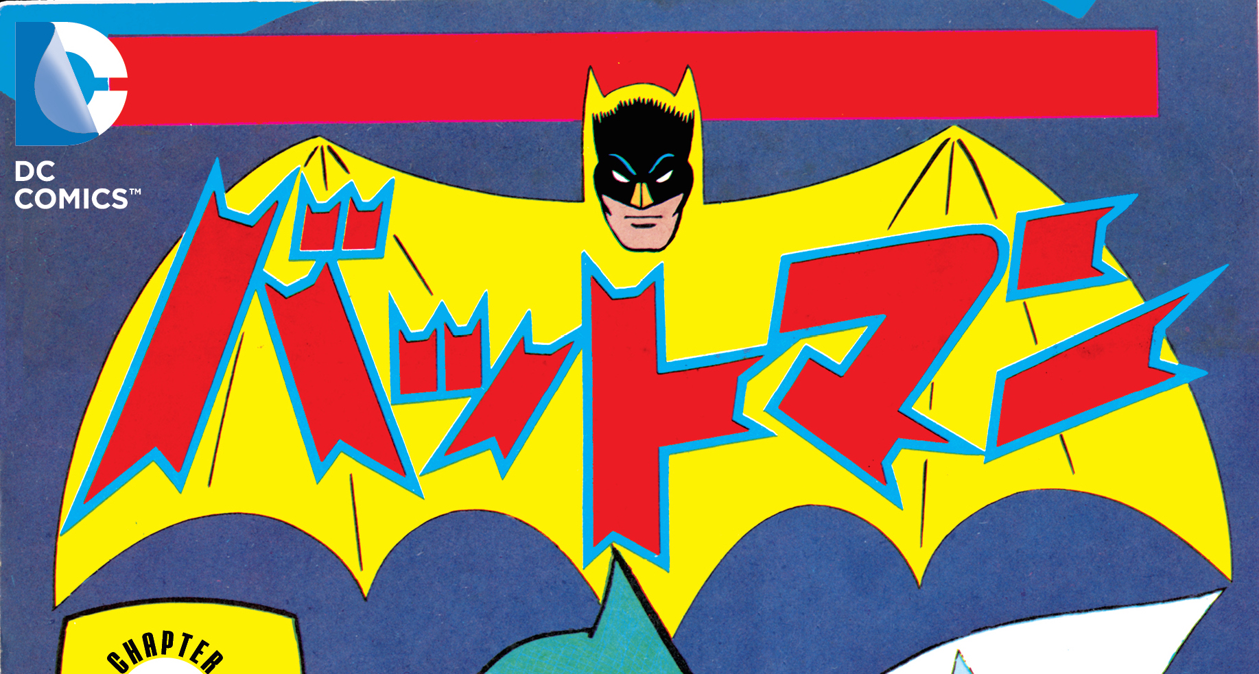
The color scheme, the old-school Bathead that’s slightly off from American comics, the Japanese words splashed just so. I was captivated.
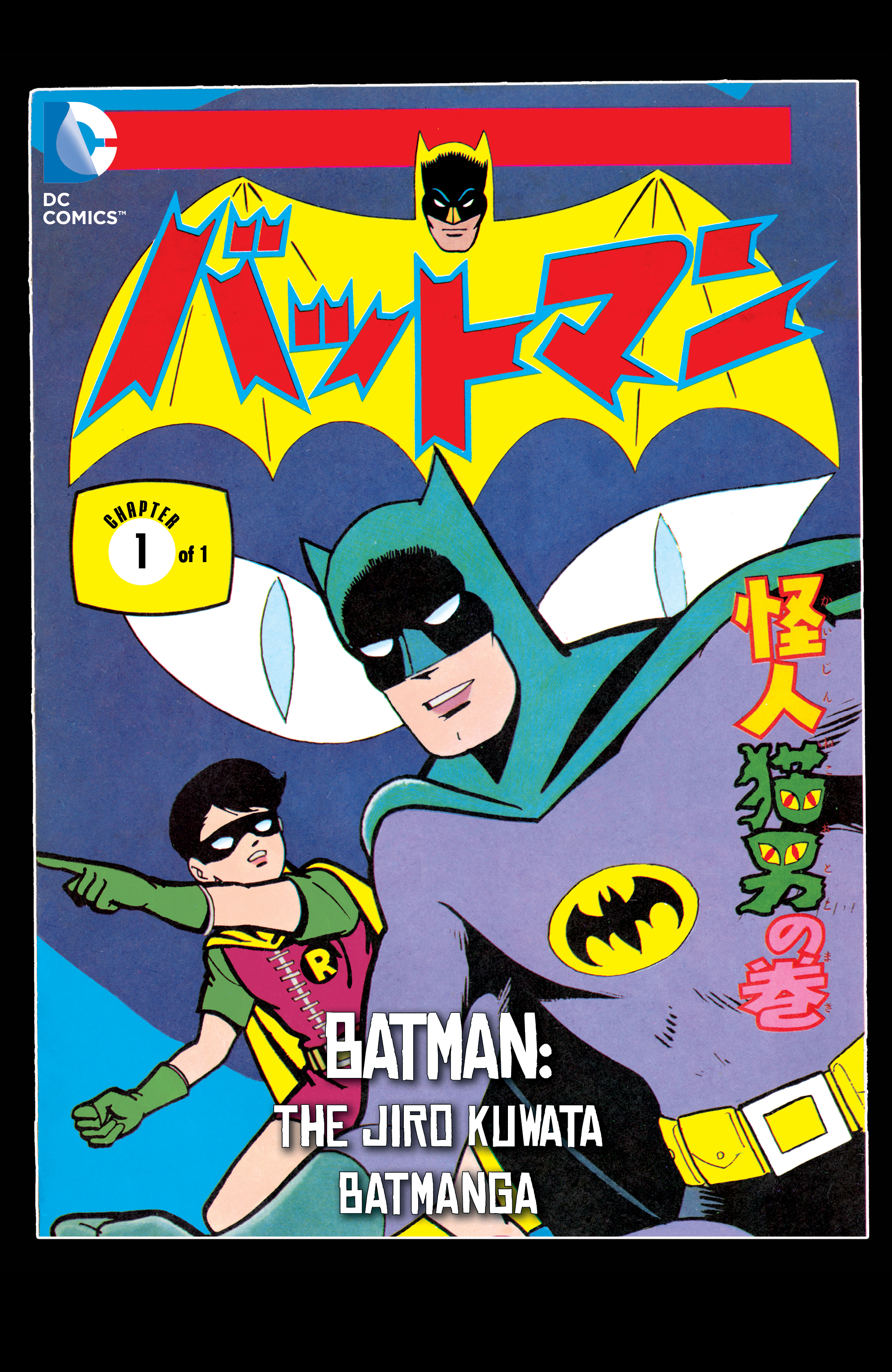
And it got me to thinking about how logos play into covers, how they fit with the overall image, how the color scheme can help embolden the rest of the piece — or simply sit there like a piece of furniture.
With Batman, it’s an especially interesting element of the cover because sometimes the best ones play with expectations — using whites and yellows and reds instead of dark blues, grays and blacks.
I’m not an art expert but I know what I like.
Seeing that Batmanga logo made me think of so many other logos I’ve loved, mostly from the Silver and Bronze Ages, when more creative uses of color seemed to be in play. And I’m not referring to logos like this — a Carmine Infantino job that plays directly into the cover image a la Will Eisner:
No, what I’m talking about is color and style and contrast.
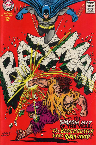
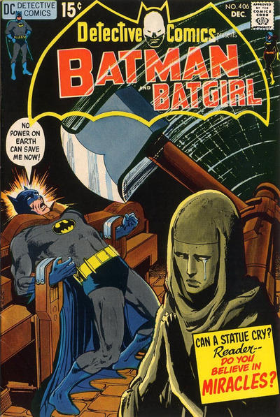
So here are 13 Great Batman Logos — presented in full context of their covers:
— This one I love because of its transparency and the white-negative Bathead. This is a concept used fairly rarely in those days and it really enhances the spookiness of the rest of the cover:
— I’m a sucker for a white Batlogo, as you’ll see below. This is smack in the middle of the Bronze Age but the broad use of bold colors gives it a sort of Golden Age vibe … only, well, modern:
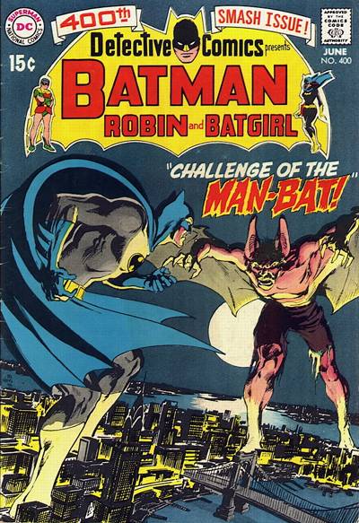
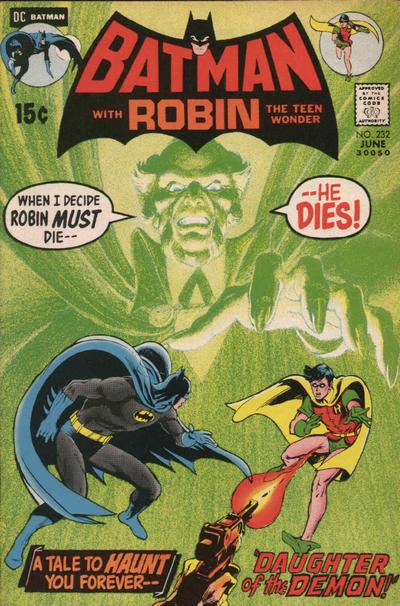
— This one’s fairly close to the Batmanga logo above in terms of color choice. It’s not as bright but I always liked the counterintuitive yellow, especially since Batman was back to his dark-and-gloomy roots. Bonus: The mini Robin and Batgirl figures, plus both of their names joining Batman‘s in the logo. I always liked when the mini-figures (and when Batman‘s allies’ names) were included in the logo:
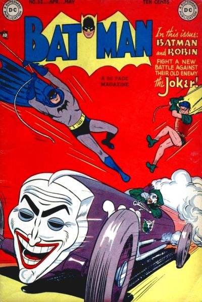
— Another one that the Batmanga logo recalls. I just dig this because of all the primary colors. I also own this. Just braggin’:
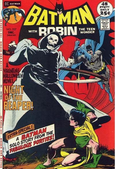
— Another logo that plays well off the bright red background, except it’s pitch black. I love Batman‘s little white eyebrows:
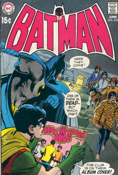
— Totally the opposite: White, with pink lettering on a gray background. Plus it’s the Beatles!:
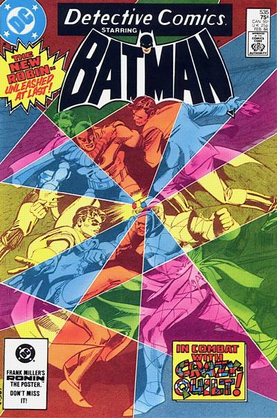
— Again with the white logo, but it’s got black (black-gray?) letters … off a rainbow background. Again, the contrast makes it work for me:
— I’m sticking with the white theme but this time it’s because of how it plays into the white of the rest of the image. This is just a gorgeous cover:
— And so is this one. Again the bright white, which is so counterintuitive. And so striking against the graytone image below it. That pink outline adds a little vibrance to boot:
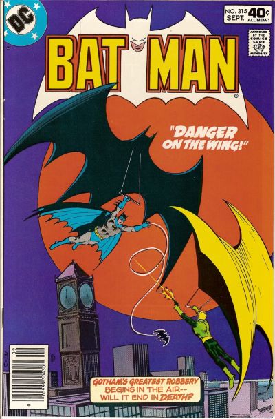
— Now, again in the other direction. Black and red and dark orange set against a textured, bright green background. Incredible. Iconic:
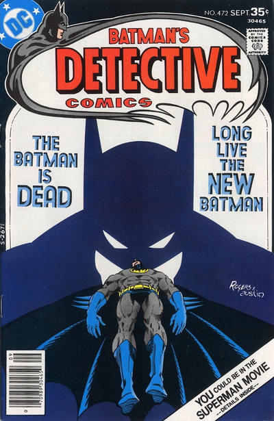
— I love this pale blue logo with bright yellow letters on its own, and in contrast to the darker blue behind it and orange below it. And whenever the Bathead itself looks like a negative, I’m all for it:
— The very next issue goes to the other pole: Dark, dark logo against a lava red/orange background. Just as effective and even more dramatic. SO EXCITING:
— Wrapping up with one that is just so whacked out that I love it. Negative imagery, yellow and pale-ish green. Black background. So unexpected. So Swingin’ Sixties. Dig it, baby!:
June 7, 2015
GREAT choices, Dan! Each one unique, each one a joy to behold! You have a great eye, Mr.G!
June 7, 2015
Thanks, Arlen!
March 29, 2016
I though I was the only one that was a sucker for Batman logos. Great post!
March 29, 2016
Thanks!