- A Bronze Age feast.
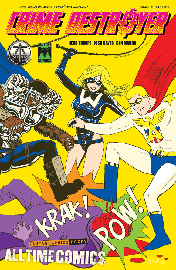
All Time Comics, a line of titles merging old-school talent and new-school vision, will be published by Fantagraphics starting in March. It’s an over-the-top homage to the Bronze Age — and features indie creators working with Big Two stalwarts from the ’70s and ’80s to create a shared universe of stories. It also includes the final work of Hulk mainstay Herb Trimpe, who just happened to be the co-creator of Wolverine. (Click here for more info.)
Anyway, we asked Josh Bayer, All Time Comics’ co-creator, to stop by to pick 13 COVERS that inspired the new line. Why now? Because 1/26 is the final order cutoff for the first issue of the imprint: Crime Destroyer #1.
We don’t usually run FOC codes but I really want to encourage you to preorder this. Here’s the solicitation:
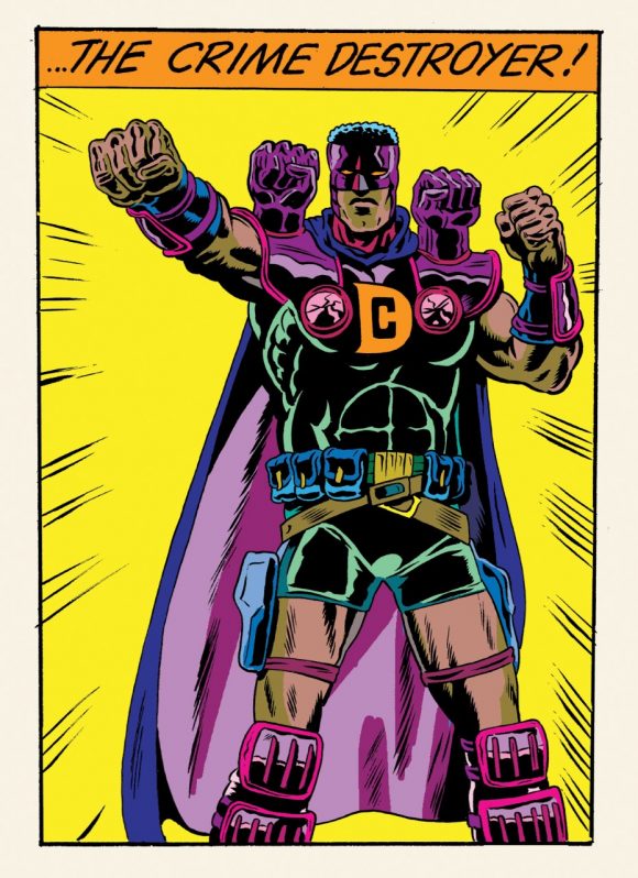
CRIME DESTROYER #1, Order code: JAN171762
(W) Josh Bayer, Herb Trimpe, Benjamin Marra. (A) Herb Trimpe, Josh Bayer, Benjamin Marra. SRP: $4.99
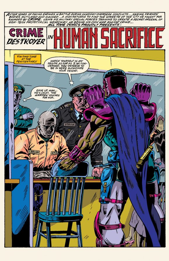
From Fantagraphics, the publisher of the world’s greatest cartoonists, comes All Time Comics, a shared superhero universe featuring the world’s most fantastic heroes. Atlas! Blind Justice! Bullwhip! Crime Destroyer! Each issue of All Time Comics features a mash-up of new cartoonists and classic comic book creators collaborating with writer Josh Bayer to unleash superhero stories that no other publisher would dare to publish: a stunning series of six comic books featuring startling stand alone, interconnected adventures chock full of retro crime fighting.
All Time Comics: Crime Destroyer #1 is a 36-page oversized spectacular featuring the wonderful writing of Josh Bayer, the irresistible inks of Ben Marra and the last art by legendary artist Herb Trimpe, who co-created Wolverine. Upcoming issues feature art by Rick Buckler Jr., Ben Marra, Al Milgrom, Noah Van Sciver, and more. Issue #1 will feature two distinct covers, one by Jim Rugg and the other by Johnny Ryan. Upcoming issues feature art by Rick Buckler Jr., Ben Marra, Al Milgrom, Noah Van Sciver, and more.
And here’s Josh, with 13 COVERS THAT INSPIRED ALL TIME COMICS
—
By JOSH BAYER
Hi, this is Josh Bayer. I’m launching a new line of comics coming out from Fantagraphics, and because it is a superhero series, I was invited to select 13 COVERS that symbolize some of the influences that we drew from in making All Time Comics.
This is an exciting thing for me — I could talk about great comics all day. There was no single criteria behind these selections. Some of them are great covers on their own, some are great because of context, and some are here because of the content inside. Many covers are listed here because they meet all three criteria. I hope you track some of these down and see for yourself. Thanks for reading!
—
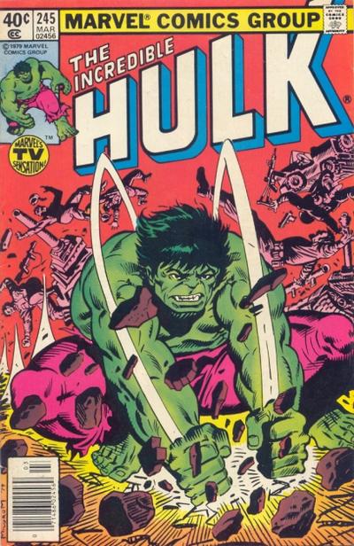
Incredible Hulk #245, Marvel. Art by Al Milgrom. Very hard to narrow it down to just one Al Milgrom cover. This one seems just rough and direct at first glance. Love the heavy patterned black-and-white soldiers in the background dancing around the Hulk, balanced by the rocks in the foreground, also dancing and patterned with black and white shadows. In the center between the tiny rocks and tiny soldiers, is the Hulk, mostly lit as a clean, solid form. And whoever tied the pink magenta soldiers to the bright magenta pants deserves a ton of credit here. In fact all the colors work beautifully. This type of rawness, joy in comics-making, and solution-finding is why I’m so happy Al Milgrom agreed to ink for us. Hope someday we’ll get him to pencil, too.
—
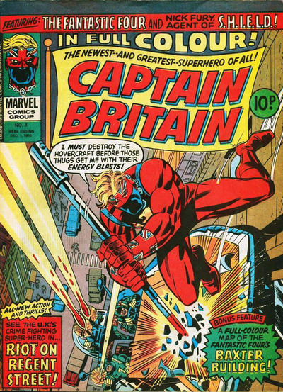
Captain Britain #8, Marvel UK. Art by Herb Trimpe and Frank Giacoia. Who is this character? I don’t know and I’ve never read this book, but Herb Trimpe effortlessly brings 100 percent enthusiasm and brilliant illumination to the dimmest corner his art is showcased in. I picked this one from among all his covers to show what Herb stood for to me: new potential and new frontiers. He shed these covers off like skins he could regenerate at will.
—
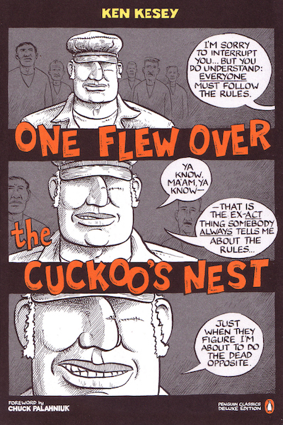
One Flew Over the Cuckoo’s Nest, Penguin Books. Art by Joe Sacco. When Joe Sacco had a chance to illustrate the cover to Ken Kesey’s classic, he did it as a comic. There’s a lot of One Flew Over the Cuckoo’s Nest in All Time Comics and the vibe is very influential in the writing of one of the titles, Blind Justice.
—
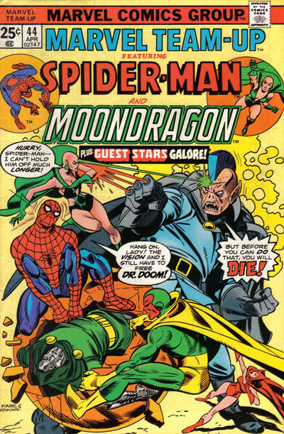
Marvel Team-Up #44, Marvel. Art by Gil Kane, Dan Adkins and Danny Crespi. This comic is crazy. The floating egg hatching Doom, Moondragon’s fight prowess (nailing the mohawk guy right between the eyes while deflecting three knuckle lasers!), and it’s a great composition: The line of the mohawked giant’s body going right into Spider-Man’s blue form, while another strong line of action takes your eye back across to make a huge slashing X.
—
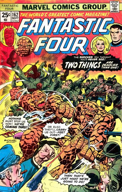
Fantastic Four #162, Marvel. Art by Rich Buckler and Joe Sinnott. I love the way the army guys are getting thrown around, the amazing floating circular head shots around the logo, the weird brown-on-orange earth-tone ’70s era fashion sense of the Thing twin, and the brutality of the cover. Can Ben Grimm take being shot point blank without feeling it? Can the army guy smoke a huge cigar while in the midst of committing bloodshed? It’s a sweaty, anxiety-ridden question mark. Also I love stories about doubles.
—
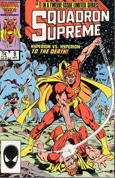
Squadron Supreme #8, Marvel. Art by Bob Hall and Bob Layton. Speaking of doubles… In this issue Hyperion fights a version of himself until his eyes are blown out of their sockets. This kind of loopy nightmare balance of opposites is akin to a superhero version of a George Herriman comic.
—
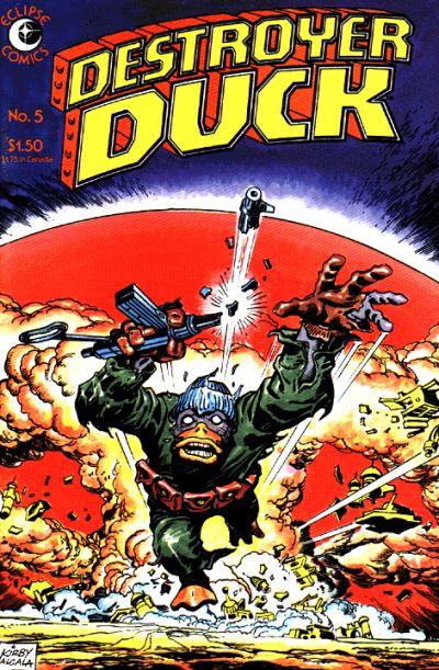
Destroyer Duck #5, Eclipse. Art by Jack Kirby and Alfredo Alcala. There is so much content in this comic I can’t even stand it. If you don’t know Destroyer Duck, please search it out. Writer Steve Gerber had more content in one panel than most writers could come up with in 30 pages. Jack Kirby is my favorite artist of all time and brings a limitless power to this seemingly simple cover.
—
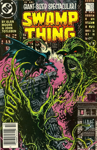
Swamp Thing #53, DC. Art by Steve Bissette. Everything I’d ever want to know about drawing is here in this Bissette cover. I saw this in the ’80s, my first year in art school. At the time I wanted to draw like Otto Dix and get away from uptight order and rules, then Bissette comes along and shows me you can be both raw and energetic and tight and proper simultaneously. Those buildings are straight as any architect could want but the figure work is as organic and raw as Gary Panter. The thick lines look like they were done with the edge of a spear. Knowing that the interior art, done by John Totleben, is so carefully precise and dominated by delicate line work, packs the whole feel with a yin/yang dynamism.
—
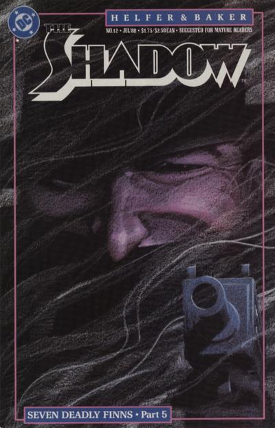
The Shadow #12, DC. Art by Kyle Baker. You know this guy, look at this cover. At first, it’s just a face then the details start to come out at you; the black eyes, the restrained, all-knowing smile behind the scarf. You don’t see it, but you know. The subtle gradation tones — how did he achieve them? Is it stipple? Duotone paper? Only Kyle Baker knows. The Shadow is a perfect late ’80s comic. I was among the fans who loved the virtuosity of Bill Sienkiewicz on the first issues, but Kyle’s more downbeat choices and his love of an almost early newspaper-comics page design introduced DC/Vertigo audiences to a type of radicalized folky conservatism that you might be surprised to see outside of a Justin Greene story.
—
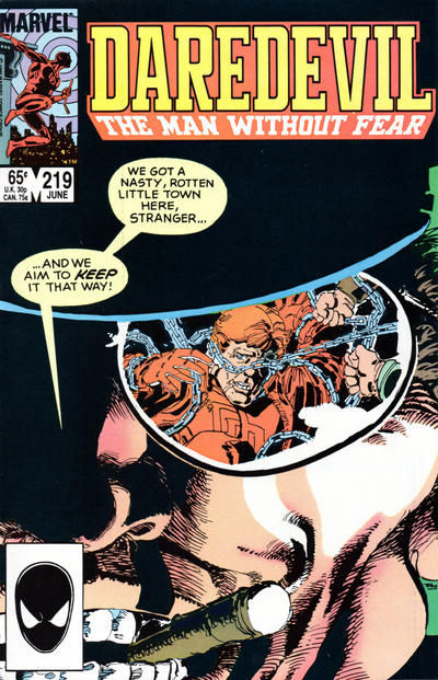
Daredevil #219. Art by Frank Miller. If you know the history of this comic, you know this was the first time Frank Miller had returned to Daredevil since he’d signed off with his finale three years earlier There is something really cool about the way the story does the talking here. There’s a no hype, no prestige format or glossy cover. It’s a humble comic, with no loud self-proclaiming. But when you open it, it’s an all-star production all the way from the script by Miller to the inspired teaming of John Buscema and Gerry Talaoc. Hard to top.
—
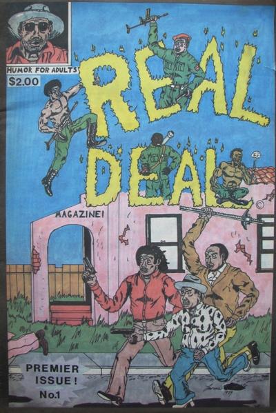
Real Deal #1, Real Deal Productions. Art by Raw Dog (Lawrence Hubbard). Talk about a comic that simultaneously makes you want to draw and makes you want to read it. This book hits a primal chord in me, from the way lines and marks are made, to the composition like a 15th century Islamic tapestry. It’s both unfathomable how they made this and unfathomable that there’s not a million comics that look like it. But there’s not! There’s just one Real Deal.
—
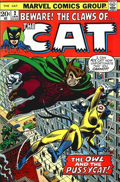
The Cat #2. Art by John Romita. We had the first Issue of The Cat when I was a kid. It’s a lurid, bold-looking thing. I think I might have made up a boy character that had her same outfit, actually, and tried to do my own comic based on her. It’s a perfect costume design to a kid the same way CC Beck’s Captain Marvel is perfect. The covers from the ’70s have never been matched. Something went out of the industry somewhere along the line.
—
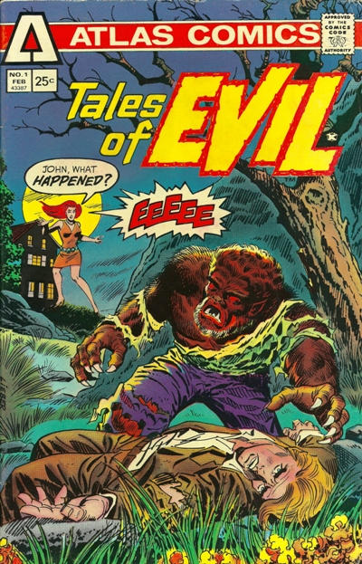
Tales of Evil #1, Atlas. Art by Larry Lieber, Frank Giacoia and Gaspar Saladino. I’m really fascinated by Atlas Comics. The comics had so much energy and still didn’t work. There’s a cautionary tale within, and it could almost be interesting if the pressures behind the scenes became even more blatant until a Dan Clowes Doc Infinity cast of artists and writers emerged from behind the scenes to have a public meltdown. This cover in particular gets to me. I love the way everyone is so thick and stocky. Larry Lieber really doesn’t get enough credit — another veteran that I like to honor whenever possible. I’d love to draw like him.
—
Crime Destroyer #1 is due 3/29.
—
Most cover images and credits from the bombastic Grand Comics Database.
—
