
Groovy!
—
Nothing says mid-20th century graphic-design kitsch like the late, lamented floating head.
Floating heads used to be everywhere — TV commercials and movie posters, magazine ads and baseball cards. You name it, there was a floating head to put on it.
Including comic book covers. Definitely comic book covers. And now, they’re back — at least for a one-off Justice League cover out this week by David Yardin:
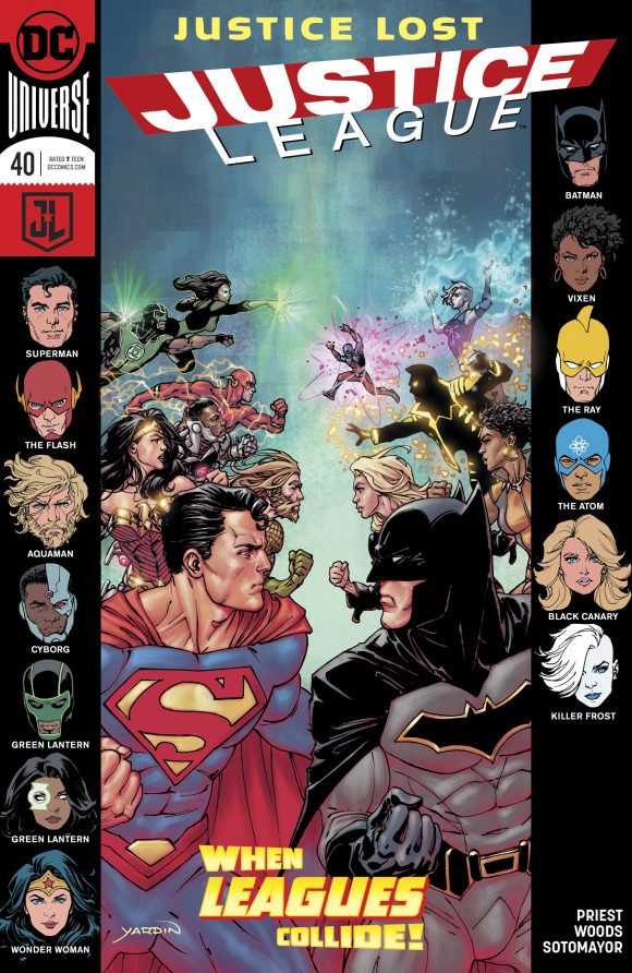
In the ’60s and ’70s, Marvel and DC each embraced the floating head in its own inimitable way, typically using them for team books as a shorthand signal to let readers know just who was going to pop up in an issue besides the heroes shown in a cover’s central image.
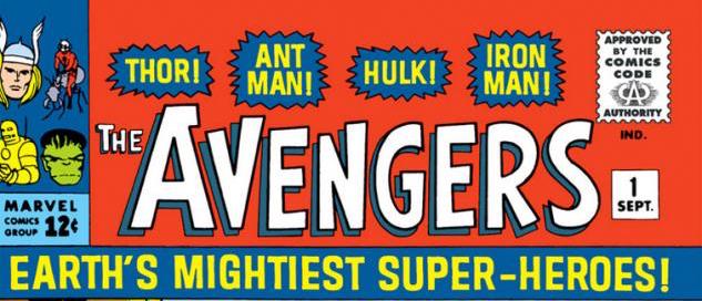
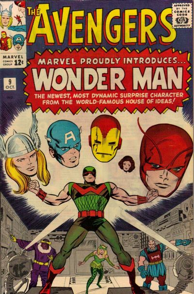
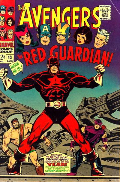
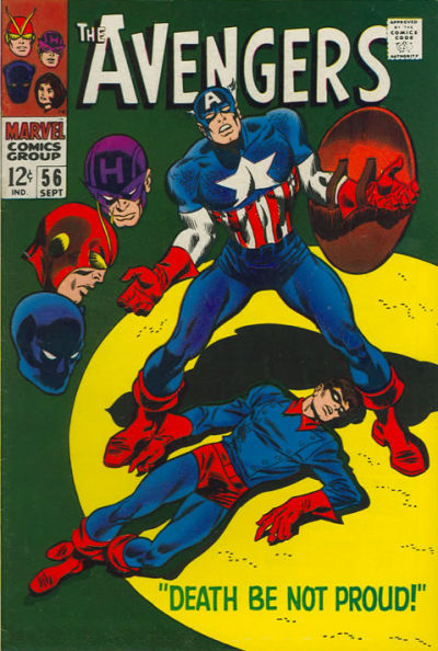
With The Avengers, for example, Marvel tended to use the heads either in their corner boxes — which have made a comeback with Marvel Legacy (though they’ve already started to disappear) — or as a sort of disembodied Greek chorus reacting to the action on the cover.
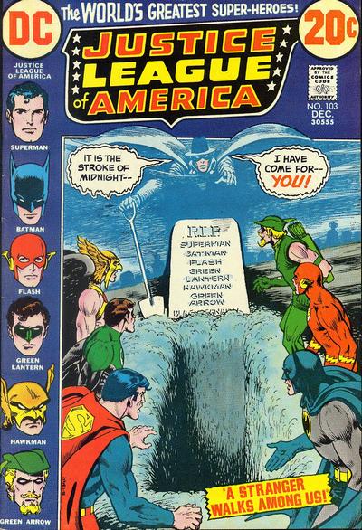
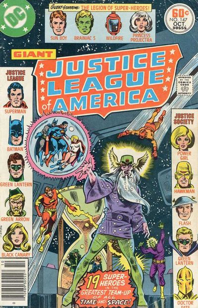
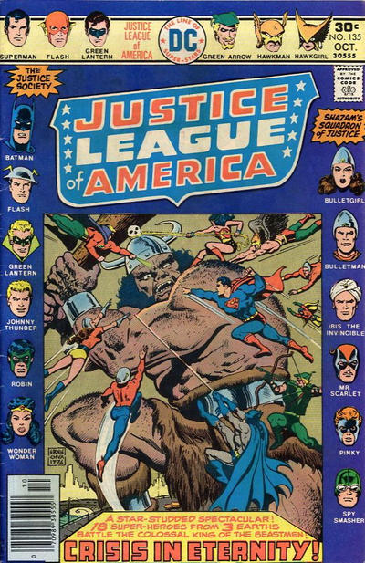
DC, unsurprisingly, took a more formal approach with Justice League of America, using heads in the margins as a roll call — a design concept made more effective whenever the League was visited by the Justice Society or some other extradimensional team.
Naturally, they showed up on non-team books, too — Spider-Man made particularly excellent use of them — but no matter what, floating heads ROCKED. And that’s why I got so excited when I saw Yardin’s cover. I just wish they were back full time.
Anyway, this august occasion just cried out for a 13 COVERS salute to that wondrous technique that was an indelible mark of the Silver and Bronze Ages.
Here are some all-time faves, highlighting JLA and The Avengers:
—
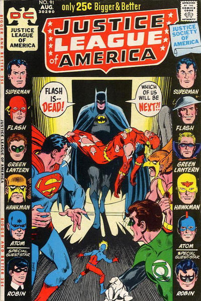
The first JLA floating-heads cover. Mike Sekowsky pencils, Murphy Anderson inks. Bernard Sachs did the heads.
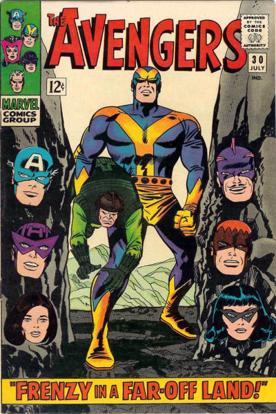
John Buscema pencils, George Klein inks, with John Romita alterations.
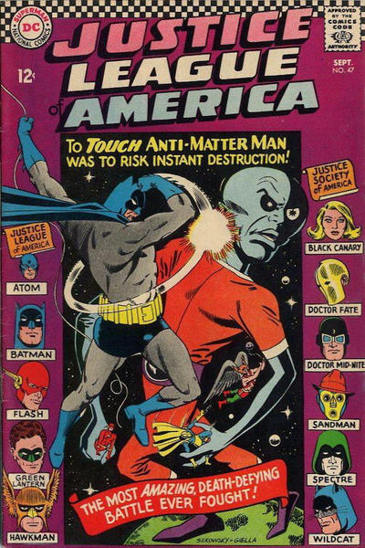
Neal Adams main image. JLA heads look like Murphy Anderson, with Robin by Adams. JSA heads look like Sachs, with Robin by Anderson and maybe Superman by Sekowsky. You tell me.
Jack Kirby pencils, Frank Giacoia inks, Romita alterations.
George Perez. A fun throwback in the ’80s.
Gil Kane
Nick Cardy main image. I believe those are all Neal Adams heads, though Alan Kupperberg evidently penciled Batman with Adams inks.
Kirby pencils, Chic Stone inks.
Dick Dillin pencils, Frank McLaughlin inks.
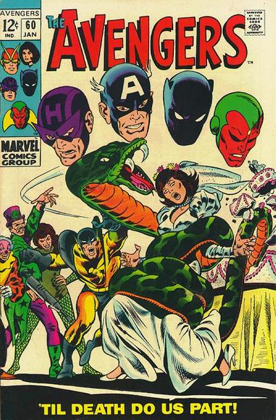
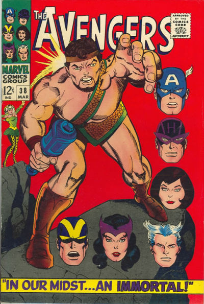
Buscema pencils, George Roussos inks.
Ernie Chan
Buscema pencils and either Giacoia or Klein inks.
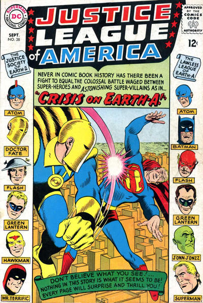
The first actual JLA-JSA floating-head cover. Main image: Mike Sekowsky pencils and Joe Giella inks. Heads appear to be a combination of artists but I see a lot of Anderson in there.
—
Cover images and credits from the nifty Grand Comics Database. Additional credit speculation my own. Feel free to weigh in below if you know something I don’t.
March 7, 2018
wish you included this: https://vignette.wikia.nocookie.net/marveldatabase/images/b/b5/West_Coast_Avengers_Vol_1_1.jpg/revision/latest?cb=20180112032244
March 8, 2018
Good addition, Chris – BUT if so, the actual original cover should be used and NOT the one that edited out the head of ROM : SPACEKNIGHT
after Marvel lost the rights.
https://www.comics.org/issue/39113/cover/4/
March 9, 2018
This is my fave https://www.google.com/search?q=avengers+186+cover&client=safari&hl=en-us&prmd=isvn&source=lnms&tbm=isch&sa=X&ved=0ahUKEwiJ7OPlqeDZAhUKKqwKHT9dCKIQ_AUIESgB&biw=375&bih=619#imgrc=MLh-esqt8hd3eM:
March 11, 2018
World War Tank Girl #2 did one!
January 11, 2025
Regarding some of the heads on the cover of JLA #91: JSA Superman, Hawkman, and Robin and JLA Flash and Green Lantern are from the splash page on JLA #56 by Mike Sekowsky & Sid Greene. JSA Green Lantern is from the splash page of JLA #22 and JSA Atom is from the splash page of JLA #38, both by Mike Sekowsky and Bernard Sachs.