The magical marriage of art and words…

The Compelled
You can’t judge a book by its cover but you can judge a cover by its cover – and the world of science fiction has had so many memorable ones since the earliest days of the genre.
Of course, when the cover is as good as the book, you’ve got something special on your hands, as writer Adam Roberts can attest.
This week, new publisher NeoText has released The Compelled, a sci-fi novella written by Roberts and illustrated by Francois Schuiten, winner of the Angoulême International Comics Festival’s prestigious Lifetime Achievement Award.
“The Compelled follows the story of several characters scattered across the globe who have all been compelled by a mysterious force to collect seemingly random objects and move them to other places, where the objects gather and begin to form increasingly alien, monolithic structures that appear to have vast technological implications,” reads the official description. “Where is the Compulsion coming from? And— more importantly—when the machines they’re building finally turn on, what are they going to do?”
So marrying evocative words with gorgeous illustration, Roberts has produced for 13th Dimension 13 AWESOME SCIENCE FICTION BOOK COVERS – RANKED:
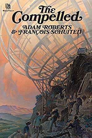
—
By ADAM ROBERTS
The cover art on science-fiction novels can be gorgeously sublime — or gloriously ridiculous. There is, it seems, nothing very much in between. Whole websites are devoted to the second type (“Good Show Sir” is a particularly hilarious example) but I want to concentrate on the first. After all, it was the cover-art on cheap SF paperbacks back in the 1970s that first made me fall in love with the genre, and that love has never faded.
13. Kings in Yellow. Not all SF covers have to include figuration. SF fans of a certain age have happy memories of Gollancz’s “Yellow Jackets,” a plain cover house style consisting of black or red typeface on a plain yellow background.

The firm’s founder, Victor Gollancz (1893-1967), disliked “prettified picture jackets” and visited all the railway station bookshops in London to decide which color would stand-out most effectively against the other books displayed for sale. He decided on yellow, and Gollancz is still publishing yellowbacks to this day.
—
12. The Day of the Triffids. Speaking of yellow, John Wyndham’s 1951 novel manages the impressive task of making vegetables scary — bioengineered carnivorous plants that can walk about on three stumpy legs and sting their prey with whip-like tentacles. Wyndham adds in a second disaster (a spectacular meteor shower, which may actually be an orbiting weapons platform: it’s never made clear) that blinds all who see it, leaving whole populations helpless before the perambulating plants. The result is one of the masterpieces of British “cosy catastrophe” science fiction.
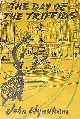
The original Michael Joseph cover by Welsh artist John Griffiths imagines the triffid as a sort of giraffe-shaped artichoke on tuberous legs. Since “gigantic artichokes” rather undersells how tense and scary Wyndham’s novel actually is, Griffiths has superimposed spiraling green lines to convey alarm. Still, his conception of a triffid was iconic enough for it to be copied across to the 1961 Penguin first paperback:
I love the way the penguin logo itself appears to be giving us an alarmed side-eye at the proximity of the monster.
—
11. Hurry Up Please, it’s Time Machines. H.G. Wells’ first published novel, The Time Machine (1895), effectively invented the time-travel genre, and remains one of the most famous of all science-fiction titles. Of course, when William Heinemann took the project on they had no idea it was going to prove as enduring, and their original cover, with a simple line drawing (by Ben Hardy) of the “sphinx” Wells’ time traveller encounters in the year 802,701 could hardly be more low key.

Since then, it has been reprinted in hundreds of formats, and a wide range of designers and artists have faced the task of covering the story. Most opt for a version of the machine itself:
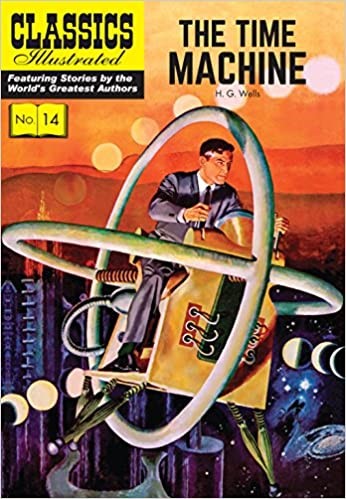
The artist there is Lou Cameron, who worked widely in comics. Not sure if those big hoops are integral to the timey-wimey machinery or just roll-bars. Still, at least Cameron’s time traveller has a seat. Here’s the 1969 Scholastic Press edition of the novel:
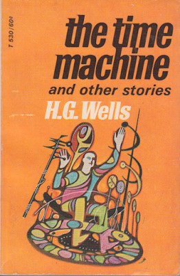
“What’s stopping the traveller falling through the hole in the base of his machine?” and “Why is there a giant psychedelic spoon behind him?” are questions that could puzzle the best minds.
—
10. Please… Fix It, Daddy? Frank Kelly Freas (1922-2005), known as the “Dean of Science Fiction Artists,” is one of the most celebrated of all genre cover artists. A 50-year career, and hundreds of magazine and book covers, produced many memorable visions, but Please… Fix It, Daddy?, the image of a plaintive-looking robot holding in its gigantic hand the broken body of a dead soldier, is surely his best-known image.
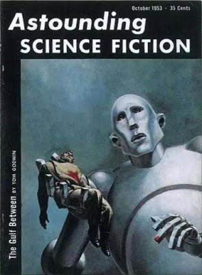
It was originally the cover for the October 1953 issue of Astounding Science Fiction, illustrating Tom Godwin’s first published story The Gulf Between. What makes this image so iconic is partly the expertly rendered limpness of the dead human body, and more the skill with which Freas paints the doleful countenance of the robot.
It’s not clear how the apparently seamless metal out of which the creature’s face is constructed can shape itself into such an expression; or more precisely, the evident rigidity of the robot’s massive body throws the poignancy of its facial expression into sharper relief. The dab of blood on the middle finger of the robotic left-hand looks almost dainty, until we remind ourselves of the difference in scale between machine and man and match that dab to the caved-in human chest. The title tells us the metal man didn’t know what it was doing, perhaps didn’t know its own strength, is sorry for the damage. It strikes home precisely because we understand, as the robot does not, that death cannot be reversed. All in all, it is a masterpiece of science-fictional pathos.
Roger Taylor, the drummer in British rock-band Queen, clearly thought so, because two decades later he hired Frears to recreate this image as the cover to Queen’s sixth studio album News of the World (1977). Frears, a fan of classical music, had never heard of Queen, and took some persuading. But eventually he executed the commission with panache, replacing the dead soldier with members of the band: guitarist Brian May and lead singer Freddie Mercury in the gigantic hand, Taylor and bassist John Deacon spilling from it.
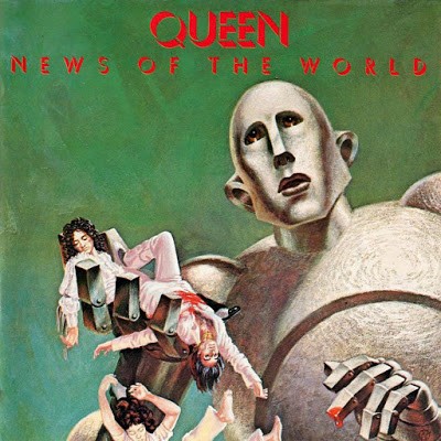
Opening the gatefold of the original vinyl record sleeve reveals a completely different context to the original Astounding story.
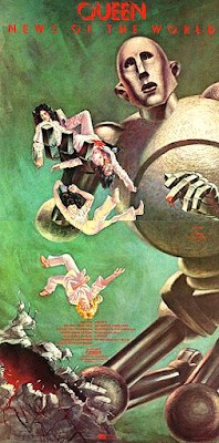
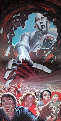
Here the giant robot has clearly gone on a rampage, breaking through the domed stone roof of some futuristic rock-concert venue to snatch the musicians out with life-crushing force before reaching back in to grab terrified audience members. It’s an object lesson in how context alters our reading of an image: The robot’s facial expression here looks less anguished and more inquiring, as if offering the bodies to some implacable robot deity.
—
9. Darkness and Whiteness. Ursula Le Guin’s Left Hand of Darkness (1969) is one of the truly great science fiction novels, set on a winter planet whose inhabitants are not fixed as male or female, except for a short seasonal period called “kemmer” when they might be either. How to illustrate this rich, beautiful novel given that it mostly concentrates on just two characters and all takes place in a pared-down all-white environment? The 1969 Walker hardcover art by US artist Jack Gaughan manages something elegantly minimalist and beautifully expressive.

—
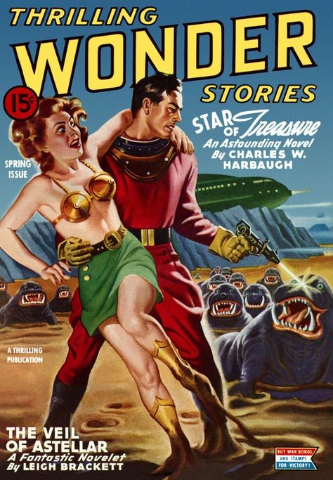
8. Ray Guns and Bug-Eyed Monsters. No list of the greatest SF cover art would be complete without at least one old-school pulp extravaganza. Here’s the cover to a 1944 issue of Thrilling Wonder Stories. It has it all: a lantern-jawed space hero, a space princess in a metal-bra, a laser pistol and a horde of toothy aliens. The image here is by US artist Earle K. Bergey, and for all its limitations — its sexism, its kitsch unsubtlety — it captures something crucial about the appeal of pulp SF as such.
—
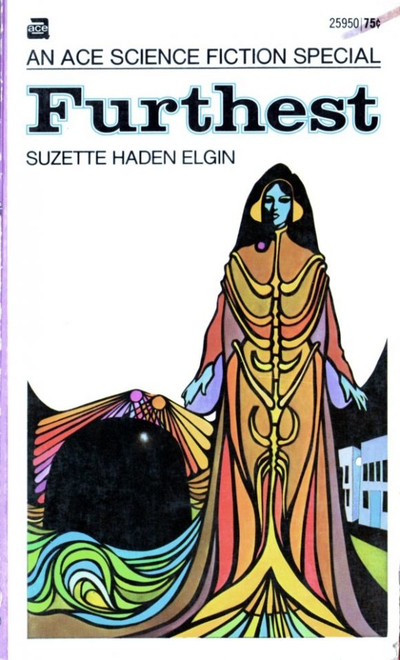
7. Furthest. By way of contrast, here’s the supremely elegant mannerism of Suzette Haden Elgin’s underrated Furthest (1971), art by Leo and Diane Dillon. The novel ostensibly concerns the adventures of interstellar man-of-action Coyote Jones, but the real star of the show is Bess, portrayed here: a telepath whose skills include projecting hallucinations into the minds of men to persuade them they’ve had mind-blowing nights of passion without her ever having to touch them.
—
6. Frankenstein. For many, Mary Shelley’s 1818 novel of over-reaching scientist creating life and facing terrible, unintended consequences is the first science-fiction novel. That it still retains its capacity to thrill and awe, still trails its tendrils of dread over the tender membrane of our imaginations, speaks to something very potent indeed in its original conception. Even more remarkable is that it was written by a teenager. I don’t mean to denigrate the 13-19- year-olds, but how often does somebody so young and unschooled produce a masterpiece capable of enduring through centuries?

What I love about this cover is the way it balances the novel form with our knowledge of the James Whale film adaptation, and especially Boris Karloff’s performance as the monster. Karloff was actually a mild-mannered middle-class Englishman called William Pratt (born, as I was my middle-mannered self, in the southeastern suburbs of London); but his stage-name was well-chosen, for there is something at once exotic and brutalist and also tender and pathos-rich about his performance. The blocky foursquare quality of Frankenstein’s monster is here expertly folded-in to the rectangular format of the novel itself. Very cleverly done.
—
5. Dune. Frank Herbert’s 1965 bestselling novel has been issued under plenty of covers, but for me, as for many of my generation, this 1972 New English Library edition is the one that evokes the Proustian rush. This was the version I first read, and the simple effectiveness of Bruce Pennington’s art — those iconic blue-on-blue eyes! — not to mention the distinctive blocky typeface for the title, capture something important about Dune’s spacious exoticism.
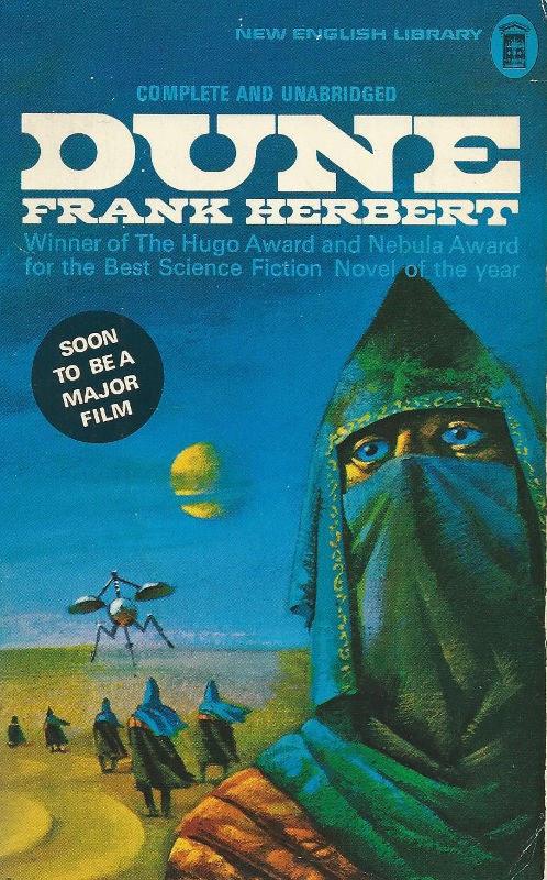
Indeed, it was such a good cover that Manor Books half-inched it for their 1978 re-issue of a completely different novel …

—
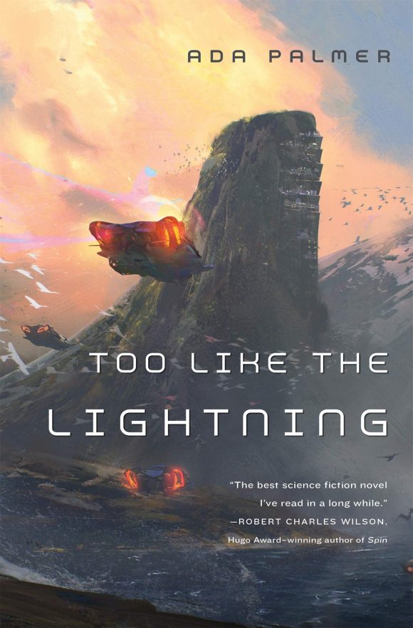
4. Too Like the Lightning. Victor Mosquera’s cover art for Ada Palmer’s debut novel Too Like the Lightning (2016) — the first in her Terra Ignota series — combines the best in classic pulp-era grandeur and imaginative hospitality with a nice, stylish modern sensibility. The image works both as an illustration of the world of the novel, and as an almost abstract pattern of beautifully balanced colors, textures and shapes.
—
3. Binti: Home. There’s a lot of extremely sophisticated and well-designed SF cover art out there at the moment. Take Binti: Home (2017), a beautifully poised and expressive combination of striking design and appealing visual realism. The visual echo between the lead character’s hair and the alien tentacles behind her, quite as much as the calm of her face and posture, speak eloquently of Nnedi Okorafor’s well-regarded story of ordinary life in a cosmos filled with wonders.

—
2. Foundational. Asimov’s Foundation series began as a string of short stories in the 1940s, was fixed up into a trilogy of novels in the 1950s and has spawned many sequels, prequels and spin-offs. But in terms of cover art few editions have been as striking as these from the 1979 Panther Books paperback edition, with British artist Chris Foss. Perhaps I’m biased: These were (once again) the editions in which I first read these tales, but they still strike me as close to perfect where SF cover art is concerned.
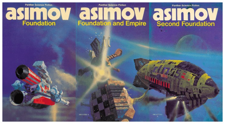
There’s the lower-case “a” on the author’s name — and how many writers could get away with just being known by their surname? — and the implied enormousness of the craft so carefully air-brushed into being. Best of all, though it sounds counter-intuitive saying it, is the way these images have nothing to do with the stories they illustrate: Asimov’s saga is all people talking with one another in interior spaces.
Foss later admitted her rarely read the novels he was commissioned to illustrate: “One of my art directors would phone me up with a job and say, ‘Chris, we need another Asimov,’ so I’d ask, ‘What do you need?’ He’d say, ‘The last one was blue, so give me a green one.’” But though it might look strange, I’d say this disconnection enhances, rather than diminishes, the glory of the books. It opens an imaginative space in which the reader gets to decide by what oblique set of expansive possibilities these images fit this story. Superb.
—
1. Dark Penguin. UK publisher Penguin have a long history of inventive and beautiful SF cover-art. You can see a full range here. Out of this wealth of art, here are a few of British artist David Pelham’s extraordinary covers for J. G. Ballard through their mutual friend, pop artist Eduardo Paolozzi.
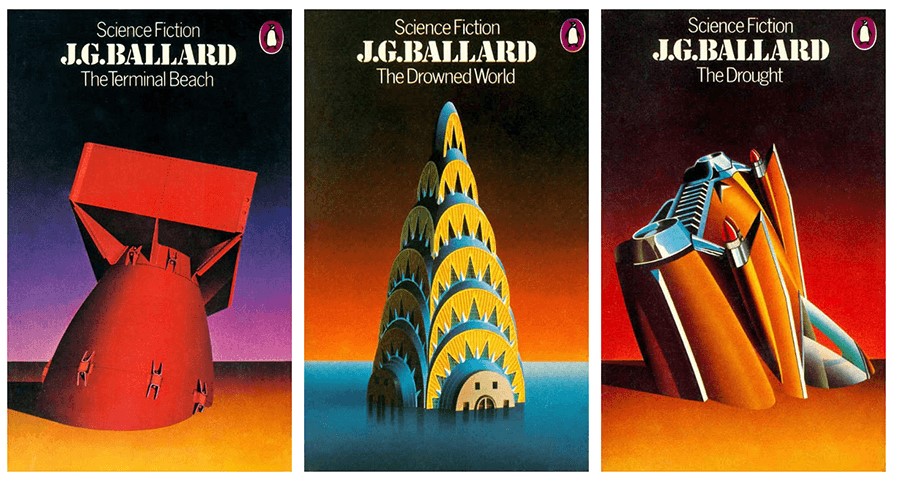
Pelham knew Ballard personally, and the author requested he paint the covers. The results are stunning in their own right, and they capture something about the brightly deracinated and timeless quality of Ballardian dystopia. They strike the perfect balance between the familiar and the strange, they are neither schlocky nor overbusy, but they are powerfully strange — all the things the best science fiction achieves.
—
For more info on Roberts and Schuiten’s The Compelled, click here.
—
MORE
— GET COSMIC: 13 Brilliant Science-Fiction Comics Covers — RANKED. Click here.
— BEYOND HAL: 13 of the Greatest Artificial Life Forms in Fiction. Click here.

August 26, 2020
Always happy to see Adam Roberts in unexpected places–more from him here, please!
April 11, 2021
Great list. There are few I have never heard of and so will give them a go. Small typo though: “Foss later admitted her rarely” should be “Foss later admitted he rarely”.