
BRONZE AGE BONANZA: Romita! Adams! DeCarlo! Kirby! MORE!

—
Welcome to BRONZE AGE BONANZA — our monthly series that looks at the greatest covers of the Bronze Age — exactly 50 years later. For more info on this feature, click here.
—
Another very strong month, and once again, everyone — including Neal Adams, Jack Kirby, Jim Aparo and Dan DeCarlo — follows the brilliance of John Romita.
Dig the TOP 13 COVERS OF JUNE 1974 — RANKED:
—
13. Archie’s Girls Betty and Veronica #224, Archie. Dan DeCarlo, you just couldn’t help it, could you?
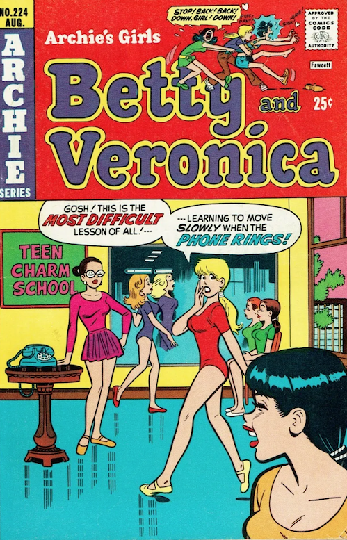
Dan DeCarlo
—
12. Plop #7, DC. This is how imagine this went. Editor Joe Orlando: “Basil, you can’t put a gigantic scrotum with eyes on the cover of a DC comic.” Basil Wolverton: “So, I’ll call it a brain instead.” Orlando: “Yeah, OK, that should do it.”
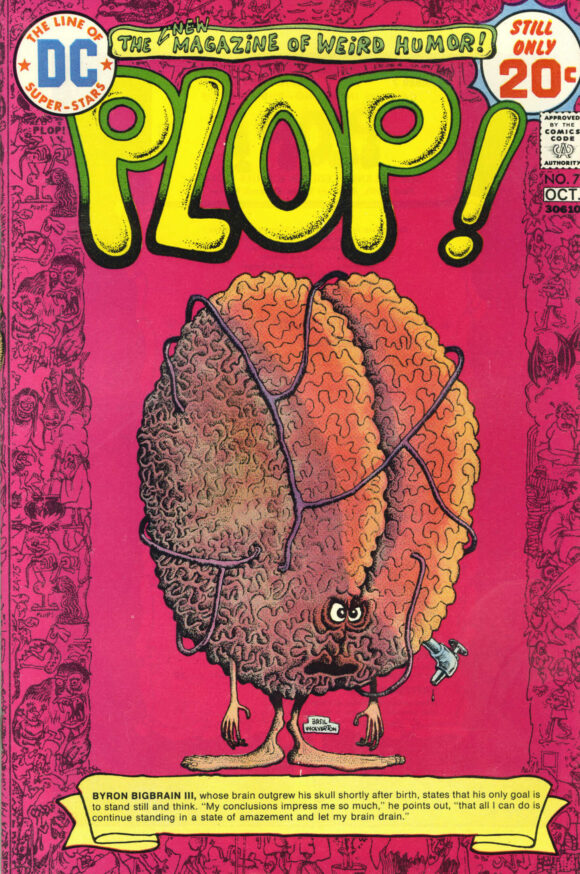
Basil Wolverton
—
11. House of Secrets #123, DC. This is so gross. Frank Robbins decided he was just going to ruin summer for everyone. Actually, it doesn’t look all that different from a Spider-Man Popsicle.
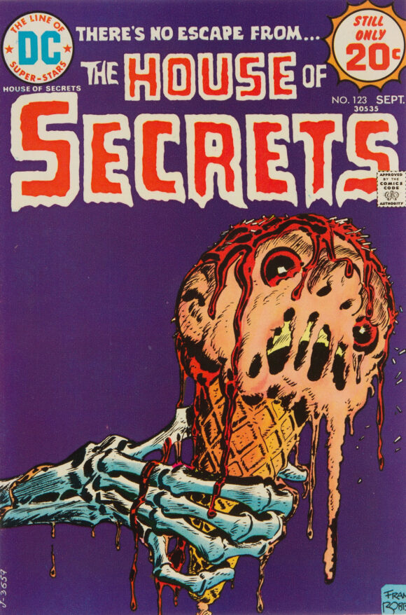
Frank Robbins
—
10. Ripley’s Believe It or Not! #49, Gold Key. The artist is unidentified but whenever a painted Gold Key is involved (this is a Whitman variant to be precise), I automatically go to George Wilson. What a groovy, freak-out cover. And it’s not about the witches at all — it’s the GIANT, ONE-EYED CAT THAT LOOKS LIKE IT CAME FROM CHERON.
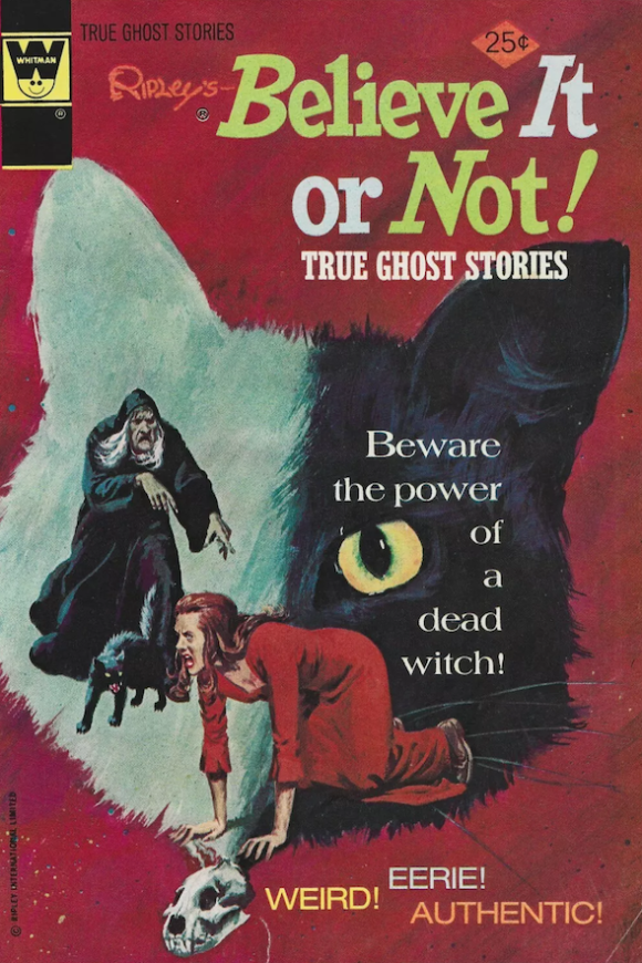
Maybe George Wilson?
—
9. Planet of the Apes #1, Marvel. Really solid Bob Larkin cover to start Marvel’s black-and-white Planet of the Apes magazine. Thing is, this series would see so many more dynamic and daring ones as time went on. Interesting choice of scene too: Cornelius’ arrest at the end of the first movie. By the way, they never explained how he and Zira got out of that, did they?
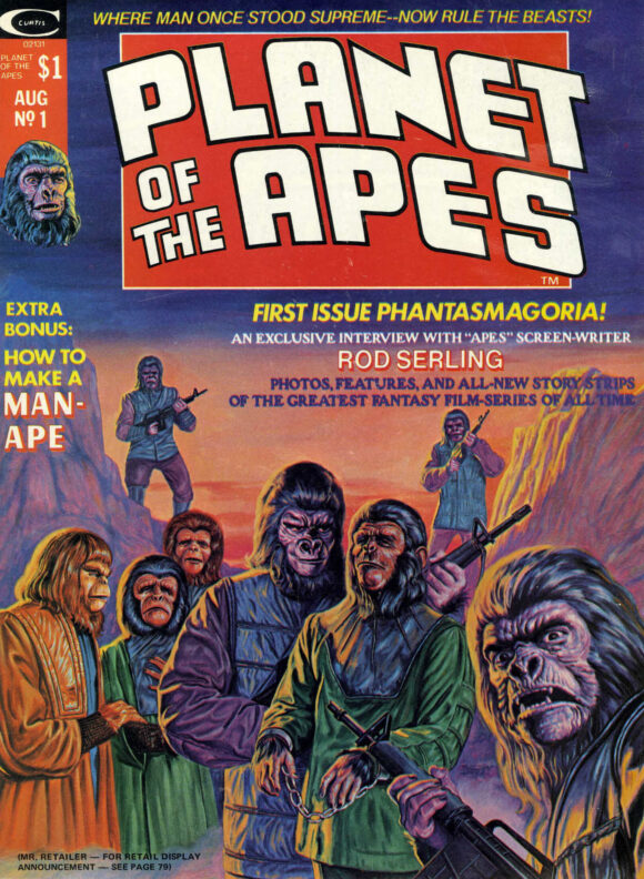
Bob Larkin
—
8. Savage Sword of Conan #1, Marvel. Pretty good month when Boris Vallejo’s cover for the first issue of Savage Sword of Conan is down at No. 8. The image is far out, but, sort of like POTA #1 above, I’m grading on a curve when it comes to Conan and artists like Vallejo. It’s good, no doubt. I’ve just seen better.
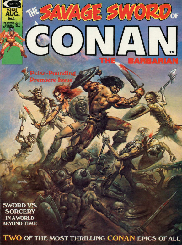
Boris Vallejo
—
7. Adventure Comics #435, DC. No twisted punishments here — the Spectre is just straight-up going for this thug’s throat. Great composition that grabs you, and a reminder that nobody — and I mean nobody — has ever drawn a better pissed-off Spectre than Jim Aparo.
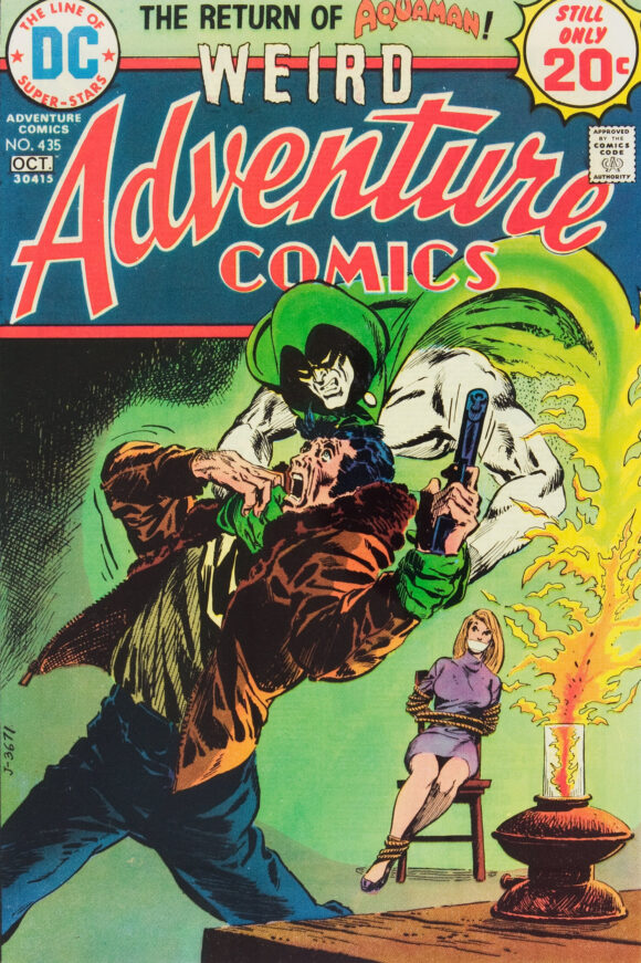
Jim Aparo
—
6. OMAC #1, DC. Fascinating and repulsive, in equal measure. I still don’t know how the cover and the opening splash page got past the Code. But credit to Kirby for yet another batshit — and really unsettling — idea.
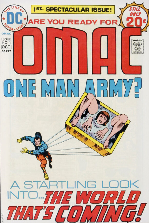
Jack Kirby pencils, Mike Royer inks
—
5. Giant-Size Master of Kung Fu #1, Marvel. This is what’s called announcing your presence with authority. When it comes down to it, my favorite Shang-Chi covers are by Gulacy or Zeck but this is just such a bold image. It’s one of the most memorable Master of Kung Fu covers ever.
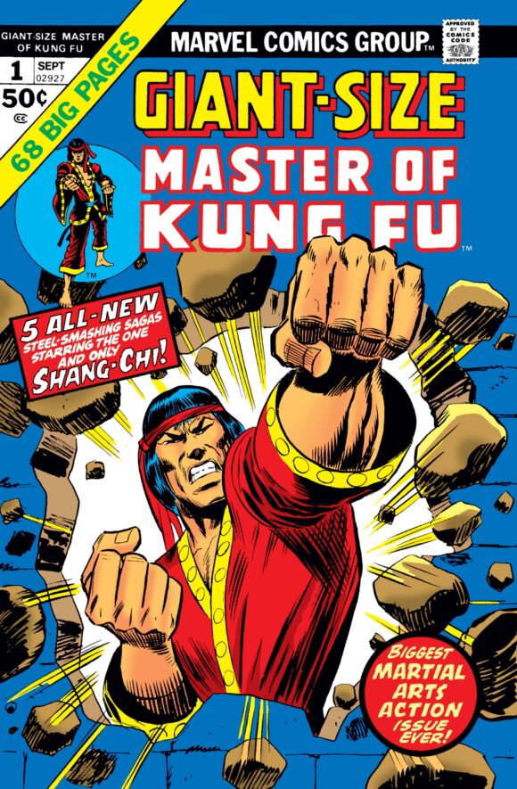
Ron Wilson pencils, Mike Esposito inks
—
4. Superman #279, DC. Paul Kupperberg just wrote a column highlighting Ross Andru’s mastery of perspective. Well, Nick Cardy’s right there with him on this one. Putting aside the groovy pairing of Superman and Batgirl (remember when DC toyed with making them a thing?), this is a brilliant example of construction and dynamism. The bird’s eye view of Park Avenue, Batgirl’s movement lines, Superman’s contrail, the facial expressions, all give this a sense of speed and urgency. Jack Adler’s colors — bold in the foreground and pale at ground level — tie it all together beautifully. Great cover.
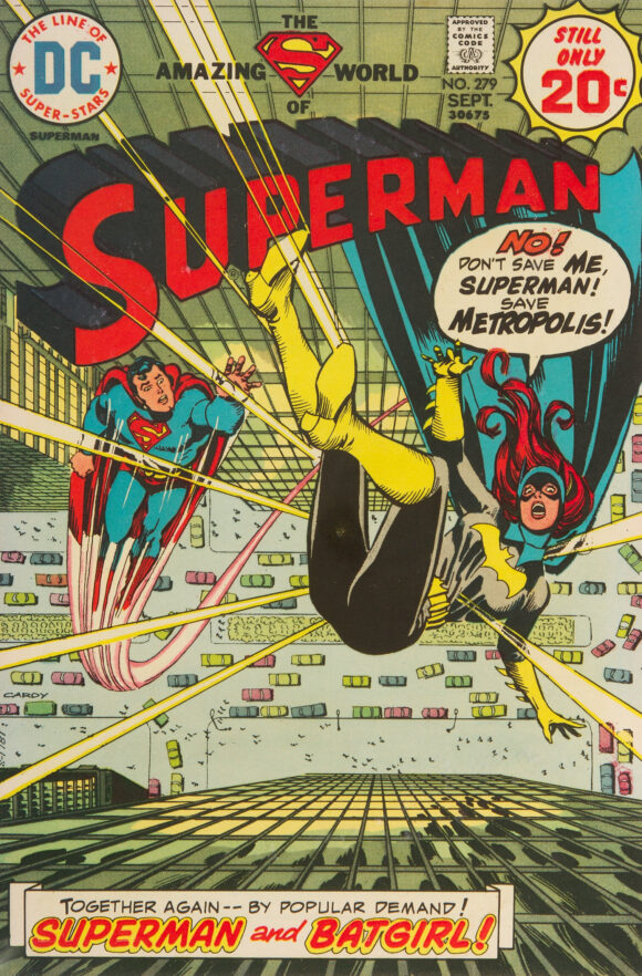
Nick Cardy
—
3. The Deadly Hands of Kung Fu #3, Marvel. Was Jim Kelly the new Bruce Lee? No, as cool as he was, nobody was “the new Bruce Lee.” Then again, Neal Adams could make just about anybody into “the new Bruce Lee.”
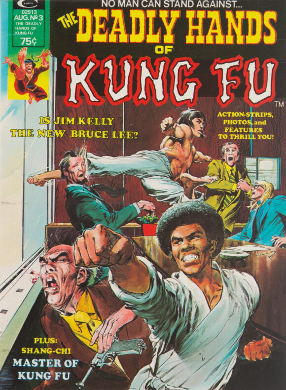
Neal Adams
—
2. The Amazing Spider-Man #136, Marvel. I would entertain any argument that this is John Romita’s greatest Spider-Man cover ever. It’s way, way up there in the pantheon, for sure. The layout is perfect, with a classic airborne Spidey vs. Green Goblin close-quarters battle dominating the image. But there’s so much drama added by Peter and Harry facing off at the bottom, each exploding with angst and rage. The curvature of the abstract platform they’re standing on has the effect of distorting the perspective of the whole cover, elongating it and emphasizing its intensity, like a Hitchcock dolly zoom.
And the colors — the colors! The yellow background, gradient shading on hero and villain, and the cool blue buildings all say Showdown at Sunset. Plus, having Parker and Osborn all in red turns up the fury to its highest level. (The colorist is unidentified, unfortunately.)
So, why doesn’t it top the list? Because…
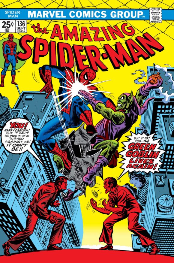
John Romita
—
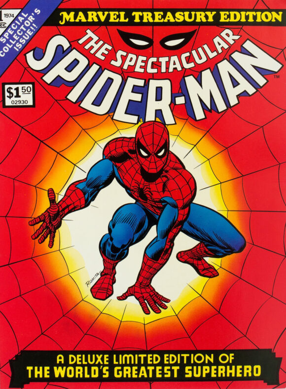
1. Marvel Treasury Edition #1, Marvel. …this is one of the most famous Spider-Man images ever and certainly one of the boldest. This and #136 are yin and yang: One is a study in incredibly dramatic kineticism, while the other is a testament to iconic cool. The cover of Marvel Treasury Edition #1 is perfect in every way, from the Spidey illustration, to the web effect, to the color scheme, to the trade dress. ASM #136 is right there in its magnificence, but I tip the scale slightly to a cover that stands as a definitive depiction of a definitive superhero.
—
MORE
— The TOP 13 COVERS of MAY 1974 — RANKED. Click here.
— BRONZE AGE BONANZA: The 1974 INDEX. Click here.
—
Comics sources: Mike’s Amazing World of Comics and the Grand Comics Database.
June 16, 2024
Romita for the win. Again.
June 16, 2024
Treasury for sure! Facsimile next!!! A lot in the list for this week would not have actually been in the spinner rack but nevertheless great stuff.
June 16, 2024
Ahhh . . . A classic Jim Aparo cover during his “classic” illustrative phase (Adventure Comics # 435) with, as very correctly noted, the archetypal, very vengeful Spectre that Aparo excelled at , and the great Nick Cardy Batgirl / Superman team up cover (Superman # 279), with Cardy rendering a striking, if imperiled, Batgirl. And I have still have both of these!
Delightful way to start a Sunday morning. Thank you, Dan!
June 17, 2024
You are welcome!
June 16, 2024
Great choices…especially at 1 and 2.
June 16, 2024
I had a lot of merch with that Marvel Treadury #1 cover art, but my favorite was a Frisbee (or knock-off flying disc) that had the Spidey figure large and bold. On Superman #279,I have always dug the way Cardy drew Batgirl’s costume folds as she turns mid-air. Some great stuff here for sure!
June 18, 2024
The “Believe It Or Not” cover reminds me of the illustration that inspired King’s story “The Cat From Hell” a few years later. I wonder…? Read the Adventure and Superman titles, never into the others but I wish I’d seen the Planet of the Apes issue back then—interview with Rod Serling? Yes! (He would be gone the next year…) Again, thank you for this monthly feature!