(UPDATED) You know them. Altered versions of them exist to this very day. They were all Ira Schnapp.
Part 2 of a five-part series on the great DC Comics designer of the Golden and Silver Ages. For Part 1, an overview of Schnapp’s voluminous contributions to the form, click here.
This series is based on Arlen Schumer’s upcoming lecture and exhibit, The Super Type of Ira Schnapp at the Type Directors Club of New York, opening Thursday, May 14 at 6:30 p.m. The exhibit will run through the summer.
—
By ARLEN SCHUMER
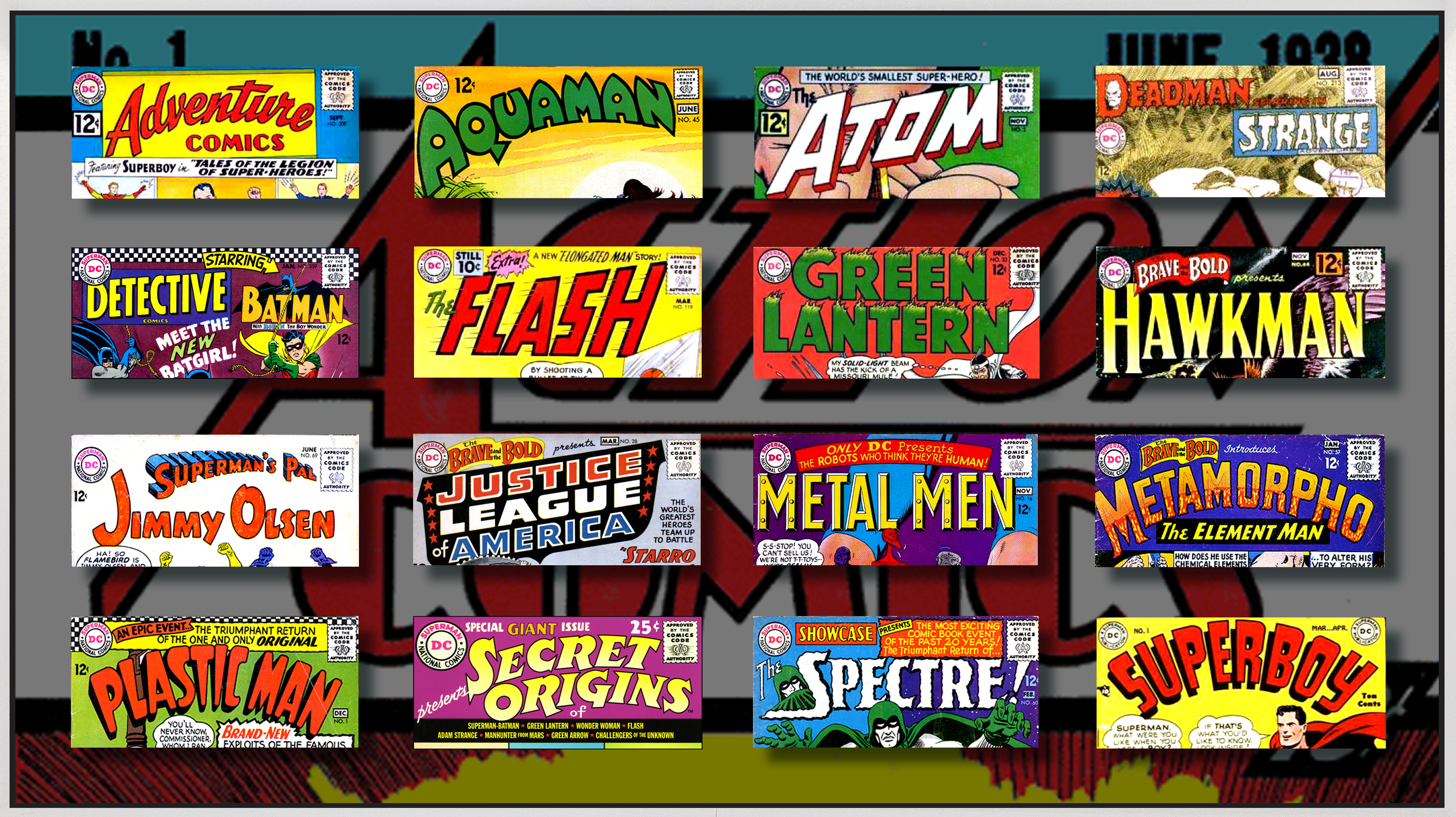
These are my sixteen favorite DC Comics logos by Ira Schnapp:
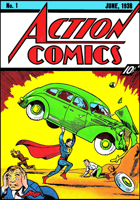
They span the years 1949 (Superboy #1) to 1968 (both the Deadman and Strange Adventures logos on the same cover of Strange Adventures #213). They also bridge the start of the Golden Age (if you count the large Action Comics logo Schnapp designed in 1938 that forms the background of the above image, a mockup of a 10-foot long piece I’ve designed for the exhibit, produced and sponsored by A to A Studio Solutions) to the final years of the Silver Age, and display the depth and breadth of Schnapp’s design skills and talent that gave DC Comics its “house” look for generations, one that is still in evidence today.
You have to marvel (pun intended) at the variety of look and style of Schnapp’s DC logos here, and how they visually bring each title’s characteristics to life, making the letterforms look and feel and sound, onomatopoeically, like the words themselves, in an artistic, typographic tour-de-force — from the “fast” font of The Flash to the faux-metal letters of Metal Men; from the spookiness of The Spectre’s moody masthead to the shield-like Justice League of America logo, Schnapp giving it that legal look you want in such an officious title! Strange Adventures’ shaky letters are suitably “strange,” Deadman’s are creepily gothic, and Plastic Man’s look inflated like balloon animals. There’s something for everyone at the Schnapp smorgasbord!
The Silver Age was borne of the ashes of the Golden Age, when the superhero genre all but died out in the early 1950s. With the establishment of the Comics Code in 1954, effectively killing the horror and crime genres, publishers began looking for new successes.
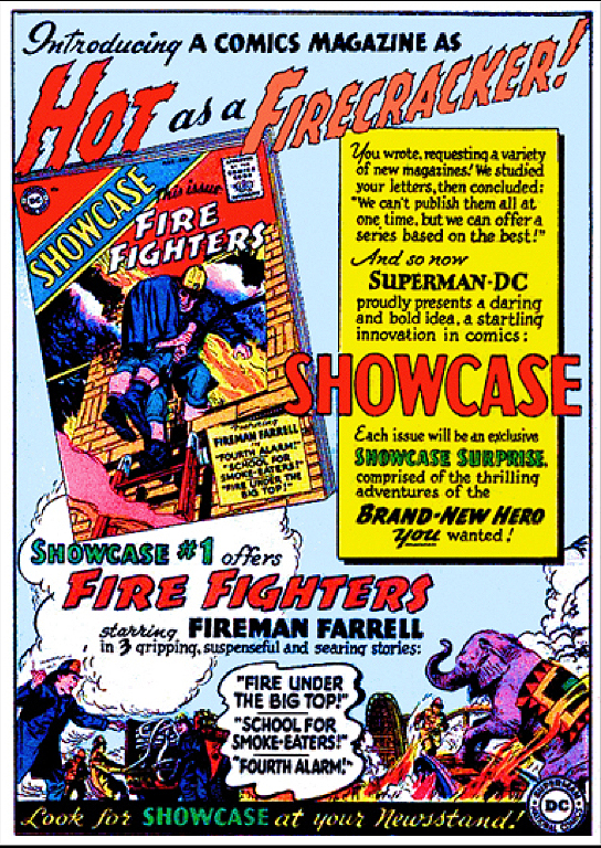
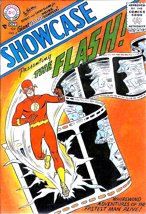
It came in DC’s Showcase title, designed to test out new concepts, like Issue #1’s Fire Fighters, seen in Schnapp’s ’56 house ad. It wasn’t until DC decided to bring back, in Showcase #4, the Flash, their super-speedster who had last been published in ’51 — but now with a totally new costume and secret identity — did DC have a hit, and the Silver Age of Comics was born!
Schnapp was there to give it its graphic identity, via the distinctive logos, cover lettering and house ads he would provide for the plethora of titles that followed in Flash’s wake — and that have proved to be as timeless as the great art and artists whose Schnapp’s works supported.
Like that of Carmine Infantino, whose art and career development at DC uncannily matches Schnapp’s, as Infantino’s style became the dominant look of DC’s Silver Age.
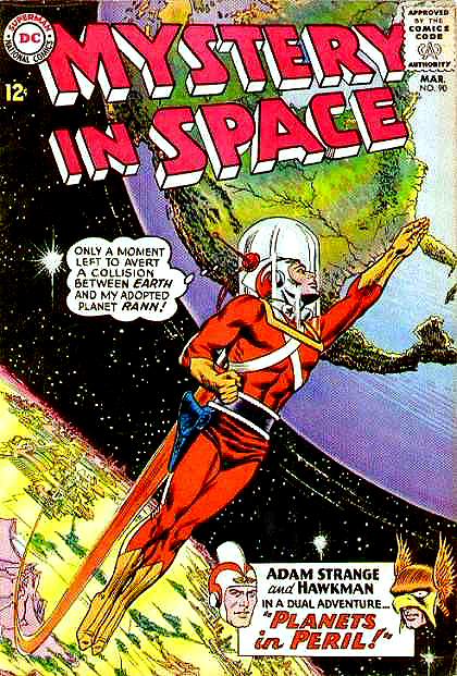
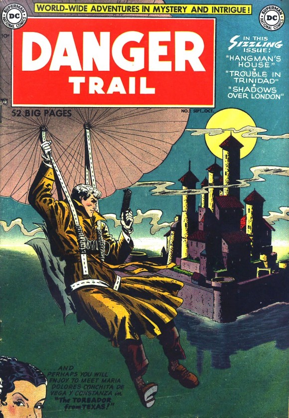
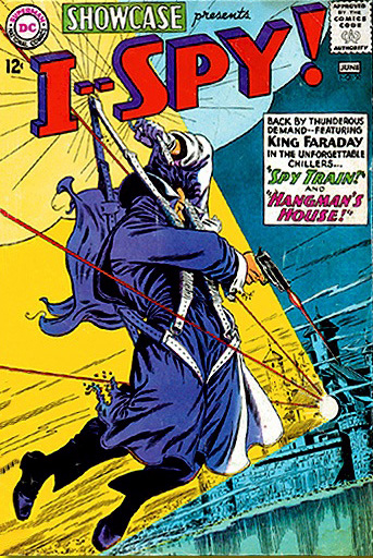
Infantino‘s Adam Strange on the ’64 Mystery in Space cover has a logo by Schnapp, natch! Just look at the quantum leap in style Infantino made between his 1950 Danger Trail cover and the ’64 I—Spy! — sublime in its contrapuntal angles and aggressive design compared to its staid forerunner.
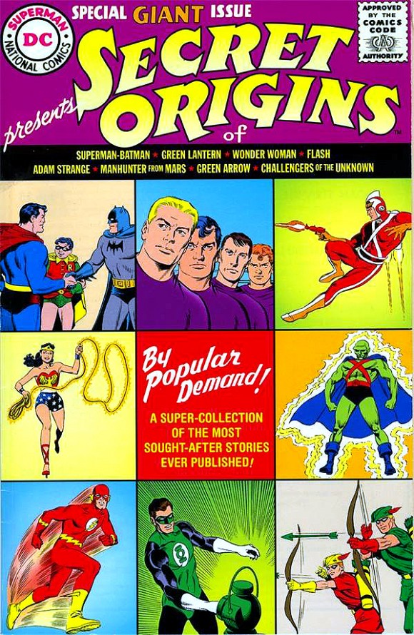
(Editor’s note: The original version of this story included logos for Enemy Ace and Sgt. Rock. But whether they were the work of Schnapp or Gaspar Saladino is unclear. To be certain, they were replaced by Detective Comics and Secret Origins.)
—
NEXT WEEK: Schnapp Brings Down the House Ads!

April 22, 2015
Register for Schnapp online: http://www.eventbrite.com/e/the-super-type-of-ira-schnapp-tickets-16397918616