The third of three parts — by our special guest columnist, Neal Adams!
—
Neal Adams turned 75 this week and we’ve prevailed upon him to pick his 13 favorite covers. Or at least 13 of his favorites.
In Part 1, he selects classics such as Detective Comics #404 and Action Comics #359. But make sure you click here to see his other choices.
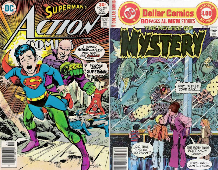
In Part 2, he enters The House of Mystery — and returns to Metropolis and Gotham, as well. Click here to see all those choices.

Now, PART 3 … — Dan
By NEAL ADAMS
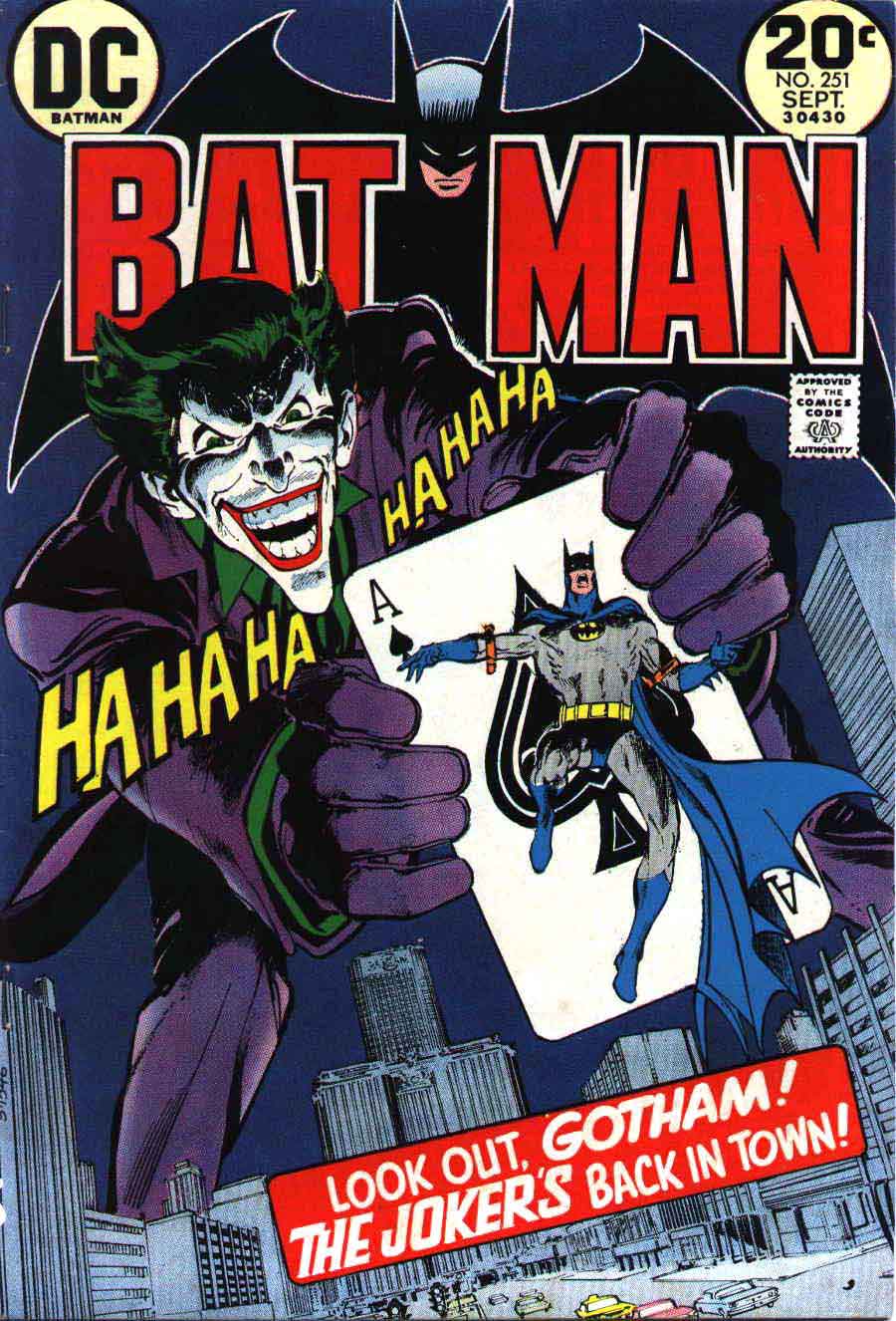
10. Batman #251. The Joker’s Five-Way Revenge has become one of my favorite covers because the world has shoved it down my throat. I can tell you they have done this with love and affection because people love that cover. It’s because of those people that I have come to love that cover. When I did it, it was a solution to a problem. The problem was that we were reintroducing the Joker after four years of absence. We wanted to see him facing us clearly, but we also had to see Batman. If these characters are antagonistic, then one has to turn their back to the camera, but I didn’t want that. My solution was to put Batman on a playing card shoved toward us by Joker and still having both characters face us. You can find that image on pegboards, t-shirts, pillow cases, etc. You can find it on every sort of licensing item. The world has fallen in love with that image. Who am I to say no?

This is one of my absolute favorites. — Dan
—
11. CyberRad’s glow-in-the-dark cover. Issue #5. Maybe not my favorite, but I do love this cover. The glow-in-the-dark technique is done with a phosphorescent ink. When you turn the light off, if the paint has absorbed enough light, it’ll glow in the dark. So what do you do with a paint that glows in the dark?
CyberRad is a teenage rocker, and under his skin he’s a robot. Why don’t we have him screaming that he’s not a machine? But have this phosphorescent ink printed over the drawing, which you cannot see until you turn the light off, and then you see the robot pieces and not CyberRad at all. Cool, huh?

—
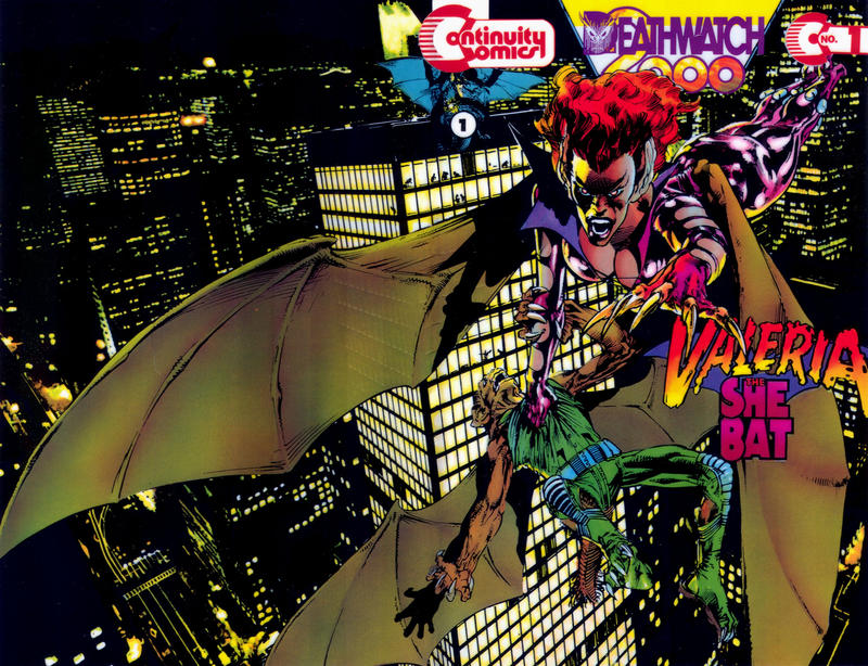
12. Valeria the She-Bat #1 is a wraparound cover. It is a well-drawn cover. It shows Valeria flying across buildings carrying one of the bad guys by her talons. The thing I like most is that I can use the glow-in-the-dark ink and light the city buildings up with that. But I can also use the glow-in-the-dark ink to make the windows appear through her thin bat wings.
This is what I’d call an artsy-fartsy cover. It’s not Marvel-y, it’s not DC-y. It’s artsy-fartsy. There’s no reason to have to see those windows through her wings, but I wanted to do it, and since I was in charge, I got to do it and it tickles my fancy. If you get a chance to look at it, let the light shine on it for a little and then go into the bathroom and close the door. If you’re even a little artsy-fartsy, you’ll love it.

—
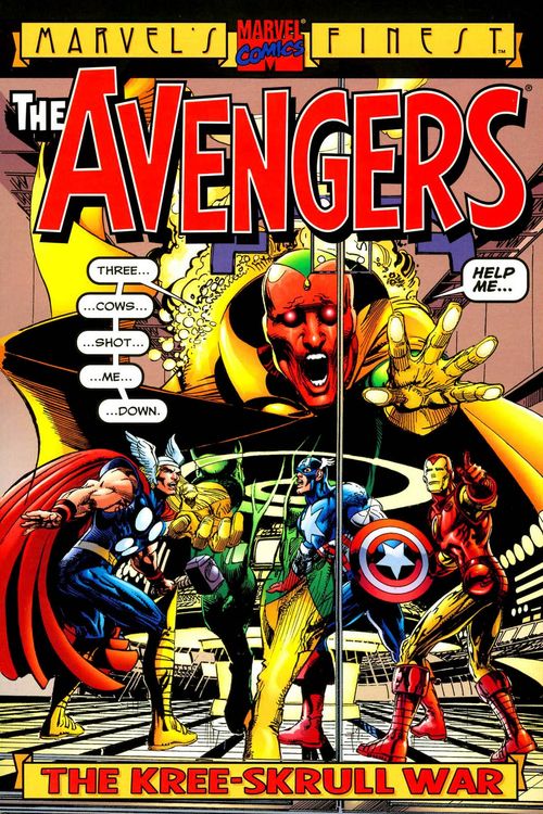
13. The Avengers: The Kree-Skrull War collection. Three Cows Shot Me Down. I have to tell you a story about this cover, which may not be the greatest cover I’ve done, but I’ll tell you why it’s a favorite.
This cover is for a reprint for my Avengers work at Marvel way back when. It is a well-known story and cover, and it helped to save the Avengers from oblivion and reinstitute them as viable and tremendous characters. I guess I just wanted to impress the readers with a few things.
One of the first things was that I had retained a memory of the introduction of the Skrulls by Jack Kirby. He had to get rid of them at the end of the story. He did by making them cows. Even though there were four Skrulls, there were only three cows. One Skrull was missing. OK? I remembered that, and I remembered there were three cows.

So I did a story in which Vision stumbles into Avengers headquarters and is mortally wounded, as if a robot can be mortally wounded. He’s supposed to say, stumbling and clearly in pain, “Three…cows…shot…me…down.” A piece of dialogue that would live in infamy and certainly confusion. What the hell could that mean? Well, of course it meant that those three cows in the field shot him down. It’s one of those lines, you see, that is magical in its way. And I asked Roy Thomas to use that as the title of the story.
For whatever reason, Roy was not agreeable. It seemed he was into doing lampoon titles based on other famous stories. For example, one chapter of the story was The Andromeda Swarm after The Andromeda Strain. I wasn’t happy with the decision because I thought The Andromeda Swarm was boring as opposed to Three Cows Shot Me Down, which was more interesting and tickled my fancy. I didn’t resent Roy’s decision, but kept it with me until when I was able to do this cover, and so as Vision stumbles into the headquarters he says, “Three…cows…shot…me…down.” Tickling once more my fancy.
That’s why that’s one of my favorite covers. I hope you don’t think that’s stupid of me, but it gives me a laugh.
—
Cover images and credits from the brilliant Grand Comics Database.
—
Don’t forget!
For PART 1: Click here.
For PART 2: Click here.
Special thanks to the always awesome Kris Adams Stone! — Dan

June 18, 2016