Thanksgiving means FOOTBALL!
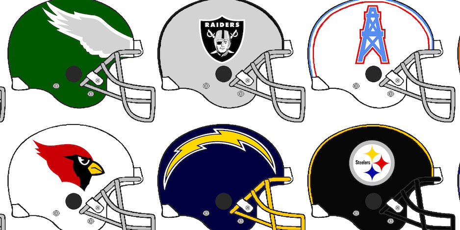
Let’s face it: Every day at 13th Dimension is an exercise in self-indulgence. I publish pretty much whatever I feel like about the world of comic books and related pop culture, whether I wrote a column or a friend did. None of this is serious. One of the site’s contributors even called it “shallow” — which I embrace. This is fan talk for the digital age, tongue usually in cheek, a wink at the ready. A good time is had by most.
But every Thanksgiving, I get really self-indulgent by writing about my love of football — specifically the National Football League. It’s got nothing to do with comics, but so what? Thanksgiving isn’t complete without the NFL. (And my beloved Dolphins are playing tonight!)
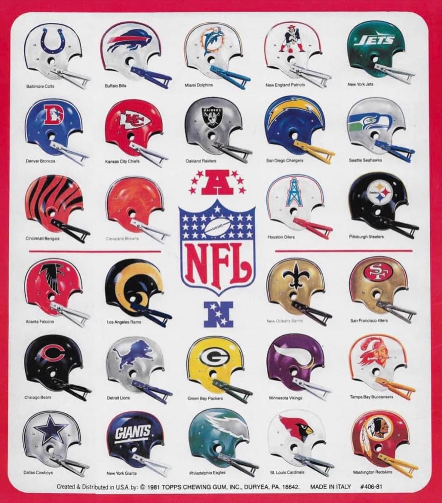
1981’s helmets, from Topps’ sticker book. Those Fleer stickers below are also from 1981. Wrong decade? Yes. But you’ll see why soon.
My friends and family know me as a real uniform nerd. I read NFL Fashion Advice’s Bets Dressed newsletter and wander through the obsessively comprehensive Gridiron Uniform Database. I’m also known to occasionally give critiques of the outfits while watching a game on Any Given Sunday (or Monday, or Thursday, or Black Friday or late-season Saturday). “Occasionally” in this case is defined as always, and in great detail.
I quiz my wife Wendy. She tolerates me, if only barely. I text jokes to my good friend Gary. He humors me.
So since I’m a child of the ’70s, this year’s piece is THE TOP 13 NFL HELMETS OF THE 1970s — RANKED. This isn’t just about aesthetics; it’s about impact, relevance, and how certain designs spoke so clearly of the days of shag carpets, disco and 8-track tapes. (For example, I’m a New Yorker but — SPOILER ALERT — you won’t find the Jets or Giants here. Hell, none of us kids rooted for them, anyway. We picked the Cowboys, Raiders, Steelers and Dolphins instead.)
Time for kickoff!
—
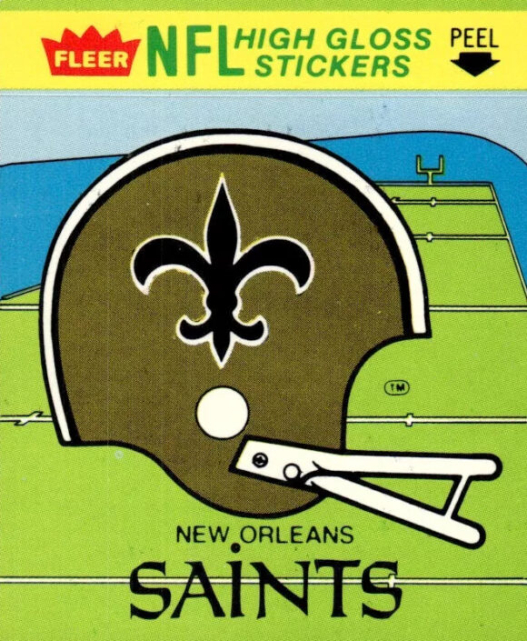
13. New Orleans Saints. The flipside to the premise here: I always dug the Saints’ helmet precisely because I rarely saw it in action. Yeah, I’d see it in highlight reels on HBO’s Inside the NFL or the syndicated This Is the NFL, but because I didn’t see it often live, and because of the weirdly intimidating fleur-de-lis, there was something vaguely exotic about it. Great color scheme, too.
—
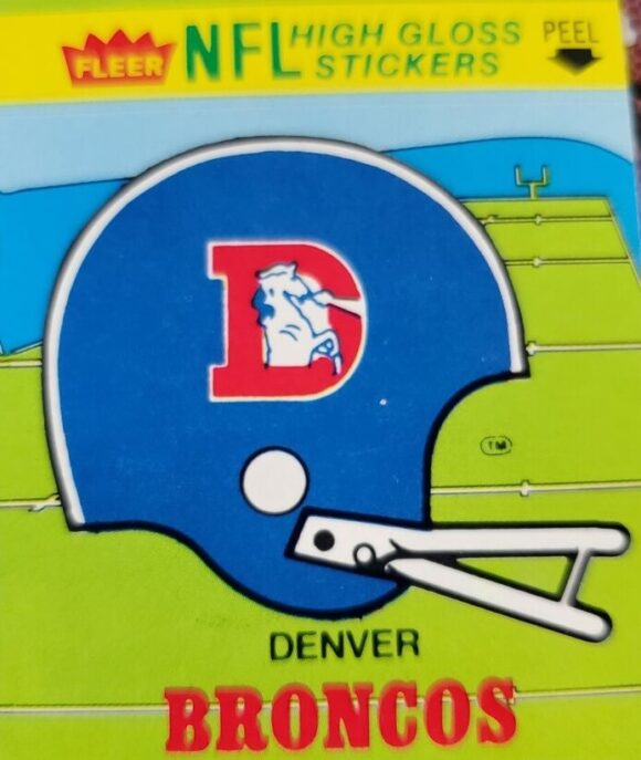
12. Denver Broncos. Long live the Orange Crush! Because of the time I came into my own as an NFL fan, I wasn’t aware that the Broncos had a lengthy history of failure. I just remember how excited everyone was in 1977 (and early 1978) when they bulled their way to the Super Bowl. The D-encased, nose-blowing Bronco is a decent logo, but the helmet stands out more for Denver’s role as a late-’70s marquee team than for its pure aesthetic appeal.
—
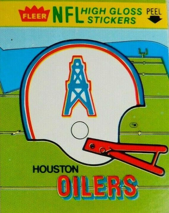
11. Houston Oilers. Earl Campbell, man. To this day, nobody’s ever made powder blue look as tough. Vertical helmet logos are rarely as effective as horizontal ones but when you consider what replaced it (the Titans’ mediocre fiery shield), this is high football fashion. Points for a team that was always a threat, even though they never came up big when it counted most.
—
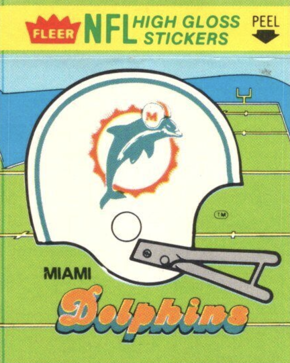
10. Miami Dolphins. The Dolphins are my favorite team. I was devoted to these guys and had a varsity jacket, parka, rain poncho, pajamas, the whole bit. Today, I have a Bob Griese throwback jersey and two t-shirts with this helmet on it. My heart puts this at No. 1, far and away. But being dispassionate about it, I have to recognize there are plenty of other teams with either groovier designs or ones that are more emblematic of the era. So, painful at it is, we go with No. 10 — though, at least that honors back-up QB Don Strock. (Side note: I much prefer this version of the helmet to the earlier one, where the Dolphin was leaping only halfway through the sunburst — even if that’s the one that symbolizes the 1972 Perfect Season.)
—
9. San Diego Chargers. You can rake me for putting this so low, because this is a tremendous helmet. (Feel free to argue whether the Chargers look better with navy or white helmets.) It’s just that I think the rest of the helmets on this list rank higher. Pretty simple, really.

—
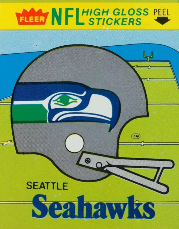
8. Seattle Seahawks. Great helmet design, terrific color scheme. A team that was always interesting to watch and seemed thisclose to getting over the hump. (They wouldn’t make the playoffs until 1983.) Zorn to Largent was a great tandem.
—
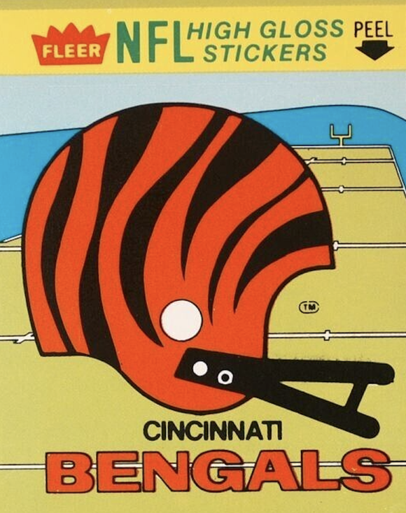
7. Cincinnati Bengals. My lone cheat on the list, so I’m putting the Bengals smack in the middle of it. When it comes down to it, 1970s football is the best football, but the NFL hit Peak Uniform in 1981, when Cincinnati unveiled this bad boy and an ensemble that complemented it perfectly. Prior to this, the Bengals had the league’s most drab uniforms, a literal rip-off of the Cleveland Browns’ classic look. The rest of the league, however, was stylin’ all the way. Once Cincinnati got on board with this bold look in ’81, there wasn’t a bad uniform in the NFL, just degrees of cool. I remember when these debuted, every kid in school was all, “Oh my God, have you seen the new BENGALS uniforms? They’re wicked!”
(Side note: If you want to be pedantic and exclude the Bengals from this list, I would hear arguments for Philadelphia or Washington.)
—
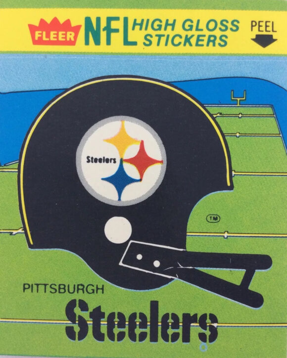
6. Pittsburgh Steelers. OK, this is where it really starts getting tough. Dallas may have been America’s Team but the Steelers were, to paraphrase the Hulk, “the strongest ones there was.” A powerhouse in every way, the Steelers defined greatness. Tremendous uniforms — they never should have switched from block numbers to italics, which is still the NFL’s biggest head-scratcher. But speaking strictly from an aesthetic standpoint, Pittsburgh’s helmet is merely good. You can’t go wrong with black, but the cool (if derivative) logo on only one side activates my OCD. Some may love that uniqueness, I find it strangely out of balance.
—
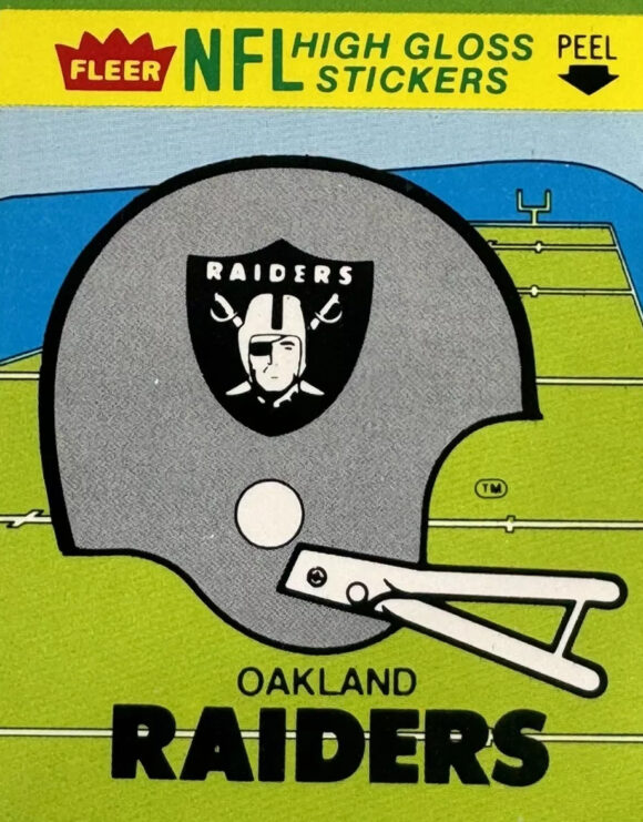
5. Oakland Raiders. Taken as a whole, the Raiders uniforms were/are among the two best in the league (Dallas is the other). The Silver and Black were downright menacing and any game you watched, you were just waiting for the yellow flags to fly and the injuries to pile up. They weren’t a football team; they were a biker gang in pads. (When they went up against the aqua-and-orange Dolphins, with the Raiders in black and the Fins in white, you expected annihilation, though Oakland had only a 5-3 advantage in the ’70s.) But this is more about the helmet, which, while, terrific, doesn’t hit quite the same lofty heights as the ones below. The colors are fantastic but Randolph Scott in an eye patch can’t compare to the…
—
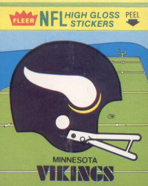
4. Minnesota Vikings. Everyone remembers their record of Super Bowl futility. Everyone remembers the Scrambler and Bud Grant. Everyone remembers their rivalry with the Los Angeles Rams and the ridiculous cold of Minneapolis in December. But they also remember that the Vikings’ helmet was — and is, even with modern tweaks — one of the most inventive looks in professional sports. I own a vintage Vikes tee just because of the fashion. Tremendous.
—
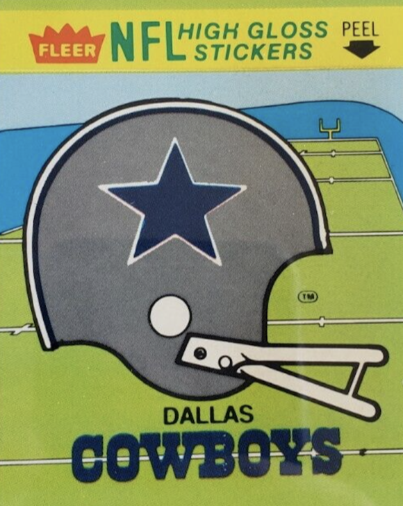
3. Dallas Cowboys. As noted, Pittsburgh may have been the Team of the ’70s but the Cowboys were America’s Team (and somehow, still are). The silver/blue helmet with the dark blue star outlined in white, may be simplistic when put against, say, the Vikings or the Bengals, but it’s that very elegance that places it this high. The Cowboys were metaphorically the white hats to the Raiders’ black hats and their helmet spoke of their role as football’s most dignified franchise of the era.
—
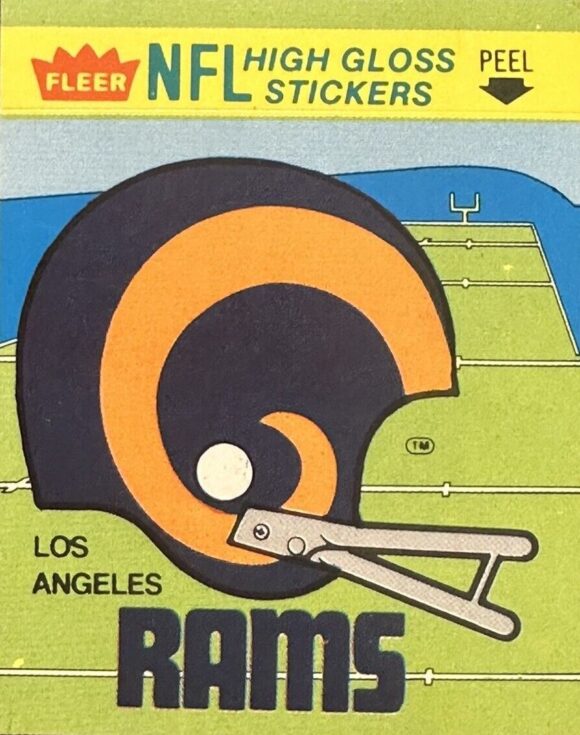
2. Los Angeles Rams. Sure, they’d always cough up the big game, but nobody looked better doing it than the Rams. Their uniforms were the snazziest in the league, especially when wearing blue — very L.A. in a good way — but their helmets were a work of art. (In the truest sense — they were designed and first painted by running back Fred Gehrke, a commercial artist in the off-season, in 1948.) That the Rams of today have tinkered with this helmet by changing its color palette and adding an unnecessary crease to simulate the look of a real ram, is a Crime Against Football. When you achieve perfection, you do not mess with it.
—
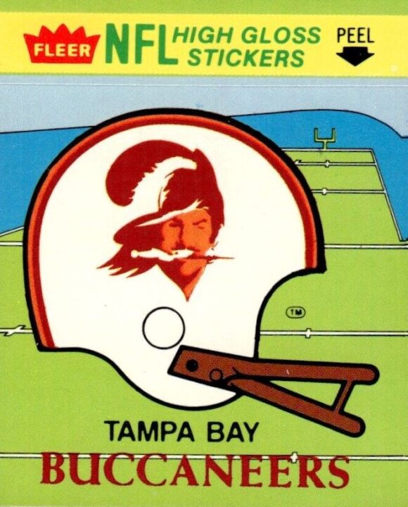
1. Tampa Bay Buccaneers. This is about the ’70s, isn’t it? Then you cannot possibly go against the bold and ridiculous glory of Bucco Bruce and the orange, red and white Tampa Bay Buccaneers. When they arrived on the scene in 1976 they were not only a laughingstock for their winless record but also their outlandish uniforms — topped by a silly helmet and its winking pirate. It was like the rainbow Houston Astros had moved to town.
Then, seemingly overnight, they became a playoff team in 1979, led by QB Doug Williams, RB Ricky Bell and DE Lee Roy Selmon, becoming the darlings of the NFL. But the Creamsicle unis still undercut the team’s image and when they switched to their modern pewter look in 1997, I cheered. Finally, I thought, they looked like a “serious” team. But these things have a tendency to come full circle, and now, decades later, I deeply mourn the death of Bruce — and celebrate his resurrection whenever Tampa Bay gets its throwback on. Come on, Bucs — bring him back for good!
—
MORE
— 13 Great ELECTRIC FOOTBALL Teams — RANKED. Click here.
— Dig These 13 Groovy 1970s NFL Catalogue Pages. Click here.

November 28, 2024
Dan, those are great choices. Well done!
November 28, 2024
Thanks!
November 28, 2024
I never in my life could ever understand how anyone could be “tough” in those horrible uniforms in Tampa against powerhouses like the Skins, Cowboys, Steelers etc of the ‘70s and early ‘80s. Back when you could hit the QB without a flag flying.
November 28, 2024
Exactly. That’s what makes them so great!
November 28, 2024
I am astounded that you left off the best helmet, that of the then-St. Louis Cardinals. I’m just shaking my head. Lol
November 28, 2024
I was thisclose to having them on there instead of the Saints. A GREAT helmet. It was tough leaving the Eagles out too.
November 28, 2024
Hi Dan,
RE: I just remember how excited everyone was in 1977 (and early 1978) when they [the Denver Broncos] bulled their way to the Super Bowl.
Man, I remember that too, Superbowl 12 (1978)–as the Bronco’s were playing against the Cowboys. I was entering a rebellious streak then coming into early adolescence, and I was really rooting against “America’s Team” (and ironically, the Broncos’ QB was Craig Morton, formerly of the Dallas Cowboys). I was sad the Broncos lost.
RE: The Houston Oilers.
Yeah, you’re quite right about Earl Campbell. But the Oilers also intrigued me as I liked the coach, certainly his name, “Bum” Phillips (aka: Oail Andrew Phillips Jr.) as well as his great sports aphorisms (see his Wikipedia page–one noted below).
A nickname that sounds lackadaisically wonderful in America, but perhaps a bit naughty in the UK (also explained on Wikipedia–that in his neck of the woods, people called bumble bees “bummel bees,” his aunt only able to say “bum”).
Bum about Earl: a reporter noting Campbell, that “He sure gets up slow” after tackles. Bum’s reply: “Yes, but he goes down slow, too.”
Thanks Dan! A wonderful indulgence here on an appropriately highly indulgent day! Happy Thanksgiving!
November 28, 2024
Thank you, William! Super Bowl XII was the first one I watched start to finish. The NFL had a real hold on me by then. Bum Phillips was a real character, too. I should have mentioned him!
November 28, 2024
Great list and Marvel’s crossover with the NFL in the 70s still gives it a feeling of having something to do with comics!
November 28, 2024
I’ll always maintain the Rams looked better in blue and white than subsequent color schemes, and the Saints’ flour de lis still looks like a peeled banana. Finally, I read a while back that historians and/or archeologists claim that Norse raiders or warriors did not outfit their helmets with animal horns, that no evidence existed that proved they did. Still, a great look for a football helmet, and virtually unchanged (overlooking slight tweaks) since 1960. If only they could have won just once in four SB attempts. A great list and nice holiday departure.
November 28, 2024
See, the fleur de lis looks to me like a really scary tip of a spear. Like it could gut you five different ways. I will always go for the Rams in that blue-gold color scheme. And not the St. Louis version, either.
November 28, 2024
Oh, yeah, 70s-era football was the best! When it comes to the Chargers, I always preferred the Navy Blue since it reminded me of the Bronze Age-era Lightning Lad. Dolphins rank much higher on my list (even taking out I’m a Dolphins fan), as do the Raiders. Bengals should be NOWHERE near a 70s top ten. (Even the Browns kept it classier.) But even as a Dolphins fan, I think Washington should rank really high here, maybe even #1. No matter how you feel about the team name, that was always one of the most bad-ass helmet designs.
November 28, 2024
Oh, come on Jeff! Those Bengals outfits rocked! I seriously considered Washington. I didn’t leave them out because of politics, just that I never really loved the design. That said, if I were to do an ’80s version (maybe next year?) I’d probably include them.
November 28, 2024
I finally sold my ‘gumball helmets’ vintage collection a few years ago. I would write to Orange Products (who made them) whenever a new version of some team came out. I liked to put the stickers on MYSELF.
Had one baseball and basketball set, but never tried to update those.
November 28, 2024
I love the gumball helmets. I started seriously collecting them a few years ago and I still need a blue Oilers helmet. I do have a couple of CFL sets, though.
November 28, 2024
The CFL! I loved watching the CFL on nascent ESPN!
November 28, 2024
Oh, the gumball helmets! Another great idea for next year — or the year after! I didn’t collect those, though I did have a Bears one. I do have a set of current Riddell mini-helmets. I always break out whatever two go with the game I’m watching. Have some throwback ones also!
November 30, 2024
Miami has the Dolphins, the greatest football team…
December 4, 2024
I always loved the Baltimore Colts helmet, though I was biased as a fan… loathe the Indy NFL team now (bitter old man), but that horseshoe helmet was fantastic. So many great ones to choose from in the ’70s, though. I’d also put the Lions up there because I really thought their ’70s helmet was much cleaner than the more detailed lion logo now.