
BRONZE AGE BONANZA: Romita! Aparo! Kirby! Buckler! MORE!

—
Welcome to BRONZE AGE BONANZA — our monthly series that looks at the greatest covers of the Bronze Age — exactly 50 years later. For more info on this feature, click here.
—
It’s fun seeing different approaches to the same challenge. It’s also fun seeing some of comics’ all-time greats do some of their most compelling work. Plus a joke or two.
Dig the TOP 13 COVERS OF MAY 1974 — RANKED:
—
13. Giant-Size Man Thing #1, Marvel. Because of that damn title, which was a meme before there were memes.
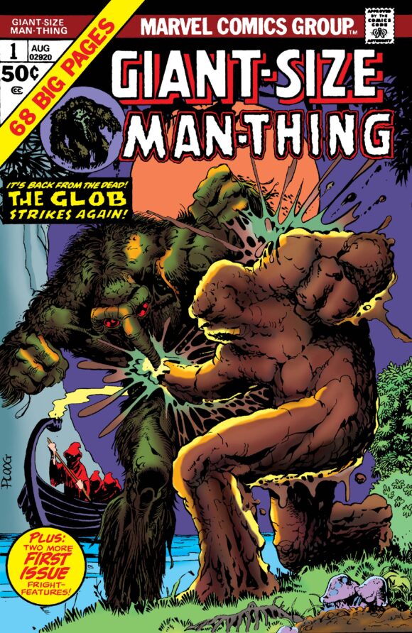
Mike Ploog
—
12. The Brave and the Bold #114, DC. I really dig this layout style for DC’s 100-pagers, and this one is a personal favorite. (The editor was Murray Boltinoff but I’m not sure if this was his concept or, say, Carmine Infantino’s.) Good color scheme, with the background and the hero logos playing well off each other. But the clincher is that main Jim Aparo image. Aquaman is so pissed off, Batman is so overwhelmed, the scene is so intense, you have to find out what the hell is going on. If only we got that image at full cover size.
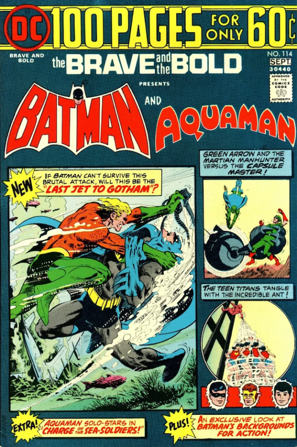
Main image by Jim Aparo, vignettes by George Roussos and Nick Cardy
—
11. Detective Comics #442, DC. And then you have editor Archie Goodwin’s approach: Let the main image breathe, with the other features represented by floating heads along the bottom. Fantastic illustration by Aparo, solid color scheme — and of course the classic Detective Comics logo, which should still be in use today.
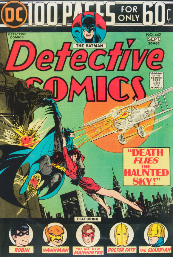
Aparo
—
10. House of Mystery #226, DC. Then you have this concept, which plays off the whole notion of Cain being the book’s emcee. I’m a big fan of Luis Dominguez’s work and the superb colors are by the great Tatjana Wood. I don’t know who did the layout — editor Joe Orlando? — but this is a killer cover.
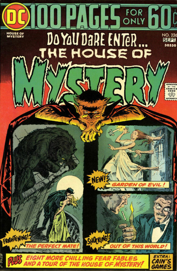
Luis Dominguez
—
9. Limited Collectors’ Edition #C-29, DC. Just your typical Joe Kubert Tarzan cover, extra large. Which means at minimum, it’s terrific.
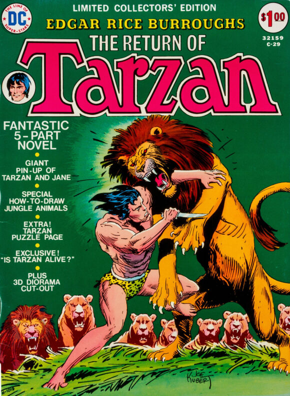
Joe Kubert
—
8. Tomb of Dracula #23, Marvel. Gil Kane doing Neal Adams doing Bob Kane. Still fab, though.
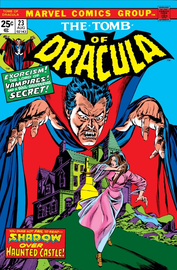
Gil Kane pencils, Tom Palmer inks
—
7. The Twilight Zone #57, Gold Key. Help! That dragon is stepping out of the Twilight Zone!
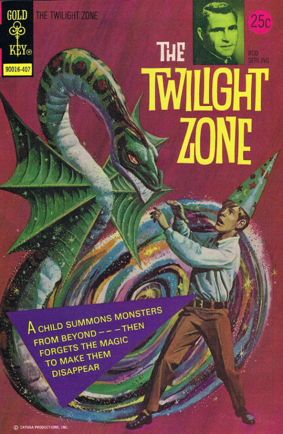
George Wilson
—
6. Vampirella #34. A rather fetching Vampi cover by Enrich Torres, doncha think?
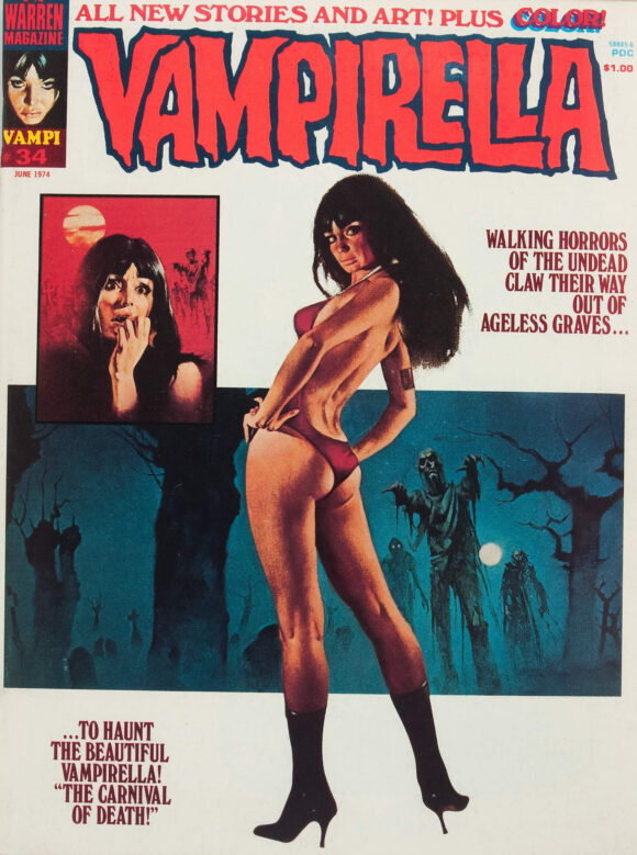
Enrich Torres
—
5. Kamandi #20. Jack Kirby’s Kamandi covers usually relied heavily on talking beasts and bizarre settings. This one goes straight for the post-apocalyptic jugular, reminding the reader that, like Planet of the Apes, it’s all fun and games until you realize that what you are watching is the end of the world.
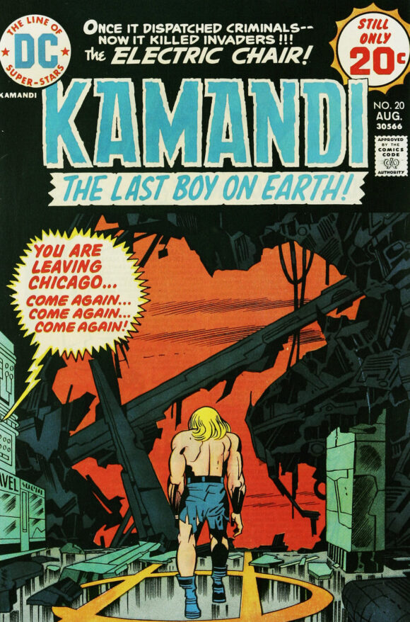
Jack Kirby pencils, D. Bruce Berry inks
—
4. The Shadow #6, DC. One of my fave Kaluta Shadow covers. The looming antihero, the (very) dark tableau, the distorted perspective of the buildings, the circle of thugs, the lone ninja in the spotlight — it all ties together to bring you into the world of men with evil hearts. Outstanding.
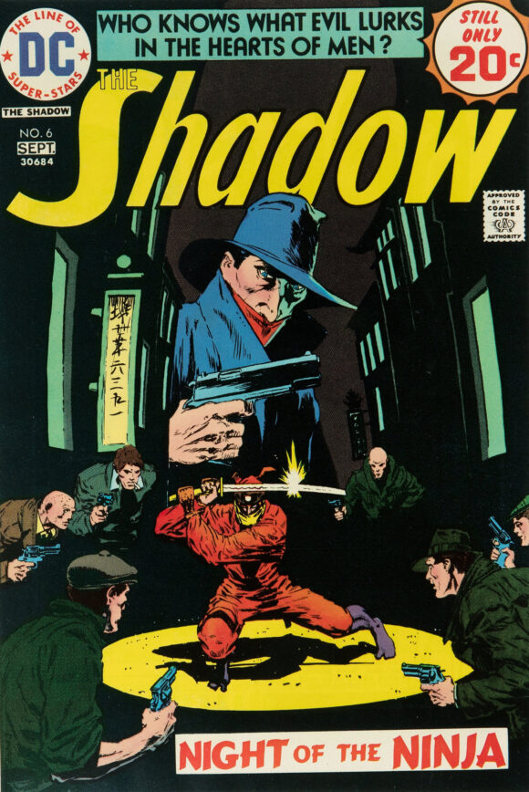
Mike Kaluta
—
3. Astonishing Tales #25, Marvel. Rich Buckler and Klaus Janson’s cover introducing Deathlok is as striking as it is horrifying. Much like the character himself. A fitting debut.
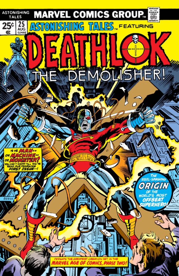
Rich Buckler pencils, Klaus Janson inks
—
2. The Amazing Spider-Man #135, Marvel. Tough call. Was really tempted to put this at No. 1. The spider-vignette motif dates back to the Ditko days and all the heads and color scheme remind you of the classic Issue #121. So you could be forgiven for calling this derivative. But so what? This is still one of the great Spider-Man covers of the Bronze Age, with John Romita using everything in his arsenal to remind you that there is always A LOT going on in Spidey’s life. I’m especially taken with wild-eyed, enraged Harry Osborn on the lower left. That scene could have been the whole cover… except next month’s issue takes care of that very nicely, thank you very much.
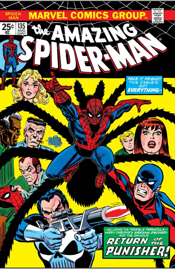
John Romita
—
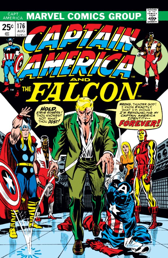
1. Captain America #176, Marvel. As I like to say, “iconic” is a word that is grossly overused. But this time it fits. Steve Rogers has plain fucking had it in a fictional world very much inspired by the real-world disillusionment of Watergate. Romita, the king of the month, plays up the shadows to convey man-out-of-time Rogers’ angst and disgust, and his Captain America outfit doesn’t look thrown away as much as it looks utterly deflated. A perfect metaphor for the time and a masterpiece of comic book drama.
Romita
—
MORE
— The TOP 13 COVERS of APRIL 1974 — RANKED. Click here.
— BRONZE AGE BONANZA: The 1974 INDEX. Click here.
—
Comics sources: Mike’s Amazing World of Comics and the Grand Comics Database.
May 19, 2024
Was never a fan of Cap being done being Cap. For me, if Cap had no hope, what chance did we have? In my world Spider-Man’s cover is #1 and miles apart from any #2. And, who thought Dracula should be depicted with a bright blue sky behind him. Was it the last issue?! Certainly some fun in the old spinner rack that month.
May 19, 2024
That’s exactly why the Cap cover is so powerful. It’s a trope now, but in the context of the time, it’s a gut punch.
May 19, 2024
Oh, wow! I still have the Detective and Brave & Bold! I loved the 100-pagers! Doesn’t the Dracula cover remind you of a bunch of Gothic paperbacks of the time? And I was a teenager back then and I NEVER caught the, uh, double- entendre of the Man-Thing! (“Hey, Beavis! Look at my Giant-Sized Man-Thing! Huh-huh! Huhhuhhuh!”) Thanks again for this!
May 19, 2024
I still have B&B 114 (bought as a 4th grader), with a very roughened, somewhat detached cover owing to too much constant handling because the opening story (“The Last Jet to Gotham”) featuring Batman and Aquaman is so fantastic (this point of the mid-ish 1970 when Bob Haney was actually hitting it out of the ball park with great stories). And then there’s the artwork . . . .
Good Lord, the artwork . . . This was Jim Aparo’s artistic pinnacle in this same period of the mid-1970s and I’m still just floored with how amazing it looks.
As this is just before the transition to the use of plastic printing plates and even cheaper newsprint, the still-metal plate printing and the more off-white paper (instead of the stronger minilla coloring it took on by c. 1977), makes Aparo’s exquisite fine line details of his gutsy realism hold up beautifully while his rich shadings combine with the coloring to a beautiful muted effect that approaches a photo-realism.
Some of the standouts concerning the latter include the bottom panel of page 4, when Batman is now underwater and shedding his parachute and then on page 16 when Aquaman’s Aquasub (the Double Dolphin) is trying to intercept the rescued jet (as it has an A-bomb in it set to go off upon reaching Gotham City), the effects of the ocean, rain, wind and spray is just masterful–the middle panel on page 16 is esp. stellar. Such craftsmanship was influential once I was college art major taking an interest in pen and ink illustration.
But B&B 114 is just one of my all-time favorite B&B issues. I’d make it cover issue # 1 or # 2 in this ranking (My mid-70s Jim Aparo bias clearly showing. The Detective Cover is slightly superior in its designing–as I noted in an earlier post, Archie Goodwin really had the best design sense of how the DC 100-pager covers ought to be done with just one large central image). Nonetheless, I’m very happy, Dan, that you included it as you saw it as noteworthy.
May 19, 2024
I could have written a lot more about B&B #114 as a comic itself. It’s one of my all-time fave issues of the series and was a childhood staple. And you’re right about Haney in this period — those stories hold up very well. I couldn’t bring myself to put the cover higher for the reasons stated, but from the heart it’s really strong.
May 19, 2024
I got the Golden Earring reference. Nice job.
May 20, 2024
Why, thank you!
May 19, 2024
Man, Weird Western #25 better make the list come Fall
May 22, 2024
‘Thou knowest not what thou dost’ is prime Thor dialogue.