
Our Annual Thanksgiving Football Feature!
It’s Thanksgiving, which means it’s time for our Annual Football Feature That Has Nothing to Do With Comic Books!
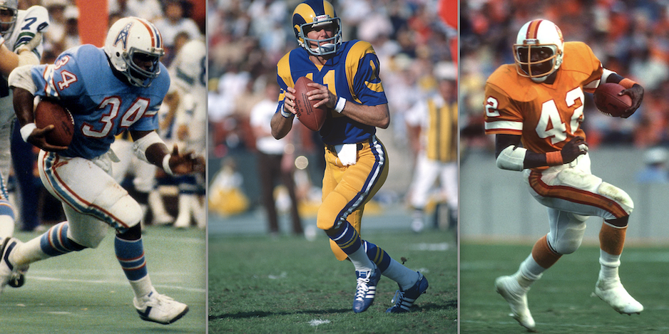
Last year’s — in which we posted THE TOP 13 NFL HELMETS of the 1970s — RANKED — was by far our most popular to date, so this year, I figured I’d take the idea to its natural conclusion and make it about football uniforms as a whole. Specifically, we’re talking uniforms with dark jerseys. (Next year, it will be white jerseys.)
Now, I am a big NFL fan but I’m not real big on a lot of uniforms worn by teams today. I freely admit it’s generational bias/oldmanism but from a purely aesthetic standpoint, I’m of the mind that the 1970s was the height of pro football fashion. There was a sameness to styles, yes — block numbers, stripes on sleeves and down the pants — but the bright, varied color palette made for marvelous television. And there actually is something to be said for tradition and consistency, espcially when given the alternatives: dopey number fonts, dark uniforms for the sake of dark uniforms, color rush (good lord!), questionable “Rivalries” outfits, gradient hues and unappealing fabric patterns.
MY EYES!!!!!
The NFL only seems to look like the NFL when certain teams play or teams wear throwbacks. Too many times, I feel like I’m watching He Hate Me and the XFL.
In that vein, I’m not going to just rank the Top 13 Football Uniforms of the ’70s. If I did, this list would be a different one. (For example, you’re not going to find the Raiders below.) Instead, I’m taking it a step further and going with THE TOP 13 1970s NFL UNIFORMS THAT NEED TO BE BROUGHT BACK FOR GOOD — RANKED.
(A caveat: Not every case needs to be a precise return. I can forgive certain liberties if the overall look captures the glory days; other times I can’t forgive any modifications. Read on and you’ll get what I mean. Also, uni graphics are from the indispensible Gridiron Uniform Database, which is to football fashion as the Grand Comics Database is to comics.)
Here goes:
—
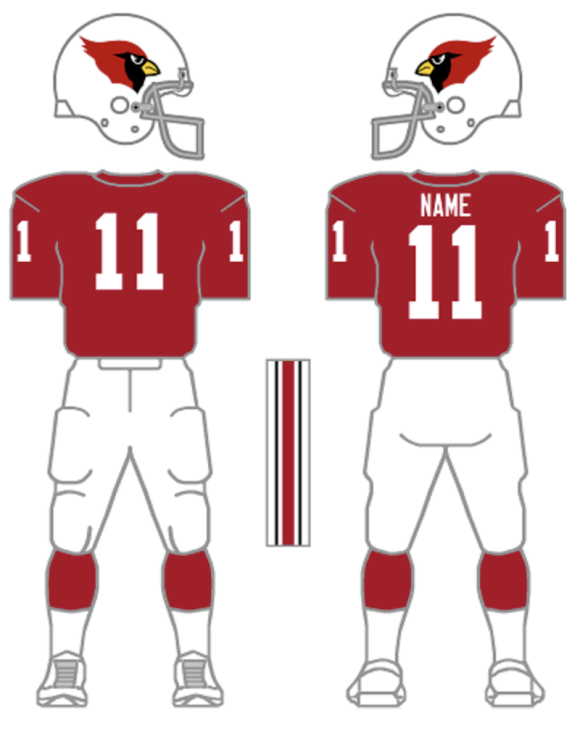
13. Arizona Cardinals. The Cardinals are thisclose to getting it right. I can live with Arizona’s fonts and I kind of dig what they did with that great helmet design, but their red tops are worn with red pants and that’s a 15-yard-flag. No, make that a 30-yard-flag, even though there is no such thing. If they wore white bottoms with the red top, we’d be in business.
—
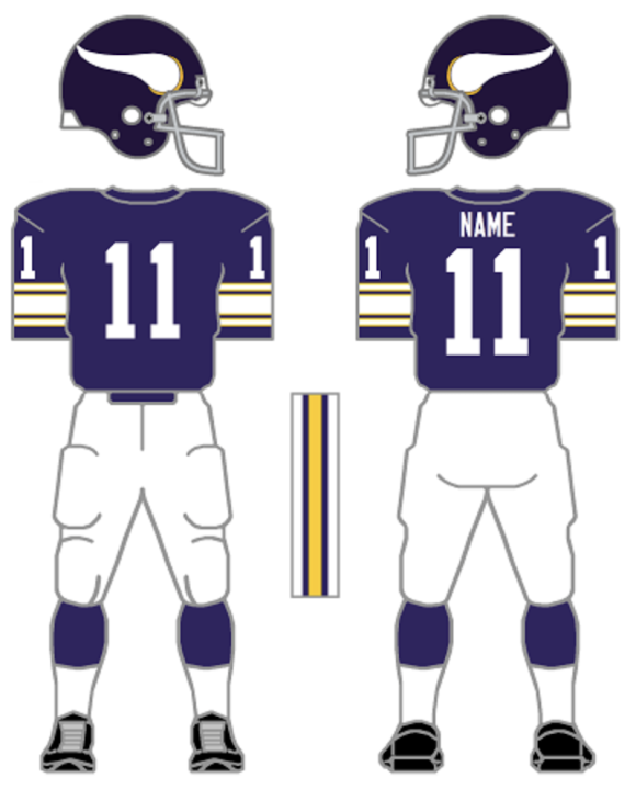
12. Minnesota Vikings. The modern Vikes aren’t all that different from the classics. The horns on the helmet have been adjusted only slightly, but the real change has been in the fonts and the striping. Neither is offensive but neither is an improvement either. When Minnesota wears these as throwbacks, they always look better. (Side point: Color rush? Feh! Winter Warrior? I’m down with it as a one-off.)
—
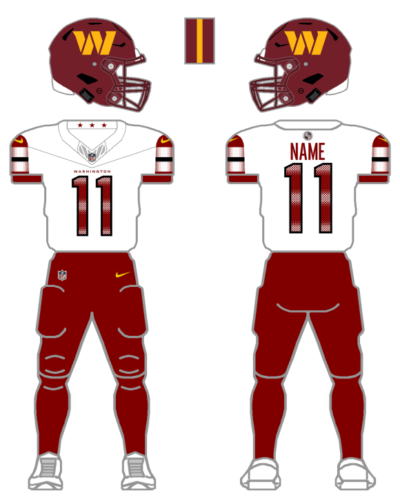
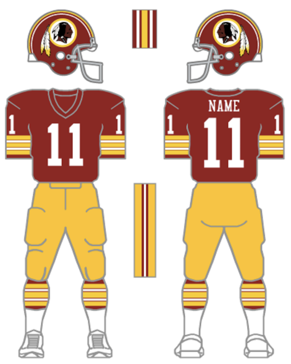
11. Washington Commanders. We’re not getting into the name or the helmet logo here. This is about the overall design. Today’s Commanders have, without a doubt, the worst selection of uniforms in the NFL. Horrendous. But there’s hope on the horizon: They’ve been wearing “fauxbacks” that mimic the ’80s Super Bowl days and the buzz is that those unis could become the norm — and I am all for it! 1,000 percent! The only reason Washington isn’t higher on the list is because I do expect this change will be made anyway. The ’70s gold-pants look is another excellent option — as seen in a variation already in use.
—
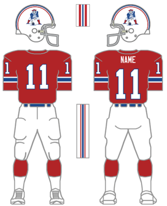
10. New England Patriots. Really, if you look at the ’70s, the Patriots uniforms are kind of middle-ground. They’re fine. But they’ve always been superior to the silver-helmet/blue jersey look, whatever iteration we’re talking about. The Pats’ current silver/navy/silver is pretty solid, and I certainly can live with it, but I’d still like to see the return of Grogan Red and Pat the Patriot.
—
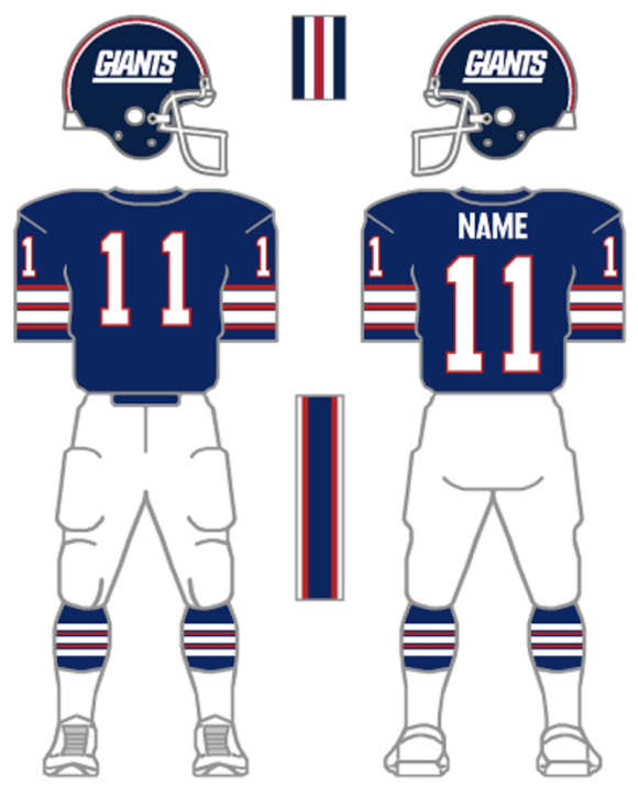
9. New York Giants. I was born and raised in New Jersey, but I have lived in New York for almost twice as long; I essentially see myself as a straight-up New Yorker with Jersey roots. But when the Giants did away with the wordmark you see below, in favor of the lower-case “ny” emblem, I cried foul and I still do. The team plays in New Jersey and “GIANTS” on the helmet is the perfect way to capture the team’s NY-NJ heritage. It speaks to the Jersey-kid-with-a-chip-on-his-shoulder who still lives inside me, while still being very much the New York Giants. Beyond that, the team’s current home blues are a drag, even if the look calls back to the pre-Meadowlands days.
—
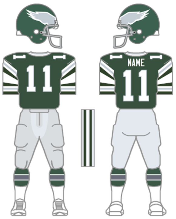
8. Philadelphia Eagles. The current Eagles outfits aren’t exactly a travesty, they’re just ugly. That “midnight green” or whatever they want to call it, has seen its day; it was trendy in the ’90s but now it looks stale. And don’t even get me started on the number fonts! Also, when they changed their design, they also did something weird with the way the helmet wings sit in the front. It just looks off. The Iggles have been wearing the 1985-95 kelly-green throwbacks and I’d entertain an argument that those are superior to these, but I kind of have a thing for the busy, Ron Jaworski shoulder stripes. Either set is better than what they’re wearing now, though. And, hey, Philadelphia: Knock it off with the black! Just stop!
—
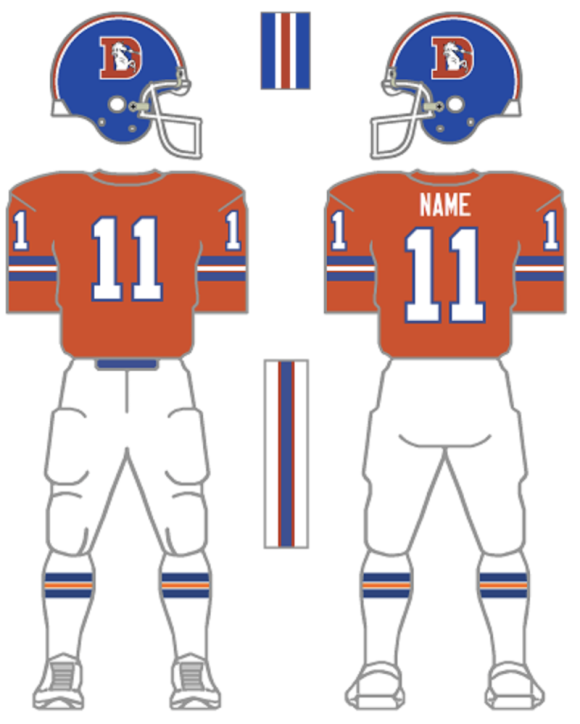
7. Denver Broncos. The Orange Crush is better than anything the Broncos are wearing today. Far and away. Just bring them back already. The throwbacks are just a mean tease.
—
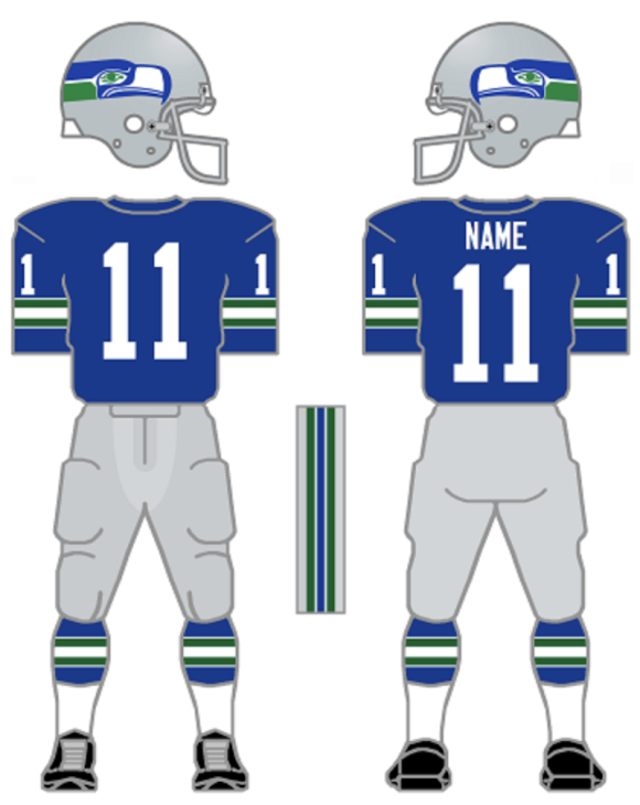
6. Seattle Seahawks. This is a no-brainer. I loved the Seahawks’ uniforms then and I love them when I see them as throwbacks now. Blue and green was a unique look but it’s been corrupted by the different shades the ‘Hawks use now. I even kinda dug the neon green when it was first introduced, because it was funny in that 1970s Houston Astros “why the hell not?” sort of way. (Despite being a traditionalist, if a team does wacky well, I dig it.) But it’s a shtick that’s worn itself out and the overall Seattle design is desperate for an overall. Going back to basics would be welcome. At the very least, give us a silver helmet. Yet another dark helmet makes the NFL dreary.
—
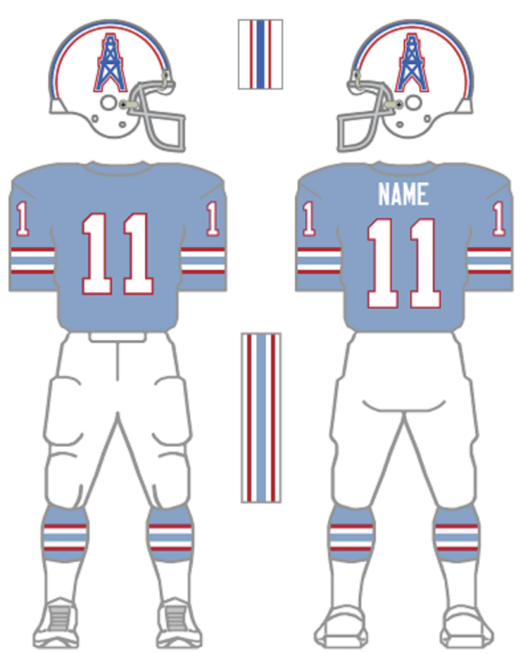
5. Houston Texans. It was total dick move that the Tennessee Titans wouldn’t let the new Houston team use the “Oilers” name when they joined the league in 2002. It’s an even dickier move that they won’t even let them use the color scheme. I mean, COME ON. It doesn’t get any pettier than that. So, compromise: call them the Texans, throw the bull on the helmet and keep these Earl Campbell unis in play. Anything but the soup that their wardrobe is now. (I actually like the bull horns on the red helmet, but the shell is so damn shiny, you can’t even see the blue!)
—
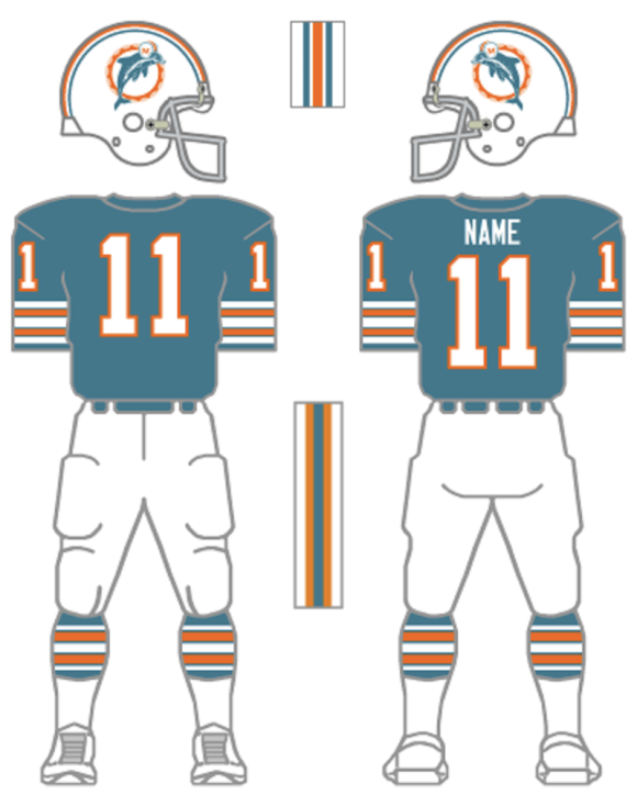
4. Miami Dolphins. The current Dolphins set is a case of change for change’s sake. Sure, the Dolphin wearing a football helmet is kinda dorky, but it’s a good kinda dorky. And they wore a variation on the design below when they went undefeated in 1972, so, y’know, dorky paid off. (I prefer this version to the one where the Dolphin is only halfway eclipsing the sunburst. It’s much more balanced.) I’m a Dolphins fan first and foremost (even though I grew up in New Jersey) and it was a treat whenever this uni popped up on TV. It’s such a better look — bring it back beyond the throwback!
—
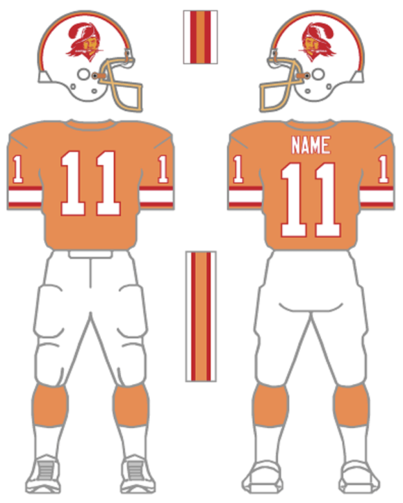
3. Tampa Bay Buccaneers. I put the helmet at No. 1 a year ago, but I have different reasons at play for the top two slots, when considering a complete look. When the Bucs replaced the Creamsicles with pewter back in 1997, I cheered. Bucco Bruce had run his course and the bright orange look felt outdated. But these things are cyclical, I suppose. Now, I find the pewter/red combo to be passe and get ridiculously excited whenever the Bucs break these out. I even bought a Bucco Bruce T-shirt to wear whenever these hit the field — whether I can watch the game or not!
—
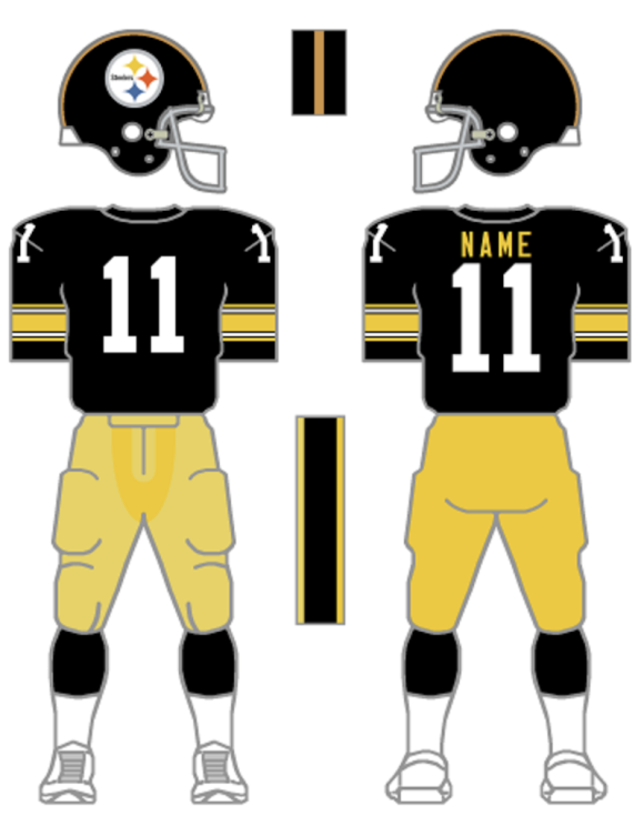
2. Pittsburgh Steelers. It’s all about the number fonts. Entirely. I’m of the mind that block numbers should be the standard for all teams except the Chicago Bears. It’s a strong, muscular look that befits a sport where brute force is the true underpinning of the game. But even I recognize that’s a little too shaking-fist-at-clouds. Nevertheless, if there’s a team that should NEVER be wearing italicized fonts, it’s the Pittsburgh Steelers. The Steel Curtain. Wielders of the Terrible Towel. The Steelers were such a force in the ’70s that they made the average fan forget they’d been doormats for decades. To back off from that look, in exchange for a number design that makes it appear like a stiff wind would push them over, is an unfathomable decision. The amazing thing is they’ve been wearing the italics for about as long as they wore this ensemble. C’mon, Rooney family! Switch it back!
—
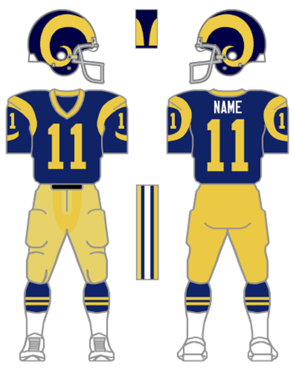
1. Los Angeles Rams. There’s so much I could say about the Rams’ current uniforms, which try to echo these but fail to capture the pizzazz, cleverness and cool of this outfit. As I wrote a year ago about the helmet alone: “When you achieve perfection, you do not mess with it.”
—
MORE
— The TOP 13 NFL HELMETS of the 1970s — RANKED. Click here.
— Dig These 13 Groovy 1970s NFL Catalogue Pages. Click here.
November 27, 2025
I was always partial to the Patriots Grogan era red pants white shirts.
November 29, 2025
I still have a Largent jersey from the classic Seahawks unis
November 27, 2025
I don’t follow the NFL (more of a CFL and NHL fan), but I agree with how modern sports uniforms try too hard. Stick with simple colour palettes and leave out the fancy little curvy stripes everywhere. Stripes should be big and bold. Uniforms aren’t meant to be fashion. By that, I mean, don’t prioritize it for people wearing it out on the street. It should look striking under stadium/arena lights.
PS. I’ve always loved the Rams’ helmet, since it doesn’t feature a logo (i.e., original).
November 27, 2025
I am personally offended that you called the Cardinals the Arizona Cardinals when, in the ‘70s, they were the St: Louis Cardinals.
(Not really, just wanted to add my two cents, whether needed or not. I’m not a huge football fan, but I’m still upset the franchise left St. Louis. lol)
November 27, 2025
First off, a great post.
Secondly, it’s pretty clear from the walk-in closet variety of uniforms some teams wear that the NFL’s object is merchandising and not promoting a team identification. Unless black is a primary team color, leave it to the Steelers and Raiders (probably forgetting a team or two but I’ve yet to have my coffee this morning).
And happy Thanksgiving to all you 13 Dimensionals.