Deadman flips!

—
Neal Adams’ latest project is a Deadman miniseries that launched Nov. 1. In tandem with that, we’re running NEAL ADAMS’ DEADMAN TALES, a recurring series featuring the artist’s views on his work with DC’s ghostly avenger.
For the complete NEAL ADAMS’ DEADMAN TALES Index of stories, click here.
—
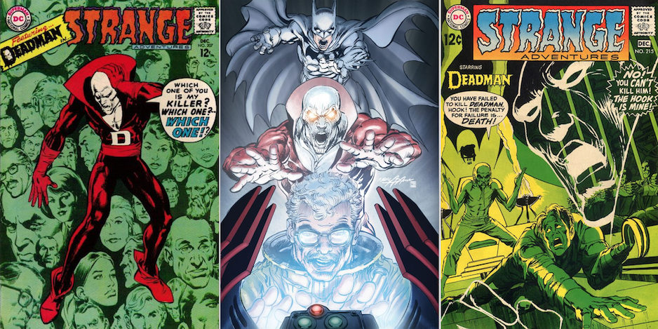
This time out? Three, count ’em three, classic Strange Adventures covers:
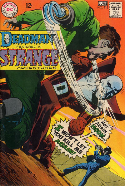
Strange Adventures #212

“For this cover, I used as my model Bob LeRose, who worked in production at DC Comics. But I also met Bob LeRose as a head of production at (an ad agency called) Johnstone and Cushing, and then later at Al Stenzel’s shop. And I helped him get a job at DC Comics later on. …
“I made him the Hook — temporarily. And the idea of this cover would be as if you went and took a picture, or took a photograph, of what was going on. The drama that was happening. A medium close-up of it. And then instead of presenting the photograph in a proper framing, you go in and cut it into a frame, or maybe cut it into a dozen frames and choose your own, most oblique kind of framing to make it the finished composition.
“And the goal of the framing would be, how do you cut it into this very hard, tight framing, and still include the basic elements that tell the story? So this is very odd, chopping up a photograph, to get you in as close as possible but still showing the main elements of what was going on. And that was the concept behind it. Which is what this is: It’s a problem solution. Part of the thing that I do with the compositions is to try to create problems that I then go ahead and solve or at least partially solve to try to make it into a decent composition.”
—
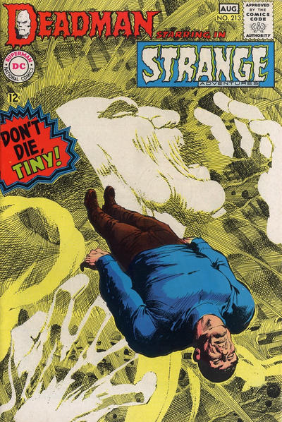
Strange Adventures #213

“Basically, that was a way to create a stylistic background that has no place in comics, has no real reason for being except that you’re creating the impression of what it’s like inside of a brain, and crying out and looking for somebody and missing them completely because, although they’re right in front of you, you can’t see them because you’re inside somebody’s brain.
“So the concept behind that was simply that we’re in somebody’s brain. What’s it like in there? Let’s try to do a depiction of it. And why should you argue with me? You’re no righter than I am or I’m no righter than you are.”
—
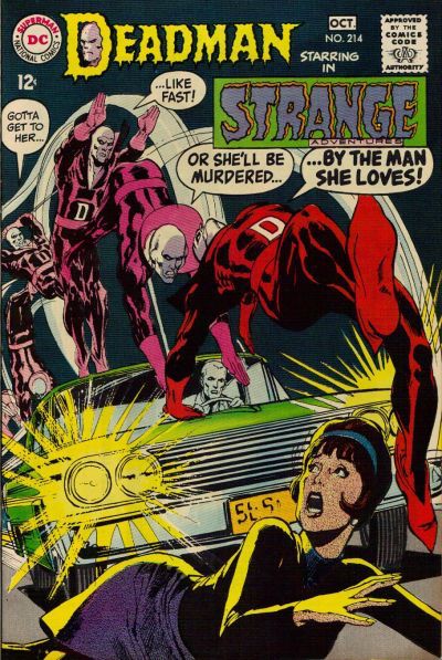
Strange Adventures #214
“That was an attempt to do animation in a series of drawings. Some people up to that point had tried to do that inside the comics but they had done it, you know, rather shabbily. Sort of, even, experimentally. This was a true animation. This is Deadman flipping over a car to rescue a girl uselessly because, of course, he’s dead. He can’t rescue her. Maybe he could jump into her body and have her jump out of the way but the idea here was to create this sense of him being animated and what it would be like to show animation on the cover.
“And probably done for the first time in history, in the history of comics, in this one comic! I don’t know how many times it’s been done after that. It’s still an area of exploration that people have not necessarily gone into. But for me, it was, here’s a way for me to experiment. It was, “Look at this! I’m having this guy flip over a car in true animation positions.” Any animators out there in the audience, I think, would properly appreciate this.”
(NOTE: Carmine Infantino did the layout, according to a response in the letter column in Strange Adventures #216, per the Grand Comics Database.)

—
NEXT: Two for the road.
For the complete NEAL ADAMS’ DEADMAN TALES Index of stories, click here.
