Ira Schnapp‘s entertaining DC Comics house ads felt more like bonus pages than advertisements. That’s a triumph.
Part 3 of a five-part series on the great DC Comics designer of the Golden and Silver Ages.
For Part 1, an overview of Schnapp’s voluminous contributions to the form, click here.
For Part 2, on 16 great Schnapp comics logos, click here.
This series is based on Arlen Schumer’s upcoming lecture and exhibit, The Super Type of Ira Schnapp at the Type Directors Club of New York, opening Thursday, May 14 at 6:30 p.m. Click here for tickets to the lecture (seating is limited). For more info, click here.
The exhibit will run through the summer. It’s produced and sponsored by A to A Studio Solutions.
—
By ARLEN SCHUMER
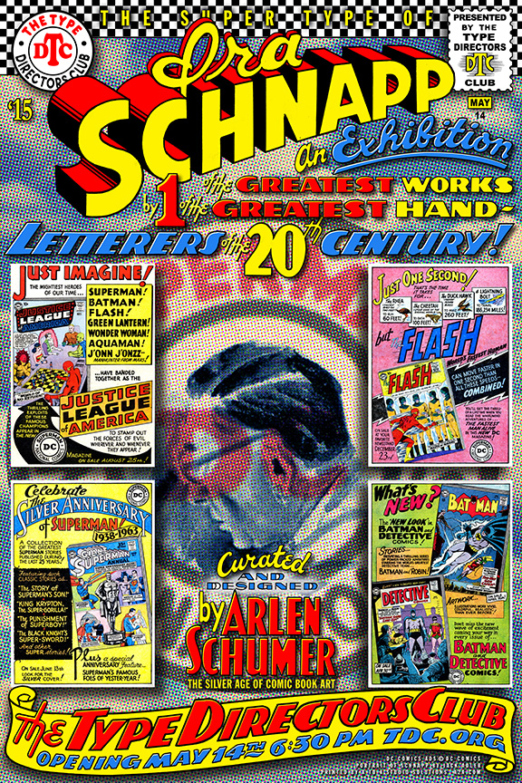
The four images inset in the poster I designed for this exhibition (above) are my four favorite house ads lettered by the longtime (1938-68) DC Comics letterer and logo designer, Ira Schnapp.
Not only did Schnapp beautifully letter most of the logos and caption type on DC Comics’ covers during the Silver Age, but he also lettered these ubiquitous ads, which gave the comics company its distinctive graphic look as much as his covers did.
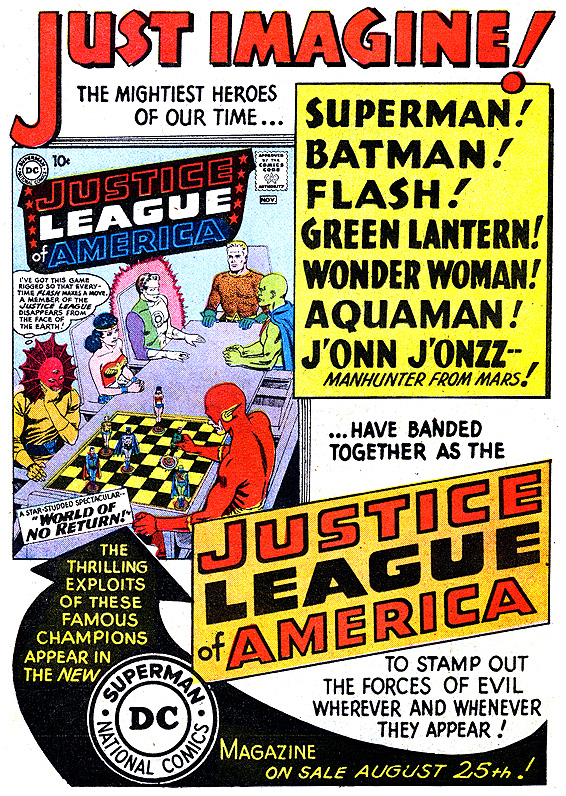
Two of them promote the first issues of two of the keynote successes of DC’s Silver Age: The Flash — the first Silver Age superhero — and Justice League of America — the first Silver Age team book. The other two advertise key issues of the two greatest comic book characters ever created, the yin and yang of superheroes, Superman and Batman.
“Just imagine!” Schnapp boldly beckons us in the banner-like lettering that spans the top of his house ad for Justice League of America #1 — playfully punctuated by one of Schnapp’s trademark oversized, diagonal exclamation points, the style that Schnapp used often on the many movie lobby cards he lettered in the 1930s.
(DC artist legend Murphy Anderson said you couldn’t go to Times Square in that era and not see Schnapp-lettered lobby cards everywhere.)
A generation of Baby Boomer comic-book fans’ imaginations were lit like firecrackers with the incendiary excitement that was the dawn of DC’s Silver Age — best represented by JLA, DC’s flagship title. Schnapp gave the logo the requisite shield-like, legalistic look, perfect for bringing words like “justice,” “league,” and “America” to visual life. Which was Schnapp’s strength as a letterer/calligrapher/typographer: His titles onomatopoeically looked, felt and sounded like what their words meant.
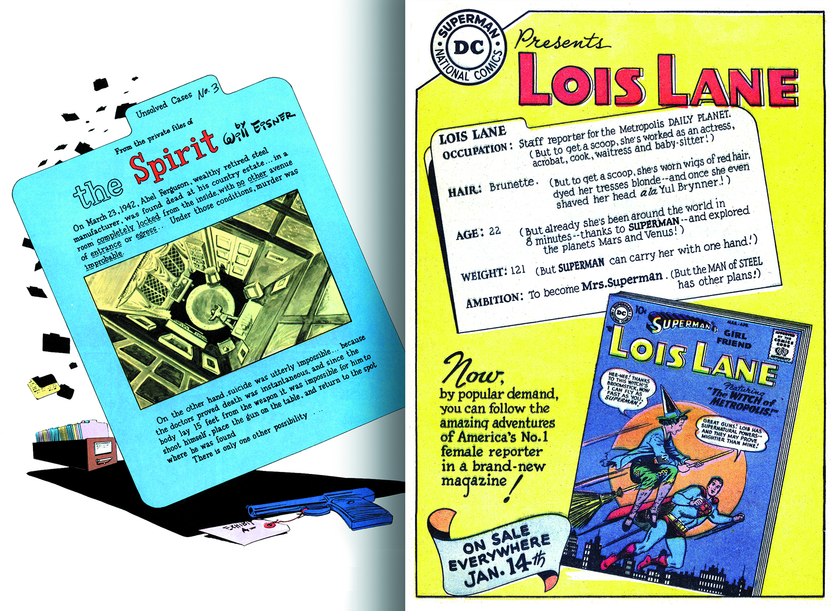
But it was in the wide-ranging freedom of the DC house ads that Schnapp got a chance to stretch his calligraphic range and play with page composition design, with stylized display lettering and filigreed fonts illuminating his comic book text, the likes of which hadn’t been seen in comic book art since Eisner’s The Spirit splash pages. They’re as classic as Hollywood hand-lettered posters and Americana as the label lettering on the fruit crates of the 19th and 20th centuries that have enjoyed post-modern revivals and reconsiderations among graphic designers, art directors, typographers and calligraphers of the 21st century.
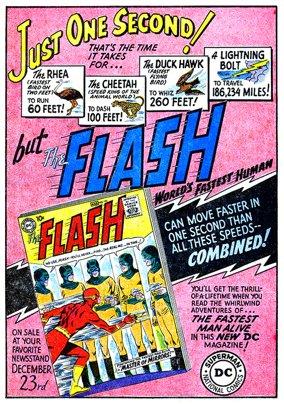
Schnapp skillfully squeezed type inside all manner of boxes and arrow shapes, designed to lead the reader’s eye toward the goal, the inset comic book cover, artfully tilted to harmonize with the dynamic angles of Schnapp’s declarative sentences. He creatively combined type with vignetted comic imagery, like those seen in his 1959 house ad for the first Silver Age issue of The Flash, the first of DC’s rebooted superheroes from the Golden Age.
Everything in that Flash ad speaks of speed — the “Just one second!” headline fairly leaps across the page like the fleet animals in the vignettes below it (adding that educational element always present in editor Julius Schwartz’s Silver Age books); a black lightning shape darts behind the Flash cover, an apropos spot for Schnapp’s breathless prose to alight.
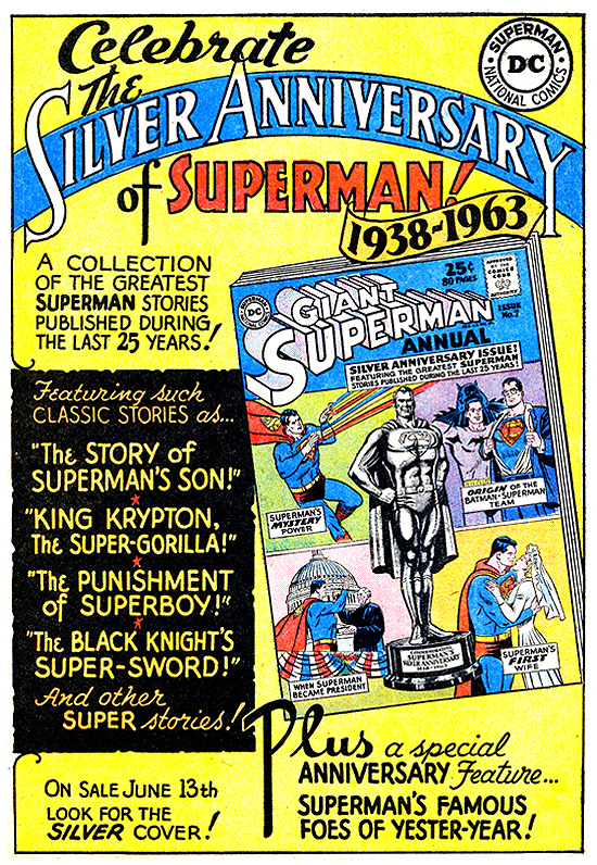
There’s an invitational quality, befitting a silver-anniversary theme, to Schnapp’s Superman ad for the 1963 Annual (which happens to be the first comic book cover I remember seeing as a child, in summer camp when I was 5 years old).
It’s hard not be enraptured by that quality, as Schnapp’s elegantly lettered blue title banner arcs across a balanced arrangement of type and image (that unforgettable silver Superman statue penciled by Curt Swan and wash-toned by head colorist Jack Adler), anchored by the giant “Plus” at the bottom center.
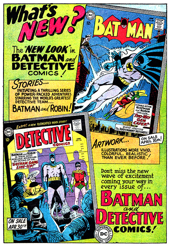
“What’s New?” asks Schnapp’s headline in this ad for the groundbreaking “New Look” for Batman that editor Schwartz and artist Carmine Infantino engineered in the spring of 1964. What was “new” about this beautifully designed Schnapp house ad was that, maybe for the first time in comic book history, the quality of the stories, and especially the artwork, were emphasized as selling points to children. Pretty straightforward way to turn on an entire generation to art! (Inset are two Infantino covers, Batman #164, April 1964 and Detective Comics #328, June ’64, both inked by Joe Giella.)
Those are just four of the 29 examples of Schapp’s house ads — both full-page and half-page sizes — on display in big, bold three-dimensional tableaux at the Type Directors Club exhibition I curated and designed.
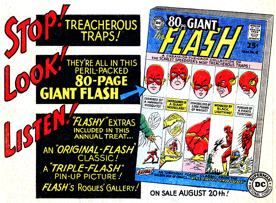
Come see them when the exhibition opens with my lecture on May 14 and see why — as the half-page ad Schnapp lettered for The Flash 80-Page Giant #4 (1964) reads — you can’t help but “stop, look and listen” to Schnapp’s DC Comics house ads!
NEXT WEEK: Schnapp, Batmania and Go-Go Checks!

April 29, 2015
Arlen Schumer is a force to be reckoned with. He’s peerless in his unique knowledge and perspectives on the art and design of superhero comics.
And his presentations are not to be missed. Over the decades I’ve been impressed with his elucidations on a wide variety of super-topics. He’s even delivered custom-created talks to my Graphic Design History classes at Art Center College of Design and Loyola Marymount University here in Los Angeles, much to the enlightenment of my students.
And among the 60-plus contributions to my 2005 book, The Education of a Comics Artist, his “Superhero Artists of the Twenty-first Century: Origins” essay on the New Draftsmen, New Stylists, and Multimedia Artists remains a landmark study.
Bottom line: Go. See. Hear. Learn. And be very entertained.
~ m
.
May 1, 2015
Thanx for those great kudos, Michael! (FYI, “Education of a Comics Artist” is available: http://www.amazon.com/Education-Comics-Artist-Michael-Dooley/dp/1581154089/ref=sr_1_1?ie=UTF8&qid=1430488664&sr=8-1&keywords=The+Education+of+a+Comics+Artist)