With nods to Batman ’66 and Batman: The Animated Series thrown in for good measure…

I don’t read ongoing series very much anymore. It’s not a knock on the creators by any means, it’s just that the storytelling style, decompression, event intrusion, and whatnot generally don’t leave me satisfied. With a couple of exceptions — Nightwing by Tom Taylor and World’s Finest by Mark Waid, and their artistic collaborators — I tend to stick with self-contained, limited series, where you can rely on a beginning, a middle, an end, and a consistency of approach.
That’s one of the major reasons I’m so excited for the upcoming Batman and Robin: Year One, by Waid and Chris Samnee, and Batman: The Long Halloween — The Last Halloween, by Jeph Loeb and a cast of thousands that kicked off in full this week.
But there’s now a third limited series that’s entered the picture that has the potential to play with those big boys — Batman: Dark Patterns, by writer Dan Watters, artist Hayden Sherman, colorist Tríona Farrell and letterer Frank Cvetkovic. That’s a pretty bold statement considering the pedigree of the first two maxiseries I mentioned, but check out this description from DC that was released with this month’s solicitations:
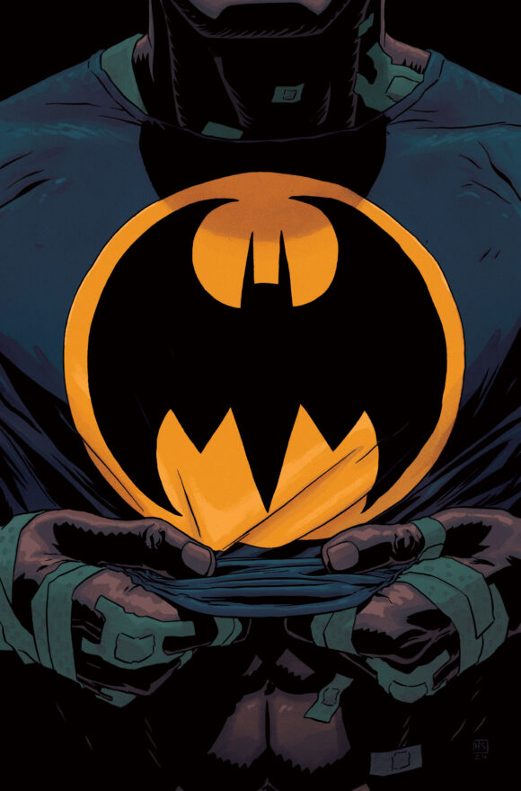
Main cover by Hayden Sherman.
“Set during the early years of Batman’s career, Batman: Dark Patterns delves into four mysterious cases as he attempts to cement his place as Gotham City’s protector while the city itself fights back against him. This is the Dark Knight Detective at his most stripped-down core, a man relying on his wits, his skills, and little else as he tackles some of the most twisted mysteries Gotham City and its protector have ever encountered,” the copy, which describes the series as “lo-fi” and “mystery-focused,” reads.
Sounds an an awful lot like a contemporary take on the earliest 1939-40 Batman stories from Detective Comics, doesn’t it?
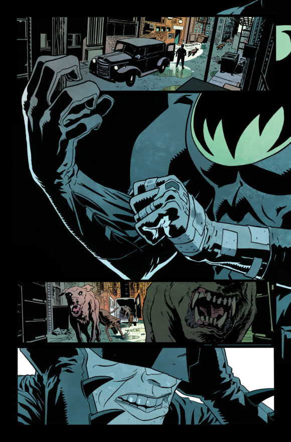
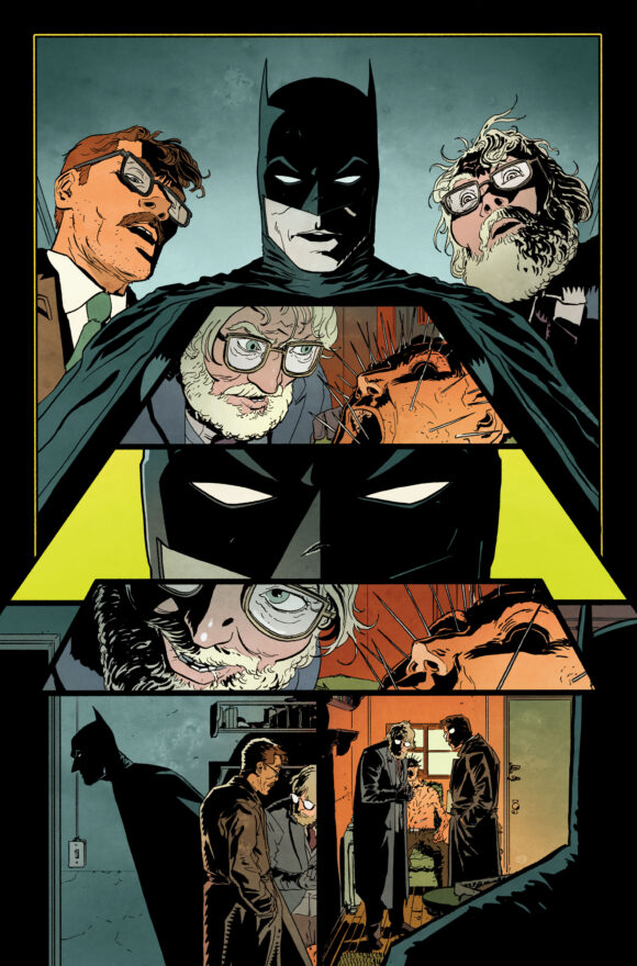
Love Tríona Farrell’s flat colors.
“I love the strangeness of Batman. A man dressed as a huge, gothic bat, solving crimes in a hostile city of black magicians, mad scientists, and superstitious, cowardly criminals. I’ve always wanted to write a series of mystery stories that would home in on that aspect of the character—a dweller in the shadows of Gotham’s towering, dilapidated spires,” Watters said.
“After watching The Batman, this desire was reaffirmed. Batman: Dark Patterns explores the pulpiest part of the Dark Knight’s rich history and gives readers an entirely new perspective on the early years of DC’s Dark Detective,” he added, using the term coined by legendary Bat-writer Steve Englehart.
It’s that “new perspective” that intrigues me. There have been a lot of great re-tellings of Batman’s early, “mysterioso” days — Matt Wagner’s Batman and the Monster Men and Batman and the Mad Monk are two sterling examples — but they tend to give us updated takes on classic villains or storylines. This year’s rock solid The Bat-Man: First Knight by Dan Jurgens and Mike Perkins trod similar ground but actually took place in 1939.
Dark Patterns, on the other hand, promises something modern couched in the ’39 Batman sensibility — but with flourishes from other aspects of Batlore, including the 1966 Batman TV show and Batman: The Animated Series.
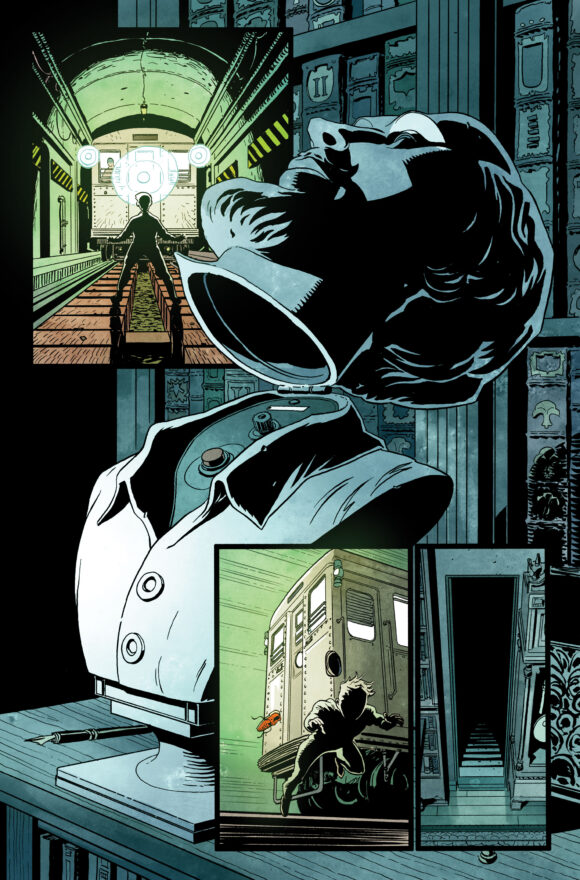
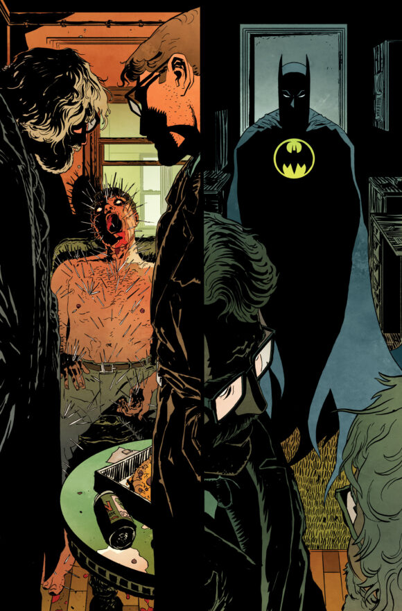
Shakespeare head!
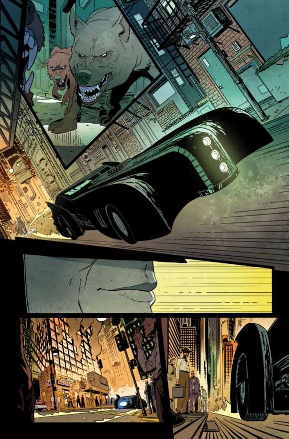
A Batmobile that combines elements of the Batman: The Animated Series and The New Batman Adventures versions.
So long as we don’t get some unnecessary and trite “Earth-shattering” retcon of Batman’s origin that promises to “change the Dark Knight’s life forever,” I’m down for the ride.
The 12-issue series comprises four, three-part standalone stories. The first mystery, “We Are Wounded,” involves a series of appropriately gruesome murders that may be the work of a serial killer — or something even worse.
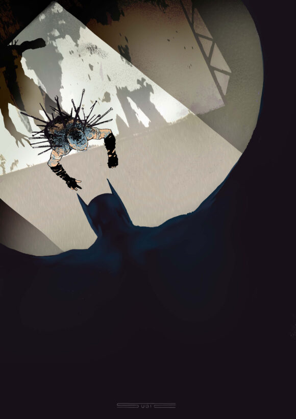
Stevan Subic variant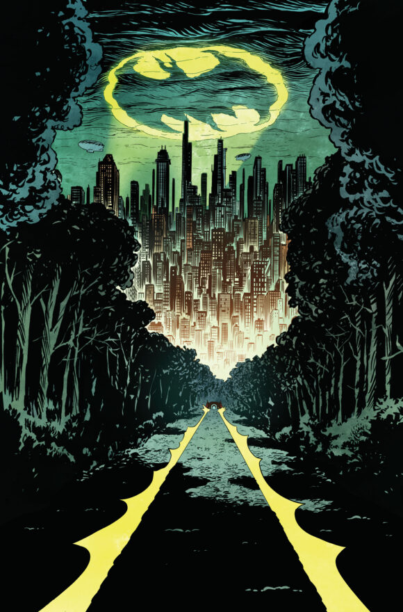
Batman: Dark Patterns #1 is due Dec. 11.
—
MORE
— FIRST LOOK! The BATMAN AND ROBIN: YEAR ONE Trade Dress and Color Pages. Click here.
— 13 THINGS We Want to See in BATMAN AND ROBIN: YEAR ONE — RANKED. Click here.

September 28, 2024
The artwork reminds me of Norm Breyfogle’s work, which was EPIC. Thanks for all of your articles!
September 28, 2024
Hi Dan,
I must say I’ve always much disliked the 1940s to the early 1960s Golden Age Batmobile–even extending back to my kiddie days–esp. both with that ungainly overly large and ungainly bat-head on the front, which never quite aesthetically worked for me, and the general over-sized clunky massiveness of the car. It wasn’t until the “New Look” Batman got the sports car in 1964 that Batmobiles began to look more normal and yet still Batman-symbolic (the TV show car is stellar and a classic design, yet unfortunately, esp. back in my kiddie days in the 1970s, DC was hardly wanting to appropriate that in the comics as wanting to get out from under the 1966 TV show’s influence–even if its influence was kinda there for the Superfriends cartoon).
But, Wow!, the Batmobile here as synthesized from Batman: The Animated Series and The New Batman Adventures looks very amazing. It does impressive job, perhaps, reinforced by the dramatic plunging perspective dynamic it is drawn in, of suggesting the massiveness of the Golden Age car with that minimal sleekness of the New Look Batmobile and beyond. I might prefer the practicality of a more horizontal layout of the headlights, but minor stuff. Quite impressive indeed!
And a shout out too to that fantastic Bat insignia on Bat’s costume as that looks great too. I thing that has never changed for me, also extending back to kiddie days, is that the Bat emblem needs that yellow field around it with a bat silhouette with very geometrized wings defining its shape be it a circle or the classic Adams-inspired oval. I always liked how it brings out the bat design from getting lost in all that dark grey of the costume, how that yellow coloring accent complements the utility belt and how it makes Bat’s total costume show that he is a creature of the night as suggestive of the Moon.
And I freely ignore what I think is a silly argument–that the oval makes the bat emblem more of a gun target (even if Frank Miller plays with that claim brilliantly in The Dark Knight Returns). Superhero emblems with or without circles or ovals as centrally placed on superhero chests are potential gun targets regardless if we want to make the argument (watch George Reeves as Superman to see the point)–and still true for Bats for the past few decades as the circle or oval has been somewhat more unfashionable.
Thanks for posting Dan. Batman Dark Patterns just from the art and design alone looks quite compelling.
September 28, 2024
Good Lord, all those typos. Ugh. Apologies Dan, I’ll try to do better next time
September 28, 2024
Series had me at Shakespeare‘s head! I’m not a fan of the modern comic. But I must admit the writing on World Finest is FUN! I 100% gave it a try based on Dan’s recommendation. (Admittedly, I’m buying the TBK.)
September 30, 2024
Hmm… I’m going to say that the level of graphic violence in these pages (considered ‘normal’ for today’s comics, I’ll grant you) puts me off this interpretation of Batman, good as the art may be in its own right. We’ve got The Bat-Man: First Knight by Jurgens, Batman: Year One and Year Two, The Monster Men and The Mad Monk by Wagner, and the whole series of Jeph Loeb/Tim Sale visitations of Batman’s early days. That may be about enough for me, without adding another “Early Years” Batman to the mix.