Easily one of Adams’ very best — yesterday and today.

February was NEAL ADAMS MONTH here at 13th Dimension, and we featured daily commentary by Adams on his variant-cover project for DC Comics. Each of his 27 variants is a twist on one of his famous covers from the past. He provided the pencils, and the inks and colors were handled by some of the biggest names in the business like Dave Gibbons and Frank Miller.
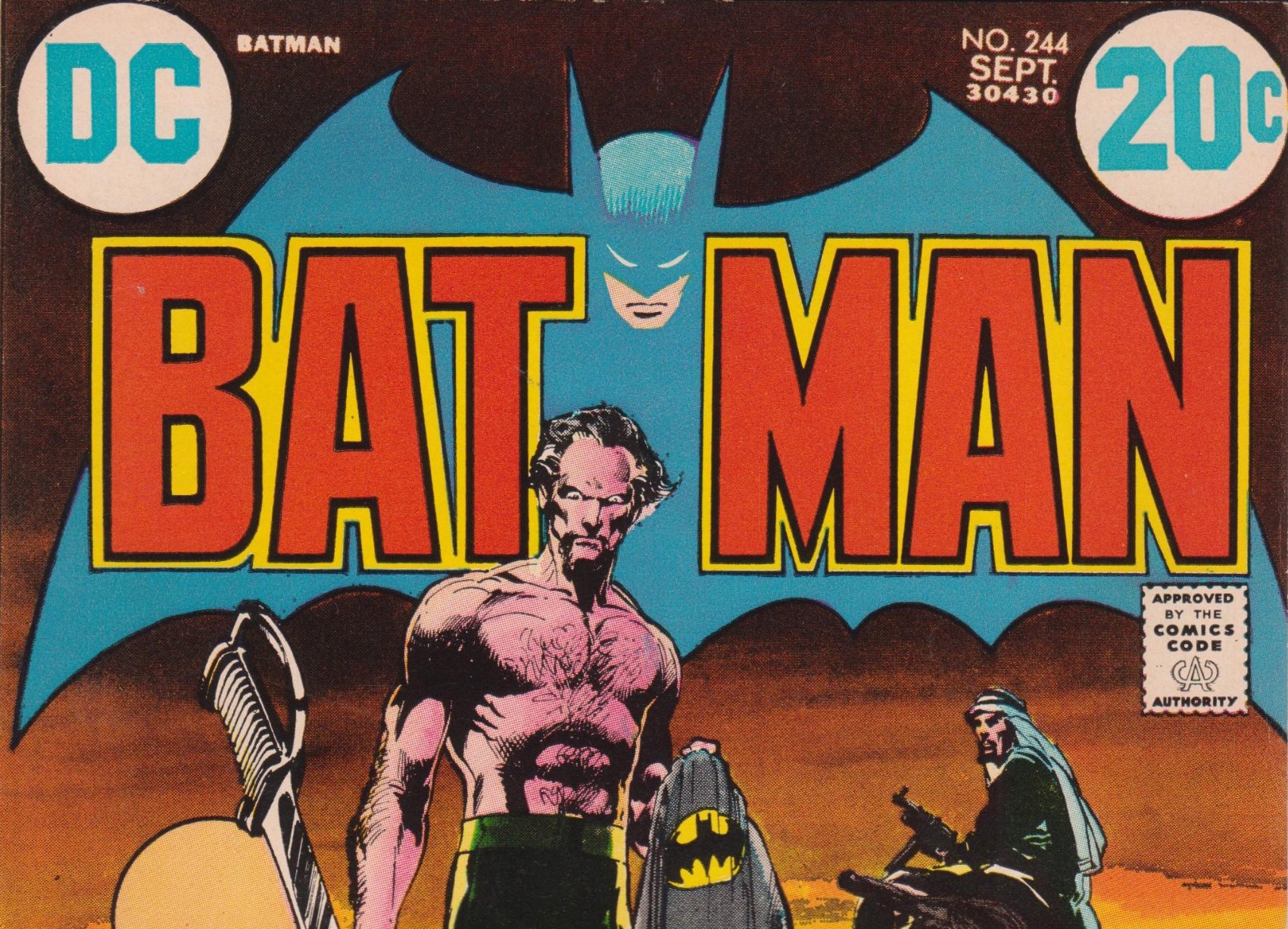
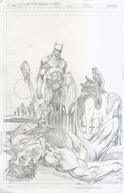
But sometimes the comics gods play havoc with publishing schedules and two of the issues for which Adams did variants were delayed. On 3/30, JLA #8 comes out, so now we bring you Adams’ commentary on that cover, which is based on the classic Batman #244, cover-dated Sept. 1972.
The guest inker is Bill Sienkiewicz (read his commentary about this cover here) and the colorist is Alex Sinclair.

—
For the full NEAL ADAMS MONTH INDEX of stories — click here.
—
Batman #244 is right up there among the very top of Neal Adams’ covers. It’s definitely in same arena as Batman #251, Batman #232 and Limited Collector’s Edition C-51 (the Ra’s al Ghul treasury edition).
In the new version, Batman (as he should) gets the upper hand over Superman with a Kryptonite sword and Talia’s on the camel to the right, looking on. And though I would have preferred that the JLA logo mimicked the same colors as the Batman logo, this is overall a gorgeous evocation of the original. Much of that is down to Bill Sienkiewicz’s superb inks.
There’s an inherent irony there for long-time fans given that Sienkiewicz, who has since become a comics legend in his own right, drew a lot of heat early in his career because his style hewed so closely to Adams’. You’ll get Sienkiewicz’s brief commentary on this cover soon.
Now, on to Adams!
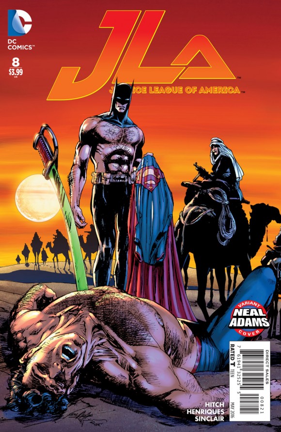
Dan Greenfield: Let’s go to JLA #8 and Batman #244, another classic and another favorite of mine. And another with transposed characters. Now, before you even ask, there’s (something) that jumps out at me: You fixed one of the great unintentional gags. You don’t have Superman’s pants there held by Batman, where on Batman #244, Batman’s got two pairs of pants.
Neal Adams: So, yeah. This is the gag that I do at conventions. I take the cover and say, “How many pairs of pants is Batman wearing?” And they say, “One? Two?” and then they ask why and I say, “Well, you have to take his shorts off to get his pants off. That makes him naked.”
What people don’t know is that this leg to the right, even though you can’t tell, is a naked leg. It’s drawn as a naked leg. It was intended to be a naked leg. And (editor) Julie Schwartz objected to it. He said, “You can’t do that.” He said, “How can you have the trunks on and not have that on?”
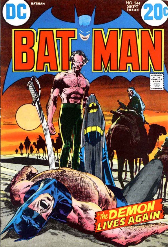
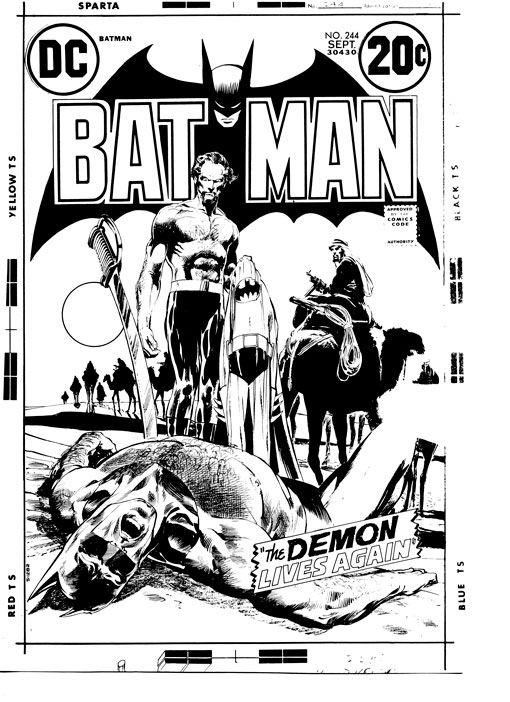
I said, “But then we’ll have two pairs of pants.” And he said, “So what? Nobody’ll notice.” “Okay, Julie, whatever you say.” So then we colored his legs. But if you were to look at the black and white of this, you go, “I can see the little hairs. It’s really a naked leg.”
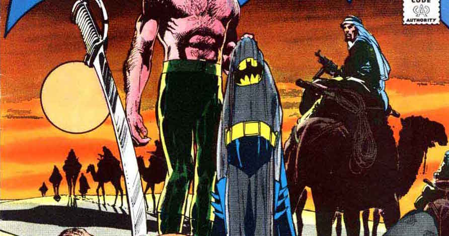
Funny. This is also one of those covers that, because even though I was being paid $50 a page for a cover, I felt it was too important not to do a professional job. So this (gestures around the background) is a professional tracing or rendering of a real photograph that I researched. So this has a snap of authenticity that often the covers don’t have… You could take this and turn it into a painting very easily because all the elements are illustrated correctly. This has all the right anatomy. You have to have the reference on the research.
Dan: Was it, like, National Geographic or something?
Neal: Yeah, my big reference was National Geographic. And probably is National Geographic. People who go back in their National Geos will probably find that photo…
This (cover) has so much in it because this is one of those times I slowed down and I said, “Y’know, I don’t care how much I get paid for this. This has gotta be a good cover. And this is a meaningful cover for the sake for the series as well.” …
Look at what I forced (production man) Jack Adler to do with that sky with his crappy color separations… That was technologically almost impossible in those days.
Dan: Let me ask you about that, because I’m a layman about these sorts of things. When I see the choice of the colors on the logo itself, they’re using that light blue and I also like that faded look. While the BATMAN word, the red and yellow, pop forward, the blue appears to be set back. It’s almost a 3D effect. Where does that come from? Whose idea was that?
Neal: It’s always mine.
To understand it, if I’m having a conversation with Jack Adler and I say, “OK, Jack. We want this to be a dark sky to go into a deep red and to be very dark, OK?” Jack will say, “What about the logo? It’s black.” And I’ll say, “Do the logo in a dropout of a lighter color of the same color. That way we can pop the words and fade that back.” “You want me to do that as a dropout? Then we don’t get the sky. We gotta get the sky. Hmm…let me try it.”
And then Jack Adler and I stayed until 8 o’clock at night or 9 o’clock at night messing around and, using your imagination to see this because none of these colors were done as colors! We did a color guide. Either I did it or Jack did it or (an assistant) did it and then Jack had to do all these things in gray tones with his washes to make that happen. All in gray tones—which you have to see in your head. So both Jack and I understood that and we could both see it in our heads.
But he had to see this (gestures across the top of the cover) in his head because we had to choose that as a color! You can’t just get it. You have to choose it. And you don’t choose it by picking a color swatch. You choose it by giving it a formula. So this is a B 60 percent, 50 percent. K, 10 percent, black 10 percent and this would be B 25 percent, 25 percent yellow, 25 percent red. But we have to give those formulas to do that.
Dan: It’s also interesting the use of the red and yellow in the logo because it makes it feel like the sky is continuing in a way, although it’s not obviously. It feels like it’s part of the sunset.
Neal: (Nods) The other thing, too, is this: Most people don’t know this but light—white light—is not white. Of course, it’s based on a spectrum—red, yellow, blue, green, indigo, and violet. ROYGBIV they teach you in school.
Dan: Right.
Neal: The thing about red is that red comes to your eye quicker than blue or indigo or violet. It comes to your eye quicker but it’s on top of the other colors so you see them together until they become white. If you took the colors of light and spread them off to the side, red would be here. Orange, yellow, green, blue, indigo, violet. It would move back because this is coming to your eye faster than the back end of the spectrum. That’s why you can get a red and blue shift when you’re looking at stars.
What that means is that the red will get to the eye quicker and in front of the other colors. That means that you register it quicker which means, to your brain—understand that a human brain is stupid—intelligence has to do with putting all those thoughts together, but the brain is just a computer.
Dan: Right. It receives information.
Neal: Zeroes and ones and that’s all it does. So it perceives that as being closer. And it doesn’t know why…but it does.
So, RED…Redorangeyellowgreenblueindigo! Red will jump to the eye whereas this blue color is chosen to fall back.
So anything that is in here is chosen for those reasons! So all the coloring in this… it’s all done based in science and research and study. And that’s why they work!
So when people go, I don’t know why it is Neal’s covers just simply blah-blah-blah-blah…There’s reasons. You just don’t know what those reasons are but there’s reasons. You can look at this upside down and see just from a scientific point of view what works and why. (Laughs) It’s just there!
—
NEXT: The final cover. Click here.
—
For the full NEAL ADAMS MONTH INDEX of stories — click here.
—

Trackbacks/Pingbacks