THE NEAL ADAMS INTERVIEWS continue…

Denny O’Neil and Neal Adams’ original Ra’s al Ghul Saga remains, to this day, the very best Tale of the Demon. I’d even argue that virtually every Ra’s story told after the first is somewhat superfluous and downright derivative of this one.
But so be it. That’s comics. You’re not going to keep a great villain down.
Anyway, the original Ra’s tale was one of those defining Batman stories not only of my youth but of my entire comics-reading life. It may be the one I’ve read more than any other, but who’s counting?
The heart of the story was issues #232 — which introduced Ra’s — and #242 (sans Adams art), #243 and #244. They were collected for the first time in DC’s treasury-sized Limited Collectors’ Edition C-51 in 1977. Other chapters, which were added to other reprint editions add more flab than meat.
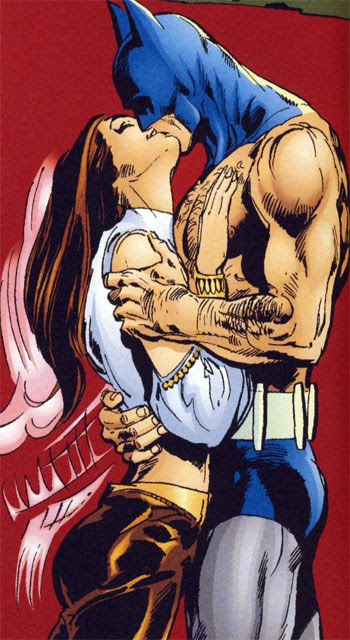
I read that treasury edition over and over and over and over, imagining it as the great Batman movie that needed to be made (with Christopher Lee as Ra’s and Caroline Munro as Talia).
That cover was magnificent too!
But when I spoke to Adams at his Manhattan studio for what would become a recurring feature here — The Neal Adams Interviews — I focused on the original alpha and omega.
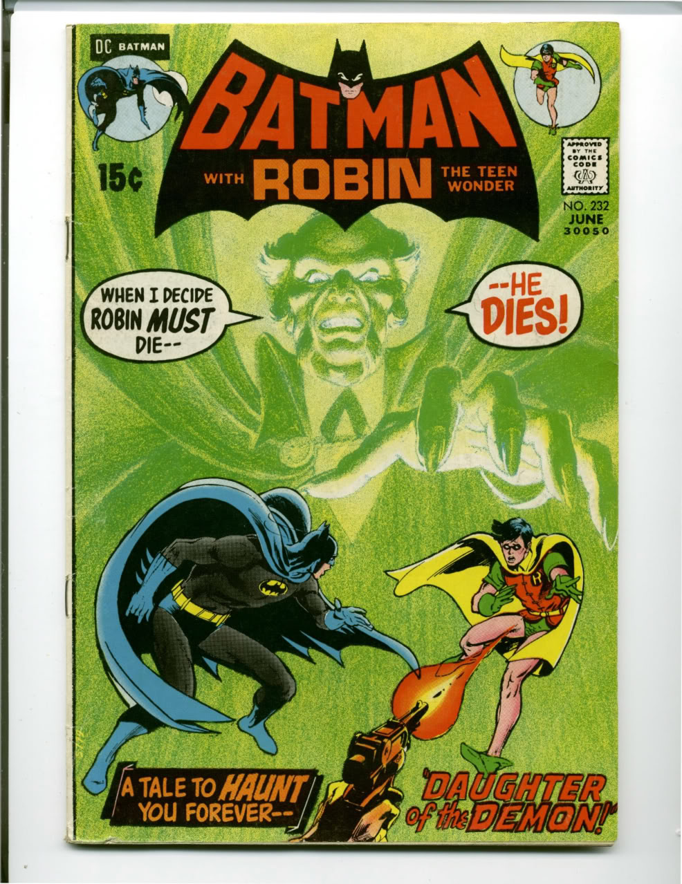
Batman #232
I asked him about the ridiculously dramatic image of Ra’s in pencil looming behind a helpless Batman and Robin. He explained with no shortage of decades-old frustration that he had to school DC’s production department in simple techniques.
I don’t pretend to be an art student — I took a few Saturday courses as the Kubert School as a teen — so I kind of nodded my head as he talked about dropouts and engravings and half-tones and photostats. But what I came away with was this:
“I started to do things that people didn’t understand,” he said. “Nobody in comics was doing this stuff. It had been done 30 years ago but not now they just forgot. … So everything I did, it seemed like I was a miracle worker but it was standard stuff. You know, if you work for a magazine or if you work for anybody, this was regular shit. … I’m walking among cavemen. I took a rock and I went like this and it printed.”
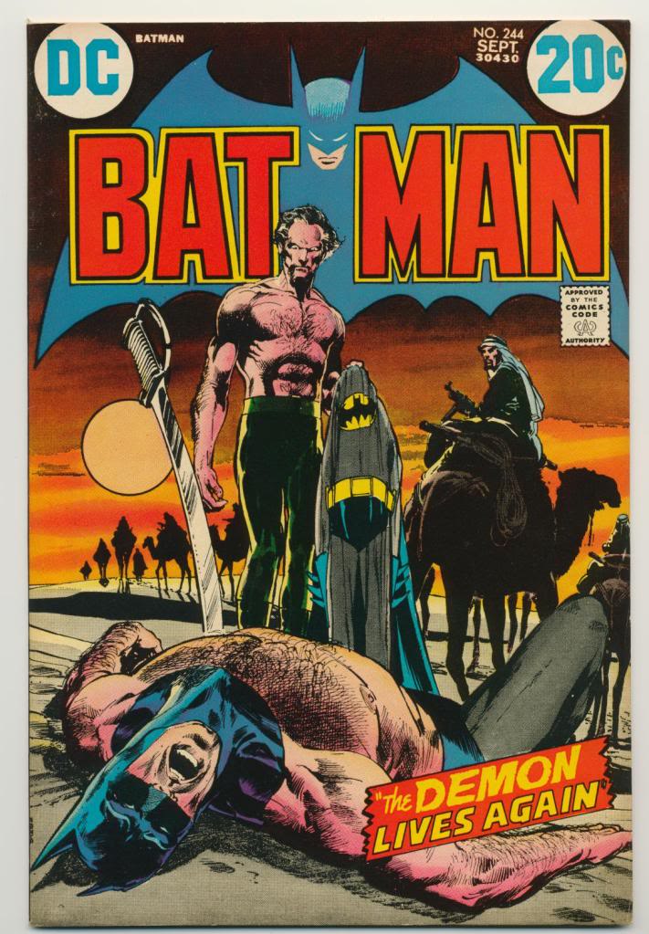
Batman #244
Here, Adams became a little more playful:
“You and I are going to play a game,” he said. “How many pairs of pants does Batman have on this cover?”
“Two,” I answered. “He’s wearing a pair and Ra’s al Ghul is holding a pair. But why is that?”
Adams explained: “It’s because (editor) Julie Schwartz refused to let me have bare legs on Batman. It was OK to do the bare chest, but if he had his pants off that would imply that he had taken his shorts off as well. So you couldn’t do that. So I said ‘But he’s got a costume!’ and Julie says, ‘Nobody will notice.’ And it’s true.”
At which point I pointed out Batman’s famously hairy chest.
“The hair on his chest sold more comics, I think than anything,” Adams said, only half joking, I think. “Like, ‘Batman’s got hair on his chest! I never realized!’ Yes he does!”
He also talked at length about the choice of colors on the cover and the way the logo’s hues worked with the rest of the image.
“You notice the red and orange … it highlights everything. And that red/orange is one of the classic images. The ‘Batman’ — red. The blue of his logo falling back and then the red sky. That’s classic design. Those things are psychological motivators to make you look at things.
“And if you’ve studied Lautrec for example, Lautrec makes you look at exactly what he wants you to look at with color. … So if you learn from these guys and you pay attention to what they’re doing and why they’re doing it, you can turn out a cover like that. You have to look at the things that they’re looking at.
“I had a guy who wrote a letter to (editor) Murray Boltinoff,” he added. “Every time I would turn out a Witching Hour or House of Secrets cover, whatever, the guy said, ‘What I do, is I buy 10 copies of Neal’s covers and I put them up on the wall. And I lie in my bed and I look at them. And I focus on them. And after a while they become three-dimensional.
“Now he thought they became three-dimensional because there was something magical about Neal Adams. But there wasn’t. It was because red comes toward you and blue recedes back. So it seems as though if you stare at the Batman logo, it’s as if the lettering rises above the blue.”
One last question, I told him: “I assume there was no blood because it was a Comics Code thing?”
“Never blood,” he confirmed. “Never, ever, ever blood. And you have (the sword) off to the side, maybe it’s not quite in him. It’s in the sand. Of course it’s in the sand. He’s knocked him out and it’s in the sand. That’s bullshit.”
“But it makes you think it’s in his chest,” I agreed.
“It’s an optical illusion. You notice the little white space between the blade and his chest? It makes you think it’s in his chest. But those are tricks that I’ve learned over the years in my career. All these — I’m kind of a geek. I know I seem like a fireman or whatever the hell it is but I am so fucking geeky. And I know all this shit. And I use it in my stuff but I never hit you in the face with it. I’ll always kind of slide it back and let you see it but I won’t pull it away. I like that so much. I like the idea of making you look where I want you to look.”
—
NEXT: Batman #251 — and the start of THE DENNY O’NEIL INTERVIEWS. Click here.


Trackbacks/Pingbacks