An EXCLUSIVE interview with the beloved artist…
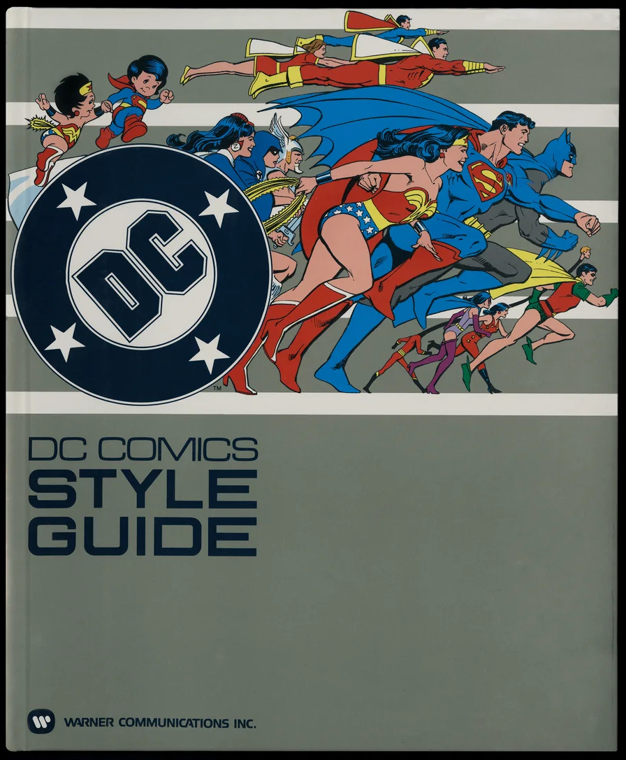
I had the wonderful privilege of interviewing artist Jose Luis Garcia-Lopez for the 1982 DC Comics Style Guide, from Standards Manual and DC Comics. It was also insightful to discuss the original project with its manager, Mary Yedlin (then Moebus).
Here’s the EXCLUSIVE interview, which is included in the newly released hardcover. Dig it.
—
By DAN GREENFIELD, 13th Dimension
As is often the case when you’re a kid, I didn’t immediately know José Luis García‑López’s art was his when I first saw it. I just knew that I liked it.
I was (and remain) an avowed Batman nut, and when, at the ripe old age of 12, I went to the local stationery shop in December 1979 to pick up the latest issue of his flagship title, I was struck by the bright, colorful cover: Batman #321 had the Caped Crusader and his closest allies — Robin, Alfred and Commissioner Gordon — trussed up on brightly burning stakes placed like giant candles on a massive, pink cake shaped like The Joker’s face.
On the upper left was a banner that read, “YOU ARE CORDIALLY INVITED TO THE JOKER’S BIRTHDAY!” On the bottom right was the wild-eyed Clown Prince of Crime himself gleefully — and malevolently — beckoning to the reader, “AND YOU’RE ALL WELCOME TO ENJOY THE FIREWORKS!”
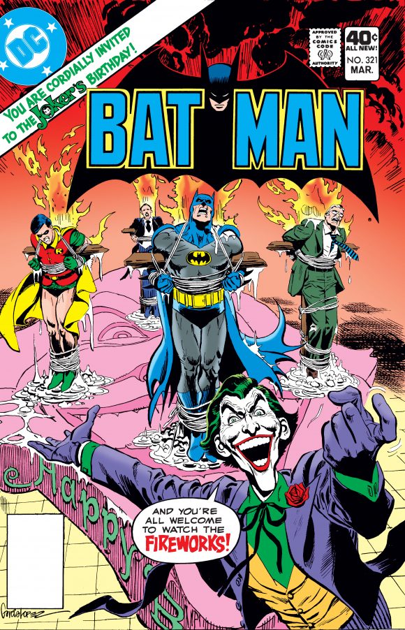
It was a setup right out of the 1960s Batman TV show, but there wasn’t a hint of camp. It was outrageous, yes, but it was dangerous. Batman and co. were clearly suffering while the Joker was having the time of his demented life. The concept easily could have collapsed under its own inherent silliness except that the artist — whom I later realized was José Luis García‑López — sold the burning hell out of it.
Today, that cover is considered a classic.
Over the next couple of years, JLGL (as he’s often called) caught my eye again, with his covers to comics’ first planned miniseries, The Untold Legend of the Batman; the interiors to Batman #336, which featured a handful of Batman villains that had been mothballed since the ’60s; and, most of all, with DC Special Series #27, better known as the treasury edition in which the Darknight Detective, as he was called at the time, took on The Other Company’s Incredible Hulk — and beat him in a memorable sequence written by Len Wein. (I still remember the look on the Hulk’s face when Batman knocks the wind out of him with a perfectly placed kick to the solar plexus.) Much of this work was inked by the great Dick Giordano.
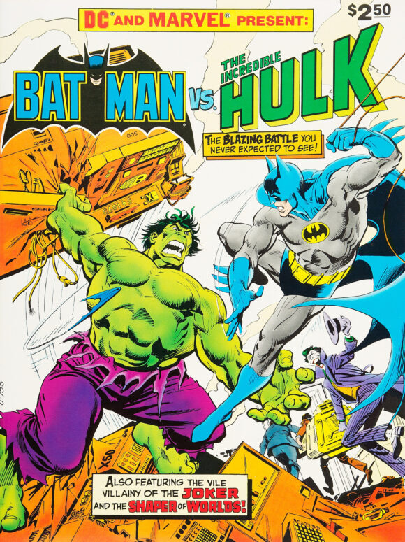
Blinded by my Bat-myopia, little did I know that García‑López — born in Spain, reared in Argentina, living in the United States — was already familiar to readers, thanks to his efforts on, among others, Superman, Wonder Woman, Deadman and Jonah Hex.
And little did I know that he would soon come to define the look of the entire DC universe for generations of fans — through what would become the 1982 DC Comics Style Guide, a project designed to bring a coherent look to merchandise starring the publisher’s characters, whether it be action figures, T-shirts or tablecloths.
“I was living in Florida at that time and had an invitation from DC to come to New York to talk about a new project,” García‑López said. “At the offices I met Mary Yedlin, who was in charge of the project. She brought me to Warner Bros., and there I was introduced to an executive who showed me the guide they already had for their animated characters, like Bugs Bunny, Porky Pig, etc. The idea was to do the same thing with DC characters in a similar format.”

Yedlin (then Moebus), who had recently been hired for the company’s embryonic licensing department of one, recalled that the project was launched by DC boss Jenette Kahn and exec Paul Levitz.
“When I joined the company in 1981, the person who’d been coordinating with our licensing company handed me a stack of comics and said, ‘Look through them and pull out pages with any poses that you think would be good on products,’” Yedlin recalled. “Jenette and Paul were concerned that the artists weren’t being compensated properly for the extended use of their artwork, and there was also no consistency in the marketplace visually to create a brand.”
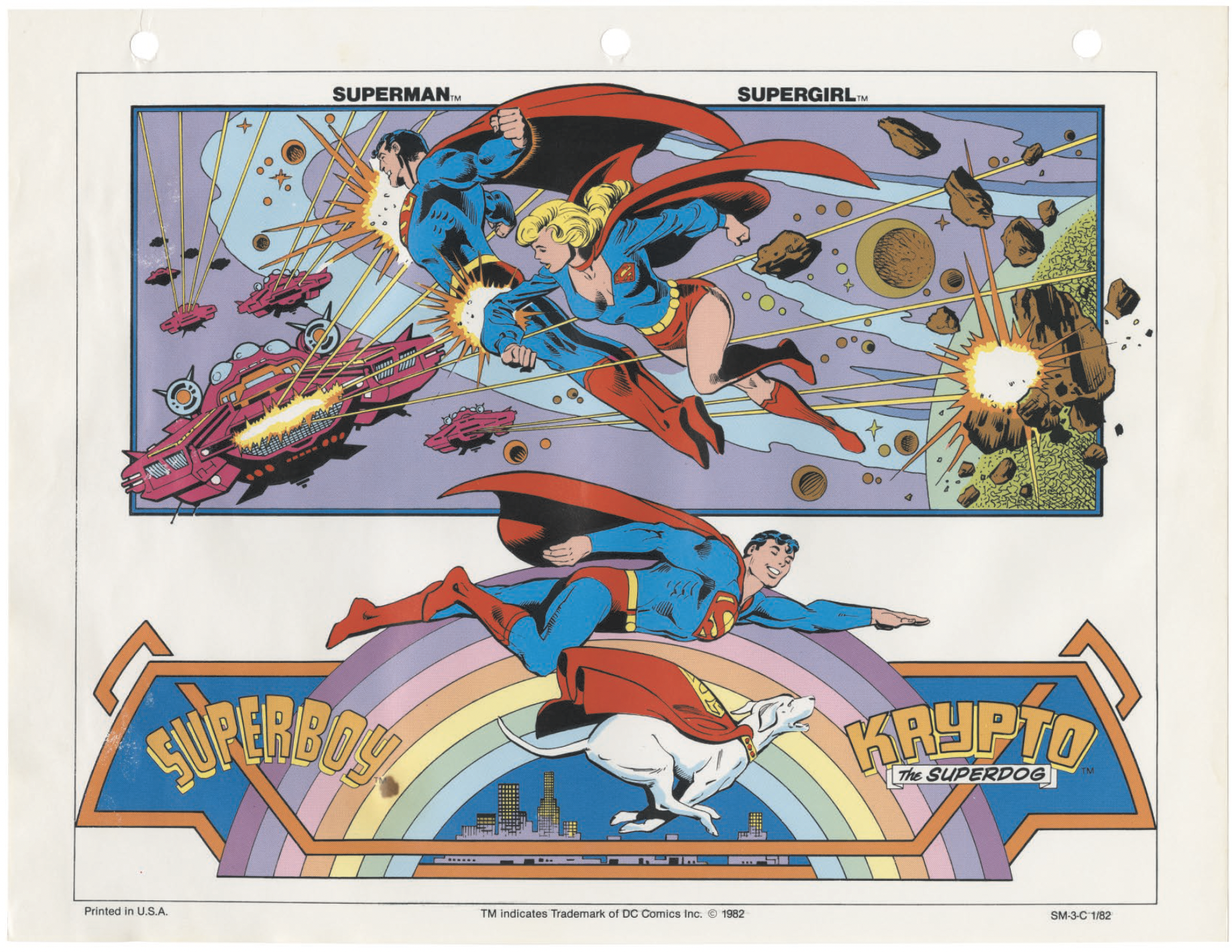
García‑López added, “After one week in New York doing several sketches, they gave me the go-ahead. The only thing I knew at that time was they wanted only one unique style for all the characters to use for licensing. It was only later, after seeing the completed guide, with the magnificent inks of Dick Giordano, that I realized the scope of the project.”
Why García‑López?
“Jenette and Paul, along with Joe Orlando, who was our head of creative, identified José’s style as being clean and accessible and the kind of thing they thought would work,” Yedlin said. “They were the ones who said, ‘OK, this is our artist.’ And then Dick Giordano, who was also on staff at that time, would take the pencils home at night to do the inks. Bob Rozakis headed up the production team that put it together and got the colorists aboard.”
While García‑López did the heavy lifting in putting the guide together, the foundation had already been set by other great DC artists, going back to Carmine Infantino, whose poses you can see in various guide designs.
“I returned to Miami, and Mary provided me regularly with many references for the characters, drawn by Neal Adams, Jim Aparo and many others,” García‑López said. “Most of the material was picked up from the regular comic books. What I did was submit several dynamic and interesting poses for the heroes; where I did some research was in the design backgrounds for action figures. I took some Art Deco and Art Nouveau elements for that. And sometimes playing a little with the characters’ logos to integrate them in the designs. Later on came the turnarounds.”
Meanwhile, in New York, Orlando and Yedlin were hard at work.
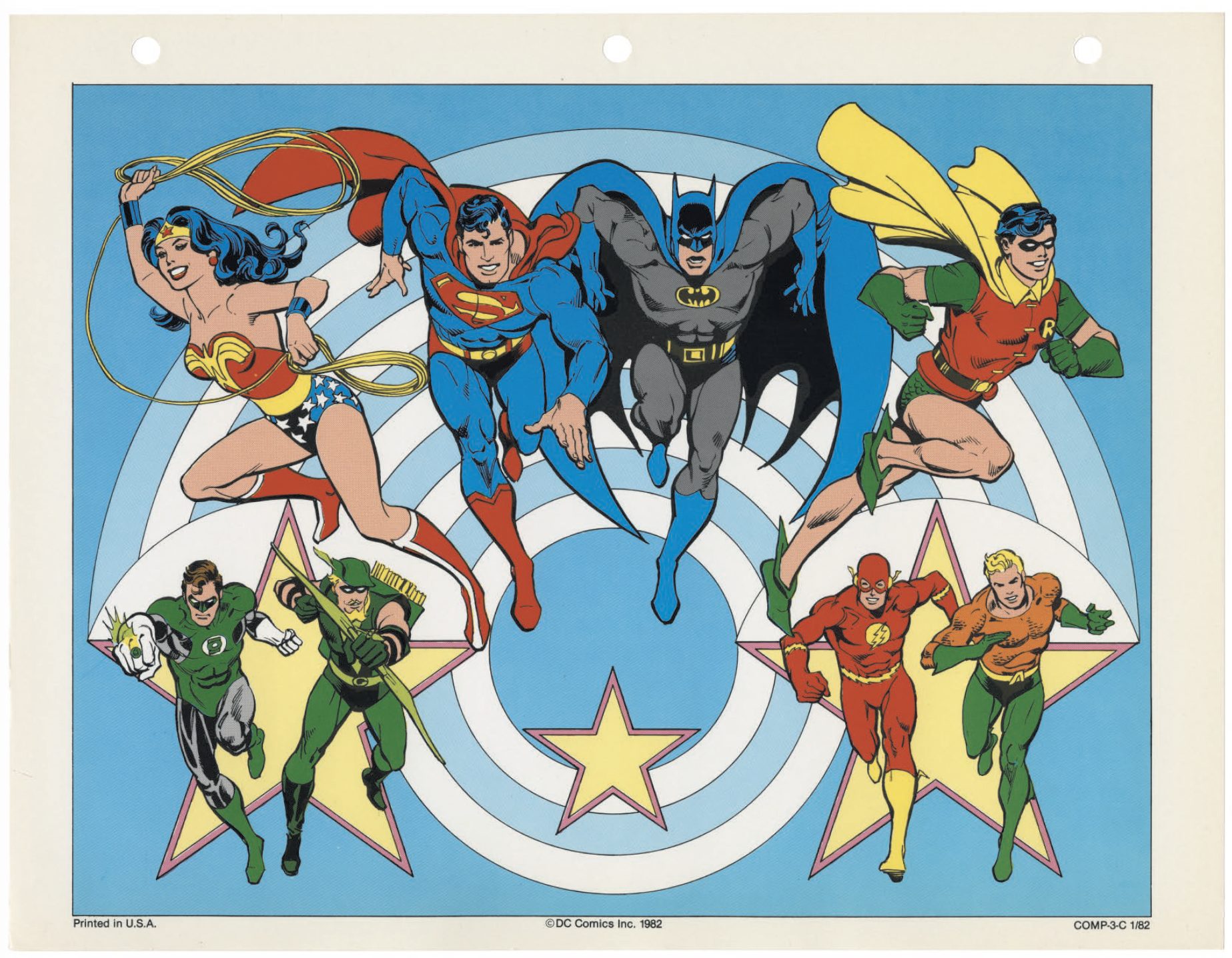
“I worked with Joe Orlando, because he had been the one pulled in whenever approvals needed to be done on special products and that kind of thing,” she said. “This was my learning curve, but I literally sat down, and I said, ‘OK, Page 1 is gonna be this. Page 2 is this.’ And then in each section, it’s like, ‘OK, we’ll have an introduction about the character, the history. We’ll have a turnaround.’ And then we came up with ideas for poses. Some of them are mine. Some of them were Joe’s. Some were other people. I remember coming up with the idea of having Superman flying through fabric that became one of the top sellers on T-shirts. But it was just kind of brainstorming.
“It was a team effort, but I was the one that kind of put everything together,” she added. “And then, as I recall, we had José come into the office a couple of times from Florida, and we’d sit down and talk with him. And he would offer ideas for things that he thought would be cool. That way, we just kinda planned out, ‘OK, this can be a page that has a couple of poses on it. This has to be a single page.’ That kind of thing. We planned out the whole book, and then he would go home, and I would start to get these amazing packages in the mail. I mean, talk about Christmas morning!
“It was a treasure seeing what he did with these concepts.”
García‑López recalled having a lot of freedom to create.
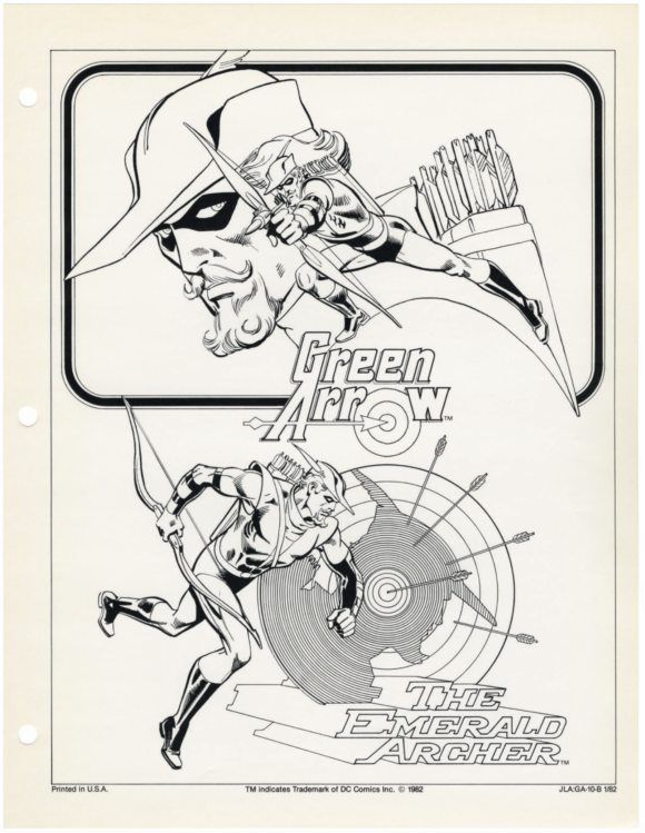
“I don’t remember being asked for something specific, except some material, like Superman stopping a train, breaking chains, or flying in outer space, for instance,” he said. “But in general, I had complete liberty to do anything with the characters. So, I just faxed all the sketches to DC and waited for their approval. It was quite a smooth process, the whole thing. Thanks to Mary, she was on everything.”
The versions illustrated by JLGL became the Platonic ideal for DC’s rich pantheon of modern gods and goddesses. This is what Superman looks like. This is what Batman looks like. That said, they were based on others’ concepts. For example, that’s Neal Adams’ Green Arrow costume and Gil Kane’s Green Lantern outfit
García‑López, however, crystallized the looks into something consistent, standard. (Other artists, such as George Pérez with the New Teen Titans, made contributions too, especially as updates were added.)
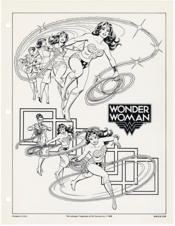
Despite fans’ familiarity with color images from the guide, much of it is in black and white, owing to the analog technology of the time. Most licensees would start developing their products with monochrome art because they might need to scale and adapt it. That’s why the book includes color swatches for reference. In some group poses, Yedlin said, García‑López would pencil, and Giordano would ink, each of the characters separately. So if somebody wanted to pull, say Aquaman, out of an image, DC could provide the full artwork.
The initial 1982 DC Comics Style Guide was a success, and soon García‑López and Giordano’s art was on products everywhere. No more wonky Superman or the Flash. Updates and offshoots followed, as characters evolved and as DC hit it big at the box office at the end of the decade and the beginning of the next, with Tim Burton’s Batman films.
One of the most beloved toy lines of the 1980s — Kenner’s Super Powers Collection — utilized guide art, and the packaging is remembered particularly fondly for it, so much so that it’s being used for the line’s modern revival by McFarlane Toys.
Not just that, if you walk into a comics shop or a department store, or you shop online or just plain wander down the street, and see someone wearing a shirt with Wonder Woman, or Green Lantern, or Batgirl on it, there’s a solid chance the art’s by José Luis García-López. It remains ubiquitous.
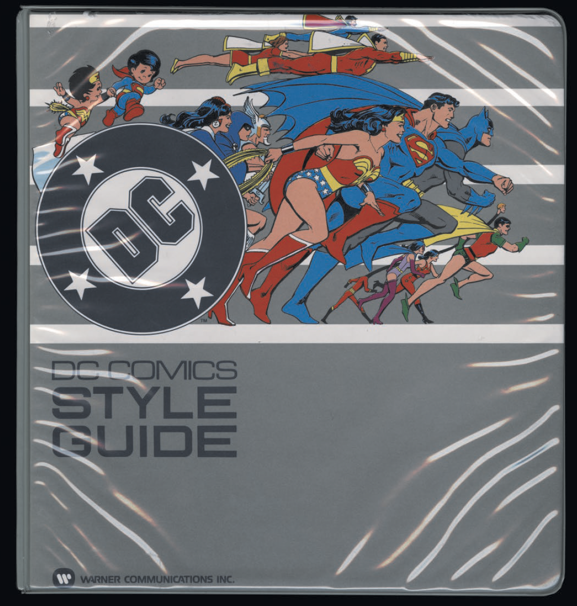
Eventually, the guide, as a three-ring physical binder, became obsolete, giving way to the digital world. But it lives on as a highly sought-after collectible, with fans demanding for decades that DC release it as a book.
And here we are.
García‑López seems a bit puzzled by the fanfare.
“I’m pleasantly surprised by all the attention in the media,” he said. “After all, it’s old history, done 42 years ago. But I’m happy to learn that now it’s going to be available to many people, not only a few fans.”
It also still gives him a kick when he happens to see T-shirts and toys with his art on them on any given afternoon.
“I’m thrilled to see that my work is still alive and well after so many years,” he said.
—
The 1982 DC Comics Style Guide is a 268-page hardcover. You can order it directly from Standards Manual for $95. It’s due in comics shops Jan. 8, 2025.
—
MORE
— Seeing Everyone Post Online Their Photos of the 1982 DC COMICS STYLE GUIDE Is Wonderful. Click here.
— HERE IT IS! Your EXCLUSIVE FIRST LOOK at the 1982 DC COMICS STYLE GUIDE Hardcover. Click here.

December 22, 2024
Hi Dan!
Thanks for the childhood retrospective on discovering Jose Luis Garcia Lopez (a multi-syllabic name I’ve always loved for how it rolls off the tongue).
My experience approximates yours though I now know I’m a bit older: I was 12 or very close to it, and my Jose Luis Garcia Lopez moment, and the very first time I came across the name, was with Batman # 272 (cover-dated Feb. 1976–so I assume released c. Nov. or Dec. 1975. My 12th B’day would be late Dec. 1975).
This was Batman facing off against “The Underworld Olympics ’76” (as so titled). I was instantly struck by the cover, one of the all-time best for Batman–love it to this day–and the similar highly dynamic splash page that opens the story. At that moment I knew that JLGL was one of the artistic greats for superheroes. He kept to the lithe Batman of the Adams and Aparo tradition as fitting for our hero’s gymnastic abilities.
That the story was by the great David V. Reed who was deliberately departing from Batman’s rogues gallery for stories like this, with Bats being more of an international secret agent, made the issue even better. It was a four-part serialized story (to issue # 275) as Bats had to deal with 4 underworld geographic teams (South America, Europe, Africa-Asia, and North America).
My sadness was that JLGL couldn’t illustrate the remaining three.
Those latter were done by Ernie Chan who I’ve always been more lukewarm to negative about (a steroidally-muscle-bound and inflated Bats and one of the laziest illustrators of drawing the bat insignia on Bat’s chest that was just so wimpy all too often. A bizarre contrast there).
But the JLGL name stuck the first I saw it both in print and given the man’s outstanding artwork.
Thanks!
December 22, 2024
The Master’s work is truly worthy of being recognized.
December 22, 2024
I can’t wait to get my hands on this!
Question: In the mid-2000s (I think), George Perez was hired by DC to an exclusive contract for awhile. Among the things he was hired to do was to do a lot of new style guide material (since it had been over twenty years since the previous style guide by Garcia-Lopez).
Now that the Garcia-Lopez one is being released commercially, I wonder if there is any possibility of the 2000s Perez material being released as a sort of follow up? (I realize that Perez’s may never have existed in the exact same “manual” format that Garcia-Lopez’s did because of the later era it was created in. If it did, I’ve never seen any images of it.)
December 23, 2024
I feel it should be noted that Hanna-Barbera used Garcia’s style guide as the bases for the last season of the Superfriends in 1985: The Super Powers Team: Galactic Guardians!
But thanks so much for getting this story!
October 7, 2025
Batman never looked better (on screen) than he did during that Galactic Guardians season!
December 24, 2024
Garcia’s work is just dazzling! It rings through the memories of my younger days!
January 1, 2025
If it wasn’t for JLGJ eye-catching cover to BATMAN #321, I would not be here typing this message.
BIG THANK YOU to JLGL. Love your art.