
Artist Tom Morgan and DIY colorist Walt Grogan bring you the other Green Team…
By WALT GROGAN
Artist Tom Morgan — who wowed us with a fab Spider-Man vs. Muhammad Ali bout — has done it again. This time he’s taken the 1970s Joker and Green Goblin, two of DC and Marvel’s biggest villains, and teamed them up to wreak havoc on Gotham and New York.
I only color pieces that sing to me and this one by Tom really did: After studying it for a while, it just softly sang in pianissimo, “I’m a splash page.”
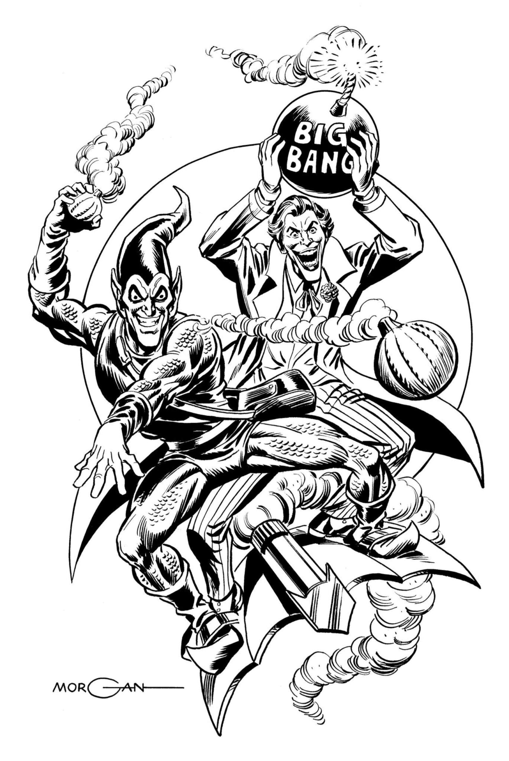
Tom Morgan
Once I knew that, I knew that I had to dress it up as an aging page, circa 1975. So, I found a good scan of the Joker logo from his “team-up” with Batman in The Brave and The Bold #191 (Oct 1982) and I also found a Green Goblin logo. Sadly, the Goblin logo was anachronistic for 1975, having been created 20 years later, but I bit the bullet and decided to go with it anyway — because it looked so cool.
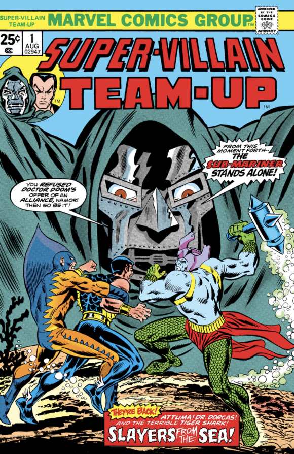
I’ve also always loved the corner box from Superman and Spider-Man’s first meeting, so I grabbed that and think it adds a nice touch. Then it hit me, this is a super-villain team-up! So, why not use Marvel’s Super-Villain Team-Up logo — because that DID fit the time period!
But who could have written this thin tome? Two possibilities jumped to mind and well… I needed editors and presenters, too! And what’s a splash page without indicia?!?
After coloring it up, and with a couple of suggestions from Tom himself, here’re the Green Goblin and the Joker in all their 1970s villainy:
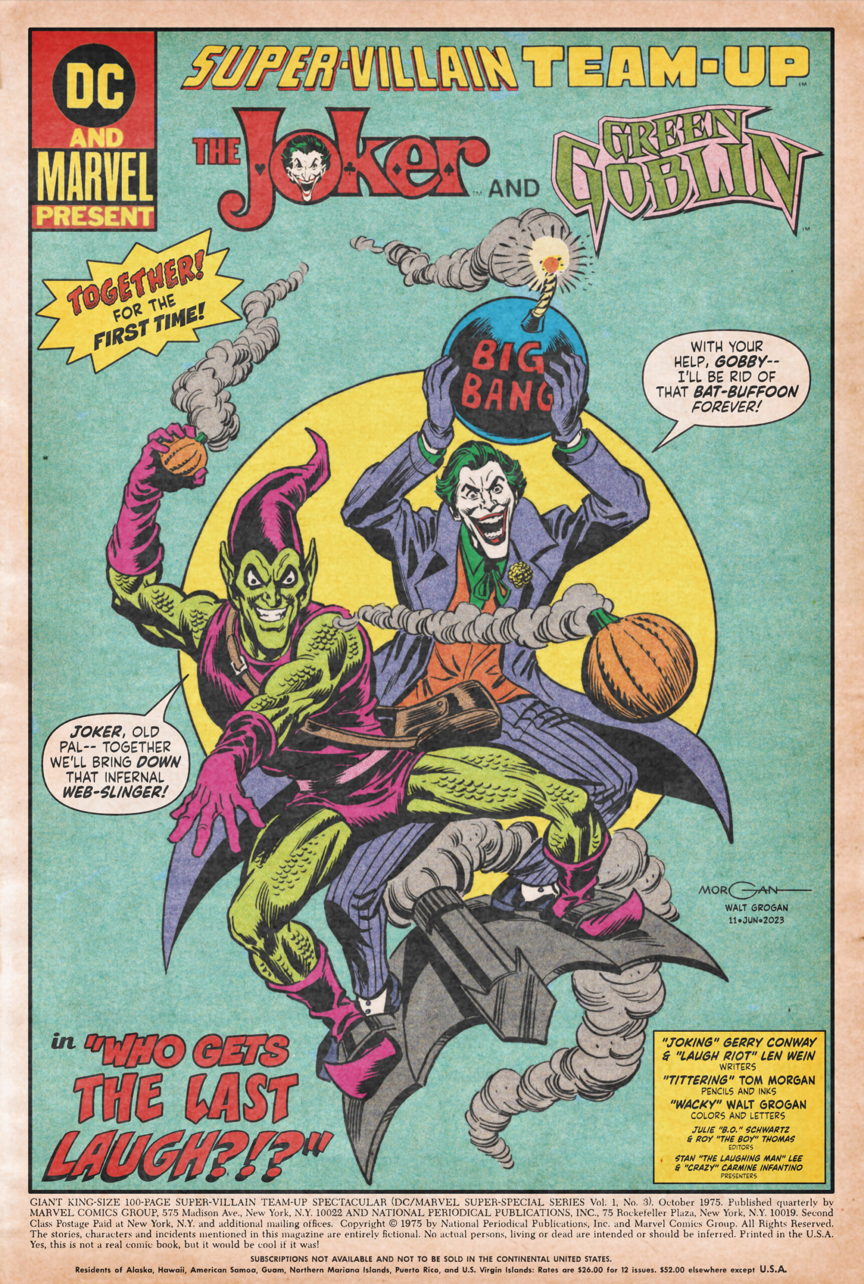
And just remember: No subscriptions in the continental United States!
If you want to see more of Tom Morgan’s amazing work, check out his Facebook page. As always, I can’t wait to see what he comes up with next.
—
MORE
— SPIDER-MAN VS. MUHAMMAD ALI: The Fight of the Century That Never Was. Click here.
— Why CESAR ROMERO’s JOKER Was Perfect For the Swingin’ Sixties. Click here.
—
A 10-year-old Walt Grogan fell in love with the Big Red Cheese thanks to essays written by Dick Lupoff and Don Thompson in the paperback edition of All in Color for a Dime, released in 1970 and bought for him by his father off a paperback spinner rack in a liquor store on the South Side of Chicago. Walt runs The Marvel Family Web Facebook page devoted to all incarnations of the Fawcett/DC Captain Marvel and blogs about Captain Marvel at shazamshistorama.com.
June 24, 2023
If you’re looking for a “period accurate” Green Goblin logo, Google the Mego figure packaging
June 24, 2023
Hi, SJG! Thanks! You’re right, of course, and I did briefly consider that one as well as another contender. The problem was that they both looked more like Display/Story Title lettering than an actual logo. One of my favorite things to do when I’m working on fantastic artwork, like Tom’s, and trying to give it a retro look, is to stay true to the period. The problem was that the Mego logo just didn’t stand up well to Gaspar Saladino’s awesome Joker logo — it was that simple. So, it was either going with the logo I used, which worked well or creating my own and I opted for the former! My story is that Kang brought it back from the future and handed it to Roy “The Boy” Thomas! That’s a good story… right? Thanks, again!
June 27, 2023
This Green Goblin logo is better than the one on the regular Mego box, but I still think you made the right choice: https://eadn-wc03-9002247.nxedge.io/wp-content/uploads/2021/01/mego_cah_green_goblin_moc_1.jpg
June 24, 2023
That is ridiculously well done in every respect, I particularly love the ‘aging’ to give it that era specific accuracy. If someone told me they just scanned that from a 50 year old comic book I’d totally believe it. Great work from you both 🙂
June 25, 2023
Thanks, Justin! It was a lot of fun to work on! Tom drew an awesome piece of art!
July 3, 2023
Nicely done!