Graphic novelist John Stanisci takes you inside Lifedeath.
—
I’ve pointed out before that I can’t draw a lick so I’m incredibly impressed by those who can. That’s pretty obvious given the whole tenor of this website, y’know?
But I still like going behind the scenes to see how it’s done and this time around, illustrator John Stanisci (Batman Beyond) is lifting the veil on his cover for Lifedeath, a graphic novel he’s crowdfunding on Kickstarter. (Click here).
Here, he explains how he constructed the cover with painter Tony Fernandez. Cool stuff. — Dan
—
By JOHN STANISCI
Lifedeath is a sci-fi epic kind of story that takes place in two timelines, the years 2211 and 1943. The book tells the story of how, in the future, mankind discovers that the afterlife is really an ancient computer program, one that is now dying.
So, when it came time to create the perfect cover image for this massive story, it was a little daunting to say the least! Needless to say, I went through MANY designs, none of which worked. On top of capturing the scope of the story, I also had to deal with the fact that Lifedeath features two main heroes: Martian soldier Deke Renner in the future and 14-year-old Jewish resistance fighter Lucet during World War II. How exactly do I set them both up?
Well, after a TON of trial and error (mostly error) I arrived at this very rough pencil sketch:
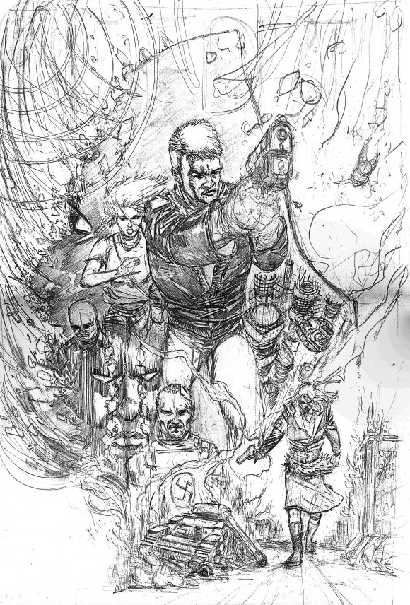
Not bad, I thought. We feature Deke Renner with his gun and some of his ancillary characters. We also have an element of the afterlife ‘matrix’ with the large head in the background, with “flakes” coming apart from his head, like he was “glitching.” And then, carved out at the bottom third of the piece would be Lucet walking toward the camera, very aggressive. A burning, broken tank in the background and the Nazi symbol in flames to show she is beating the enemy.
This could possibly work.
But there was one problem: I didn’t want to finish the pencils and then ink it. I felt that the kind of epic story Lifedeath is deserved a fully painted cover. So, that’s what I decided it had to be. Done.
Next problem: I don’t paint.
OK, maybe I’ve messed around with a watercolor or two in my day, but this needed someone really, really good.
Enter Tony Fernandez.
I met Tony at a fundraising event where I was the guest artist helping raise funds for a special organization. We got to talking and he mentioned he was a painter. Yeah, sure, that’s great (snore). I meet a ton of people who say they are artists, etc. He said, “Here’s my card”. OK, so I go and check out his website and WOW. He ACTUALLY IS A PAINTER!!! And a damn good one.
I consulted with my editor on Lifedeath, Joseph Navarra and we agreed to offer Tony the gig to paint the cover. Tony graciously accepted and we were off.
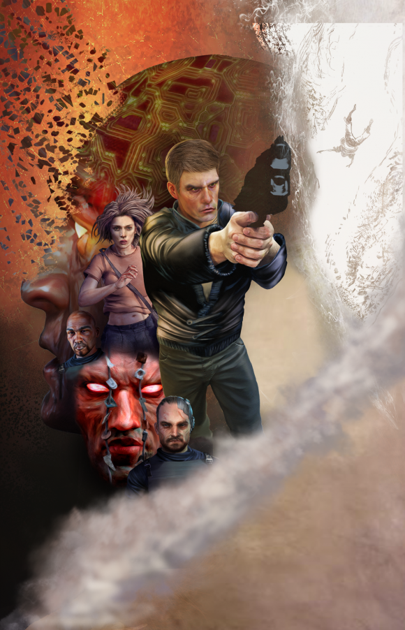
Working off my pencil sketch, Tony began to rough in the main figures. He did a pretty smart thing which was to basically map out “zones” of the cover and a color scheme in each “zone’’ that would help bring focus to the things we felt were most important. I could see immediately that Tony was totally heading in the right direction.
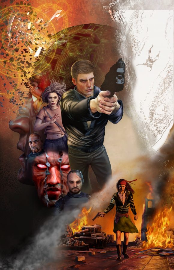
Here was the first attempt to paint in Lucet. Not bad, but not quite right. Lucet didn’t really look like how she appears in the graphic novel. Plus, the tank was too straight on. It didn’t look like it had been blown up. Also, the lines on the ground too closely indicated the perspective. But, the color schemes were working great!
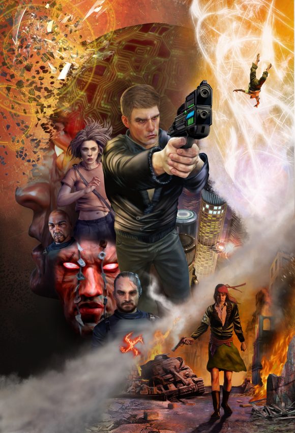
Ahhhh, much better. Lucet looks great and the tank looks broken down. Plus, Tony perfectly captured the cityscape of Mars Colony Six. Now, we just need to figure out how to tackle that afterlife matrix effect that the small figure of Dr. Heydrich is falling into, as well as figure out how to best handle the smoke/flame trail that separates the Lucet part from the rest of the image.
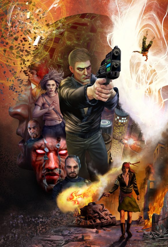
Wow! Now it’s really coming together! Tony made Deke’s face more intense in this version as we were feeling he looked a little too soft in the previous versions. The afterlife ‘matrix’ effect looks great, a really cool effect. But, there is still an issue with the proper placement of the fire trail from the tank. Right now, it looks like it fades right into the outline of the cityscape part and creates a bit of a design issue.
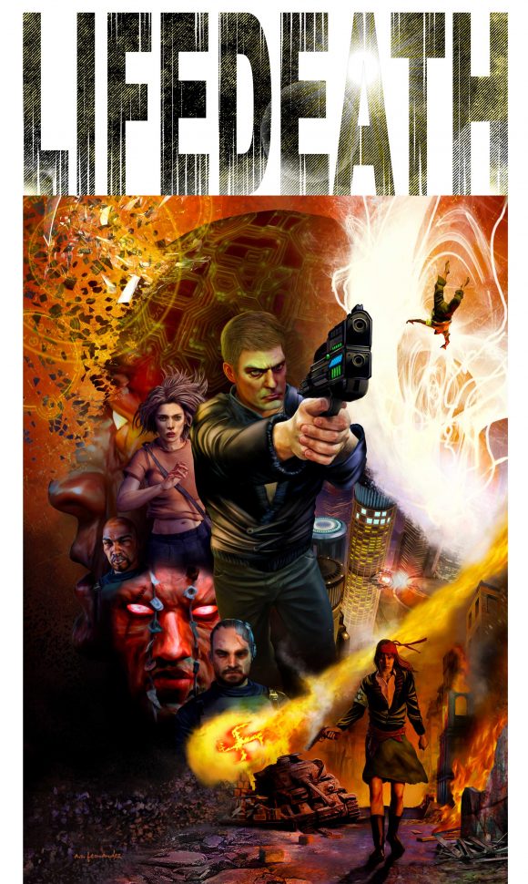
Annnnnd….Fixed! And finished!! An absolutely outstanding job by Tony! Incredible attention to detail and he perfectly captures the world and the feel of Lifedeath!
Tony Fernandez can be reached here.
Thanks so much for reading! And to get your copy of Lifedeath today, please click here.

Trackbacks/Pingbacks