PART 2 OF A THREE-PART SERIES: Comics are wonderful. But are they fine art? Just ask historian Arlen Schumer.
Arlen Schumer will be speaking at EAST COAST COMICON — which 13th Dimension is sponsoring – and here’s a preview of his lecture, excerpted from his verbal/visual essay slated to appear later this year in the British hardcover anthology A-1.
Part 1 can be found here.
—
By ARLEN SCHUMER
Infantino & Kirby vs. Duchamp & Picasso—Strange but True!
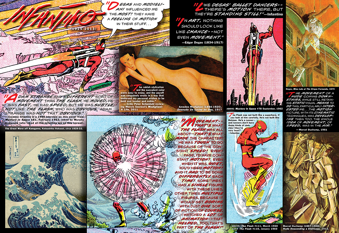
Though he had drawn for many comic book publishers since he was a teenager in the 1940s — the Golden Age of comics — Carmine Infantino’s style matured at DC Comics by the mid-’50s to make him the premiere DC artist of the 1960s, the Silver Age. He earned this title with his absolutely modern delineation of the first true Silver Age superhero, super-speedster the Flash in 1956. His two-dimensional depictions of speed and motion—among many graphic innovations Infantino developed during his eleven-year run on the strip—remain benchmarks in the comic book medium.
Infantino said in a 1999 interview, “Movement—that’s what the Flash was all about—that’s what made the character. He was tough to do because of the constant speed. Every page, I’d have constant motion. Even when it was quiet, you’d need motion.
“And it had to be done differently each time. Sometimes I had a single figure with these lines, other times multiple figures… because it would get boring with just one sort of motion.
“Of course, I watched a lot of animation–that helped, too; that’s part of the Flash.”
One can see Infantino’s animated quality in the vertical panel of the Flash air-stepping in super-speed, like a superhero-costume-clad version of Duchamp’s Nude Descending a Staircase (1912). In a 1961 interview, Duchamp said, “The movement of a nude coming downstairs while still retaining static visual means to do this, particularly interested me… the motion picture with its cinematic techniques was developing then too. The whole idea of movement, of speed, was in the air.”
Infantino added, “The Flash was not built like a superhero, if you look at him carefully. He’s not built like Batman. He’s a runner—and runners don’t have those kinds of muscles—they’re very lean.”
When asked about fine-art influences in his work, Infantino was quick to respond, “Degas and Modigliani influenced me the most. They have a feeling of motion in their stuff…like Degas’ ballet dancers—there’s motion there, but they’re standing still.”
Degas’ dictum, that “in art, nothing should look like chance, not even movement,” was a sentiment obviously shared by Infantino, as in his motion-in-stillness stylization of DC’s science-fiction superhero Adam Strange, who, backpack-rocketing up into the airspace of red-sunned Rann, is as gracefully hanging, suspended, as Degas’ dancer, Miss Lala at The Cirque Fernando (1879).
And this description of Modigliani’s “long-necked women, with their piquantly tipped heads and mask-like faces,” by art critic Peter Schjeldahl (in his 2011 book review of Meryle Secrest’s Modigliani: A Life)—“The rakish stylization and the succulent color were easy to enjoy, and the payoff was sanguinely erotic in a way that endorsed my personal wishes to be bold and tender and noble”—can easily be applied to Infantino’s elegant, horizontal Strange figure, almost feminine, as elongated as Modigliani‘s long necks, serenely gliding over the bubblegum pink-hued abstract sci-fi-scape of Rann, like Kubrick’s solarized scapes in the “Beyond the Infinite” sequence in 2001: A Space Odyssey.
“Adam Strange had a different sort of movement than the Flash,” Infantino said. “He moved, he was fast, he had speed, but he was subtle. Not like the Flash, who was obvious; Adam Strange was not that obvious.”
Jack “King” Kirby (1917-1994) was as profound as he was prolific during the course of his seven decades in comics, working for a myriad of publishers. The stories he told at Marvel Comics during the Silver Age, developed in concert with writer/editor Stan Lee and arguably Kirby‘s greatest and most influential body of work, exploded with boundless imagination and wonder, kaleidoscopes of action and adventure set in planet-sized arenas of conflict, cataclysmic clashes of titans that read like the epic odysseys of legends past. His works are the power and glory of comic-book storytelling. And like the legendary Atlas, it is upon Kirby‘s shoulders that the world of superhero comics rests.
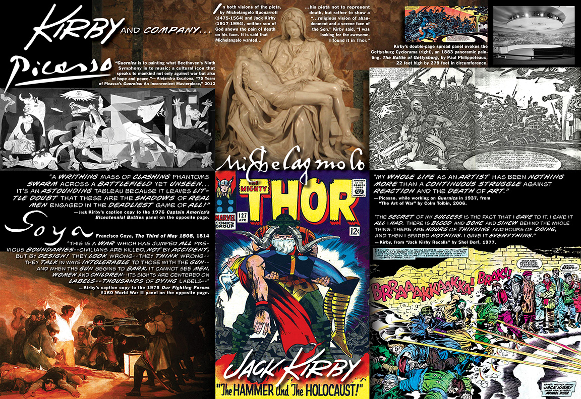
Artistically, Kirby looms largest in the field of comic book art, its undisputed Michelangelo. They both did epic pietas, Kirby’s on the cover of The Mighty Thor #127 (April 1966). In both visions of the Mary-Jesus coupling, neither Son of God shows the pain of death on his face. It is said that Michelangelo wanted his pieta not to represent death, but rather to show a “…religious vision of abandonment and a serene face of The Son.” Kirby said, “I was looking for the awesome. I found it in Thor.”
Kirby’s awesomeness extended beyond the borders of Asgard, the otherworldy home of Thor and his fellow Norse gods, infusing his earthbound landscapes of long-underwear characters (as he liked to call his jumpsuited superheroes) with the same glory and grandeur as his more cosmic epics.
The black-and-white penciled version of the double-page spread panel from Captain America’s Bicentennial Battles (1976), the titular character frozen in awe in front of a classic Kirby klatsch of Civil War armies in battle, evokes the Gettysburg Cyclorama, a 22-feet-high-by-279-feet in circumference panoramic painting, The Battle of Gettysburg by Paul Philippoteaux (1883).
Comic artist Adriano Moraes compares Kirby’s work instead to Picasso’s Guernica (1937). Indeed, Kirby’s caption to his Captain America panel, “...a writhing mass of clashing phantoms swarm across a battlefield yet unseen…It’s an astounding tableau because it leaves little doubt that these are the shadows of real men engaged in the deadliest game of all,” could be an apt description of Picasso’s masterpiece of war as well.
Similarly, Kirby’s caption copy to his World War II Our Fighting Forces panel (Issue #160, 1975), depicting a lineup of civilians getting murdered by machine-gun fire from off-panel—“This is a war which has jumped all previous boundaries—civilians are killed, not by accident, but by design! They look wrong—they think wrong—they talk in ways intolerable to those with the gun—and when the gun begins to bark, it cannot see men, women and children—its sights are centered on labels—thousands of dying labels…”—is an equally accurate reading of Goya’s famous 1814 painting of a massacre of Spanish civilians by French soldiers, The Third of May 1808.
Picasso said as he worked on Guernica, “My whole life as an artist has been nothing more than a continuous struggle against reaction and the death of art.“
Kirby said in 1977, “The secret of my success is the fact that I gave to it. I gave it all I had. There is blood and bone and sinew behind the whole thing. There are hours of thinking and hours of doing, and then I spared nothing. I gave it everything. What’s come out of it is for you to pick up and look at.”
—
NEXT WEEK, PART 3 of “Art & Comic Book Art”: Steranko & Adams and the Psychedelic ’60s!
—
See Arlen present Art & Comic Book Art as a VisuaLecture at East Coast Comicon April 11! You can also buy his hardcover The Silver Age of Comic Book Art here.


