
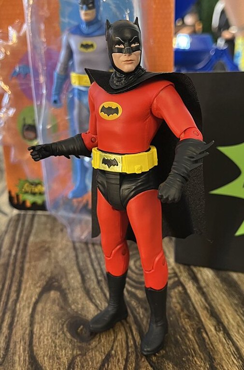
Soon to be an action figure from McFarlane Toys!
Coolest thing I’ve seen coming out of San Diego Comic-Con so far? McFarlane Toys’ upcoming red 1966 Batman action figure, which will lead a wave that includes a Joker with a Total Dehydrator; a Batgirl variant with a color palette from Batman: The Animated Series; and a Wonder Woman loosely based on Lynda Carter’s TV version (the costume is spot on, but it’s a generic WW face evidently due to rights issues).
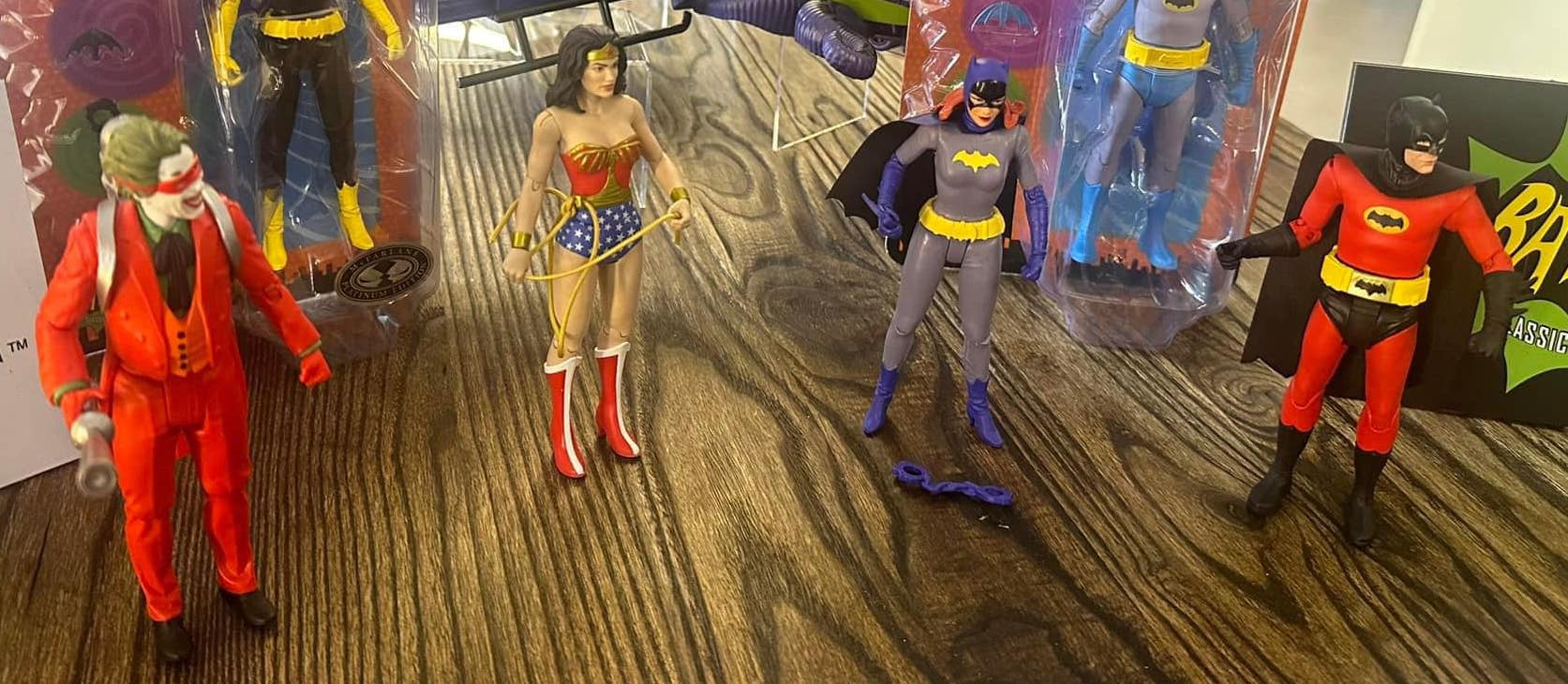
Joker looks like he’s painted to resemble Joaquin Phoenix’s suit… (Did you take this picture? I’d like to give you credit.)
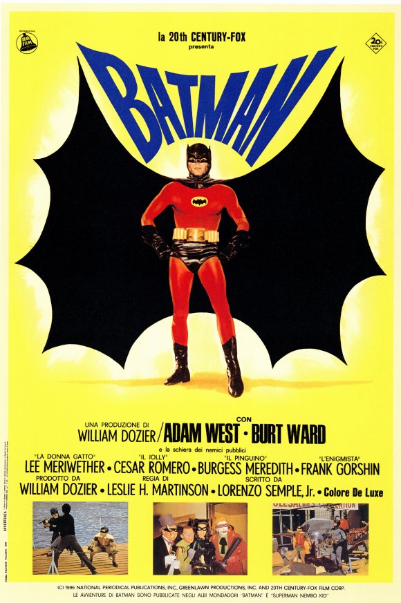
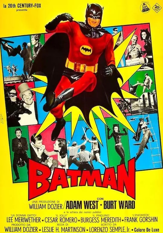
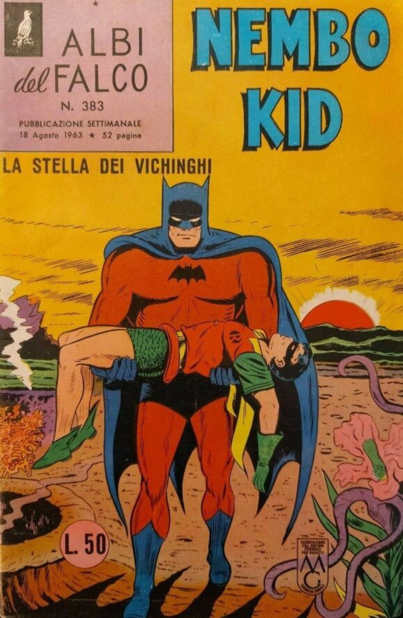
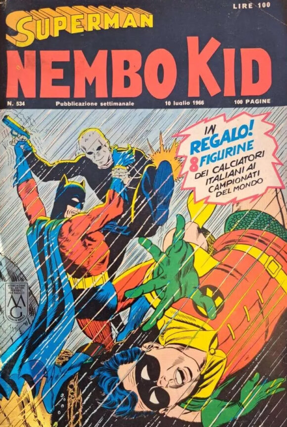
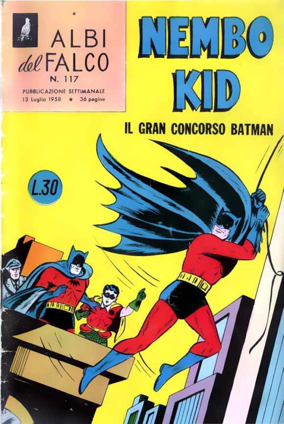
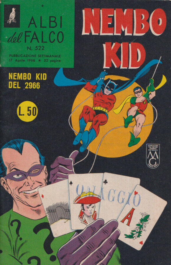
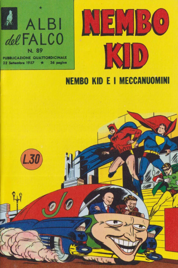
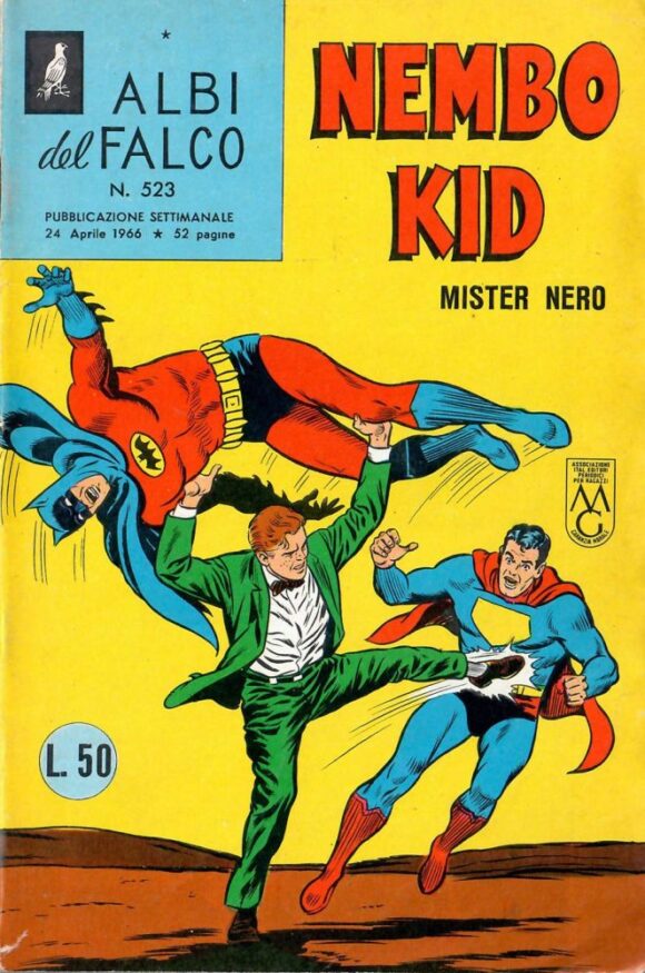
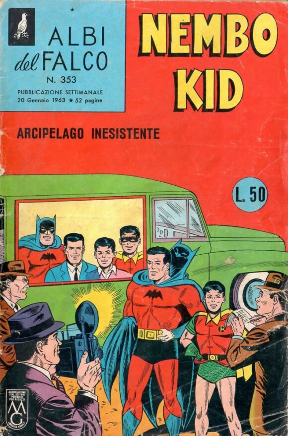
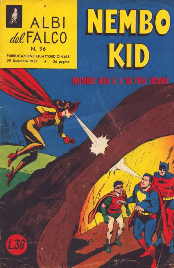
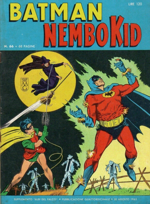
But why is Batman red? Is this repaintmania run amok? No. It’s because Italian posters for the 1966 Batman movie featured the Caped Crusader in bright red, with a black cowl and cape, just like the action figure shows.
But, again, why red to begin with? Well, there’s historical precedent: In the Italian comics of the 1950s and early 1960s, red was Batman’s primary color instead of gray. The reasons for this differ: One school of thought has it that it started as a mistake and just stuck. Another is that publisher Mondadori felt that a gray Batman would frighten children but a red one wouldn’t. (The art itself was generally lifted or tweaked from American covers with art by folks like Dick Sprang, Curt Swan, Sheldon Moldoff and Carmine Infantino.)
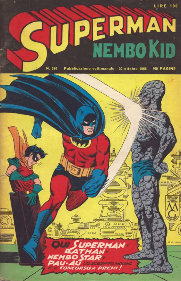
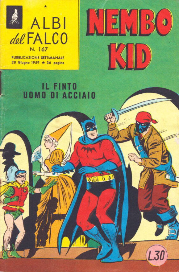
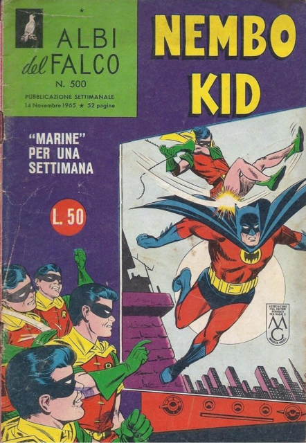
Whatever the actual truth — or whether it’s a combination of those ideas or perhaps because they simply thought red would look better — a generation of Italian kids was weaned on Red Batman. His exploits were originally published in Mondadori’s Albi del Falco, which was headlined by Nembo Kid — aka that guy we call Superman.
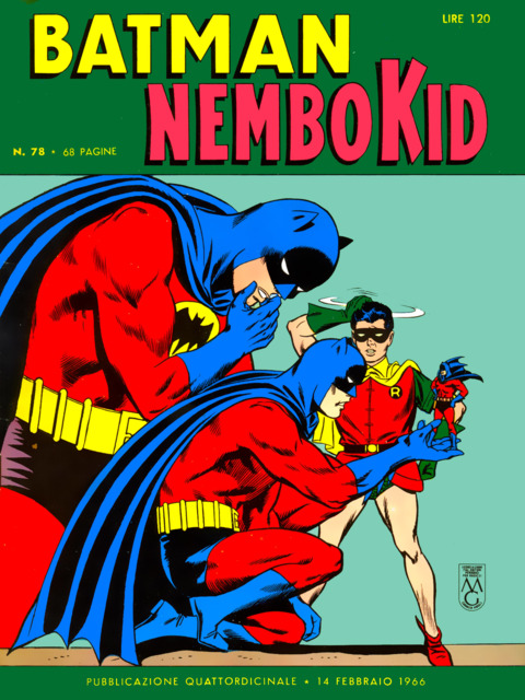
Batman would pop up in his classic colors on occasion but it was only when he got his own title in December 1966 — about two months after the movie came out in Italy — that he was shown steadily in gray. (The film premiered in the U.S. at the end of July.)
So how about 13 COVERS starring Red Batman?
Yes, let’s do that:
—
MORE
— BATMAN and SUPERMAN’s Greatest Italian Comics Mysteries! Click here.
— ARGOMAN and the 1960s ITALIAN SUPERHERO FRENZY. Click here.
July 26, 2024
Red Batman? Ugh. I may be out on a limb here–but this is not a good look, even if Bob Kane had originally conceived of Batman in this very red way (thankfully, Bill Finger persuaded him that grey or black would make for a more striking bat-like, creature of the night, appearance). Though thinking it through, it is esp. the coloring of the comic covers that I find to be esp. unappealing–with the strongly saturated red and blue (even if meant to be sort of a black but not as “flat” for a comics page). But even the strong red alone is a bit jarring.
Plus the association that kept coming into my head with the coloring is Mark Miller’s Superman: Red Son, even if Supes’ costume there still hewed closer to the, if not quite original, then customary Superman outfit, minus the color yellow–where, as typical for Soviet era graphic design (think Alexander Rodchenko, etc.), esp. before Stalin’s entrenchment and his proscribing of Soviet avant-garde modernism, red and black were dominant colors.
It’s like this Batman, rather than being an antagonist like in Red Son, also comes from behind the Iron Curtain as well (rather than Italy, even if the communist party there was much more prominent compared to the UK and US during the Cold War)–and which the McFarlane Toy action figure well captures with the red and black design (Rodchenko would be proud!). And bats typify the uncanny in Russian iconography–and some Soviet Republics used them to symbolize military reconnaissance given their associations with night and echolocation to trap prey, etc.
Even as I try to wrap my head around the very wealthy Wayne family as Bolsheviks (the Kents, or their Russian equivalents as being farmers, even if a collective farm, works, since the line of work is the same). But teamed with Red Son Supes, we have the World’s Finest Comrades (in Arms or otherwise). But Red Batman is still too bizarre.
PS: Thanks Dan and Peter (Bosch) for your input on the whole “correct author attribution” debate we had per the design of the site–I fell well under the weather during it and was not up to any further responses. But I liked the input.
July 26, 2024
Thanks, William. You may notice the bylines are now significantly larger.
July 26, 2024
Forget Red Batman. I want to know about flesh tone Joker with brown hair.
July 26, 2024
I know, right?
July 26, 2024
I’d rather see an Outsider! I’ve no connection to a red BATMAN so I’ve no room in my collection for this. I’m thinking Italian publishing in the ‘60s were just clueless. Ugly. What’s up with stripping out the “S” on Superman?
July 26, 2024
It’s because Superman was called Nembo Kid, translated as Cloud Kid because he could fly. So they blocked out the S. Another weird aspect of the comics.
July 29, 2024
I live in Italy. The S emblem was a trademark to pay apart so initially they paid less for the characters, Batman was red because printers used just for comics and newspapers were still old and couldn’t print properly black and grey togheter. Same reason for ‘The Phantom’, here was red and not violet.
August 9, 2024
Thanks for the information. I’m not sure why it’s not being accepted by other commenters.
September 20, 2024
Red Batman pre-dates the Albi del Falco era, as Batman had been published right after the war with the name “Ala d’Acciaio” (Steel Wing). Those were reprints of a french edition, mostly in b/w that only had a the character full in red on the cover. When Batman rights properly passed to Mondadori, they used his real name and looks, but kept the red, maybe also for the reason mentioned by Alain.
The rights issue for the missing Superman emblem is totally new to me, and it is an interesting view.
July 26, 2024
And I would LOVE an Outsider. One of my faves! Not likely coming from the Batman ’66 line, though, because I don’t believe he was ever in the Batman ’66 comic.
July 26, 2024
If McFarlane is going to do Red Batman, it should have the huge bat cape from the first poster and use a regular Bat head as a chase to reflect the Italian comics.
July 26, 2024
Interesting because The Phantom, who predated Batman, was also depicted in Italy as wearing a red costume. The Ghost Who Walks was originally intended by Lee Falk to have a grey costume. But The Phantom had only appeared in black and white dailies when Italian publisher Editions Nerbini in Florence became the first to launch comic book reprints of the newspaper feature, so there were no color guides. For some reason, perhaps just to make the character stand out in a color-driven medium, the publisher chose to make his costume bright red. (A similar incident happened when The Phantom Sunday debuted in 1939, and comic section printers working without color guides chose to use purple for the costume.) Comic book publishers in France and a handful of other countries followed suit and reprinted Phantom adventures with the hero in a red costume as well.
So perhaps when it came time for Batman to see publication in Italy, there was already a precedent for red-costumed masked heroes in comics, and the colorful idea transferred to the costume of DC’s rising detective.
July 26, 2024
That is an excellent theory. Comics publishers have always copied what works. And if a red Phantom was popular, perhaps they though, hey let’s skim off that.
July 26, 2024
Seeing these covers makes me want to see DC put out a facsimile edition of the “Robin Dies At Dawn” issue.
And why does Superman have just a yellow shield with no letter in his chest emblem?
July 26, 2024
That would be a great Facsimile, I agree. Re, logo: It’s because Superman was called Nembo Kid, translated as Cloud Kid because he could fly. So they blocked out the S. Another weird aspect of the comics.
July 26, 2024
That Red Batman jumped out at me too, and I instantly knew where McFarlane was going with this. I kind of dig the variation, and it’s much like how the Phantom is different colors in different countries. I have a bootleg red Mego-like Batman on a cool card with a lift from Carmine Infantino’s classic Aurora box artwork. I love it.
July 26, 2024
I love off-model stuff like this. It adds to the richness of the character’s history. It’s also an unintentional reminder that fans really shouldn’t take this stuff so seriously.
July 26, 2024
Most people commenting here seem to have no idea on how varied and unexpected were the adaptations of very early superhero material in other countries, not just Europe. It’s an extremely fascinating history.
July 27, 2024
Fascinating, learn something new every day. So, there must have been some confused Italian movie-goers when they sat down, and he ran out in grey?
Maybe with today’s technology someone will re-colour him red for the Italian version.
October 28, 2024
I was kind of wondering about this and glad I found your page.
As a Batman fan and Toy Collector, this is a figure that’s worth collecting. It’s never been done before and has a historic significance. And it’s a cost effictive repaint.
We’ll also get the bat shield.
I think it makes sense that it was a coloring issues back in the day. Remember, Stan Lee originally intended Hulk to be gray but the printers told him it’s a hard color to show on print hence, Hulk now green.
As for Wonder Woman, she falls into the 66″ comic book license to it’s the workaround for McFarlane toys to make her without worrying about not being able to get Linda Carter’s likeliness rights. (Same with Yvonne Craig, Batgirl is technically the comic book version)