A BATMAN: THE ANIMATED SERIES anniversary gallery…
—
UPDATED 9/5/24: Batman: The Animated Series debuted 32 years ago. Perfect time to reprint this piece from 2017’s BTAS WEEK. It gets a great reaction every time we run it. So dig it! — Dan
—
Batman: The Animated Series — the brainchild of Bruce Timm, Eric Radomski, Paul Dini and a team of animation visionaries — celebrates its 25th anniversary Tuesday, Sept. 5, but we’ve got a whole week of retrospectives planned for you here at 13th Dimension. For the complete list of stories, including interviews with creators and animators, click here.
—
Bruce Timm, Eric Radomski and the rest of the BTAS crew rightly deserve the lion’s share of the credit for envisioning what the show would look like.
Then there are artists like Kevin Nowlan — one of the best in comics — who helped launch the show with designs that were adapted by Timm and co.
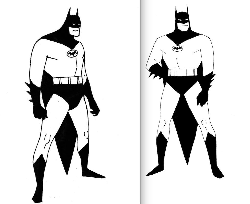
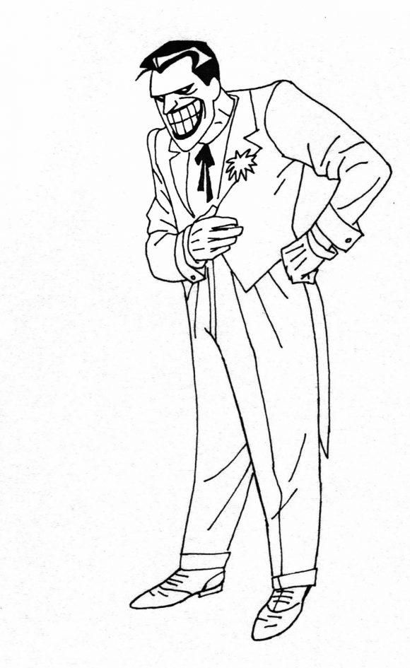
Here, in a Q&A, Nowlan explains his role on Batman: The Animated Series and shares 13 of his best character designs. It’s fascinating to see how some, like Killer Croc, were practically unchanged while others, like the Penguin, were unfortunately discarded for larger, commercial concerns.
—
Dan Greenfield: How did you get involved in the show?
Kevin Nowlan: Bruce Timm just called me up out of the blue. He said he got my number from an old family friend, Bruce Smith, who lived nearby in Hutchinson, Kansas. Smith was taking photos out in California, ran in to Timm and my name came up somehow. It’s weird how those connections were made back in those pre-internet days. Bruce Timm explained what they were doing with the series and sent me a copy of the show “bible,” which coincidentally had been co-written by another guy from Hutchinson, Mitch Brian. I didn’t know Mitch at the time, but later I found out that my wife had known him for years.
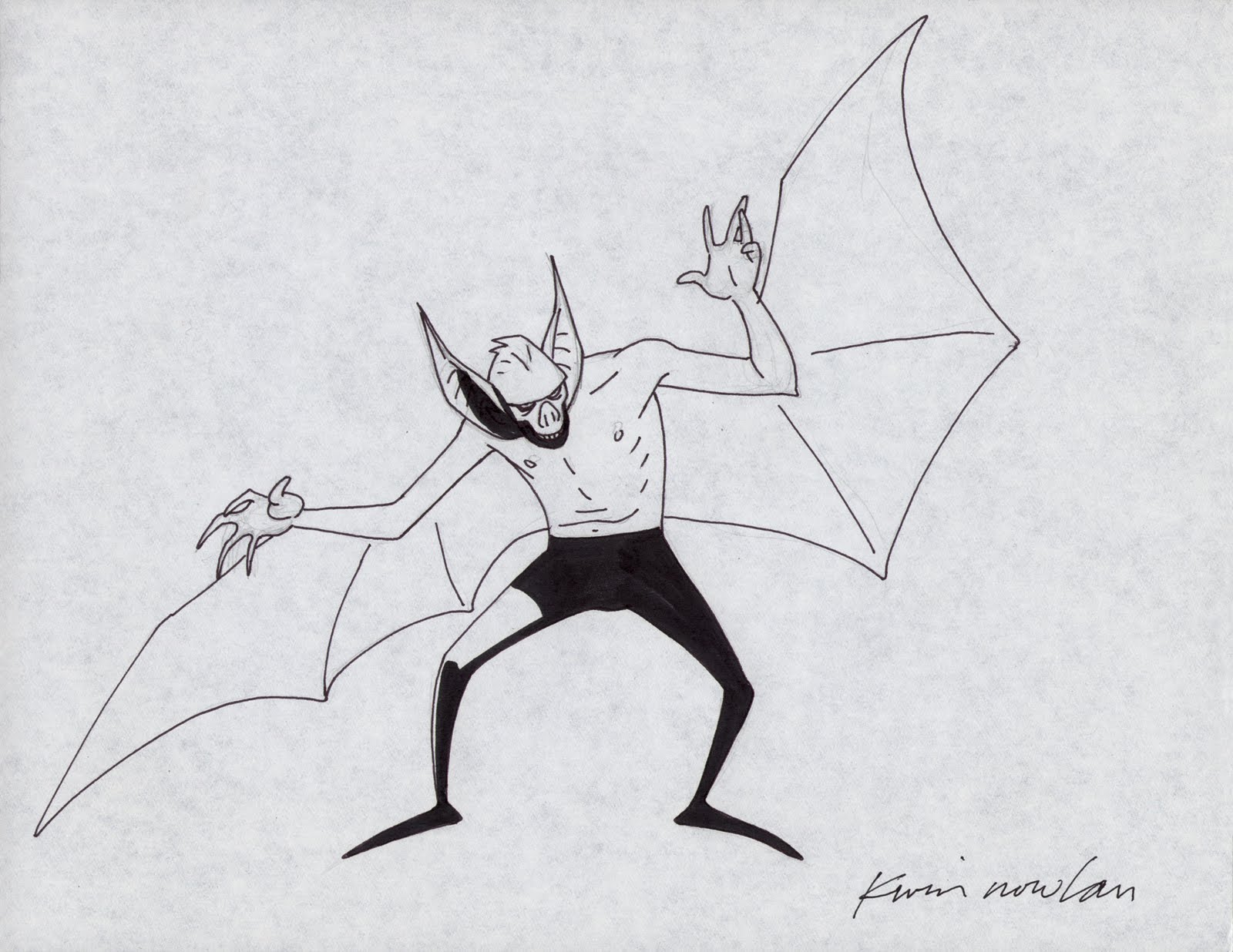
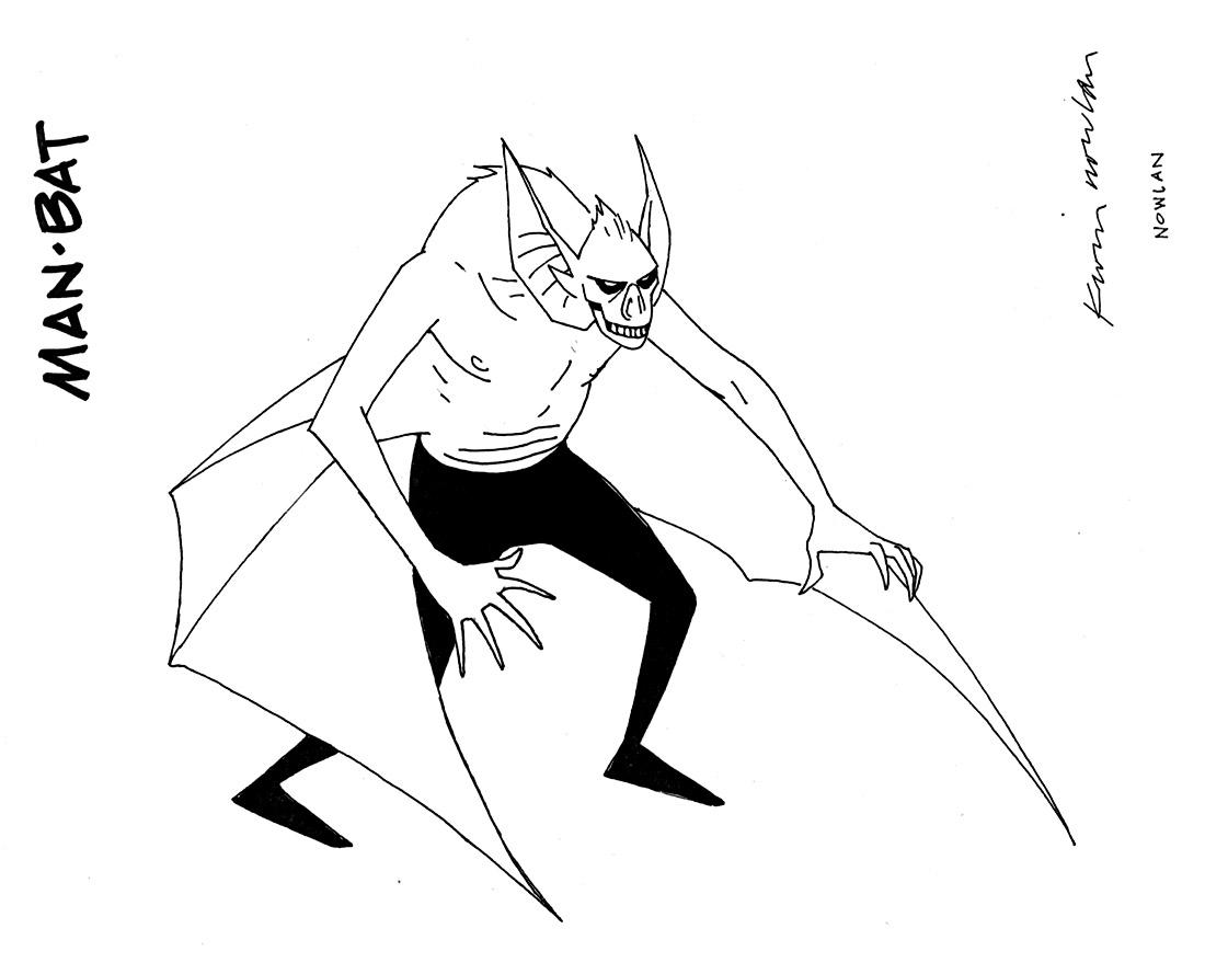
I think Bruce Timm had seen my Man-Bat Secret Origins story and made note of the pared-down style I was using. I remember him talking a little about how the heavy rendering approach that other Marvel and DC artists were using at the time just wouldn’t work with cel animation. Everything had to be reduced down to the bare essentials, which lit a fire under me because that was my obsession at the time. I was looking at the work of Alex Toth and some of the ligne claire European artists. I really wanted to learn to draw better before I went back to adding more rendering and fussy details.
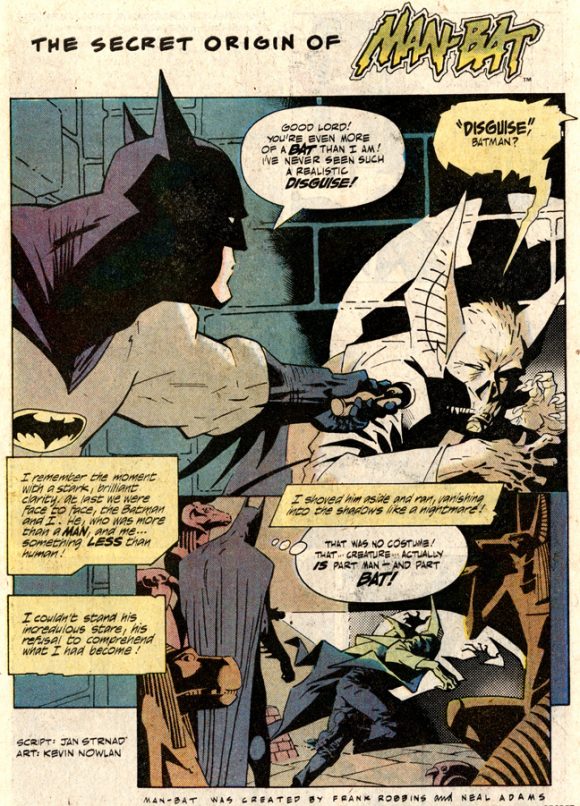
From 1989’s Secret Origins #39
—
Dan: How did you approach the designs?
Kevin: As a challenge. “How can I say as much as possible with just a few lines?” I tried to focus on personality with the supporting cast and the thugs. For some, Bruce would suggest a real person as a starting point or inspiration. A tough little gun moll (Jesse) was based on Rhea Perlman. The Ventriloquist was based on George Will.
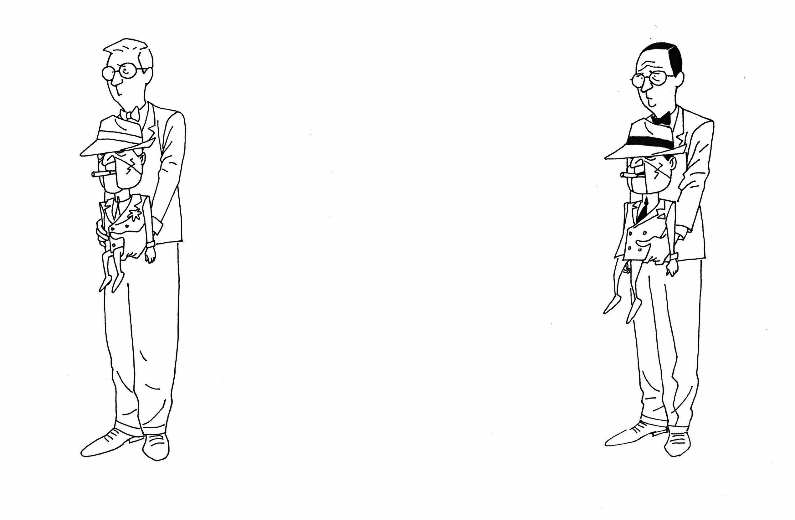
I used a fat, deadweight marker to ink them. No fine lines, no crosshatching. I tried to make them as simple and bold as possible. I might have used angles and straight lines more than I should but all the designs seemed to get more angular as the series went on. Simple shapes, lots of fiddling with proportions and body language.
Dan: Bruce Timm produced the final, stylized versions of these characters. How did your collaboration work?
Kevin: He’d call me up and tell me what he wanted. I’d send in a batch of drawings and that was it. There wasn’t much back and forth. Except on Man-Bat. He kept asking for him to be bigger and I couldn’t figure out how to do that. I gave him a thicker neck and a hump, but nothing seemed to work. I didn’t do any of the turnarounds, just a shot or two from the front.
Dan: Which of your designs is your favorite?
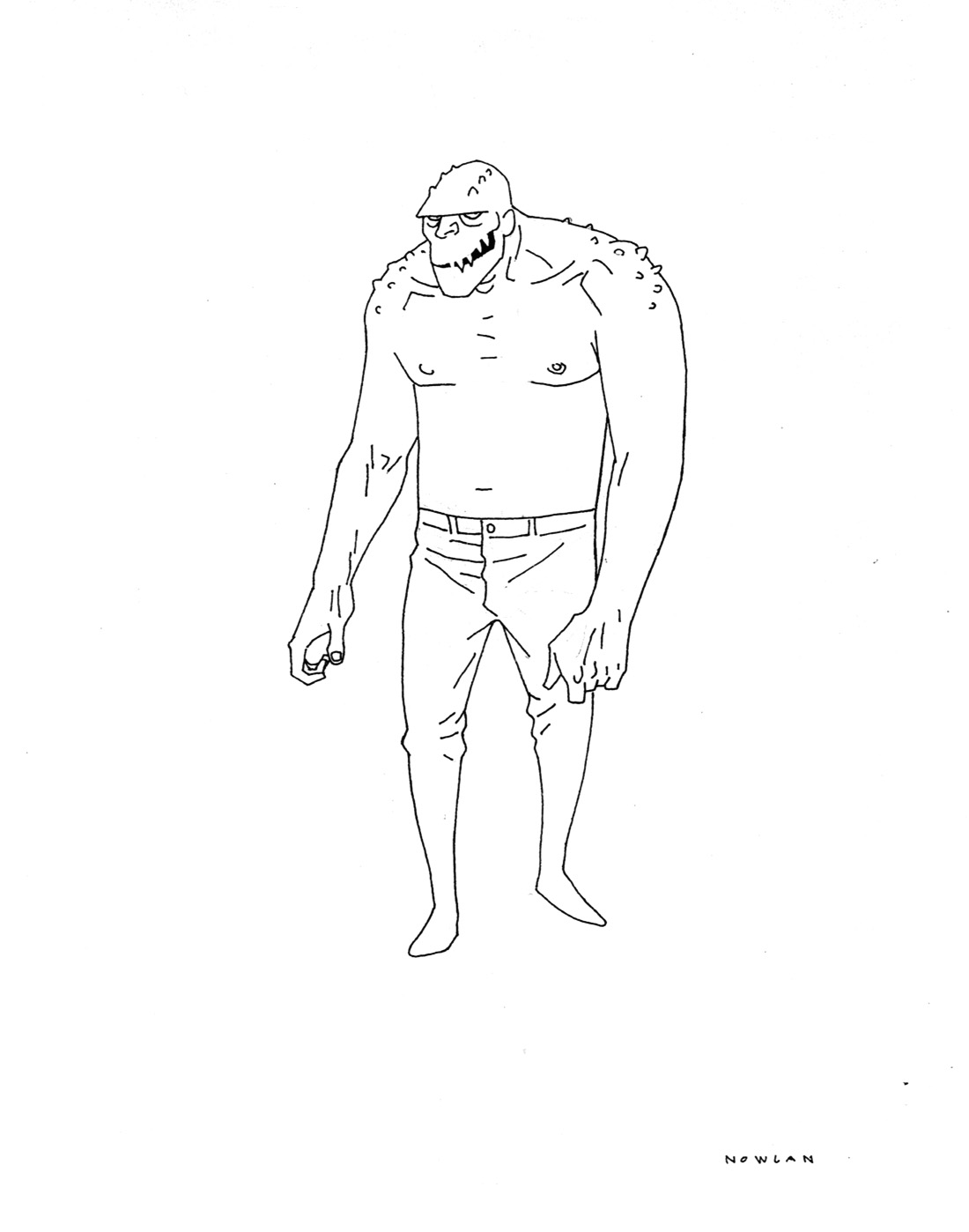
Kevin: Probably Killer Croc. That was a unique challenge because we had to start from scratch. The comic version was covered with tiny lizard scales and I didn’t think that would work. So I had to create a long monster face that suggested a human crocodile with the huge jaw and odd proportions. Instead of scales, he had just a few little bumps on his brow and shoulders. I was very happy to see how faithful the animators were on the follow-through.
Dan: Which one are you most disappointed didn’t get used or got changed?
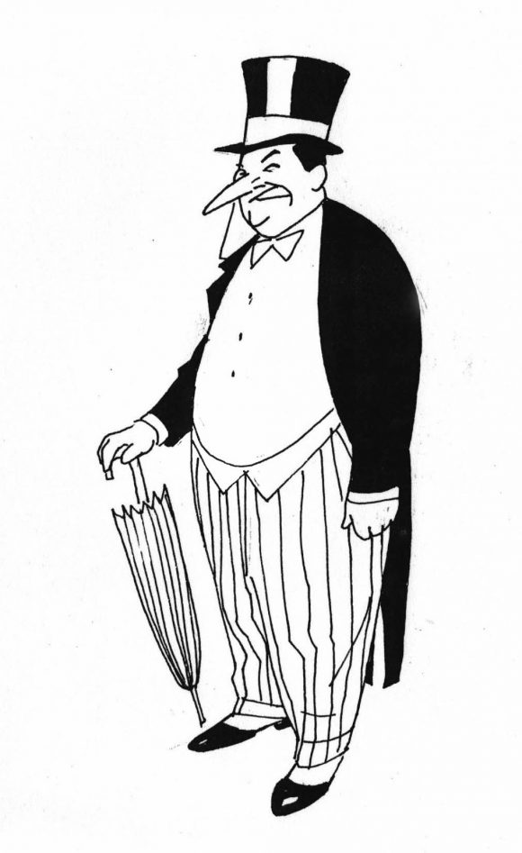
Kevin: The Penguin was changed to the Tim Burton movie version. But I hadn’t done much more than sketch the ’66 TV character so I didn’t have a lot invested in that one. I also had Frank Gorshin in mind when I drew the Riddler. The Mad Hatter always looked very awkward to me. I was thinking of the toothy, chinless, Tenniel drawings from the original book. In the end, it didn’t matter because Roddy McDowall did the voice and just acted up a storm. No one noticed the character design, good or bad. They were focused on Roddy’s virtuoso performance.
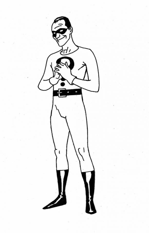
Dan: Did you have any input after the first season? That Joker looks like the Season 1 Joker but you can also see later animated versions in it, especially around the eyes.
Kevin: I don’t think so. After they were up and running, they seemed to have so many talented people working directly on the show that they didn’t need to farm out any freelance work.
Dan: And finally — which is your favorite episode?
Kevin: Heart of Ice. And I’m impartial because I had nothing to do with it! They gave Mr. Freeze a sad, tragic backstory, with a heartbreaking score and a beautiful new design by Mike Mignola. Then you had Michael Ansara doing that cold, emotionless voice and it was just a little 22-minute masterpiece! Not only was it better than the earlier comic-book versions of Freeze, it was ridiculously superior to the Schwarzenegger movie that came along a few years later. Heart of Ice is just beautiful and poetic and I think it’s still haunting most of us who saw it 25 years ago.
On Leather Wings is a close second but I’m a little biased on that one.
—
We’re not done yet. Check out even more of Nowlan’s designs:
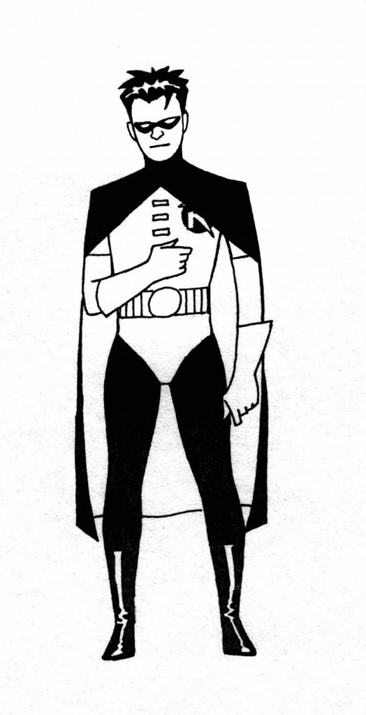
Robin was virtually unchanged
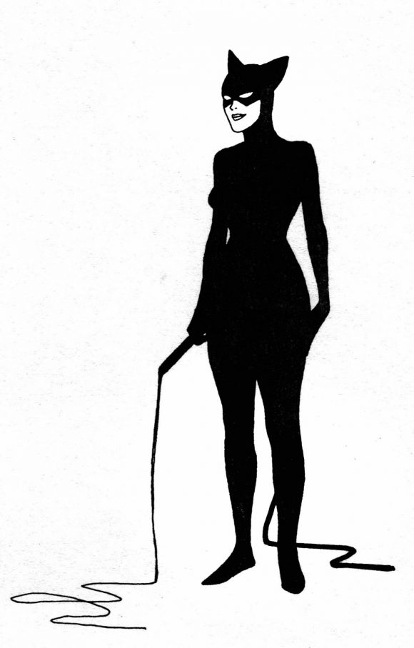
This version of Catwoman hues closely to the version used in Season 4/The New Batman Adventures
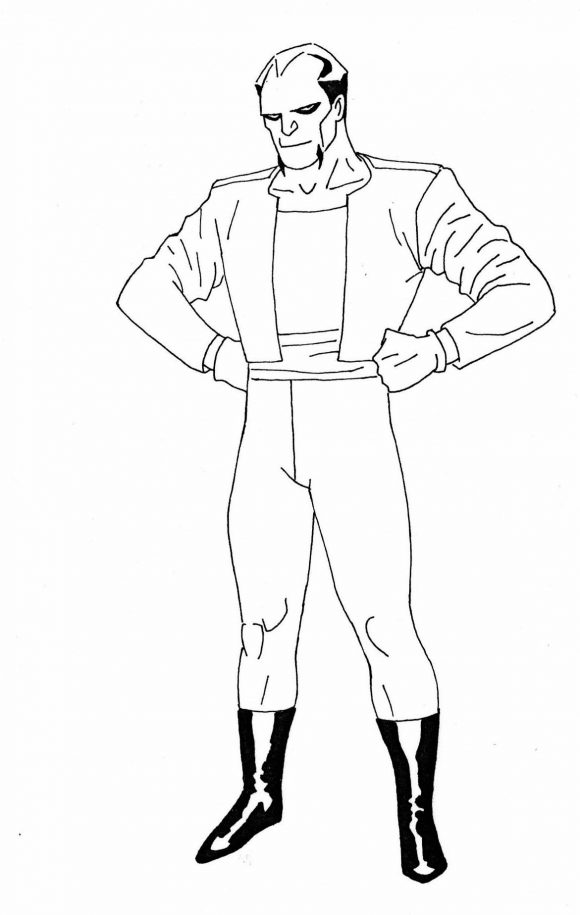
Ra’s al Ghul
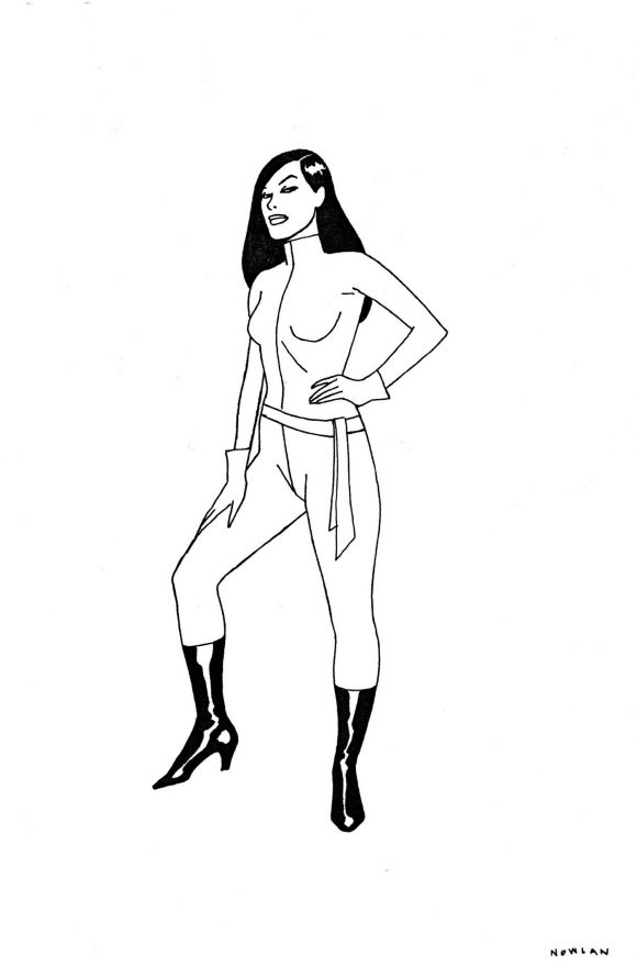
Talia
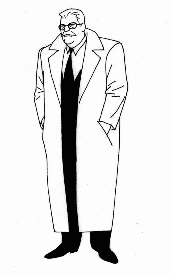
Commissioner Gordon
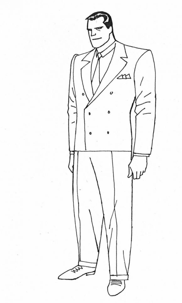
Bruce Wayne
—
MORE: For the complete BATMAN: THE ANIMATED SERIES WEEK Index of features, click here.

September 6, 2017
Amazing designs and it’s wonderful to see some were almost direct translations, such as Robin and Croc. Though I know from past interviews, reading, etc, that they wanted very much to stray away from the Frank Gorshin-type Riddler, I can’t help but love his classic designs on Riddler and Penguin.
And he’s right on the Hatter. With McDowall’s performance, few were paying attention to much else! 🙂
September 6, 2017
Great interview and series. That Gordon certainly brings to mind the later version Bruce did for the redesign. This is the first I’ve seen Kevin’s Catwoman too.
October 20, 2019
This is a pretty fascinating insight.
February 9, 2021
i had no idea that was Mignola’s Freeze….
this is an awesome article!
February 9, 2022
Though I liked the fresh look of the series at the time, I like a lot of these designs, particularly Commissioner Gordon, better than the ones they used.
January 12, 2023
They should’ve stuck with the Gorshin Riddler. What they came up with was unremarkable.
September 5, 2024
Incredible to think Batman: TAS has been around for nearly half my life. Own volumes 1 and 2, and these timeless stories (no surprise) are as engaging and enjoyable as they were at the time of their TV debut.
September 5, 2024
When ever I run across a new (to me) BTAS design sketch by Kevin, it’s like hitting the lotttery! Also I would love to own all of these!!! LOL