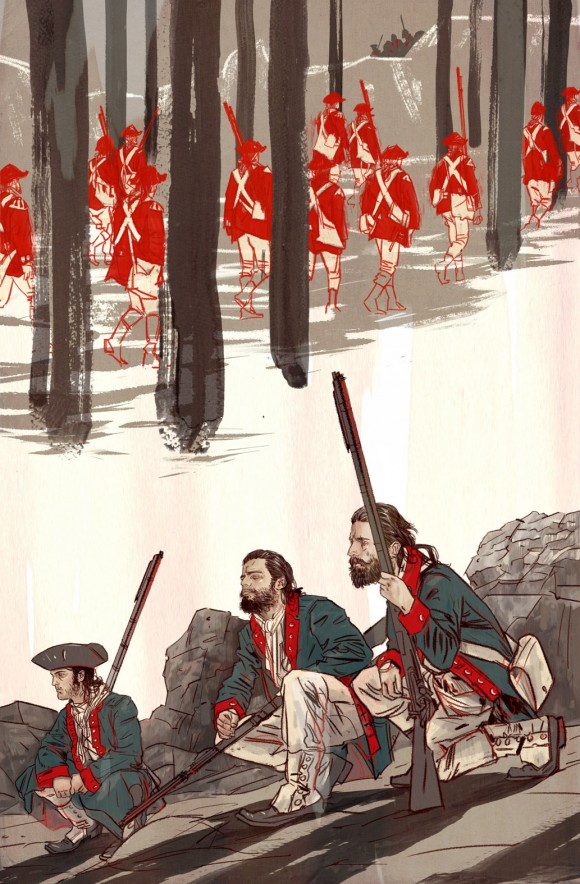
The Spectrum Award nominee and cover artist for Dark Horse‘s forthcoming Rebels #1 builds you a magnificent cover — one step at a time.
Rebels, the Revolutionary War-era historical fiction series by writer Brian Wood, artist Andrea Mutti and colorist Jordie Bellaire, comes out 4/8 — in time for Patriots’ Day for you Massachusetts types. Here, Tula Lotay takes you behind the scenes on how she created the cover to the debut issue, step by step:
—
By TULA LOTAY
I work in Photoshop CS5 (must update) using digital blue line and normal inks scanned. Then paint the illustration digitally before adding water-colour textures and overlays. All these different stages are on their own layer so they can be added and taken away.
—
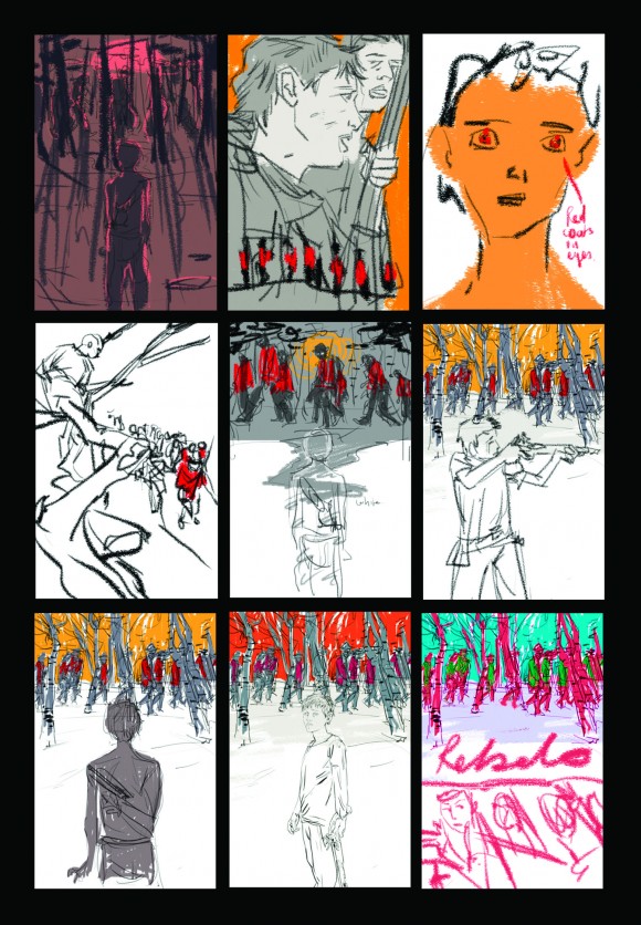
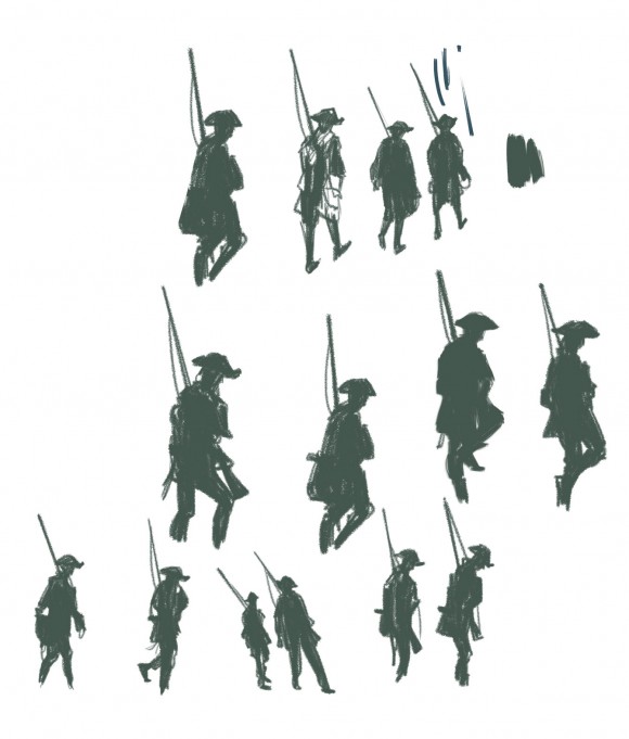
1. Thumbnail sketches
—
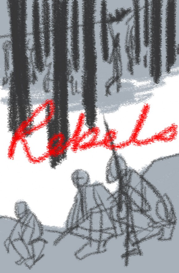
2. Main thumbnail selected
—
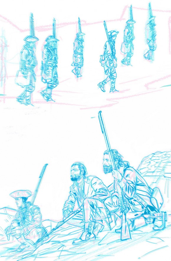
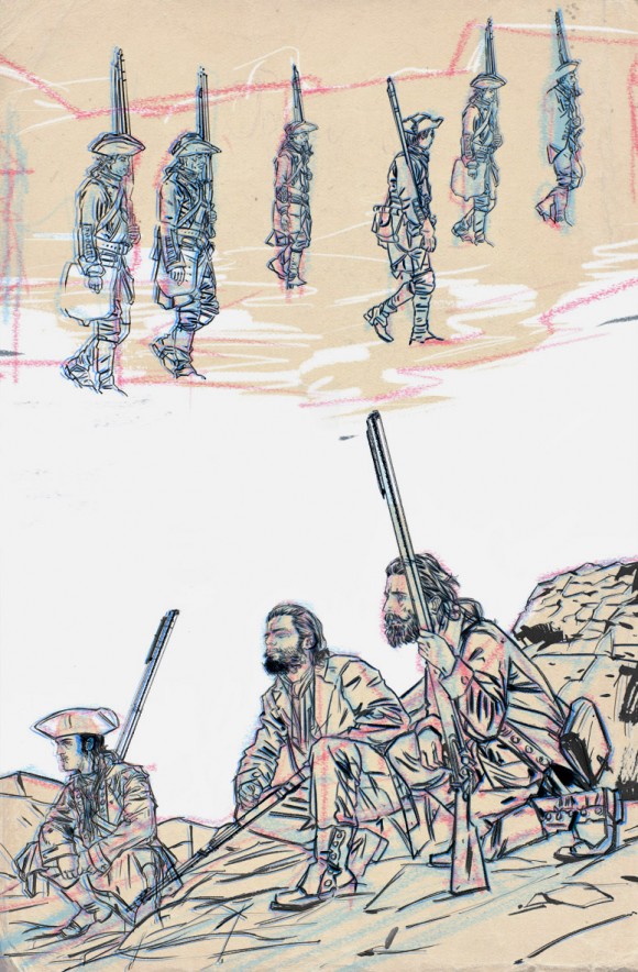
3. Digital blue line sketch to print for inks
—
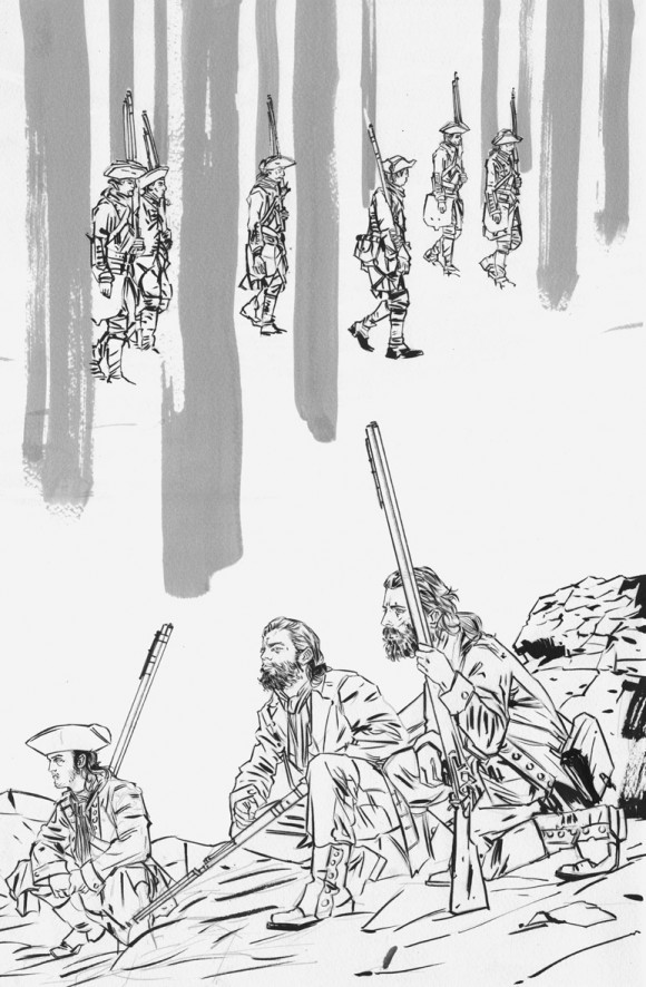
4. Main inks
—
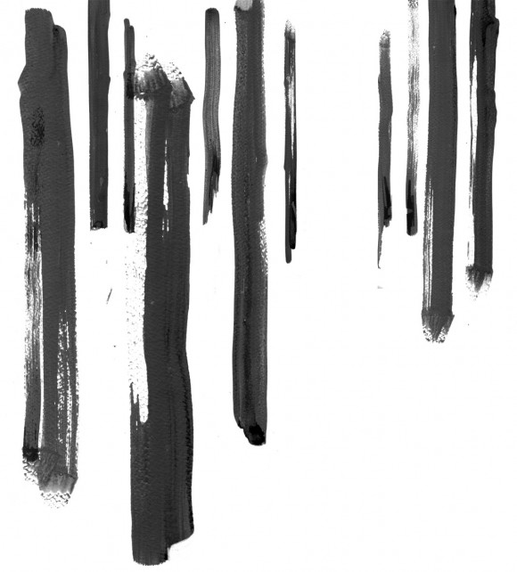
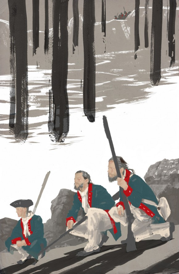
5. Tree water colour washes: Created separately so they would have a freer feel and can be moved around within the image once scanned.
—
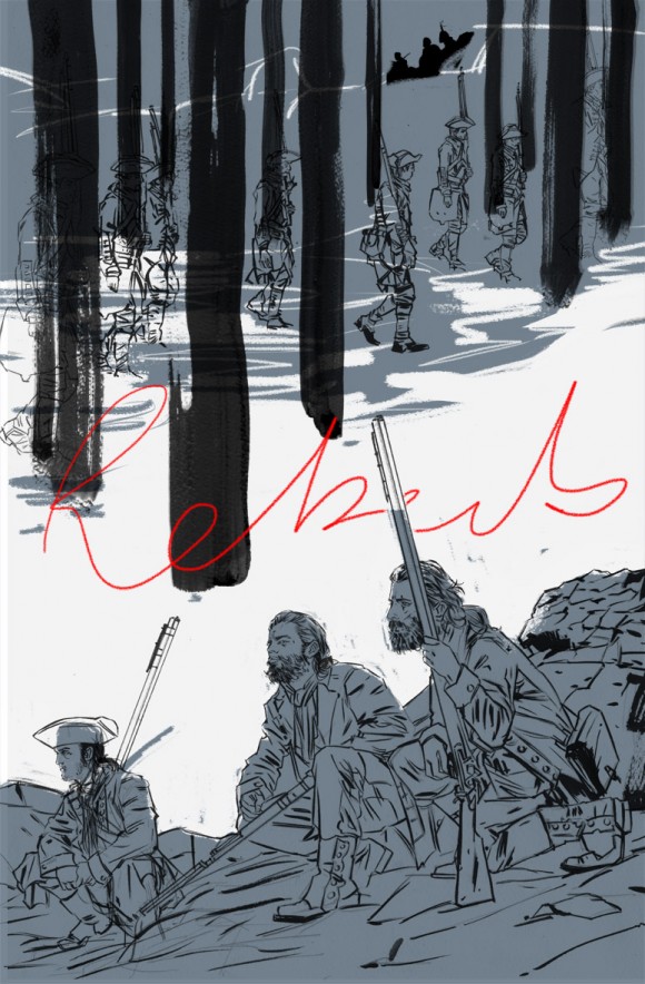
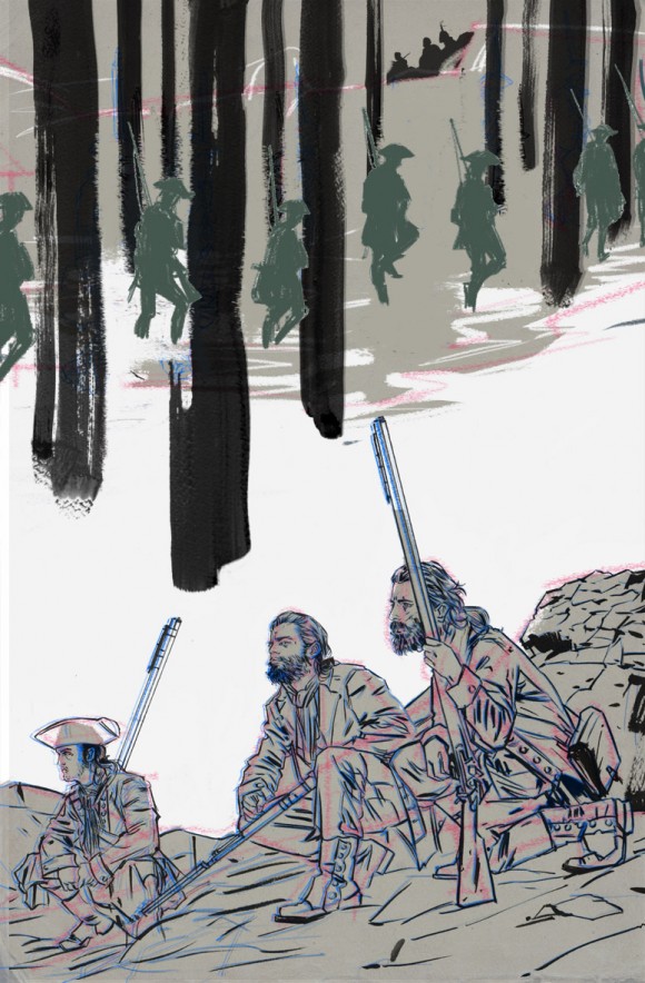
6. I drop in background textures as starting point. I always leave my rough lines there as sometimes they can add an extra dimension to an image. Make it a bit more interesting.
—
7. I bring the darker blue back to define the white. Check the composition of the white is right and that the image flows correctly from top to bottom.
—
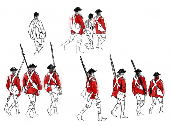
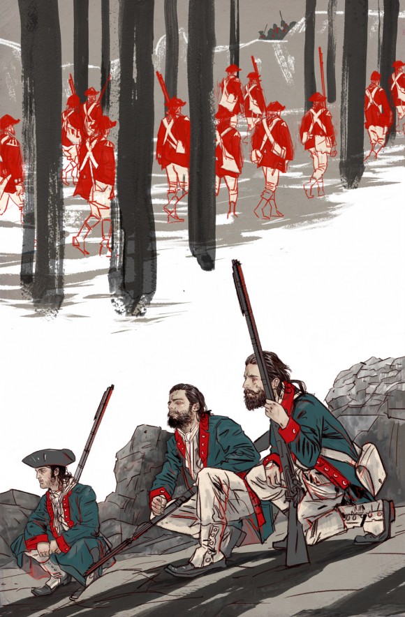
8. I don’t like the way the original Red Coat soldiers at the top look, too static and too much detail, so I experiment with new versions, try to simplify. I practise drawing them really loose, in a similar way to some of the Saturday Evening Post illustrations of the ’50s/’60s. Parts of those illustrations are super detailed and other parts are very lose and sketchy.
—
9. The soldiers still don’t feel right and I really want to bring the red out for the Red Coats.
—
10. I try again with the Red Coat illustrations, making them loose still but incorporating the colour too.
—
11. I’m happy with these now. Just a few more tweaks.
—
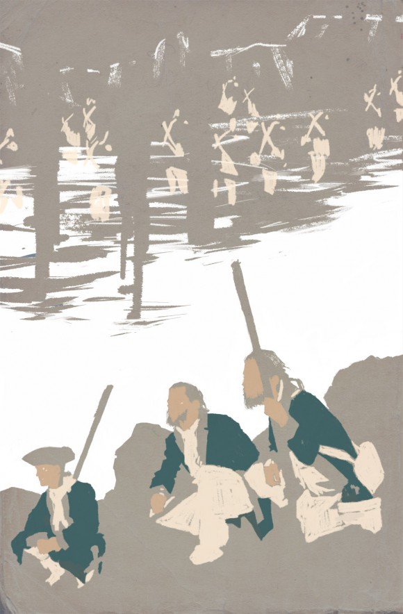
11.5. Starting to paint in colour flats.
—
12. Base colour for the Mountain Boys. I usually paint this on another layer under the line.
—
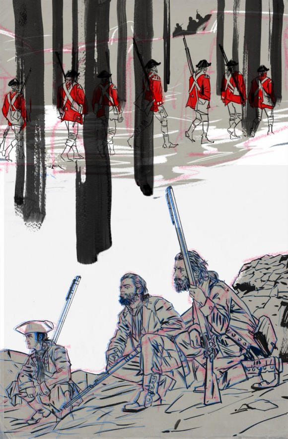
13. I add more Red Coats and change the line colour. Work into them a bit more.
—
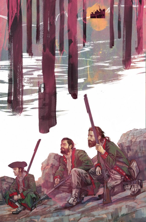
14. Now the line art and colour is ready. I start to overlay watercolour textures to see if any bring the image out more. Sometimes there are some really nice surprises at this stage, other times it’s too much. I like the pink here but it doesn’t work for the feel of the book.
—
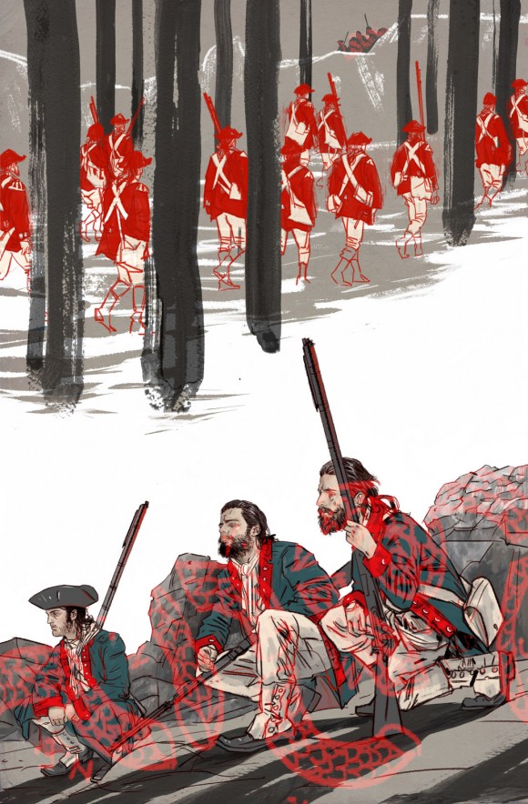
15. Another idea of laying the Join or Die flag design over the Mountain Boys at the bottom. It’s too much though.
—
15.5. Coffee and orange juice texture scanned and overlaid over the final image on the ‘Hard Light’ setting in Photoshop.
—
16. Final image.
—
If you want this gorgeousness in your life, the Final Order Cut-Off is Monday 3/16. Diamond Order Code: FEB150008.
(UPDATED! If you want to see a similar piece on the interiors by Andrea Mutti — and you do — check out Bleeding Cool.)

March 2, 2018
So great. I wonder is she does this full process for interior pages as well? Thanks for this.