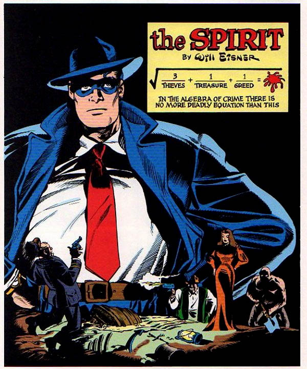
No self-respecting WILL EISNER WEEK would be complete without a look at The Spirit! Published in color comics inserts and syndicated to Sunday newspapers across the country, the feature lasted from 1940 to 1952 and spotlighted Denny Colt, the masked Spirit, handy with his fists, feet, and brains.
By JOHN DiBELLO
The Spirit deftly mixed comedy, adventure, satire and drama. Best of all, it was immensely ground-breaking: innovative layout, compelling pacing, inventive use of white and dark space, artistic lettering, and the ingenious, ever-changing design and placement of the feature’s logo on its first page, frequently as part of the story’s architecture or setting.
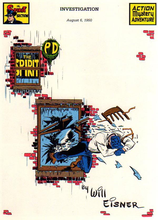
With stories clocking in at a brisk seven pages in length, Eisner and his studio used the first page as both cover and beginning of story, frequently combining these two purposes into what have become classics in the comic book field.
Here are thirteen of the best first pages from The Spirit: trailblazing, clever, beautifully designed, and as fresh as the day they were printed:
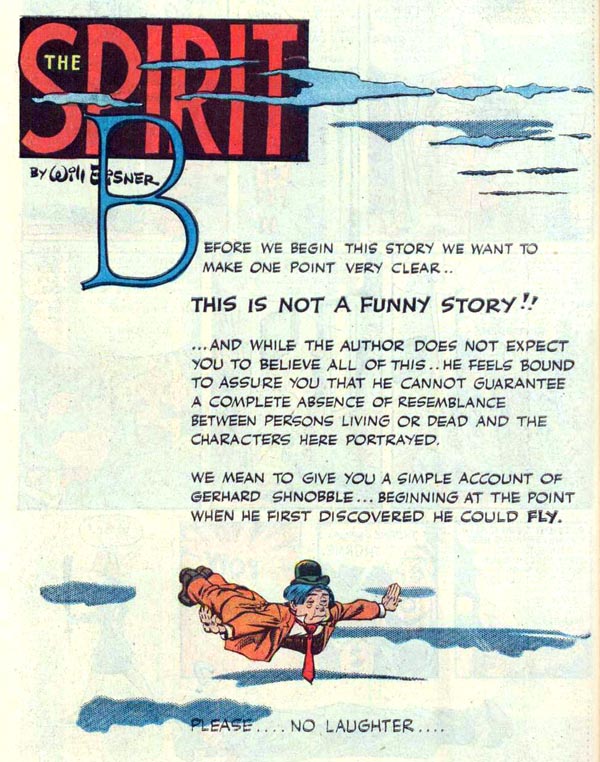
The Man Who Could Fly
Kicking off with one of Eisner’s best-known and most-loved stories: it’s an ideal example of what made The Spirit different. On this splash page we’re warned it “is not a funny story,” despite the humorous appearance of the little man with arms outstretched. A little man who is flying. Yes, The Spirit stories did not confine themselves to crime or mystery but included humorous and fantastic tales. This is one of Eisner’s best, and the ending is one of his most poignant.
High Rise
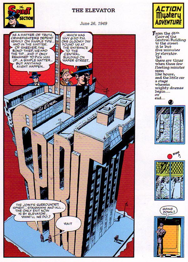
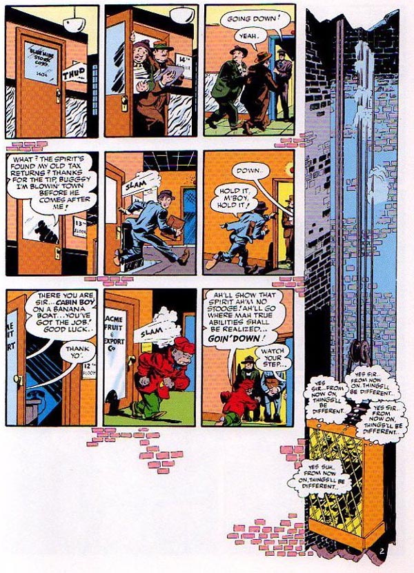
“The Elevator” (June 26, 1949), script by Will Eisner and Jules Feiffer, art by Jerry Grandenetti (?)
The transformation of the logo into the architecture of Central City is a distinctive feature of The Spirit. Here it’s extended into a 65-floor high-rise served by an elevator. The vertical shaft of the elevator is represented by the tall series of panels alongside on the right — a style of artistic license that is unique to comics. I won’t use many interior pages in this post, but here’s an example of how the motif is continued on Page 2: each tier of strips takes place on a different floor, from the 14th through the 12th as the elevator, again taking a vertical journey on the right, makes its descent. The background’s spotted by bricks: It’s as if the building were sliced open and we can see inside, each room a comic book panel.
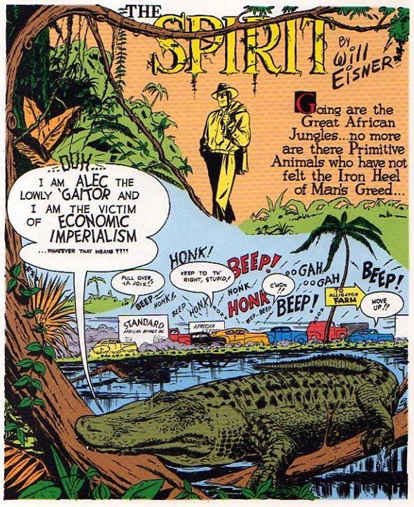
See You Later, Alligator
Not every Eisner story took place in the big city: The Spirit traveled to all corners of the globe in search of adventure, including Africa in this story. It’s a beautiful splash — while not exceptionally innovative, in incorporates in words and images the theme of the story and the forces The Spirit will face. It’s funny, frantic, and evocative. Also, that’s one beautifully drawn alligator.
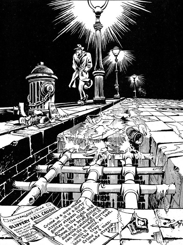
Life In the Big City
An apology: I couldn’t find a large-format, high-res version of this, one of my favorite Spirit images, in which the Spirit strides, hunched in his trench coat, as water and garbage — including scraps of paper that spell out “The Spirit” — all trickle down into a sewer. It’s wonderfully designed as a single image that works like a series of panels, the eye being drawn from the lampposts at the top to the Spirit, and down the trash-strewn stream to the grate. Then you see and read the newspaper, giving us the tale’s background info, and then the paper next to it: a moral and metaphor to instruct and intrigue before we turn to the story proper on Page 2. Since the color scan above is small and dark, here’s a black-and-white version of the page that highlights the fantastic linework and dark, shadowy inks that make this a panel to savor, from the sparkle of distant lamplights to the uneven, worn paving stones.
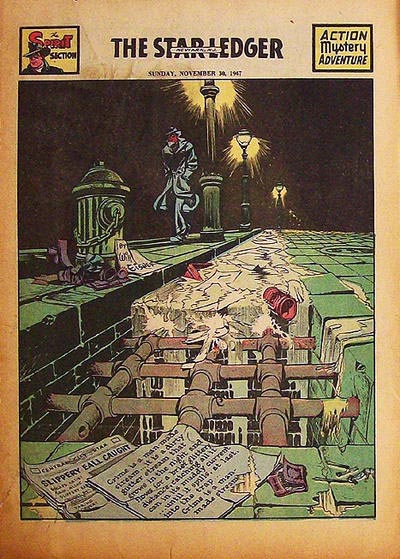
“Slippery Eall” (November 30, 1947), script and art by Will Eisner, backgrounds by Jerry Grandenetti
The Paper Chase
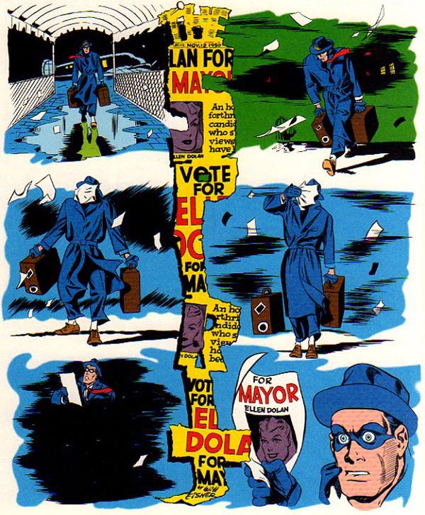
“Ellen Dolan for Mayor” (November 12, 1950), script by Jules Feiffer, pencils by Will Eisner, inks by Gene Bibrew (?)
Here’s another splash that tells the entire set-up to a story on another wet night: As The Spirit returns to his home town, he’s battered by scraps of paper on the wind — Central City must have an even less strict littering law than Gotham City. The expression on The Spirit’s face in the final panel is pricelessly funny, and newspaper shreds of the news his girlfriend is running for mayor split the panels down the middle. Note the use of heavy shadow in the fifth panel — The Spirit is in the dark — compared to the brightness of the final panel.
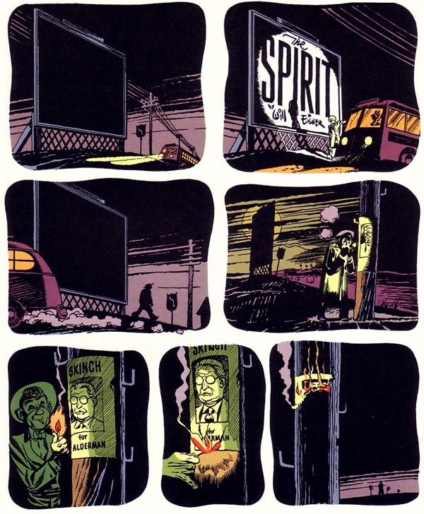
Bus Stop
Politics and politicians were a frequent source of inspiration in The Spirit. “The Partner” features another new arrival to Central City, alighting from the bus, whose headlights on the billboard and warm orange interior glow are the only light we see in the first three panels – the dull, dim moon doesn’t appear in the sky until the angle changes in panel four. A struck match illuminates the following panels with light and with information and mood. This is a finely detailed chiaroscuro of tone and tale: choreography worthy of cinematography.
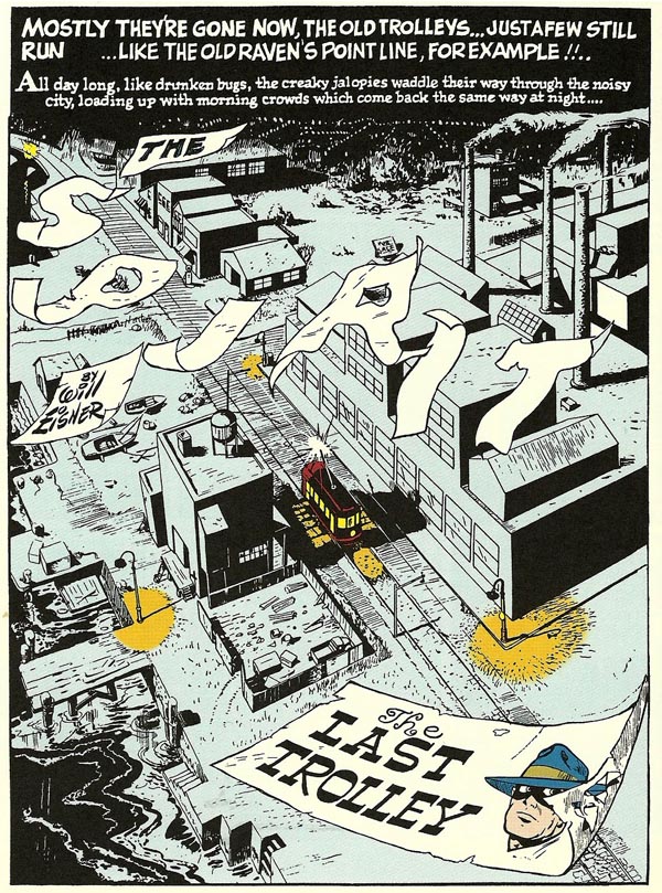
Clang Clang Clang
More scrap paper, more shadow and light in this splash page. Worthy of admiration is how finely detailed and realistic the city is: lights streaming out in perspective in the distance, the foreground dominated by the story’s title and the little trolley, but inspect the buildings, streets, yards and fences. There’s no shortcuts here, no mere “crossword puzzle” windows of black and white squares. The two boats are distinct and different, and the run-down dock, filled with junk and ragged fencing, show us we’re in the run-down, industrial section of Central City. Even the wind is consistent, blowing the papers and the smoke from the smokestacks in the same direction. And not even Tennessee Williams came up with such a brilliant metaphor for streetcars as “drunken bugs.”
After Midnight
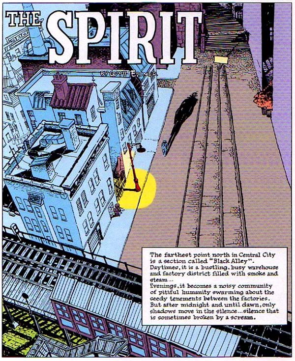
Another sublime cityscape seen from above. It might be called Central City in the story, but this is actually Eisner’s New York, later greatly expanded on in his graphic novels like A Contract with God and The Building. The nitty-gritty detail is astonishing and, to this New Yorker, amazingly exact. The shuttered building fronts, the rickety stairs to the el, the protruding building shaft for an interior stairwell: all are picture-perfect, and Eisner puts the sole source of light near-dead center and positions the Spirit walking toward it, casting a long shadow behind him.
The Heat of the Night
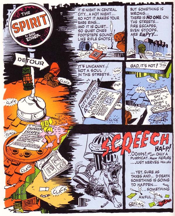
“Showdown with the Octopus” (August 24, 1949), script and art by Will Eisner, backgrounds by Jerry Grandenetti
This text-heavy splash achieves a similar mood but uses all the elements at its disposal to paint the scene: Chandleresque narration, flies buzzing around melted ice cream on the sizzling pavement, sound effects of footsteps, and each newspaper prepping us with the detail of the approaching story. The Spirit stories often “occurred” at precisely the same time they were published — snow fell on Central City in stories published in winter, citizens grappled with taxes in mid-April installments, and the “Christmas Spirit” tales were printed the last week of the year. “Showdown with the Octopus” absolutely nails the late August heat wave of the inner city — the same climate in which the newspaper readers would be sweating when they read this. I picked this page because of its fine sense of season and its intense, compelling progression — but also for that cat, spittle drooling out of its jowls as his tail gets stepped on. It’s too hot, too tense, and we can’t wait to turn the page.
Iron Bars a Prison Make
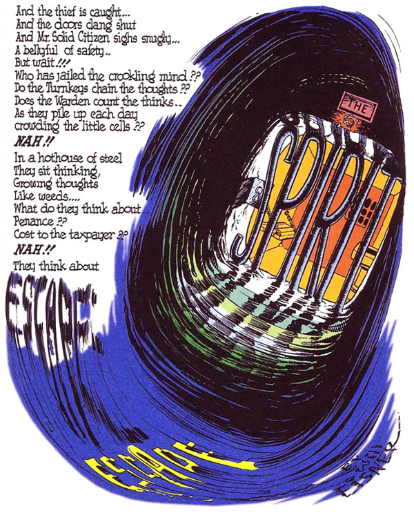
Begin with the near blank-verse text at the top left and your eye moves down the column to the fast-flowing title, pulled along on a swift tide like a whirlpool to the prison bars and the tiny cell beyond it. It’s a clever visual trick — a backwards “J” of motion — but note that the whirlpool leads into the cell, not an escape outward. And who, symbolically and actually, is blocking the thief’s escape from the jail cell? The Spirit, that’s who.
There is Nothing Like a Dame
Okay, enough urban cityscapes. Let’s get to the good part, shall we? Sure, The Spirit did architecture great, and the feature’s shadows and light were amazing and groundbreaking. But The Spirit didn’t just face off against thugs and thieves and criminal masterminds, who, let’s face it, can be a weirdly ugly crew in comics. So bring on the women:
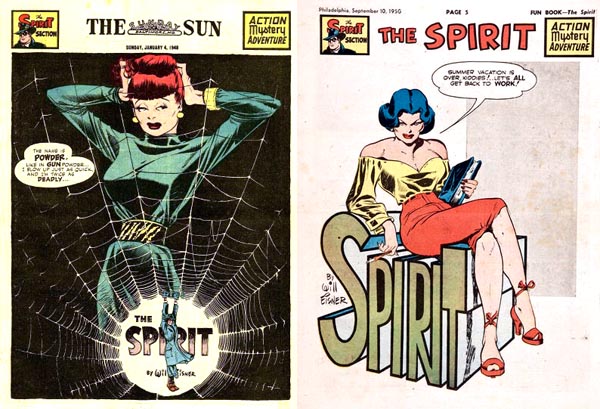
Left: from “The Name Is ‘Powder'” (January 4, 1948), script and art by Will Eisner, backgrounds by Jerry Grandenetti
Right: from “Teacher’s Pet” (September 10, 1950), script and art by Will Eisner
For all its realistic portrayal of the urban landscape, Eisner and associates drew the Spirit’s female adversaries — all slinky, sly, and sharp — like cinema idols. They were this world’s most beautiful women, vying against and very nearly outwitting the Spirit with charm and smarts. Their names were howl-worthy puns: among them “Powder Pouf,” “Silken Floss,” and “Sand Saref.” They looked amazing, too. But no female adversary ever challenged the Spirit with as much deadly seduction as the elegant and exotic P’Gell.
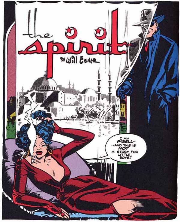
“Meet P’Gell” (October 6, 1946), script by Will Eisner, pencils by John Spranger, inks by Will Eisner and Bob Palmer
“This is not a story for little boys,” P’Gell purrs in her first, iconic appearance. No, it wasn’t. And neither is she.
I Am the Law
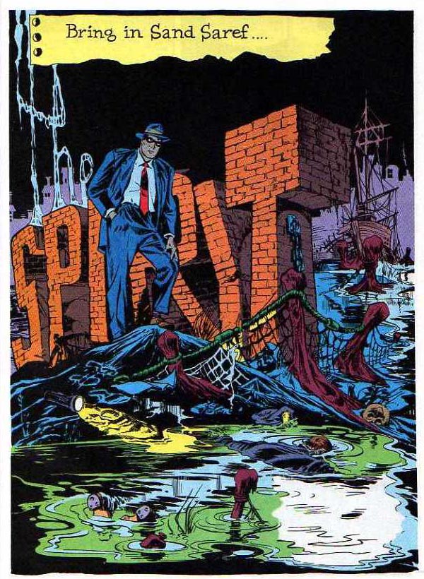
One of the best-known Spirit splash pages actually originated with a different Eisner project.
This pretty much has the complete range of standard Spirit elements: big logo made of brick, the decomposing hulk of an old rickety ship, single light source, lots of water … and a face-down corpse floating in it. But it didn’t start out as a Spirit story.
Originally planned for a comic book in the 1940s, the stories starring noir-world cop John Law were never published in their original form, and Eisner adapted them with corrected art and revised script to Spirit stories. The original artwork survived, however, and Eclipse Comics published the newly colored John Law stories in a 1983 one-shot. It’s a fascinating look at a proto-Spirit.
A Trip to the Moon
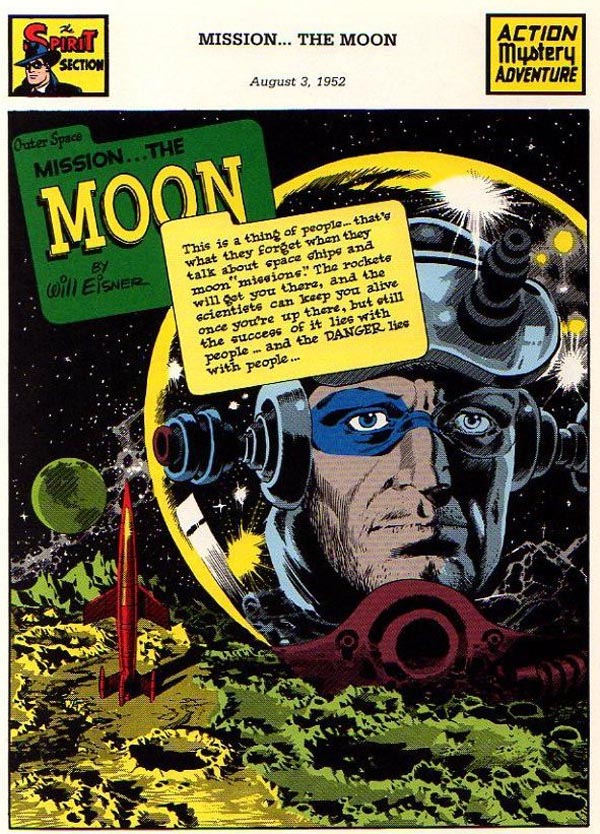
By the time the final Spirit strips were published in late 1952, Eisner was no longer directly connected to creating the feature. The stories were cut from 7 to 4 pages, and the final published story ends with a cliffhanger. But at least The Spirit went out literally shooting for the moon.
The last several weeks of The Spirit, known collectively as “The Outer Space Spirit,” feature moody and nuanced art by the legendary Wally Wood, who drew classic stories for EC’s Shock SuspenStories and Mad as well as early issues of Marvel’s Daredevil. The plots are spooky and dark — The Spirit accompanies a group of convicts to explore the moon — and give off a poignant air of distance, loneliness, and desperation. This is no longer the fast-hitting, jocular Spirit of Central City. Like the NASA astronauts who would follow him in real life, the Spirit was left with the emotional conundrum of “where do you go once you’ve been to the moon?” Luckily for us, he went out with superb Wood art.
After the end of The Spirit, Eisner had a long career creating comics and graphic novels until his death in 2005. In the 1970s he returned to The Spirit for a series of new stories published by Warren and Kitchen Sink, and drew new covers for Kitchen Sink’s extensive reprint series of the postwar Spirit.
The influences of Eisner and his studio upon the comic art that followed him are inestimable. Entire generations of artists have adopted and built on his techniques. In the 1980s, I discovered Eisner, working backward from my appreciation of Frank Miller: Miller’s highly praised early work on Daredevil is a style familiar to a fan of Will Eisner.
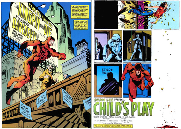
Left: from Daredevil #170 (1981), script and pencils by Frank Miller, inks by Klaus Janson
Right: from Daredevil #183 (1982), script by Roger McKenzie, script and breakdowns by Frank Miller, finishes by Klaus Janson.
Batman is another character ideally suited to Eisneresque stylings:
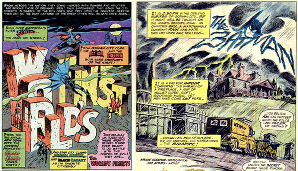
Left: from World’s Finest Comics (1978), script by Jack C. Harris (?), art by George Tuska and Vince Colletta
Right: from Detective Comics #438 (1973), script by Archie Goodwin, art by Jim Aparo.
In fact, DC Comics created an entire event month to feature covers in an Eisner vein:
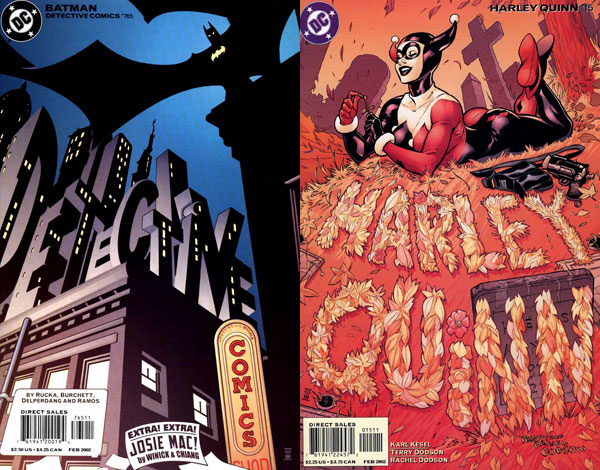
Left: from Detective Comics #765 (2002), art by John McCrea and James Hodgkins
Right: from Harley Quinn #15 (2002), art by Terry Dodson and Rachel Dodson.
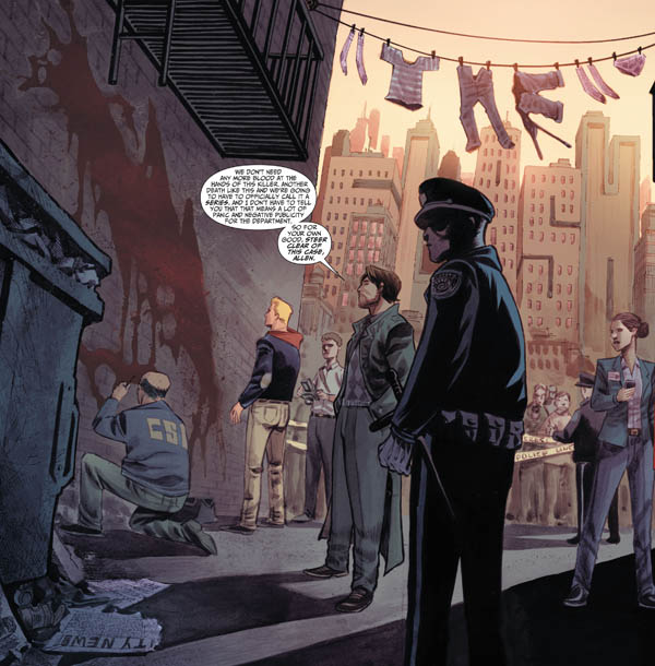
This art tradition continues today in many issues of The Flash.
In the end, though, nobody beats The Spirit. Eisner and his associates brought comics to a new level of art, innovating comic design and narrative. They gave us a lot of great stories, too. And they taught us there’s nothing like a great entrance.


April 15, 2015
Thank you!