
Celebrating the late artist, who was born 60 years ago…
Artist Norm Breyfogle, who was born Feb. 27, 1960, left us too early at the age of 58 in 2018.
But he’s remembered particularly fondly by Batman fans — so much so that a California comics shop, Dr. Cain’s Comics in San Luis Obispo, has declared Thursday to be Breyfogle Day.
You can click here to see what owners Patrick Hayes and Nicole Martin have cooked up to celebrate, and it’s something I would love to see spread elsewhere and become an annual thing.
Anyway, Patrick’s enthusiasm for Breyfogle’s work is so palpable that I invited him to cook up THE TOP 13 NORM BREYFOGLE COVERS — RANKED.
He didn’t hesitate. — Dan
By PATRICK HAYES
I was 10 years old, hurtling toward 11, when I first encountered Norm Breyfogle’s work on the cover of Detective Comics #606. Or maybe it was #604. I know for sure it was one of the “Mudpack” issues.
I had just begun my sincere love affair with comics that summer — Web of Spider-Man, X-Factor, New Mutants and Incredible Hulk, mostly. But there was something unsettling and attractive about the garish Batman covers my eyes fell on. Things looked a little bit more dirty and maybe even a bit more scary than most of the other stuff I was reading.
I wasn’t a DC guy but something about this art with its exaggerated characters and symbolic, rather than literal, depictions forced me to start reading. It was dirty, it was ugly, it was invigorating and it holds up today.
Norm was vastly underrated, I would have taken him over a dozen Image founders any day of the week (not to throw shade but when it comes to capes, Breyfogle > McFarlane). He was so good they had him banging out covers for Batman while Jim Aparo was drawing it!
I have a lot of favorite Bat-artists: Aparo was one of the best; Colan, Newton, Rogers and that Adams guy were all great too. But Norm is my favorite of my favorites. He drew Batman exactly the way I wanted Batman drawn, he helped introduce one of my all-time favorite characters in Tim Drake, and he did it all in a way that never got stale.
It still seems crazy to me that he drew so many issues starring Batman and yet I still feel like we didn’t get enough.
Here, then, are THE TOP 13 NORM BREYFOGLE COVERS — RANKED:
—
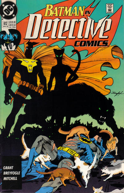
13. Detective Comics #612. A reverse of Breyfogle’s usual trick, here we have Batman in the light and worse for the wear while the feline villains enjoy the atmospheric shadow coverage. If this was all you had to go on wouldn’t you assume Catman was one of the greatest villains ever?
—
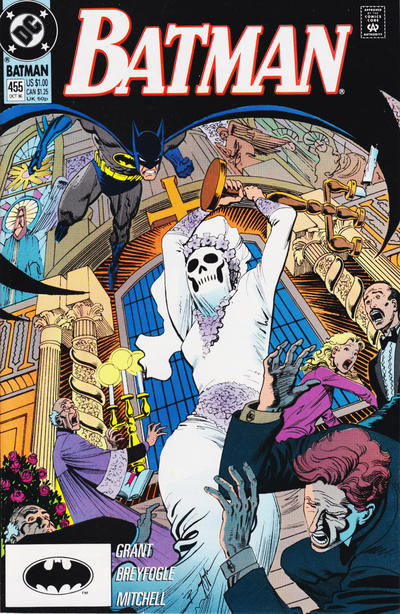
12. Batman #455. Once again, we get to see a pretty much fully lit Batman, but that doesn’t detract from the wholehearted embrace of the Dark Knight’s gothic side. The angles he chose here make this cover pop!
—
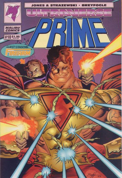
11. Prime #10. I fell in love with his Batman work but I really appreciated his run on Malibu’s Prime too. He was so good at perfecting the tough guy through a child’s eyes that Prime required. His horrifically over muscled body with “classic” hero face was genius.
—
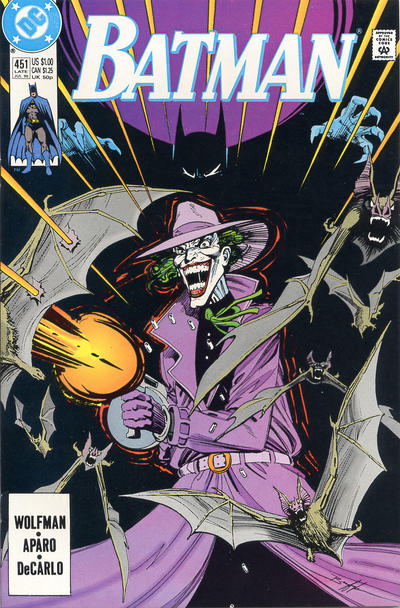
10. Batman #451. Using Batman in shadows was one of Breyfogle’s best tricks — here he’s just claws and cape!
—
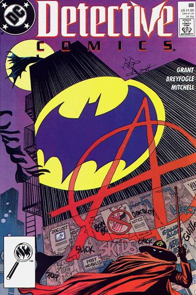
9. Detective Comics #608. Good example of great dynamics even in what should be a relatively static shot. The massive Anarky- and Bat-symbols dwarf the actual figure of Batman, making for an impressive cover.
—
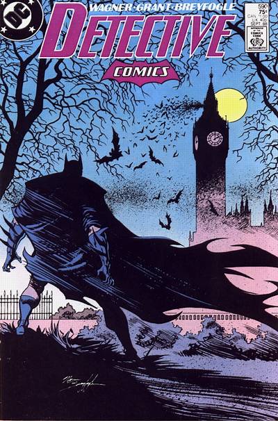
8. Detective #590. So moody, so gothic! If this doesn’t make you want to see why Batman is hanging out in a very spooky-looking London then I don’t know what will.
—
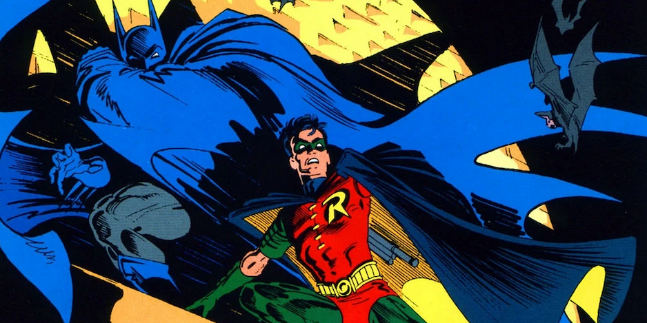
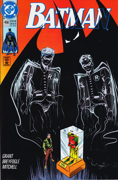
7. Batman #456. Many of my favorite Breyfogle covers have Robin involved: This one manages to evoke the weight of legacy with the ghost Robins and the looming presence of Batman hanging over everything. Really fantastic composition on this one.
—
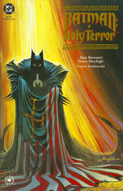
6. Batman: Holy Terror. There might be better covers but I wanted to feature some of his painted work, as well. As his pencils got tighter, it was interesting to see Breyfogle flex some other muscles.
—
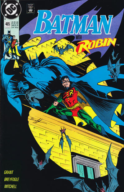
5. Batman #465. A modern rendering of Batman #9, complete with Breyfogle’s cool little bats everywhere.
—
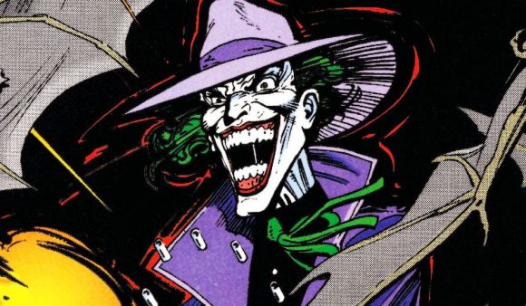
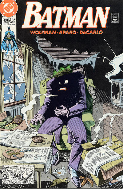
4. Batman #450. Batman #251 and #366. Detective #365 and #475. All iconic Joker covers and this one from Breyfogle fits right in. Doesn’t he look incredible, half obscured in shadow and grunge?
—
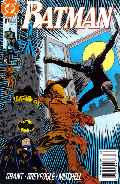
3. Batman #457. See, everyone looks cooler half buried in shadows. It’s no coincidence that one of my other favorite Bat-things is Tim Drake; Norm was one of the artists who drew him most early on.
—
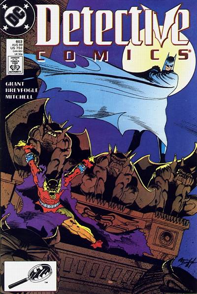
2. Detective Comics #603. Etrigan has never looked better! The way Breyfogle draws the cape wrapping around Batman, shielding him against the wind, makes for a great variation on his usual use of the cape element.
—
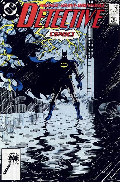
1. Detective #587. It had to be this one. That cape! There’s a reason they put this image on the front of covers collections and make statues out of it. That cape! A striking image combining some of Breyfogle’s best tricks — an iconic cover by any measure. It’s also the coolest the yellow oval has ever looked. And that cape!
—
MORE
— How to Celebrate NORM BREYFOGLE DAY This Week. Click here.
— NORM BREYFOGLE: In His Own Words. Click here.
—
— Cover images and credits from the Grand Comics Database.
February 27, 2020
You can’t beat this kinda talent! 🙂
March 4, 2020
Beautiful covers by Norm. Miss him dearly.
Cat-Man in my opinion is a very good villain. Enjoyed his bronze age appearances.
April 18, 2022
If you are so inclined, I have a Kickstarter currently running where you can get your hands on another 198 pages of Norm Breyfogle drawn story, a bunch of covers and a ton of his skecthes. The campaign is for the OF BITTER SOULS Omnibus. Tons of stuff in the book… including a foreword by Norm’s longtime Batman colaborator, Alan Grant! I hope you’ll check it out. Thank you. https://www.kickstarter.com/projects/monstersandmidways/of-bitter-souls-400-page-omnibus-drawn-by-norm-breyfogle?ref=1wgsns
April 5, 2021
I have some original signed ( Norm Breyfogle) pencil sketches for some mudpack covers. Can anyone tell me what these could be worth? I cant find anything online.