A final, fantastic foursome.
Michael’s from Canada. That’s why he spells it “colour.”
Artist Michael Cho is doing about 20 variants for Marvel this month, melding graphic design and superheroing to produce many a masterpiece.
We were so taken with these electric covers that we invited him to do a “director’s commentary” on each, grouped by week of release.
Week 1: Click here.
Week 2: Click here.
Week 3: Click here.
And now, the finale, Week 4, featuring books released 2/24 (including one due 3/2):
—
By MICHAEL CHO
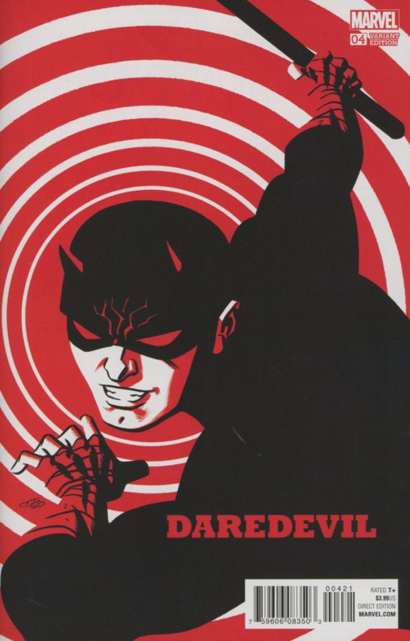
Daredevil #4. This was the first cover I worked on, as I wanted to start with something I was fairly familiar with. My first thumbnails were of DD in action, on rooftops, jumping, posing, etc., but they all seemed tired and done before. Marvel gave me a lot of freedom when I accepted this assignment, so I realized there was no requirement to just do a “standard comics approach” to cover design. I changed tactics and thought about stripping an image to its essentials, focusing on interesting crops and emphasising design. I hit on this image right away, and it formed the mindset I used on all the other covers.
—
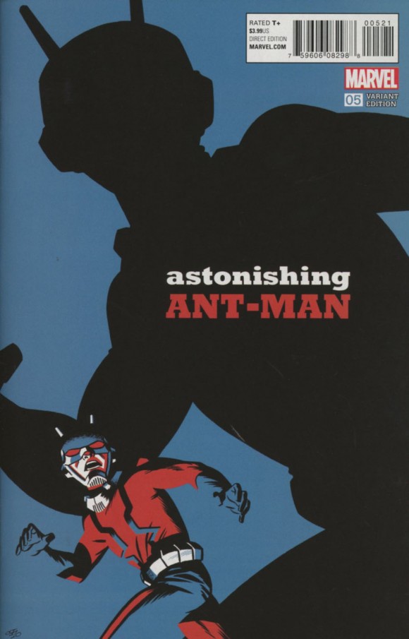
Astonishing Ant-Man #5. The rough I submitted and had approved for this was very different. It was a downshot of a full-size cast shadow on the floor, while Ant-Man himself was tiny in the bottom corner. It worked better in concept than in execution, so at the last minute, I asked Marvel for a do-over and they allowed me to run with this one instead. It’s a similar idea but the up angle makes it work better.
—
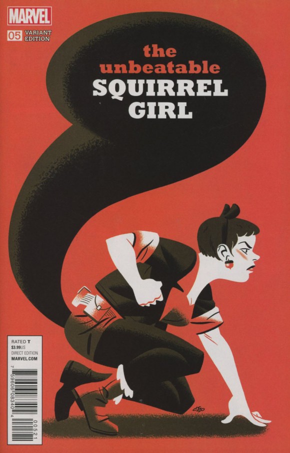
Unbeatable Squirrel Girl #5. Squirrel Girl is my favourite monthly comic right now so I was really excited to draw this one. The pose came together in a brainflash and didn’t change much from thumbnail to final. This is one of a handful of covers I drew digitally, and the rendering is a bit flatter than the others. I cheated with her hair — it should be orange, but having orange hair on an orange background wasn’t going to work. Looking at it now, I wish I’d put Tippy Toe into the drawing, but overall I think this is my favourite cover of the whole batch.
—
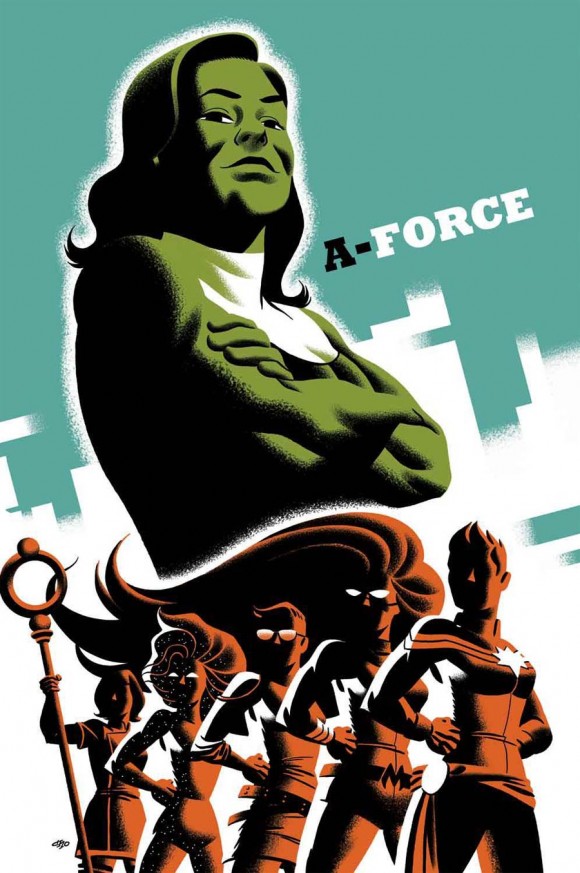
A-Force #3 (due 3/2). The last cover I drew, and one where I deviated a bit more than usual from the template for the series. It’s got 3 colours, not 1 or 2 plus black, and I added a finicky bit of design on the background pattern. This one is a more overt attempt to echo the look of WPA and WWII posters — I conceived it as a recruiting poster for an army. For the second time, my wife was the reference for the main figure. Last time it was Captain Marvel (click here), this time it’s She-Hulk.