EXCLUSIVE COMMENTARY: Magnificent design across seven covers.
Michael’s from Canada. That’s why he spells it “colour.”
—
Artist Michael Cho is doing about 20 variants for Marvel this month, melding graphic design and superheroing to produce many a masterpiece.
We were so taken with these electric covers that we invited him to do a “director’s commentary” on each, grouped by week of release.
So here are the Week 2 covers, featuring books released 2/10. And in case you missed it, make sure you click here to check out his Week 1 commentary.
—
By MICHAEL CHO
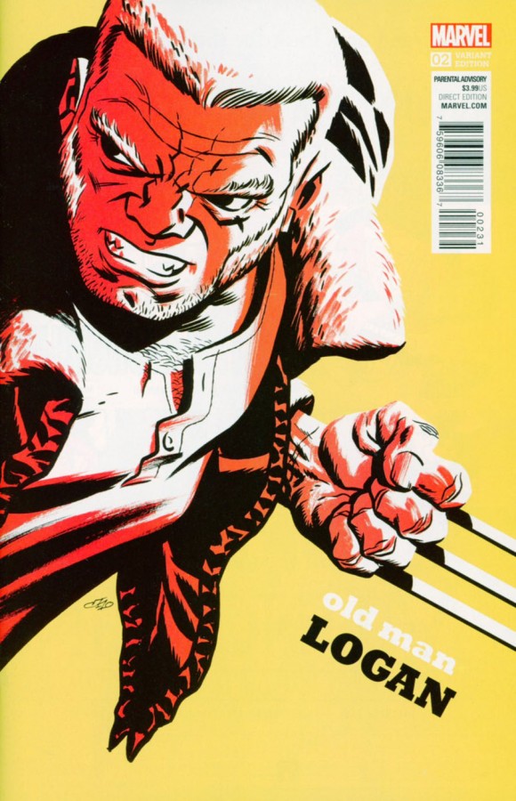
Old Man Logan #2. The second cover I worked on. I drew a version with a background of ruined buildings with a suggested interior and couldn’t really decide between the two. Generally, my philosophy when faced with two equally good options is to pick whatever looks the most raw and direct. Hence, no background.
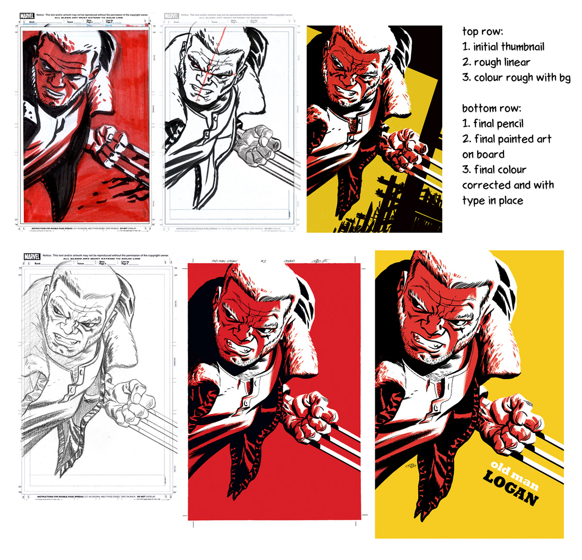
When I came up with the type treatment, I was thinking of these covers as something between a paperback cover and a movie teaser poster — you know, the kind that introduces a major character in the story. I think this one is representative of that approach.
—
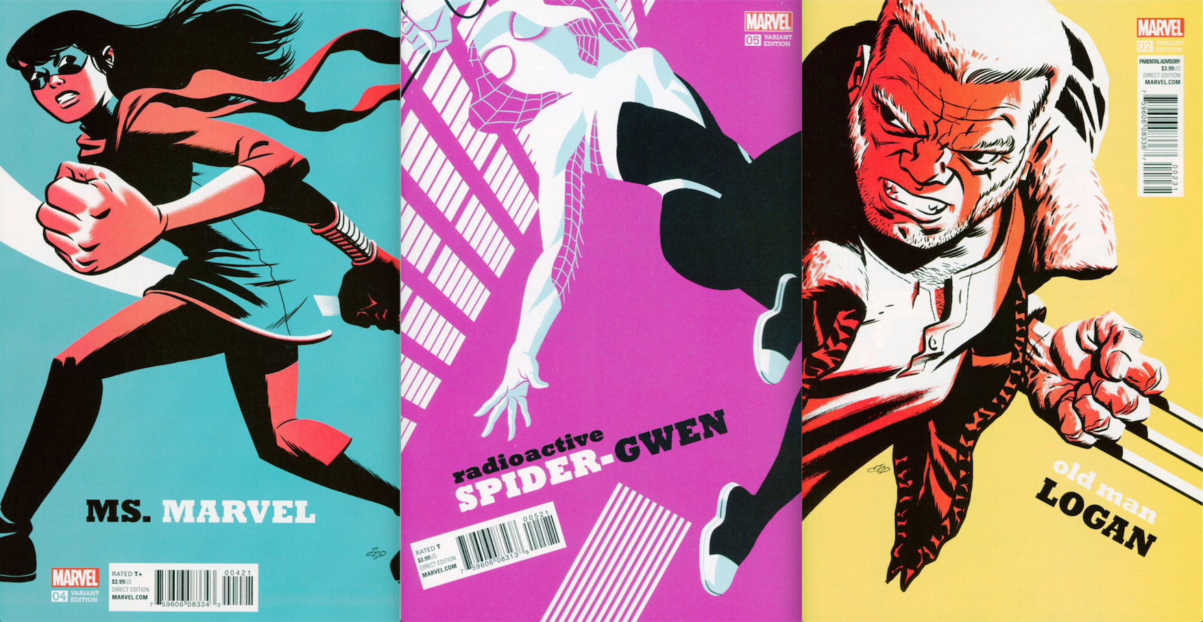
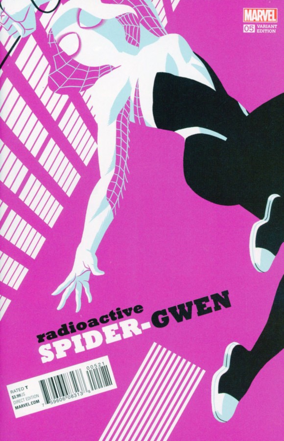
Radioactive Spider-Gwen #5. Boy, Latour and Rodriguez designed a great looking character. I had the pose pretty quickly and after that it was just working out how much background I wanted to suggest while keeping the overall look focused more on design. I played with the window shapes a lot, trying out different angles, different depths and eliminating more and more until I got down to the two buildings shown in the final composition.
—
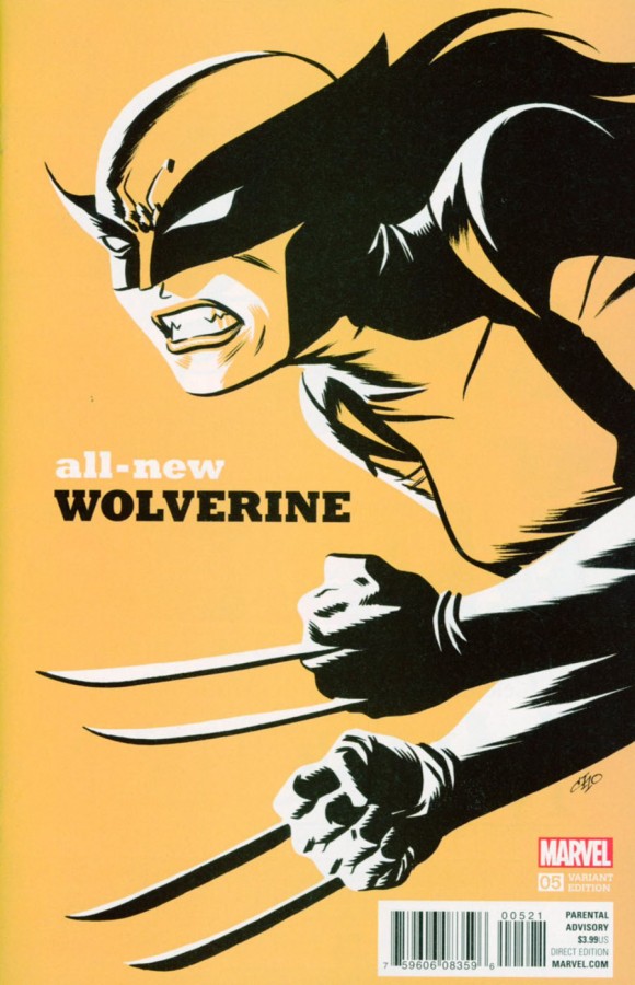
All New Wolverine #5. I drew up a bunch of different ideas for this one, trying to get them to work before I hit on this. I painted this using a yellow Dr. Martin dye that just did not scan very well at all — something I’ll have to remember in the future. Not much to say here, except if I did it again, I’d consider introducing some red in the facial area, to contrast against all the yellow. Or maybe not.
—
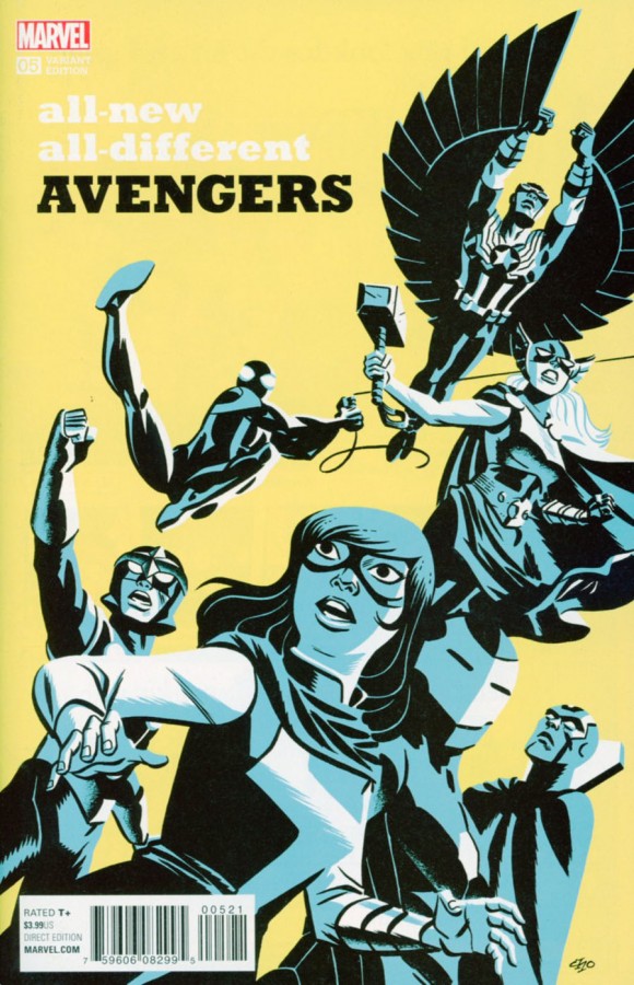
All-New All-Different Avengers #5. The composition is built on a diagonal tilt to add more motion — a simple trick I use all the time (you can see it in many of these covers). The thumbnail for this came together really easily, but for some reason, I had a hell of a time pencilling it. I ended up pencilling all the figures separately and then compositing and tweaking them all digitally before painting it on board.
—
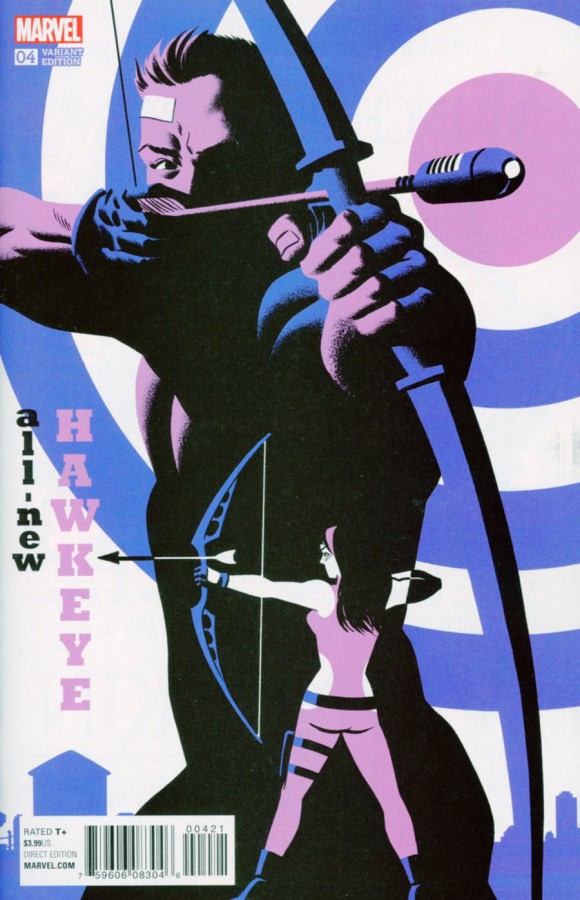
All-New Hawkeye #4. I went for a slight “James Bond” feel here in the design. I tried to position the type so that Kate’s arrowhead has a natural shape echo in the “K” in Hawkeye. I also added the water tower in the background to create another arrow shape that points to the type. Marvel added the “all-new” type after I handed in the final art. I might have put that somewhere else, probably on a horizontal to avoid the problem with the “-” looking weird vertically. These things happen.
—
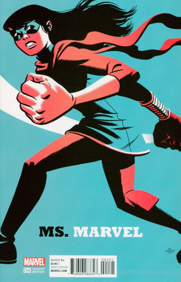
Ms. Marvel #4. This one was easy. I had a brainflash of the pose and didn’t really do much revising after that. I added the white swoosh of the arm swing at the last minute to break up the blue and help define the back of her blue tunic’s outline a bit. I don’t use many contour lines to define forms, preferring to indicate them through colour, shadow or little visual cues like the white swoop — it helps the viewer’s eye “contribute” to the illustration. Fun and stress-free from start to finish.
—
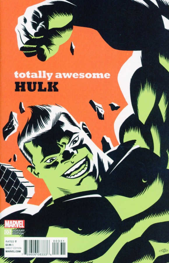
Totally Awesome Hulk #3. I wasn’t very familiar with the new Hulk since the book hadn’t launched yet when I drew this cover. Marvel editorial told me that he’s Asian and that he really enjoys being the Hulk. Hence, I drew him having a great time doing the Hulk Smash!