
TREK TUESDAYS: Artist Tony Shasteen’s back with his next cover for IDW’s LEGACY OF SPOCK arc …

—
Cyberspace, the Final Frontier. These are the Trek Tuesday voyages of the website 13th Dimension. Its ongoing mission: to explore strange new stories about Star Trek, to seek out new angles and new ideas every week, to boldly go where plenty of people have gone before, but in a funky, fresh, interesting way…
—
Tony Shasteen is back for our third Trek Tuesdays segment. The IDW Star Trek artist is walking us through the creation of his superb covers for Legacy of Spock, the new arc by Mike Johnson that kicked off with this month’s Star Trek #55. (You can read all about that here.) The four-part story is about new-timeline Spock’s search for a Vulcan colony as he reflects on his life and career. (Plus, check out Tony’s groovy, Spock-Kirk-Bones cover for Star Trek #56, here!)
Star Trek #57 is due in May, and Tony’s here with a step-by-step guide to how he created this brilliant Next Generation-inspired cover:
By TONY SHASTEEN
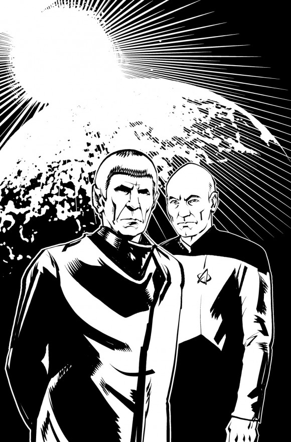
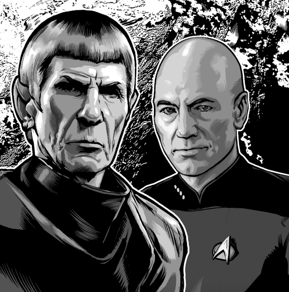
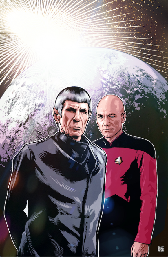
The concept for this cover was pretty straightforward. We needed to see Spock and Picard with Romulus in the background. The design mirrored the previous cover by having the characters as the focus in the foreground and a circular design element in the background. The similarities are subtle, but they’re there.
The sketch was approved. Since there wasn’t much back and forth with the concept of this cover, I could end here, but that would make for a boring article. So, lets talk about my process a little:
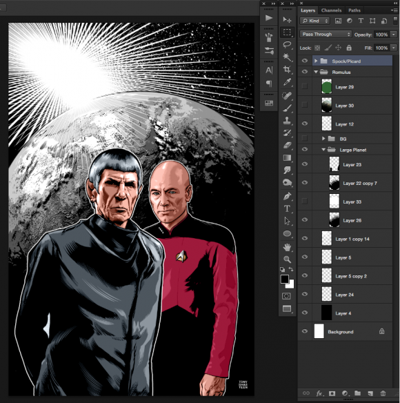
I moved on to inks. The inking process is fairly common, so I won’t bore you with the details. Basically I convert the sketch to a blue line and digitally ink on top of it. With most of my covers I’ll then convert the tight digital pencils to blue line, print it out to Bristol board and ink it traditionally.
Now comes the coloring stage. From what I know of other colorists, I don’t work in a traditional manner. This method works best for me, but it’s going to drive some colorists crazy. Here we go.
I isolate the different elements of the page by lassoing or cutting paths. I’m pretty quick cutting paths because of my years as a graphic designer, so that’s usually my go-to tool. I can also tweak the path and selection easier that way. I render in grayscale first by blocking in large sections with the pencil tool. I keep the amount of gray minimal. Usually four or five shades of gray. I could do more and render more tightly, but I’m on a schedule and I don’t need to go down the detail rabbit hole.
Then I go back with my finer brush tool for the feathering and blend the blocked areas together. This is the same brush I use for digital inking, so it gives the piece a consistent look. Nothing bugs me more than to see a coloring style that doesn’t work with the inks. For example, soft airbrushed coloring generally doesn’t work with hard-edged inks.
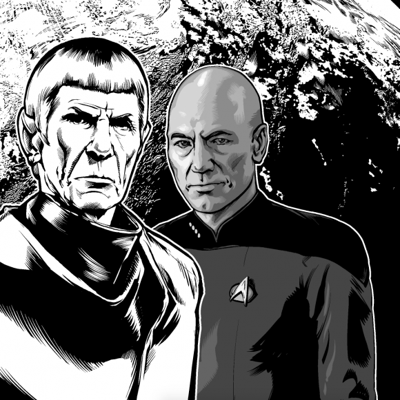
Once all the rendering is done for each of the elements of the page, I’ll go back and color the line holds in gray. This keeps the line art from looking too harsh and dark in areas where it needs to be more subtle and soft. Some of the common areas will be around the nose, cheeks and wrinkles. I color them in gray for a good reason. If changes are made later down the road to something like a skin tone, the color of the holds will adjust along with the rendering of skin. I’m getting ahead of myself.
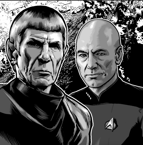
Next come the basic color choices. I flat in very local colors. By local I mean apples are red, sky is blue, etc. This is my base that tints the underlying gray tones I just finished.
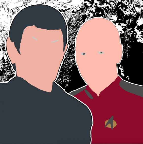
I then change that layer mode to color, and everything below it is tinted with those flat colors. The rendering and line holds adjust as I adjust my flats layer. Once I do that for the entire page it’s easier to tweak the colors without touching the rendered areas.
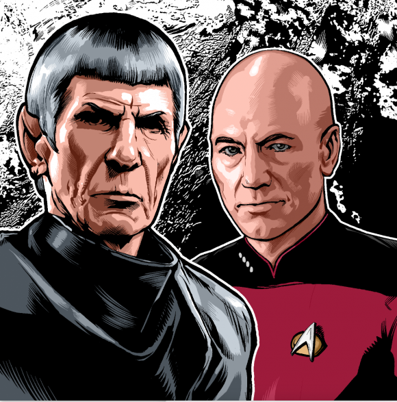
Then I turn my attention to the background planet, working in the same way I rendered the foreground characters.
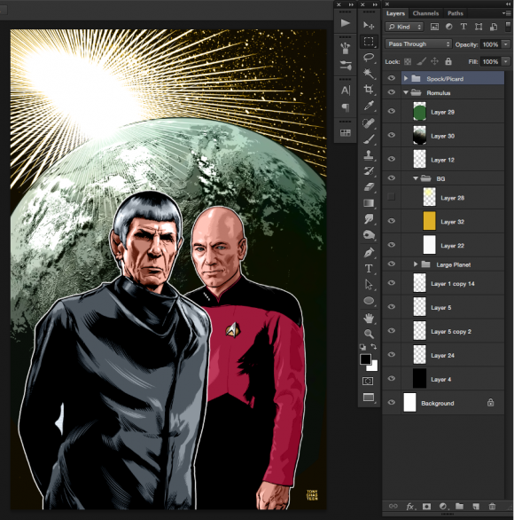
Once I have the rendering done, and basic flats in place, I’ll start to lay in color tints over the page to give it a more unified look. For this piece I dropped in a purple tint at different opacities on the foreground characters and the background. For you process junkies, it was a 60 percent tint on the foreground and a 13 percent tint on the background with a color dodge layer mode. Too much of a tint on the characters would have given them an odd-looking skin tone.
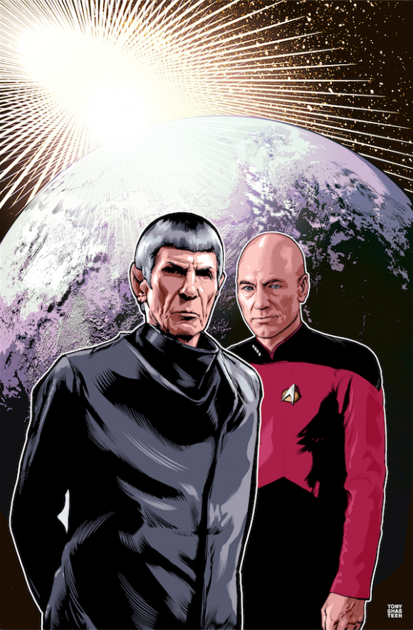
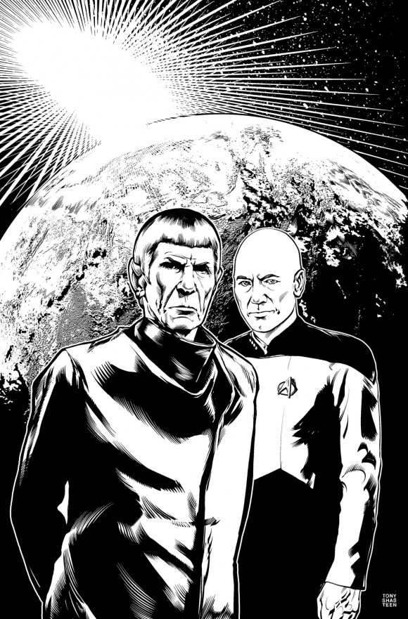
The last step is laying in textures on top. I have a library of textures I’ve created over the years. I’ve made everything from different levels and consistencies of grit, to abstract color patterns. For this piece I used some lens distortions and lighting effects emanating from the rising sun over the planet. This step is the rug that really ties the room together.
—
NEXT: A legacy complete …
Trackbacks/Pingbacks