
NO SPOILERS!
Everything DC Comics has been pushing toward since the launch of DC Rebirth about 18 months ago is here: Doomsday Clock, the courageous — or perhaps foolhardy — Watchmen sequel that combines that world with the prime DC Universe debuts 11/22 (or, in some places, three minutes to midnight on Tuesday night PT).
I’ve read the first issue and here are my 13 QUICK THOUGHTS — without spoilers:
—
UPDATED 11/22/17: For the FULL REVIEW with SPOILERS, click here. For the NON-SPOILER review, read on.
—
1. Doomsday Clock #1 is very good — engrossing and compelling. There’s an equal balance of set-up and payoff so that by the end, you’re eager for the next chapter. That’s what first issues should so and this one delivers.
2. Now, I’ll get this out of the way immediately: I’m not terribly inclined to relitigate the whole Don’t Touch Watchmen thing. I laid out my 13 REASONS I’m cool with it over here. Feel free to check it out because you’ll probably have something to say about it.
3. Nevertheless, because it’s salient in this context, I do wish to point out yet again that some of Alan Moore’s best, most highly regarded work was built upon others’ creations — most notably The League of Extraordinary Gentlemen, Lost Girls and Watchmen itself. He gave up the high ground on this argument long ago.
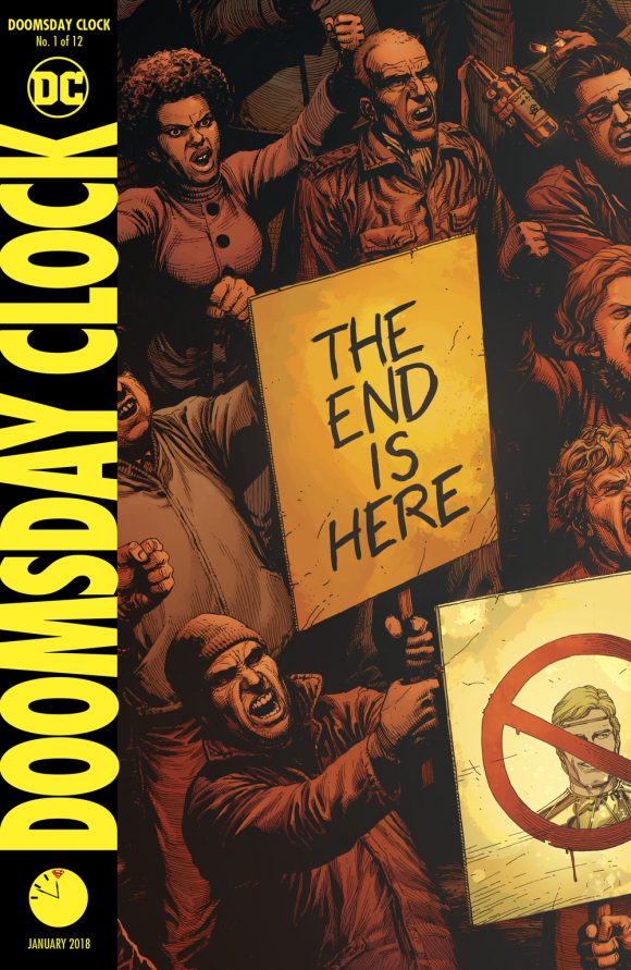
Main Frank cover
4. That said, if you hate the hate the idea of Doomsday Clock — or hate its execution — it doesn’t change Watchmen a lick. The original will forever stand on its own as a brilliant piece of comics literature. After all, 2010 didn’t tarnish 2001: A Space Odyssey, did it?
5. Not that I’m comparing Doomsday Clock to 2010, per se. (2010 is underrated, by the way. It’s solid sci-fi, just not a majestic masterpiece.) The first issue is first-rate comic-book storytelling. Geoff Johns is one of the medium’s best writers. He knows how to pace a story and give it emotional currency. He also respects and understands comics history, making him an ideal choice for this project.
6. Not that everything in the first issue works. It’s already been made clear that Rorschach plays a role in the series so I’m not giving anything away here. (How he does is deceptively simple.) But his overboiled dialogue in Johns’ hands reads like a parody. Though maybe that’s intentional…
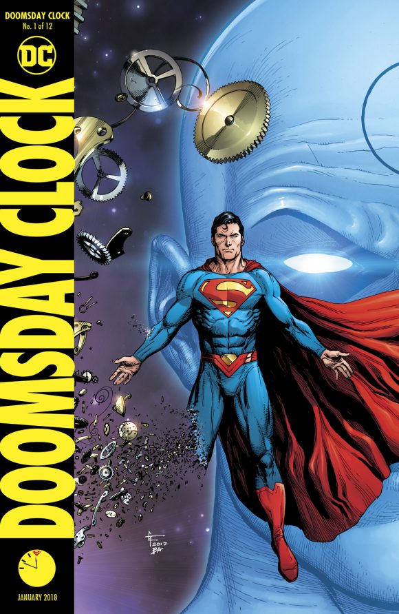
Frank variant cover
7. Once you start reading, it’s startling that this is a bona fide sequel to Watchmen. Not a prequel or a film adaptation or motion comic or TV series or role-playing game. A full-on, Here’s What Happens Next story that addresses what came before and introduces new characters and ideas. That gives everything a Wow quality I didn’t expect.
8. Because really, this project took guts. For DC as a whole, sure, but for Johns and Frank in particular. Unlike some of the creative teams involved in Before Watchmen that bobbed and weaved, Johns and Franks are taking this head on — and risking everlasting ridicule if this project collapses into a critical assault.
9. If you’re wondering, yes, they even go with the 9-panel grid — though at one point they break with the format in a way that appears not only intentional but symbolic. (UPDATED: Upon re-reading, I realized I’d made a mistake. The 9-panel grid is present but they break the format a few times. For more on this, click here. But beware of SPOILERS.)
10. And yes, there’s even the additional matter — press clippings and the like. I suppose if you’re going to do this, you need to do it all. I would have been fine either way, but it’s another way Johns, Frank and DC are acknowledging they’re going to be judged. If you’re going to do a sequel, you might as well put all the cards on the table, right?
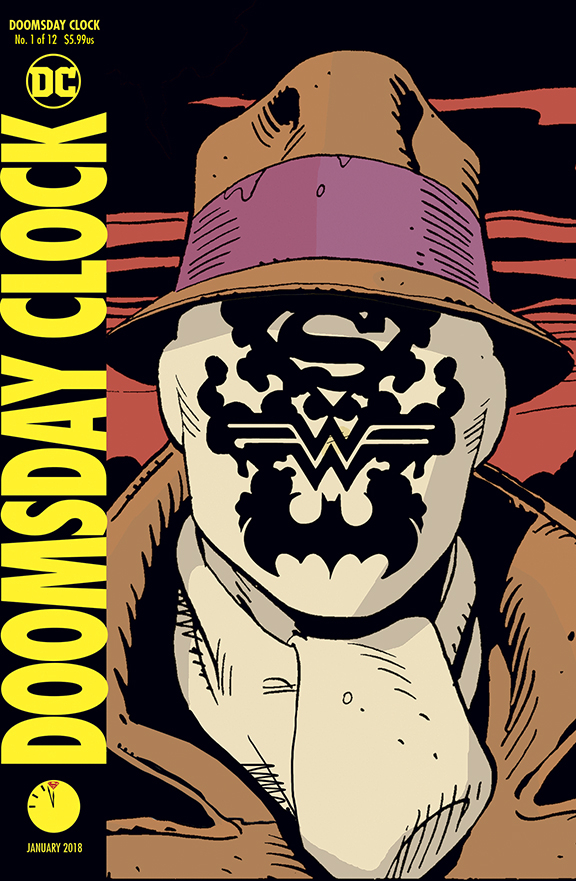
Lenticular variant cover based on existing Dave Gibbons art
11. But, please, no Black Freighter, huh? That shit was a drag.
12. Frank’s art is top notch. He and Johns have a well-established collaboration –their Superman work is some of the best ever — but he also is a smart choice to follow Dave Gibbons. Their styles are certainly different but there are strong enough echoes to make reading Doomsday Clock a more seamless exercise. A different artist might take you out of the story and that doesn’t happen here. Brad Anderson’s color palette adds the appropriate texture.
13. I really would like to get into the nitty-gritty of the story itself. But you’ll have to wait until Wednesday!
—
MORE: For the FULL REVIEW with SPOILERS, click here.
—
Trackbacks/Pingbacks