
Merch maven Chris Franklin plays show and tell with some of Neal Adams’ coolest illustrations…
By CHRIS FRANKLIN
Neal Adams changed comics. You can look at the medium of comics as Pre- and Post-Neal Adams. He revolutionized visual storytelling with a realistic approach that had never before been applied to the most popular genres of the form. His heroes were muscular and lean; his villains, visually threatening, and often unhinged. There was an edge that Adams brought over with him from his days in commercial illustration that had never been found in books by Marvel or DC before. But overall, there was humanity. These characters, still larger than life, looked as if they lived and breathed in the real world.
In the mid-to-late-’70s, Adams’ comic output decreased significantly. But fans could find his renditions of their favorite heroes and villains elsewhere. In the toy aisles, in the record department, even in home goods. Adams had returned to commercial illustration, and he and his Continuity Associates studiomates partnered with many different companies to provide exciting packaging artwork for nearly any product that featured a superhero. This made those products feel somewhat more “now” and contemporary. While fans loved Curt Swan and Carmine Infantino’s images of Superman and Batman from the ’60s, the Adams art made the products inside seem more relevant and desirable.
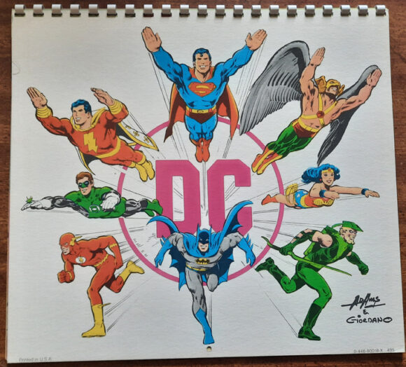
Here are but a handful of some of the great products Adams and his colleagues (including frequent inker Dick Giordano) made leap off the shelves at kids and fans alike, hungry for more from one of comics’ greatest artists:
—
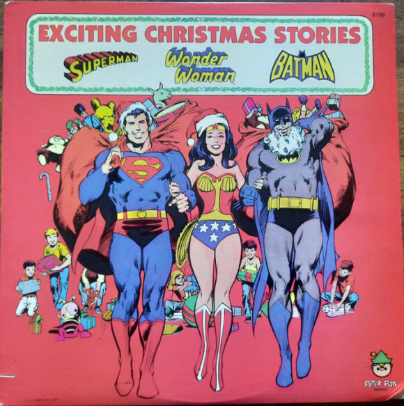
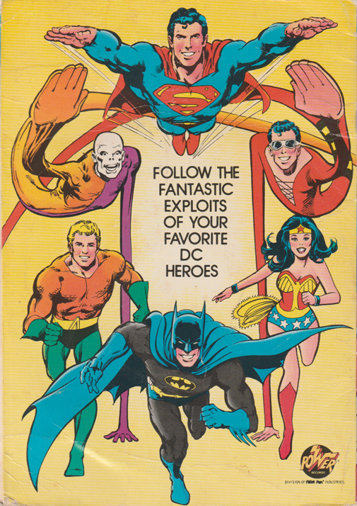
Exciting Christmas Stories: Superman/Wonder Woman/Batman (Peter Pan/Power Records). Adams and Continuity Studios provided a lot of artwork for Peter Pan and their Power Records division, even beyond superheroes. This album itself is fun, if tonally a bit of a mixed bag, but that cover is pure bliss — recalling a happier time, when the DC Trinity could just show up arm-in-arm, decked out in Santa gear and drop gifts off to some very happy kids. Adams’ mastery of body language and anatomy sells this just as well as a dramatic action scene, and it’s honestly just as exciting. There’s a variation of this album with a green background, but I prefer the red. I even have a sweatshirt with this image on it that I wear every Christmas!
—
Batman’s Flying Batcopter (Mego Comic Action Heroes). Adams and his colleagues created almost all of the packaging for the pioneering 3.75-inch Comic Action Heroes line from Mego. One of the nicest pieces is the box for Batman’s Flying Batcopter. Adams depicts the Caped Crusader at the controls of what comic fans know as a Whirly-Bat, a one man chopper. He soars above Gotham, just as the toy could actually do when launched with a ripcord. The magenta sky ties into the main color Mego used on Batman’s packaging, but honestly, this art would look perfectly at home in Batman or Detective Comics.
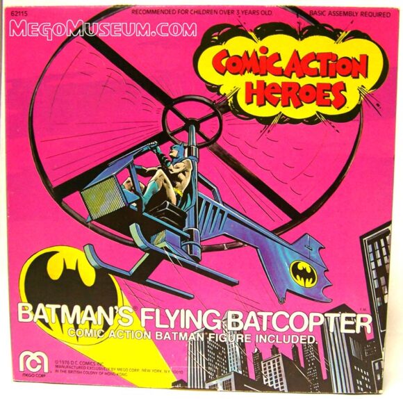
Courtesy of megomuseum.com
—
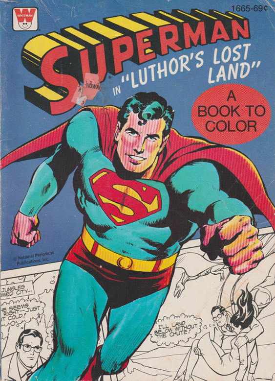
Superman: “Luthor’s Lost Land” Coloring Book (Whitman). Perhaps the most iconic image Adams produced for Superman merchandising adorns this cover. Although Mego may have used it initially in advertisements, it showed up on just about every kind of product you can think of, from toy watches to kids’ robes. It’s odd that Adams depicted Superman running instead of flying, but it works. The foreshortened fist out displays power, but the face is completely benign. Is it just me, or does it look a bit like Adams himself?
—
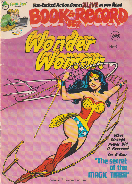
Wonder Woman: “The Secret of the Magic Tiara” (Peter Pan/Power Records Book and Record Set). Does a Wonder Woman image get more iconic than this? The Amazing Amazon descends from her Invisible Plane on a rope ladder, and deflects bullets with her bracelets. And she looks gorgeous and strong doing it. Says it all, doesn’t it? This same image was used for a plastic tumbler, although someone drew Steve Trevor inside the Invisible Plane for that version.
—
The Mangler (Mego Comic Action Heroes). The Mangler is one odd toy: a Zamboni-like machine that resembles a crocodile, which the superheroes use to basically murder their foes. The box art by Adams tells the tale: Spider-Man confronts the Green Goblin, punches him into the waiting maw of the Mangler, and ol’ Norman Osborn comes out flat as a fritter. The toy does this by ejecting a pre-printed image of the Green Goblin, but I prefer Adams’ depiction, which shows Spider-Man getting a more humiliating revenge for the death of his beloved Gwen Stacy. This is also one of the few occasions where Adams got to draw the web-head.
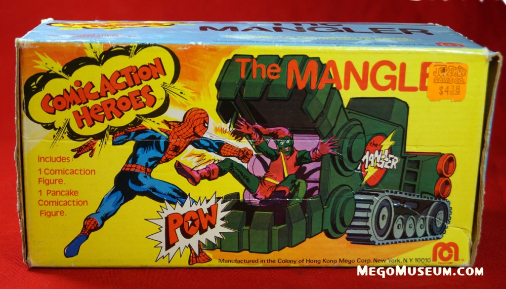
Courtesy of megomuseum.com
—
Batman: Robin Meets Man-Bat (Power Records Book and Record Set). Perhaps the seminal Batman Power Record release (although some may argue that’s “Stacked Cards”/”Trumping the Joker”), the story retells Batman’s initial meetings with Kirk Langstrom’s nocturnal alter ego, and introduces him to the Teen Wonder. Some of the interior art is lifted from Adams and Giordano’s initial Man-Bat stories in Detective Comics, but the cover is all new, and shows Adams’ mastery over depicting emotions. Batman is worried, Man-Bat is feral, and Robin is just wondering what he’s gotten himself into.

The back cover of this book is no slouch either, lifting Superman and Batman from Adams and Giordano’s cover to the 1976 Super DC Calendar, and adding new images of Wonder Woman, Aquaman, Plastic Man and Metamorpho. Who wouldn’t want this as a poster?
—
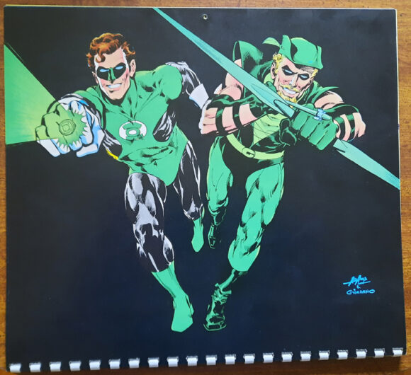
Hall of Justice (Mego World’s Greatest Super-Heroes). Perhaps Adams’ tour de force for Mego, the Hall of Justice playset for the 8-inch World’s Greatest Super-Heroes line features artwork worthy of a giant DC crossover, decades before they even existed. Front and center on the playset itself are three of the five main TV Super Friends, where of course this headquarters originated (although the design is quite different).
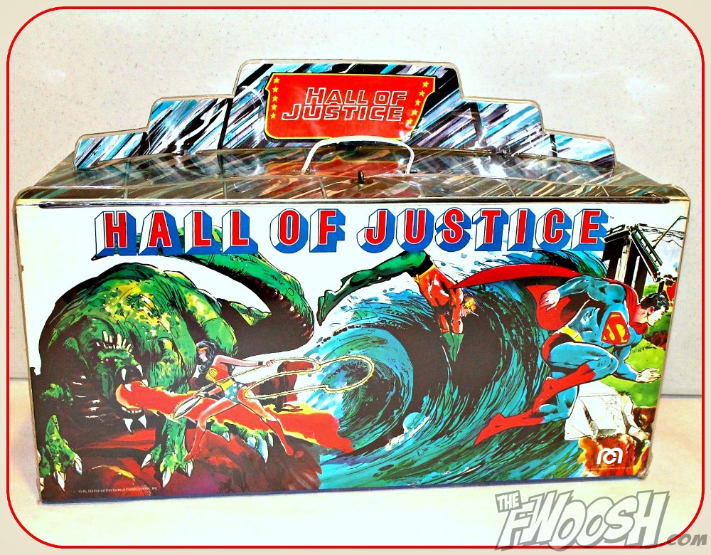
Image courtesy of thefwoosh.com
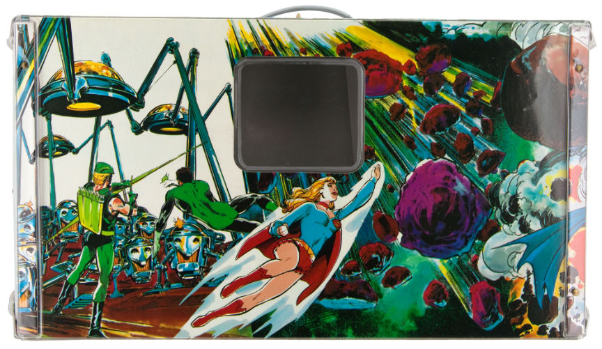
The back though, oh the back. We see Supergirl in action, but alongside Green Arrow, is another character Adams was noted for, his Hard Traveling buddy Green Lantern. The burn is Mego NEVER made a Green Lantern figure in any form in their original heyday. Maybe Adams was pulling for Hal, or maybe he just assumed Mego had made a figure of him. But either way, no playset EVER looked better from the outside, that’s for sure!
—
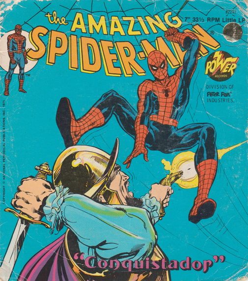
The Amazing Spider-Man: Conquistador (Power Records). This is a beautiful image for a rather silly Power Records audio adventure. Adams never got a chance to work on Spider-Man in the comics, and it’s shame. The blacks he spots on Spidey’s uniform harkens back to Steve Ditko’s initial treatment. The Conquistador in question looks menacing, and period authentic, as if he stepped out of history. What kid could pass this up in the record section of their local department store?
—
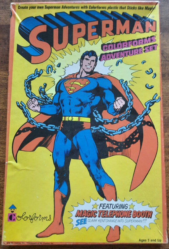
Superman Colorforms Adventure Set. Adams was surprisingly never happy with his iconic cover of Superman #233, where the Man of Steel entered the Bronze Age bursting a set of Kryptonite chains. So Adams often recreated the image, and every version was used for licensing. This image here was also seen on a Power Records album, but I like the coloring and presentation here. The chains are of the normal variety so Superman isn’t even breaking a sweat, but he sure looks happy in his work, doesn’t he? This wonderful set features a really fun gimmick, a “Magic Telephone Booth” so you can change Clark Kent to Superman. But the real magic is right there on the front of the box.
—
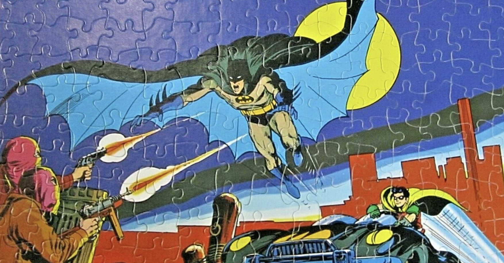
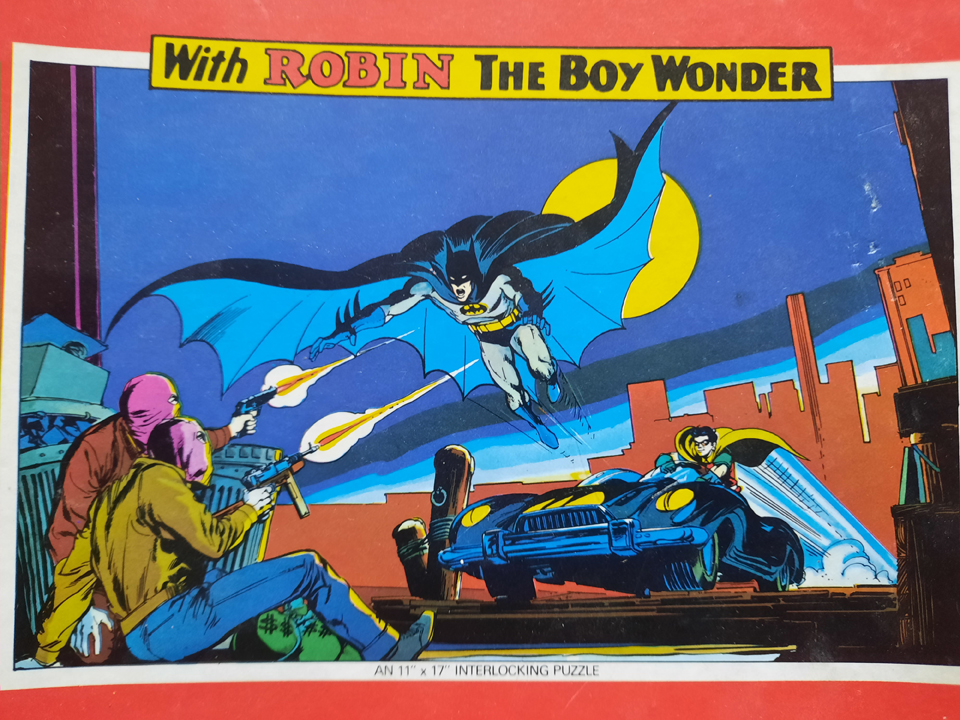
Batman Jigsaw Puzzle (APC). OK, so the box design is a bit sparse, with lots of dead space. But we do get one of Adams’ great ’70s Batman logos at least.
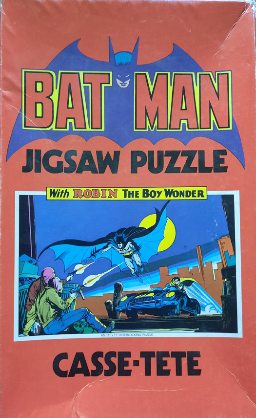
But the real treat is the art on the puzzle itself. Robin stands up while driving a speeding Batmobile toward a duo of hooded criminals, while Batman leaps from the passenger seat, directly at their hail of bullets! It’s pulpy, it’s dark and moody, and it almost looks like Batman is a goner, until you notice Adams thought things out, and the hoods’ gunfire is JUST going to miss him on either side. This 1973 puzzle is an early example of Adams shifting the public persona of Batman from the fun and safe atmosphere of the ’60s TV show era, into something far more dangerous and gritty. But not TOO gritty.
—
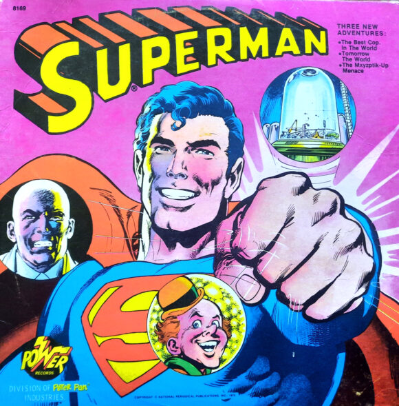
Superman Album, Serial No. 8169 (Power Records). A variation on that classic running/punching pose Adams drew earlier, this album cover has the Man of Steel happily punching listeners right in the face — but we don’t mind! It’s so dynamic and powerful, who cares if our head is now probably missing from our shoulders? The vignettes of Luthor and Mr. Mxyzptlk are equally gorgeous. Lex looks to be seething with anger and contempt, and Mxy is dementedly delighted with his latest prank. Pitch perfect for both. The image was so great, Power Records just repeated it on the back, san logos and vignettes!
—
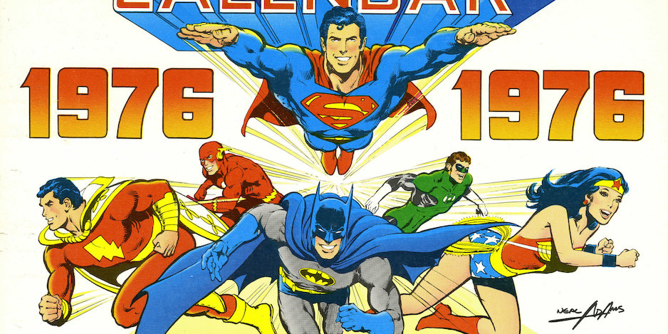
1976 Super DC Calendar (Warner Books). Is this the ultimate piece of Adams/DC merchandise? Well considering you get 12 new Adams-drawn images of DC’s biggest stars, then yes, yes it is. Adams goes solo on the cover, and he draws the back and 10 of the 12 months (Giordano handles Wonder Woman, and a group of DC’s other leading ladies solo). Each could stand the test of time as THE image for that character (or group of characters), even to this day.
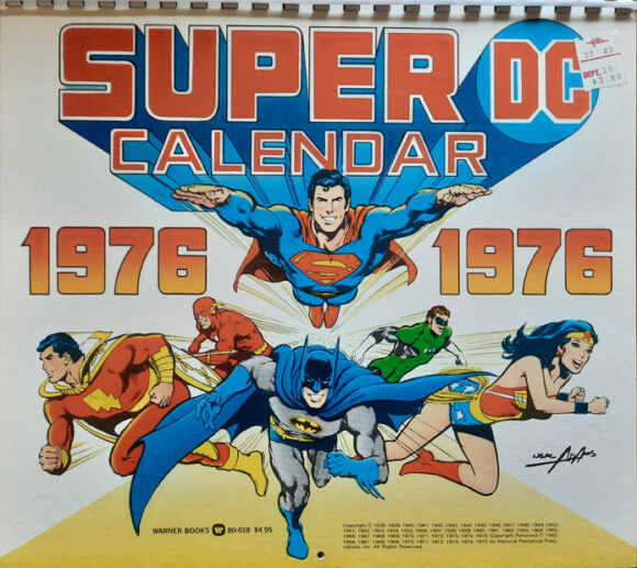
Just look at Green Lantern and Green Arrow. It was later used for one of the Hard-Traveling Heroes collections.
As dynamic as the front cover image is, the back has had a more lasting impact. That simple shot of the heroes flying and running forth was reinterpreted for both the front and back covers of Limited Collector’s Edition C-46, with both the JLA and JSA teams. And, most surprisingly, in the opening credits of the Challenge of the Super Friends animated series!
—
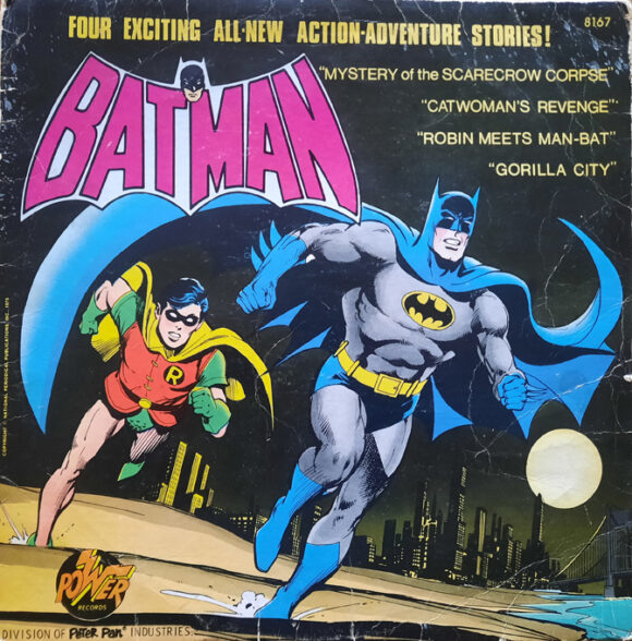
Batman Album, Serial No. 8167 (Power Records). I remember buying this album from a local grocery store, and listening to the audio adventures (including the aforementioned “Robin Meets Man-Bat”) over and over, for years, even after it started skipping. But equally mesmerizing was the front of the sleeve. I now know the image was a variation of Adams and Giordano’s instantly iconic image of Batman chasing the Joker across the shoreline of Gotham in Batman #251, “The Joker’s Five-Way Revenge.” But back then, I just never saw Batman and Robin look so… cool! Or powerful, and mysterious. And SERIOUS. This is one determined Dynamic Duo! The white and magenta Bat-logo (also designed by Adams) just adds to the nearly flawless design.
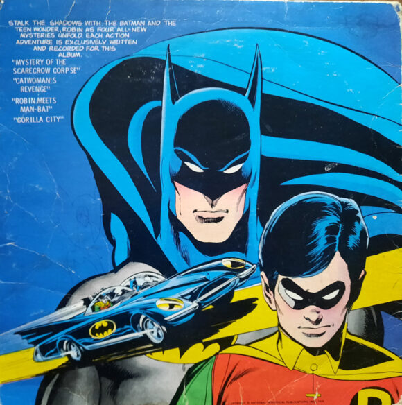
Did I say our heroes looked serious? Well, flip the back over and stare into the blank white eyes of the Dynamic Duo in extreme close-up! Adams’ Batman and Robin have never looked so grim. Even Robin has no time for puns today. Batman’s swirling cape, and that sweet image of another Adams-designed Batmobile blazing across the sleeve just adds to the moody atmosphere. For me, these are THE seminal images of Batman and Robin of my early youth. If you look at Batman’s right shoulder, you’ll see my own youthful attempt at drawing the Caped Crusader. Adams was one of the primary artists who inspired me to become an artist and a graphic designer, which is how I make my living today. To say his work was seminal to me would be a vast understatement.
—
MORE by CHRIS FRANKLIN
— EARTH-TWO ROBIN: Crisis of the Megos That Need to Be Made. Click here.
— The TOP 13 BATCAVE PLAYSETS Ever – RANKED. Click here.
—
Chris Franklin is a graphic designer, illustrator, and podcaster, who co-hosts several shows on the Fire and Water Podcast Network, including JLUCast, which he produces with his wife Cindy, and The Power Records Podcast with Rob Kelly. He also contributed essays to Jim Beard’s Subterranean Blue Grotto Essays to Batman ’66 – Seasons One, Two and Three.
May 4, 2022
So much fun stuff. I am sure I still have that calendar in one of my boxes.
May 4, 2022
Utterly delighted to see that Batman record on there (with both sides of the cover, no less). Didn’t know who Neal Adams was when I was a little shaver, but I listened to that record A LOT, and stared at those illustration a lot as well. All the stories were pretty suspenseful and at times scary, especially the Man-Bat story. And let’s not forget the groovy opening version of the Batman theme, with some crazy intense female vocals thrown in the middle. Thanks for the memories.
May 5, 2022
Can’t you tell Giordano from Adams? That WW is Giordano
May 6, 2022
Yeah, I think I’m pretty good at it. If you can point me to a source that states that Wonder Woman is just Giordano, I’ll be happy to admit I was wrong. Giordano “absorbed” a lot of Adams work after inking him for a while, so it can be hard to distinguish at times. To me, the face on the Peter Pan Book and Records looks more Adams than Giordano.
August 8, 2022
Hi Chris. I’ve been helping to put an archive of Neal Adams’ material together for the past two years at the Official Neal Adams Appreciation page on Facebook. It’s a collaborative effort by fans of Neal’s work from all over the Planet and is a true labour of love. Before he passed Neal would confirm details with us and reminisce on days gone by. He had so many great stories in him. His family have been incredible, and continue to be so, with weekly live shows on FB and Instagram. In the matter discussed above, the Wonder Woman Power Records Book/Record cover is pencilled by Neal and Inked by Dick Giordano. The Interiors are pencilled by Rich Buckler and inked by Adams & Giordano.
August 11, 2022
Thank you for the confirmation Paul!