
Sometimes a cover is more than what it seems.
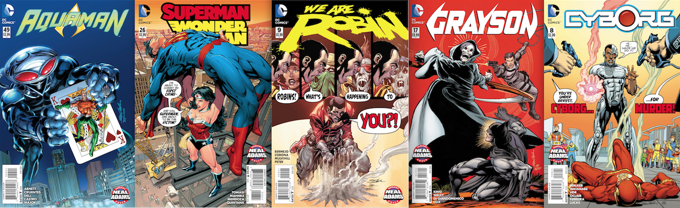
Week 4 books, on sale 2/24
It’s NEAL ADAMS MONTH here at 13th Dimension, and we’re featuring daily commentary by Adams on his variant-cover project for DC Comics. Each of his 27 variants is a twist on one of his famous covers from the past. He provided the pencils, and the inks and colors were handled by some of the biggest names in the business like P. Craig Russell and Tom Palmer.
For the full NEAL ADAMS MONTH INDEX of stories — click here.
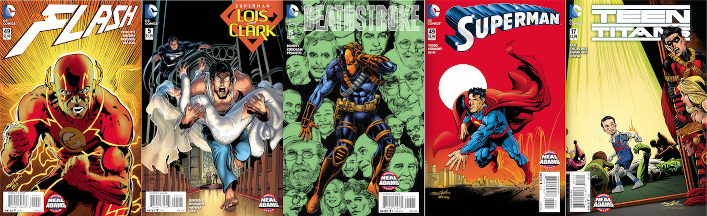
Week 4 books, out 2/24
Our previous installment featured We Are Robin #9, which was based on Detective Comics #408. (Click here.)
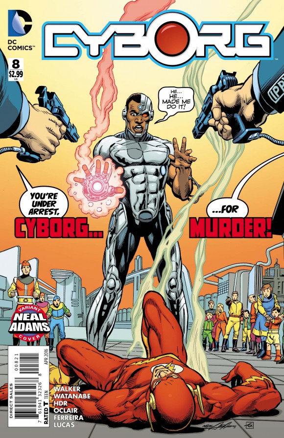
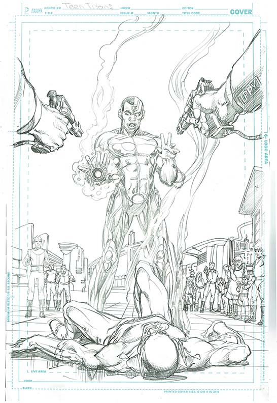
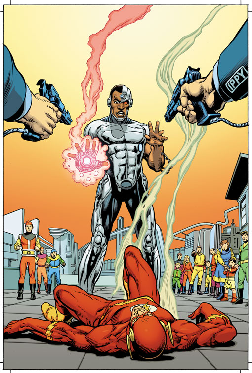
In this segment, it’s Cyborg #8 — out now — which is based on The Flash #246, cover-dated Jan. 1977.
—
BONUS: Gibbons picks his fave Adams covers: Click here.
—
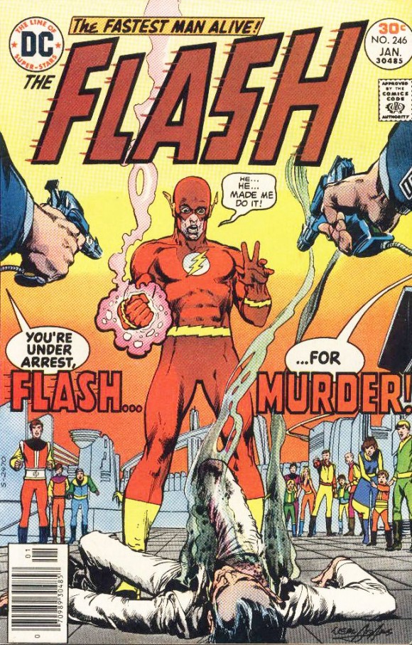
This one’s interesting for a few reasons:
1. It wasn’t until I sat down with Adams and went through these covers with him that it occurred to me how little he did on the Flash compared to other DC heroes.
2. The Cyborg version of the cover was inked by none other than Dave Gibbons, another legend who’s one of our big favorites here at 13th Dimension. (It was colored by Dave McCaig.)
3. The Flash #246 isn’t really that interesting. Until you look closer …
—
Neal Adams: Why was that cover fun for me to do when I first did it? Because Flash is not moving at all. He’s just standing there. When I did it, I was asked, of course, to do a Flash cover. I had done very few Flash covers. I don’t think any!
Dan: There are some in there, I think, but not very many. I don’t equate you with the Flash at all.
Neal: No. And so, I was asked to do a Flash cover and I thought, “Wait a second. You know, a Flash cover’s running. You have him running. Why don’t I just have him stand there?”
And nobody questioned it! The only thing that’s moving is his hand, which is vibrating. To me, that is the joke of the cover. The joke of the cover is he’s doing nothing. He’s just standing there.
It’s also a very calm cover. Everything’s organized, everything’s calm, everything’s, you know, like blocks. But still there’s the tension of the cover that continues to exist, that turned it into a significant cover that people love. And a part of that is that everything is meticulously done. Everything is carefully done. So the face is carefully done. The body has very few lines but every line is important. Everything about this is very carefully done. So that is the thing, except maybe the background figures, which look like crap.
Look at it this way (moves cover around). It’s the same composition. I can do it upside down or right side up. It’s the same composition. Everything’s the same. So it lives for its stillness rather than its movement.
It didn’t translate (thematically) into this cover (Cyborg) except that it’s a very good display of a character. So you get to look at the character and you get to look at the characters on the ground and, oh guess what, the character on the ground is the Flash.
So, for the sake of the composition, remember, to me, some of these have historic significance, some of these have art significance, compositional significance, organization significance. All these covers have a different significance.
(Adams then wondered aloud why some of the guest inkers might have asked to work on certain covers — what would make specific covers significant to them.)
Why would a cover that is so bland appeal to anyone? Who’s the inker on this one?
Dan: The inker on this is Dave Gibbons.
Neal: Dave Gibbons. Well, maybe that’s the reason. Because Dave is very organized in what he does. Maybe that appealed to him. Everything about this is neat and organized and just makes a lot of sense. Other artists might find this to be dull and boring or pedantic, but apparently he found something in there that he liked and that appealed to him and he did it successfully.
You know, when I do a cover like this, compared to doing a cover like this (points to Batman #237) a different switch goes on in my head.
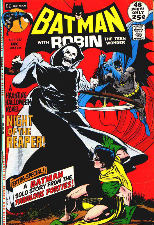
It’s sort of like…I like to do lettering. I like to do display lettering. When you letter, you have to slow your mind down. Everything has to be exact. Your pen has to be right, your ruler has to be just right, and it takes a given amount of time. It’s sort of like moving forward like this (gestures a slow, straight line), whereas when you’re doing a drawing like that Batman cover, you do, you know, sweeping lines and you get excited and get involved. But there’re some things that you do that are just organized and sensible.
For example, let’s just say you have your inking and you have buildings in the background and then you have an action figure. When you’re thinking a certain way, you can do the action figure, but you don’t wanna do those damn buildings. But you’ll then fall into a moment where everything is calm and quiet and then you can do the buildings. You don’t even have to think about the action figure. Your mind is now organized and working a different way. Same thing with lettering.
So there’s a different kind of mindset you need for a thing like this and you see that in Dave Gibbons’ work in general so this is very organized. Organized thinking.
—
NEXT: The final cover of NEAL ADAMS MONTH proper — and the Secret Origin of Man-Bat ... Click here.
PLUS: Gibbons picks his fave Adams covers: Click here.
—
You can also find more on Neal Adams at his website, here.
—