
There’s a reason I’m posting this on a Wednesday …
It’s NEAL ADAMS MONTH here at 13th Dimension, and we’re featuring daily commentary by Adams on his variant-cover project for DC Comics. Each of his 27 variants is a twist on one of his famous covers from the past. He provided the pencils, and the inks and colors were handled by some of the biggest names in the business like Kevin Nowlan and Dave Gibbons.
For the full NEAL ADAMS MONTH INDEX of stories — click here.
Week 4 books, on sale 2/24
Our previous installment featured Teen Titans #17, which was based on House of Mystery #191. (Click here.)
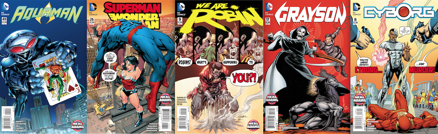
In this segment, it’s Aquaman #49 — out now — which is based on 1973’s Batman #251. It’s inked by artist par excellence Brian Bolland and colored by Alex Sinclair.
Week 4 books, out 2/24
—
I said last week that Limited Collector’s Edition C-51 might be the greatest comic-book cover ever (Click here). Yeah, that’s a purely subjective judgment but art is about passion — and that cover conveys such powerful imagery and elicits such a strong response in me that it’s definitely a part of the equation.
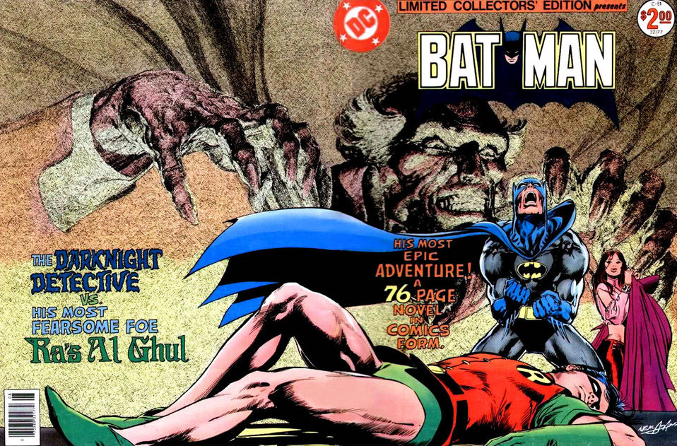
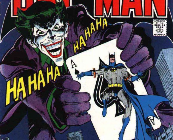
But best and favorite are not necessarily the same thing, because as much as I love and admire that cover, I dig Batman #251 even more. At least I think I do. Ask me again in an hour.
Batman #251 was one of my first “current” comics, one of the first I owned at the time it came out. Coincidentally, or ironically — I’m not quite sure which — I read and re-read that comic so many times that eventually the cover disappeared completely, replaced by the blue-ink Ha-Ha-Ha’s I scrawled around the margins of the opening splash page.
I’ve replaced that copy a few times since then and a framed, oversize version graces a spot on the wall over my comic-book collection, next to a framed, Adams-signed print of C-51. I’m also wearing a T-shirt with that cover on it as I write this, it’s the banner on 13th Dimension’s Facebook page and it’s the wallpaper of my computer right now.
A perfect storm of Adams Jokerdom.
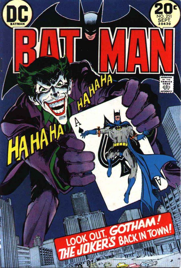
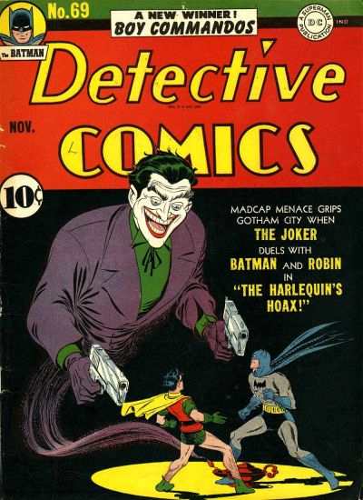
The cover itself is exaggerated and absurdist in the best way a comic-book cover can be. The Joker isn’t really thousands of feet taller than a New York (or Gotham) skyscraper. He’s not capable of holding a gigantic playing card that Batman can be trapped upon. And nothing even close to this concept appears anywhere inside the issue. Actually, one of the most famous images from inside the issue became the cover of a different publication — Limited Collector’s Edition C-25 (which was turned in an homage cover too: Click here).
But the cover to Batman #251 works in that magical way all great comic-book covers work — and just happens to echo earlier concepts by Golden Age stalwarts like Jerry Robinson and Lew Sayre Schwartz.
Jerry Robinson
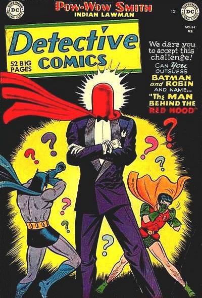
Lew Sayre Schwartz/George Roussos
Now, NEAL ADAMS MONTH has been dedicated to most of the artist’s most famous covers, but I’d be remiss if I didn’t point out that this is issue as a whole — written by my all-time favorite comics scribe Denny O’Neil — is not only a timeless classic that holds up to this very minute, but it just may be the best single-issue Batman story ever.
Oh, and one more thing:
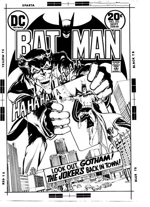
That’s Park Avenue in Manhattan standing in for Gotham City in case you’re unawares. The two buildings directly below the Joker are what’s now the MetLife Building (the taller one) and the Helmsley Building (the shorter one right in front of it, which sits across 46th Street).
Every Wednesday, I cross 47th and Park on my way to Midtown Comics to pick up my weekly haul. I glance up and to the right and, in my mind, the Joker’s there, towering over the area.
I smile and continue to walk through my favorite comic-book cover of all time.
—
Neal Adams: Let me tell you about this cover. We re-introduced the Joker, perhaps a little bit more deadly than he should be, I don’t know. But we did it, and it was a really good reintroduction, and I am reminded of that all of the time. People remind me by telling me of certain pictures that they see in that story—the scene of the Joker (and the shark through the glass), all these things. All these pseudo-iconic things.
So how do we get a cover that’s good enough to belong on this comic book? The idea for this cover comes from the problem, and the problem is, how do you have two characters face you if they’re facing each other? Can’t do it.
By having one character on a card being shoved into your face (laughs) and having the other character behind him, now we’re able to see both characters front on. So it’s a device, right? It doesn’t matter what the device is. It could have been a car or something, that you got to see the characters front on like this. The mind doesn’t make that intellectual jump that this is impossible. It’s sort of like looking at a movie poster and you see all the characters facing you and they’re just photographs. Because if you want them to be in an interesting pose, they have to face each other.
Yet, the tension is here. The conflict is here! And they’re facing you. We’ve solved the problem! That’s the reason that you like this cover so much. It’s not that the Joker’s gigantic. The Joker isn’t really gigantic. It’s not that Batman’s on a playing card. It’s that you’re getting to see both characters, and in a way both as powerful as each other, even though the Joker is bigger and Batman is smaller. It doesn’t matter. You like his figure. You like his anatomy and all the rest of that. Everything else is incidental.
For a New Yorker, that’s Park Avenue. That’s there. And then the other thing is, it’s a clean composition so you never get confused — never get confused — by looking at that cover.
Did I ever think it would become an iconic cover and one of people’s favorite covers? No. No more than the Superman thing. (Click here.) I’m grateful because it’s drawn well. For the most part it’s drawn five times better than the Superman cover so, hey! I got one through. That’s good.
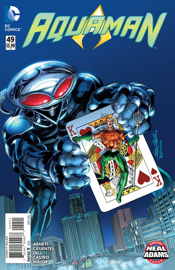
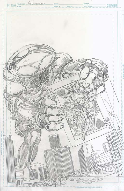
Dan: So, we have the original and then you translated it into Aquaman.
Neal: What’s his name? Manta?
Dan: Black Manta.
Neal: Black Manta. SUCH an awful character.
Dan: (Surprised) Why?
Neal: Because he’s got a flying saucer for a head. I mean the idea of the character appalls me…because he’s got a flying saucer for a head.
Dan: OK…
Neal: Give him anything but a flying saucer for a head and he’s fine, you know? But it’s a flying saucer for a head. So…take that, reverse it, and say, “YES! I LOVE the flying saucer for the head! (Dan laughs) Now we’re gonna make it the big, damn Joker thing!” And it WORKS! It’s SO dumb it works! It’s got all the elements of the other one. People will LOVE this cover I am convinced! And now that we’ve got the best inker in the world for it (Brian Bolland) people will LOVE this cover.
Dan: That might be the winner.
Neal: This will be the winner.
Dan: When I saw it, I laughed.
Neal: Right!
Dan: When I saw the pencils for it, I laughed. I said, “That’s hilarious!”
Neal: But that hooks ’em! That’ll hook ’em!
Dan: Yeah, people were talking about it online when it first came out. People were saying, “Oh! Gotta get the Aquaman one!” Now, I also noticed you changed it to a King as opposed to an Ace.
Neal: Right, Because he’s a Sea King.
Dan: Because he’s the Sea King, yep.
Neal: Absolutely. Even down to the finger shields, whatever it is that he’s got. That’s a winner. That’s gonna be a winner. … Bolland’s inked a couple of covers for me in the past—very special covers. And where you think he’s gonna go off into his style, whatever that is, he inks it like I ink it, only better.
Dan: I like also that you didn’t update the cityscape at all.
Neal: Nothing. Nothing. Straight out.
Dan: It still looks like the same place. These cars…
Neal: These cars. That’s right.
Dan: Park Avenue. It doesn’t say Pan Am (the name for the Met Life Building when the original cover came out) but it’s pretty close. There’s 46th, 47th, 48th. There you go.
Neal: I’m telling you.
—
NEXT: It’s getting dusty around here … Click here.
—
You can also find more on Neal Adams at his website, here.
—
Trackbacks/Pingbacks