
Guest columnist Josh Bayer pays tribute to one of his prime influences — and collaborators.
—
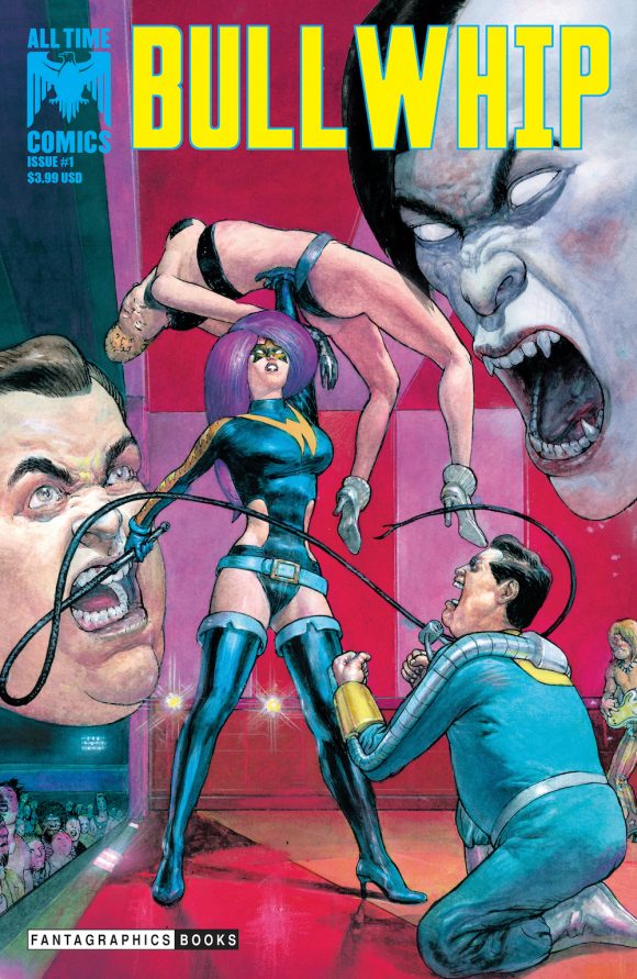
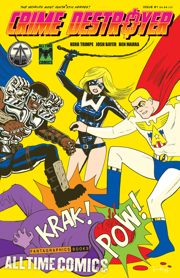
As much as I like curating the 13 COVERS columns we do here, I love turning the reins over to a creator who has a devout passion about a particular subject. In this case, it’s Josh Bayer, prime creative force behind Fantagraphics’ All Time Comics, a new line of titles featuring a shared universe of heroes. The project is a mash-up of Bronze Age concepts and indie sensibilities. The first issue, Crime Destroyer #1, showcased the final public work of the late Herb Trimpe. The next issue, Bullwhip #1, is due in April and includes the work of Al Milgrom, former Marvel stalwart.
Das Pastoras
Milgrom was born March 6, 1950. He’s 67 today. So here’s his collaborator, Josh Bayer, with 13 COVERS: An AL MILGROM Birthday Celebration:
—
By JOSH BAYER
Hi, this is Josh Bayer collecting a list of my favorite 13 Al Milgrom covers to celebrate his birthday — and his work on my new series All Time Comics, a superhero universe from Fantagraphics that just debuted with Crime Destroyer #1.
Jim Rugg
The yardstick I used has multiple heads: One is based on appealing visual elements, inventiveness, aesthetics and charisma. (Now, ALL of these covers have that going for them, but some of them are great on their own merit regardless of interior content, but in the case of some of these selections, I have no idea what the comics insides are.) Two: Some of them are great because either they are historically significant, like the Firestorm cover, while some of them are great and are wrapped around amazing examples of some of the best or most interesting Bronze Age comics I have personally read.
I picked examples where Al inked and penciled or just penciled with another inker, for example Joe Sinnott inked over Al on West Coast Avengers. The inker is somewhat subordinate to the vision of the penciller, and so I picked examples where Al is the true author of the piece.
Al is still working, and it’s been an artist’s dream seeing him transform my pencils for All Time Comics issues. In these cases, I am the author but he is the one pulling out the invisible, best potential of what I’ve put down on the page. Whenever he picks up his pen, he is drawing from a history of making comics that stretches back to the Vietnam war era, as this list illustrates.
Comics artists are rare creatures, rarer all the time. Sure they’re still being made and still being trained, but the feeling and the look of late 20th century comics is hard to come by these days. You can still tap into that wealth of experience in one person by knocking on his door, where he is just as ready to pick up a brush now as he was then and do amazing art, and that’s a precious resource.
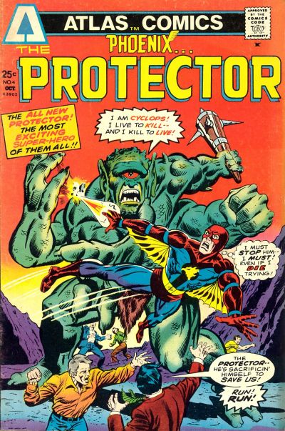
1. Phoenix… The Protector #4, Atlas. When I was a kid, I was obsessed with this cover far more than the content of this book. Atlas Comics was an attempt by creators to splinter off and eventually subsume Marvel. It was spearheaded by Martin Goodman, his son Chip and others, including Larry Lieber and Al. Always seemed like the stuff of legends, like the Titans attempting to overcome the primordial deities, so in the mid-’70s, this comics label was a big deal in my house, and we had this issue. I was 5 or 6 years old and I remember one night when I was unable to sleep, staring at it and going back and forth, pretending the giant was holding his arms in different positions, so it appeared he was moving. Meditating on the foreshortened receding back hand and the forced perspective front hand, I stared and stared. The primary colors, perfectly centered head with its single eye in the middle of the frame. All the elements held a massive powerful pull over me. Years later, I wasn’t sure Al had drawn it, but I sent him an email and sure enough, he did it. This was a period where Al was doing less flattened, rough faces, and his figure work was more textured and rounder. He developed a style that was more constructed of flatted forms over time, which I think heightens his design sensibility and probably created a speedier method of working.
—
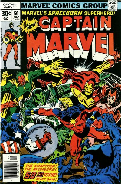
2. Captain Marvel #50, Marvel. This one is especially cool to me because of how many shading techniques are on display. There’s something Caniff-like about the shading on Adaptoid’s right hand, and the way it hovers above the sketchy shadows on his right thigh and his torso. And if you look carefully on the right side, you can see the marks where Al used a razor to cut white marks into the paper and imitate ragged motion up by Adaptoid’s other hand. Compositionally, notice how the Avengers’ hands form a jagged frame around the action in the center of the page, sort of like dancers in a Busby Berkeley musical. Awesome.
—
3. Firestorm #1, DC. I know Al is proud of having co-created this character. I think the design is awesome and the first issue is a landmark that seemed likely to usher in a new era of characters at DC, as Marvel creators migrated over in the late ’70s. I remember being excited about Firestorm as a 10-year-old, watching him on Super Friends, marveling at the abstract symbol on his uniform. Something about the design was fascinating then and it still is. This early series lasted five issues, and was canceled in the DC Comics Implosion of 1978 but returned four years later.

—
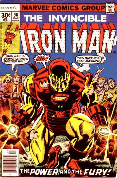
4. Invincible Iron Man #96, Marvel. Killer iconic cover very much showing Al’s love of a Kirby sensibility. So many of Al’s covers flirt with showcasing characters staged in the center of the composition. The question is: How many variations can you come up with on this theme? Al did a lot of centered characters, but never repeats himself. This cover came after Milgrom inked the iconic Iron Man #80 a year earlier, which he still owns, and has described to me as one of the great iconic Kirby images. I think Al was doing something here that is staged as an analog to the earlier piece.
—
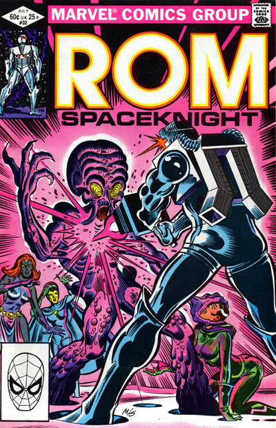
5. ROM #32, Marvel. From top to bottom, a great cover, mostly composed of round shapes abruptly countered by sharply plunging triangles, sort of like a series of Valentine hearts. Hybrid’s head, ROM’s shoulder, and the round patterns of black scattered over his body, are all circular, all the way down to Rogue’s weird brokeback pose and Hybrid’s curling finger. Beautifully colored with pink and purples, balanced with the hot yellow of ROM’s logo. If anything looks weird here, it’s ROM’s length: He seems wrong somehow, but that’s actually correct. ROM is around 9 or 10 feet tall (something Steve Ditko ignored when he took over art chores) and it feels weird having him be so big in relation to the other characters. However, that’s the wonky, off-kilter nature of the world of ROM, Not only is he a cyborg from space who materializes weapons from thin air, but he’s also a giant.
—
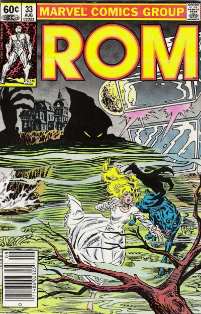
6. ROM #33, Marvel. Very different than the other covers here. Atmosphere is the key thing rather than the bodies in conflict or explosions. Beautiful line weights completely mixed with different looming shadowy figures. And look at the dog on the right. So solid and graphic and savagely demarcated. There’s something so abstract about the mix of wispy phantoms and the landscape jutting out so solid amid shifting, smoky elements.
—
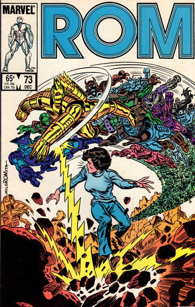
7. ROM #73, Marvel. A drawing of a human woman recoiling from the site of a hundred robot attackers, all set against a hostile mountain environment. If you’re an artist who struggles with receding forms, study this cover. I’ve given this out to my students to show them ways to portray masses and crowds that they hadn’t thought they were capable of portraying. This is a trick Al pulled off in other places as well (see Secret Wars II #7), showing smaller and smaller figures that begin to lose their features and appear as simple blobs of black as they vanish into the distance. Simple but effective strategy, this is one of the few times Al was inked by Romita, possibly the only time. It’s always interesting to see how distinctive Al’s trademarks, like the slashy blacks on the pants, are interpreted by another artist.
—
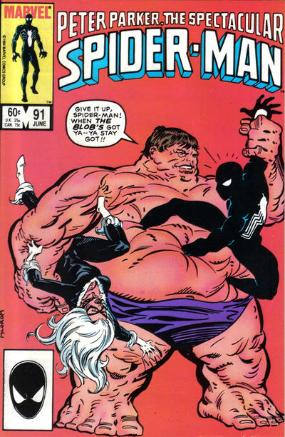
8. Peter Parker: The Spectacular Spider-Man #91. This one is so appealingly simple. The Blob harkens back to the original Kirby design of the character, but with Milgrom’s own take on the slashy, impressionistic shapes that show his bumpy, uneven skin surface. Look at the brushstrokes that compose Blob’s blue trunks. So much variety. It’s as cool and impressionistic as you could get and the figure of the Blob looks impressively stable and grounded. Something about the way the figure runs off the right side of the page keeps the image from being static. I just can’t stop staring at it. I should redraw this as a portrait of Trump holding up women’s reproductive rights and sucking the EPA regulations into his vast swirling vortex of a person.
—
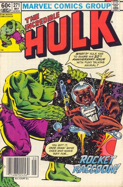
9. Incredible Hulk #271. In 2017, this is undeniably an historically significant cover, the first appearance of current Hollywood superstar Rocket Raccoon. Love the depth of the image, the solar system, the way that Hulk’s butt and heel extend out of the frame on the left side, and the way Rocket’s knee sticks out on the right. And the way that Hulk’s leaning form and the tilted plane of the cosmos form a shape like the roof of a house. It’s the small touches that make these bold compositions work.
—
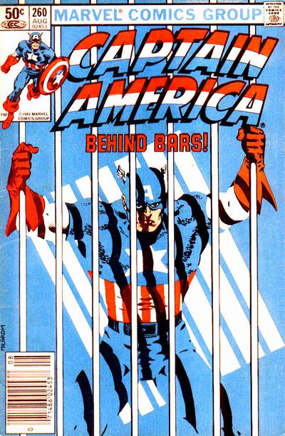
10. Captain America #260. A stunning example of design that uses color to create form and shadow. Aside from Captain America’s gloves and wings and of course, the bars, are there any black outlines in this whole piece? I emailed Al about this, and he said “I think I did all the color ‘holds’ using red lines (an old newspaper strip technique). Then I probably worked with George Roussos to get the color just the way I wanted. The artist (Al Kupperberg) drew the cover, it didn’t quite convey what I wanted so I asked (Jim) Shooter permission to re-do it. He agreed and you see the results. Don’t know how Alan felt about it, but I think it’s one of my best covers.”
—
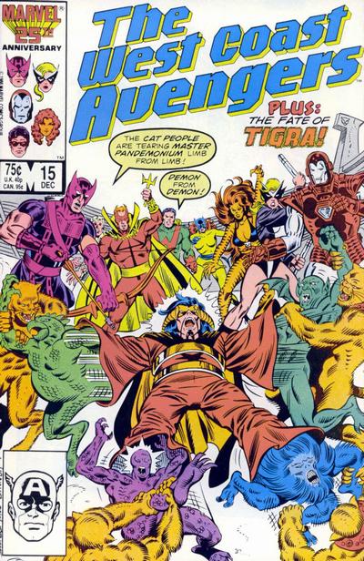
11. West Coast Avengers #15. Milgrom’s art with Sinnott inks. Milgrom’s a very adaptable person to work with and his sensibility was a good fit for Steve Englehart’s gonzo ideas at this point in the ’80s. I gotta say this is the most anguished image possible, like a weird revisiting of tropes from Medieval woodcuts of the suffering of the damned but with these bright colors and pop-culture signifiers and all these obscure superheroes in their weird, glammy dance leotards. You can see the way that Sinnott translated the slashy folds that Milgrom drew here, similar to the way Al did it, but slightly refined. When I first went back to art school, I became fixated on this image and tried to do it as an ink wash drawing or as an oil painting multiple times.
—
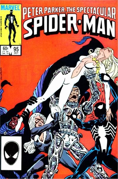
12. Peter Parker: The Spectacular Spider-Man #95. Composition seems to be taken from a classic painting, not sure which one, but it reminds me of Jesus’ body being taken from the cross. This is not an easy composition to do, with overlapping figures. Al makes it as simple as possible for the viewer, and again, pulls off creating a scene where every single element reads clearly against every other.
—
13. Captain America #356. This cover is great with a cool, cinematic, movie-poster feel. The cover is broken into rough, uneven horizontal sections, and showcases scratchy, almost Kubert feathering on teenage Cap’s form, but the interior of this comic must be seen to be appreciated. It’s a comic that Al was credited with doing in a week (he told me it was actually more like two weeks-plus), and features some amazing cartooning and tons of fast and dirty art solutions. It’s like a master’s course in making comics under dire circumstances.

—
Cover images and credits from the bombastic Grand Comics Database.